
You might have heard the news… Kadence Blocks 3.0 is now out, and it has some fantastic features that make creating pages and blog posts in WordPress easier than ever before.
The Row Layout block now uses CSS Grid, which is one of my favorite new features in Kadence Blocks 3.0.
What exactly does this mean? CSS Grid is a two-dimensional grid system that significantly alters how we generate different page layouts and better online designs.
Previously, Flexbox was used for everything in Kadence Blocks v2. That was fantastic, however, Flexbox excels primarily at one-dimensional layouts.
Create Amazing Websites
With the best free page builder Elementor
Start NowAssume you wanted to make a 3x2 grid with three columns and two rows on your page. To achieve that with Kadence Blocks v2, you would be required to design two separate Row Layouts.
The first Row Layout would be your first three columns and top row, followed by the three columns in your second row.
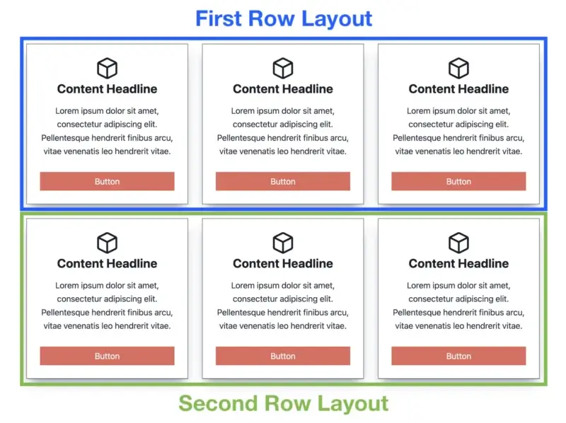
From the looks of it, you will notice is 1 dimensional.
The issues this caused are as follows:
- Maintaining many row layouts, each with their unique settings
- Increased DOM size (using more elements than necessary)
- Unable to switch sections (you'd have to copy and paste pieces)
- Column and row gutter values that are inconsistent (space between columns and rows)
Using CSS Grid solves these problems. A single grid can be used to create a multi-dimensional layout (many columns and rows).
But here's where things become truly interesting… CSS Grid can be used for page layout, and each grid item can be a Flexbox container.
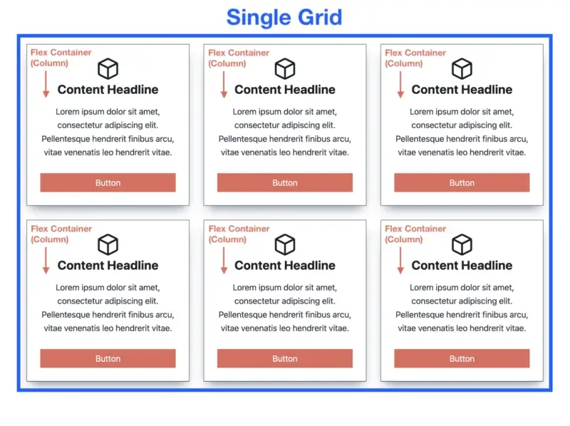
Now, that looks much better!
CSS Grid and Flexbox can complement one another well.
Other Gutenberg block plugins have tried to imitate Kadence Blocks (because it is the most popular block plugin in WordPress) by using Flexbox for everything… "Hold my beer," Kadence said, deciding to outdo everyone.
They're now once again a mile ahead of the competition. And CSS Grid is only one of the hundreds of new features in Kadence Blocks 3.0.
Now that we've covered CSS Grid, let's go through the top 5 Kadence Blocks grid features that make designing pages with the WordPress block editor even easier.
1. Add Sections With a Click
The new Kadence Row Layout block, which employs a CSS grid, offers up a world of possibilities for quickly and easily designing sites. You may now quickly add sections to the Row Layout.
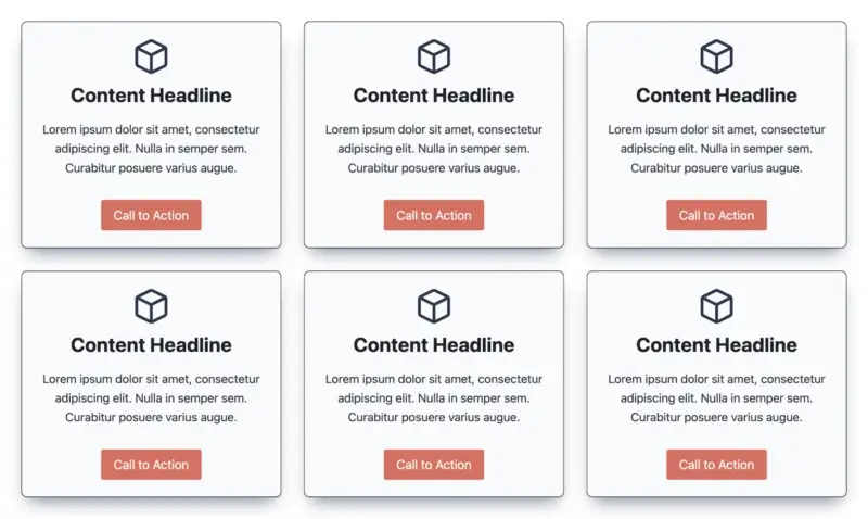
Assume you use a Row Layout with three columns to generate three content boxes. What if you wish to add another row of content boxes, bringing the total to six (three columns with two rows)?
Prior to Kadence Blocks 3.0, you had to put another three-column Row Layout underneath the first one, which added needless elements and increased work.
All you have to do now to add a section is go to the Row Layout level and click the 'Add Another Section' button in the toolbar.
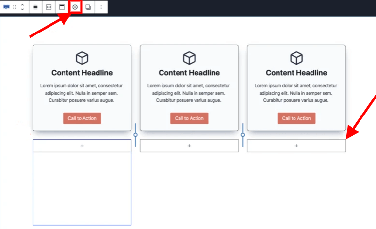
If you click the '+' button three times in a row, you'll get a full new row of parts without having to add another Row Layout. Then, at the Section level, use the Copy/Paste Styles function to rapidly give your three additional sections the same look as your first row.
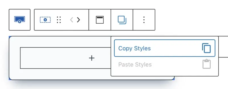
Then, just copy the section content and paste it into the three new sections to quickly create six entire content boxes.
The ability to add a segment with a single click leads to the greatest Kadence Blocks grid feature…
2. Additional Layout Options
I mentioned before in this above how the old Kadence Blocks v2 used Flexbox for literally everything. The issue is that Flexbox excels at one-dimensional layouts but struggles with multi-dimensional layouts (many columns and rows).
We have several new layout possibilities for various screen sizes with Kadence Blocks 3.0 leveraging CSS Grid, making our layouts even more adaptable and mobile-friendly.
3. Easily Swap Sections
One of the most exciting new features of the new Row Layout block based on CSS grid is the ability to quickly swap parts in your grid with the press of a button.
Prior to Kadence Blocks version 3.0, if you wanted to exchange two pieces of content, you had to copy all of the content and paste it into the next one. This was not a beginner-friendly game.
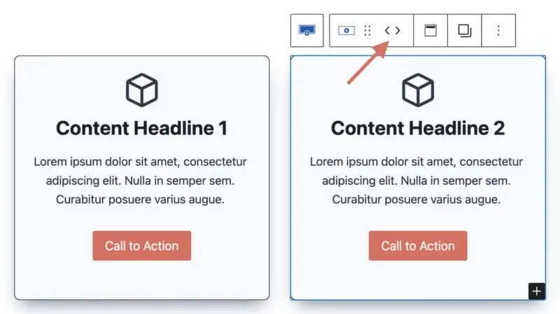
It's now ridiculously simple to change the position of a section. Returning to our previous six content boxes above, what if we wish to change the position of the second part in our grid?
Simply select the second Section block and then click the arrow in the toolbar to move it in the desired direction.
This function alone will save you a lot of time when creating new pages.
4. Column and Row Gutter Variable Spacing
The next key point in Kadence grid innovation is the new configurable spacing for column and row gutters. Because all sections are now contained within a single grid (rather than numerous Row Layouts), you may manage both the column and row gutter from a single Row Layout.
The column gutter determines the horizontal spacing between columns, whereas the row gutter determines the vertical spacing between rows.
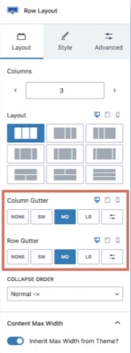
When you select your top-level Row Layout, the Column Gutter and Row Gutter options appear in the Layout tab.
Remember that the Row Gutter option will only appear if you have more than one row.
Take note of the variable spacing options, which include None, Small, Medium, Large, and Custom, where you can enter your own value.
Columns and rows The new variable spacing choices from Gutter are fantastic since they provide consistency between each part (horizontally and vertically).
You can also change the spacing between parts with a few clicks rather than manually entering values.
When you had to design many Row Layouts before Kadence Blocks 3.0, it was difficult to maintain the horizontal and vertical spacing consistent between sections.
5. Reduced DOM Size
Last but not least, the smaller DOM (Document Object Model) size that comes with employing a CSS grid is one of my favorite Kadence Blocks 3.0 grid improvements.
For those who are unfamiliar, the DOM is the data representation of all the elements that comprise a webpage. Using hefty third-party page builders to create pages in WordPress results in massive DOM sizes, which can slow down page rendering.
Kadence Blocks is one of the most lightweight plugins for building pages directly in the WordPress block editor, which is one of the main reasons your site will load much faster.
Conclusion
Kadence Blocks is a robust and adaptable plugin that adds new features and options to the WordPress block editor. Kadence Blocks 3.0 introduces CSS Grid, which allows you to design multi-dimensional layouts with ease and speed.
In this article, we looked at some of the best Kadence Blocks grid features, including:
- Add Sections With a Click
- Additional Layout Options
- Easily Swap Sections
- Column and Row Gutter Variable Spacing
- Reduced DOM Size
These characteristics combine to make Kadence Blocks one of the best WordPress plugins for creating visually appealing websites.