
With Divi's Gradient Builder, you can make a wide range of backgrounds. The colors combine to make shapes and patterns that would be hard to make on their own. The Gradient Builder in Divi has settings that make it easy to make circular patterns, like a round background shape. This makes it easy to create unique backgrounds. In this post, we'll look at how to use the Divi Gradient Builder to make unique circular background shapes that draw attention to any section or column.
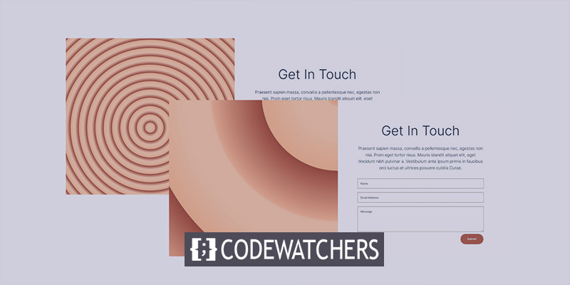
Design Preview
Here is an outlook of what we will be building today. Here is 1st circular background shape design.
Here is 2nd circular background shape design.
Design Module
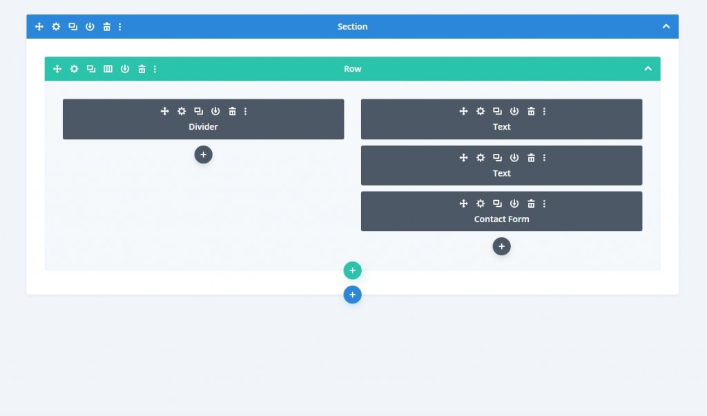
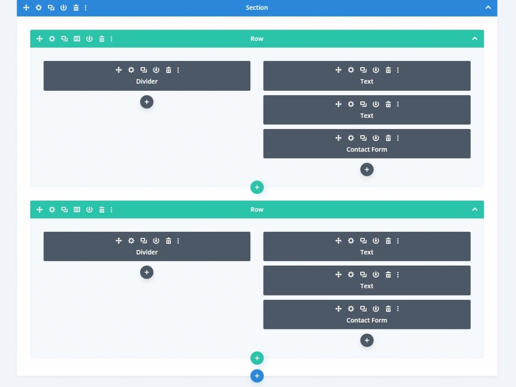
Instead of a Divi layout section, we will create a custom section for this tutorial. The section will require a two-column row of equal size for its content.
Create Amazing Websites
With the best free page builder Elementor
Start NowA divider will be placed in the left column. This is not going to be apparent. It allows our column 1 background to be displayed on smaller screen sizes. On smaller screens, only columns with modules are displayed. Two text modules and a contact form will be included in the right column.
Add the following modules accordingly to the row.
Section Settings
Click the gear icon to reveal the section's settings. Then change the background color.
- Background Color: #fff7ef
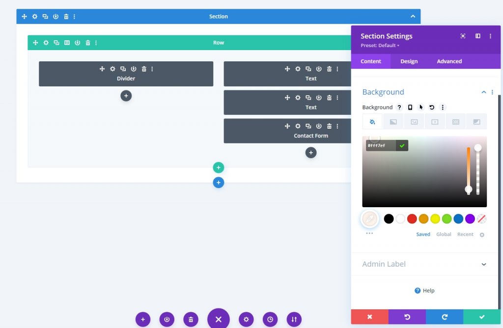
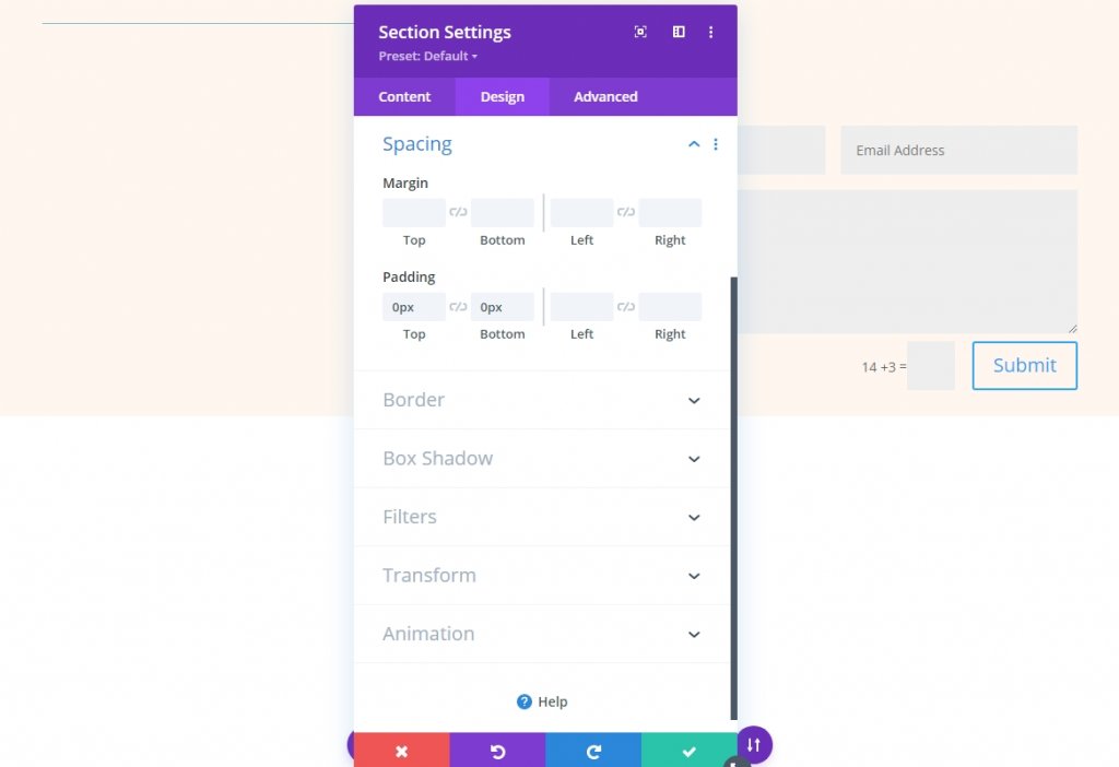
From the Design tab, scroll down to the Spacing section and make do following changes to padding.
- Top: 0px
- Bottom: 0px
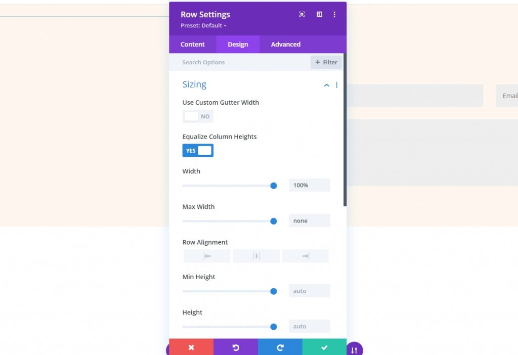
Row Settings
Open the row settings and alter the following values accordingly.
- Equalize Column Heights: Yes
- Width: 100%
- Max Width: None
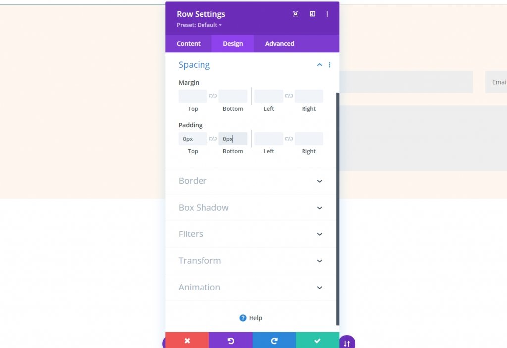
Now from the spacing section, change the padding value.
- Padding: 0px Top, 0px Bottom
Column Settings
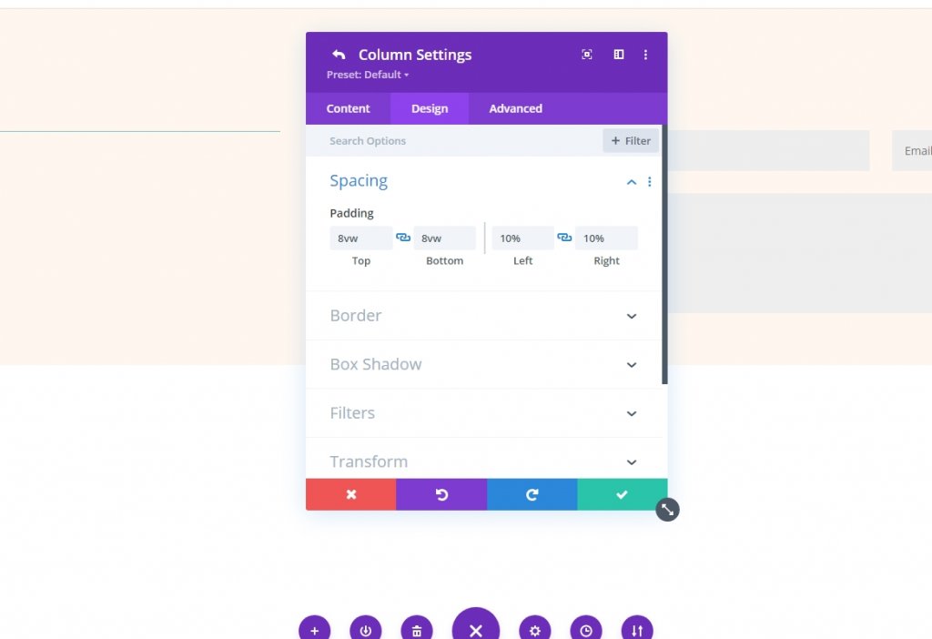
Column spacing modifications are the next step. During the process of creating the circular backdrops, we'll return to the column settings. Open the settings for the first column and make the changes on the design tab.
- Top: 8vw
- Bottom: 8vw
- Left: 10%
- Right: 10%
Now open the second column and make the following changes.
- Top: 8vw
- Bottom: 8vw
- Right: 12%

Divider Module
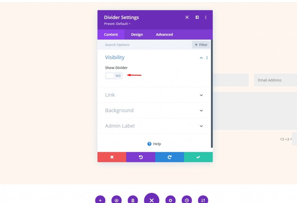
Open the divider modules setting from the 1st column and change visibility.
- Show Visibility: No
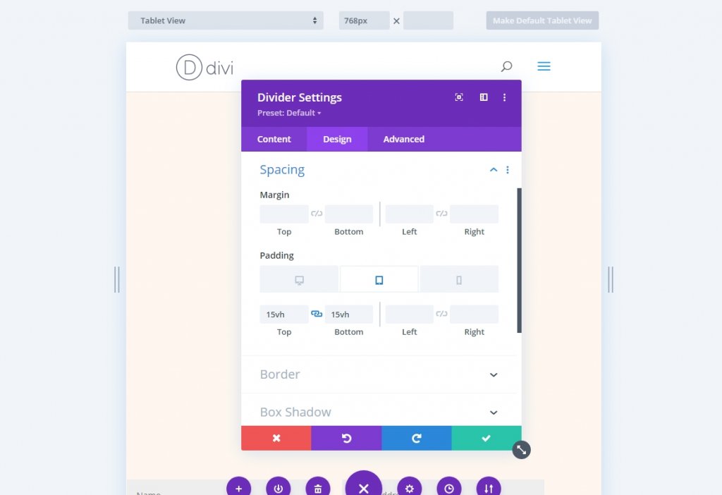
After that, go to the design tab and look for the Spacing section. Select the tablet tab and add 15 volts to the padding on the top and bottom. The tablet's settings will be synced to the phone.
- Padding (tablet): 15vH Top, 15vh Bottom
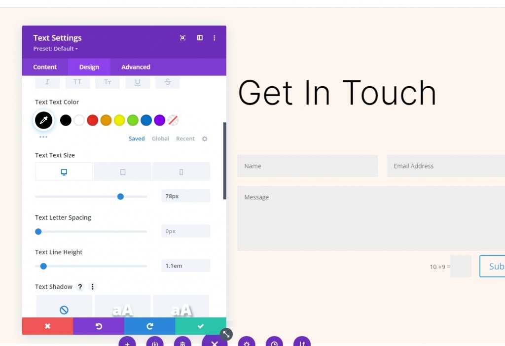
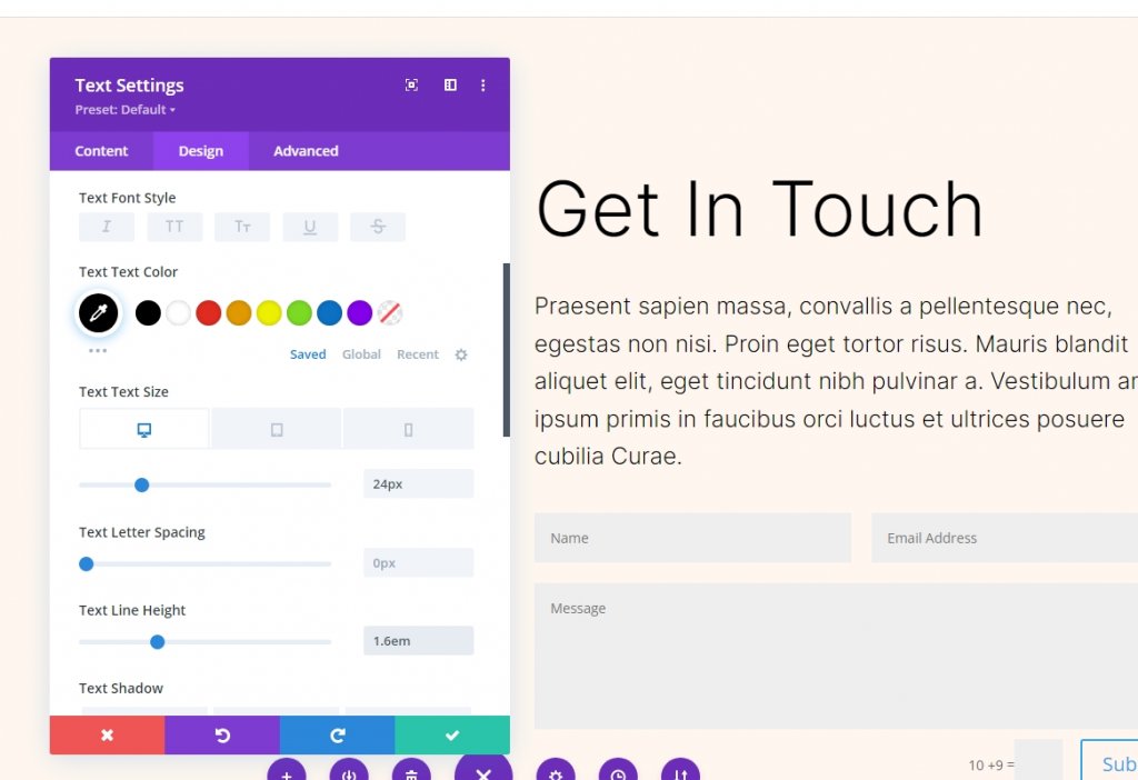
Text Module 1
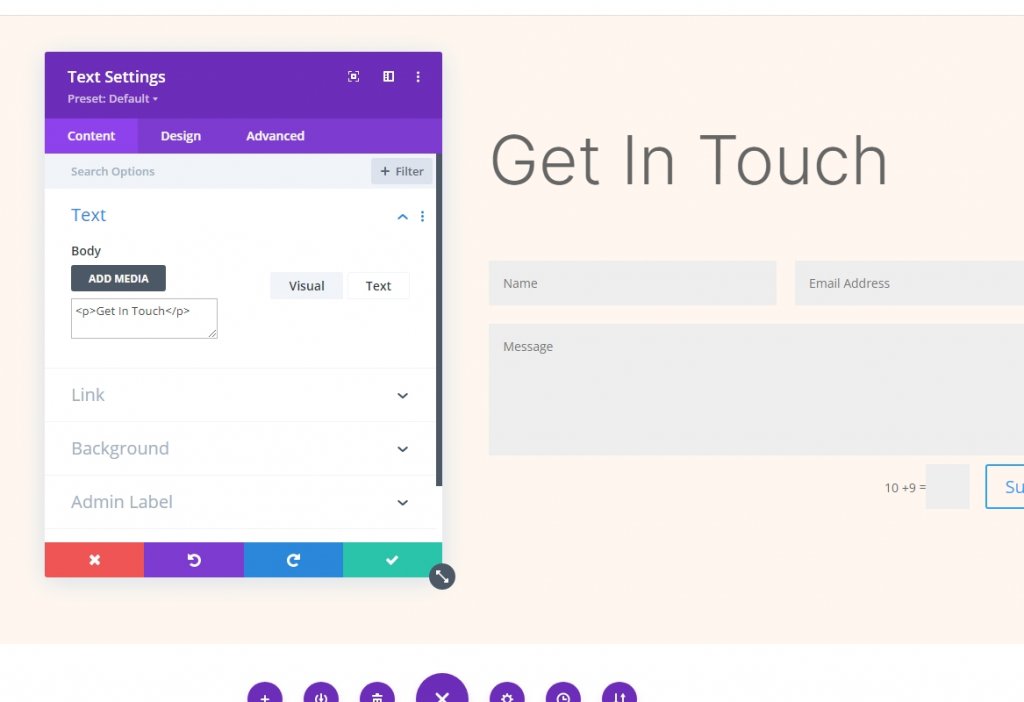
Now go to the first text module on the 2nd column. It will act as a title for the contact form. Change the following:
- Body Content: Get In Touch
Go to the design tab and change the font and font-weight.
- Font: Inter
- Font Weight: Light
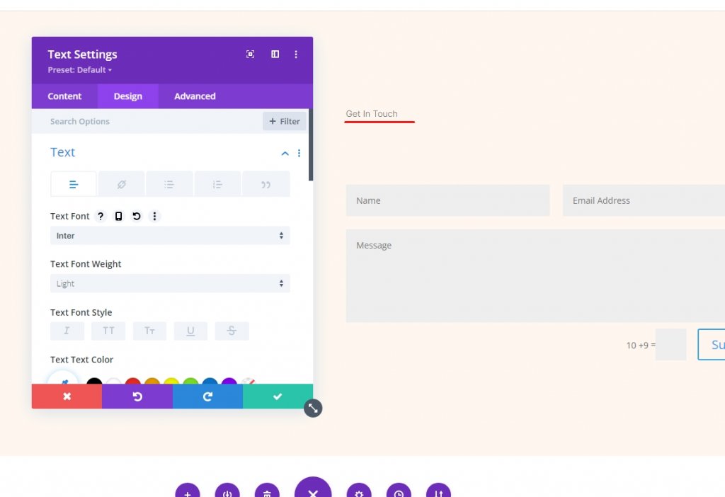
Also, change the following settings too.
- Color: #000000
- Font Size: 78px (desktop), 44px (tablet), 28px (Phone)
- Line Height: 1.1em
Text Module 2
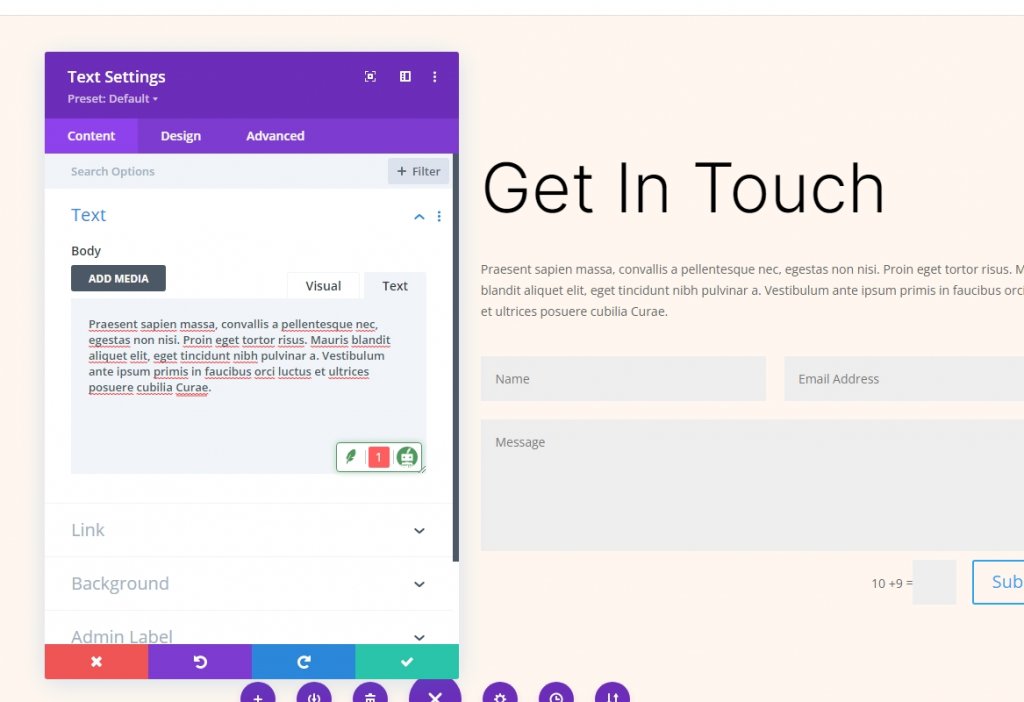
Open the second text module settings and add a description.
Go to the design tab and add the following values to the designated places.
- Font: Inter
- Font Weight: Light
- Color: #000000
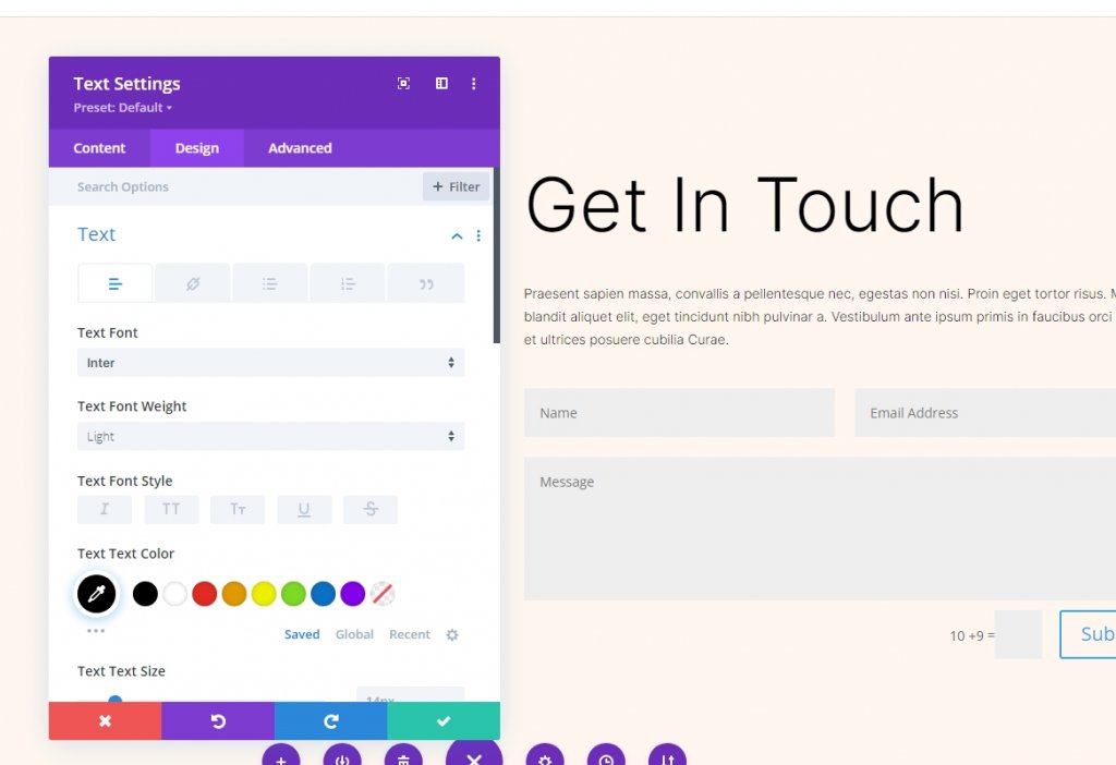
Also, alter the following values too.
- Font Size: 24px (desktop), 20px (tablet), 16px (Phone)
- Line Height: 1.6em
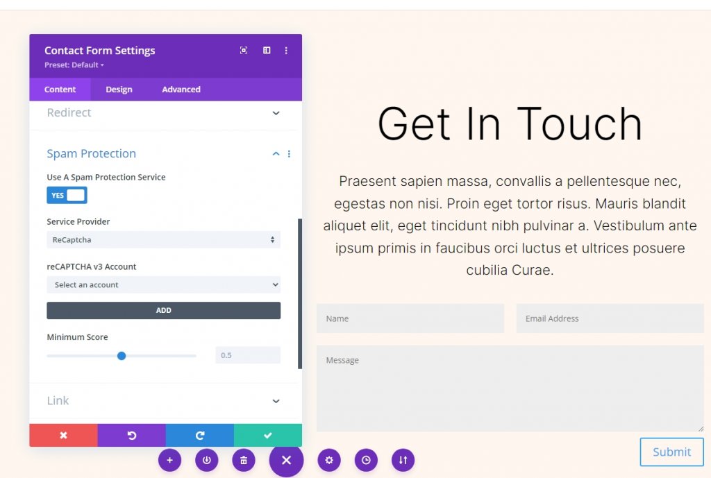
Contact Form Module
Open the settings for the contact form module and activate Use a Spam Protection Service under Spam Protection. Give spam protection service in Divi Email Opt-in a read to know further.
- Use a Spam Protection Service: Yes
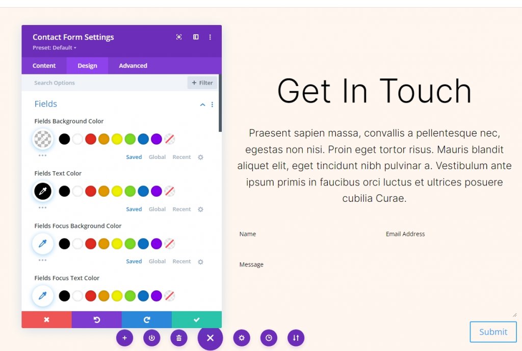
Fields Design
Go to the design tab of the contact form and change the mentioned settings.
- Fields Background Color: rgba(0,0,0,0)
- Text Color: #000000
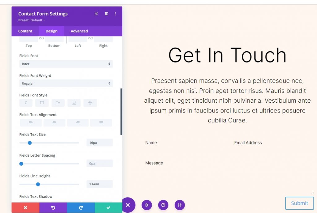
Next, make some changes to the font section.
- Font: Inter
- Size: 16px
- Line Height: 1.6em
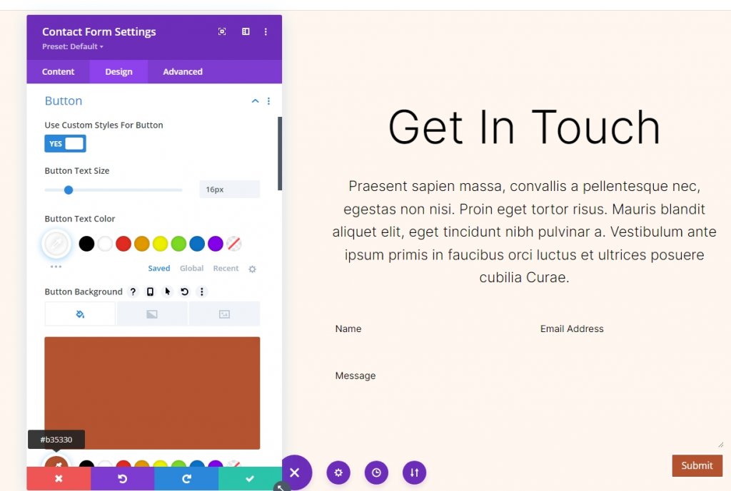
Button Design
Scroll down to the button option and change the following.
- Use Custom Styles: Yes
- Text Size: 16px
- Text Color: #ffffff
- Background Color: #b35330
Change border radious, font and its weight too.
- Border Radius: 100px
- Button Font: Inter
- Weight: Medium
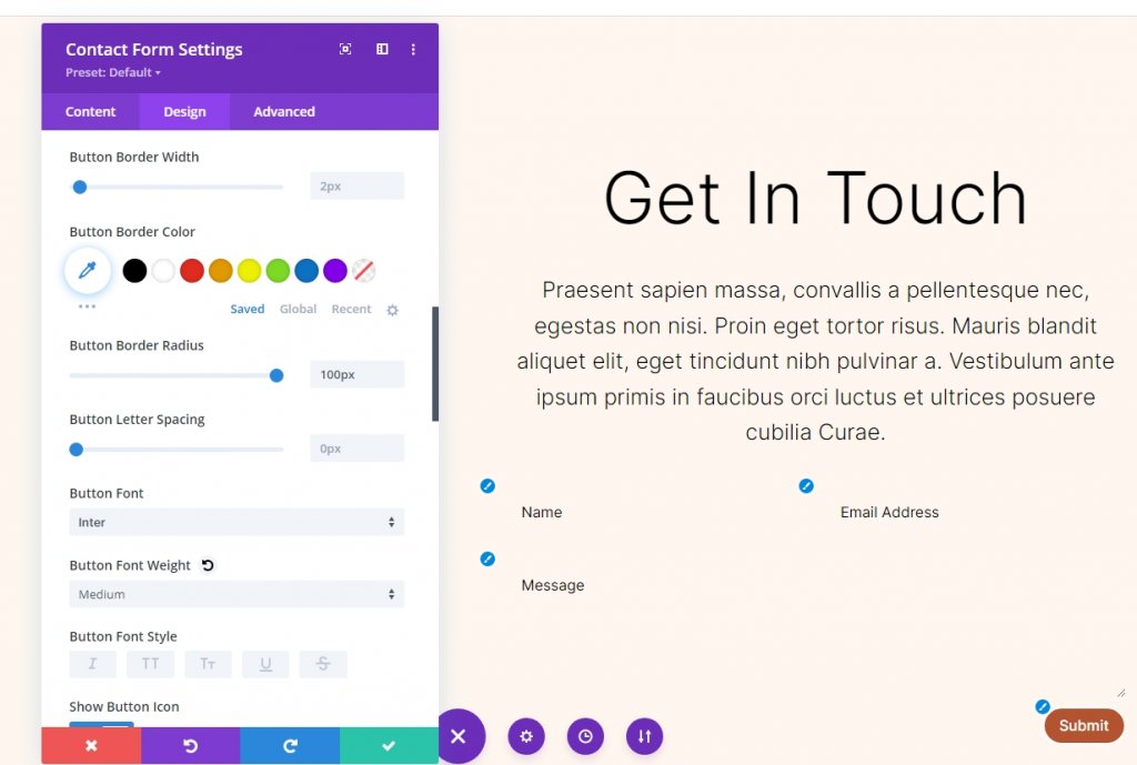
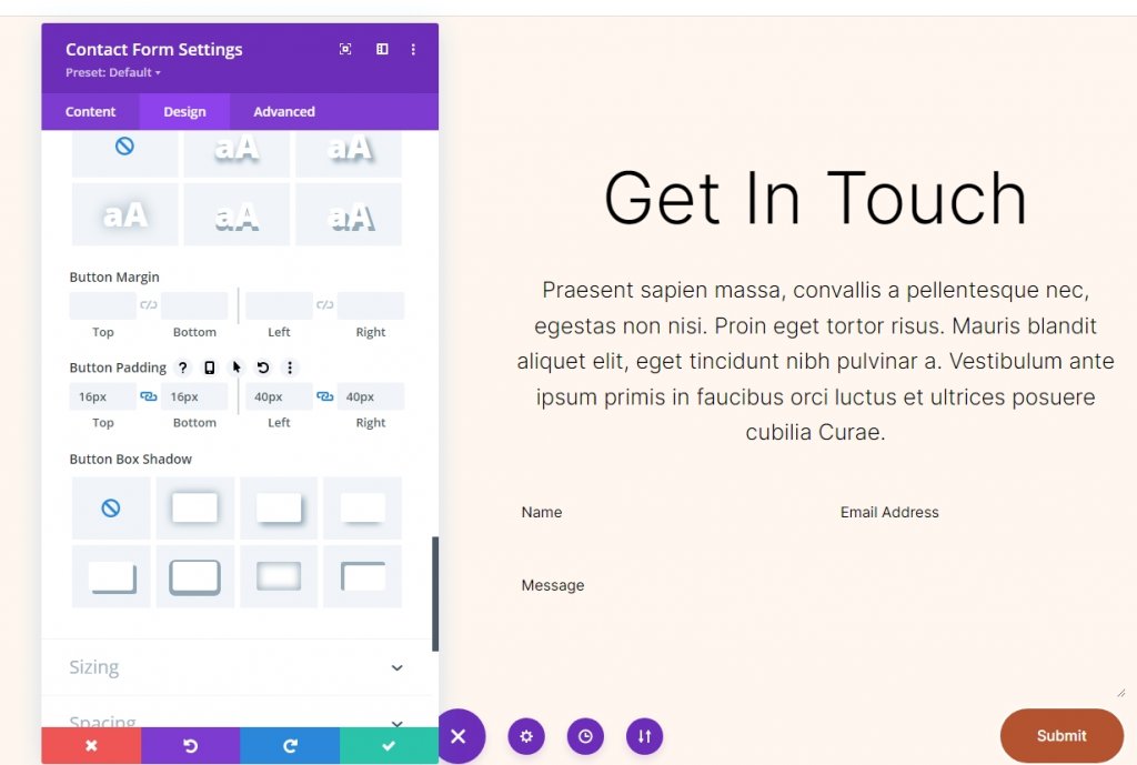
Now change the button padding settings.
- Button Padding: 16px (Top, Bottom), 40px (Left, Right)
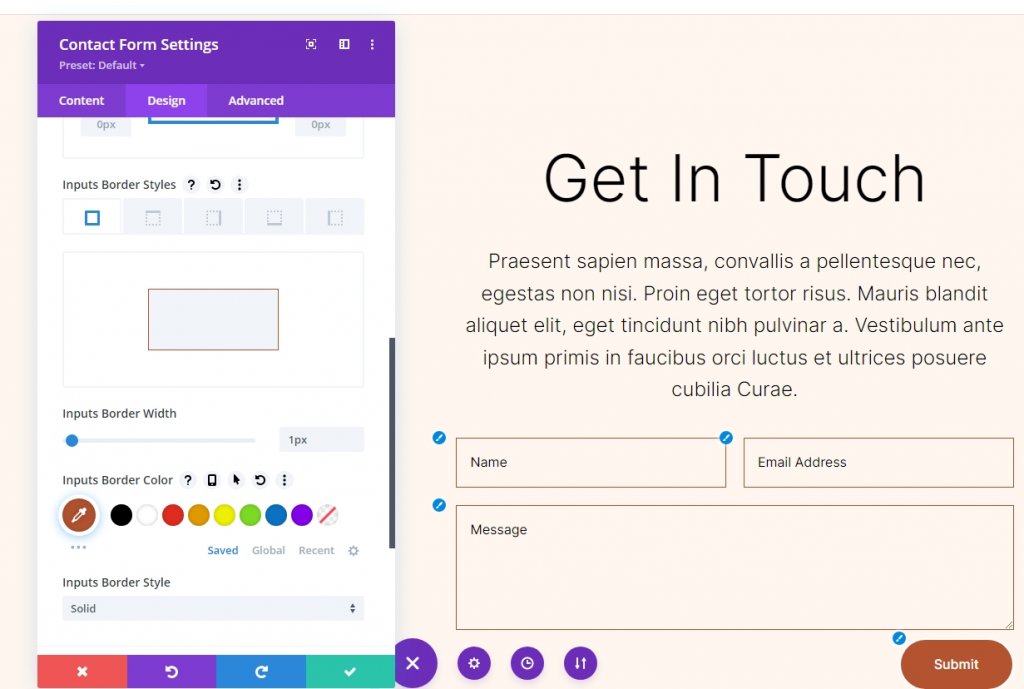
Field Border
Now come down to the Border setting and make these changes.
- Inputs Border Width: 1px
- Inputs Border Color: #b35330
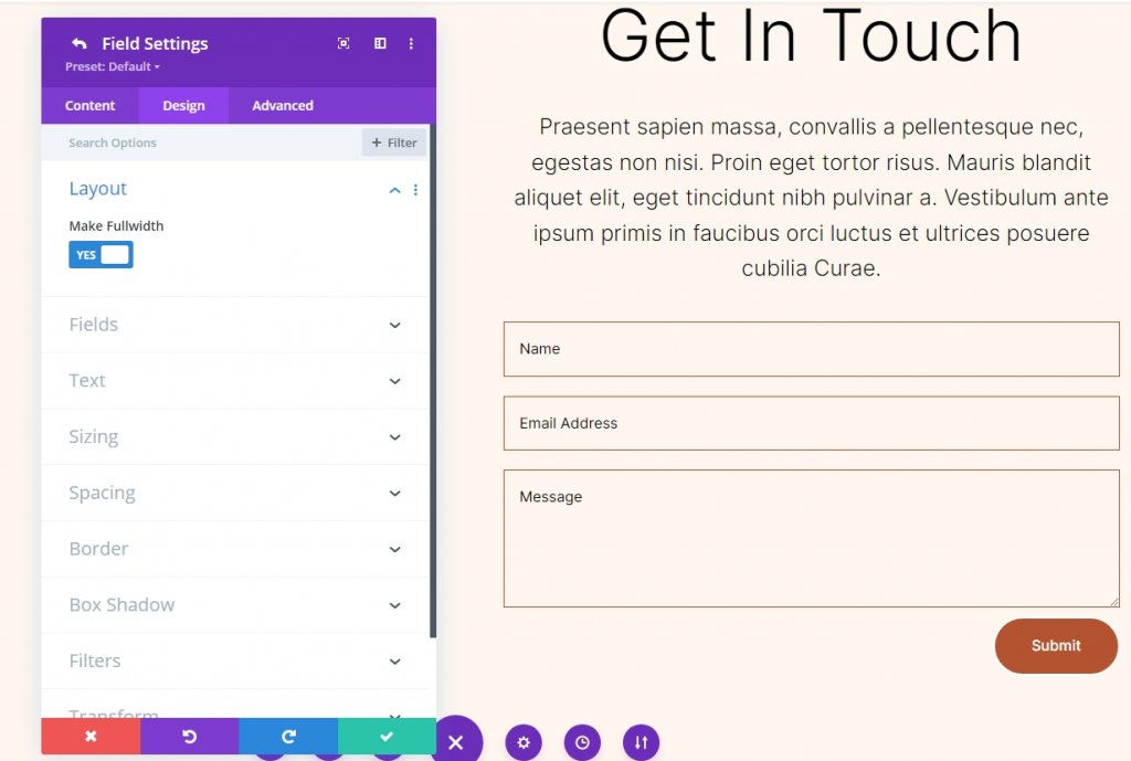
Field Settings
Change the size of the field and make them full width.
Section Cloning
Now duplicate the existing section 1 time so that we can have 2 sections in total. We are going to add different background colors to them.
Applying Background Gradient
We'll add the Background Gradient to the left column of the row for each of our circular backdrops. Some of them will feature Gradient Stops that can be stacked, and others will use the same colors. The gradient will be altered if the stack order is incorrect, therefore pay close attention to it. There will be a variety of units used, but they'll all begin with a percentage as a base.
Open the row settings and click on the first column settings. Then scroll down to the background and move to the gradient background.
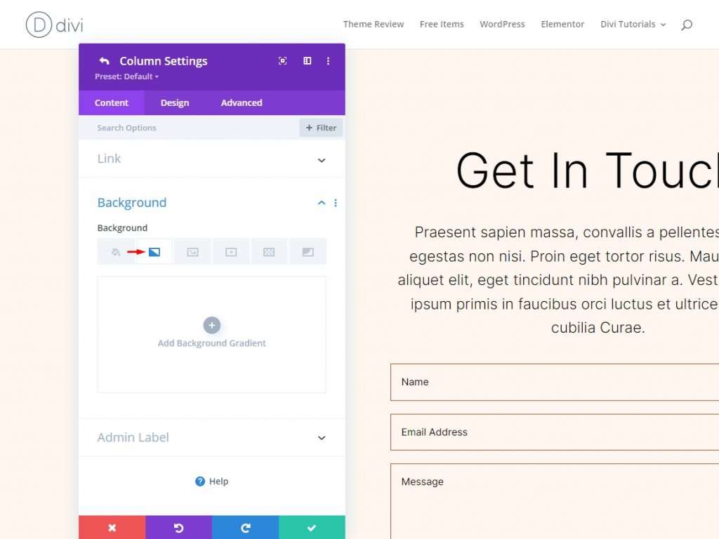
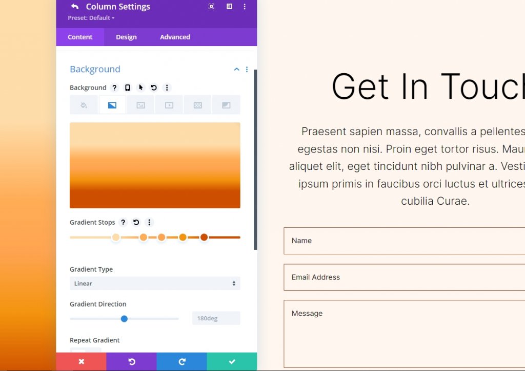
You can add a Gradient Stop to the bar by clicking on it. By picking them, you can change their color. As we go forward, we'll be changing the percentages on the gradient bar.
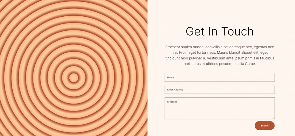
Circular Background Shape One
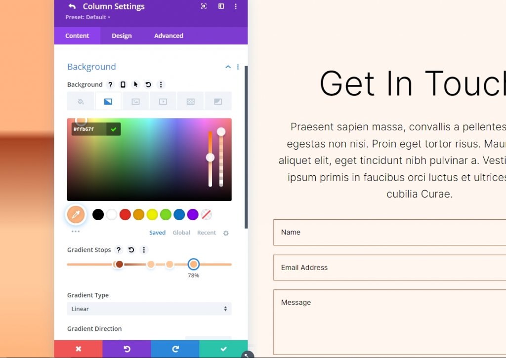
Five Gradient Stops will be used to create a circular background with a lot of circles within circles.
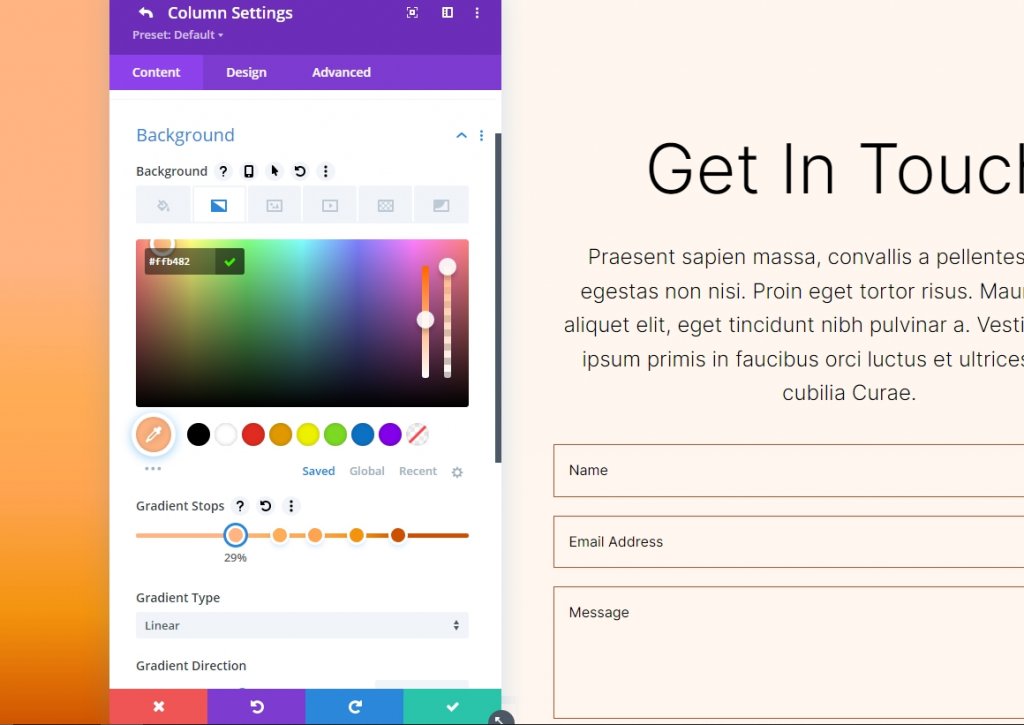
Gradient Stop 1
Follow the settings for 1st gradient stop.
- Position: 29
- Color: #ffb482
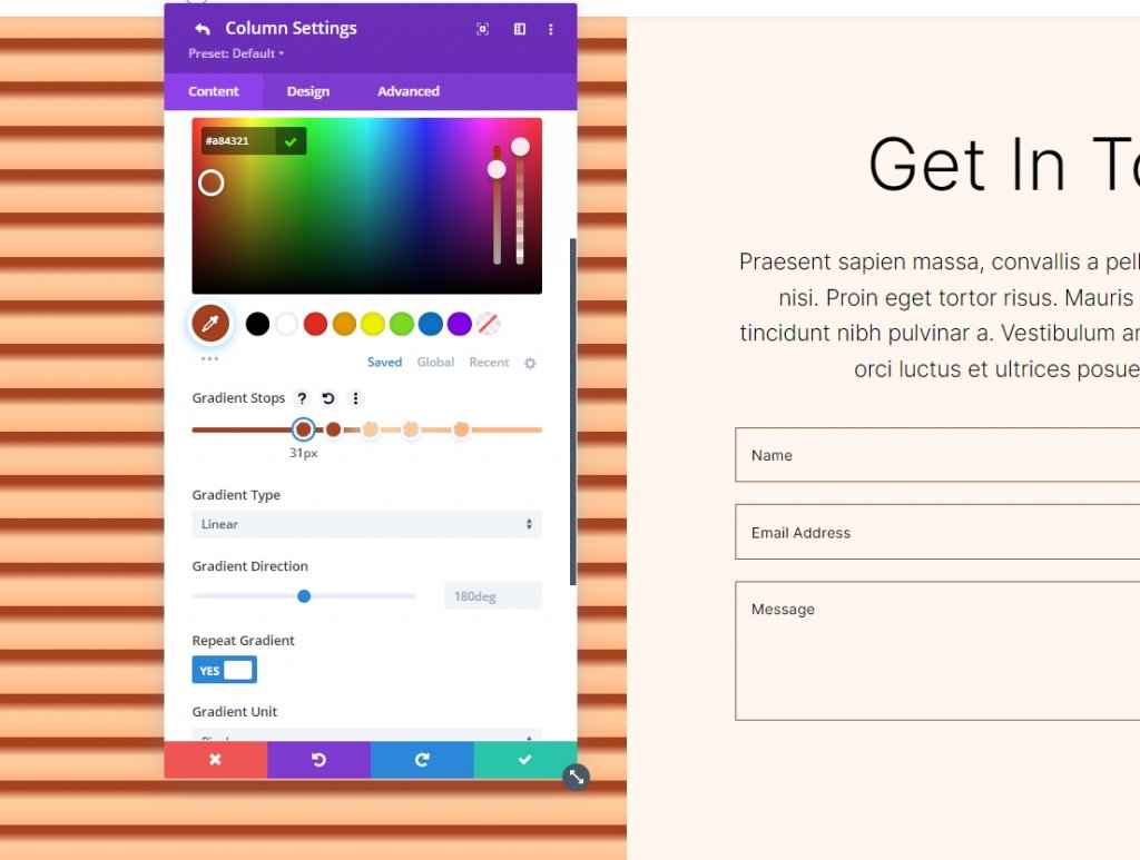
Gradient Stop 2
Follow the settings for 2nd gradient stop.
- Position: 31
- Color: #a84321
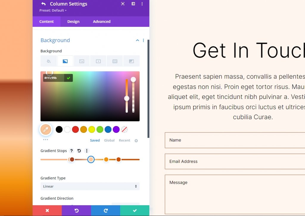
Gradient Stop 3
Follow the settings for 3rd gradient stop.
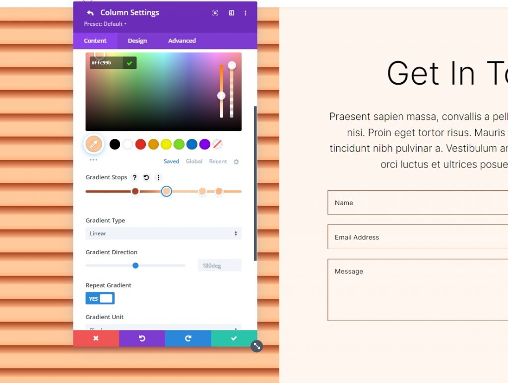
- Position: 51
- Color: #ffc99b
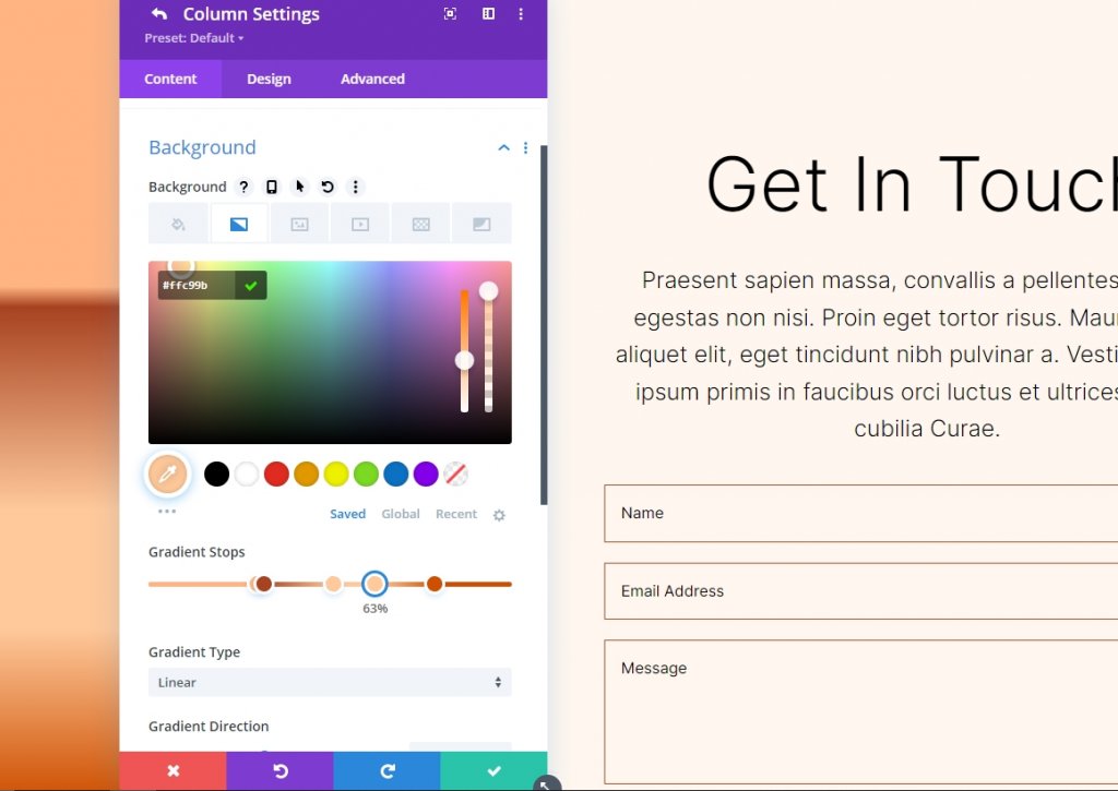
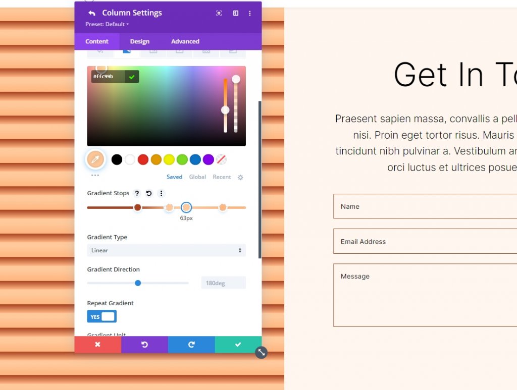
Gradient Stop 4
Follow the settings for 4th gradient stop.
- Position: 63
- Color: #ffc99b
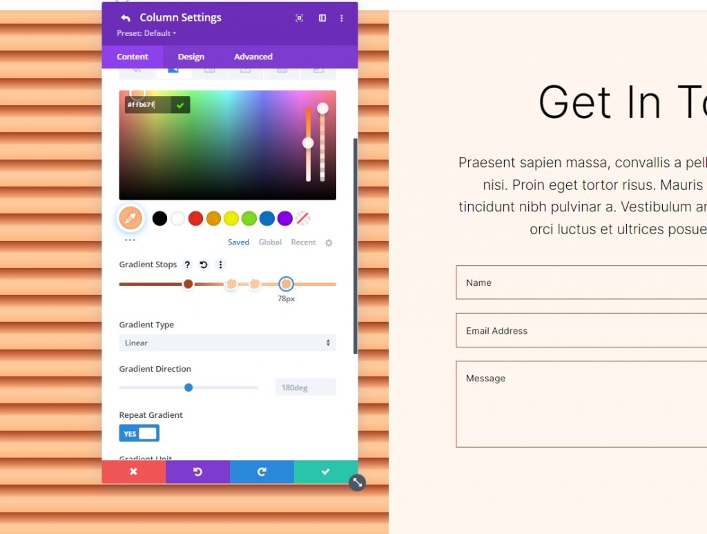
Gradient Stop 5
Follow the settings for 5th gradient stop.
- Position: 78
- Color: #ffb67f
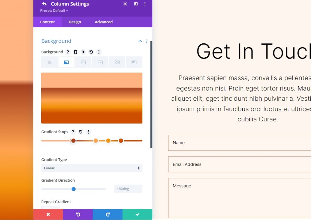
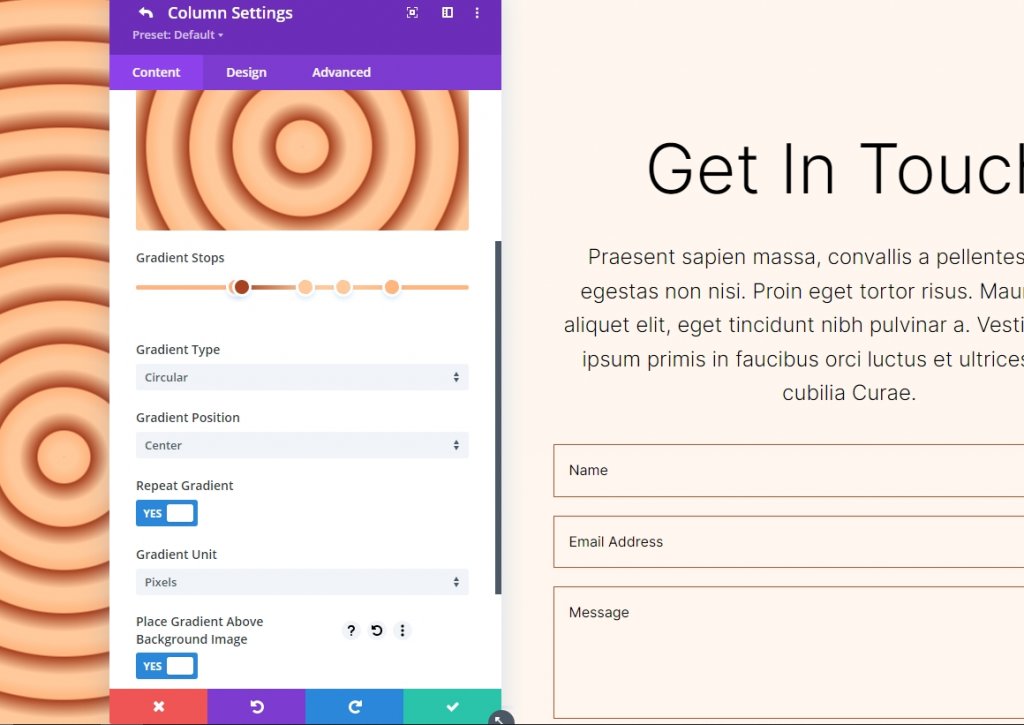
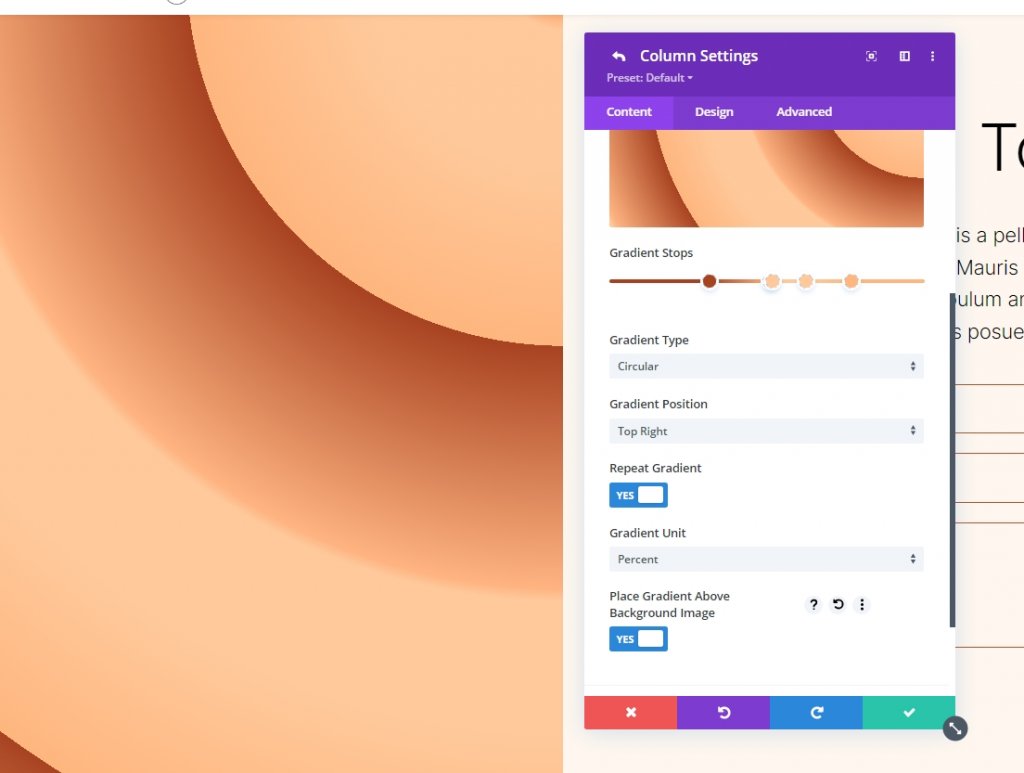
Setting For Gradient
Gradient settings should be changed to Circular and center-placed. Enable Place Gradient Above Background Image, Repeat Gradient, and Change Units to Pixels.
- Type: Circular
- Position: Center
- Repeat Gradient: Yes
- Gradient Unit: Pixels
- Place Gradient Above Background Image: Yes
Here is our output for Circular Background Shape 1.
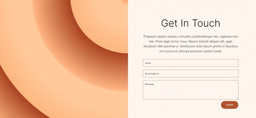
Circular Background Shape Two
There will be a total of five Gradient Stops in our second circular background shape. A portion of a circular pattern will be seen from one corner.
Gradient Stop 1
Follow the settings for 1st gradient stop.
- Position: 31
- Color: #a84321
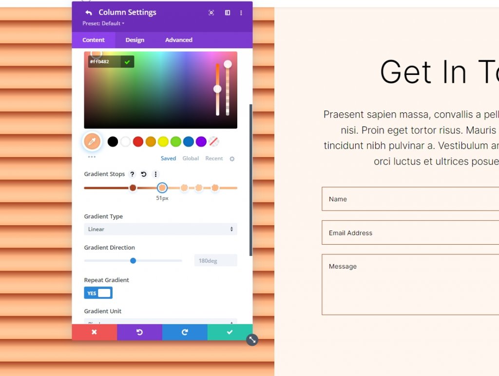
Gradient Stop 2
Follow the settings for 2nd gradient stop.
- Position: 51
- Color: #ffb482
Gradient Stop 3
Follow the settings for 3rd gradient stop.
- Position: 52
- Color: #ffc99b
Gradient Stop 4
Follow the settings for 4th gradient stop.
- Position: 63
- Color: #ffc99b
Gradient Stop 5
Follow the settings for 5th gradient stop.
- Position: 78
- Color: #ffb67f
Settings For Gradient
The next step is to alter the gradients. Switch to Circular and put it at the Top Right location. Use Repeat Gradient, Pixels as the unit, and Place Gradient Above Background Image to create a seamless background image. Close the module and save your configuration.
- Type: Circular
- Position: Top Right
- Repeat Gradient: Yes
- Gradient Unit: Percent
- Place Gradient Above Background Image: Yes
Here is our output for Circular Background Shape 2.
Wrapping Up
This concludes our tutorial on creating custom circular background shapes with the Divi Gradient Builder. Now you can easily create eye-catching backdrops using the Gradient Builder. Using circular shapes is a great way to add visual interest to a section or column. Anyone may quickly and easily construct eye-catching circular patterns by following the instructions provided here. You should experiment with the parameters and stacking order to see what you can come up with. Check other Divi tutorials, who knows that something might become helpful for the next project.