
Hero sections are always considered to be a great tool to catch visitors' attention. Also, it unconsciously set a tone for the website in their mind. So having a creative hero section is a blessing for the business. Divi is a wonderful WordPress theme and page builder and it provides a lot of opportunities to make your website's hero section beautiful. Earlier we have seen how to design a sticky hero section on scroll and today's we'll see how to design a hero section where there will be a secret image grid that will unveil through scrolling. Sounds exciting, right?

Lets jump right into the tutorial.
Sneak Peak
This will be the design we will create today and this will be completely responsive.
Desktop View
Mobile View
Designing Hero Section
Open a new page from your WordPress dashboard. Name it as you like and open it with Divi builder.
Create Amazing Websites
With the best free page builder Elementor
Start Now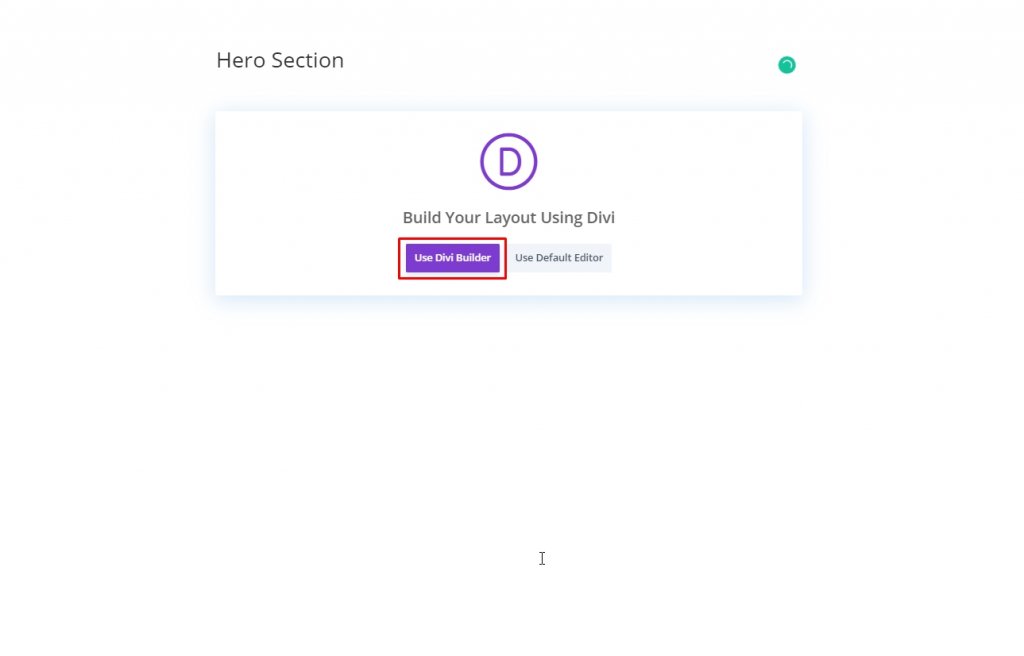
Adding: New Section
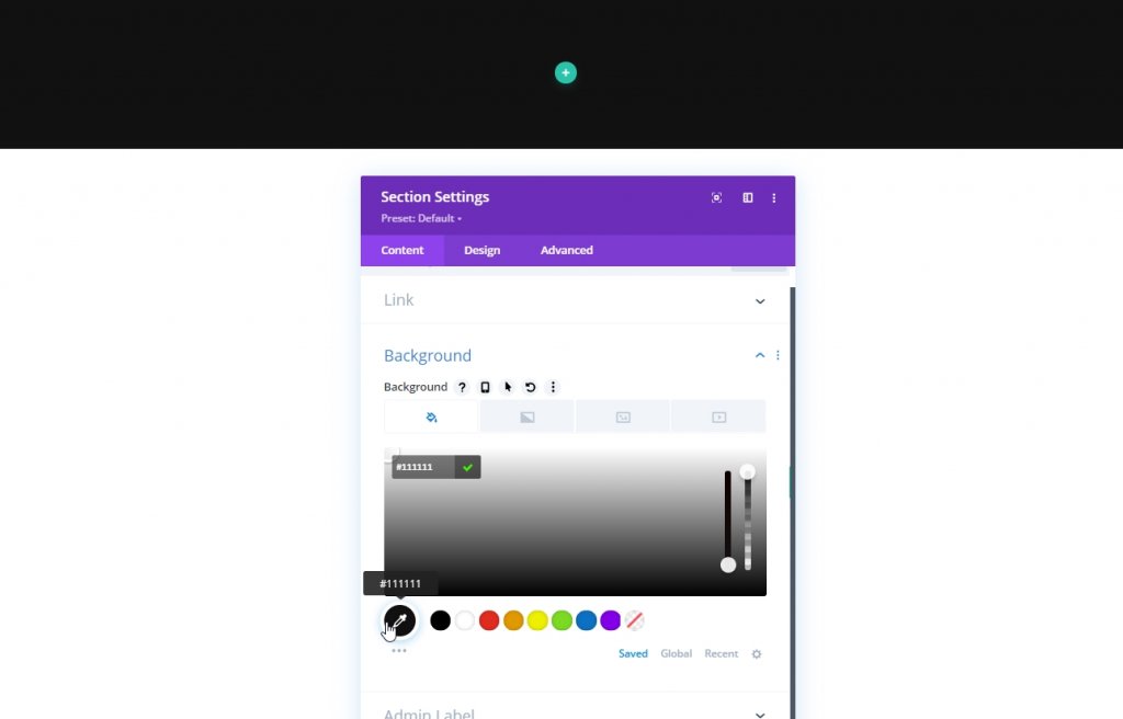
Background Color
We will add a background color to our initial section. Open settings for the section and add the Background color.
- Background Color: #111111
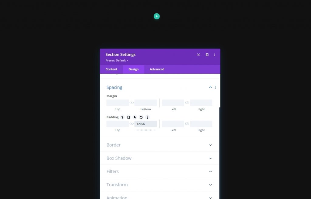
Spacing
Now move to the Design tab of the section and do some adjustments in bottom padding because it will give us more space to have a better scrolling experience.
- Bottom Padding: 120vh
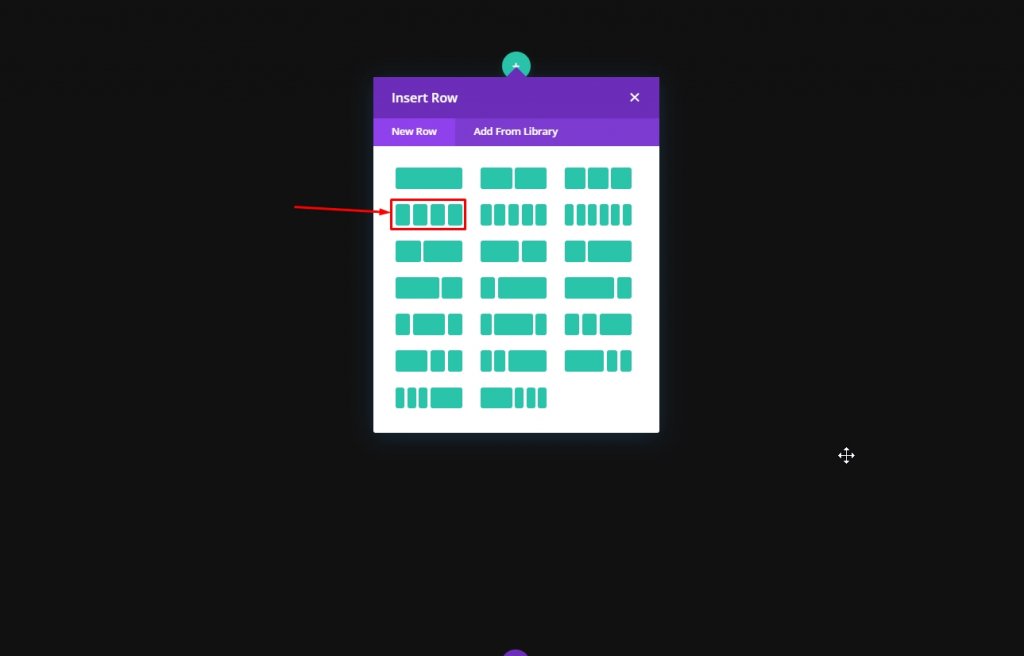
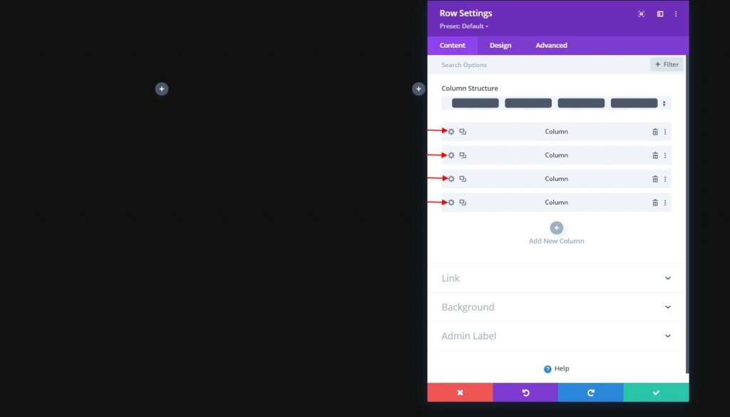
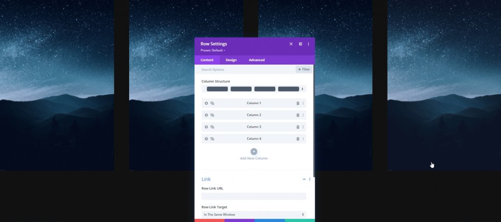
Adding: Row One
Column Structure
Now we'll add a new row to the prepared section. Follow the shown column structure.
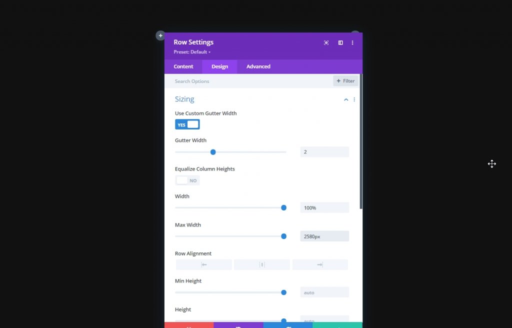
Sizing
Now before we add any more modules, open the row setting and change following values from design tab.
- Use Custom Gutter Width: Yes
- Gutter Width: 2
- Width: 100%
- Max Width: 2580px
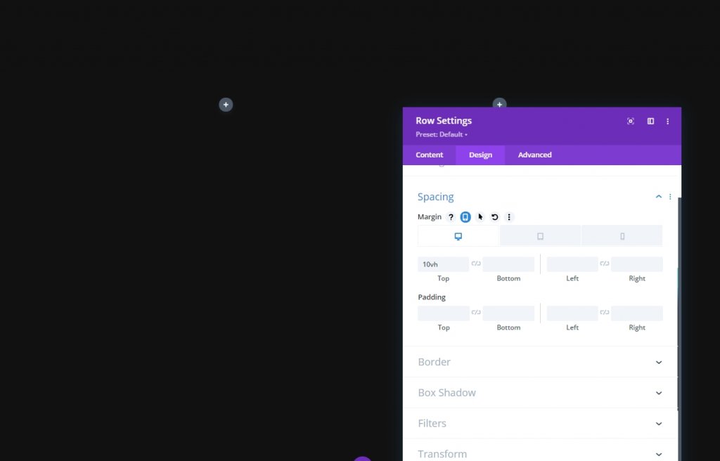
Spacing
Now add some margin to the top.
- Top Margin: Desktop: 10vh, Tablet & Phone: 5vh
Z Index
In order to maintain our design sequence, we need to keep this row below the second row. That's why we will add some Z index values.
- Z Index: 10

All Column Settings
As we are done with the row one settings, now open settings for each column and make changes explained below.
Main Element CSS
This CSS code is only for mobile devices. Make sure to add them to each column individually.
width: 50% !important;
margin: 0 !important;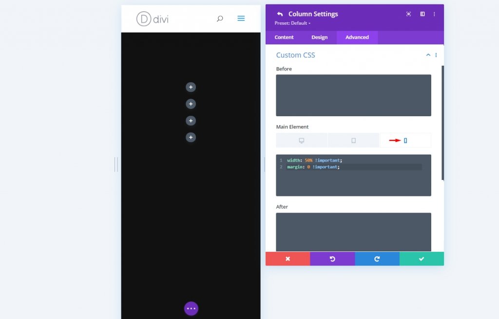
Column 2 Settings
Z Index
Then, open the column 2 settings and add Z index value to it. This will bring the column over next one.
- Z Index: 12
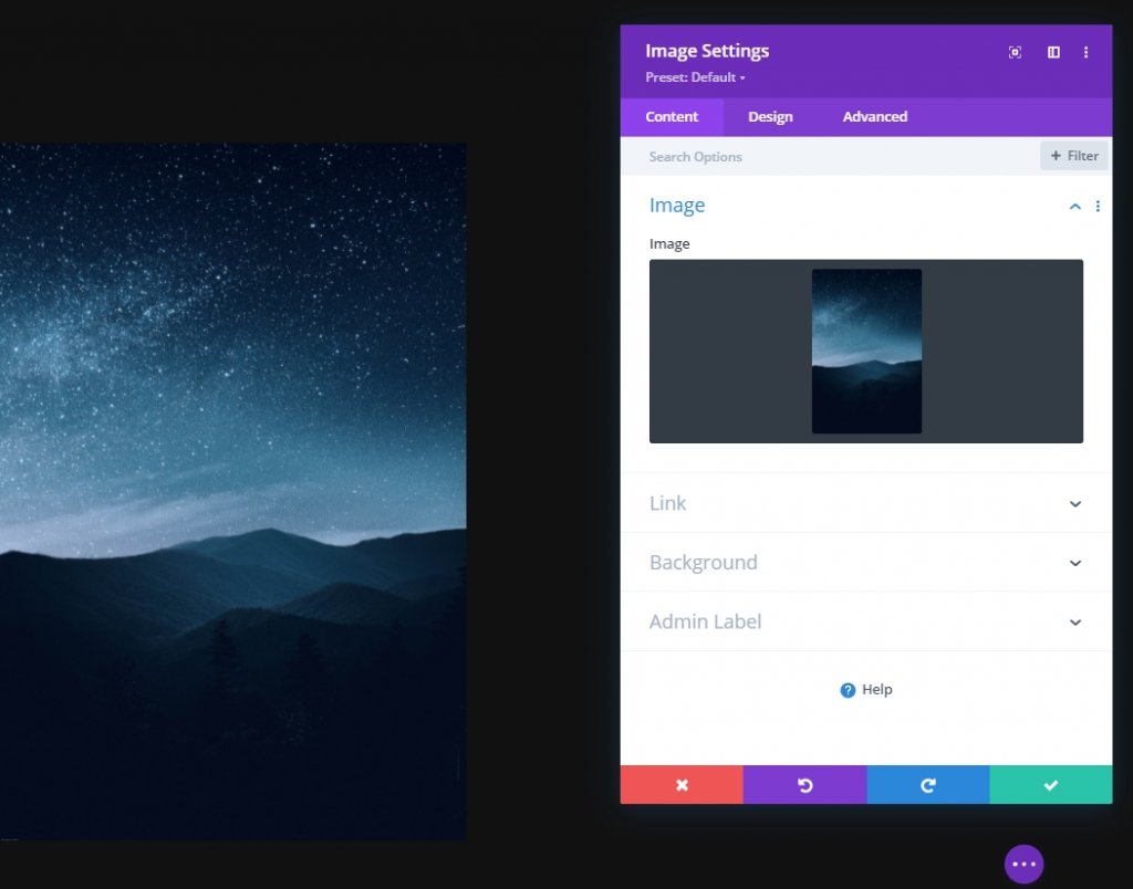
Adding: Image Module to Column 1
Upload Image
Now we'll add a image module to column 1 and upload a image of our choice.
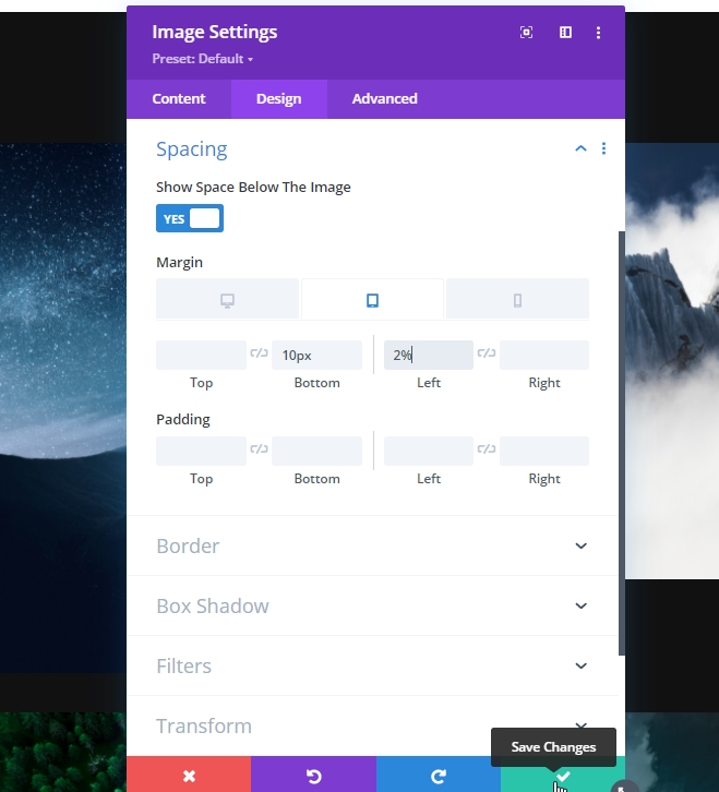
Spacing
From the module’s design tab and change the spacing settings.
- Bottom Margin: Tablet & Phone: 10px
- Right Margin: Tablet & Phone: 2%

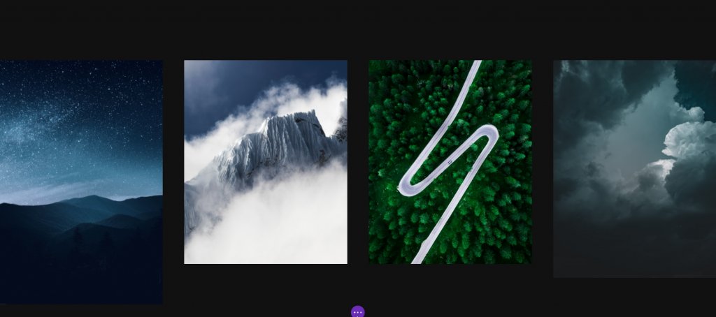
Clone Image Module & Fill Remaining Columns
As we just finished the module settings, let's duplicate the entire module thrice and place it on the remaining columns.
Now change the images from rest of the columns.
Change Spacing Settings For Image 2 & 4
Then, open the settings of the Image Modules in column 2 and 4, and apply the following spacing values to them:
- Bottom Margin: Tablet & Phone: 10px
- Left Margin: Tablet & Phone: 2%
- Right Margin: /
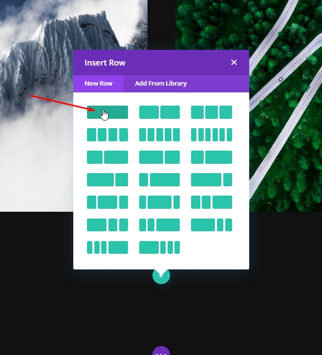
Adding: Row Two
Column Structure
Now add a new row to our main section.
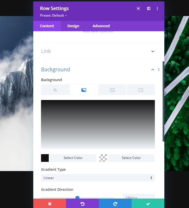
Gradient Background
Now we will apply a gradient background to this newly created row. So, open the setting and apply the background
- Color 1: #111111
- Color 2: rgba(255,255,255,0)
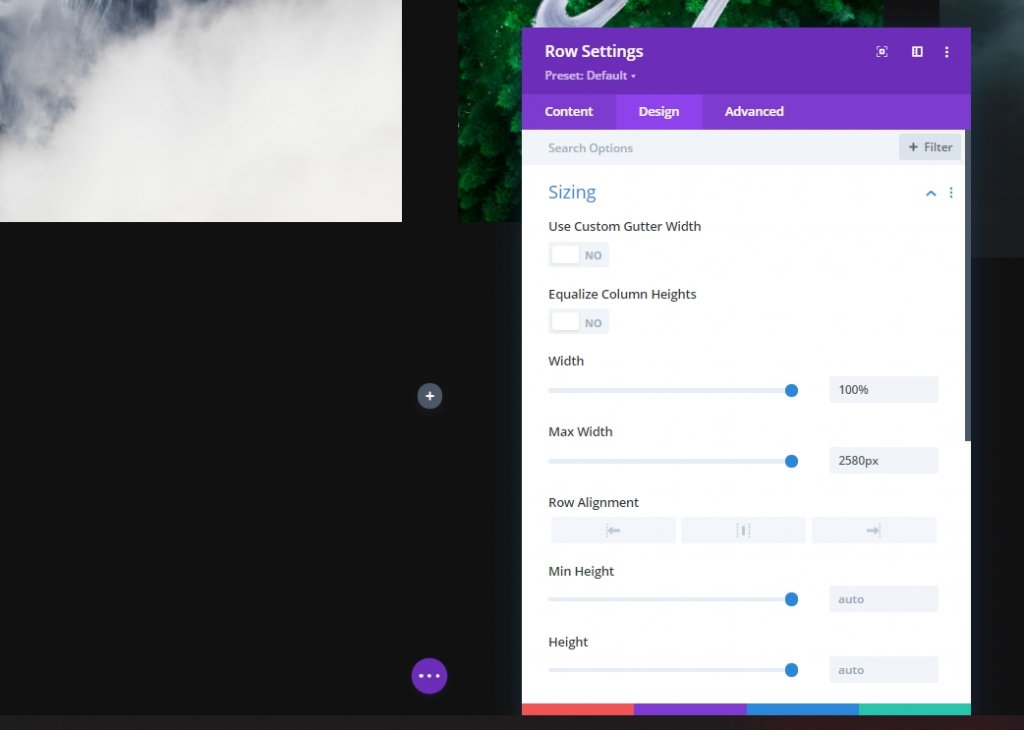
Sizing
Modify the sizing settings next.
- Width: 100%
- Max Width: 2580px
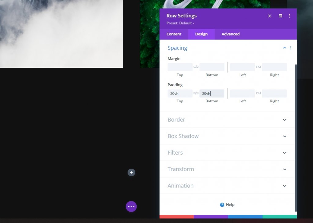
Spacing
Then, add some padding to the top and bottom.
- Top Padding: 20vh
- Bottom Padding: 20vh
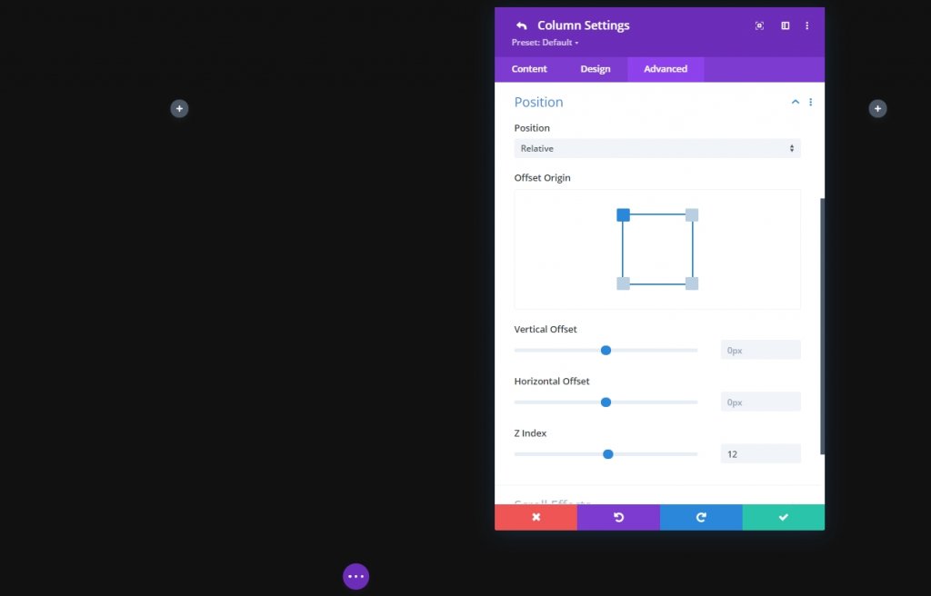
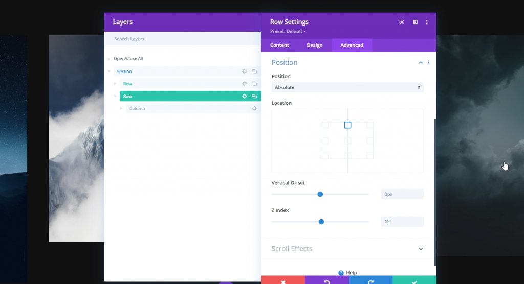
Position
Now as we want to place the second row over the first one, we need to set the position settings accordingly.
- Position: Absolute
- Location: Top Center
- Z Index: 12
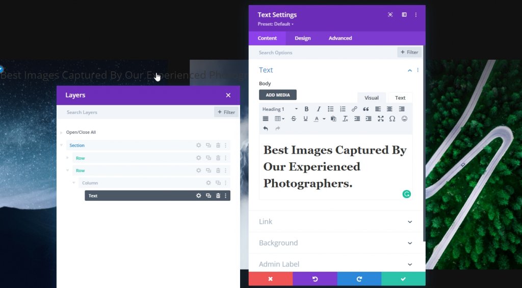
Adding: Text Module to Column
Add H1 Content
Now add a text module and some content of your choice to the column.
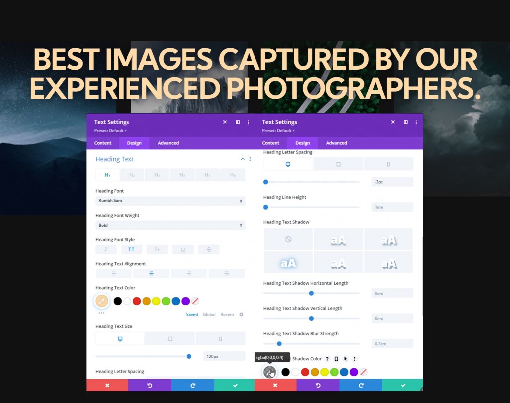
H1 Text Settings
Move on to the module’s design tab and change the H1 text settings accordingly:
- Heading Font: Kumbh Sans
- Heading Font Weight: Bold
- Heading Font Style: Uppercase
- Heading Text Alignment: Center
- Heading Text Color: #ffdbaa
- Heading Text Size: Desktop: 120px, Tablet: 60px & Phone: 40px
- Heading Letter Spacing: Desktop: -3px, Tablet & Phone: 0px
- Heading Text Shadow: Select: Third Option & Heading Text Shadow Color: rgba(0,0,0,0.4)
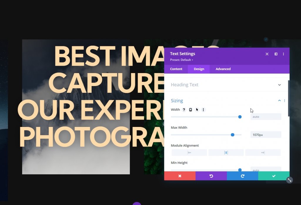
Sizing
Now adjust the module alignment and max width from the sizing settings.
- Max Width: 1070px
- Module Alignment: Center
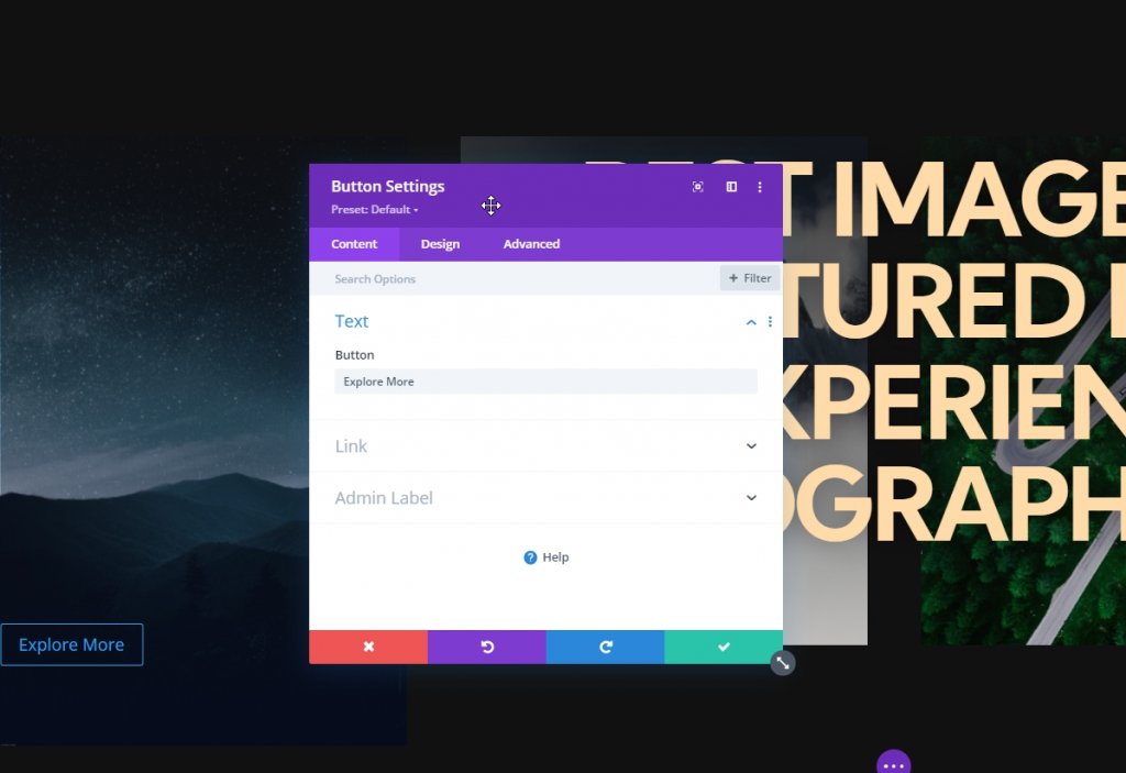
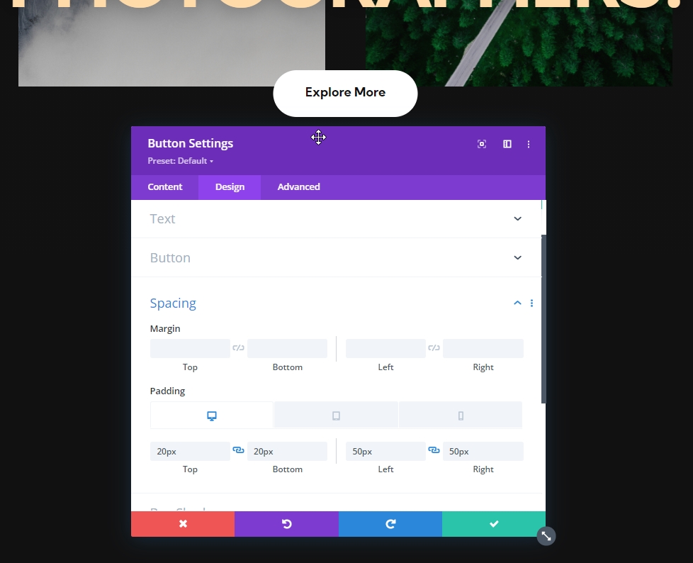
Addding:; Button Module
Add Copy
The final module we'll add in this row is a utton module. Write something according to your need.
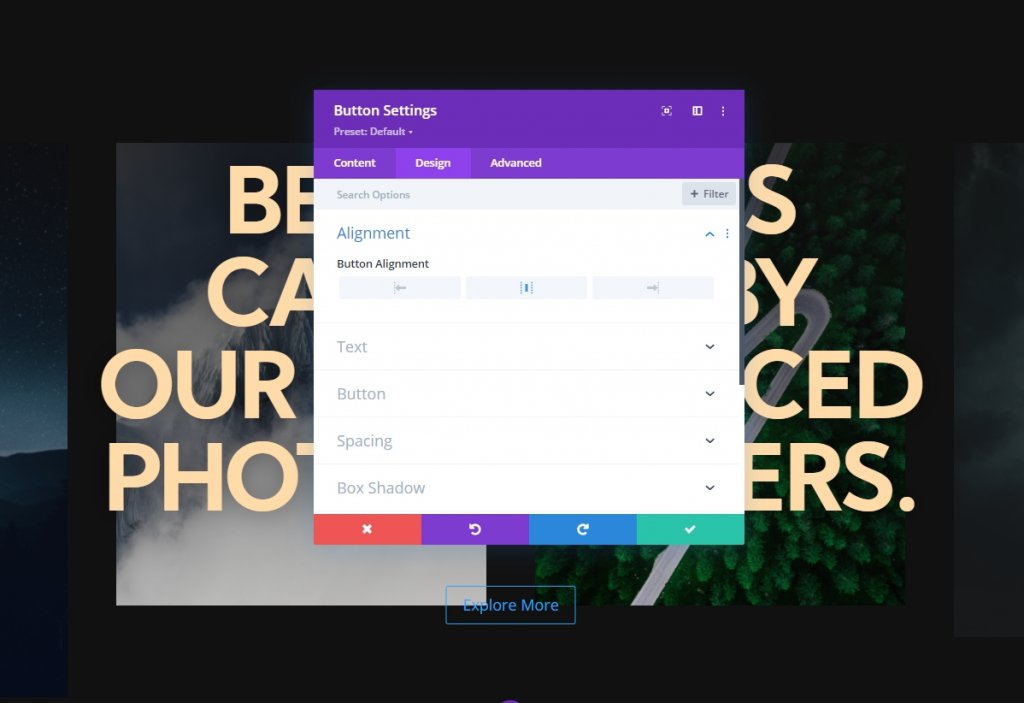
Button Alignment
From the design tab and change the button alignment.
- Button Alignment: Center
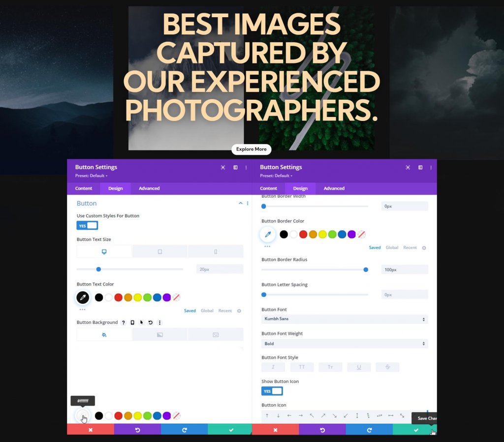
Button Settings
Then, style the button.
- Use Custom Styles For Button: Yes
- Button Text Size: Desktop: 20px, Tablet: 16px & Phone: 14px
- Button Text Size: #111111
- Button Background Color: #ffffff
- Button Border Width: 0px
- Button Border Radius: 100px
- Button Font: Kumbh Sans
- Button Font Weight: Bold
Spacing
Add padding values from the spacing settings.
- Top Padding: Desktop & Tablet: 20px, Phone: 15px.
- Bottom Padding: Desktop & Tablet: 20px, Phone: 15px.
- Left Padding: Desktop & Tablet: 50px, Phone: 40px.
- Right Padding: Desktop & Tablet: 50px, Phone: 40px.
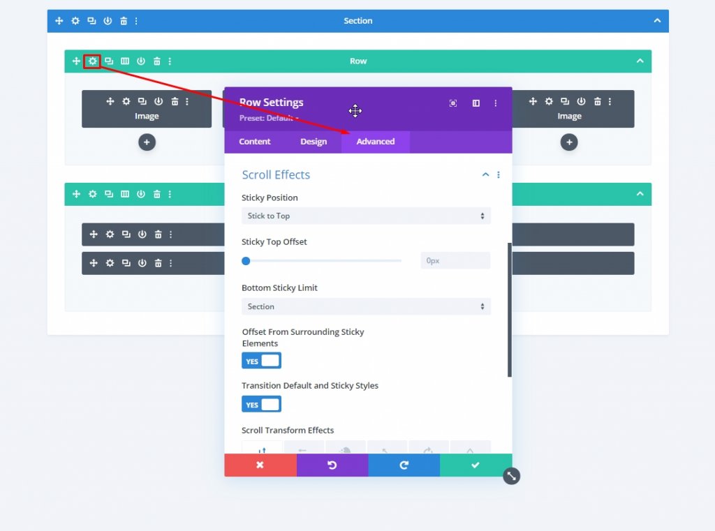
Sticky Settings On Hero Section
Row One Sticky Settings
Now our design is done and it's time to focus on sticky settings. The following sticky settings will be applied on the first row so open first row settings.
- Sticky Position: Stick to Top
- Bottom Sticky Limit: Section
- Offset From Surrounding Sticky Elements: Yes
- Transition Default and Sticky Styles: Yes
Sticky Opacity
Then, change the opacity in the filters settings.
- Default: 20%
- Sticky: 100%
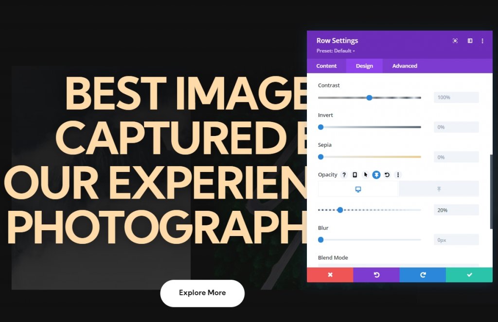
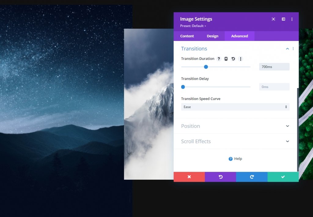
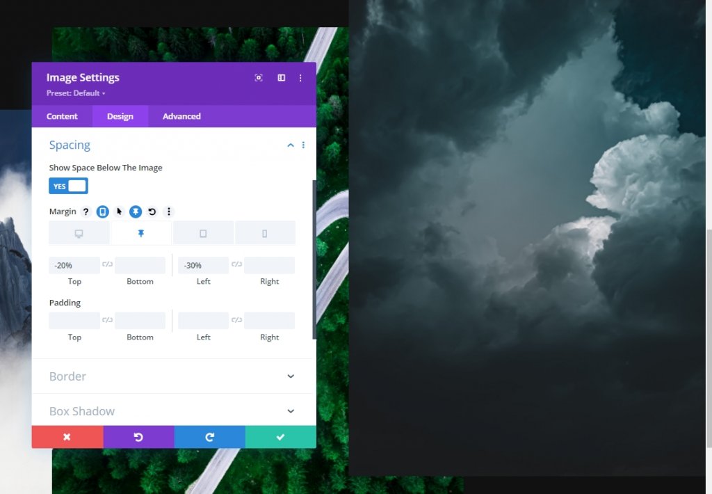
Image Module One Sticky Setting
Spacing
From the image module settings, go to the design tab and add some sticky spacing.
- Sticky Top Margin: -20%
- Sticky Right Margin: -20%
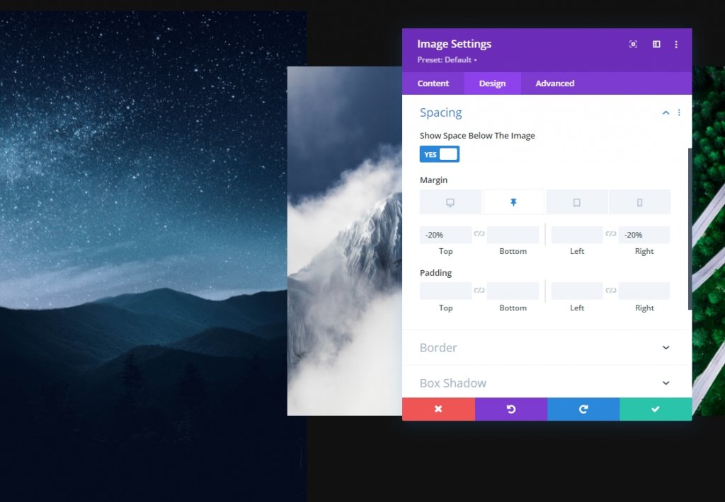
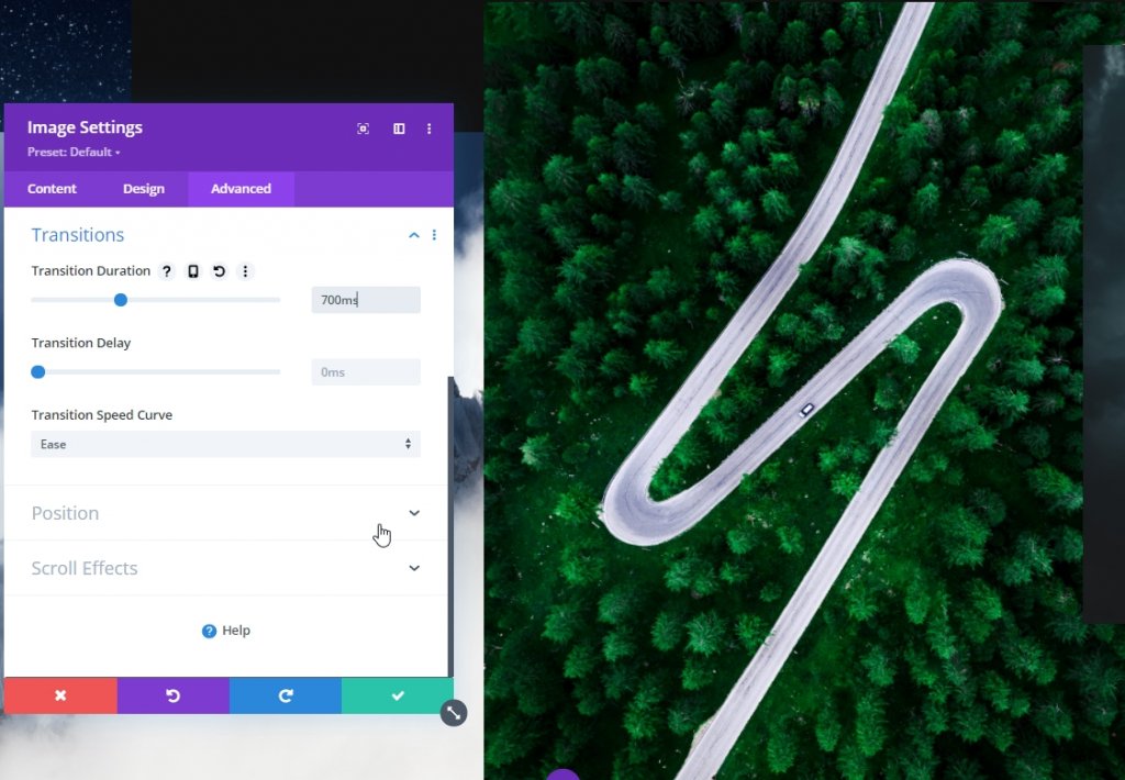
Transition
Increase the transition duration as well.
- Transition Duration: 700ms
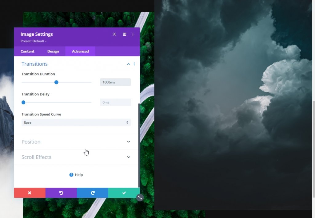
Image Module Two Sticky Setting
Spacing
From the image module 2 settings, make some adjustments too on spacing.
- Sticky Top Margin: 20%
- Sticky Left Margin: -30%
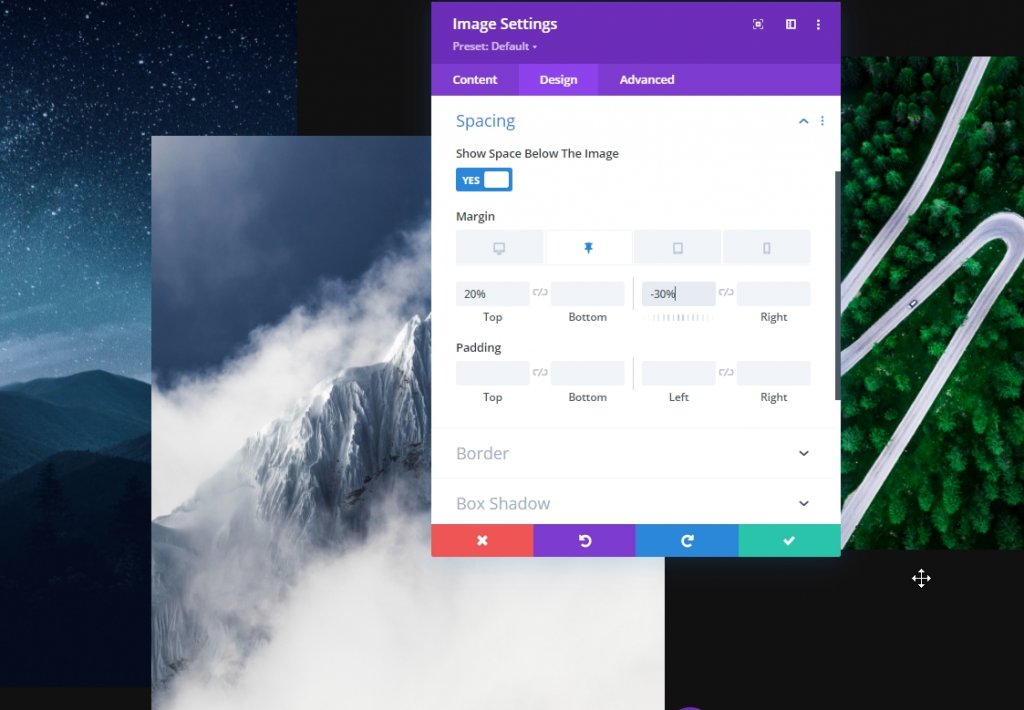
Transition
Increase the transition duration here too.
- Transition Duration: 1000ms
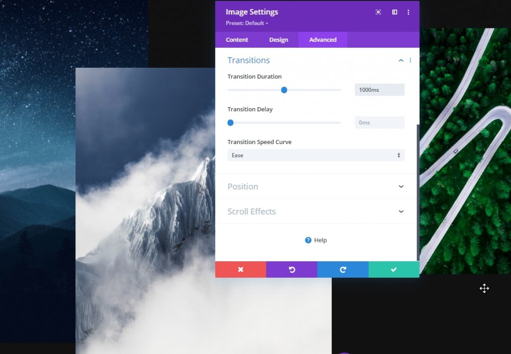
Image Module Three Sticky Spacing
Spacing
Now for the third image module, use the following sticky spacing values:
- Sticky Top Margin: -10%
- Sticky Left Margin: -25%
- Sticky Right Margin: -25%
Transition
Adjust the transition duration accordingly:
- Transition Duration: 700ms
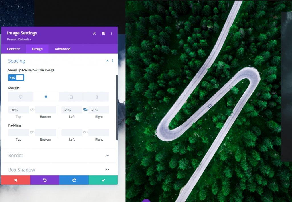
Image Module Four Sticky Spacing
Spacing
Now open the last image module and make the changes.
- Sticky Top Margin: -20%
- Sticky Left Margin: -30%
Transition
Now finish today's job by increasing the transition duration for the fourth image module.
- Transition Duration: 1000ms
And we are done! Save and exit the page to see our todays design outcome.
Final Look
So here is our todays design. The gradient background of second row moving up by scrolling and the images from first row is popping up as we set the values. This way it looks more interactive.
Desktop View
Mobile View
Conclusion
In today's tutorial, we tried to show you how creatively you can innovate in the hero section of a website using Divi's sticky options. We hope you find the tutorial useful. You can share the post so that others can also benefit from it. Thanks for reading this post.