
Hero sections are considered as projecting part of a web page. For that reason, website owners use this section as a weapon to catch visitors' attention. If you are looking for an interactive sticky hero section animation on your website, Divi has got your back. Thanks to Divi's Sticky options because it's very easy to make a creative hero section scrolling effect with it.

Today, we will see how we can use a visually pleasing scrolling effect on our WordPress website's hero section. In the first part of the tutorial, we will look at the overall design, and in the next part, we will add effects there. So let's get started without delay.
Design Ouline
Before we proceed, let's have a look at how our final design will look like.
Create Design Framework
New Section Addition
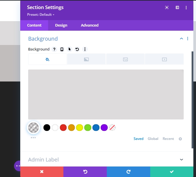
Background Color
In the beginning, we will concentrate more on creating the design. Later in the part two, we will apply the sticky effects. Now, please create a new page and add a new section to it. Open the settings of that section and add a background color.
Create Amazing Websites
With the best free page builder Elementor
Start Now- Background Color: rgba(53,44,43,0.17)
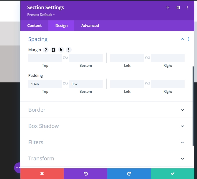
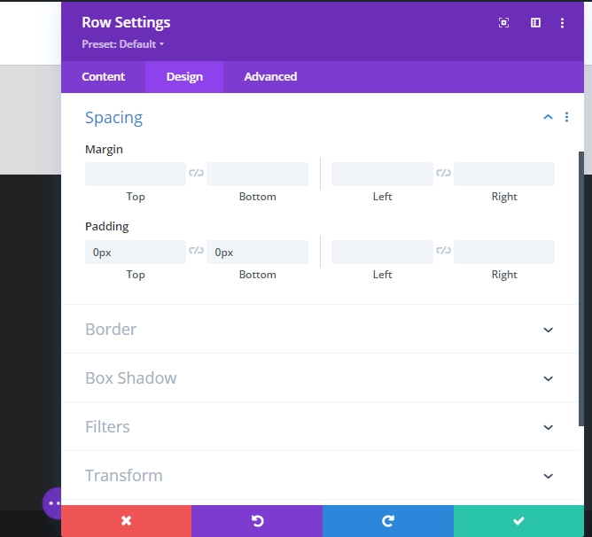
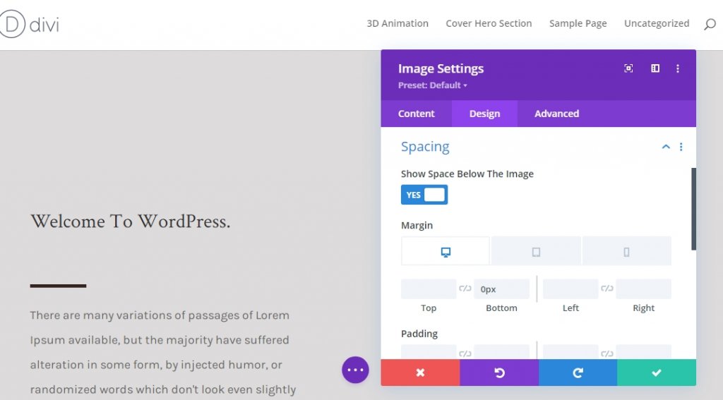
Spacing
Let's move on the design tab of this section and change the values as follows.
- Top Padding: 13vh
- Bottom Padding 0px
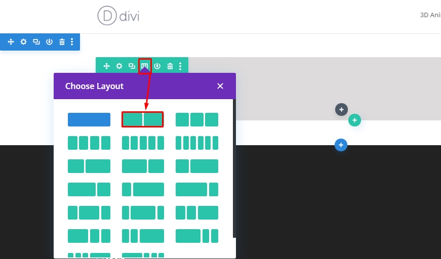
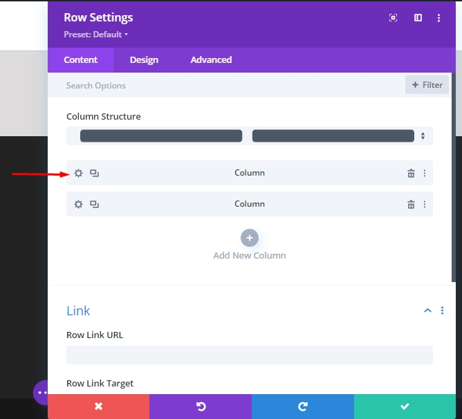
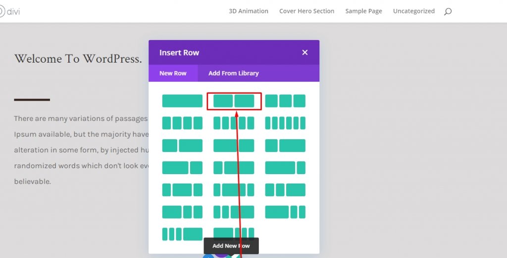
Row 1 Adding
Column Structure
Now add a new row using the following column structure.
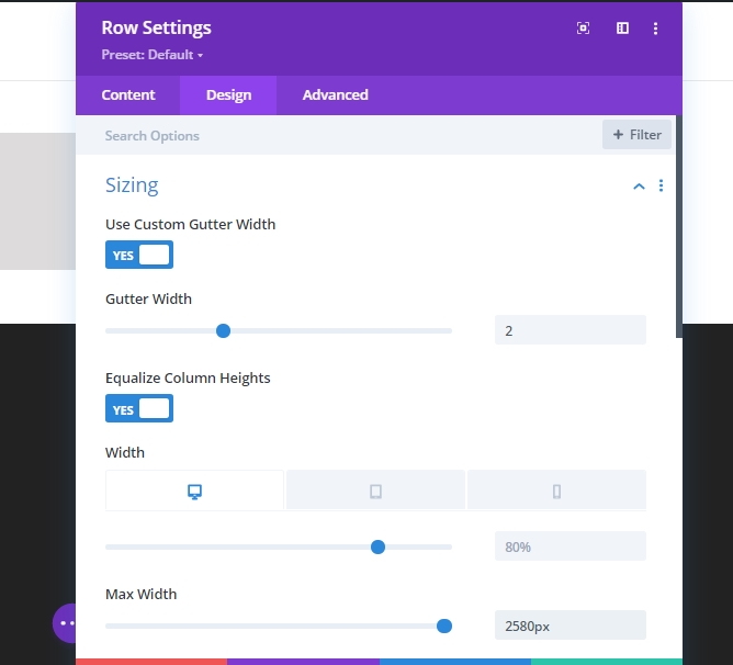
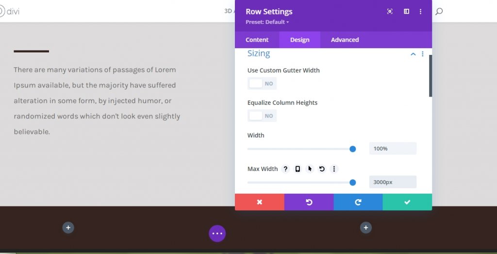
Sizing
Now add the row settings and move on the design tab to change sizing setting like below.
- Use Custom Gutter Width: Yes
- Gutter Width: 2
- Equalize Column Heights: 2
- Width: Desktop - 80%, Tab and Phone - 90%
- Max Width: 2580px
Spacing
Now we'll remove all the padding from top and bottom. So, Top and bottom padding is 0px.
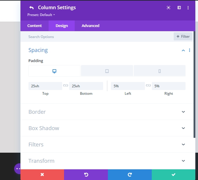
Setting For Column 1 (Row 1)
Spacing
At this time, Open the setting for Column 1 and change the spacing settings.
- Top Padding - Desktop 25vh, Tab & Phone 10vh
- Bottom Padding - Desktop 25vh, Tab & Phone 10vh
- 5% Padding both on left and right side.
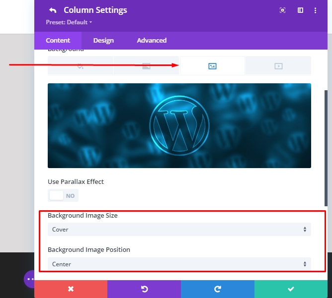
Setting For Column 2 (Row 1)
Background Image
Next , add a background picture to your selection from the settings of column 2.
- Background Image Size: Cover
- Background Image Position: Center
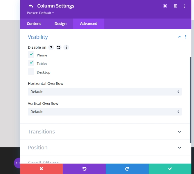
Visibility
To be sure this works on smaller display screen sizes, we'll move on to the advanced tab of the second column and disable the visibility for tablets and phones.
Text-Module Adding To Column 1 (Row 1)
Header Content
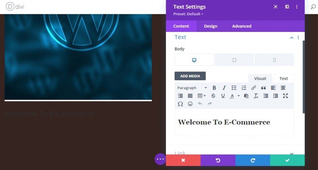
We will add modules now. Let's start with a text module in column 1. Add any H1 content you like!
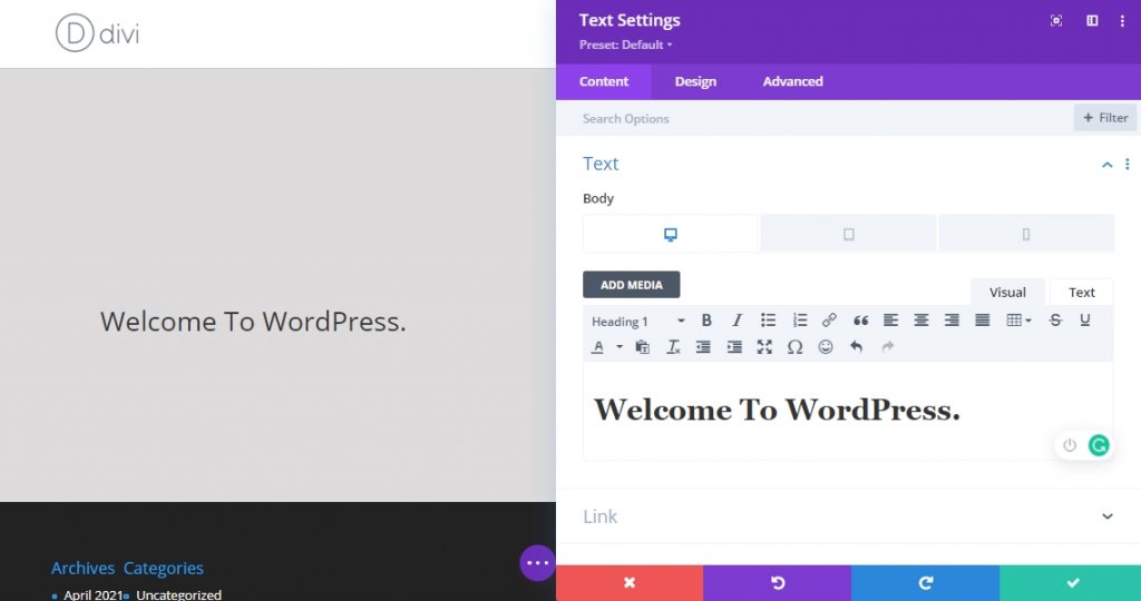
H1 Text Settings
Now change H1 text settings from the modules design tab.
- Heading Font: Crimson Text
- Heading Text Size: Desktop 6vh, Tablet 50px, Phone 40px
- Heading Line Height: 1.2 em
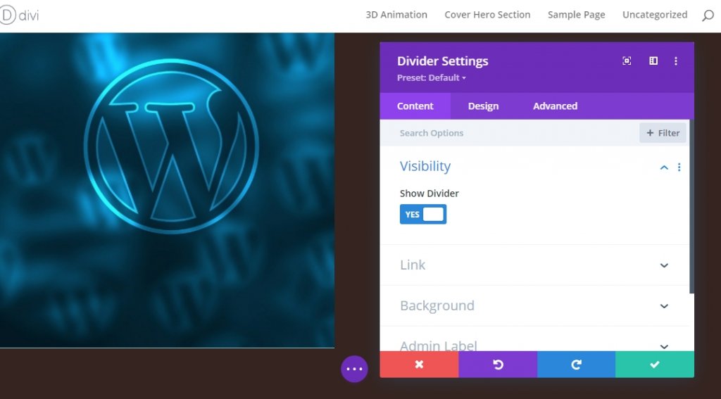
Divider Module Adding To Column 1 (Row 1)
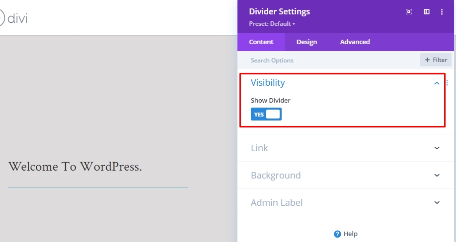
Visibility
It's time to add a divider module to our first column. Also, enable the show divider option.
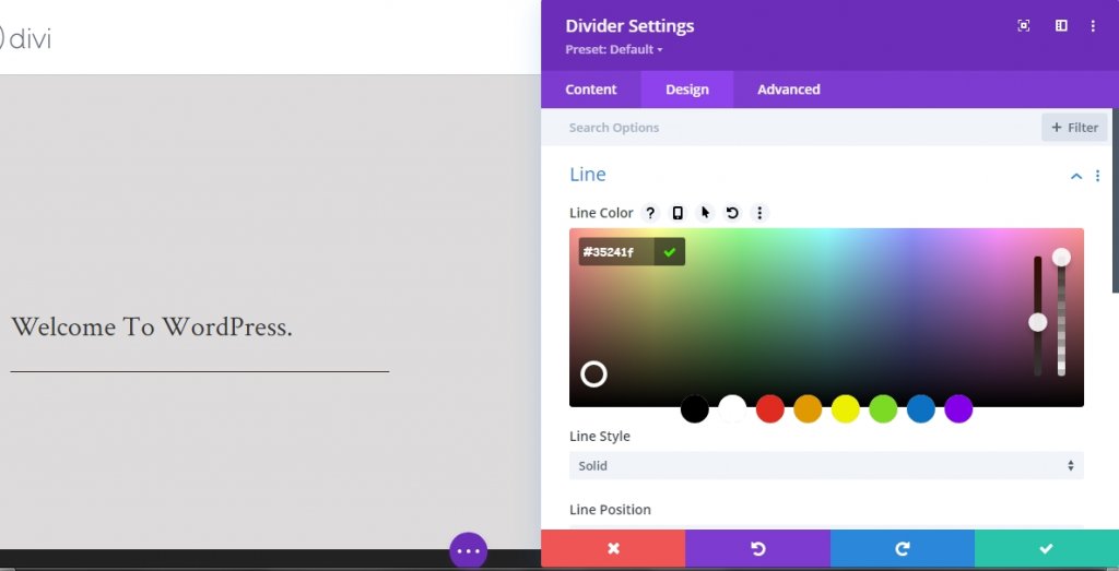
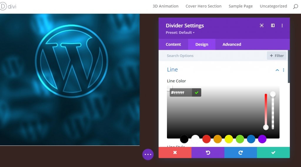
Line
Now switch to the modules design tab and change the line settings.
- Line Color: #35241f
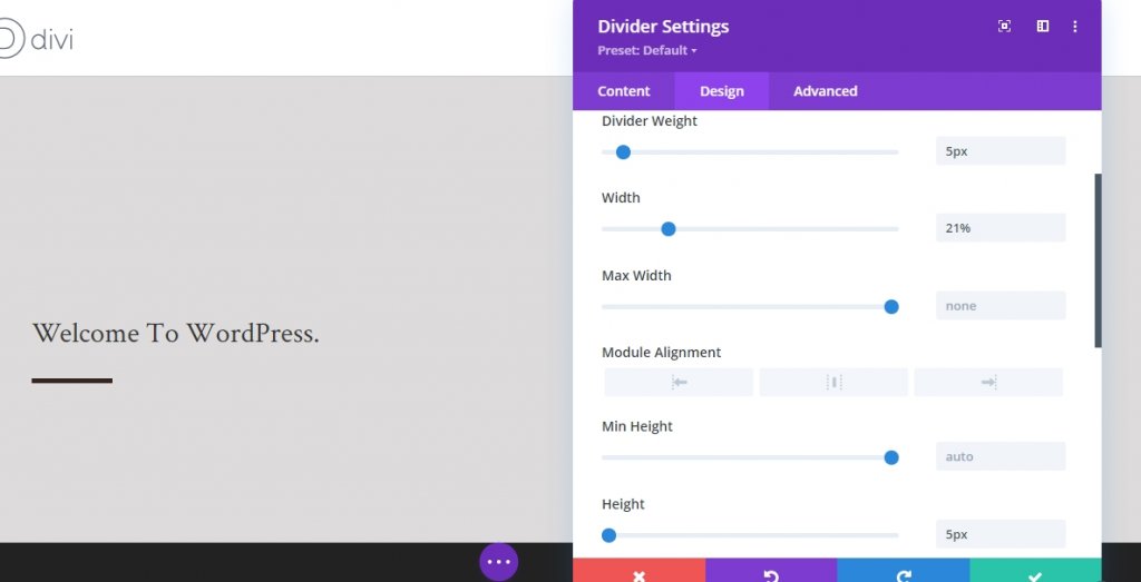
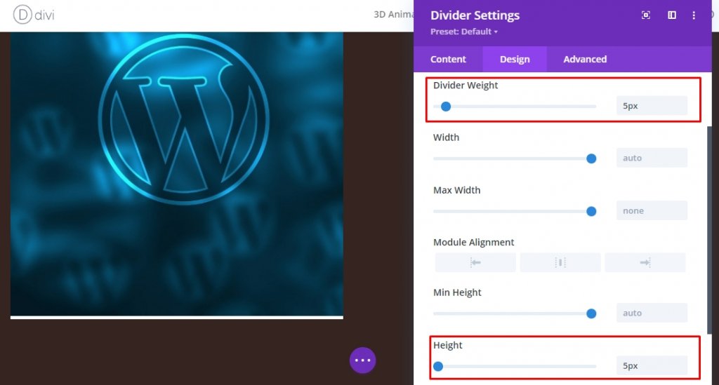
Sizing
Change values on sizing settings.
- Divider Weight: 5px
- Width: 21%
- Height: 5px
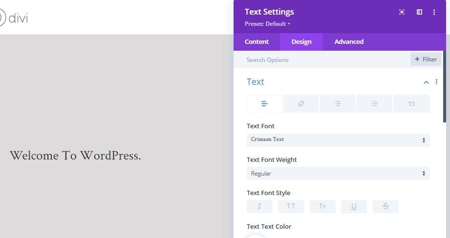
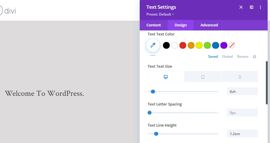
Description Content
Now we will add the last module we need in column 1 and that is another text module. Add some description there.
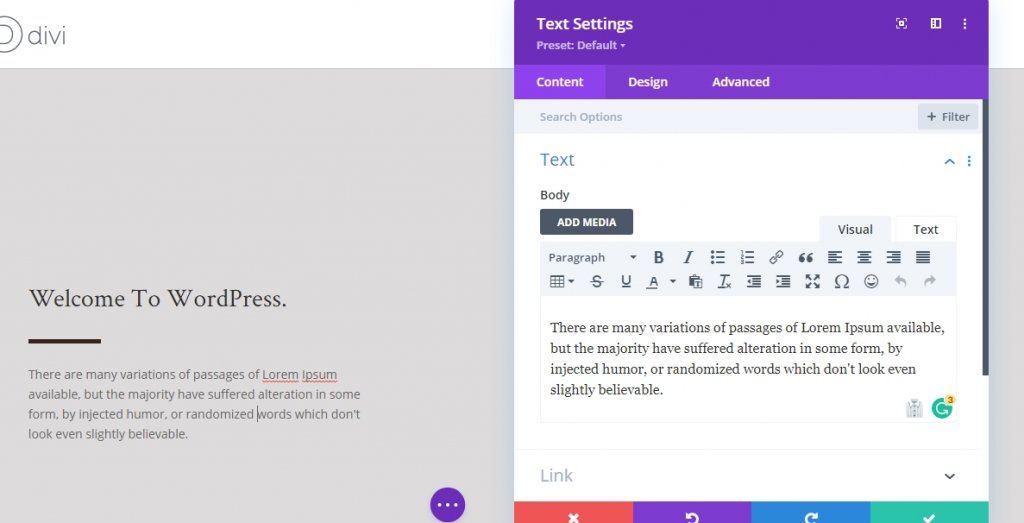
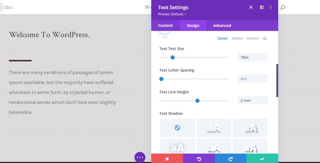
Text Settings
Modify the modules text settings as follows.
- Text Font: Karla
- Text Size: 18px
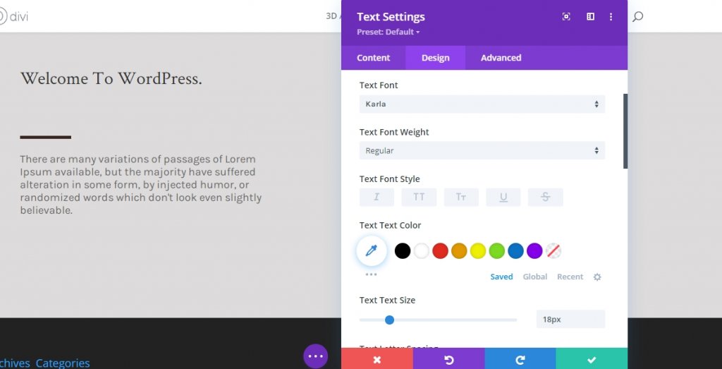
- Text Line Height: 2.1em
Row 2 Adding
Column Structure
To make this impact work, its necessary that you simply add a brand new row below the primary one, under the same section. This row will need a background color and sufficient height and width so the first row can fit beneath it. We are using the following column structure.
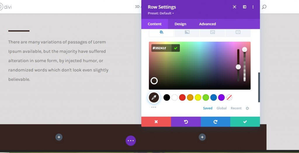
Background Color
Now, add a background color to the row.
- Background Color: #35241f
Sizing
Change the values in sizing settings from the design tab.
- Width: 100%
- Max Width: 3000px
Spacing
For the spacing setting, change values similarly.
- Top Padding: Desktop - 30vh, Tab & Phone - 0vh.
- Bottom Padding: 30vh
- Left Padding: 10%
- Right Padding: 10%
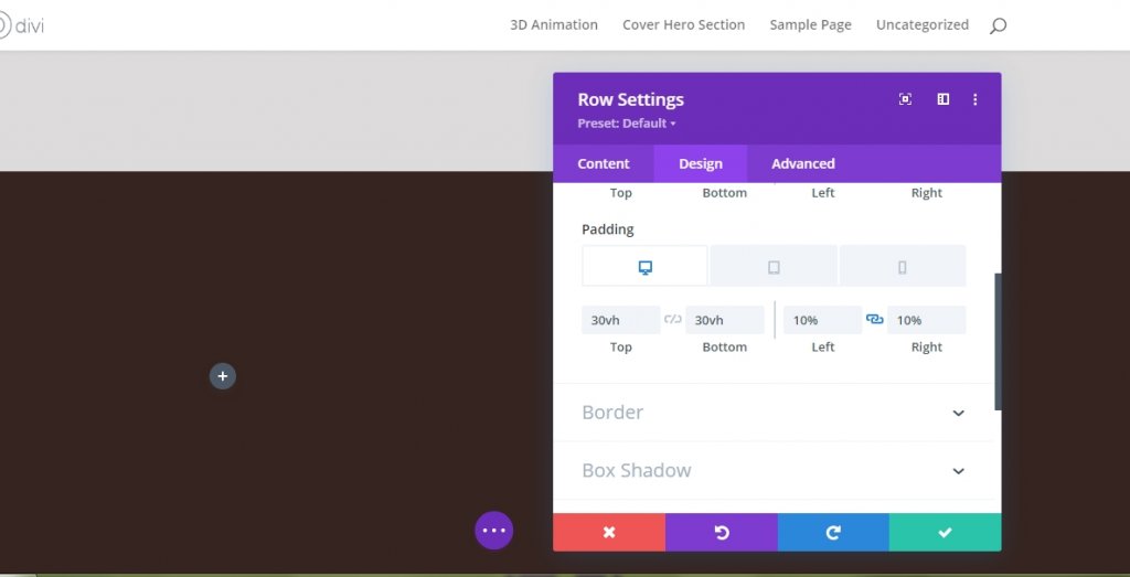
Image Module On Column 1 (Row 2)
Upload Image (Mobile and Tab Only)
Now, we will add and image module to the first column. Can you remember we disabled the visibility of image for Tablets and Phone? This image module will replace the image that used on the first row on smaller screen sizes. Use an image for tablets and phone only!
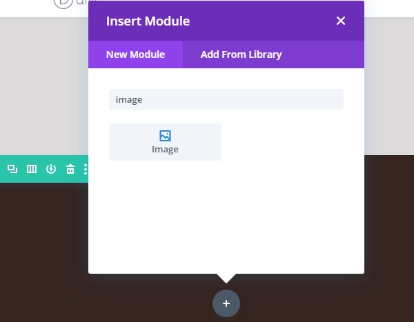
Move to the tablets and mobile view and add image.
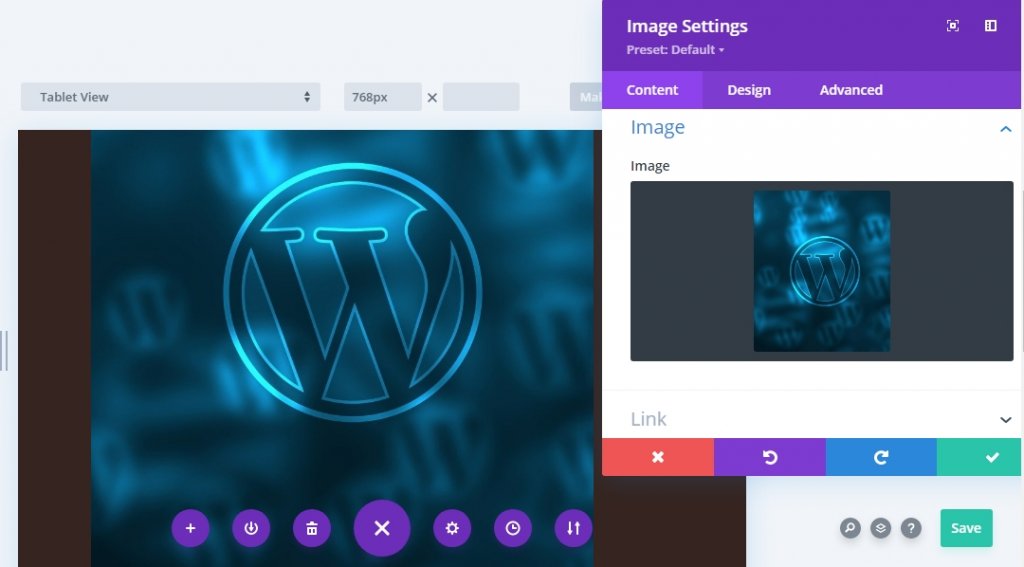
Spacing
Move on to the modules design tab and alter the bottom margin as follows.
- Bottom Margin: Desktop 0px, Tablet & Phone 50px
Divider Module Adding to Column 1 (Row 2)
Visibility
Now add a new Divider module beneath the image and enable the "Show Divider" option.
Line
Switch to module's design tab and alter the line color.
- Line Color: #ffffff
Sizing
Change the sizing setting too from design section.
- Divider Weight: 5px
- Height: 5px
Text-Module Adding To Column 1 (Row 2)
Header Content
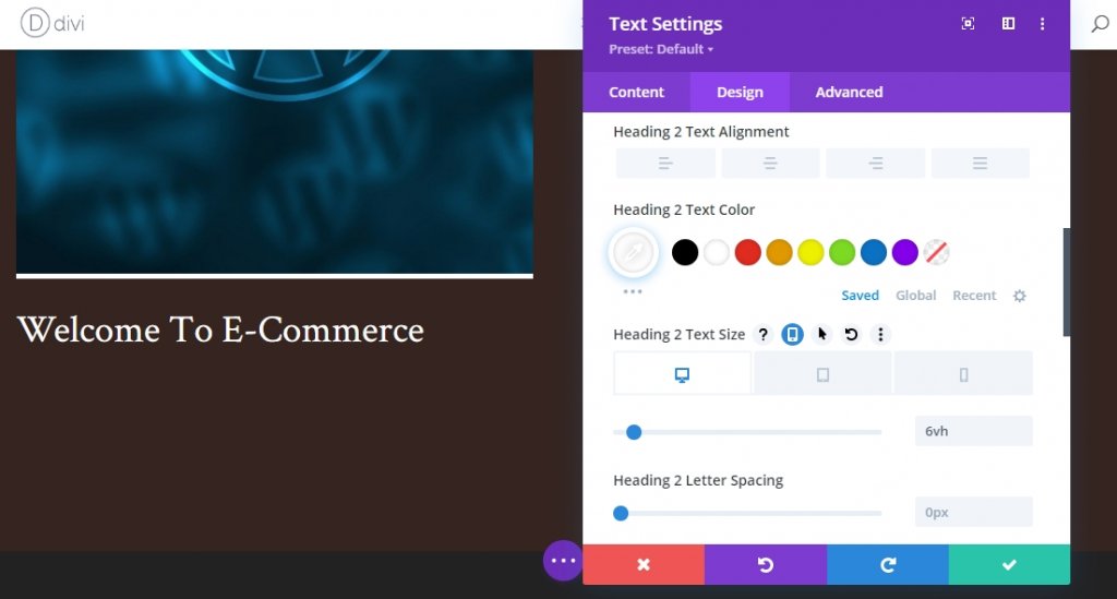
Add a new text module with some H2 content.
Header Text Settings
Modify the H2 text settings as follows
- Heading 2 Font: Crimson Text
- Heading 2 Text Color: #ffffff
- Heading 2 Text Size: Desktop 6vh, Tablet 50px, Phone 40px.
Text-Module Adding To Column 2 (Row 2)
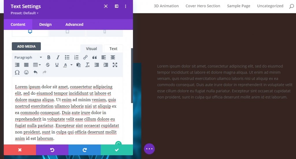
Description Content
The only module we will add on column 2 is a text module where there will be some description content.
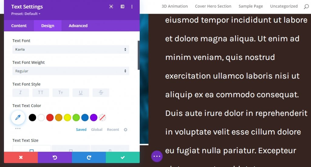
Text Settings
Alter the text modules setting like given below.
- Text Font: Karla
- Text Font Weight: Regular
- Text Size: Desktop 30px, Tablet & Phone 18px
- Text Line Height: 2.2em
- Text Color: Light
Apply Sticky Effects
Change Row Z Index Values
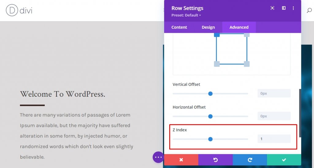
Row 1
Now that we have oriented the base of our design, now we will focus on some further step to make the hero cover effect. Open the first row settings and alter the Z index in the advanced tab.
- Z Index: 1
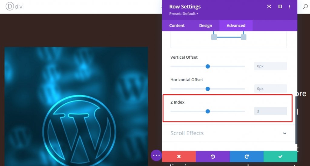
Row 2
Change the Z index value of second row. The value needs to be higher than the first row.
- Z Index: 2
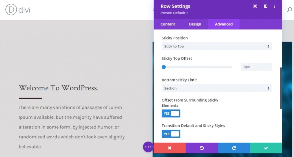
Sticky Effect On Row 1
Now, Open first row setting once again and apply sticky effect from the advanced tab. Its mandatory make bottom sticky limit is set to section.
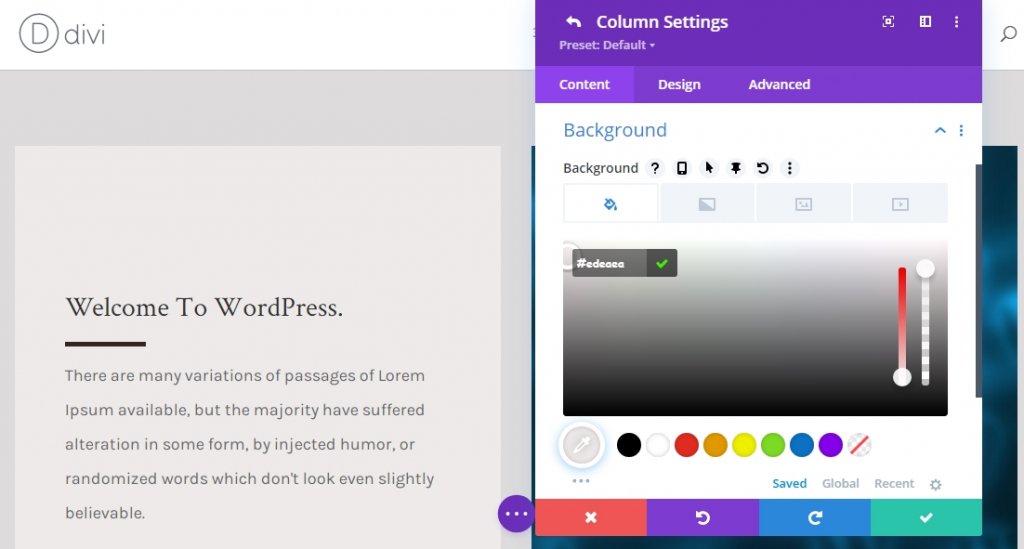
Sticky Setting For Column 1 (Background Color)
Now that the entire row has been turned sticky, we will apply some sticky effect on the child elements of the row. Open column 1 settings and apply the following sticky background color.
- Sticky Background Color: #edeaea
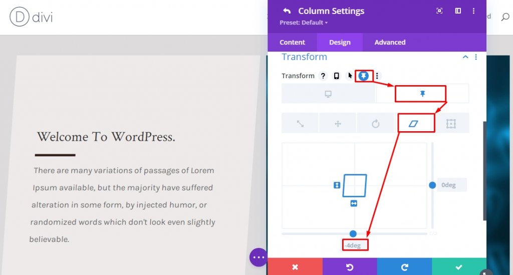
Sticky Setting For Column 1 (Sticky Transform Skew)
Now, move to the design tab and apply the following sticky skew value.
- Sticky Bottom Skew: -4deg
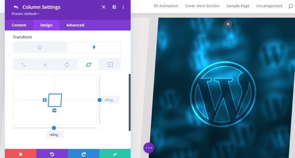
Sticky Setting For Column 2 (Sticky Transform Skew)
Apply the same sticky skew value from transform settings for column 2.
- Sticky Bottom Skew: -4deg
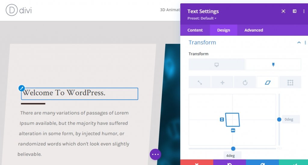
Sticky Settings For Text-Module x2 (Sticky Transform Skew)
We are at the final part of our design. We'll complete the design and effect by changing the bottom skew value for both text modules in column 1 in a sticky state. This will even out the navigate sticky column skew value.
- Sticky Bottom Skew: 4deg
Final Result
Since we have gone through all the steps and did what we asked for, our final product will look like this.
Final Words
Divi has a vast option for making a website more beautiful than others. Our today's tutorial is a great way to display short descriptions, services, and many more! If you have any questions or suggestions, feel free to leave a comment in the comment section. Also, if you found this tutorial helpful, a share will be splendid!