Have you struggled to create complex layouts for your website? Me too. I believe most web developers have been there. This is why we use containers, which allow us to craft each page section as we want. Trust me—these are the game changers in web design.

Elementor Containers make responsive layouts that look amazing on all devices a reality without the burden of custom code. From content widgets to clickable elements, clickable containers, clickable buttons, and entire sections, Elementor gives you everything you need to craft beautiful designs effortlessly.
But people often ask me one thing: Does web page container negatively impact page performance? I heard many people saying that using too many containers in a single webpage can harm your page loading score, and sometimes, it affects the SEO, too. Is this really a fact or a myth? In this write-up, I will give you a complete brief on this topic, and we'll work on this issue (if it really is one).
Let's discuss helpful learning resources about proper Elementor container setting and its impact on a webpage.
Create Amazing Websites
With the best free page builder Elementor
Start NowWhat Are Elementor Containers?

Elementor Containers are flexible sections that serve as the building blocks for creating responsive layouts in Elementor. They are smart, adaptable boxes that hold your content widgets and design elements.
At their core, Elementor Containers are parent containers that use Flexbox - a powerful CSS layout model. This means they offer a wide range of container layout options, giving you more control over how your content is displayed and arranged on a page.
Key features of Elementor Containers include:
- Flexbox functionality: Flexbox Containers create fluid, responsive designs that adapt to different screen sizes.
- Customizable settings: Each container has its own set of settings, allowing you to adjust things like minimum height, element gap, and content direction.
- Nesting capabilities: You can place containers within containers, enabling complex layout structures without needing extra divisions.
- Versatility: Elementor Flexbox Containers can hold various content elements, from text and images to more complex widgets.
- Improved responsiveness: The container layout tab lets you control your design's behavior on different devices.
- Streamlined structure: Flexbox Containers often replace the need for separate sections and columns, simplifying your page structure.
One of the most powerful types is the Flexbox Container Elementor introduced. These use CSS Flexbox properties to give you even more control over your layout, including options for justification properties and content direction.
Whether you're working on vertical layouts or grid containers or need clickable containers for interactive elements, Elementor Containers provide the flexibility and control you need. They're crucial for creating modern, responsive websites that look great and function well across all devices.
Role Of Containers In Elementor
Containers play a crucial role in Elementor, revolutionizing how we approach web design. Here's a breakdown of their key functions:
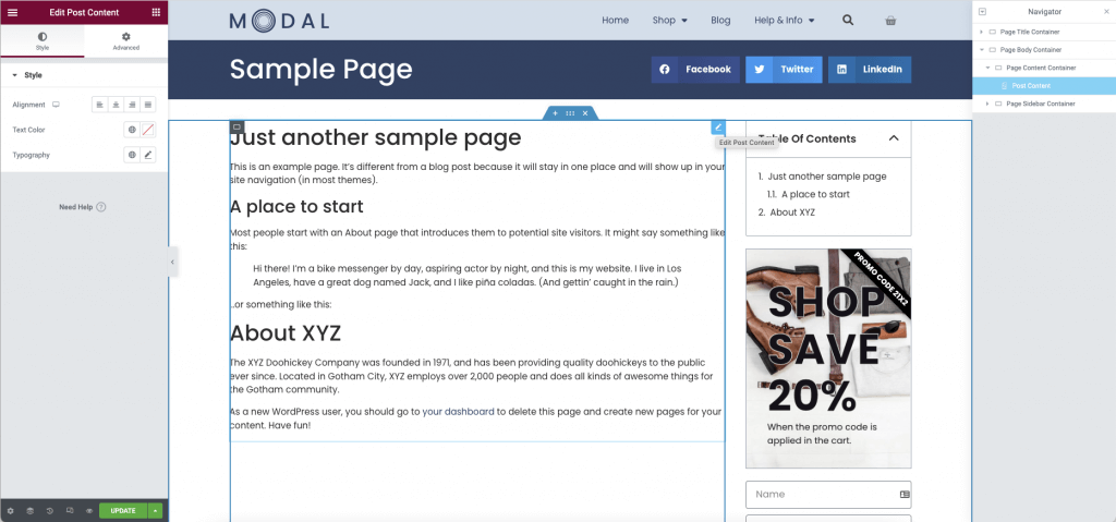
- Structural Foundation: Containers serve as the primary building blocks for your layouts. They replace the traditional combination of sections and columns, providing a more flexible foundation for your design. This streamlined approach reduces the need for extra divisions, simplifying your page structure.
- Content Organization: As a parent container, Elementor elements under containers act as vessels for your content widgets. They allow you to group related elements together, creating logical content sections. This organizational capability is particularly useful when working with complex layouts.
- Responsive Design Control: One of the most powerful features of containers is their ability to create responsive layouts. The container layout options give you precise control over how your content adapts to different screen sizes. This flexibility ensures your design looks great on everything from wide desktop screens to compact mobile devices.
- Design Flexibility: Flex containers offer a wide range of layout options, allowing you to easily manipulate the content direction, justification properties, containers within containers and element gap. This flexibility enables you to create unique designs without relying heavily on custom code.
- Performance Optimization: Containers can potentially improve loading times by streamlining the page structure. Fewer nested elements often translate to cleaner code and faster loading speeds, which benefits user experience and SEO.
- Enhanced Functionality: Elementor containers support advanced features like creating clickable containers. This allows you to turn entire page sections into interactive elements, opening up new user engagement and navigation design possibilities.
- Consistent Styling: Playing with Container size help maintain design continuity across your site. By applying styles to a container, you can ensure consistent spacing, backgrounds, and other design elements for all its content.
- Efficient Workflow: The Convert button feature allows you to easily transform existing sections to containers, streamlining the process of updating your layouts to take advantage of container benefits.
In essence, Elementor containers are more than just design elements – they're powerful tools that enhance your ability to create sophisticated, responsive, and efficient websites. As we continue to explore their impact and best practices, you'll see how mastering containers can significantly elevate your web design skills.
Read: How to convert a container-based to a column-based layout
Impacts Of Containers

Elementor containers are the building blocks of your layout. They organize and store different elements, such as images, text, or widgets. Flexbox Containers and Sections can help keep your designs clean and neat and improve the user experience. However, in some cases, proper use of the entire container can create a key difference in page performance.
Page Loading Time
Nesting of containers can have a noticeable effect on page loading times. By streamlining the page structure and reducing the need for nesting of containers, you can create cleaner, more efficient code for the page. This optimization can lead to faster loading speeds, especially on mobile devices.
The simplified structure of Flexbox Containers often results in fewer DOM bloat elements than traditional layouts. This reduction in complexity can significantly improve loading times, particularly for content-heavy pages.
However, it's important to note that a single container in Elementor adds extra code. This can increase load time if not appropriately managed. Slow load times affect SEO negatively.
Consider the following general guidelines for the number of containers and their impact on load times:
| Number of Containers | Load Time |
| 1– 5 | Fast |
| 6 –10 | Moderate |
| 11+ | Slow |
Therefore, while containers might have numerous benefits, it's crucial to use them judiciously and optimize your design for performance.
SEO
While containers in Elementor can offer benefits for SEO, overusing them can have negative consequences. Each container adds extra code to your page, increasing its size and complexity. This can lead to slower loading times, a critical factor in search engine rankings. Search engines like Google prioritize fast-loading pages, and a site bogged down by too many containers may see a drop in rankings.
Moreover, excessive containers can complicate your page structure, making it harder for search engine bots to crawl and understand your content hierarchy. This can potentially impact how well your content is indexed and ranked.
To mitigate these issues and optimize for SEO, consider the following approaches:
- Use containers judiciously: Aim for the minimum number of necessary containers to achieve your desired layout.
- Optimize container content: Ensure each container holds meaningful, well-structured content that adds value for users and search engines.
- Leverage Elementor's built-in SEO features: Use proper heading structures (H1, H2, etc.) within your containers to indicate content hierarchy.
- Monitor page speed: Regularly check page loading times using tools like Google PageSpeed Insights and optimize accordingly.
- Implement lazy loading: For image-heavy containers, use lazy loading to improve initial page load times.
By striking a balance between design flexibility and performance, container-based layouts can be visually appealing and SEO-friendly.
Mobile Responsiveness
While Elementor containers offer powerful responsive design capabilities, an excessive number of containers can negatively impact mobile responsiveness. Too many containers can lead to a complex DOM structure, which may cause layout issues on smaller screens. This can result in slower rendering times on mobile devices in mind, potentially leading to a poor user experience.
Additionally, many nested containers can make maintaining consistent spacing and alignment across different screen sizes challenging, risking a disjointed or cluttered appearance on mobile devices.
To ensure optimal mobile responsiveness while leveraging the benefits of separate containers as individual elements:
- Embrace Flexbox Container and Section: Use Flexbox containers' flexibility to create fluid layouts that adapt seamlessly to different screen sizes.
- Simplify your structure: Aim for a flatter hierarchy with fewer nested containers. This can improve both performance and ease of responsive design.
- Use the container layout tab. Use Elementor's responsive controls to fine-tune your layout for different devices. Adjust content direction, element gaps, and justification properties as needed.
- Test extensively: Regularly preview your designs on various devices and screen sizes to ensure consistency and functionality.
- Optimize images: Use appropriately sized images for mobile devices to reduce load times and improve overall responsiveness.
- Use custom breakpoints: Elementor's custom breakpoint feature allows you to create tailored layouts for specific device sizes, ensuring a smoother responsive experience.
Implementing these strategies can create separate container-based designs that are visually appealing and perform excellently across all devices.
How Many Containers Should You Use?
The number of containers to use while designing a webpage depends on various factors such as layout complexity, design structure, and content organization. However, to get the best performance, up to five containers per page is good to go.
Here are some guidelines to help you decide:
- Basic Layout: The entire webpage's content should be contained in one main container boundary. This container ensures that the overall structure is consistent across devices.
- Sectioning: Use separate container options for different sections of the webpage (e.g., header, body, and footer) to keep things organized and ensure a modular design.
- Responsive Design: Create responsive layouts by using container boundaries. For example, you might have one container for the desktop view and another that adjusts for mobile.
- Flexibility and Reusability: Multiple containers can help you organize content into reusable components, like grids or cards.
- Maintainability: Too many containers can make the code harder to manage. A balanced number is key for readability and maintainability.
Use containers as needed for clarity and organization without overcomplicating the structure.
Conclusion
So yes, the extensive use of containers can negatively impact page performance up to some level. But there is no need to worry because with the help of clean and efficient design, you can always enhance the website speed and user experience. Get Elementor AI's help to create a simple yet outstanding design for your website, and your audience will have a faster and smoother website-using experience.
Frequently Asked Questions
What Is The Default Container Size In Elementor?
Answer: The default container size in Elementor is typically full-width, stretching across the entire page. However, this can be easily adjusted using the container layout options. You can set custom widths, use preset sizes, or create responsive layouts that adapt to different screen sizes.
Does the Number of Elementor Containers Affect SEO?
Answer: Yes, the number of Elementor containers can affect SEO. While containers offer design flexibility, too many can increase page load times and complicate the DOM structure. This may negatively impact SEO, as search engines prefer fast-loading, well-structured pages. It's crucial to balance design needs with performance optimization.
What Is an Elementor Flexbox Container?
Answer: An Elementor Flexbox Container is a powerful layout tool with CSS Flexbox properties. It allows for flexible content arrangement, easy alignment, and responsive design. Flexbox containers in Elementor offer advanced options for content direction, justification, and element distribution, making complex layouts simpler across various devices.


