
Responsive design is essential to providing the best possible user experience, and Divi 5 Public Alpha has enhancements that simplify implementation. It enables seamless switching between devices, offers real-time feedback, and can scale the canvas to optimize layouts across numerous devices. Thanks to these capabilities, creating totally responsive websites is much simpler with Divi 5.
Importance Of Responsive Design

Responsive web design represents a fundamental paradigm shift in modern web development architecture, addressing the critical challenge of device fragmentation in contemporary digital ecosystems. The methodology employs fluid grids, flexible media elements, and CSS media queries to dynamically adapt content presentation across diverse viewport dimensions and device capabilities. This approach is particularly crucial given the exponential proliferation of devices with varying screen resolutions, pixel densities, and interaction modalities.
Developers can ensure optimal content consumption patterns by implementing responsive design principles while maintaining semantic structure and functional integrity across all breakpoints. The technical implementation typically involves employing relative units (such as percentages, vw/vh, and em/rem) instead of fixed pixel values, alongside the strategic implementation of flexbox and grid systems for layout management. This architectural decision significantly impacts performance metrics, eliminating the need for device-specific redirects and reducing server load through consolidated codebase management.

Furthermore, responsive design aligns with search engine optimization algorithms, particularly considering Google's mobile-first indexing paradigm. The approach facilitates enhanced maintainability through centralized codebase management, reducing technical debt and development overhead associated with maintaining multiple device-specific versions.
Create Amazing Websites
With the best free page builder Elementor
Start NowFrom a business perspective, responsive design offers a compelling ROI by ensuring consistent user experiences across all devices. Through optimized content delivery, responsive design can potentially improve conversion rates and reduce bounce rates.
How Divi 5's Responsive Editing Differs from Divi 4's
Divi 4's Responsive Architecture
The responsive implementation in Divi 4 operates on a modular-level device-switching paradigm, utilizing a tab-based interface for desktop, tablet, and mobile viewports. This architecture necessitates frequent context switching between device views, implementing responsive modifications through a hierarchical navigation structure within individual modules.
The system employs a bottom-positioned device preview mechanism, primarily for visualization purposes rather than direct manipulation capabilities.
Divi 5's Enhanced Responsive Framework
Divi 5 introduces a fundamentally restructured responsive editing framework, implementing a unified device control panel that significantly reduces the interaction overhead.
The system incorporates real-time visual breakpoints and instantaneous preview capabilities, eliminating the need for recursive toggling between device-specific settings. This architectural enhancement enables simultaneous multi-device editing within a single viewport context.
Technical Advancements in Divi 5
The new iteration implements several critical technical improvements:
- Dynamic canvas scaling functionality through programmatic viewport manipulation
- Granular breakpoint targeting for precise layout control
- Unified device-specific parameter adjustments within a single interaction context
- Optimized performance through a rebuilt Visual Builder framework, significantly reducing latency in responsive transitions.
Integration and Performance
Divi 5's responsive framework represents a significant architectural advancement in user interaction efficiency and system performance. Implementing seamless device switching, advanced layout control mechanisms, and optimized backend processing results in a more streamlined development workflow. This technical evolution enables more precise responsive design implementation while reducing the computational overhead associated with device-specific modifications.
A Comprehensive Guide to Divi 5's Responsive Editing
Understanding the essential tools and features for modifying your design to fit different screen sizes is necessary to become proficient with responsive editing in Divi 5.
Becoming acquainted with Divi 5's responsive interface before using these tools is crucial, as it has been improved to increase productivity and design quality. Here's a detailed tutorial on how to become proficient with it.
Use the Responsive Window Editor
Divi 5 has significantly enhanced the responsive web page editing experience. The first step is to get acquainted with the tools and interface. Divi 5 offers two responsive editing options: module-specific controls in each section, row, and module or device icons at the top of the Builder. Most people find that using the icons at the top of the Builder is the simplest way to edit designs. However, you may occasionally need to adjust quickly to a single module.
Device-Specific Control Policies
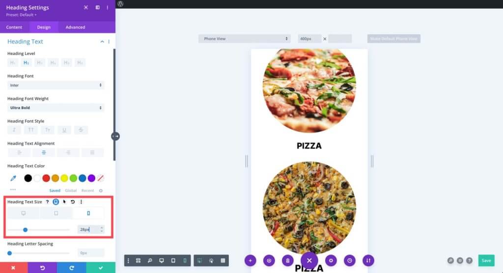
Divi 5 allows you to adjust designs for various screen sizes by using device-specific controls. You can change the look of each module element for desktop, tablet, and mobile viewing without changing the design of the other aspects. To guarantee that layouts are flawless on smaller displays, learn how to adjust padding, margins, and alignment for every perspective.
Use the text settings to adjust the size and characteristics of fonts for various screen sizes. For instance, enormous headlines for desktop computers nearly always require resizing to fit smaller screens. When working in mobile view, you can save time and maintain consistency in designs by simply copying the style of one module and applying it to another comparable one.
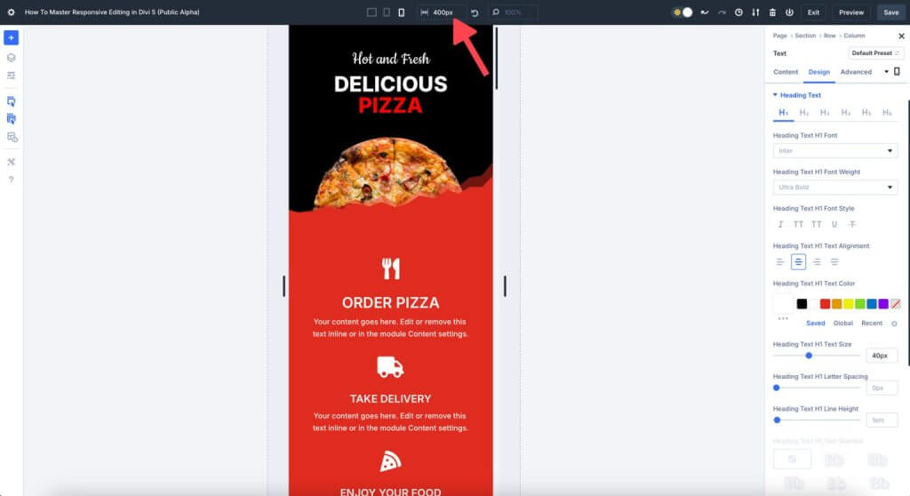
Use of Visual Breakpoints
Divi 5 provides visual breakpoints that let you modify items according to predetermined screen width thresholds. These breakpoints are not limited to standard tablet or mobile settings. Breakpoints in Divi 5 let you instantly modify layouts for smaller or larger screens.
For instance, the screen width of a Samsung Galaxy S7 (360px) differs from that of an iPhone 14 (390px). Therefore, to ensure your website is accessible and error-free for everyone, it's a good idea to design your layout for the smallest screen size. Divi 5's mobile breakpoint is 467 pixels by default.
Dynamic Scaling
Dynamic scaling is advantageous for responsive websites, and Divi 5 allows for creating fluid layouts. Try scaling sections and rows using percentages (%), viewport width (vw), and viewport height (vh) as an alternative to fixed pixel values. In this manner, as the screen size varies, the design elements will scale appropriately.
Images on your website, for instance, can look great on a desktop computer but be too large on a mobile device. To ensure your images are the right size and have enough room on the canvas, you can use Divi 5's settings to change their width.
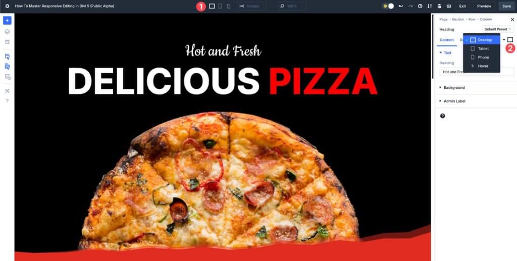
Canvas Scaling
Canvas scaling is a fantastic responsive design technique in Divi 5. It enables you to see the visual integrity of your design across a range of screen sizes. Canvas scaling enhances user experience without lag by scaling items proportionately and maintaining design consistency.
For instance, you can sample how your website will appear on different mobile devices by dragging the canvas edge down to 300 pixels wide while working in the mobile view.
Wrapping Up
There has never been a simpler way to create a mobile-friendly and visually consistent website than with Divi 5, which features expanded responsive editing capabilities. Divi 5 gives designers the ability to create unique, fully responsive websites in a short amount of time and with no effort. Its features include seamless device switching and sophisticated canvas scaling. Are you prepared to advance to the next level in your web design? By diving into Divi 5 Public Alpha right now, you can see the future of responsive editing for yourself.