
A mobile-friendly website can make a big difference in enticing customers. Research shows that about 67% of users are more inclined to purchase from a company if their website is mobile-friendly. However, the twist is that even if your WordPress website is designed to work on mobile devices, it might not appear as you'd like it to. Some page builders like Elementor or Divi has default system to edit pages separately for mobile.
In this article, common reasons why your WordPress site might look different on mobile devices will be explored. This can range from design quirks to technical glitches. So, if you're keen on optimizing your WordPress website for mobile users and ensuring it appears the way you want it to, keep reading for insights and tips to enhance your site's mobile performance. Your mobile audience will thank you for it!
What is Mobile Responsiveness?
Responsive design became important when devices other than desktop computers became popular. Web developers needed a way to make websites look good on smaller screens like those of mobile phones and tablets.
Responsive design makes your website adjust itself to look great on any device. For example, if someone views your WordPress site on a small phone screen, it will automatically make the text and images fit that screen properly.
Create Amazing Websites
With the best free page builder Elementor
Start NowWhen your WordPress site is responsive, it saves users from having to constantly zoom in and out or scroll too much. It also means you don't have to create separate websites for different devices.
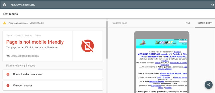
The reason your WordPress site may not look good on mobile is because it's not responsive. If your site isn't responsive, it might look the same as on a desktop, but it won't work well on mobile devices. This could drive mobile users away, and studies show that people are less likely to interact with a company if their mobile site isn't user-friendly.
So, the first thing to do is check if your site is responsive.
Why Does A Theme Look Bad On Mobile
If someone doesn't have a mobile-friendly WordPress theme, they should definitely consider getting one. The theme for their WordPress website is the easiest way to make it work well on mobile phones.
A non-responsive theme will display the website exactly as it appears on a computer, which doesn't work well for mobile users. This becomes a problem when you think about the difference in screen size between a computer and a mobile phone.
The horizontal layout on a computer doesn't fit nicely on a vertical mobile screen. Due to this size difference, the website will look tiny on a mobile phone, which makes the user's experience not so great.
Although a mobile-friendly theme won't look exactly the same on both a computer and a mobile phone, as it rearranges many elements into a single column, the change is beneficial. It significantly improves the user experience on mobile devices. This means that visitors will have a more enjoyable time exploring the website on any device.
Use Responsive Design
When people search for themes on WordPress, they can take a sneak peek at the design before making a decision. To see if the theme adapts well to different devices, they can simply resize their browser window.
If they want to get more technical, they can switch to developer mode by pressing Ctrl+Shift+I or right-clicking and choosing “Inspect.”
If the chosen theme doesn't adjust properly to mobile screens, they should consider finding a responsive one and updating their website. A responsive theme ensures that the WordPress site looks good on both desktop and mobile devices.
Just like themes, some plugins may not be suitable for mobile devices. To check this, they should investigate.
If any of the plugins aren't mobile-friendly, they might mess up the layout on the mobile version of the WordPress site, making it look different from the desktop version.
In such cases, it's a good idea to swap out the non-responsive plugins for responsive ones that perform the same functions.
Does Your Media Scale?
f your website's media doesn't adjust in size, it can make your WordPress site on mobile devices appear unattractive.
In simpler terms, pictures and other things won't properly fit the screen when people look at your site on different devices. Media that doesn't adjust will often appear too wide for the mobile screen, causing problems for visitors and making your WordPress site seem disorganized and unprofessional.
When your site's media is adjusted correctly, it makes the mobile version of your WordPress site more user-friendly and appealing, which can lead to more people showing interest and buying from you.
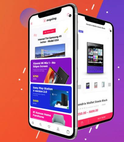
You can see how this men's clothing online store, Stag Provisions, appears on a mobile device as an example.
How To Make Content Scalable?
Make sure to check how big your pictures and videos are. If they're too large, they can slow down your website and may not even show up when someone visits your site, especially on mobile phones because they're not as powerful as desktop computers.
You can make these files smaller using websites like Kraken.io or ShortPixel, and they also have special tools for WordPress. Shrinking your media will make your website load faster on both computers and mobile phones.
If some of the pictures and videos on your website aren't important for mobile users, you can use the WP Mobile Detect plugin. This tool lets you choose which things to hide on mobile devices, which makes your mobile site look cleaner and nicer, especially if you have things like infographics or pop-up forms that don't look good on mobile.
Make Use Of AMP
AMPs, or Accelerated Mobile Pages, are like super-fast versions of your website that show up on mobile phones. They take only the most important stuff from your site and make it load really quickly on mobile devices.
When you add AMPs to your WordPress website, it's great for people who visit on their mobiles, and it can also make your site work better on regular computers. But, keep in mind that your site will look a bit simpler on mobile, with a more basic layout.
By making AMP caches for your pages, you can:
- Get your site to show up higher on Google when people search for it.
- Make your site load super fast on both mobile and regular computers.
- Give users a better experience when they visit your site.
So, it's a good idea to use AMPs for your WordPress website.
The official AMP plugin for WordPress and another well-known plugin called AMP for WP are both popular choices for adding AMP to a WordPress website. If someone wants to return their website to the regular mobile version, they can simply turn off any of these AMP plugins.
Use Mobile Theme Plugins
The Jetpack plugin is a free tool for keeping your WordPress website safe and making it work better. It does more than just protect your site like Sucuri; it also helps you make your pages show up on search engines and create interesting content.
But be careful because it might make your mobile site look different from the one you set up for your computer. Jetpack has a special part that changes how your website looks on mobile phones, and this often leads to your mobile and computer sites appearing very different.
Jetpack has this part to make sure your site looks good on mobile phones, especially if your website's basic design doesn't do this on its own. But because most website designs these days are already set up to look good on mobile phones, you don't usually need this part.
Also, there are other tools like WPtouch that work like Jetpack's mobile site changer. WPtouch creates a separate design for your site when people visit on a mobile phone. So, if you have this tool turned on, your mobile and computer sites might look very different.
If you want both your mobile and computer sites to look the same, you can turn off this tool. Here's how:
- Go to your WordPress dashboard.
- Find "Jetpack" and click on it.
- Look for the "Writing" tab and click on it.
- Scroll down to "Theme enhancements."
- Turn off "Enable the Jetpack Mobile theme."
After doing this, check your site on a mobile phone to see if it now looks the same as it does on a computer.
Wrapping Up
To optimize your WordPress site for mobile users and ensure a consistent appearance, it's vital to ensure mobile responsiveness. Responsive design adapts your site to various devices, enhancing user experience. Checking your theme's mobile compatibility and replacing non-responsive plugins can resolve many issues. Scaling media and using Accelerated Mobile Pages (AMPs) can also improve your site's mobile performance. Additionally, mobile theme plugins like Jetpack or WPtouch can cause differences in appearance between mobile and desktop versions, so consider disabling them if you want a consistent look.