
You've just launched your new WordPress website after weeks of hard work creating content and getting the design just right. You eagerly share your new site with friends to show it off, but when they visit on their phones, they mention things look broken or squished together. So you pull up the site on your own mobile device, only to find text that's too small to read, images awkwardly stretched and laid over each other, and navigation menus that are difficult to access.

This is a common problem many website owners face - optimizing a site for desktop but not accounting for the mobile experience. With mobile internet usage now exceeding desktop usage globally, your website needs to provide an optimal viewing and interaction experience for mobile users. However, many websites still don't render correctly on mobile screens, leading to a poor and frustrating user experience that can negatively impact your traffic and conversions.
In this article, we'll look at the primary reasons your WordPress site might not be displaying correctly on mobile and how you can resolve these issues.
What is a Responsive Website?
A responsive website is one that dynamically adapts and resizes to fit the screen size on any device. It provides an optimal viewing and interaction experience whether accessed on a desktop computer, laptop, tablet, or mobile phone.
Create Amazing Websites
With the best free page builder Elementor
Start Now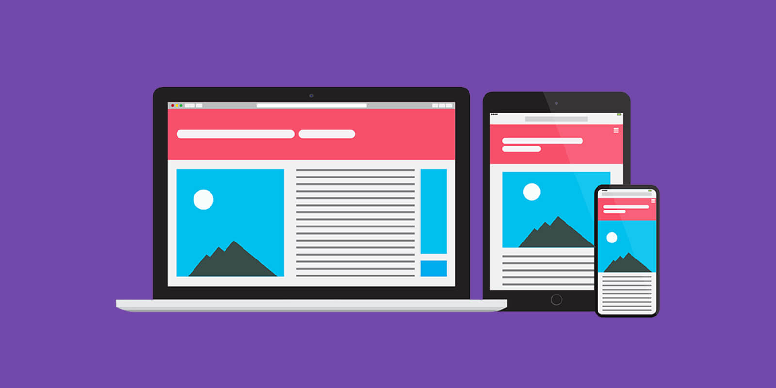
This is achieved through the use of a responsive web design framework and flexible images, layouts, and content. The site detects the visitor's screen size and orientation and automatically adjusts page elements to optimize them for that particular device. For example, on a phone the navigation menu may switch to a tap-friendly icon while on a desktop it remains a horizontal menu.
To create a responsive WordPress website, a responsive theme is required. The theme's layout will resize and reflow based on screen width using CSS media queries. This removes horizontal scrolling, reshapes the layout, and resizes text and images to maintain proper proportion and readability. A responsive theme ensures your website content looks great and functions easily regardless of the device used to access it.
With mobile usage now exceeding desktop usage for web browsing, having a responsive design is crucial for providing a quality experience to all of your website visitors. Using a non-responsive theme that is rigid and fixed in size will result in a poor mobile user experience that discourages engagement. Implementing a responsive theme creates a flexible foundation to build a website that caters to any screen.
Why Should You Use A Responsive Theme For Your Website?
Using a responsive theme is critical for providing a quality user experience across all devices that access your WordPress website. With mobile internet usage now exceeding desktop usage globally, catering to these mobile visitors through responsive design is essential.
A responsive theme creates a site that dynamically adapts and resizes content to provide an optimal viewing and interaction experience on any screen size. Whether a user is browsing on a 27 inch monitor, 10 inch tablet, or 4 inch smartphone, the site will detect the screen width and optimize the layout accordingly. Text, images, menus, and other elements will resize and reflow to eliminate horizontal scrolling and maintain proper proportion.
Without a responsive theme, visitors on phones and tablets would face a poor experience such as having to pinch and zoom to read text, navigating uncomfortable horizontal scrolling pages, or struggling to click menus not designed for touch. Non-responsive sites force mobile users to access desktop-oriented layouts that provide subpar visibility and usability.
In contrast, a responsive site presents the same high quality experience regardless of the device used to access it. Users can read content easily, tap menus designed for touch, and navigate pages optimized for smaller screens. This convenience and ease-of-use leads to higher engagement and satisfaction across all visitors.
Additionally, with mobile traffic making up increasingly larger portions of website visitors, responsive design becomes critical for accessing this growing market. Google also favors responsive, mobile-friendly sites in search rankings, so utilizing responsive design can improve accessibility for search engines.
By implementing a flexible responsive theme, you can save time and resources by avoiding building and maintaining separate mobile sites. Responsive sites also provide feature and content consistency across devices for a seamless user experience.
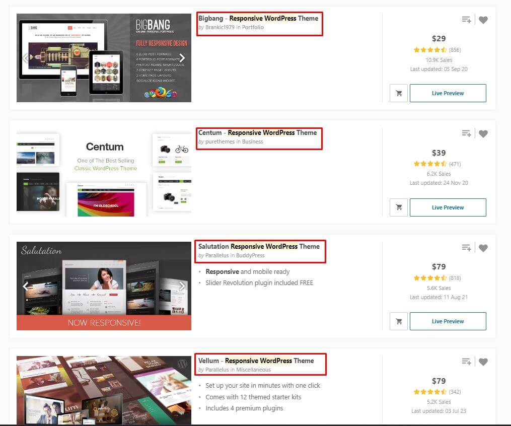
Top 5 Responsive WordPress Theme
Since you know the importance of using a responsive theme for your website, here are top 5 WordPress responsive theme that can help you to make any kind of website, despite your business types.
Hello Elementor
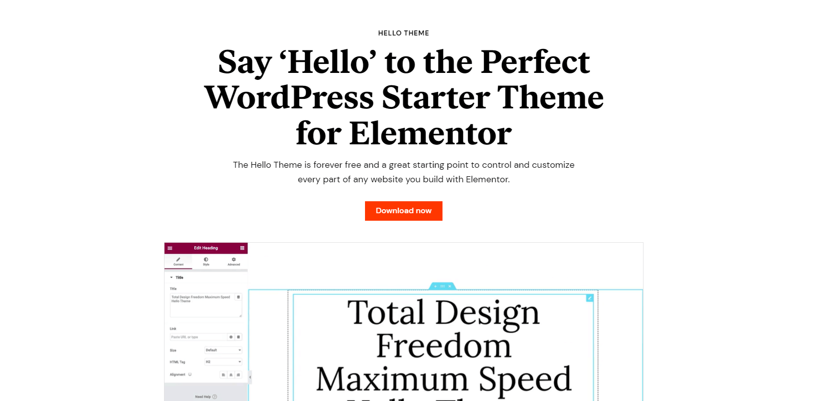
Hello Elementor is a popular free WordPress theme optimized for use with the Elementor page builder plugin. This lightweight theme helps you build a fast, responsive website through a drag-and-drop interface. It focuses on showcasing your Elementor page designs and provides a clean canvas with basic templates. This theme handles all the theme settings and customizations directly within the page builder itself. This allows you to visually design different page layouts with responsive columns and styling options. With robust integration between the theme and page builder, Elementor makes it easy to create elegant websites without code.
Key Features
- 100+ Ready Designs
- WooCommerce Builder
- Dazzling Performance
- Headers & Footers
- Built for Speed
- Loads in 1/4 Second
WoodMart - Responsive WooCommerce WordPress Theme
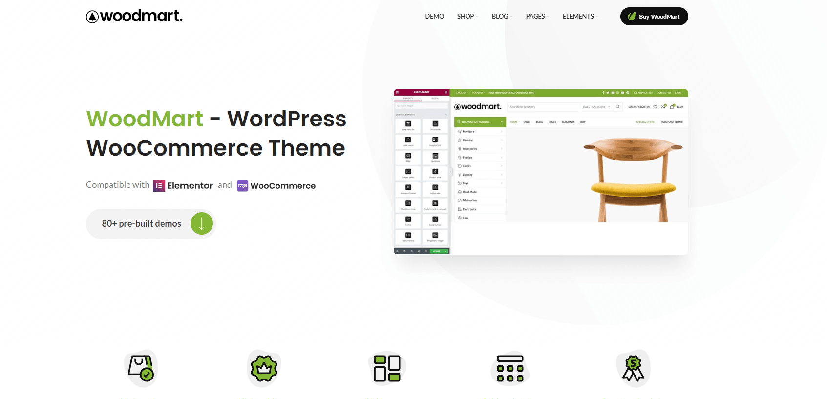
The WoodMart theme provides a seamless, high-speed shopping experience through its use of powerful AJAX technology. This allows the site to update instantly without constant page refreshes. Built-in support for WPBakery Page Builder and Slider Revolution enables flexible page building capabilities. After reviewing the theme, it's clear WoodMart offers an extensive feature set that can provide visitors with a unique user experience for responsiveness.
Key Features
- 45+ Beautiful demo layouts
- 15+ Prebuilt home pages
- SEO friendly
- Fully Responsive Layout
- WooCommerce supported
- Social login/register support
- WPBakery page builder
- Revolution Slider
- GDPR compliant
- WPML Officially Certified
Divi Theme

The Divi theme from Elegant Themes is highly customizable and fully responsive, making it a great choice for building websites that adapt to any device. Divi uses a responsive grid system that adjusts up to 12 columns depending on the screen width. This provides complete control over how content reflows across desktop, tablet, and mobile views. You can fine-tune sizing, spacing, and arrangements per device. Divi also lets you hide and show elements for each viewport. With mobile usage exceeding desktop, Divi’s fluid responsive framework ensures your site content looks fantastic regardless of the visitor’s device.
Key Features
- Drag-and-drop building
- Custom CSS Control
- Design Options Galore
- Huge Template Library
- True Visual Editing
- Responsive Editing
- Inline Text Editing
- Real Time Visual Editor
Astra
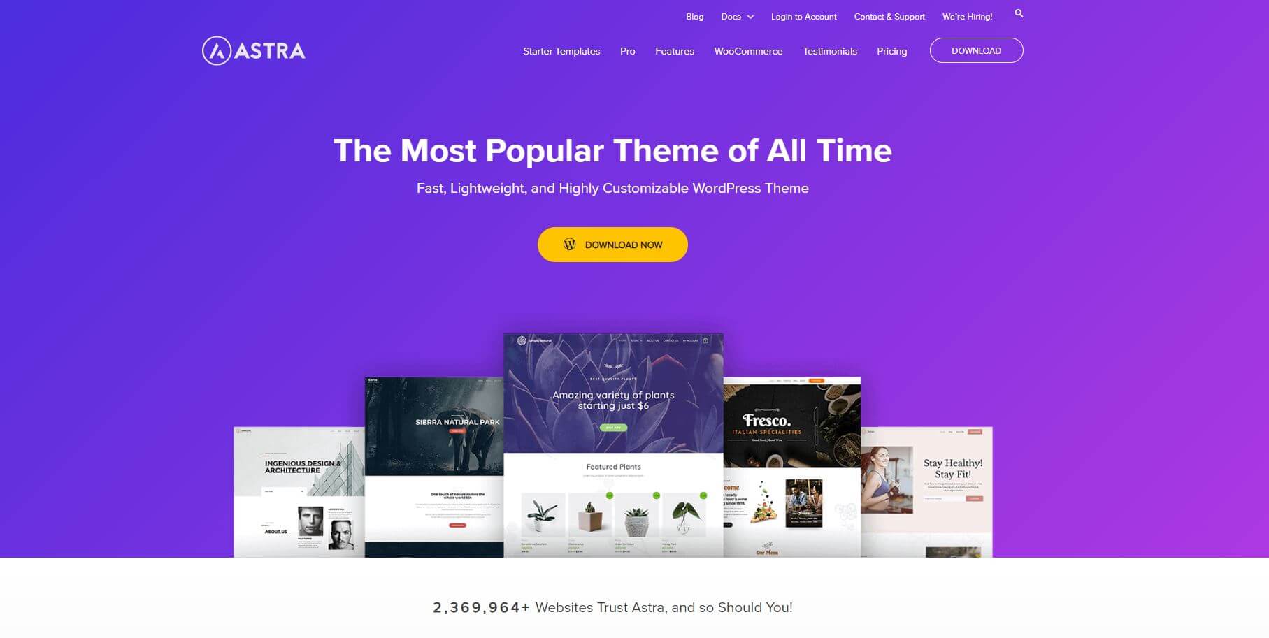
Astra is one of the most lightweight and responsive free WordPress themes available. It uses a flexible grid system that adapts up to 5 columns for seamless content reflow across device sizes. You can control column widths and layout through both desktop and mobile-specific settings. Astra was designed to be highly customizable for responsive websites. It enables you to adjust font sizes, margins, colors, and more for desktop versus mobile views. With optimized performance and a responsive framework, Astra makes it easy to build fast loading websites that provide an excellent user experience on any device. Its slim design is ideal for showcasing your content on both mobile and desktop.
Key Features
- Pre-Built Websites
- Customize Without Code
- Made for Page Builders
- Superfast Performance
- Colors & Typography
- Gutenberg Compatibility
- Load in Just 0.5 Seconds
- Responsive Web Design
Electro Electronics Store WooCommerce Theme
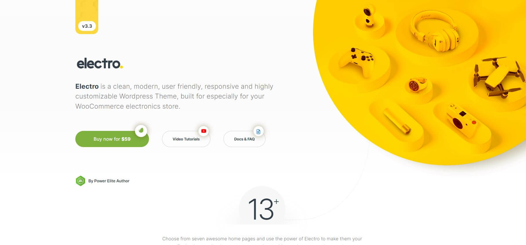
The Electro WooCommerce theme delivers a robust, flexible platform for e-commerce websites selling electronics and tech products. With its responsive design, Electro adapts seamlessly to any screen size for optimal viewing on mobile, tablet, or desktop. The theme resizes product galleries, illustrations, menus and other elements to provide the best experience across devices. Electro’s WooCommerce integration empowers stores and marketplaces with advanced shop functionality. For vendors and affiliate marketers in the electronics niche, Electro’s well-crafted responsive framework showcases products effectively while providing a smooth, user-friendly shopping journey. Let’s explore how Electro’s responsive layout and deep WooCommerce support can help electronics businesses build customizable online stores that engage customers on any device.
Key Features
- Dedicated Mobile UI
- Built on Bootstrap 4
- Cross-browser compatible
- Search engine optimized
- WPBakery page builder
- Slider revolution
- Added Hamburger menu
- Fully Responsive layout
- Multivendor compatible
- WPML Compatible
Wrapping Up
With mobile usage continuing to rise, having a website that displays properly across devices is essential. By using a responsive theme and optimizing for mobile, you can provide all visitors with a great experience. As we've discussed, factors like non-responsive layouts, large images, and poor content formatting often cause mobile issues. Thankfully, implementing responsive design principles and choosing a flexible theme can transform your WordPress site into one that adapts seamlessly to any screen size. With quality responsive options like Hello Elementor, Astra, Divi, Electro and WoodMart, you can rest assured that your site will look fantastic regardless of the device. Mobile-friendly, responsive design is crucial now and for the future of your website.


