
If you want to add more vertical space to your WordPress site and make scrolling more interesting, a sticky sidebar menu could be the answer. Instead of utilizing a conventional horizontal menu, you may use this style of the header to vertically connect your menu and navigation to the sidebar of your WordPress website. We'll walk you through the process of making this sticky sidebar navigation menu with Elementor and Elementor Pro in this tutorial.

Introduction of the sticky sidebar menu
A sticky sidebar header takes up vertical space on either the left or the right of your site, as opposed to a standard or shrinking sticky header, which sticks horizontally at the top of your site. Although it is constantly present, in its default minimized state, it occupies very little room. Clicking the symbol will cause the complete navigation menu to "slide out" for visitors who want to view it in its entirety. The sticky sidebar menu appears as follows by default:

And this is what it appears like when a visitor clicks to open the complete menu:

One thing to bear in mind is that this effect truly only works for visitors who are on desktop or tablet computers; it is not an option for visitors who are on mobile devices. Because of this, you should still have a standard fallback header that loads for users on mobile devices. In the lesson, we'll assist you in setting up this fallback mobile header.
Create Amazing Websites
With the best free page builder Elementor
Start NowBenefits of a Sticky Sidebar Menu
The biggest advantage of this style of the header is that it frees up more vertical room for your content because there isn't a header at the top. You only need to give up a small amount of side space in order to utilize 100% of the vertical area.
Additionally, it gives your visitors an immersive scrolling experience while yet allowing them to use the navigation at any time.
Create a Sticky Sidebar Menu Using Elementor
You'll need to mix a few different templates/features to make your sticky sidebar menu. What you'll need is as follows:
- Regular header –This header will serve as your website's fallback for mobile users. For visitors using desktop computers and tablets, you will remove this header so they can see the one in your sidebar.
- Section template – To fit your sidebar header's reduced size, you'll develop a new section template (the default state).
- Popup menu –When a user clicks on the sidebar menu that is minimized, the entire sidebar navigation opens. The popup in the aforementioned example is what actually has the menu links for "Homepage," "About," etc.
- Page template –This allows you to enable Elementor to show your sidebar header in addition to your main content.
Create a Sticky Sidebar Menu
Hide Your Header on Desktop and Tablet View
Make sure your current header only appears for mobile visitors as a starting point (and footer if your site has one). Open your header template in Elementor Theme Builder (Templates → Theme Builder → Header). Then, find your header’s name and click Edit with Elementor).

Or, if you haven't already done so, you can design a fresh header template just for use as your mobile header (you can also create a blank header template for desktop only). You can start from a variety of pre-built templates that are included with Elementor Pro. Or you might start from scratch and create your own mobile header. We are referencing the header template from the template kit for the digital agency.
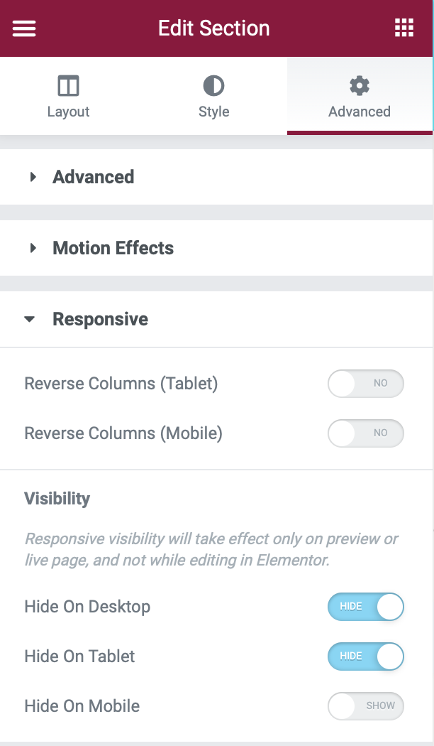
After you log into the Elementor interface, open the settings for the section that has your header:
- Go to the Advanced tab.
- Find the Responsive settings.
- Use the toggle to enable Hide On Desktop and Hide on Tablet in the Visibility settings.
Create a New Template for Your Sidebar Navigation
The section template that will serve as your sidebar navigation should be created at this point. Keep in mind that, at first, everything in your template will look way too big to be a sidebar navigation menu. Not to worry! You're not doing anything incorrectly; you'll address this with some of the CSS we supply later. Go to the Templates section of your dashboard to build your template. Click "Add New" after switching to the Section tab. Sticky Side-Nav Header is its name. Even though you'll use this template as your sticky side-nav header, you're actually generating a regular "section" template with Theme Builder rather than a "header" template.
To configure section settings, create a new section with one column first. Configure the section as follows in the Layout settings:
- Content Width: Full Width
- Columns Gap: No Gap
- Height → Min Height: 100vh (this configures your sidebar header to take up 100% of the vertical height)
- Column Position: Stretch
- HTML Tag: header (this is optional, but it’s good for SEO to configure it this way)
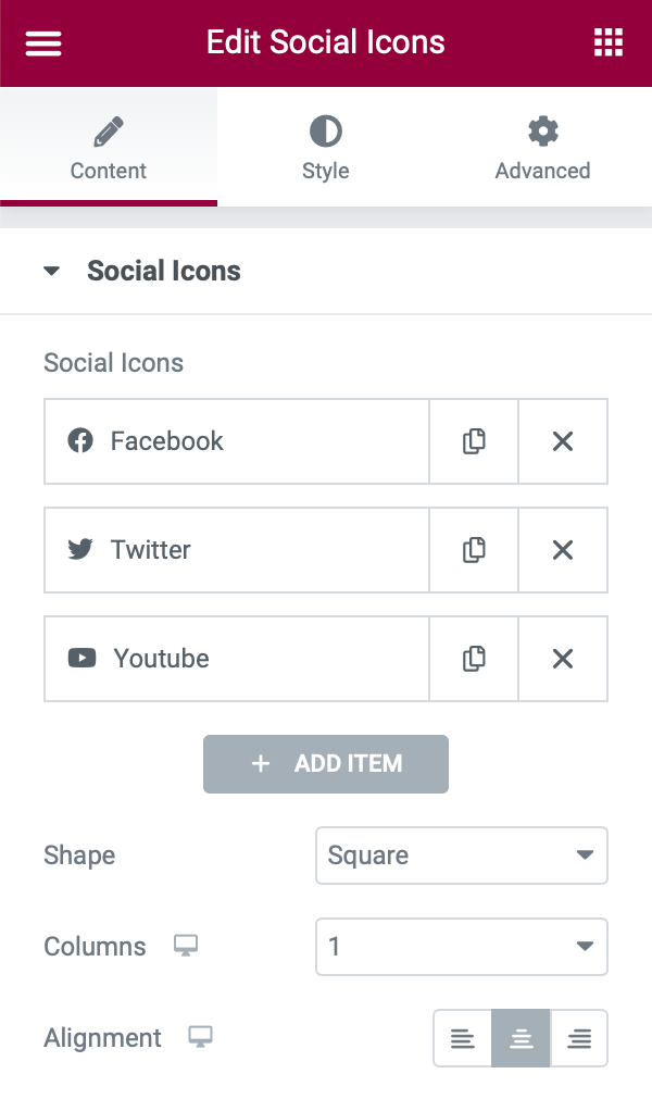
To add widgets, You may add the widgets to your sidebar menu. In our case, we've added:
- A logo
- An icon to open the full menu
- Social follow icons
Remember that your actual navigation menu items will be contained in a popup window; you don't need to worry about establishing a navigation menu just yet. All you have to do is include the symbol that visitors will use to access the complete menu.
To add a site logo, Use a Picture widget to add your logo image.
To add an icon, use an Icon widget to add the toggle icon. We used the Bars icon as an example. You can, however, use any icon, including an image or Lottie file. Just make sure that visitors realize that by clicking here, they can access the whole menu. You should also select a theme-appropriate color and hover color.
Using the Social Icons widget, you may add as many social networks as you wish. You can also change the shapes and colors to fit your theme. Select 1 as the number of columns to ensure that your social icons are vertically aligned in a single column. And there you have it! Return to the WordPress dashboard after publishing/updating your section template.
Create a New Single Page Template That Includes Your Sidebar Navigation
Then, using Elementor Theme Builder, create a new single-page template that incorporates your site's content as well as your sticky side-nav header.
To do so, go to Templates → Theme Builder:
- Go to the Single Page tab
- Click Add New
- Make sure Single Page is selected as the template type.
- Name it Page with Fixed Side-Nav.

Create a section with two columns in the Elementor editor:
- Left column – this will hold the sticky sidebar.
- Right column – this will contain your site’s regular content.
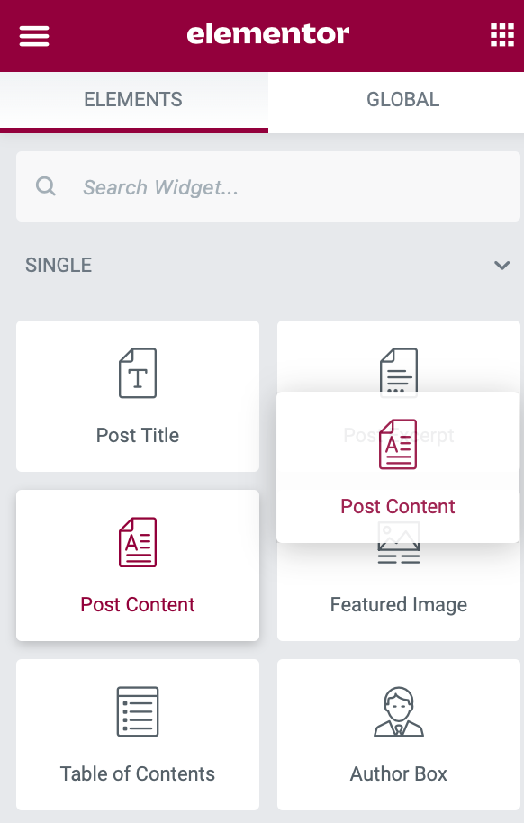
Add the Post Content widget to the right column to display your regular content.
Insert a Template widget to add your side-nav heading to the left menu. Then, choose the Sticky Sidebar Header template you made in the previous step. In addition, go to this column's Advanced options and change the Z-index value to 10000 (ten thousand) and the Responsive controls to Hide on Mobile. This ensures that your sticky side-nav header is only visible to desktop and tablet users.
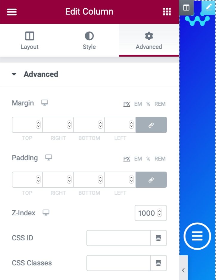
Your side-nav currently occupies 50% of the page. To correct this, in the Layout tab, choose the left column (containing your side-nav) and set its Column Width to 5%. This should automatically equal 95% on the right column. Setting the z-index value ensures that the complete navigation popup created in the following step slides beneath the side nav.
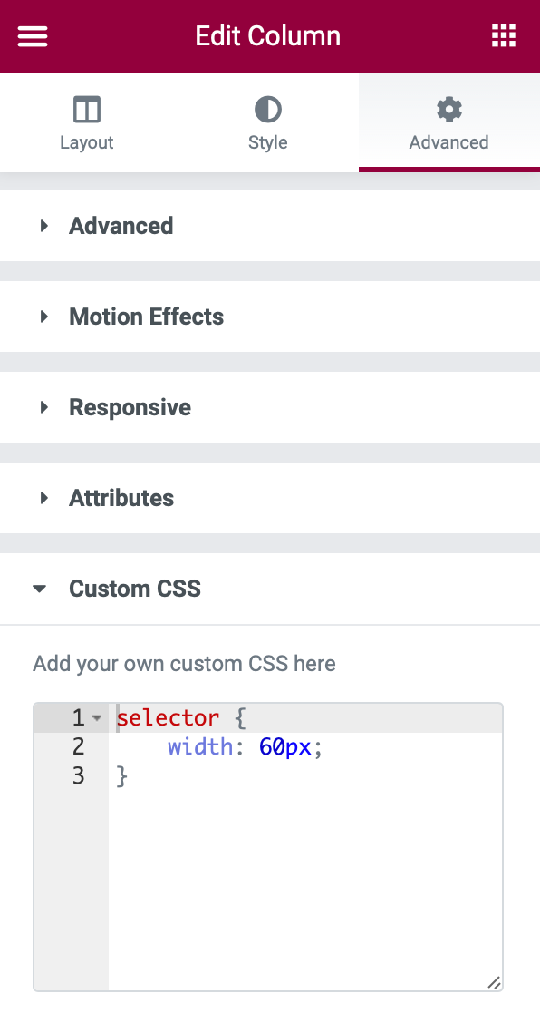
selector {
    width: 60px;
}
By setting the width to 60 pixels, this CSS ensures that the side-nav always remains narrow. Feel free to change this value to suit your needs, but don't deviate too much from 60px.
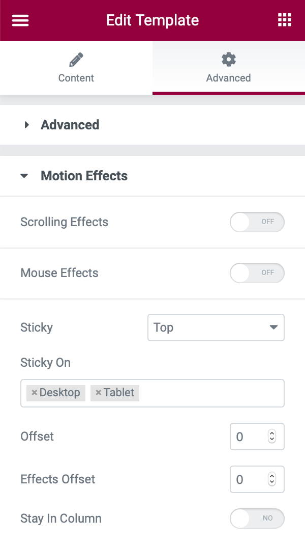
Now we want to make sure the side navigation is always shown on the screen. To do so, select the following template from the right column:
- Go to the Advanced tab.
- Click Motion Effects.
- Set Sticky to Top.
- Set Sticky On to Desktop and Tablet.
Now, publish your Single Page template and control where it displays using the Display Conditions. Set your sticky side-nav to display on All Pages if you want it to appear on every page.
If you're adding this to a site that already has some existing page templates, make sure to set all of them to "Draft" to deactivate them and avoid potential conflicts.
Create the Popup Navigation Menu
Then, when a visitor clicks on the symbol in your side-nav header, you must generate the popup that displays the full navigation menu. The popup will slip behind the side navigation, creating a really cool look. We'll keep things easy for the tutorial stages below. However, you are free to explore as much as you like in order to produce something truly amazing. If you want to learn more about constructing menus with Elementor Popup Builder, see our comprehensive guide.
To begin, navigate to Templates → Popups → Add New and give your popup a name to help you remember it, such as Sliding Nav.
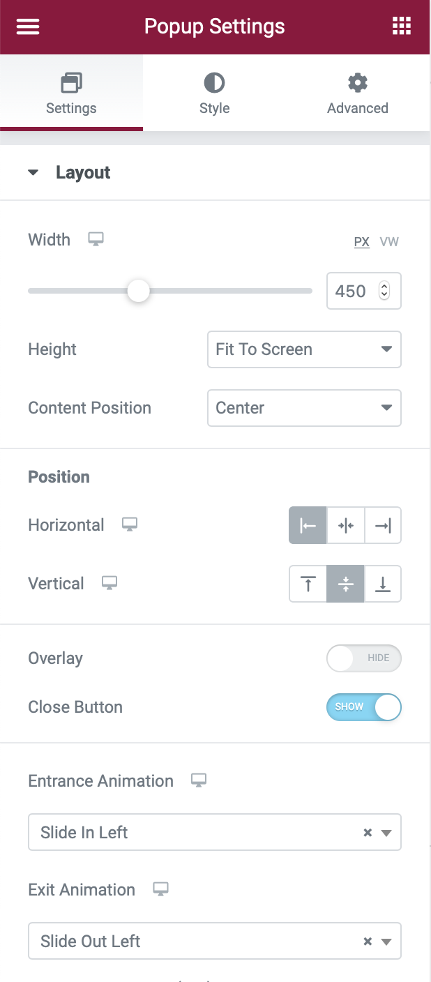
To configure popup settings, click the gear icon in the bottom-left corner to open the Popup Settings and configure them as follows:
- Width: 450px
- Height: Fit to Screen
- Horizontal Position: Left
- Overlay: Hide (turned off)
- Entrance Animation: Slide In Left
- Exit Animation: Slide Out Left
To ensure that your popup displays to the right of the existing side navigation as it slides out, add the following margin:
- Go to the Advanced tab.
- Find the Margin settings.
- Add 60 pixels to the left (or the right if you choose to display the sticky side-nav on the other side).
- Add 20 pixels under Padding.

Then, add your navigation menu to the popup's body using widgets. I used four Heading widgets in my example. You may also use the Nav Menu widget to rapidly add one of your existing navigation menus if you set the Layout to Vertical. You might also want to Align it to the middle. Again, for a more in-depth look, see our whole guide. When you're finished, remember to publish your popup. There's no need to set up any display criteria, triggers, or advanced rules because you'll handle triggering your popup in the next step.
Configure the Side-Nav Icon to Trigger Full Nav Menu Popup
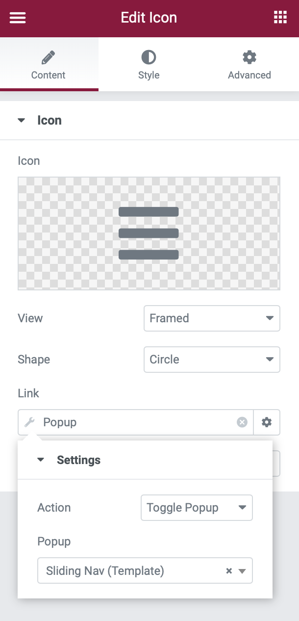
To end, configure it so that your navigation menu popup appears when a visitor clicks on the symbol in your side-nav section design. To accomplish this, navigate to Templates → Saved Templates and change the existing Sticky Side-Nav Header section template.
Go to the navigation icon's settings. Then, for the Link, select the Dynamic Tags option. In the list of dynamic tag choices, select Popup under Actions. After you've configured the link to Popup, click the Wrench symbol to choose the specific popup. Toggle Popup should be set as the Action. Search for and pick the Sliding Nav popup that you produced in the previous step using the Popup search field. Then, make changes to your section template.
Test and Enjoy
You should be finished at this point! Check that your new sticky side-nav header is operating properly by opening a page on your site. If you're having problems, consider briefly switching to the Hello theme to ensure there's no conflict with your current theme. While this guide should work with any WordPress theme, there is always the possibility of problems. If your sticky side-nav header works in Hello but not in your theme, you should contact the theme's creator for assistance.
Wrapping Up
With a sticky side-nav header, you can add more vertical space to your site and make the scrolling experience more immersive. You can quickly set up a side-nav header on your WordPress site with Elementor Pro and this tutorial. Give it a shot right now!