
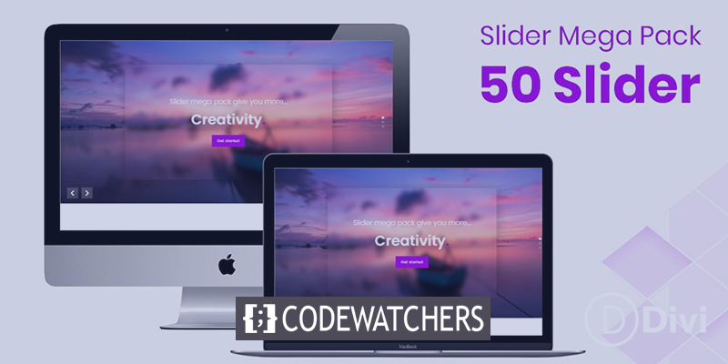
The Slider Mega Pack is a set of fifty slider layouts for Divi that you can use in your next web design project. All of the sliders are made with Divi modules, and you can easily add your own content and designs to them. In this spotlight on a product, we'll look at the layouts that Slider Mega Pack has to offer and help you decide if it's the right solution for you.
Let's get started!
Install Slider Mega Pack
The Slider Mega Pack is a ZIP package containing .json files for Divi Builder. To install the slider layouts, unzip the file first. Next, open the page you desire in the Divi Builder.
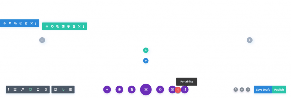
Select the import tab by clicking the portability option located at the bottom of the page. Select the.json file for the slider layout you desire, and then import the layout. After importing the layout, you only need to modify the text and photos to have a gorgeous slider on your website!
Create Amazing Websites
With the best free page builder Elementor
Start Now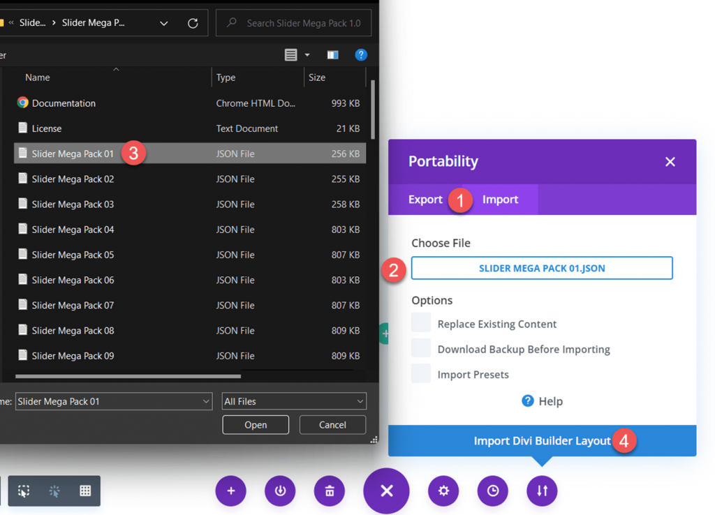
Fullwidth Sliders On Slider Mega Pack
Slider Mega Pack includes 32 full-width slider designs. The full-width slider layouts are suitable for presenting large photos alongside text and can be a wonderful method to attract the attention of your visitors. It's also a terrific opportunity to offer information or highlight some of your service's benefits. Each of these sliders has a unique layout and appearance, so you are certain to find one that suits your needs! Let's examine each of the 32 full-width slider designs.
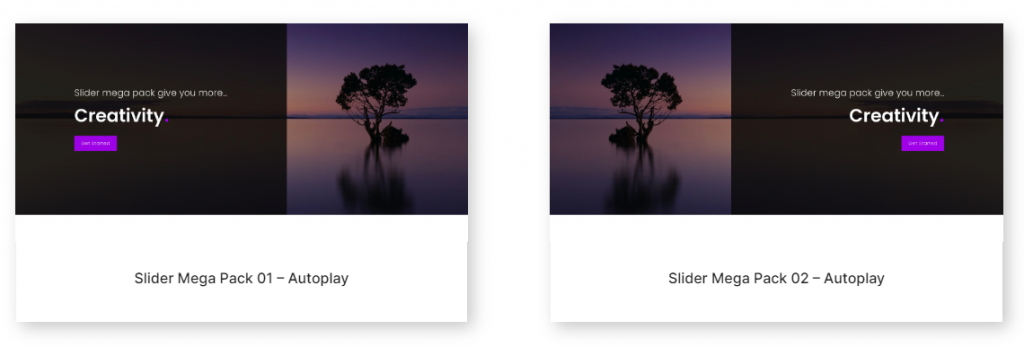
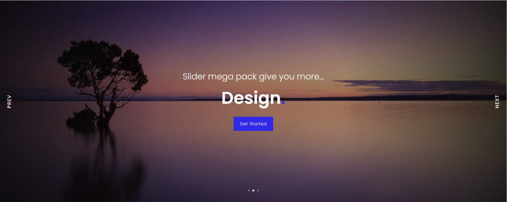
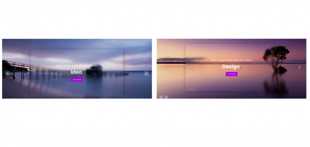
The initial slider design is a text slider with a photo background and a black overlay on the photo's left side. On each slide, the text and the button are different. The second slider layout is identical to the previous layout, with the exception that the black overlay and text are located on the right.
The third slider layout has an image with a vignette effect as well as text and buttons that change in the center. Additionally, there are previous and subsequent buttons on each side.
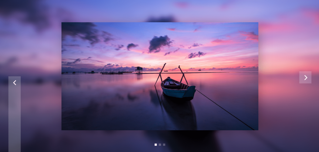
This slider displays many photos on a blurred image background, with navigation arrows on either side and navigation dots at the bottom.
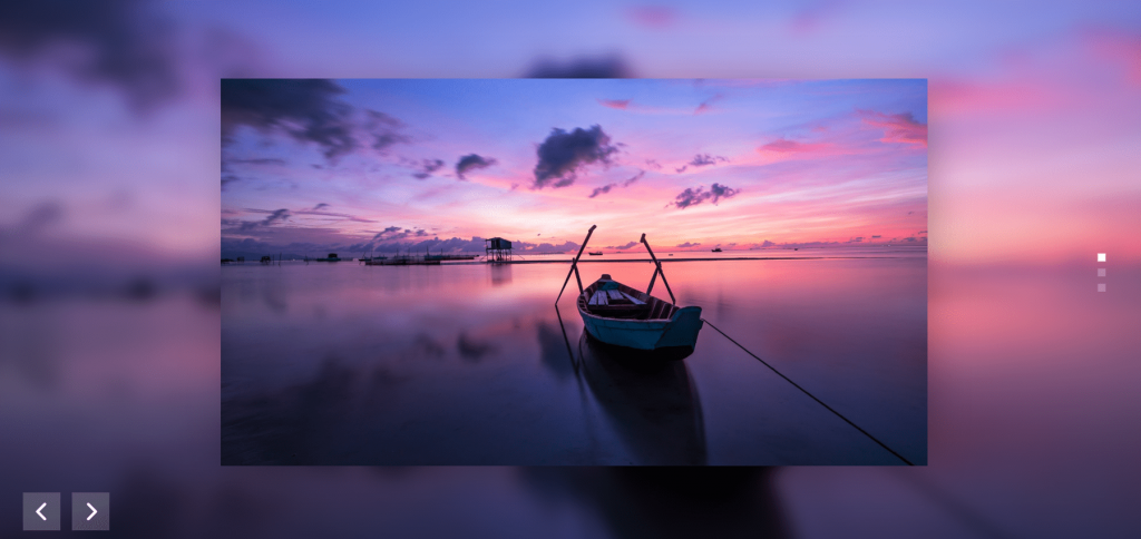
The fifth layout of the slider likewise has various photos on a blurred background of the same image. It features navigation arrows on the bottom left and navigation dots on the right.
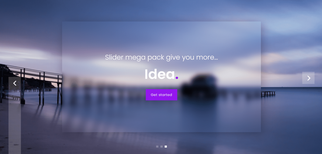
The sixth slider layout offers to change text on a blurred, translucent square over a photo background with parallax effects. There are navigational arrows on both sides and navigational dots at the bottom.
Similar to style 6, layout 7 features a parallax background and text slides. The navigation arrows are located in the lower left corner, while the navigation dots are on the right.
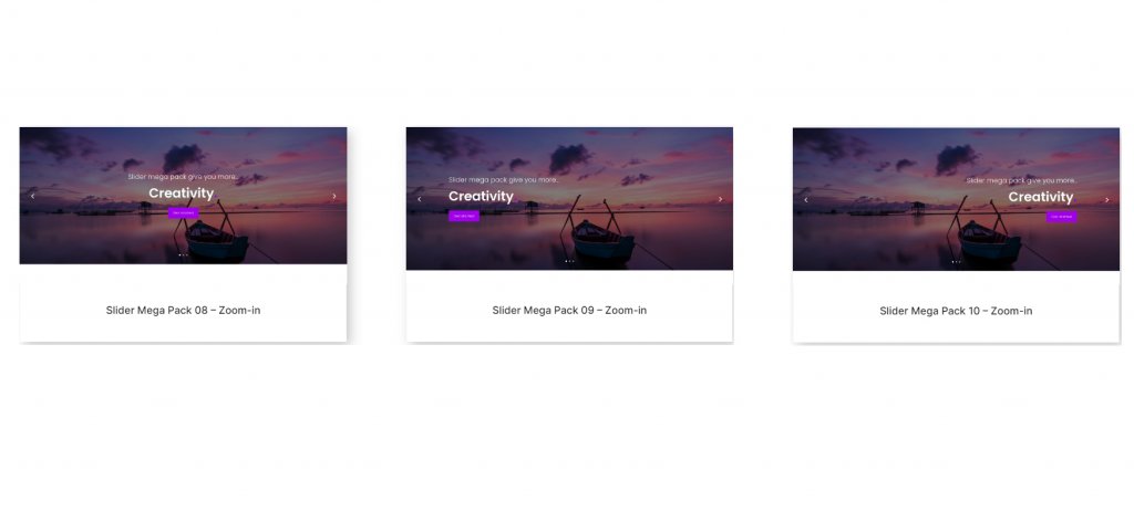
Slide layouts 8, 9, and 10 feature text over many zoomed-in images. In these layouts, navigation arrows are located on each side of the slider, and navigation dots are located at the bottom. The text is centered in Layout 8. Text in Layout 9 is positioned to the left. And the text in Layout 10 is oriented to the right.
On each slide of Designs 11, 12, and 13, there is a large image with text and a button, as well as navigation arrows on the sides and navigation dots at the bottom. Layout 11 is centered. Slider 12 is left-aligned. And slider 13 is positioned to the right.

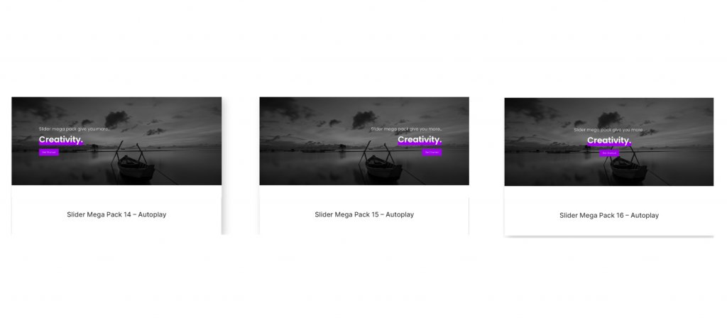
These layouts 14, 15, and 16 all have a greyscale effect on the photo and a parallax scrolling effect. The header content is underlined in bold font. The text is aligned in the center for layout 14. Slider 15 is positioned to the right. And slider 16 is left-aligned.
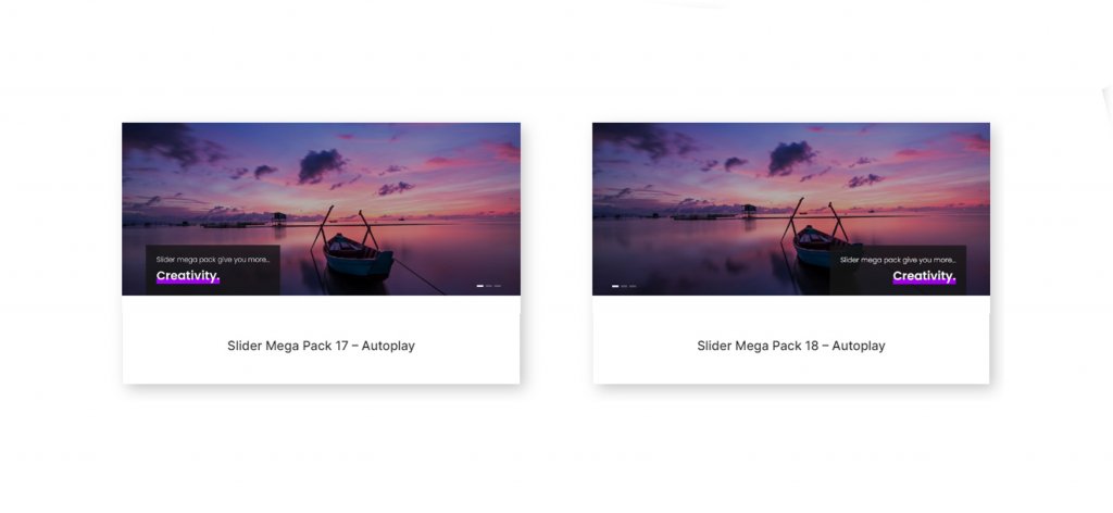
The 17th and 18th layouts contain a huge image with slide text in a dark overlay box. Layout 17 positions text on the left and navigation on the right. The navigation is on the left, and the text is on the right for layout 18.
The 19th, 20th, and 21st sliders all contain a grayscale photo overlay with a zooming effect. No navigation buttons exist. Slider 19 is left-aligned. Slider 20 is right-aligned. And the text in the 21st slide is centered.

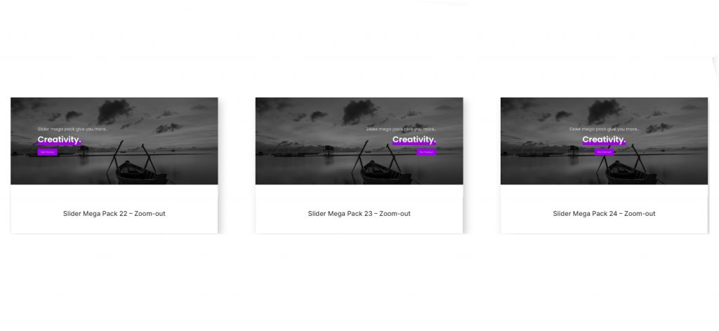
These layouts are identical to the previous three, with the exception that the photographs have a zoom-out effect. Text on Layout 22 is positioned to the left. Text on Layout 23 is positioned to the right. And Layout 24 features text that is centered.
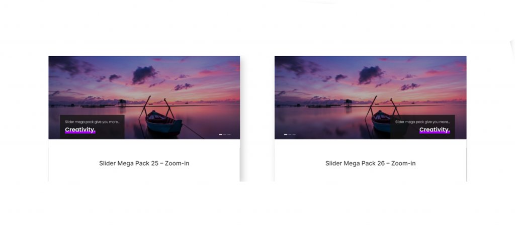
The 25th and 26th slider layouts feature a zooming image and text over a dark overlay box. Text is positioned to the left in Layout 25, while navigation icons are to the right. The text is oriented to the right while the navigation symbols are aligned to the left in Slider Layout 26.
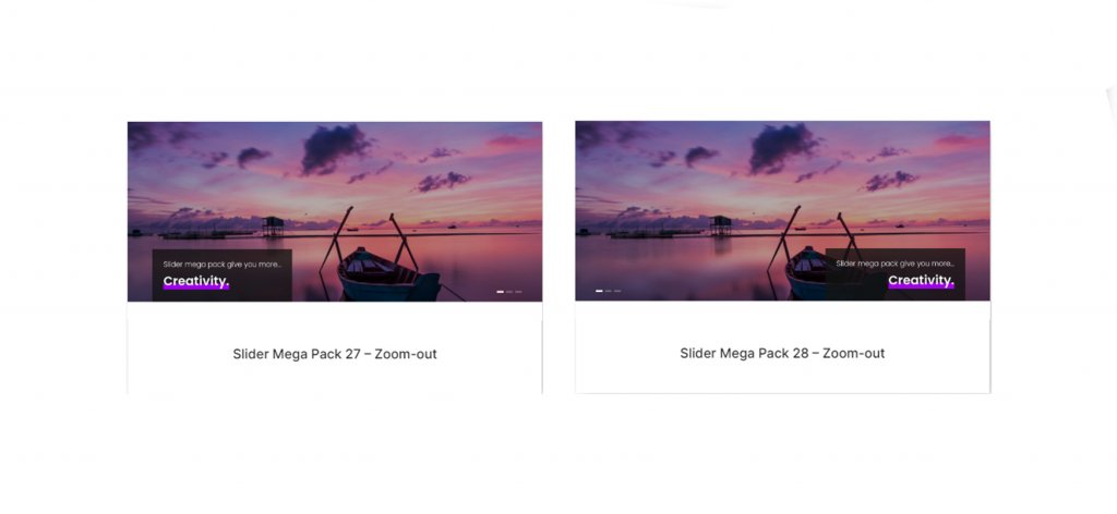
The next two layouts are identical to the previous two, but the image zooms out. Text and navigation icons are oriented to the right in Slider Layout 27. Layout 28 features left-aligned navigation icons and right-aligned text.
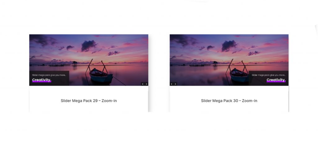
These two sliders each include a huge image that can be zoomed in on, as well as several navigation icon styles. Text is on the left while navigation icons are on the right in Layout 29. Text appears on the right while navigation icons appear on the left in Layout 30.
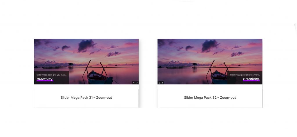
These subsequent patterns are identical to layouts 29 and 30, except the image is magnified. Text is on the left in Layout 31, while navigation is on the right. Text is on the right of Layout 32, while navigation is on the left.
Fullwidth Post Sliders On Slider Mega Pack
Additionally, the Slider Mega Pack includes 18 post sliders. These sliders show blog posts and show information about the post along with a button to read it. The featured image of the post is used as the background image for the slide. You can choose which category of posts to display, or you can simply show your most recent posts. All post sliders are fully customizable and come in a range of layouts, alignments, and styles, similar to the sliders listed above.
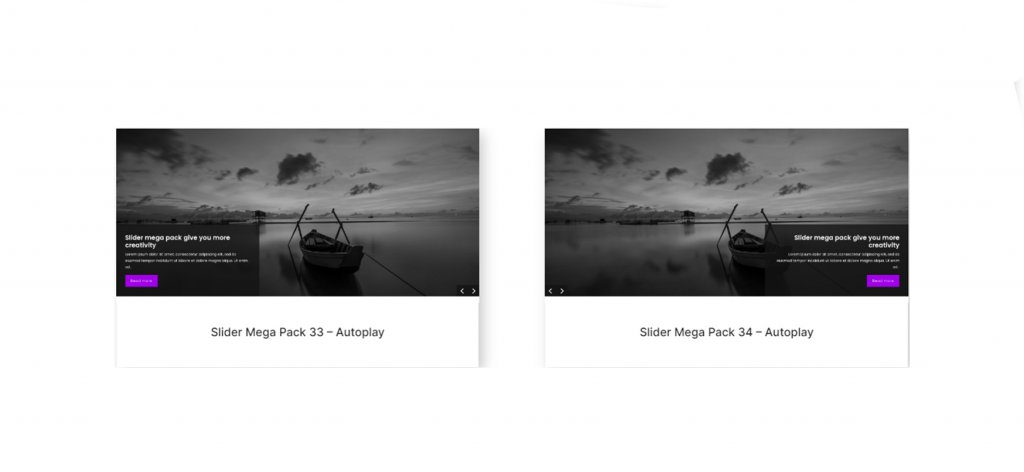
The grayscale and parallax image effects are used in these sliders. With layout 33, text is on the left and navigation is on the right. With layout 34, navigation is on the left and text is on the right.
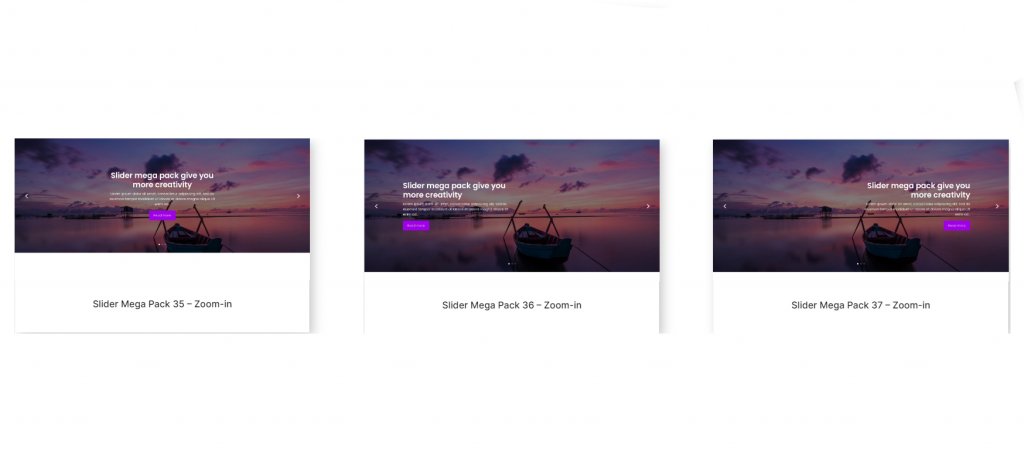
The layouts 35, 36, and 37 include a large featured image with navigation arrows on both sides and navigation dots below. The image has been magnified. The text in Layout 35 is centered. And in 36 and 37, the text is positioned to the left and right, correspondingly.
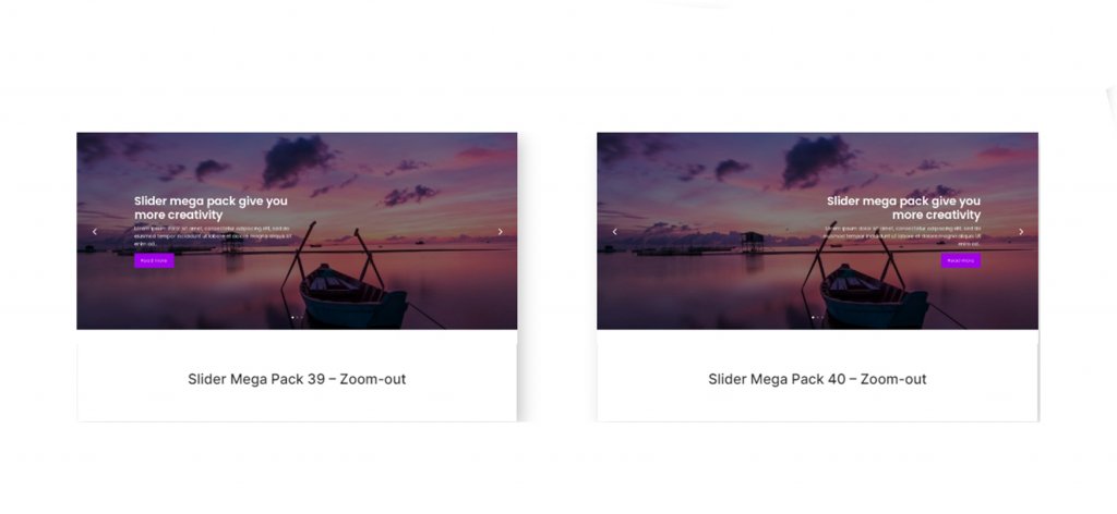
These slider layouts are identical to the previous three, except the image zooms out. Arrangement 38 is centered. Layout 39 is aligned left. And layout 40 is positioned to the right.
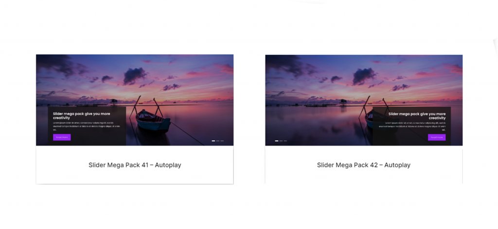
On sliders 41 and 42, these layouts have a parallax image at the bottom with text on one side and navigation arrows on the other.
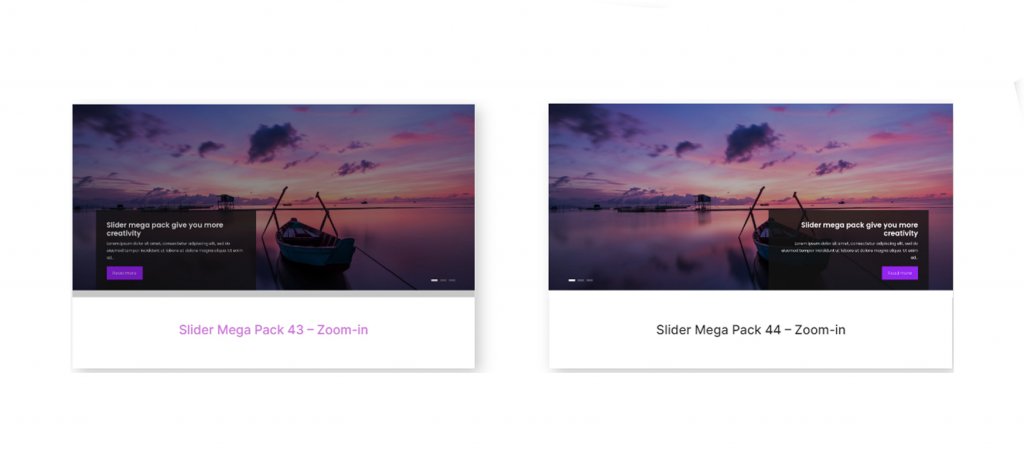
Layouts 43 and 44 resemble the layouts above, except the image is magnified. In layout 43, the text is oriented to the left. in 44 it is on the right.
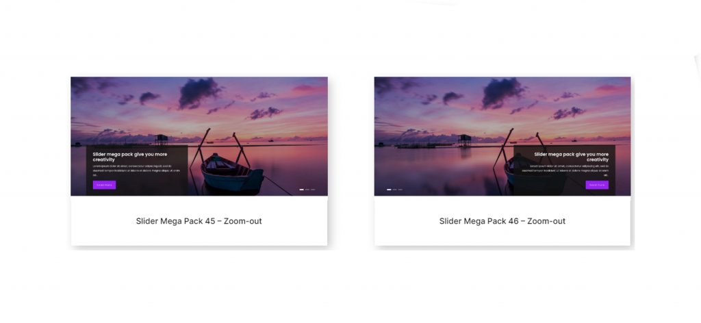
Again, layouts 45 and 46 are similar to those above, but the image zooms out instead. Text on line 45 is oriented to the left. And layout 46 has text positioned to the right.
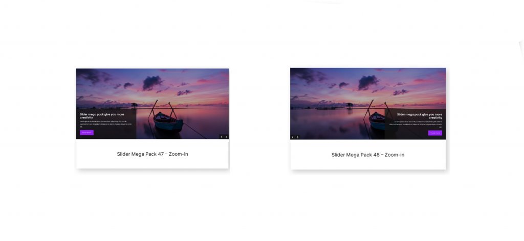
For the post title and navigation arrows, layouts 47 and 48 contain a dark square overlay. The image zooms in. Text is on the left, and arrows are on the right in Layout 47. In Layout 48, the text is to the right.
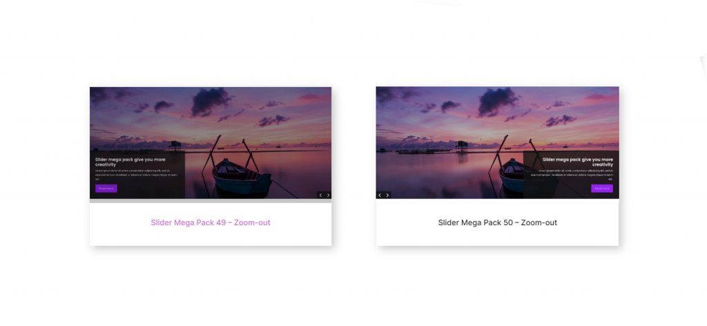
Lastly, slider layouts 49 and 50 are similar to layouts 47 and 48, except that the photos are magnified. Text is located on the left side of Design 49. And layout 50 has text aligned to the right.
Wrapping Up
The Slider Mega Pack includes 50 pre-built slider layouts with beautiful transitions, effects, and navigation layouts that can be simply modified using the Divi Builder. This solution may be suitable for you if you are looking for slider layouts that are customized beyond the normal Divi possibilities. We are eager to hear from you. Have you ever utilized the Slider Mega Pack? Tell us in the comments what you think about it!