The ability to vertically align content when building a site with Divi can be a convenient addition to a designer's tool belt. Sometimes a certain layout calls for content to be vertically aligned in different ways (centered, bottom, top). The most common need is to have content vertically centered. It provides a delightful touch of symmetrical spacing that really comes in handy when using multiple column layouts for content.
Plus, vertically centered content stays centered on different browser widths, which removes the need to apply custom padding or margins to achieve similar responsiveness. In this tutorial, the author will show how to add small snippets of CSS to any column to vertically align the content. The author will use some of Divi's premade layouts as examples of how to do this. Even if the reader does not know much about CSS, this will be easy enough to apply to layouts in seconds.
How to Vertically Align Content
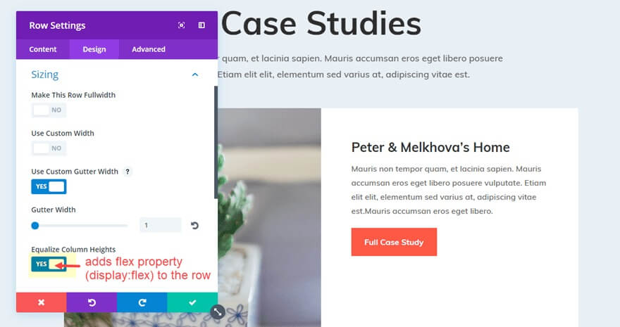
The second row on the page (the one immediately below the row with the page title) should have its row settings opened. Open the Sizing option group under the design settings toggle and you'll see that "Equalize Column Heights" is already selected. This indicates that the row has been given the flex property ("display: flex;").
Next, add the following CSS snippet under the input box for Column 2 Main Element on the same row's Advanced tab settings.
Create Amazing Websites
With the best free page builder Elementor
Start Nowmargin: auto;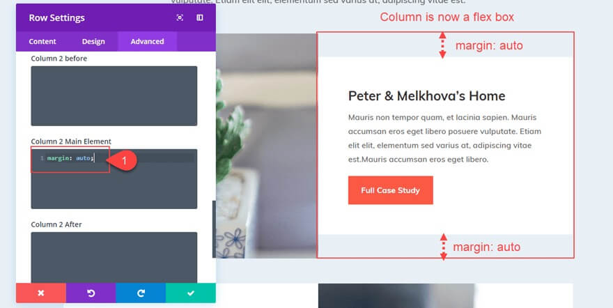
The content of the second column has now changed and is now vertically centred.
Making the Content Bottom Aligned
You can alter the margin value as follows to make your content bottom aligned so that all modules stack at the bottom of your column:
margin: auto auto 0;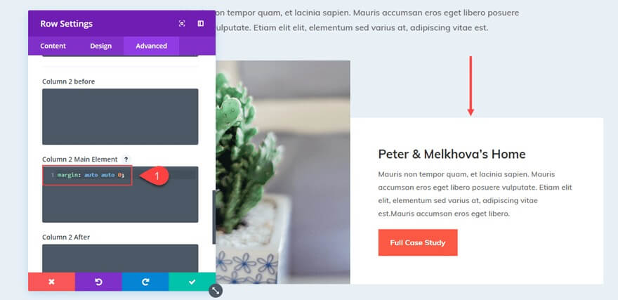
Aligning Content Vertically for All Columns
You can vertically centre the content of all the columns in your row by adding the following code to the main element of your Row settings, as opposed to adding "margin:auto" to each column individually.
align-items: center;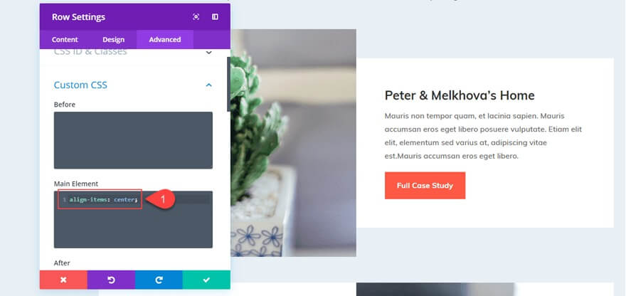
Alternatively, you may include the following snippet if you want the entire content of your columns to be bottom aligned:
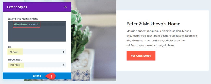
align-items: flex-end;Additionally, keep in mind that you may utilize Divi's Extend Styles functionality by selecting "Extend Main Element" from the context menu when right-clicking on the main element that contains your CSS snippet.
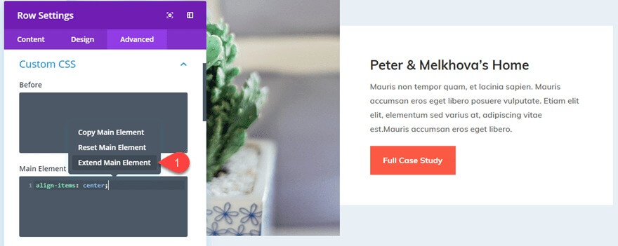
To vertically centre all of the information in each column on the page, extend the CSS for the main element to all rows throughout the page (or section).
The entire scene is now vertically balanced.

However, you might have observed that the white backdrop of the column is no longer the entire height of the row. This is as a result of the column's addition of "margin: auto". You could remedy this by removing the row padding and changing the row background colour to white. Instead, I'll demonstrate how to centre your column's text while keeping the margin intact.
Wrapping Up
Although this approach on Divi does depend on a few tiny pieces of custom CSS, I think the application can be very helpful for individuals searching for a quick resolution to an occasionally time-consuming process. If you can think of any more instances when this may be useful, please let me know. Please feel free to comment below with your thoughts.