
As a Divi developer, understanding the WordPress row block is crucial to creating visually appealing and organized content for your website. The row block serves as a design element that allows you to arrange your content in a horizontal row, making it a versatile block that can be used in various areas of your WordPress editor.
From creating custom templates to organizing content within posts and pages, a row block is an essential tool that can help you take your website design to the next level. With its drag-and-drop interface and customization options, the row block allows you to easily create dynamic layouts and arrange content in a visually pleasing manner.
By mastering the use of this block, you can enhance the user experience of your website and create a cohesive and professional design. Whether you're new to Divi or a seasoned developer, understanding the WordPress row block is a must-have skill that will take your website design to the next level. So let's dive in and explore the many possibilities of this powerful tool.
Introduction To WordPress Row Block
The row block functions similarly to the stack block. Instead of displaying items vertically, it displays blocks horizontally across the parent container's available space. By default, the block will evenly space the blocks contained within it - and on smaller screens, it will display content in a grid format using the flex CSS property.
Create Amazing Websites
With the best free page builder Elementor
Start Now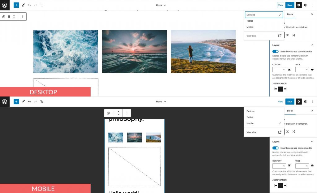
The row block isn't required if you're using a page builder like Divi. The Divi Builder can be used to add rows and other elements with more advanced design options.
Adding The Row Block To The Post or Page
We'll add it using the Twenty Twenty-Three theme for this post, but you can use any block theme or full site editing theme to follow along. Begin by logging into your WordPress account. Then, create a new page.
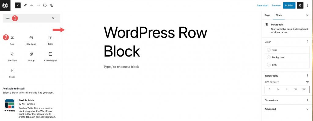
There are two ways to add the block from the block directory to your site. The first method is to employ the block inserter. At the top left of your page, click the block inserter icon.
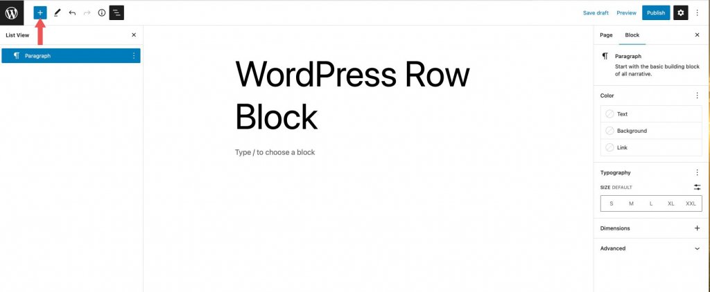
Then, in the search bar, type row. Locate it in the search results and either add it by clicking or dragging it into the page editor.
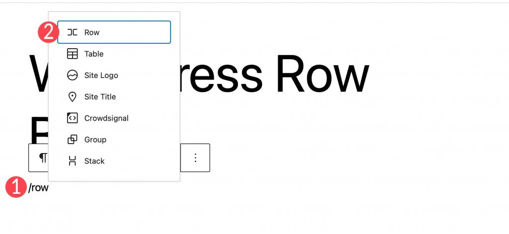
To add the block, click the + icon on the page editor, or simply begin typing /row to reveal the block results. Insert the row block into the page by clicking it.
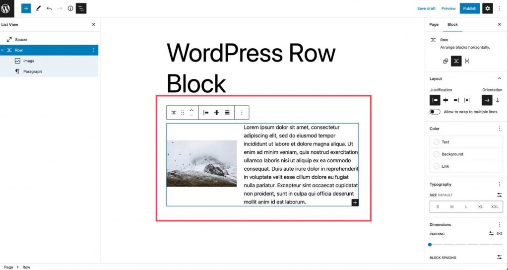
After adding a row to the page, you can insert as many blocks as you want within that row. Whether or not you stack the blocks determines how they appear. We'll go over this in greater detail in the following section. By default, when you add blocks, they appear in the row from left to right.
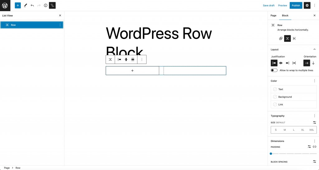
Row Block Settings and Options
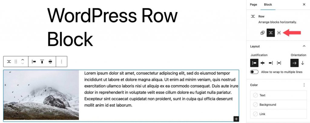
Toolbar Settings
The toolbar settings group contains several settings, as shown in the image below:
- Transform to
- Drag
- Move
- Justification
- Vertical alignment
- Width
- More options
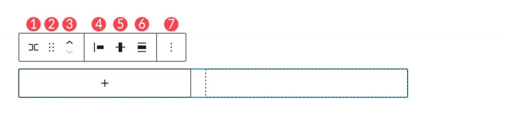
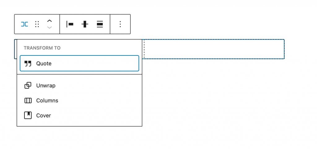
The first option is to transform to. You have a couple of options here.
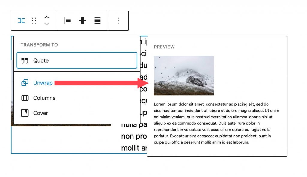
The row can be converted into a quote, unwrapped, converted to columns, or converted to a cover. When you unwrap a row, the blocks within it stack on top of each other instead of being displayed from left to right. Gutenberg will show you a preview of how your row will appear once unwrapped.
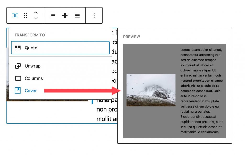
When you convert it to a cover, you can add a background image, background overlay, and padding. When you select this option, your row is converted into a cover block, but the blocks within the row remain.
You can reposition the block anywhere on the page by dragging it. This is useful for complex page designs with multiple sections of content. Similarly, move allows you to move the row up and down the page without having to drag it.
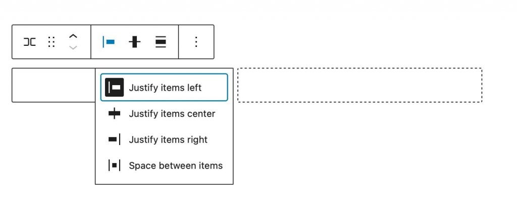
You can use the justification setting to justify the items in your row to the left, center, or right, or to evenly space the items in your row from left to right.
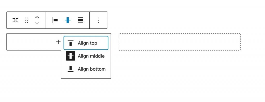
You can use the alignment tool to align the blocks in the row to the top, middle, or bottom.
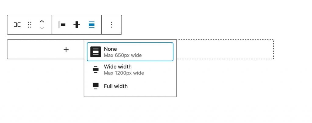
The width of the block can be set to a maximum of 650px, 1200px, or full width. Full-width rows span the entire width of the page, which is ideal for rows that have been converted to covers or call-to-action sections.
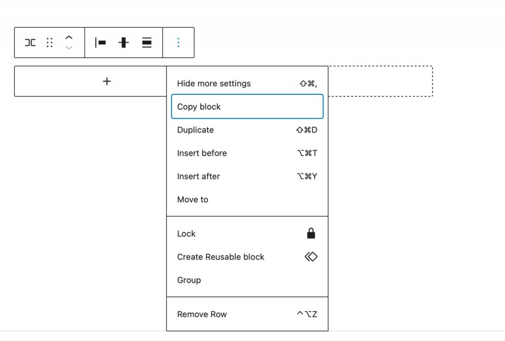
More Options allows you to copy, duplicate, insert, move, lock, group, ungroup, remove, or create a reusable block from the row.
Additional Block Settings
Additional settings contain a number of options. Click the block tab in the row block's sidebar settings to access the block's additional settings.
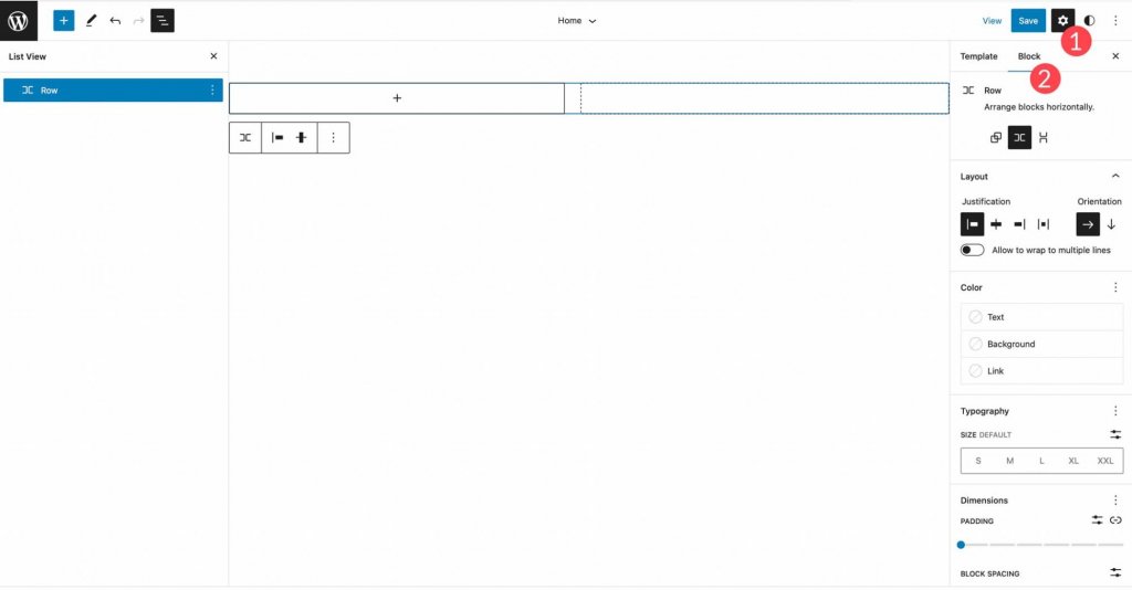
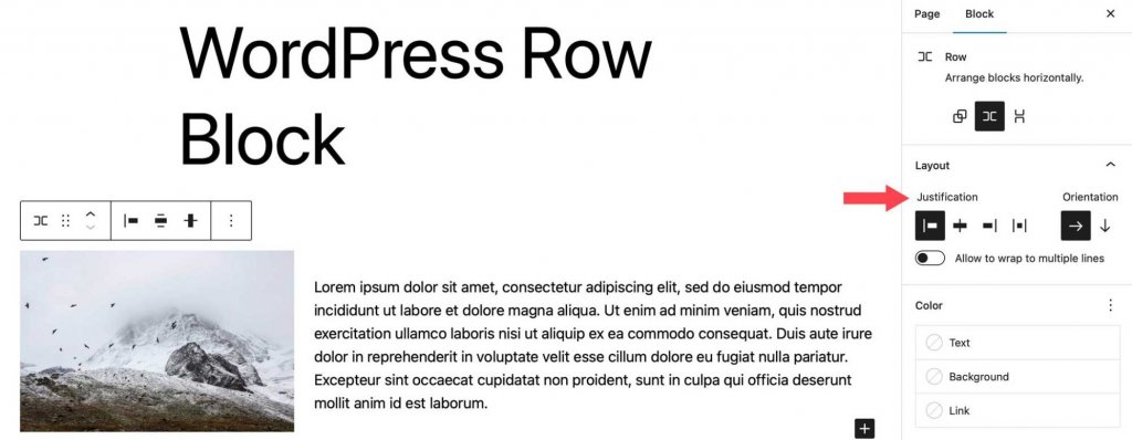
To begin, you can arrange blocks in your row horizontally or vertically.
Following that, you can configure justification and orientation, as well as set blocks to wrap to multiple lines. The options for justification are the same as in the toolbar settings. You can align your blocks to the left, middle, or right, or space them evenly. Orientation works similarly to the arranged options in that it allows you to choose between horizontal and vertical orientation.
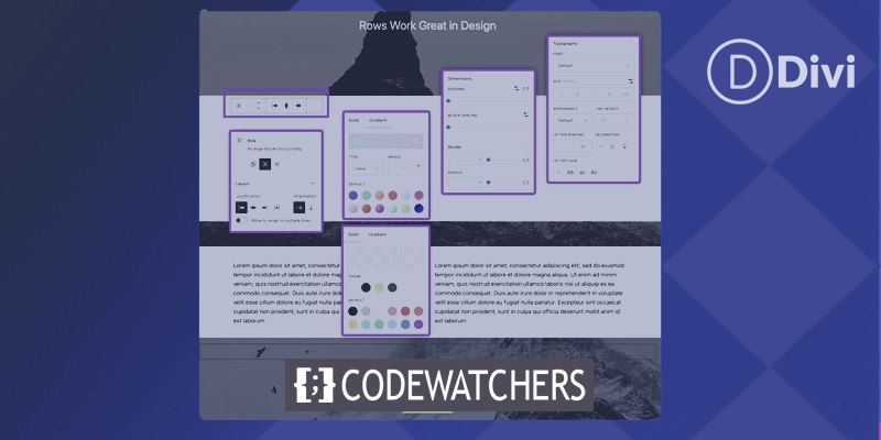
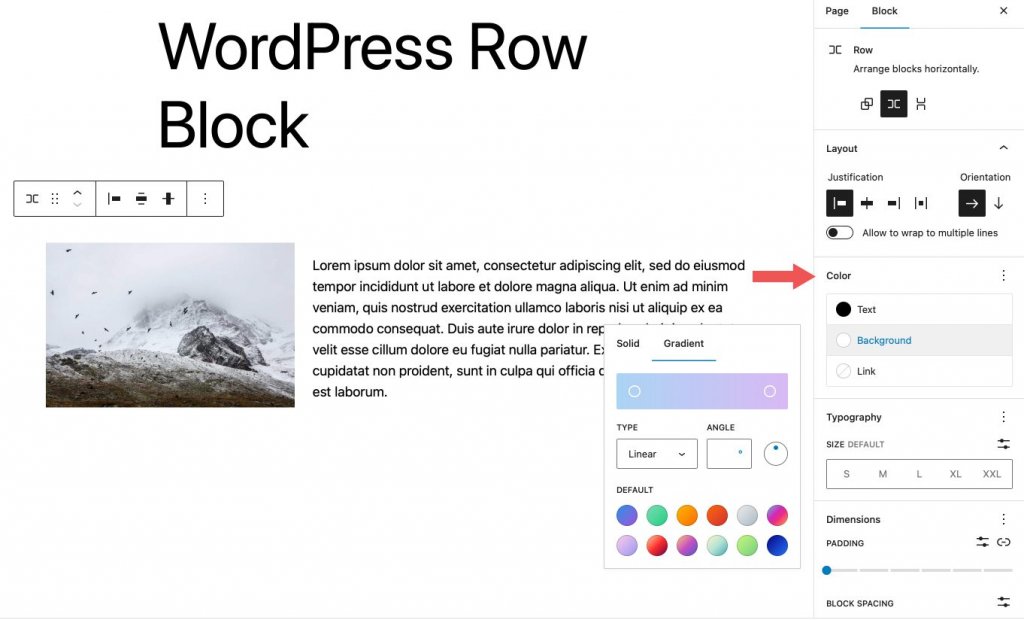
Colors for text, background, and links in the row's blocks can be changed under color options. Depending on the theme, gradient background colors as well as solid colors are available.
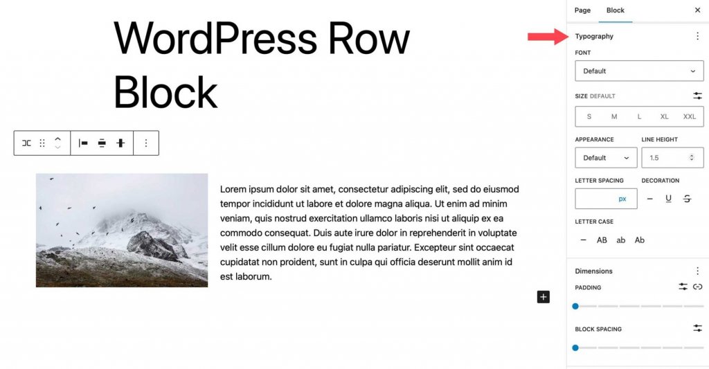
Typography options can be applied to any text in your row. Font family, font size, font weight (appearance), line height, letter spacing, text decoration, and letter case can all be customized.
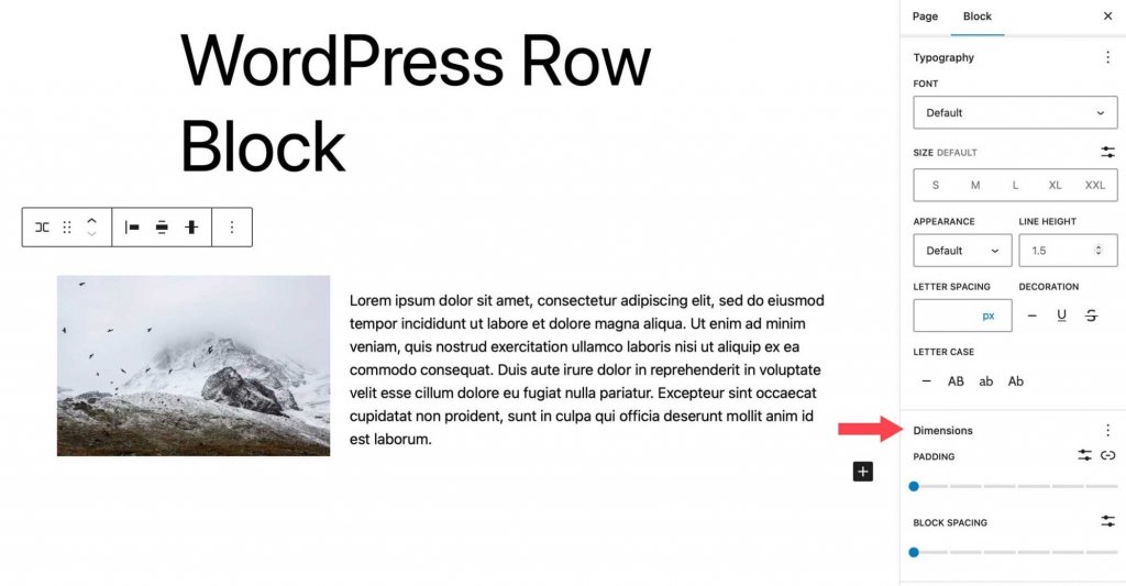
Padding and block spacing is controlled by dimension settings. The amount of space between blocks is controlled by block spacing.
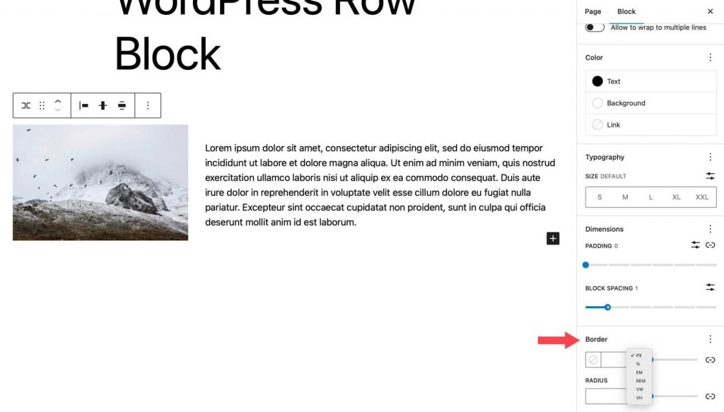
The final setting governs the row's border as well as its border-radius. Pixels, percent, em, rem, vh, and vw are all units.
Best Practices for Using the Row Block Effectively
The row block is a highly versatile tool that offers a wide range of capabilities, including the application of visually appealing effects and the organization of content. To maximize the utility of this block, there are several key considerations to bear in mind. One of the primary advantages of using a row block is the ability to apply various effects to groups of blocks. For instance, when designing call-to-action sections for a website, while a call-to-action block may be useful, its functionality is restricted. By contrast, utilizing a row block provides the flexibility to include any desired type of block.
Moreover, the use of a row block facilitates the customization of width, vertical alignment, and background options for a set of blocks. This feature is particularly beneficial when highlighting a specific area of a website, such as a group of posts.
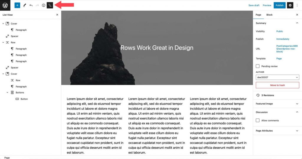
Another helpful tip for working with rows is to make use of the list view. This feature can be advantageous when dealing with a large number of blocks on a single page, enabling easy identification of row boundaries, relocation of blocks within a row, and addition of new blocks in desired locations.
Wrapping Up
The row block is an important design element for organizing your website's content. It can be used in templates, posts, and pages, and it can contain an unlimited number of blocks. It's useful for making template parts like headers that display multiple blocks. A header row, for example, could include the site logo, page list, social icons, and a call to action button. This block is essential if you're building a website with blocks.


