
Elementor Flexbox is a new way to structure layouts that makes designing websites easier and more efficient. It's a step forward from the old section-column layout that we're all used to.

The old layout was handy with its sections, sub-sections, and columns, but it lacked design flexibility. Each Elementor section could only contain columns and one sub-section. Adding too many of these elements to a page would slow down your website.
And making designs that worked well on mobile devices was also a hassle with the old setup.
While the section-column layout did its job, it's time to embrace a better, more flexible way of designing websites using Elementor's page builder.
Create Amazing Websites
With the best free page builder Elementor
Start NowIf you're keen on learning about Flexbox containers, save this blog. We'll guide you through all the important details about this new layout structure and show you why it's an improvement over the old section-column layout.
What is Elementor Flexbox Container?
Elementor Flexbox containers are a way that Elementor, a website builder, uses a design technique called CSS Flexbox. This technique, based on CSS 3, helps arrange things on a web page.
Flexbox is great because it makes sure your web page looks good and works well on different devices and screen sizes.
Elementor introduced Flexbox containers with its 3.6 update. These containers help you create web pages that adjust to devices. They're like special boxes that hold your text, pictures, and widgets. The cool thing is, you can even put these boxes inside other boxes.
If you've used regular layouts with sections and columns, you know it can be tricky, especially with different layouts like blocks or tables.
But with Flexbox, you can keep nesting boxes inside each other as much as you want. This opens up tons of possibilities for unique designs.
In simple words, these containers act like sections, but they're super flexible. You can adjust lots of things about them, like how they line up, the space around them, and where they sit on the page.
How to Use Elementor Flexbox Containers?
The way you build pages with Elementor Flexbox is pretty much like using the regular Elementor blocks. So, whether you're new to Elementor or switching from the old version, you won't have any trouble adjusting.
You might be wondering about things like "how to turn on/container in Elementor? How do you put containers in Elementor? How to add a container in Elementor?" This part will give you the answers you need.
To help you begin, here are the steps for using Flexbox containers to design your website:
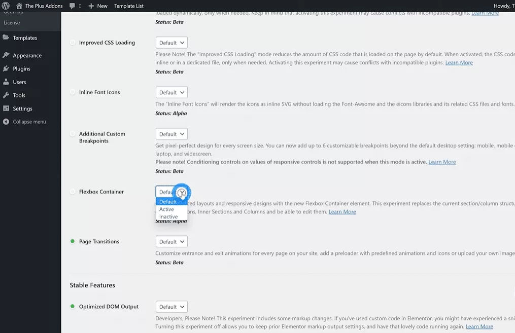
Step 1. Turn on Flexbox in Elementor Settings
Before you can use the new containers, you need to activate Flexbox. So, go to Elementor settings in your WordPress dashboard. Click on the Experiment tab, scroll down, find the Flexbox container option, and choose Active from the drop-down menu. Save your changes and move to the next step.
On new websites, the Flexbox container is already active by default.
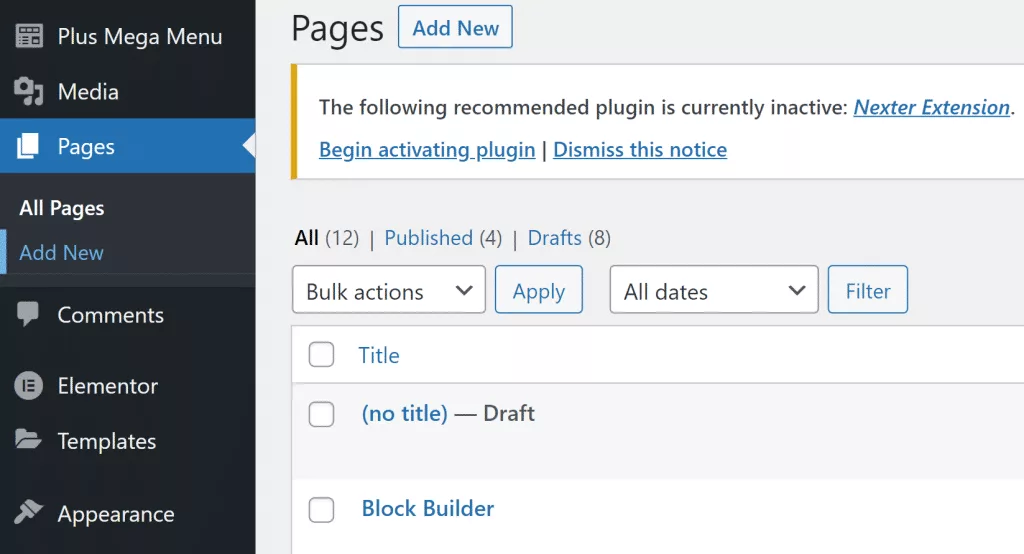
Step 2: Make a New Web Page
First, let's create a new page just like we usually do. Go to the Pages section, choose All Pages, and click on Add New.
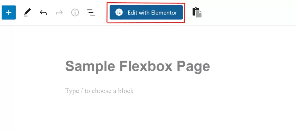
Step 3: Open Elementor
Now you'll see the WordPress page builder window on your screen. Give a title to this new page and click on Edit with Elementor to start using Flexbox containers.
Step 4: Add a New Box
You'll have a familiar Elementor page builder interface. Also, you can add a new box by dragging and dropping it from the sidebar. Or, you can click on the + symbol and pick a structure you like.
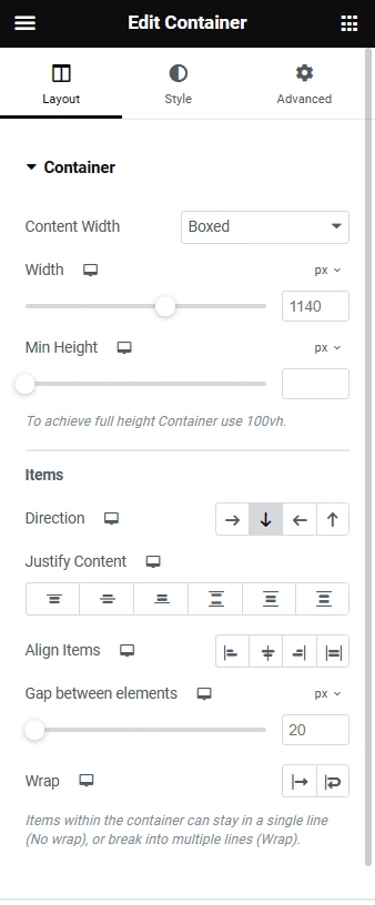
Step 5: Style the Box
Once you've added a box, you'll find many ways to make it look how you want. You can adjust things like the type of box, how wide or tall it is, which way it faces, how it lines up, and more.
Step 6: Drag and Put Widgets in Boxes
Putting widgets inside boxes is easy too. Just select the widget you want from the Elements tab, then drag and drop it onto the + icon in the box.
Step 7: Change Widget Look
Just like you changed settings for the whole box, you can also change how things look inside the box. You can change things like which way they face, how they line up, how much space is between them, and more.
Step 8: Share Your New Flexbox Web Page
You can make lots of boxes, make copies of them, and change where they are. Keep doing these steps as you add more things. Once you're finished, click the Publish button to make your web page live. You can also click the Preview button to see how your new Flexbox web page works.
Wrapping Up
In conclusion, you've now learned about Elementor Flexbox containers. If you're already familiar with Elementor, the new Flexbox builder should be easy for you to grasp. And if you're a beginner, following this guide will help you work with Flexbox without any trouble.