
One easy way to make your website look good is by using Divi's Divider module. Divi dividers help create a sense of space between things on your page, making the design balanced. They can also add empty areas to the design without just leaving them blank. Plus, dividers are great for showing off your brand by customizing them with colors, line styles, and more! In this post, we'll talk about why dividers are useful in designs and share some ways you can use them in your next web design project. Let's begin!

Why Use the Divider Module?
Whitespace is a crucial design element on websites, influencing how users navigate and interact with the page. It divides elements, directs attention, and contributes to overall balance. Increasing whitespace around an element makes it stand out. The spaces between paragraphs are as vital as the text itself for creating intentional balance.
In web design, whitespace should feel purposeful, aiding smooth transitions between page sections. Divider modules in Divi are versatile tools, easily adding whitespace, breaking up content, and enhancing balance. They can also introduce color and style, creating harmony between different elements like text modules or images. Examples of how dividers can be utilized are provided.
Define Headings
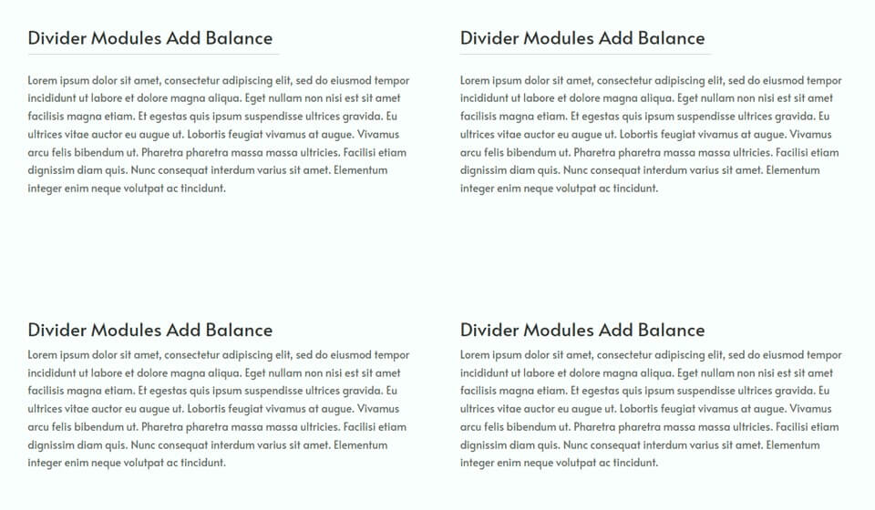
Using dividers in your web design to create balance can be effectively done by placing them between headings and body text. This separation helps distinguish the heading text from the body text, making it easier for website visitors to quickly scan and find information.
Create Amazing Websites
With the best free page builder Elementor
Start NowFor instance, adding a subtle divider line between the heading and body text enhances separation and balances the design, as seen in the example compared to blurbs below without a divider.
Another example demonstrates dividers styled to match the overall page design, a topic that will be discussed further.
Separate & Group Elements
Divider modules help achieve visual balance on your website by separating sections and clarifying which information is grouped. Including a simple divider module can enhance navigation for visitors, improving the overall user experience.
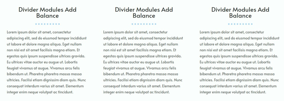
For instance, in this example, light grey dividers were used to delineate major sections and separate bullet points. The subtle and unobtrusive design of the divider adds separation to the page without being overly distracting.
Reflect your Branding
Divi's divider module allows customization with any color, enabling the incorporation of branding colors into the layout. By adjusting settings like width, weight, and line style, unique dividers can be created, reflecting branding and enhancing design balance.
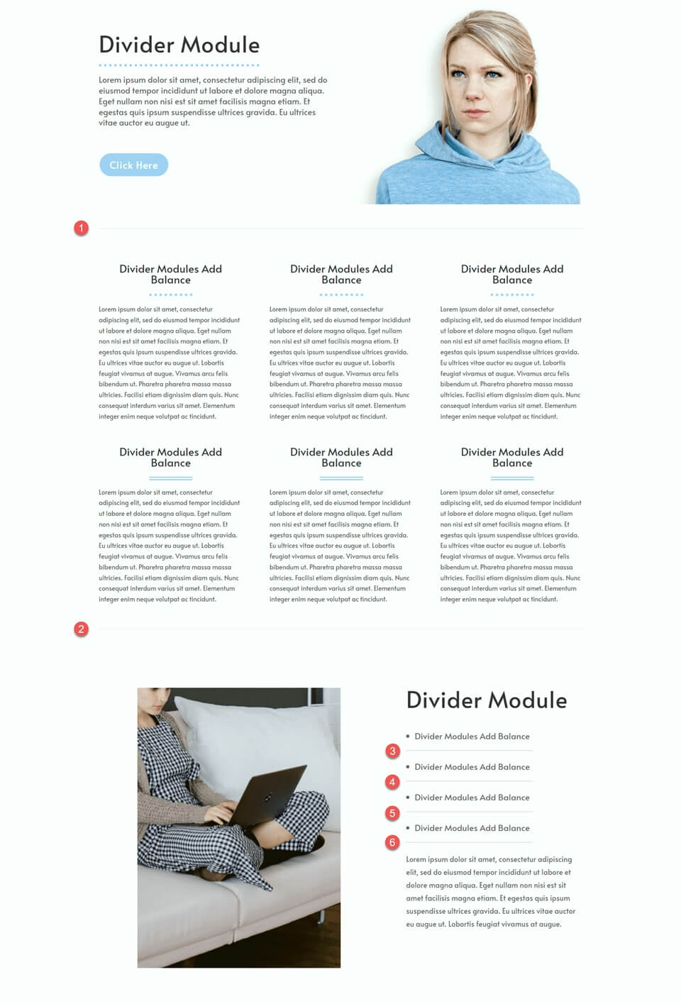
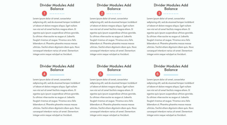
The example demonstrates various divider styles, showcasing the versatility to align the design with branding. Beyond functionality and user experience, dividers present an opportunity to reinforce website design and highlight brand colors.
How to Use Divi Divider Modules to Create Balance in Your Design
Now that we've talked about the advantages of including dividers in your website design, let's move on to the tutorial section of this article. We'll be adding dividers to a pre-made layout from the Divi Library.
First, install and activate the Divi Theme, ensuring you have the latest version on your website. Now you're all set to begin!
Create a New Page
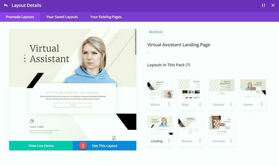
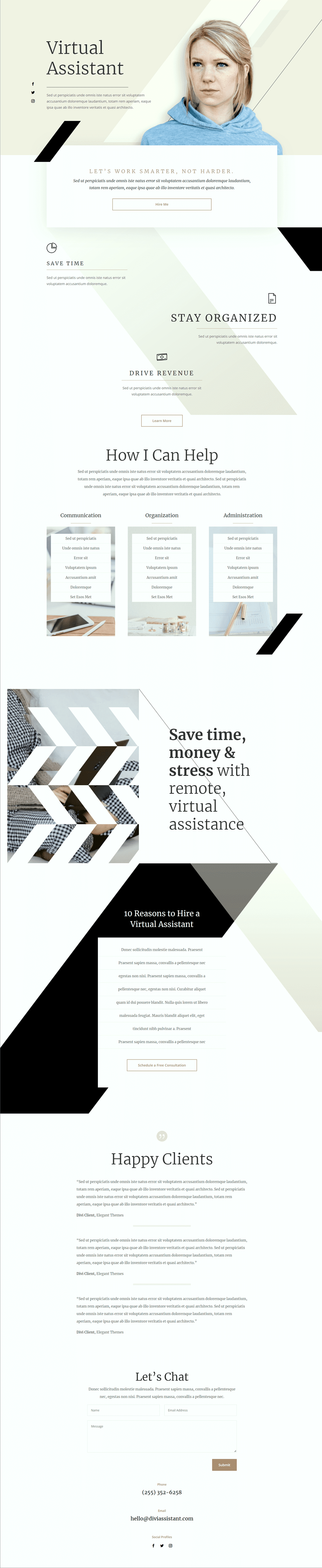
Begin by selecting a premade layout from the Divi library. In this case, we'll use the Virtual Assistant Landing Page from the Virtual Assistant Layout Pack. Create a new page on your website, give it a title, and then choose the option to Use Divi Builder.
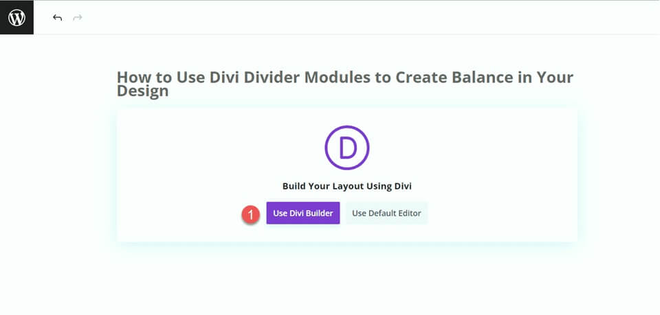
For this example, choose a premade layout from the Divi library by selecting "Browse Layouts" and then select select the Virtual Assistant Landing Page.
Hero Section Modification
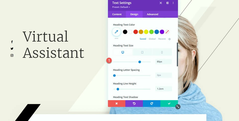
To make our first change, let's add a divider and some body text to the hero section. Start by opening the settings for the "Virtual Assistant" text. Then, go to the Design tab and navigate to the Heading Text settings. Change the font size to 80px for desktop.
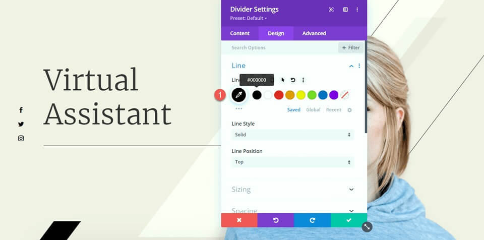
Now below the virtual assistant text, add a divider.

Access the divider settings and go to the Line settings under the Design tab. Set the Line color to #000000.
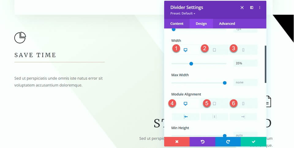
Now, adjust the width and module alignment under the Sizing options.
- Width: 75%
- Module Alignment: Left
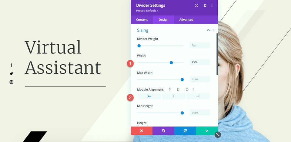
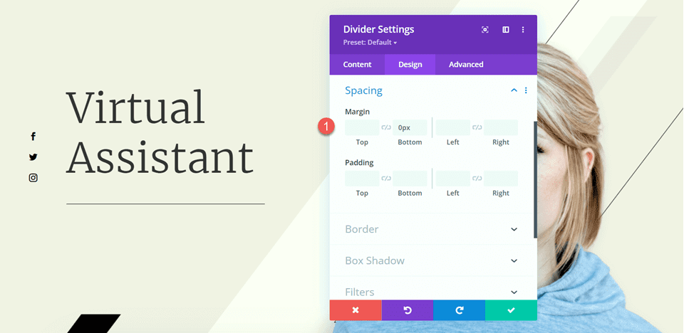
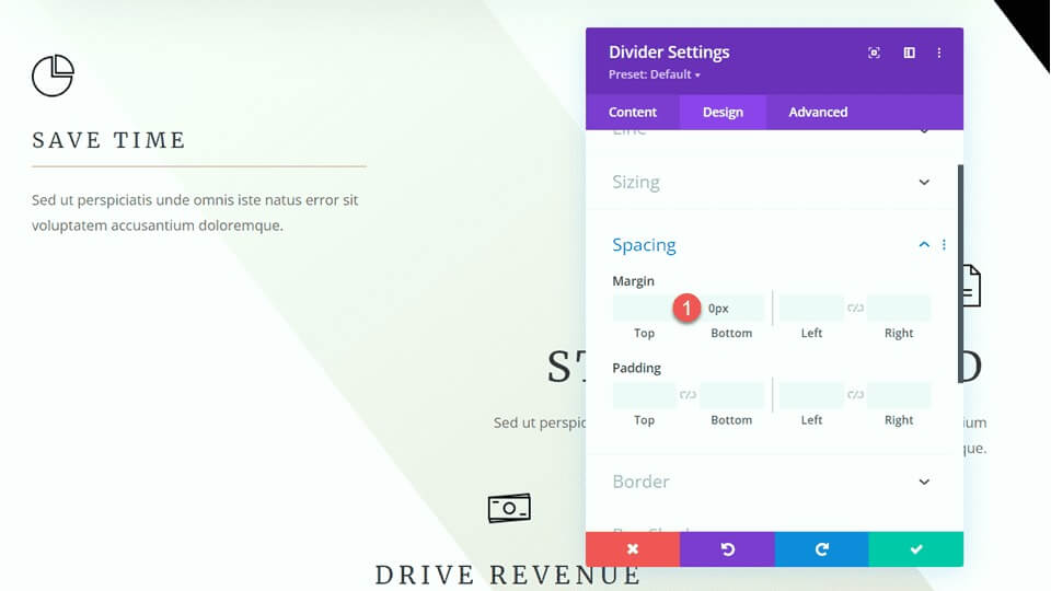
Afterward, configure the bottom margin in the Spacing settings.
- Margin Bottom: 0px
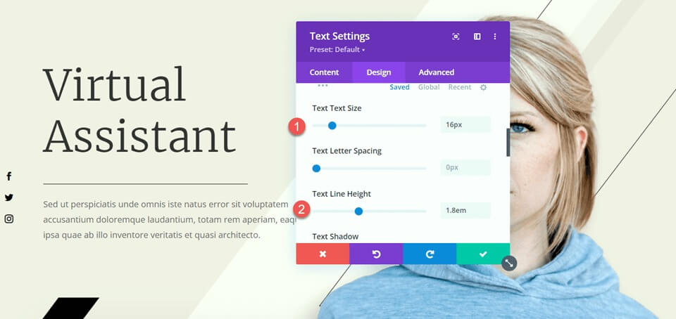
Now, add a text module below the divider and insert your text. Open the text module settings and navigate to the Text settings under the Design tab. Adjust the text size to 16px and set the line height to 1.8em.
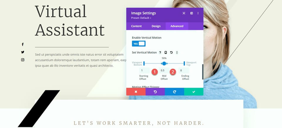
The final adjustment for this section is to modify the scroll effects for the black bar to ensure it doesn't cover the added body text. Open the image settings, then go to the scroll effects section in the Advanced tab. Change the Mid Offset to 0.5 and set the Ending Offset to 0.
Features Section Modification
Now, let's focus on the section with the blurbs. To enhance the balance of the layout, we'll insert dividers between the headings and the body text. Since these are blurb modules, we can't directly add a divider between the heading and the body. Therefore, we need to move the body text to a separate text module first.
Copy the body text from the "Save Time" module, and then delete the text from the blurb module, leaving only the heading and the icon.
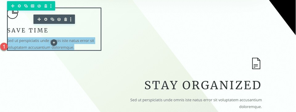
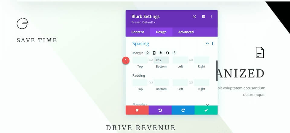
Go to the Spacing settings for the blurb module and adjust the bottom margin.
- Margin Bottom: 0px
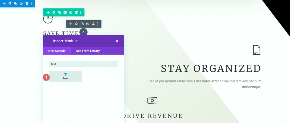
Afterward, add a new text module below the blurb, and paste the body text.
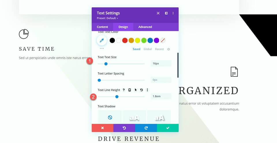
Open the text module settings and customize the text size and line height.
- Text Size: 16px
- Text Line Height: 1.8em
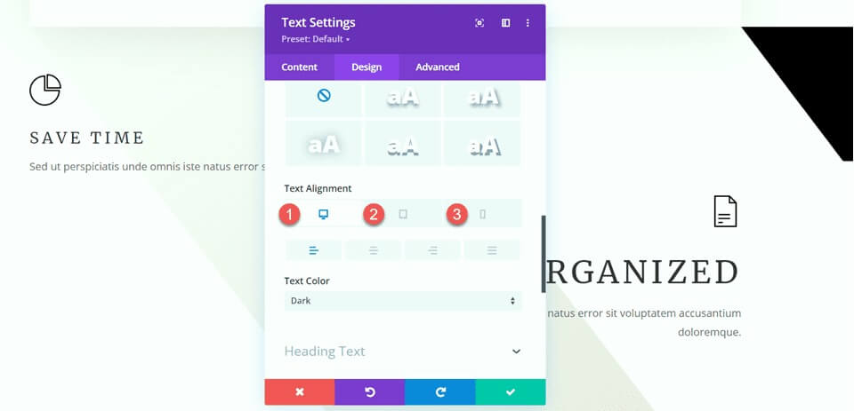
This module will be left-aligned on desktop and center-aligned on tablets and mobile devices. Utilize the responsive options to set different alignment settings for various screens.
- Text Alignment Desktop: Left
- Text Alignment Tablet: Center
- Text Alignment Mobile: Center
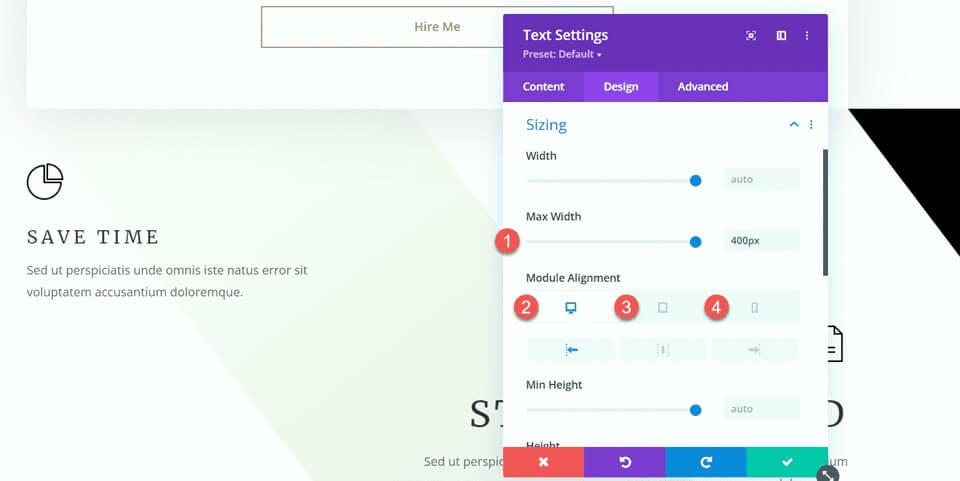
Proceed to the Sizing options and set the Max Width. Also, use the responsive options to define the module alignment.
- Max Width: 400px
- Module Alignment Desktop: Left
- Module Alignment Tablet: Center
- Module Alignment Mobile: Center
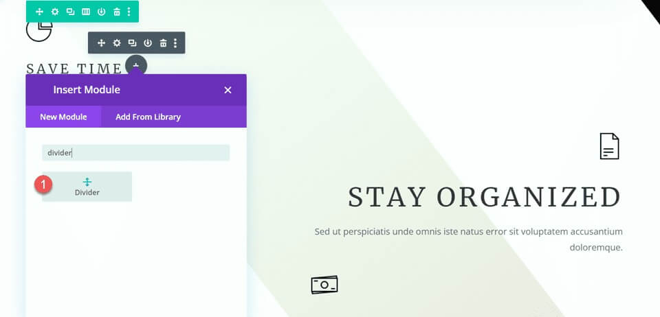
Now, you can insert the divider module between the blurb and text modules.
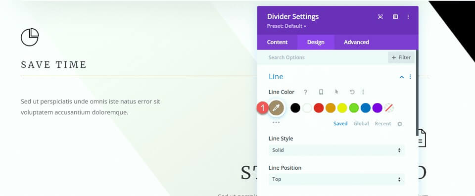
Open the Divider settings. In the Line settings, set the line color to match the page's theme by using the brown color: #a78e6e.
Next, go to the Sizing settings and use the responsive options to configure the width and module alignment as follows:
- Width Desktop: 35%
- Width Tablet: 40%
- Width Mobile: 50%
- Module Alignment Desktop: Left
- Module Alignment Tablet: Center
- Module Alignment Mobile: Center
Finally, remove the bottom margin.
- Margin Bottom: 0px
Modifying “How I Can Help” Section
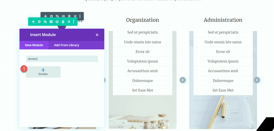
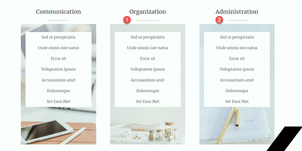
For our next adjustment, let's add dividers to the "How I Can Help" section. Specifically, add a new divider module below the "Communication" heading.
Open the Divider settings and change the line color to match the page's theme: #a78e6e.
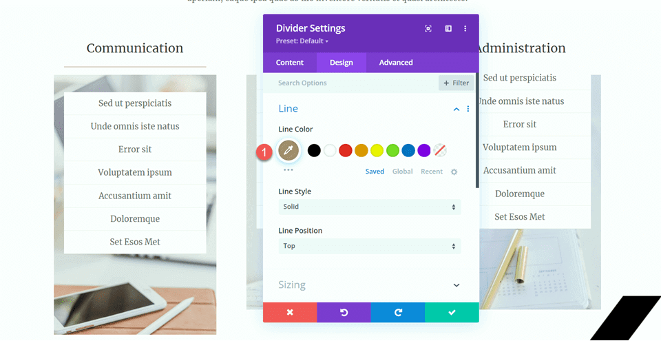
Next, adjust the width and module alignment in the Sizing settings.
- Width: 34%
- Module Alignment: Center
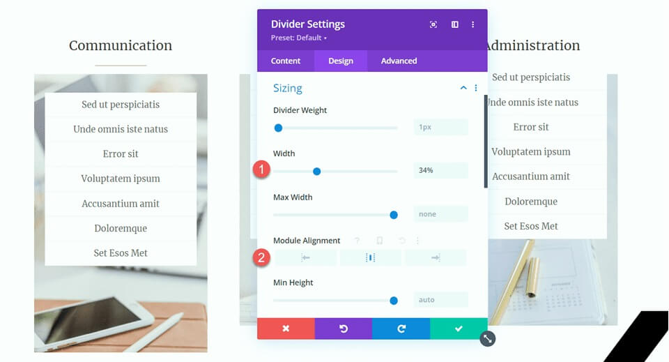
Then, copy the divider module and paste it under the "Organization" and "Administration" headings.
Happy Clients Section
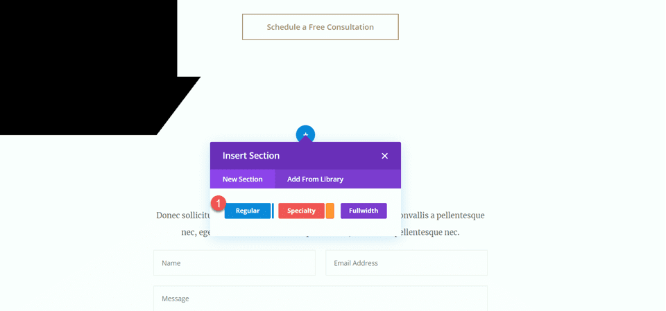
To finalize our design, we're introducing a new section dedicated to showcasing testimonial quotes, each elegantly separated by dividers. Here's a step-by-step guide to achieve this:
Begin by scrolling down the page and inserting a new regular section between the existing “10 Reasons to Hire a Virtual Assistant” and the “Let’s Chat” sections. Within this new section, create a row with a single column to structure the upcoming elements.
Now, add an icon module to the column, selecting the quote icon to visually represent the testimonials. Customize the icon by setting its color to #e4ded7 and adjusting the size to 50px for a balanced visual appeal.
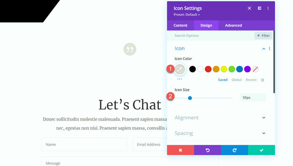
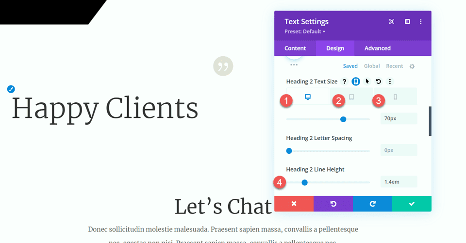
Directly below the icon, introduce a text module with the heading "Happy Clients" (H2). Open the heading settings and style it with a light Merriweather font for a sophisticated look.
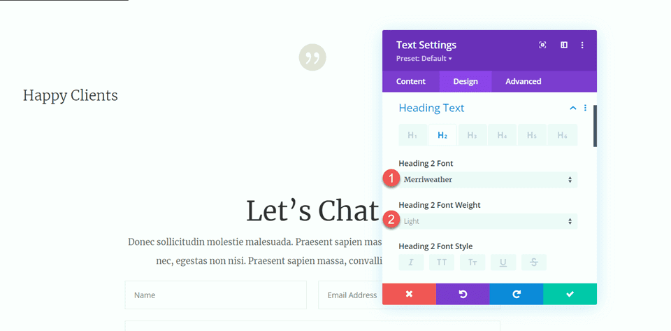
Fine-tune the text size using responsive options:
- Desktop: 70px
- Tablet: 40px
- Mobile: 30px
- Ensure a consistent line height of 1.4em for a harmonious design.
In the Sizing options, set the max width of the module to 800px and align it to the center for optimal presentation.
Add another text module below the heading, incorporating the testimonial text.
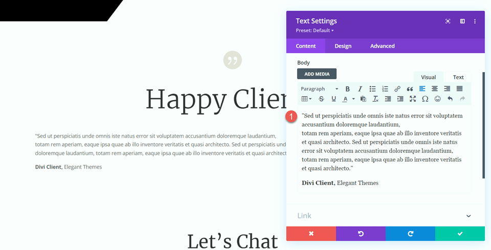
Under the Design tab, set the text font to Merriweather for a consistent and polished appearance.
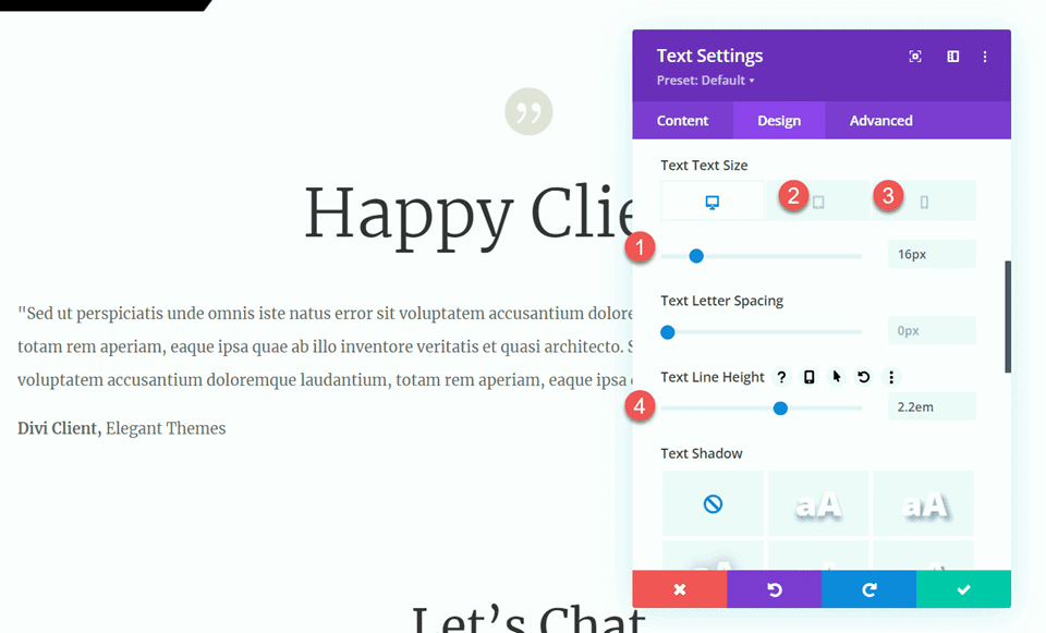
Fine-tune the text size using responsive options:
- Desktop: 16px
- Tablet: 14px
- Mobile: 14px
- Maintain a line height of 2.2em to ensure readability.
Introduce a divider module below the testimonial text to create visual separation. Customize the line color to match your theme and opt for a double line style for added elegance.
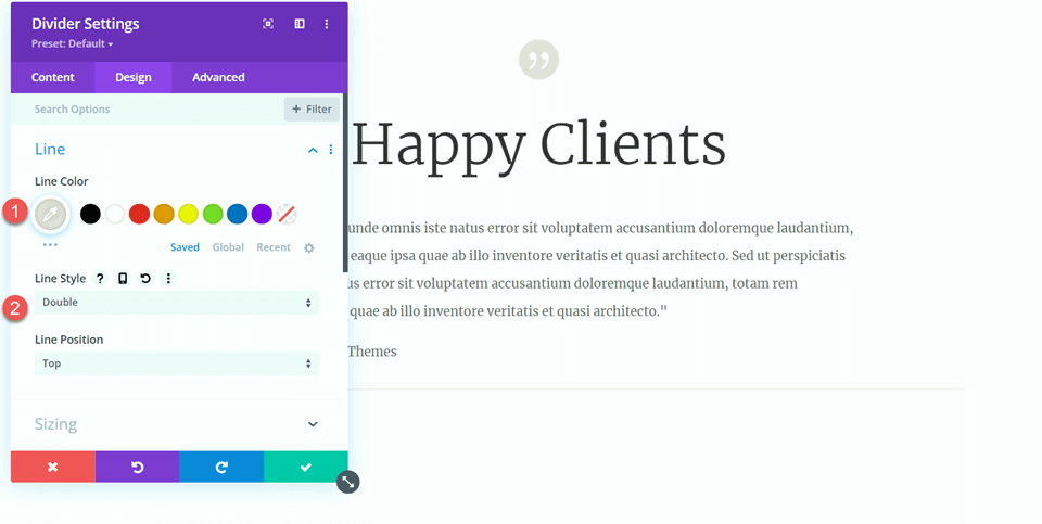
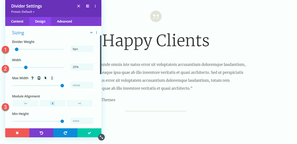
In the Sizing settings for the divider, adjust the divider weight to 6px, set the width to 25%, and align the module to the center for a balanced composition.
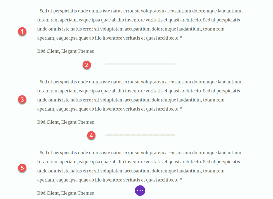
Duplicate the body text module twice and the divider once to create three text modules with two dividers in between. Arrange these modules to ensure the dividers are appropriately positioned between the text modules.
With these steps completed, your design is now polished and ready for presentation.
Final Output
Now, let's review our final design. As you can observe, we've successfully introduced balance and structure throughout the page by strategically incorporating dividers. These elements not only enhance the visual appeal of the content but also contribute to a more organized and harmonious layout. The dividers serve as effective separators, creating a well-defined and aesthetically pleasing presentation.
Wrapping Up
Hopefully, this article has illustrated the simplicity and effectiveness of using dividers as a tool to achieve balance and incorporate whitespace into your website design. The Divi divider module, with its wide range of customization options, allows you to craft visually appealing dividers that not only enhance the overall design of your website but also align with your brand's unique style and color scheme. By leveraging dividers, you can effortlessly elevate the aesthetics of your Divi website and create a design that resonates with your brand identity.