Even though a traditional resume never goes out of style, it's worth exploring new avenues to display your skills effectively. One such option is creating an online resume website, which can be particularly beneficial if you're seeking a job in the tech industry. In this step-by-step tutorial, we'll guide you on using Divi and the FREE Creative CV Layout Pack to craft an impressive online resume website design! Additionally, we'll highlight how to make the most of the built-in Divi Circle Counter Module to showcase your achievements in a captivating way."
Whether you're a seasoned professional or just starting your career, having an online resume website can give you a competitive edge, allowing potential employers to easily access and appreciate your skills and accomplishments. Don't miss out on this opportunity to stand out in the tech job market!"
Install the Layout Pack
In this tutorial, we'll be exploring how to enhance the home layout of the pack using the Circle Counter Module in Divi. This fantastic native module allows you to beautifully showcase your skill set with its clean lines, animations, and other impressive features. By incorporating it into your layout, you can present your skills in a visually engaging manner, giving your resume a unique edge. So let's get started and see how the home layout looks out of the box!
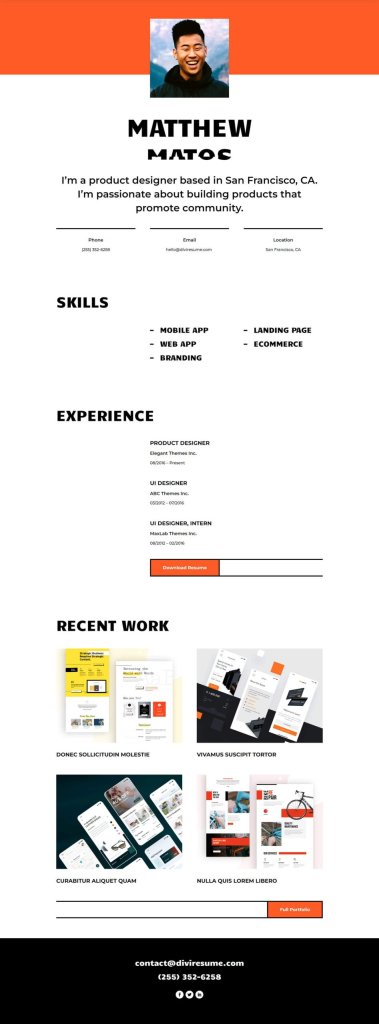
Skills Section
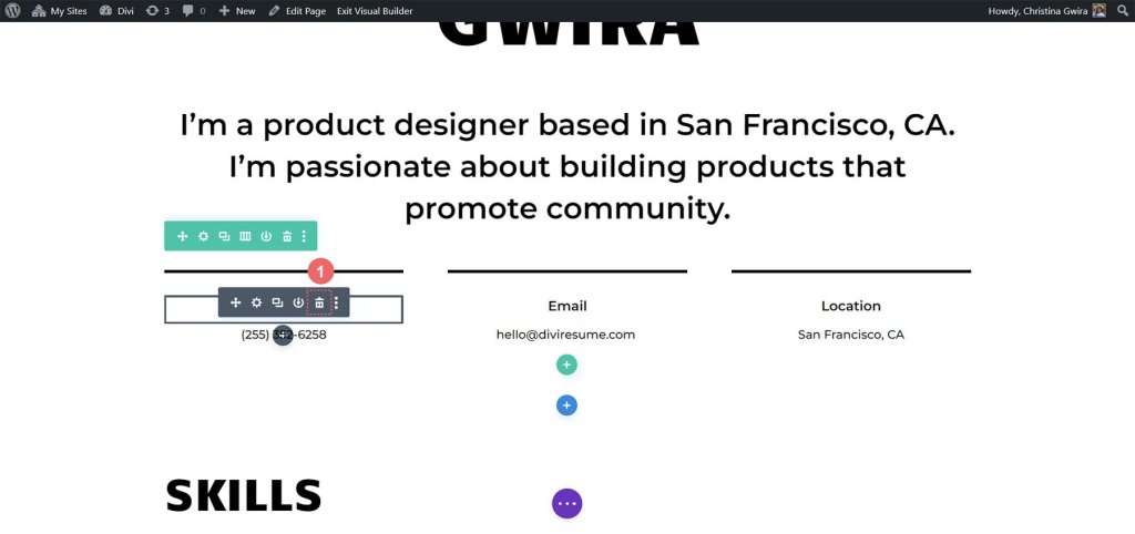
Remove the Text Modules. To do this, just hover your mouse over each module, and you'll see a trash can icon in the Module Settings menu that pops up. Click on that icon to delete the Text Modules.
Create Amazing Websites
With the best free page builder Elementor
Start Now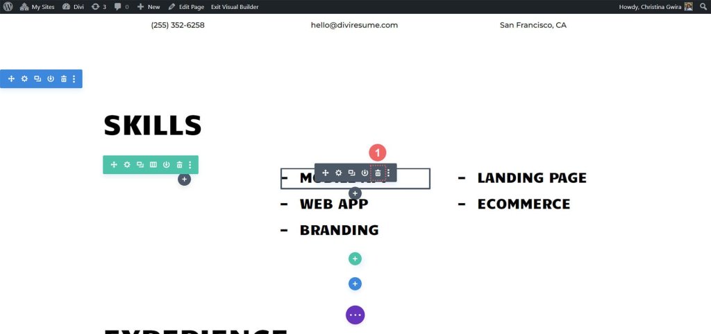
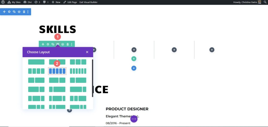
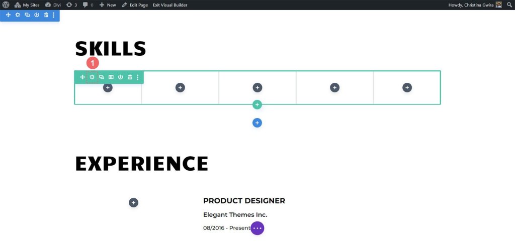
Adjust the row structure. Look for the grid icon in the hover menu of the row. Click on it. Then, choose the number of columns you want to use for showcasing your skills. For our example, we'll go with 5 columns, so click on the icon for 5 columns.
We want to add borders to each column in the row, similar to the borders used in the Creative CV Layout Pack. To achieve this, simply click on the gear icon, and a modal box called Row Settings will open up.
Now, go to the Row Settings and find the gear icon on the first column.
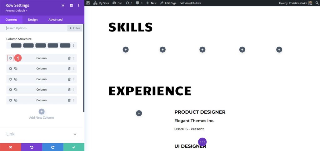
Clicking on the gear icon will open up the Column Settings for you. Once you're there, navigate to the Design tab. From there, go to the Border tab.
Now, we want to add a thick, black border at the bottom of each of the 5 columns in this row. To do this, use the following settings:
Border Weight: 5px
Border Color: #000000
Border Style: Solid
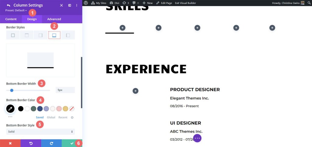
After you've entered your settings, simply click on the green checkmark to save your column preferences. Repeat these steps for the other columns in the row. Once you've finished setting up all the columns, don't forget to save the entire row.
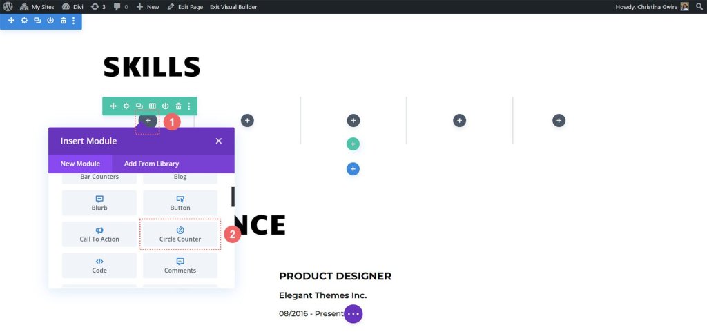
Add Circle Counter Module
Now that we've laid the groundwork, it's time to bring in the star attraction - the Circle Counter Module. To get started, simply click on the gray plus icon located in the first column. Next, choose the Circle Counter icon to add this fantastic module to the row.
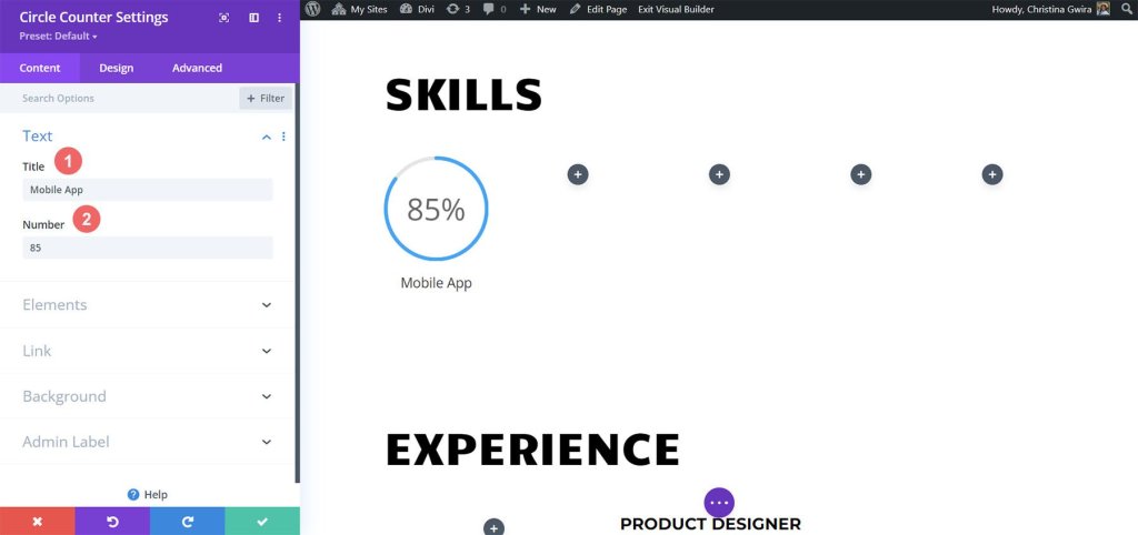
We're going to draw inspiration from the branding of the Creative CV Layout Pack to give a stylish look to our newest addition. Let's begin by adding the skill we want to showcase in the Title field under the Content tab. After that, include the percentage that represents your proficiency in that skill. Remember, being authentic is crucial when building your personal brand and presenting yourself online.
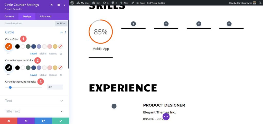
Now, let's take the brand design of the Creative CV template as a reference and proceed to the Design tab. Here, we'll add some color to our Circle Counter Module. In the Design tab, click on the Circle option. To style the circle part of our module, use the following settings:
Circle Design Settings:
- Circle Color: #fe5a25
- Circle Background Color: #000000
- Circle Background Opacity: 0.2
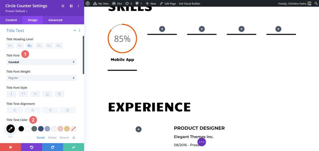
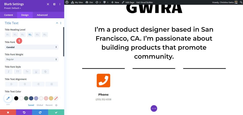
Next, we'll style the title of our module. To do this, click on the 'Title Text' tab. We want the title to have the same font as the rest of the layout, which is 'Candal.' Here are the settings for the title text:
- Font: Candal
- Text Color: #000000 (black)
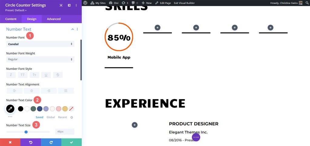
Moving on to the Number Text styling, it follows the same pattern as the Title Text, but we'll make the font size larger to draw attention to our skillsets displayed in the Circle Counter Module. To access the Number Text settings, click on the 'Number Text' tab. Here are the settings:
- Font: Candal
- Text Color: #000000 (black)
- Text Size: 46px
Let's add a finishing touch to our Circle Counter Module by including an entrance animation. Once we have finalized the visual design, it's time to set up the motion design. With Divi, it's a breeze to add subtle animations to different modules used in your design. For our Circle Counter Modules, we'll apply a smooth slide animation.
Animation Settings:
- Animation Style: Slide
- Animation Direction: Up
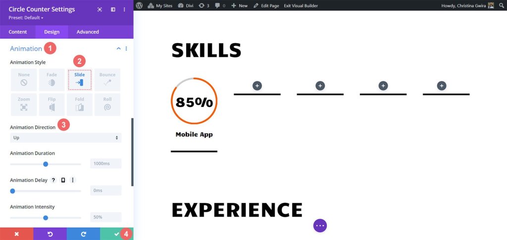
There are various animation settings available to further customize the look and feel of this module. However, we want to keep our motion design simple and timeless, so we'll stick with the default settings for most of them. Once you're satisfied with the animation setup, click on the green icon at the bottom of the Circle Counter Setting menu to save your changes.
Now that we've successfully completed the first Circle Counter Module, we can easily replicate our progress, saving valuable time and ensuring a consistent look throughout our work. To duplicate the module, simply hover over it and click on the Duplicate icon. Once you have the duplicate in place, click on the gear icon to access the settings.
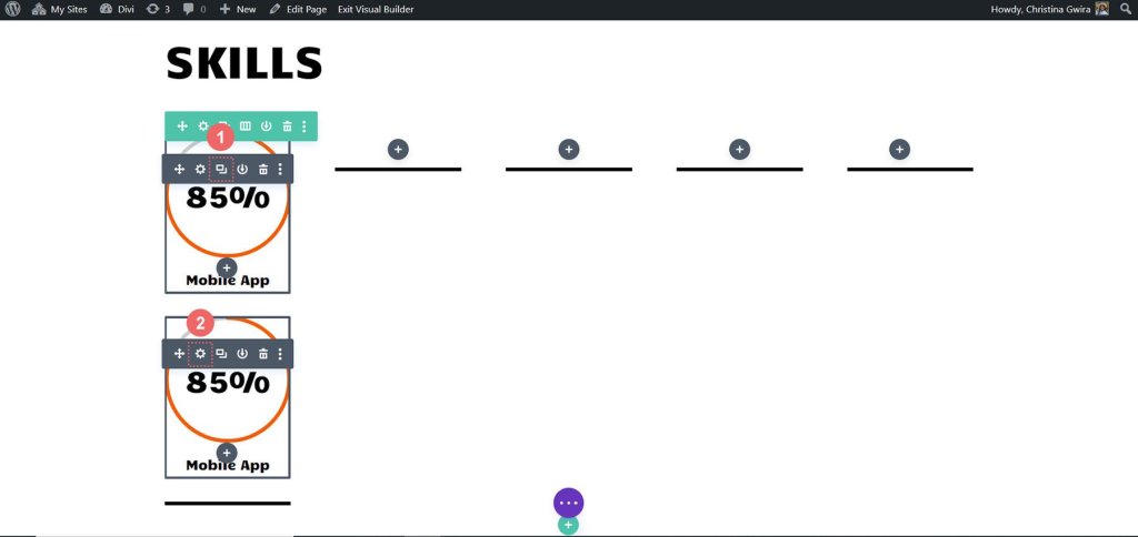
Remember to update the Content tab with your additional skills and talents, while leaving the Design tab untouched. Don't forget to save your changes after making updates in that module. To organize your modules neatly, hover over the module again, click and hold, then drag it to move it into the desired second column.
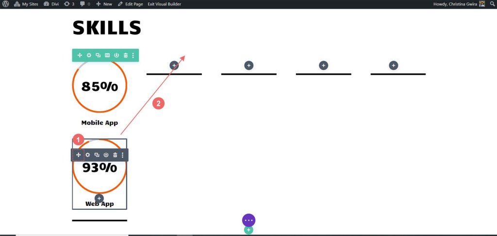
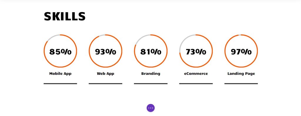
Repeat this process until all your skills are effectively showcased within the columns of your row, creating an impressive display of our capabilities using the Circle Modules.
With the Circle Modules showcasing our skills beautifully, it's time to add some excitement to the other modules on this page. Let's get creative and make this page truly stand out!
Profile Photo Animation
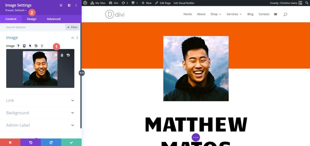
At the top of our page, there's an Image Module that plays a crucial role in creating a strong first impression. To make it stand out, it's important to upload a professional, bright, and sharp headshot of yourself. To do this, just hover over the module and click on the gear icon. This will open up the options, and then navigate to the Design tab where we can add an exciting animation to the photo.
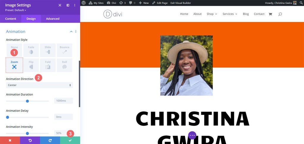
Once you're in the Design tab, you'll find the Animation settings. Similar to the Circle Counter Modules, it's best to keep the animations relatively simple. For this particular image, we'll use a Zoom animation with the default settings to instantly capture visitors' attention when they land on our website. The following settings are what we'll use to apply the zoom animation to our image:
- Animation Style: Zoom
- Animation Direction: Center
As we proceed with designing the online resume website, it's important to remember that personalization is key. Feel free to modify the static modules like text to tailor the template according to your specific needs and preferences.
Blurb Modules & Element Settings
Let's move on to our next task, which involves replacing the contact text with Blurb Modules. We have two reasons for doing this. Firstly, we want to enhance the visual appeal by incorporating an icon within the module and adding some color to it. Secondly, we have an opportunity to introduce a subtle animation, but this time it will be limited to a single Blurb Module, preventing the screen from being cluttered with multiple lines of text flying around.
To begin, we simply need to hover over each Text Module, locate the trash can icon, and click on it to remove the modules from the section.
With that done, we proceed to click on the gray plus icon, which will enable us to add a Blurb Module to the first column. Once we have customized it to our liking, similar to what we did with the Circle Counter Modules, we can duplicate the module for further use.
We click on the Blurb Module icon to complete this step of the process.
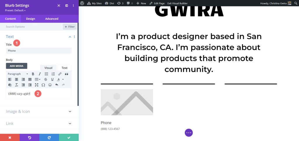
Then, we'll start by navigating to the Text tab where we can add our content. In this module, we're going to display our phone number details, email address, and location. So, let's focus on inputting the phone number information for now.
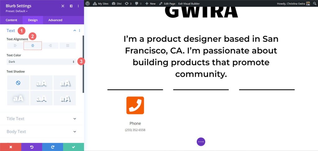
Next, we head over to the Image & Icon tab. Here, we want to use an icon, so we toggle on the "Use Icon" option. We'll then search for a suitable phone icon and select the one that best fits our design.
Now, let's move to the Design tab to style our blurb. We need to adjust the settings for the icon to make it look just right. We'll set the icon color to -
- Icon Color: #fe5a26
- Image/Icon Placement: Top
- Image/Icon Width: 96px
After working on the icon, we go back to the Text tab. Our aim here is to center-align the text and ensure it appears in a dark color throughout the module. We simply click the center icon for alignment and choose "Dark" from the Text Color dropdown.
Regarding fonts, we'll use the same font that was used in the Circle Counter Module for the Title Text. So, we change the font family to Candal.
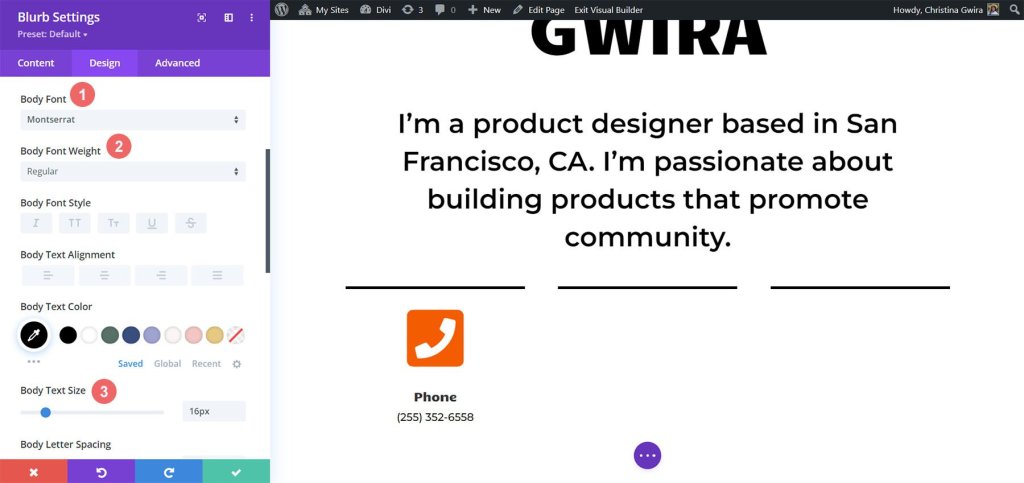
For the Body Text, we want a different font to match the styling of the Text Modules in this section. We'll use -
- Body Font: Montserrat
- Body Font Weight: Regular
- Body Text Size: 16px
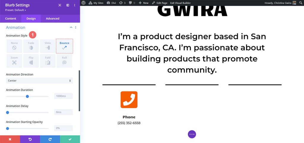
To give our Blurb Module some life, we decide to add an entry animation. We head to the Animation tab and choose the "Bounce" animation, which we hope will catch the eye and add a playful touch. We leave the other animation settings at their default options.
With our design all set, we click on the green icon to save our hard work. Now, we want to duplicate the Blurb Module.
After duplicating it, we can go back to the content tab to update the Text & Image & Icon tabs according to our needs. Keep in mind that while we used the Blurb Modules to showcase our phone, email, and location, you can get creative and use them to display other relevant information based on your role or industry.

Final Touches
Let's enhance the description of how to use the latest Divi native module, the Icon Module, to add a touch of iconography to our digital resume. To begin, we'll navigate to the resume section on our page and then proceed to click on the gray plus icon. This action will insert an Icon Module into the column, allowing us to place an icon at the beginning of each entry in our resume. The goal is to choose an icon that visually represents the company or role in a more general sense.
Now, to find the perfect icon for the position we want to showcase on our resume, we can use the search box and enter a term that resonates with the role.
For instance, in our example, we opted for a color swatch icon to symbolize the importance of color in UI, UX, and the work of a product designer.
Next, let's click on the Design tab to further customize the appearance of our chosen icon. We have two specific settings to adjust: the color and size of the icon. For our example, we set the Icon Color to -
- Icon Color: #fe5a26
- Icon Size: 32px
Now, it's time to align the Icon Module correctly. We can do this by clicking on the Alignment tab and selecting the left-align option. Once satisfied with the design, remember to click the green checkmark button at the bottom of the settings window to lock in these icon settings.
With the Icon Module perfectly designed, we can now place it at the top of our role title for each entry in the resume. By repeating this process for every role mentioned in our resume, we can create a visually appealing and informative representation of our professional experience.
Here are the icons we've chosen for the roles in our current resume:
Final Output
By incorporating subtle animations and introducing additional modules such as the Icon Module and the Circle Counter Module, we have successfully revitalized the Creative CV home layout, breathing fresh life into its design
Wrapping Up
The Divi Circle Counter Module is a powerful tool that can elevate the design of your home layout to new heights. With its ability to add captivating and interactive circular counters, this module enables you to display important statistics, skills, or achievements in an eye-catching manner.