
The Fullwidth Header Module in Divi has a plethora of features that can be used to add interesting design elements to any Divi website. The skill to reveal a background image when the user hovers over the module is one example. This provides additional detail that most visitors would not expect. This is simple to accomplish with Divi.

We'll look at how to unveil a hover background image in the Divi Fullwidth Header Module in this post. In addition, we'll build a full-width header from scratch using one of Divi's free Layout Packs.
Let's get this party started.
Design Preview
First, let's take a look at what we'll be creating in this post. Because hovering with a mouse isn't an option for phones, I've included a design for phones that appears when the user touches the background.
Create Amazing Websites
With the best free page builder Elementor
Start Now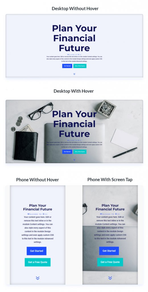
Hover Background Image Fullwidth Header
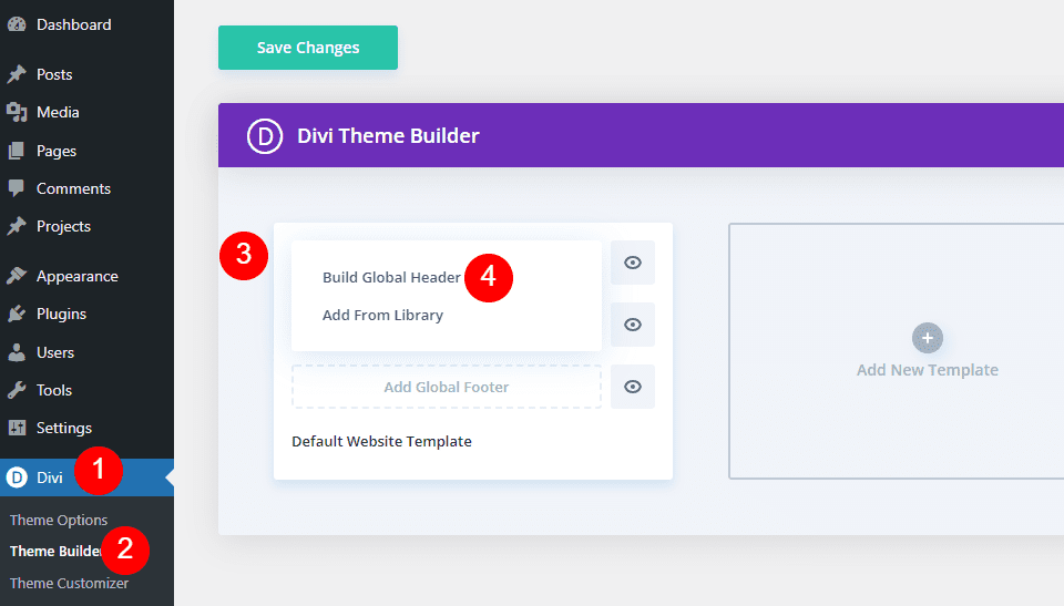
Let's start by creating the full-width header that will be used in the example. To create a new template, open the Divi Theme Builder and click Add Global Header. Select Build a Global Header to start from scratch.
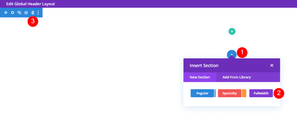
Then, replace the Regular Section with a Fullwidth Section.
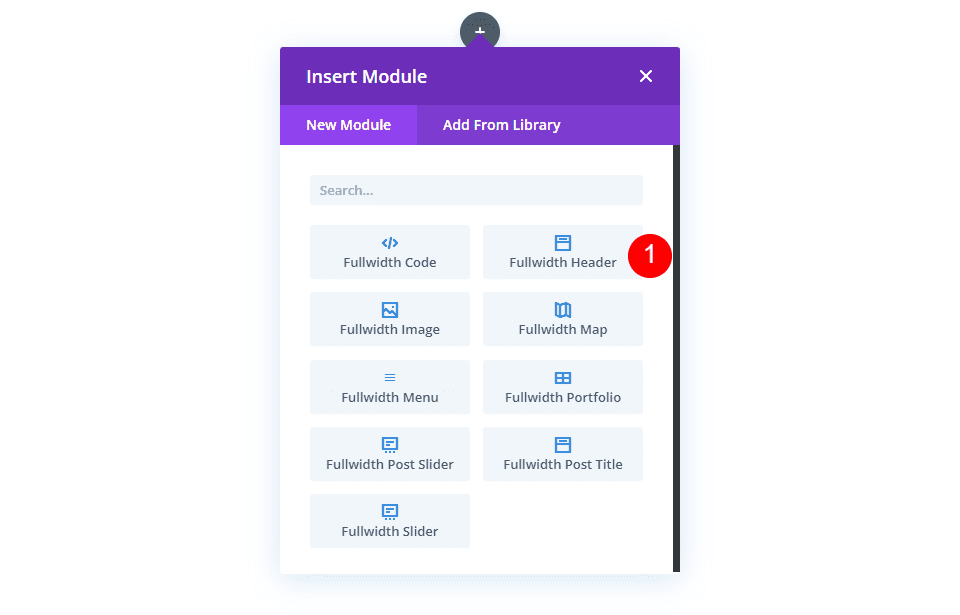
Finally, in your new section, insert a Fullwidth Header Module.
Create the Hover Background Image
Let's start with the hover reveal feature for the Fullwidth Header Module before we style it. We'll style the rest of the module to match our preview example once we've seen how to make it and how it works.
Hover Reveal Background Image
There are two elements to the hover revealed background. The first is the background color, which appears normal. If we wanted, we could also use a gradient or an image. The second element is the one that appears when the user hovers over the Fullwidth Header Module. This is an image in our case, but we could just as easily use a background color or gradient.
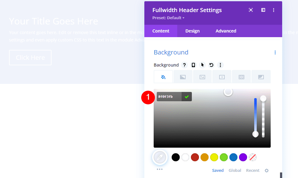
Scroll down to Background first. Change the Color on the Background Color tab to #f0f3fb.
- Background Color: #f0f3fb
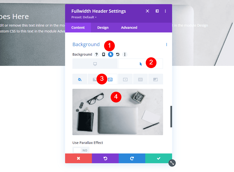
Then, click the Hover State icon. This is an image of a mouse cursor. When we click it, a series of tabs appear, allowing us to switch between the regular and hover state settings. To access the hover options, select the Hover State tab. Then, select the Background Image tab and upload your background image. I'm using the background image financial-services-9 from the Financial Services Layout Pack.
- Hover State Background Image: financial-services-9
We now have an image that the user will see when they hover over the Fullwidth Header Module. This is how all hover state options work.
Style The Hover Background Image
Let's style the rest of the module now that we've got our hover background image in place.
Image Content
Let's start with the fields, body, and buttons' content. Fill in the blanks with your Title, Subtitle, Button One, Button Two, and Body content.
- Title: Plan Your Financial Future
- Subtitle: Welcome to Divi
- Button One: Get Started
- Button Two: Get a Free Quote
- Body Content: Content
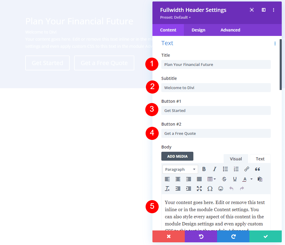
Image Layout
Then, go to the Design tab. Change the alignment of the logo and text to the center.
- Logo & Text Alignment: Centered
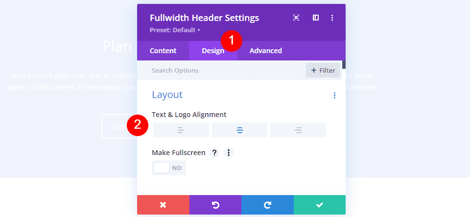
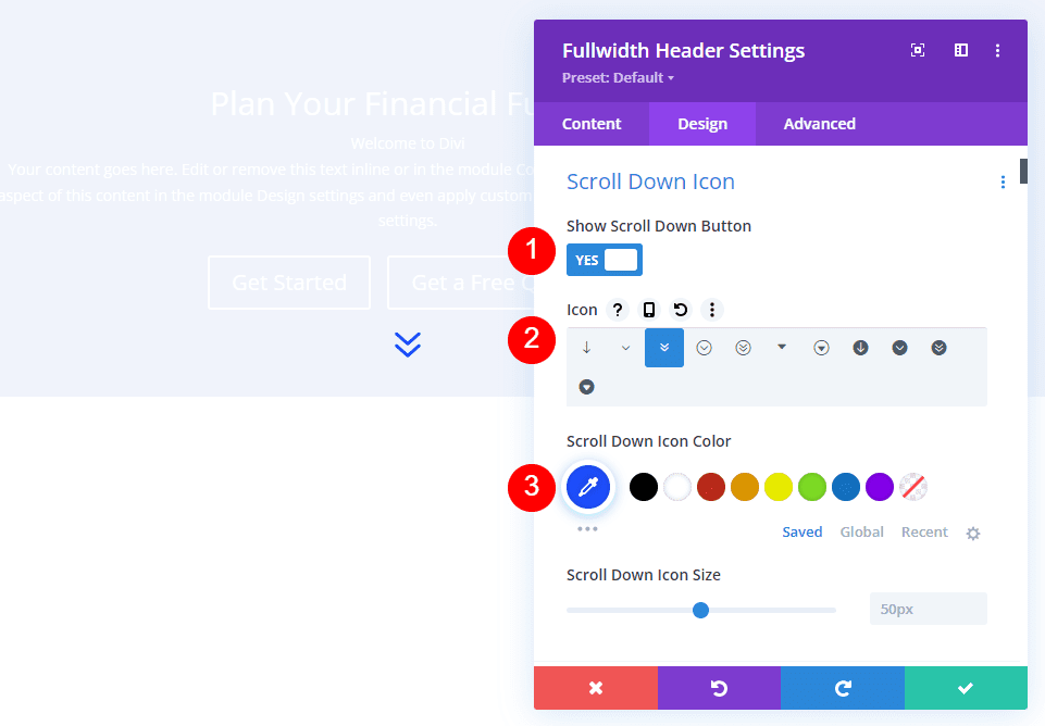
Image Scroll Down Icon
Show Scroll Down Button should be selected. Change the color to #1d4eff by selecting the third icon. Keep the Size at its default value.
- Show Scroll Down Button: Yes
- Icon: 3rd
- Color: #1d4eff
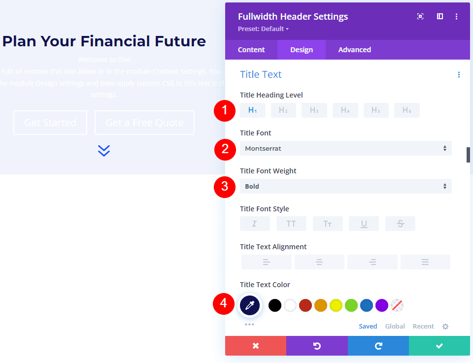
Image Title Text
After that, scroll down to Title Text. Choose H1 as the heading level. Set the Font to Montserrat, the Weight to bold, and the Color to #0f1154.
- Heading Level: H1
- Font: Montserrat
- Weight: Bold
- Color: #0f1154
Change the Font Size for desktops to 125px, tablets to 40px, and phones to 24px. Line Height should be set to 110%. As a result, we have an oversized title that looks great on any screen size.
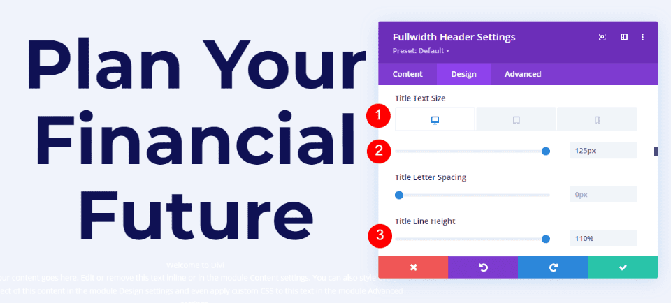
Image Body Text
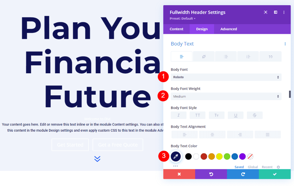
Scroll down to Body Text. Set the Font to Roboto, the Weight to Medium, and the Color to #0f1154.
- Font: Roboto
- Weight: Medium
- Color: #0f1154
For desktops and tablets, set the Font Size to 18px, and for phones, set it to 14px. Line Height should be set to 180%. This gives the body text plenty of room to breathe.
- Size: 18px desktop and tablet, 14px phone
- Line Height: 180%
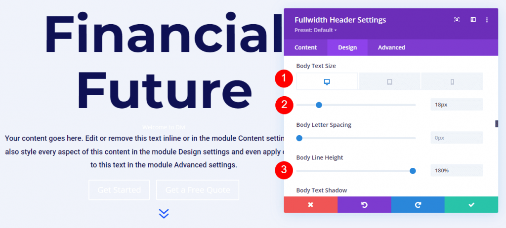
Image Subtitle Text
Scroll down to Subtitle Text. Montserrat is the new font. Change the Weight to bold, the Style to TT, and the Color to #1d4eff.
- Font: Montserrat
- Weight: Bold
- Style: TT
- Color: #1d4eff
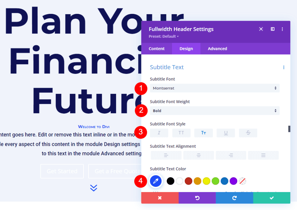
Change the font size for desktops to 16px, tablets to 14px, and phones to 12px. Line spacing should be 0.3em and line height should be 1.6em. This distinguishes the subtitle from both the title and the content without taking up much space.
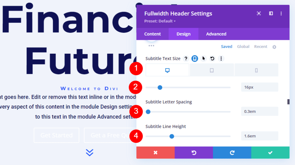
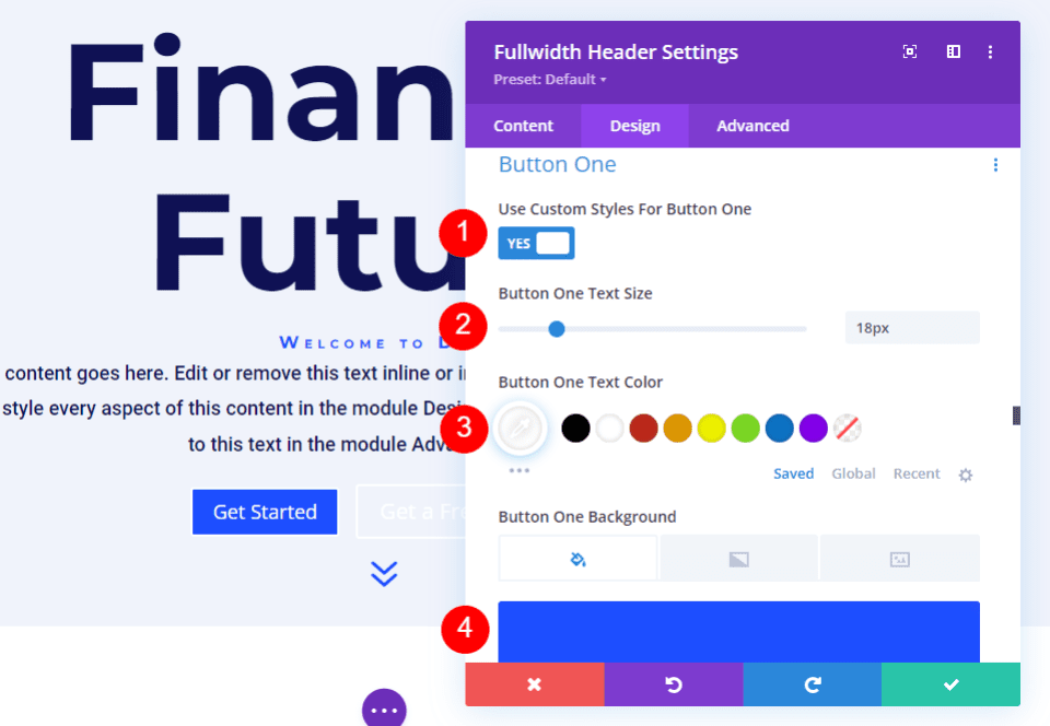
Image Button One
Scroll down to Button One and check the Use Custom Styles for Button One box. Set the Text Size to 18px. Change the background color to #1d4eff and the text color to white.
- Use Custom Styles for Button One: Yes
- Text Size: 18px
- Text Color: #ffffff
- Background Color: #1d4eff
Then, set the Border Width and Radius to 0px. Set the Font to Roboto and the Weight to Medium.
- Width: 0px
- Radius: 0px
- Font: Roboto
- Weight: Medium
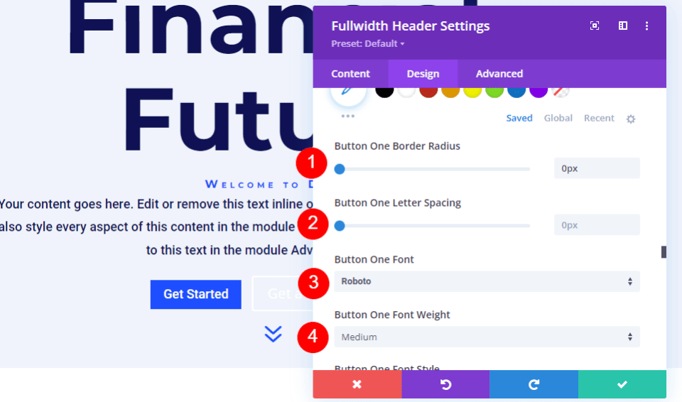
Scroll all the way down to Button One Padding. Top and bottom padding should be 14px, and right and left padding should be 24px.
- Padding: 14px Top and Bottom, 24px Left and Right
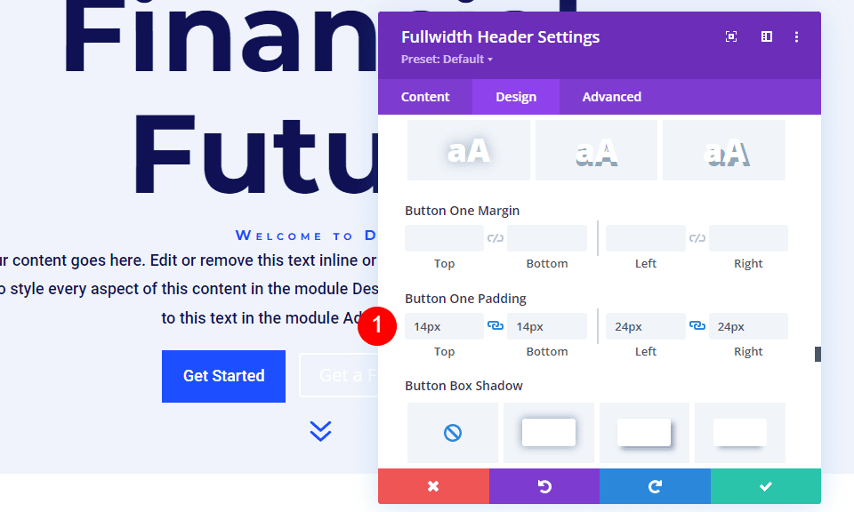
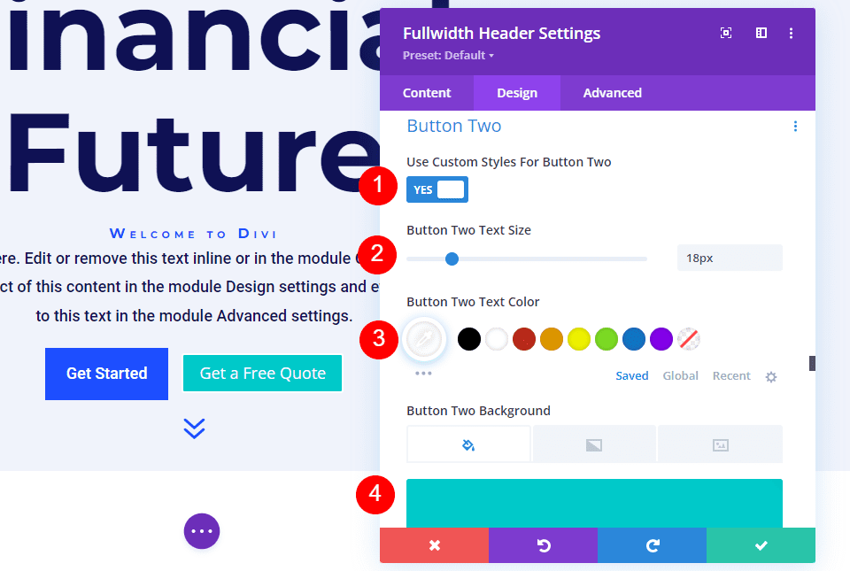
Image Button Two
Scroll down to Button Two and check the Use Custom Styles for Button Two box. The majority of these options are the same as Button One. Change the text size to 18px, the color of the text to white, and the background color to #00c9c9.
- Use Custom Styles for Button Two: Yes
- Text Size: 18px
- Text Color: #ffffff
- Background Color: #00c9c9
Then, set the Border Width and Radius to 0px. Set the Font to Roboto and the Weight to Medium.
- Width: 0px
- Radius: 0px
- Font: Roboto
- Weight: Medium
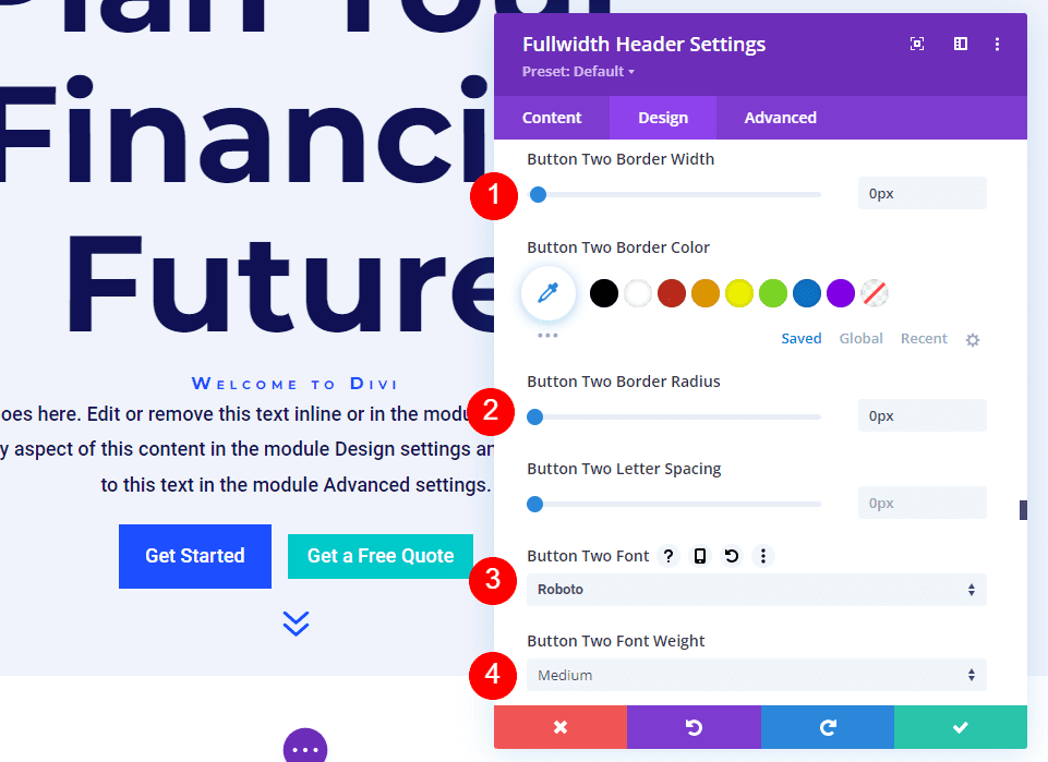
Scroll all the way down to Button Two Padding. Top and bottom padding should be 14px, and right and left padding should be 24px.
- Padding: 14px Top and Bottom, 24px Left and Right
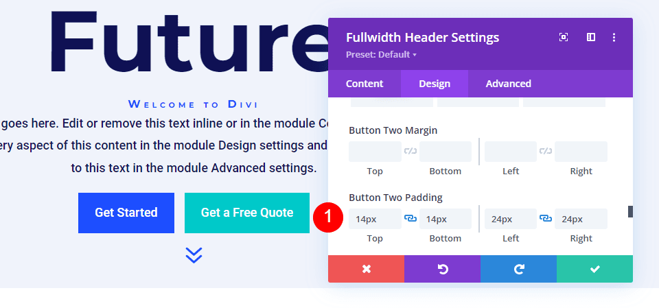
Image Spacing
Then, in the Spacing section, add 100px Padding to the top and bottom. Without using the Fullscreen option in the Layout settings, this increases the size of the fullwidth header. In my examples, the full-width header leaves some space at the bottom of the screen for the next section to appear. Of course, you could use the full-screen option instead of padding if you prefer.
- Padding: 100px Top and Bottom
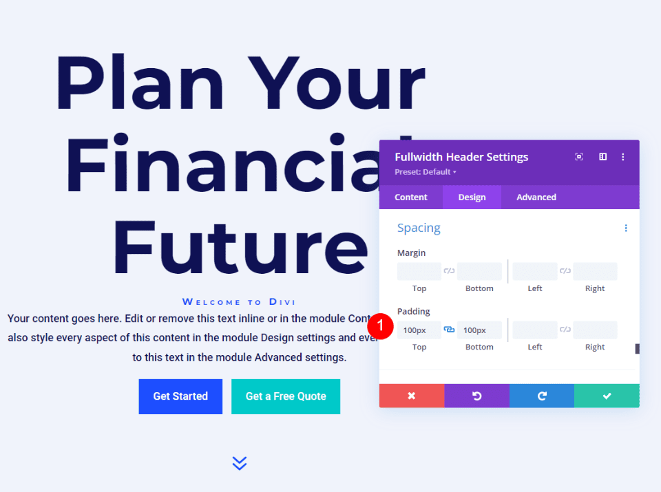
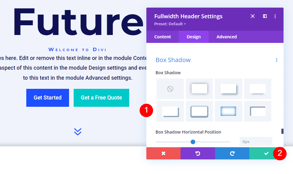
Image Box Shadow
Finally, go down to Box Shadow and select the sixth Box Shadow option. This gives the header a more distinct appearance. Save your settings and exit the Fullwidth Header Module.
- Box Shadow: 6th
And you are done!
Wrapping Up
This concludes our discussion of how to reveal a hover background image in your Divi Fullwidth Header Module. The hover state for background images is a simple setting that can have a significant impact on the design of the site. It's a great way to get people's attention. You can customize the design by adding Gradient Stops, overlays, changing images, and more. I recommend experimenting with the hover background settings of the Divi Fullwidth Header Module to see what you can come up with.


