
The signature theme, Divi, offers a plethora of styling options for its library of native modules, empowering users with extensive control over the visual aspects of their websites. Furthermore, Divi provides the capability to incorporate motion into web pages through a variety of animation effects.
This post delves into the utilization of animation settings within the native Call to Action Module in Divi, covering - hover effects, scroll effects, animation effects, and sticky functionality.
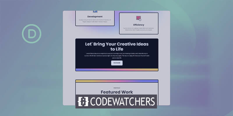
The tutorial focuses on recreating a section from the Divi Marketing Agency Layout Pack, specifically working with the Landing Page Layout.
Layout Installation
To start, create a new page in WordPress. Go to Pages, then Add New.
Create Amazing Websites
With the best free page builder Elementor
Start Now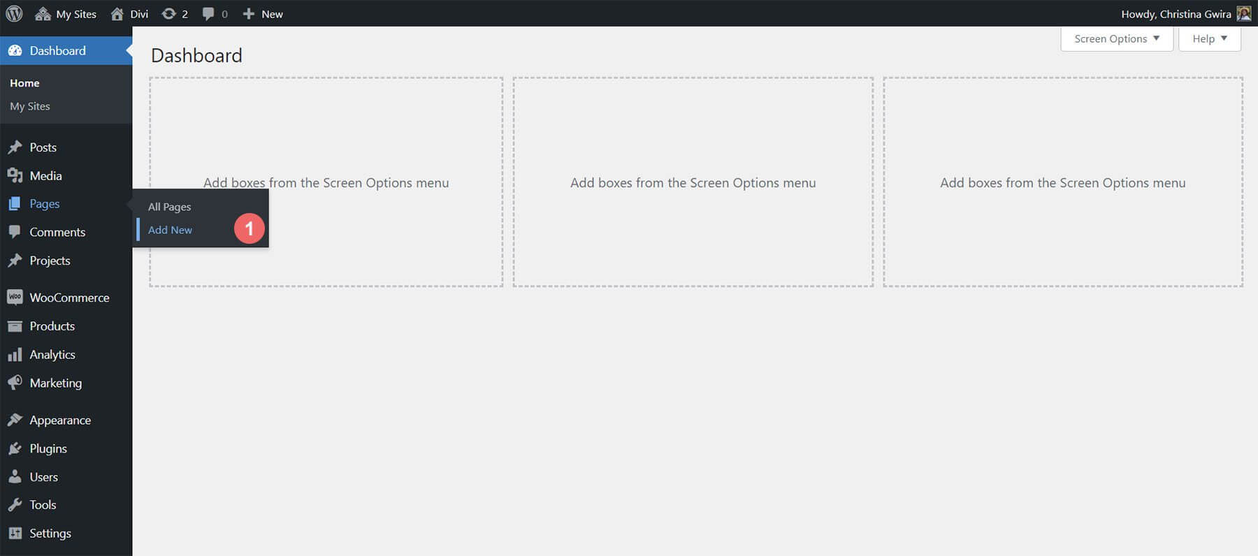
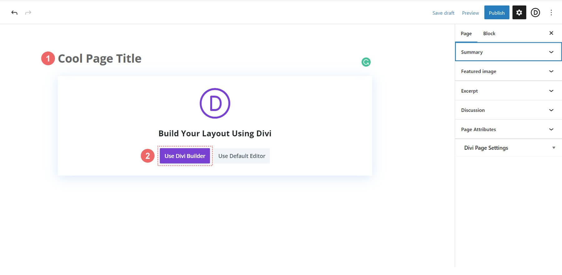
In the editor, give your page a title. Click Use Divi Builder.
Choose Browse Layouts. Pick the Marketing Agency Layout Pack.
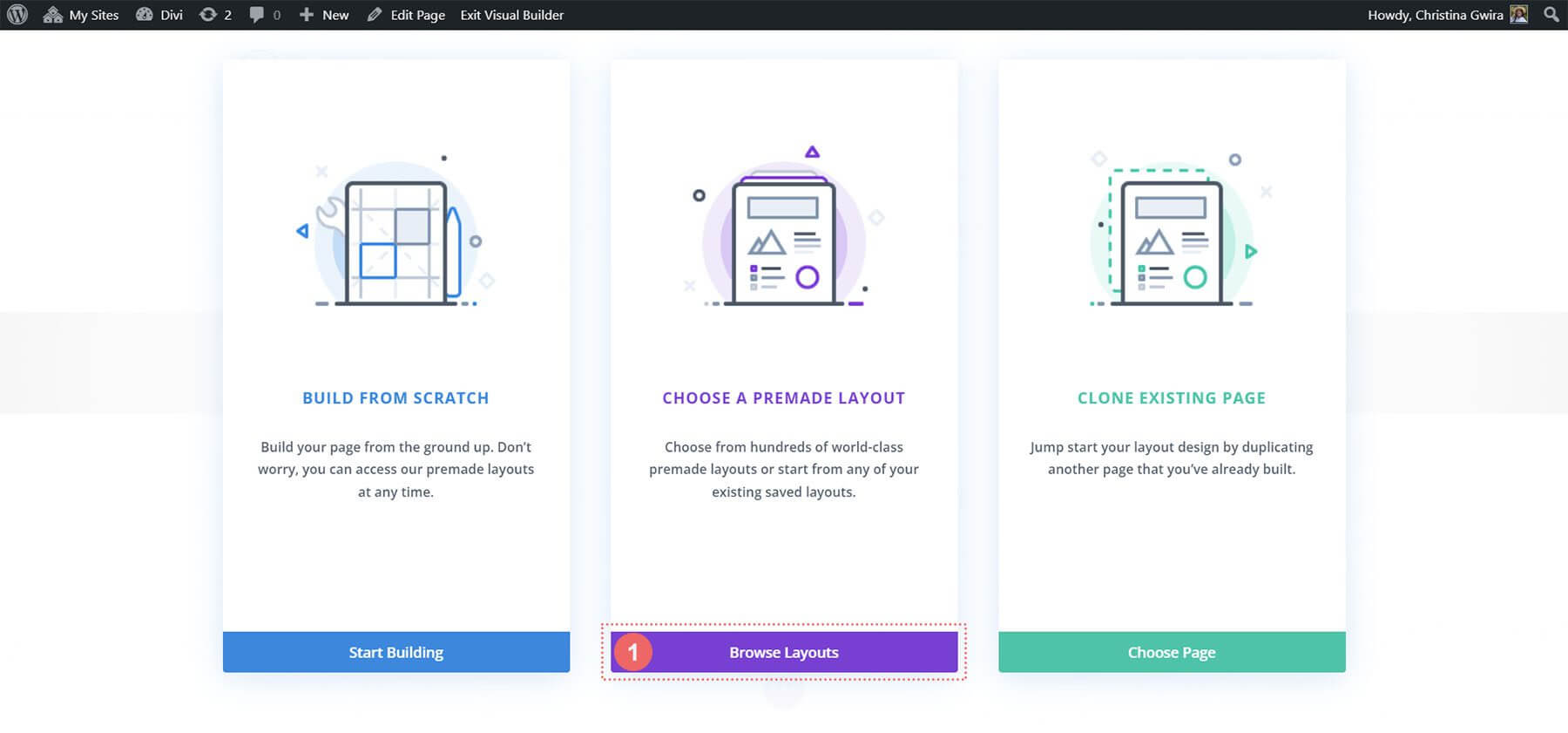
Select the Landing Page Layout. Click Use this Layout.
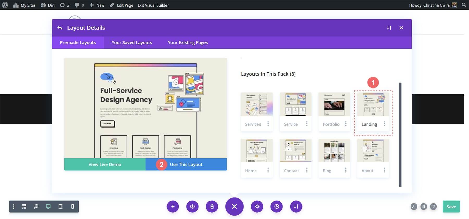
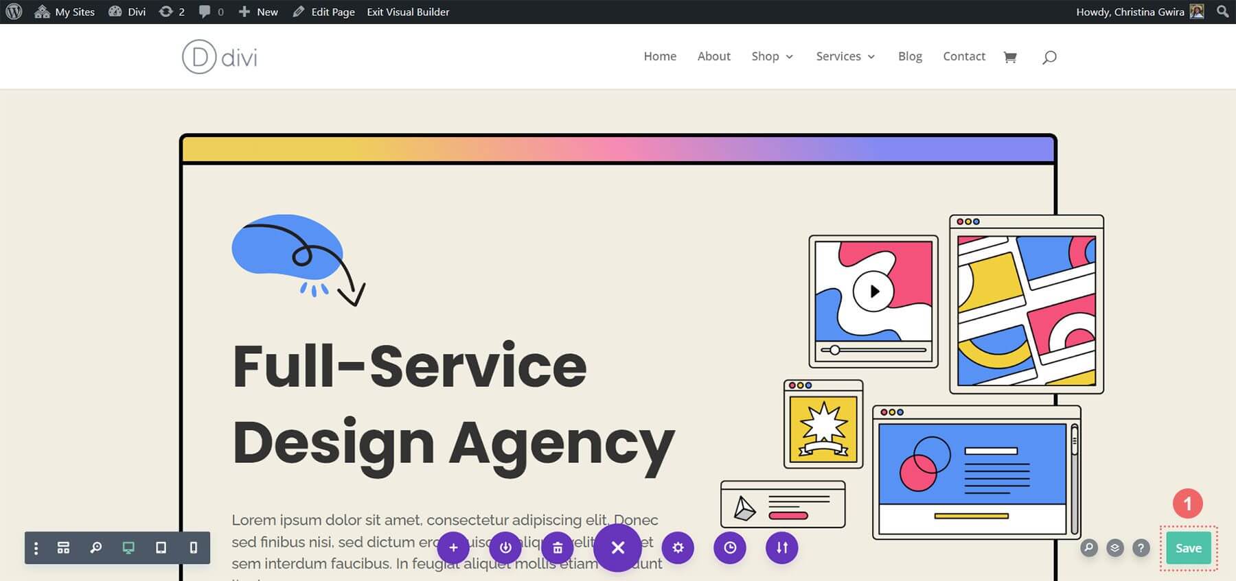
Save your changes.
Now, let's add our first call to action!
Adding CTA Module
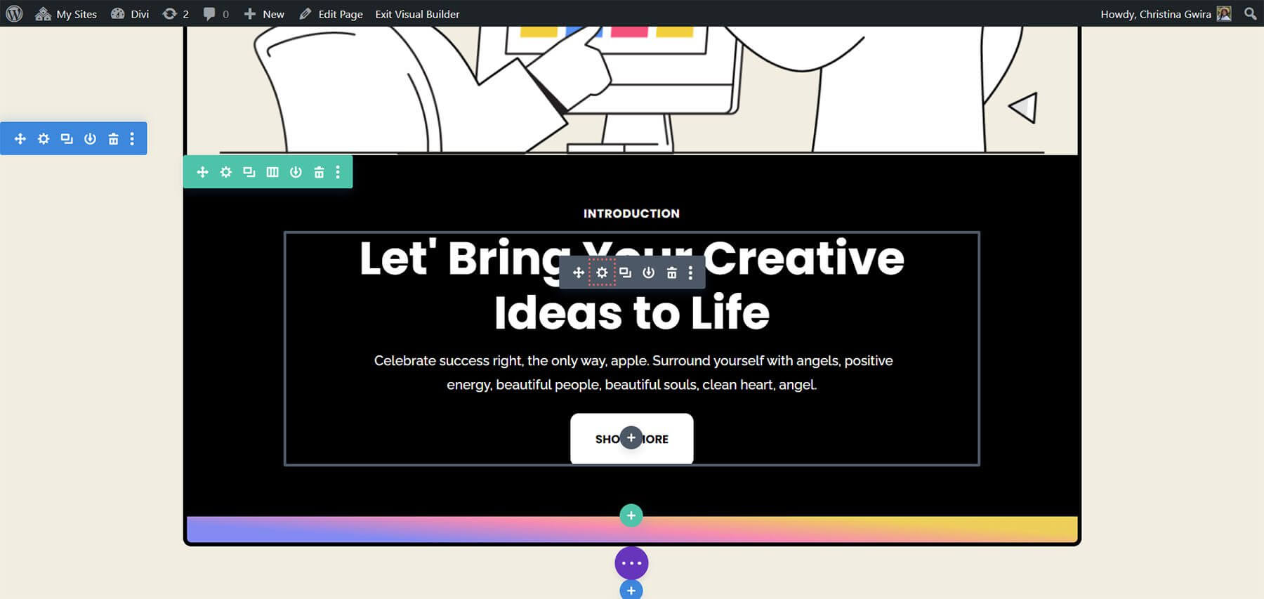
In this tutorial, the Text and Button Modules in this section will be replaced with a Call to Action module.
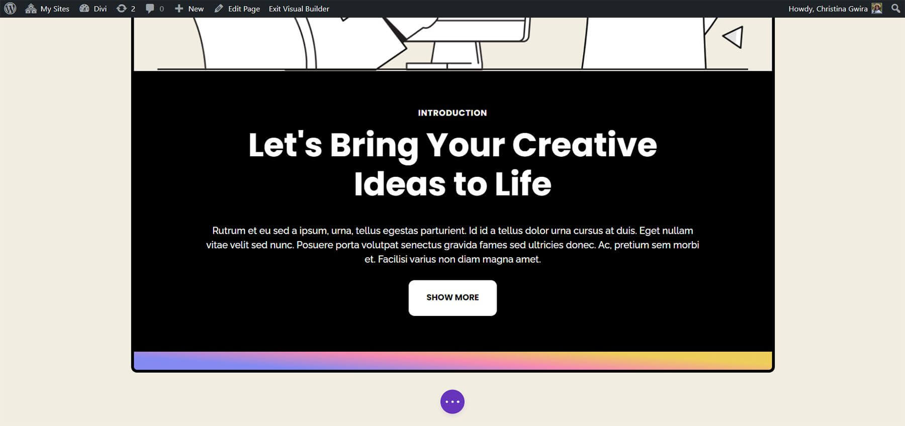
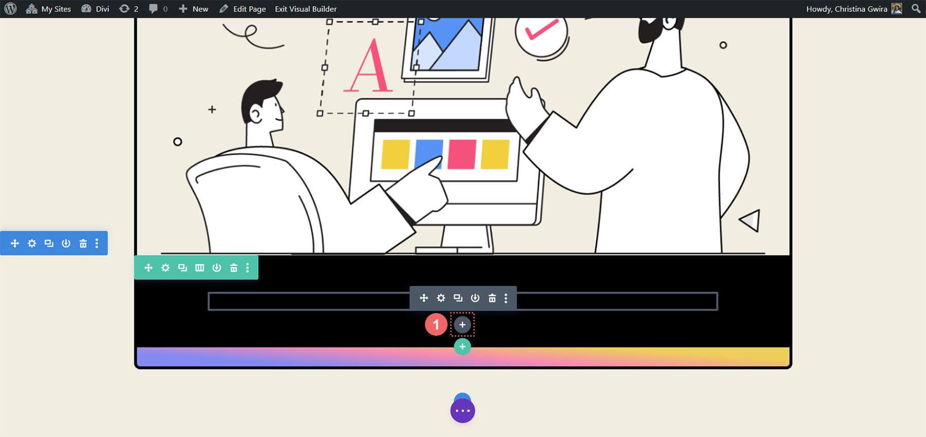
To begin, delete the existing modules by hovering over each one and clicking the trash can icon in the gray pop-out menu. Keep the Text Module labeled "Introduction."
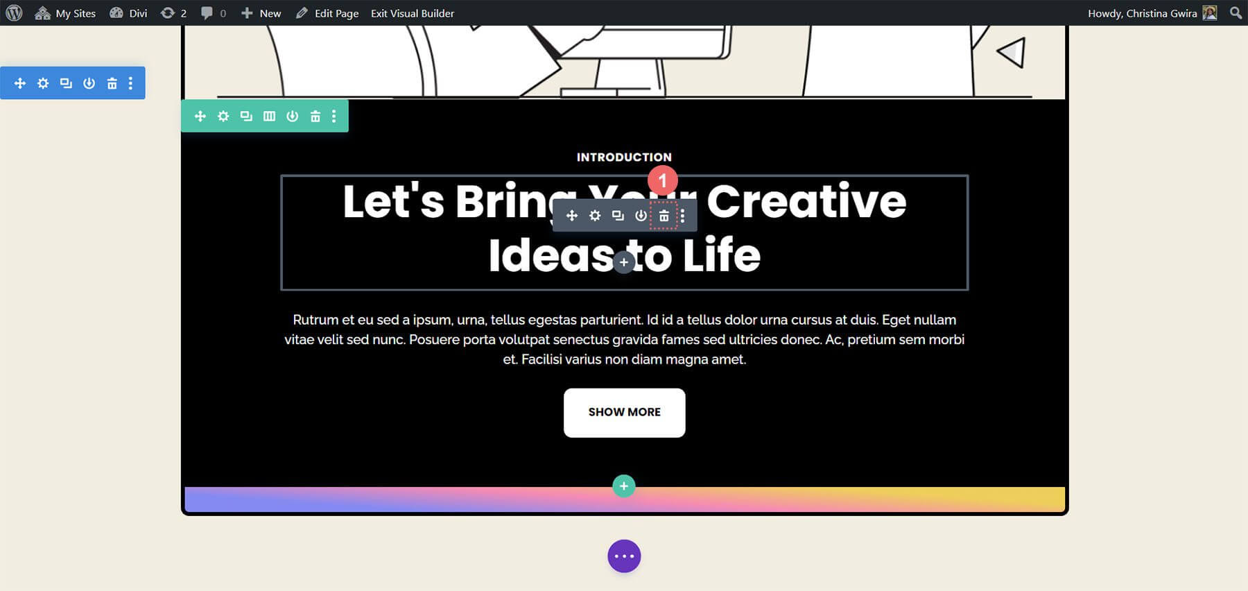
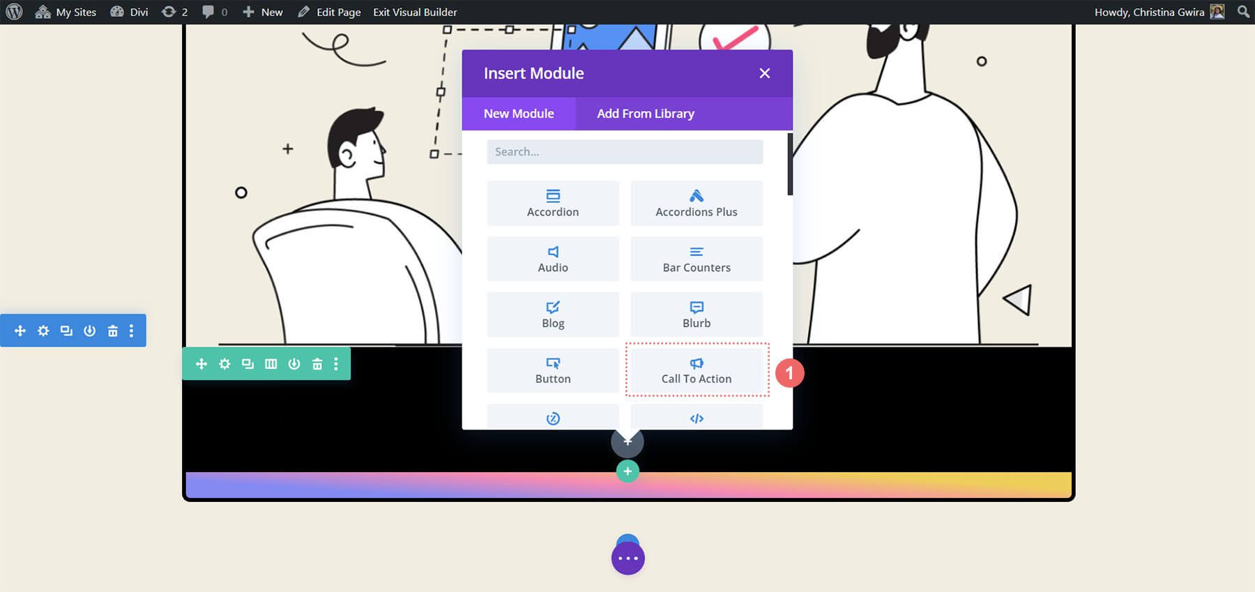
Next, add a Call to Action Module to the row by hovering over the Text Module and clicking the gray plus icon. Select the Call to Action Module icon from the modules pop-up.
Once added, customize the Call to Action Module to suit the layout.
Styling CTA Module
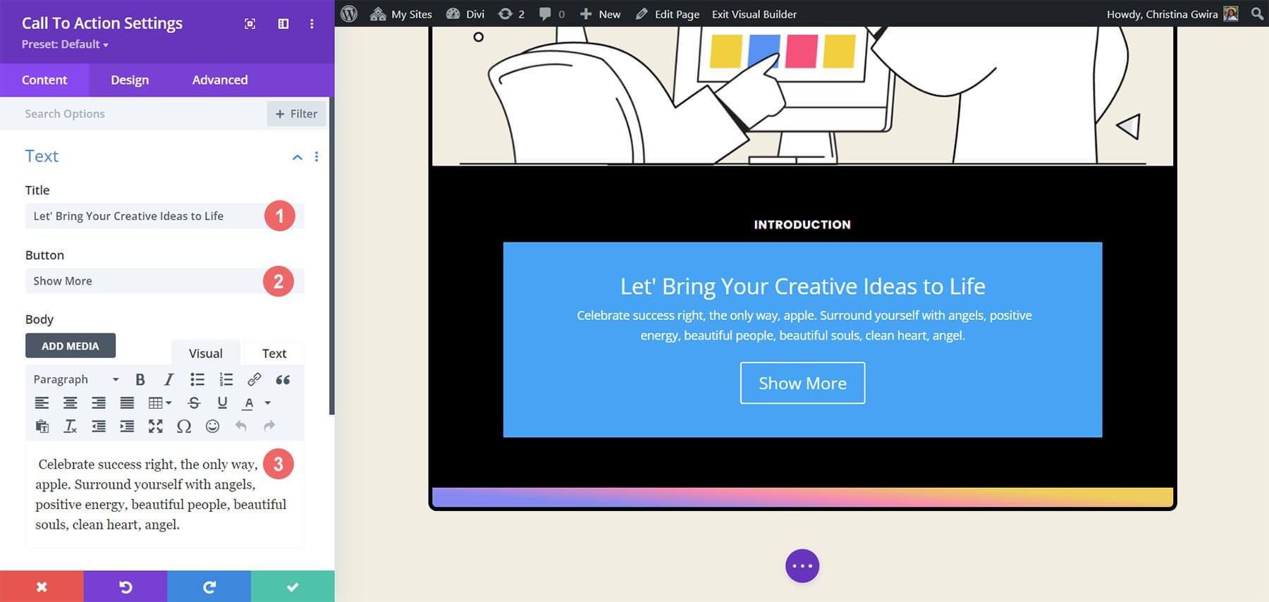
The existing content from the original modules will be replicated in the newly integrated Call to Action Module. This content will be inserted into the designated fields for Title, Button, and Body.
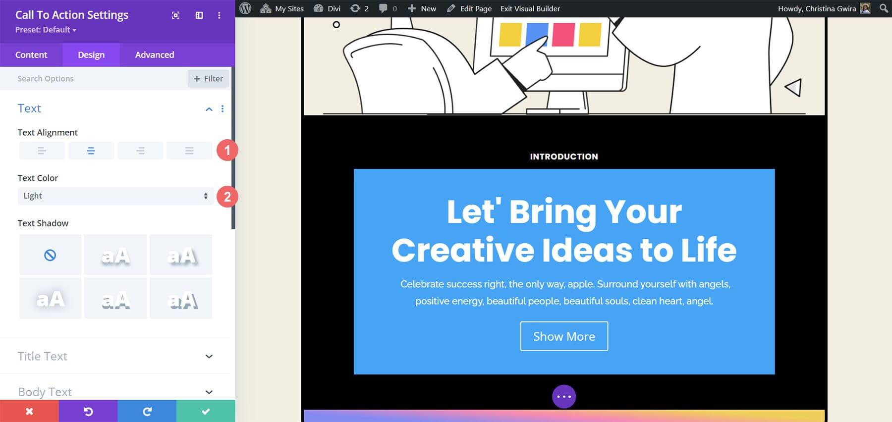
To customize the module's appearance, navigate to the Design tab of the Call to Action Module. Begin by configuring the alignment and color of the text. Align the text to the center and set the color to Light.
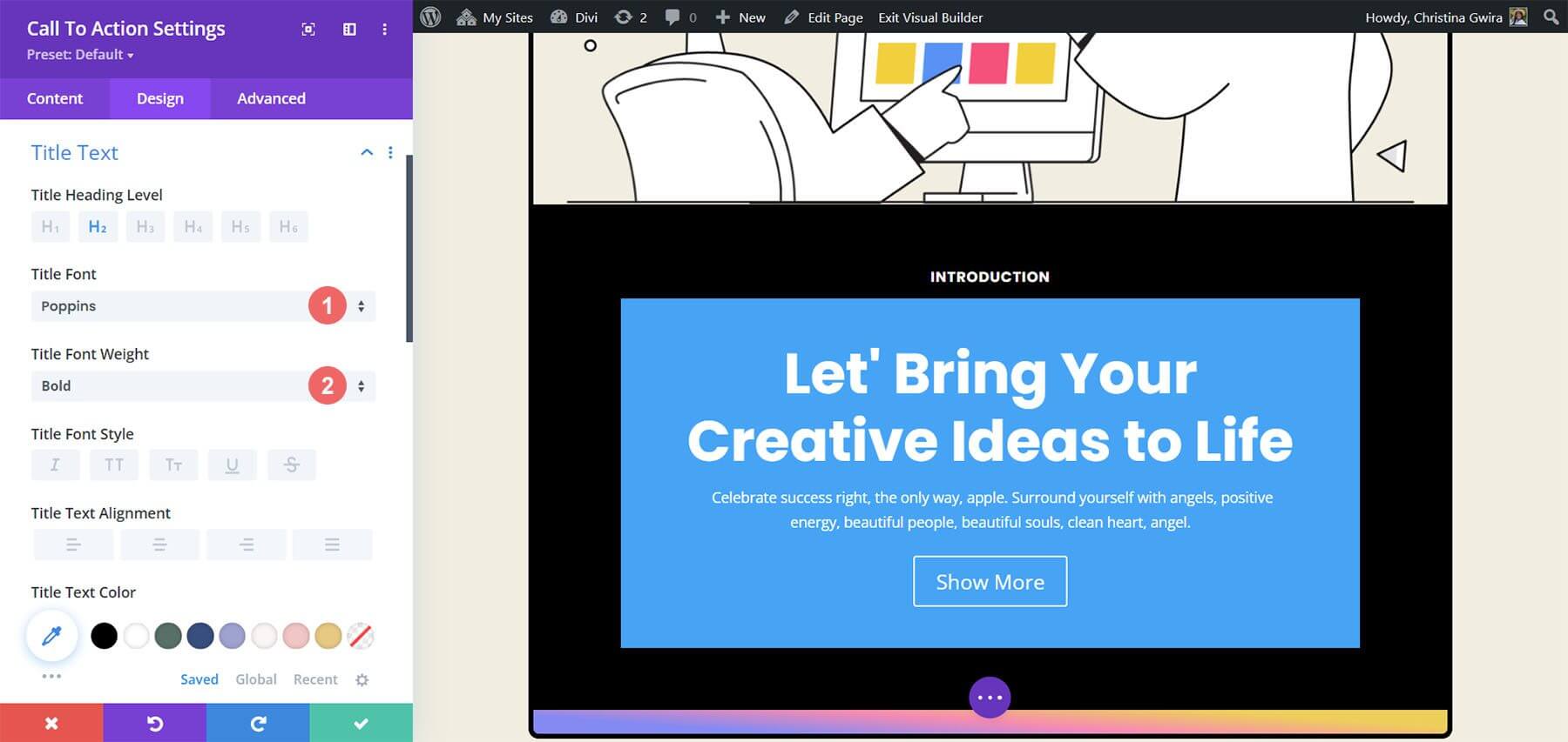
For title text customization, here are the following settings that we r point to use -
- Title Font: Poppins
- Title Font Weight: Bold
- Title Text Size: 55px
- Title Line Height: 1.2em
The resemblance to the previously utilized text is notable. The style guidance will be derived from the Divi Marketing Agency Layout Pack.
Furthermore, attention will be given to styling the Body Text using the specified settings for the module.
Body text settings -
- Body Font: Raleway
- Body Font Weight: Regular
- Body Text Size: 16px
- Body Line Height: 1.8em

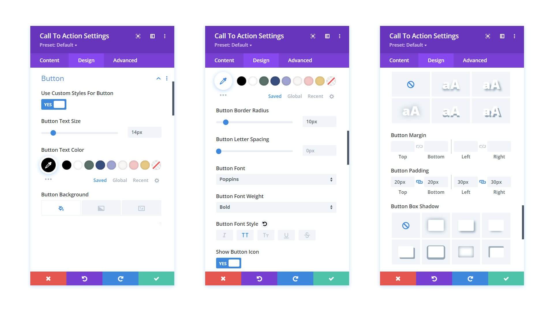
Next, the prescribed settings will be applied to customize the Call to Action Module button.
Button Settings:
- Use Custom Styles for Button: Yes
- Button Text Size: 14px
- Button Text Color: #000000
- Button Background: #ffffff
- Button Border Width: 0px
- Button Border Radius: 10px
- Button Font: Poppins
- Button Font Weight: Bold
- Button Padding: Top and Bottom - 20px, Left and Right - 30px
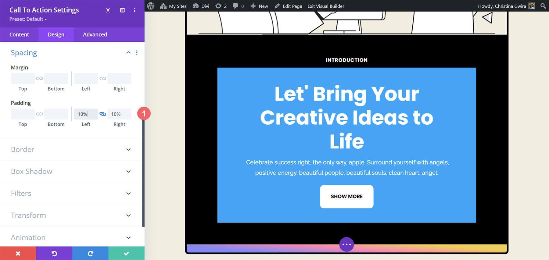
Before moving on from the Design tab, it's advisable to adjust the padding within the Call to Action Module. This can be accomplished by navigating to the Spacing tab and setting both the Left and Right Padding to 10%.
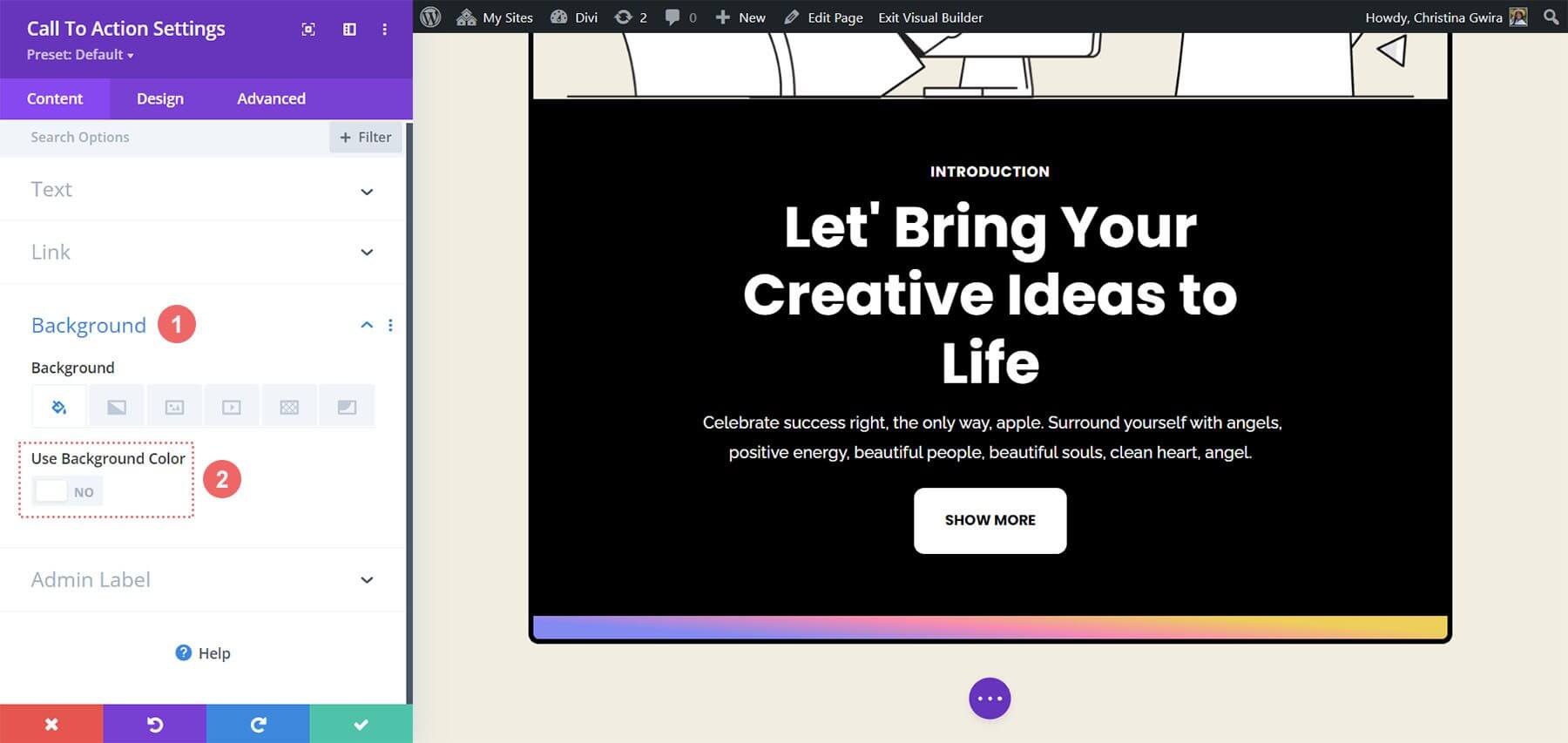
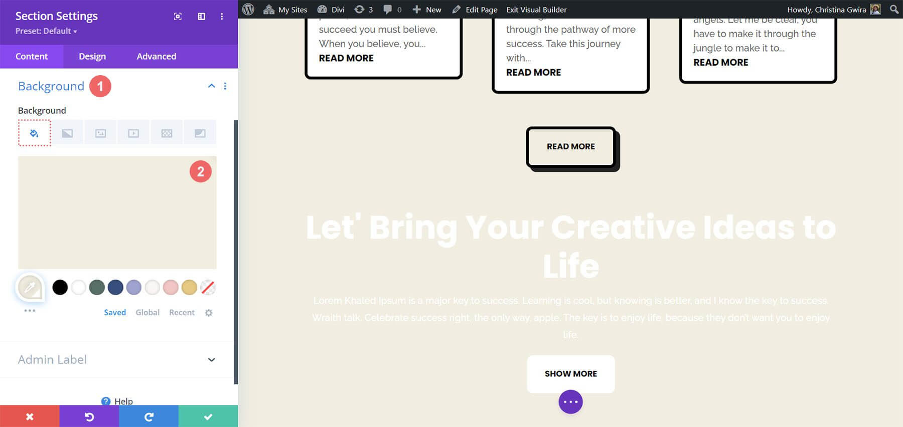
After styling the module, proceed to the Content tab. Here, access the Background tab and deselect the Use Background Color toggle to eliminate the default background color.
Finally, remember to save the changes by clicking on the green check mark and closing the Call to Action Module.
Hover Effect Animation On Module
We are going to start adding a minor Hover animation to our first Call to Action Module. The result of our labor is displayed below.
Hover Settings
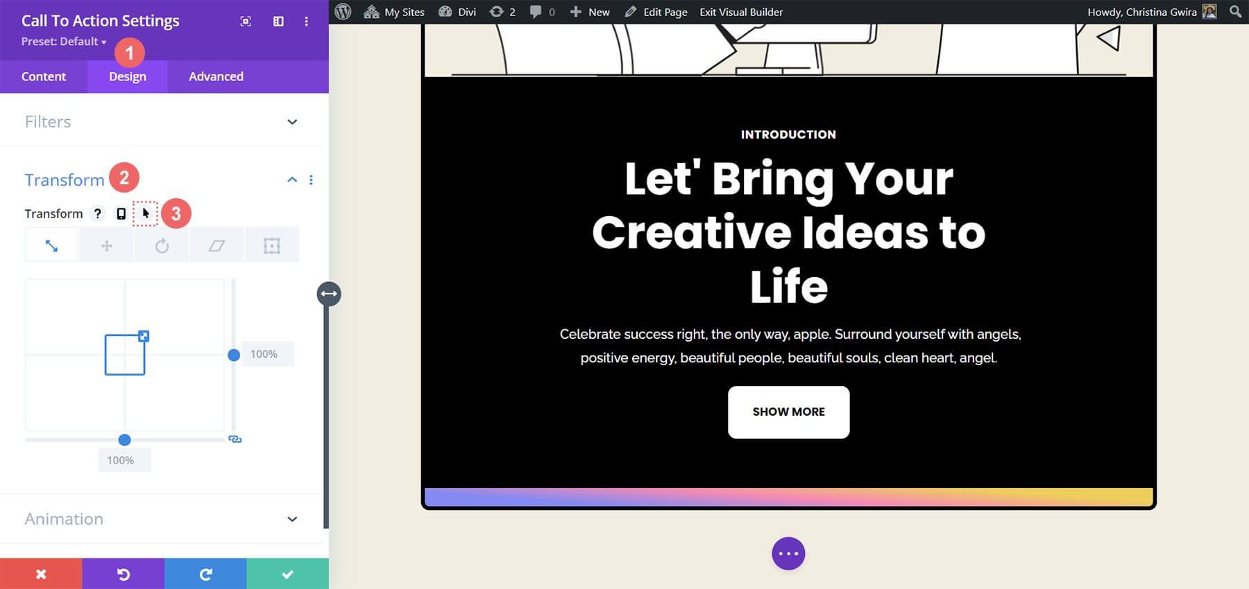
We start by going into the Call to Action Module's Module Settings, which has been recently styled.
After that, we select the Design tab. At last, we descend to the Transform tab. This is where we will turn on this module's hover effect. When we hover over Transform in the Transform section, a flyout menu appears.
Click on the Pointer icon from the menu. With the help of this symbol, we may adjust several Transform choices that will become active as we hover over them.
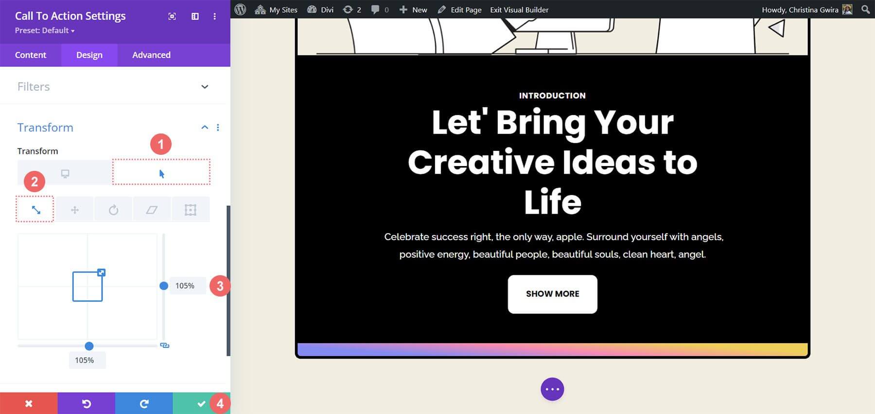
Divi's ability to activate the same hover effect on a multitude of items and options is one of its many wonderful features. In this instance, we would like the module's size to grow by 5% as we hover over it.
We'll start by selecting the hover tab. This will provide the alternatives available to us for changing our module. Next, we are going to select the Scale icon. Our goal is to make our module bigger overall.
The amount we want our module to rise by is then entered. We selected 105% in the size option because we want it to be five percent larger than it is now. Next, save the modifications.
Adding Scroll Effects To CTA Module
Let’s explore the utilization of Scroll Effects to subtly animate the Call to Action Module. This process leverages Divi's native features for seamless integration.
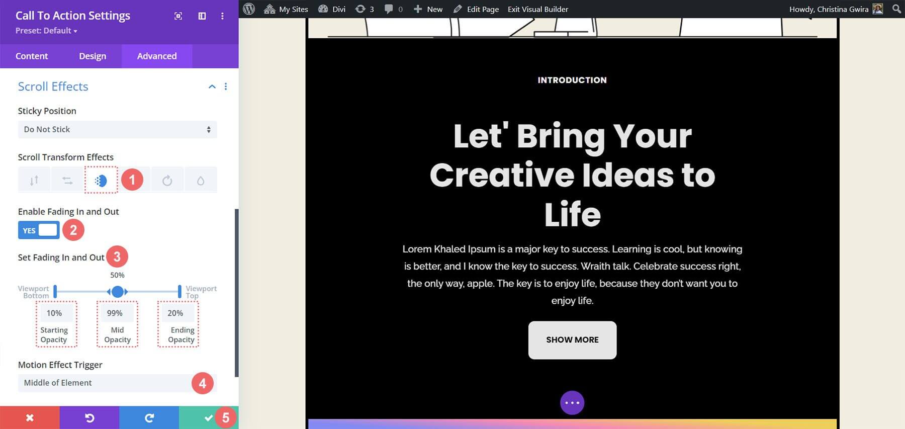
Within the Advanced tab of the module, the Scroll Effects are activated. This tab serves as the control center for adjusting various settings to achieve the desired animation effect.
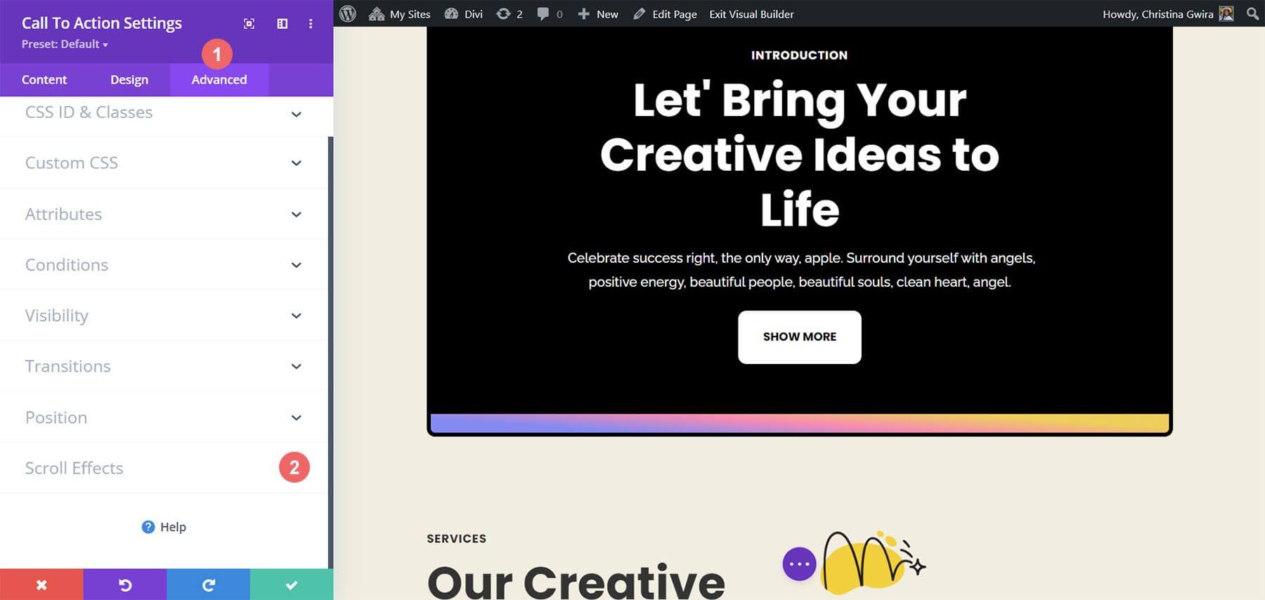
Upon accessing the Scroll Effects tab, specific parameters are modified to tailor the animation. These adjustments include settings such as Sticky Position and Fading In and Out Scroll Effect.
The opacity levels at different stages of the animation are crucial for achieving the desired visual effect.
Fading In and Out Settings:
- Starting Opacity: 10%
- Mid Opacity: 99%
- Ending Opacity: 20%
With these meticulously configured settings, a polished scroll effect is achieved within the Call to Action Module. This subtle animation enhances the user experience and adds a touch of sophistication to the interface.
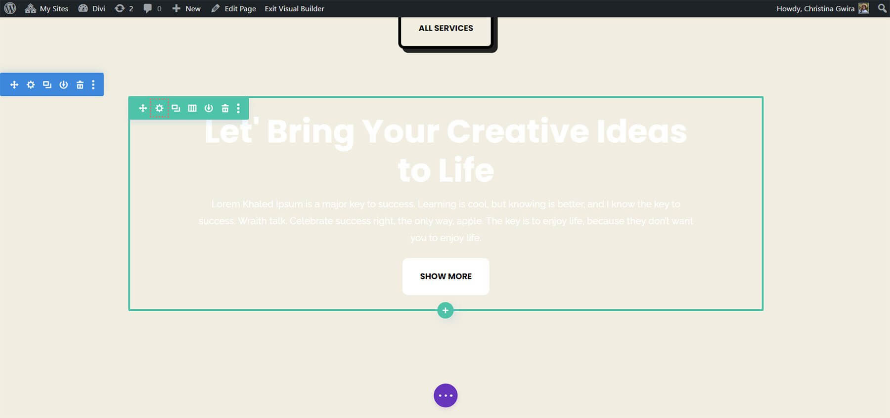
Moving forward, the procedure delves into animating the entrance of another Call to Action Module using the Animation tab. This tab offers further customization options to refine the module's visual presentation and create a cohesive user experience.
Opening Animation
A module's entrance animation occurs as it enters the screen viewport, while Scroll Effects enable continuous interaction with the module upon scrolling. Unlike Scroll Effects, the entrance animation activates only once and does not repeat even with subsequent interactions like scrolling or hovering.
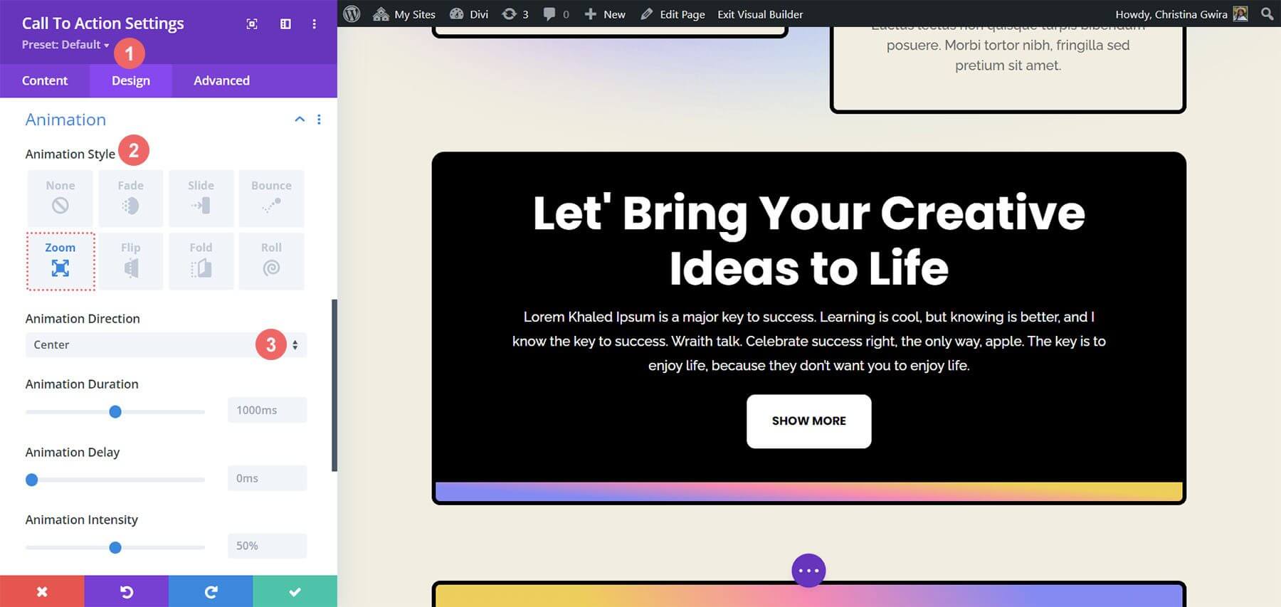
To create an entrance animation using a Zoom effect:
- Go to the Call to Action Module settings window.
- Click on the Design tab and navigate to Animation.
- Choose the Zoom Animation Style.
- Keep the Animation Direction as Center (default) and leave other settings unchanged.
Sticky Effects On CTA
The demonstration will illustrate the utilization of Divi's native Sticky Effects.
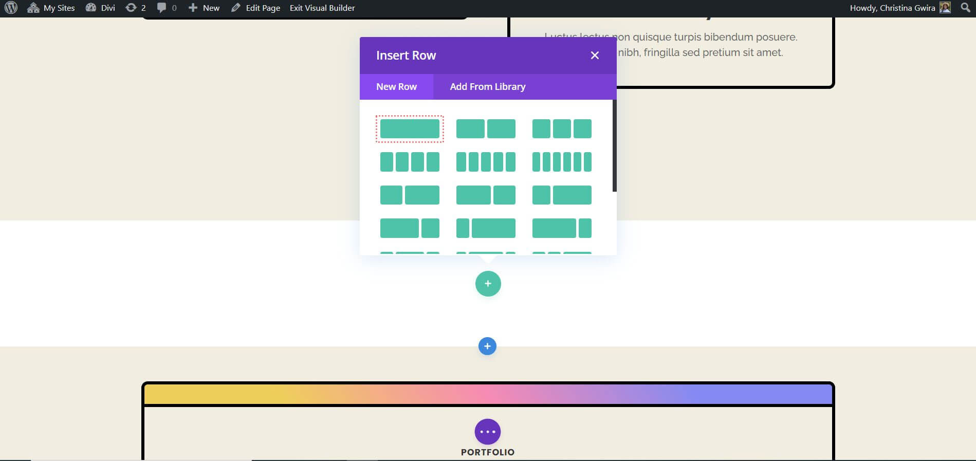
To begin, a new row and section must be created.
- Click the blue plus icon to initiate a new section.
- Select the one-column row layout.
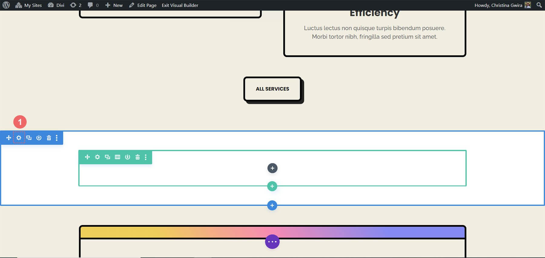
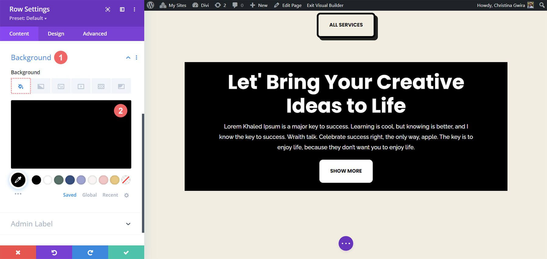
Utilize the premade Call to Action Module and close the Add New Module window. Begin by accessing the section settings by clicking the gear icon.
Then, navigate to the Background tab and set the background color to #f1ede1.
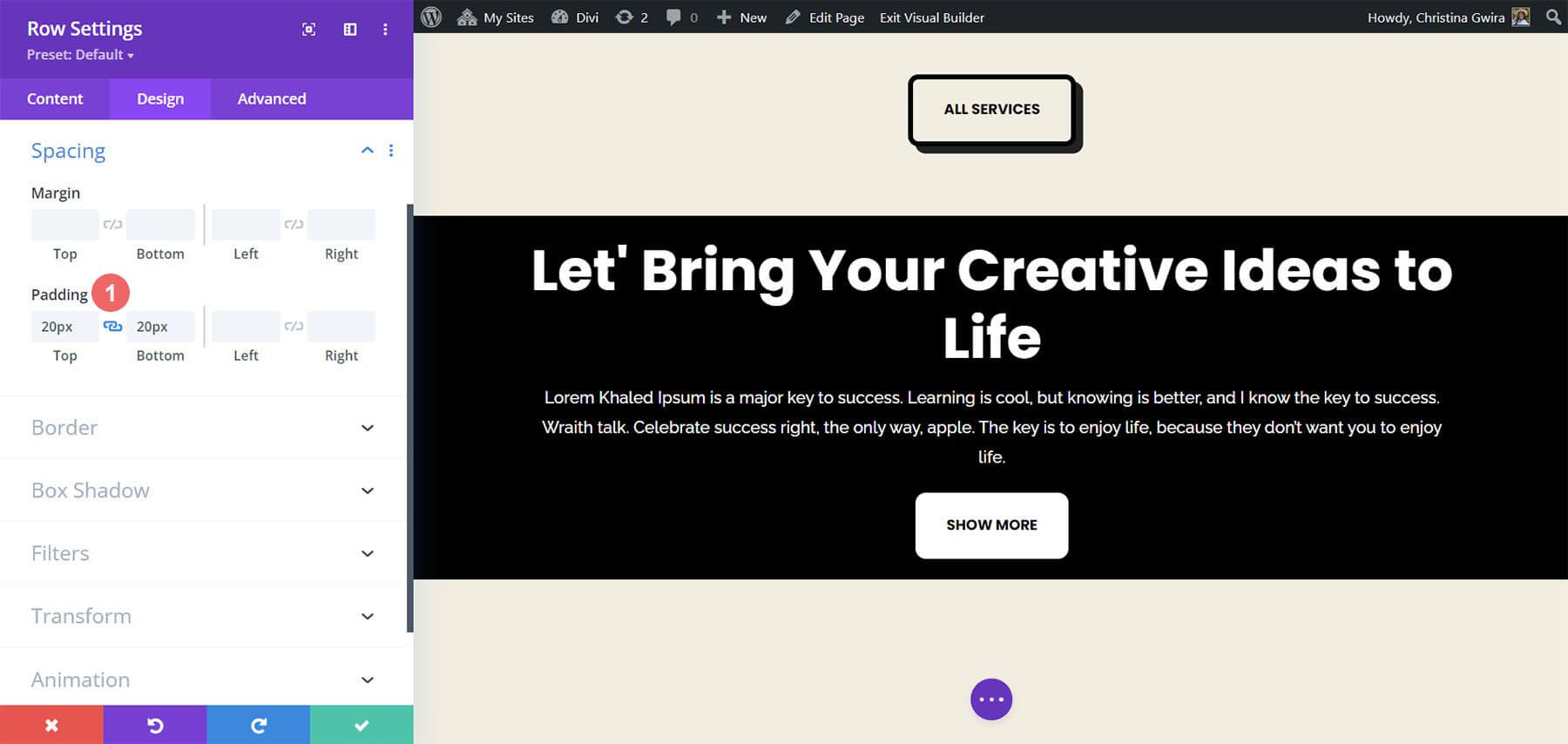
To ensure the proper functioning of the sticky Call to Action Module, it's essential to add spacing settings. Click on the Design tab and scroll to the Spacing section. This step is crucial for allowing sufficient space to observe the Sticky animation.
Section Spacing Settings:
- Margin Top: 0px
- Padding Top: 0px
- Padding Bottom: 300px

After entering these parameters, we can click the green tick to save our work. We're going to turn on the Sticky effect inside our section's row now. Initially, we click the gear button to access the row settings.
We can click the green checkmark to save our work after entering these parameters. We are now going to activate the Sticky effect inside the row of our section. To access the row options, we first select the gear button.
Prior to accessing the Advanced tab, let us adjust the row's background color. We go to the Background tab and select #000000 as the Background Color, just like we did with the section.
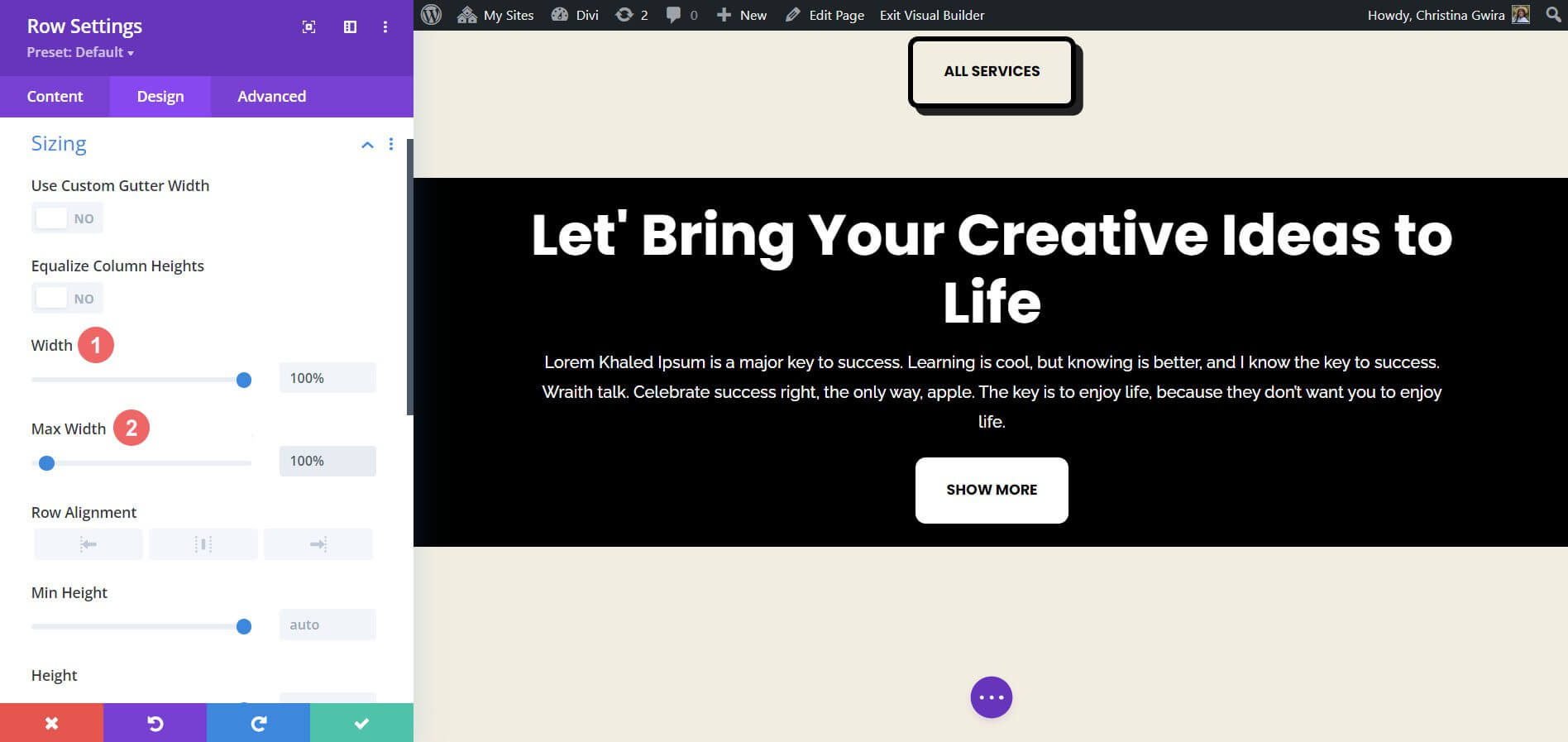
As a result, our row resembles the Call to Action Module that we made at the beginning of the course. However, to make this row extend to the edges, we'll employ margins and padding. This will make the Sticky effect less obtrusive and more visually appealing for visitors to your website.
We now select the Sizing tab under the Design tab. The Width and Max Width are then both set to 100%.
Next, we add identical top and bottom padding values of 20px by swiping down to the Spacing tab. This makes our call to action appear more streamlined.
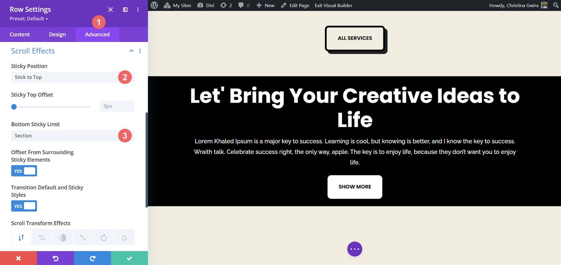
Now that the aesthetics are taken care of, we can apply our Scroll Effect. Next, we select the Scroll Effects tab after going to the Advanced menu. By choosing Stick to Top, we can now activate the Sticky Position. We set the Sticky Top Offset to 0px because we want our call to action to remain flush with the top of the screen. The Bottom Sticky Limit, which we have now set to Section, is the only other option we will be changing.
Wrapping Up
In conclusion, Divi offers numerous default features and methods to incorporate animation and movement into your page. Whether you aim to enhance page introduction or engage users with your content, Divi equips you with the necessary tools. While we explored four methods to animate the Call to Action Module, these settings are applicable across Divi's library of modules. Furthermore, they can be extended to sections, columns, and rows, enabling the creation of dynamic and distinctive page layouts for your audience.