
In Elementor, overlapping elements can give them a distinctive, expert, and fashionable appearance. Additionally, it enables you to cram more information into a compact space without having it appear sterile or uninteresting.

The good news is that using Elementor makes it as simple as it gets to overlap images, text, and other elements. We'll show you how to create an overlapping section in Elementor in today's tutorial.
Make Overlapping Elementor Sections
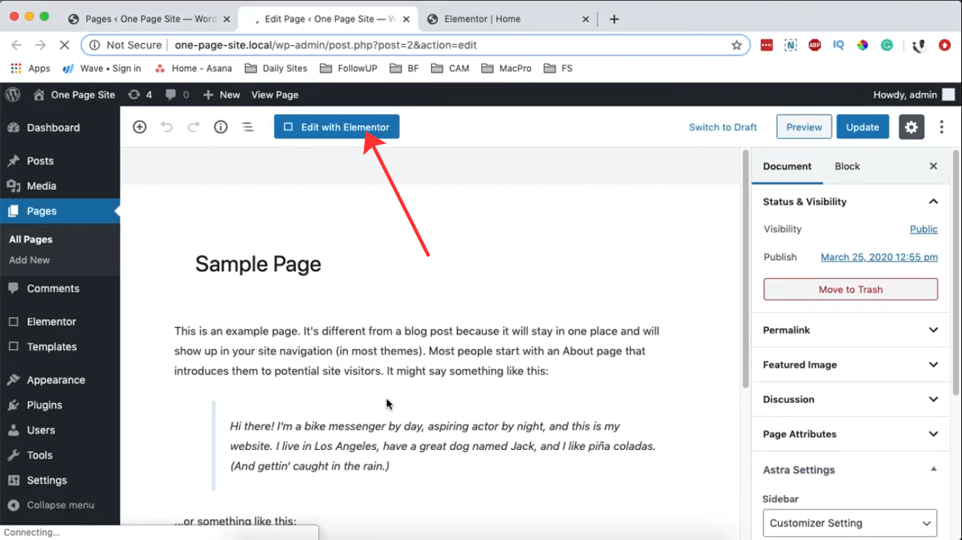
Navigate to your dashboard, access the "Pages" section, and open any page using Elementor. Then click on "Edit with Elementor"
Upon opening your page, go to Page Settings and choose Elementor Canvas as the Page Layout. Next, select the (+) icon to generate a new section with a single column.
Create Amazing Websites
With the best free page builder Elementor
Start Now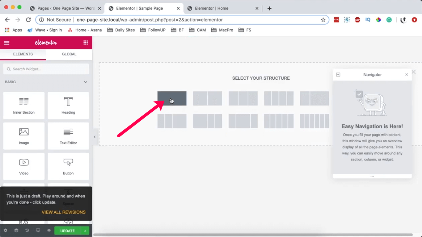
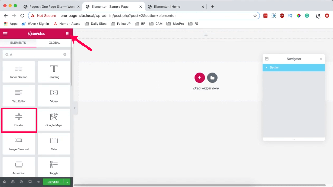
In the new section, include a widget by selecting the widget icon. In the search bar, enter "divider" to locate the divider widget, and then drag it into your section.
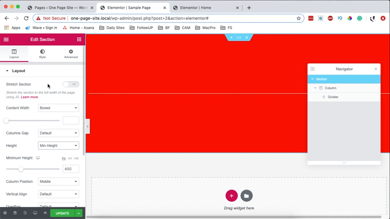
Choose the segment, and within the Edit Section panel on the right, under Layout, adjust the Height to a minimum of 400 pixels. Then, under Style, assign a background color (I'm opting for red). Pick the divider, and similarly, under Style, assign it a white background.
Choose the segment, perform a right-click on it, and select the option to duplicate.
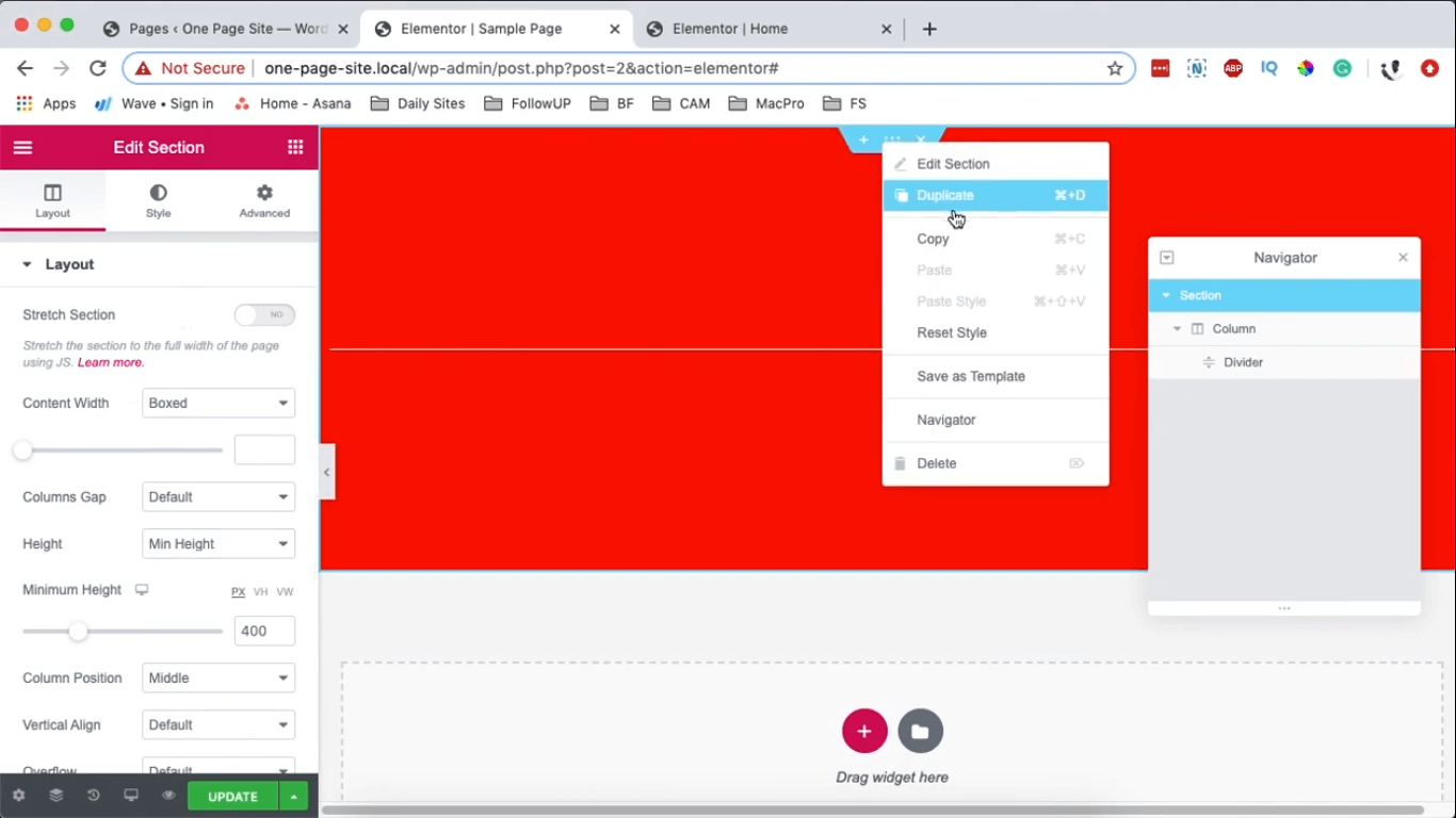
Select the segment, right-click on it, and choose the duplicate option.
After creating your two sections, the subsequent action involves merging them.
Initially, I will demonstrate how to place the blue section above the red section.
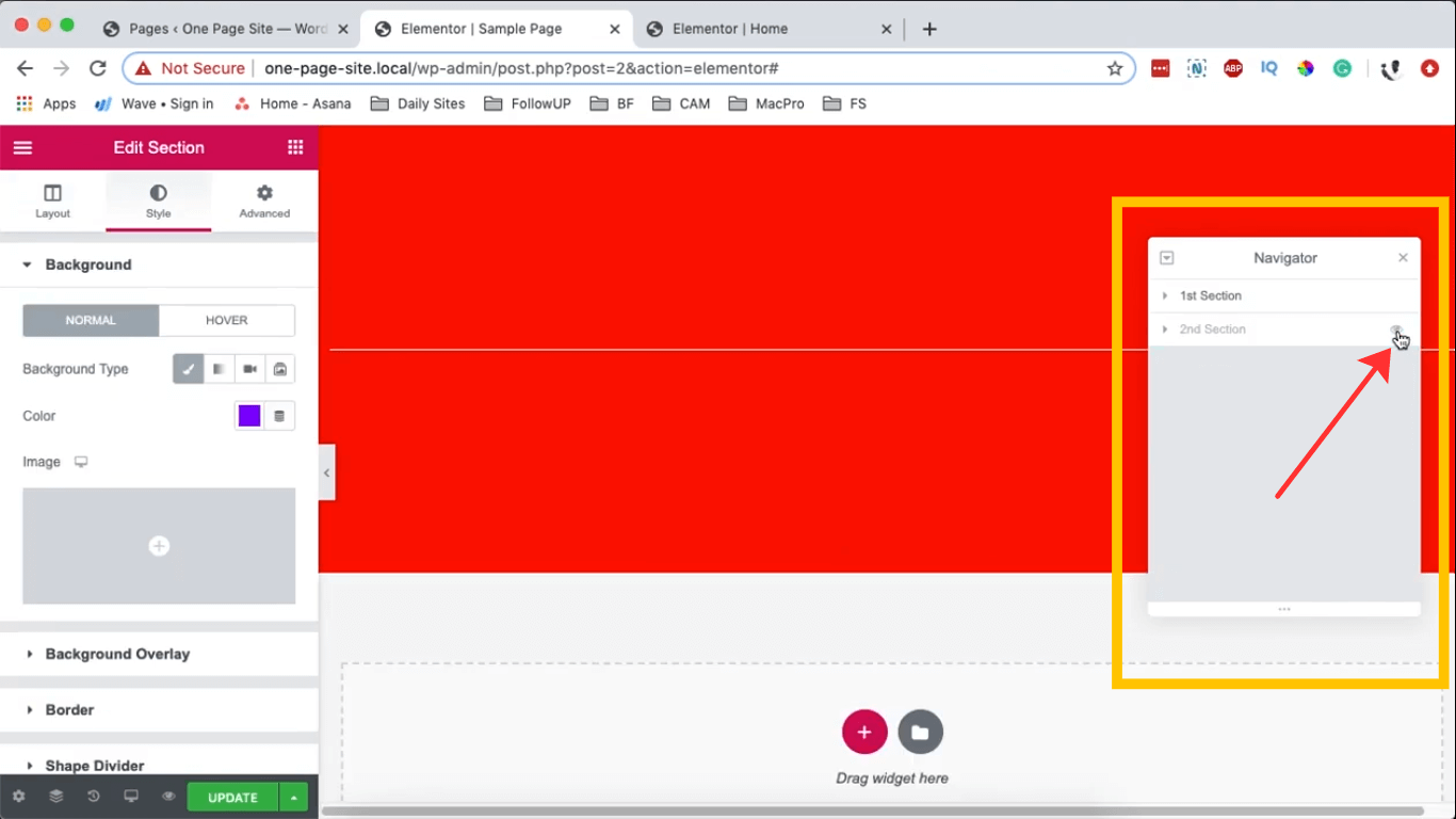
To accomplish this, you will require the Elementor Navigator. Locate the navigator icon situated at the bottom of your Edit Section on the left.
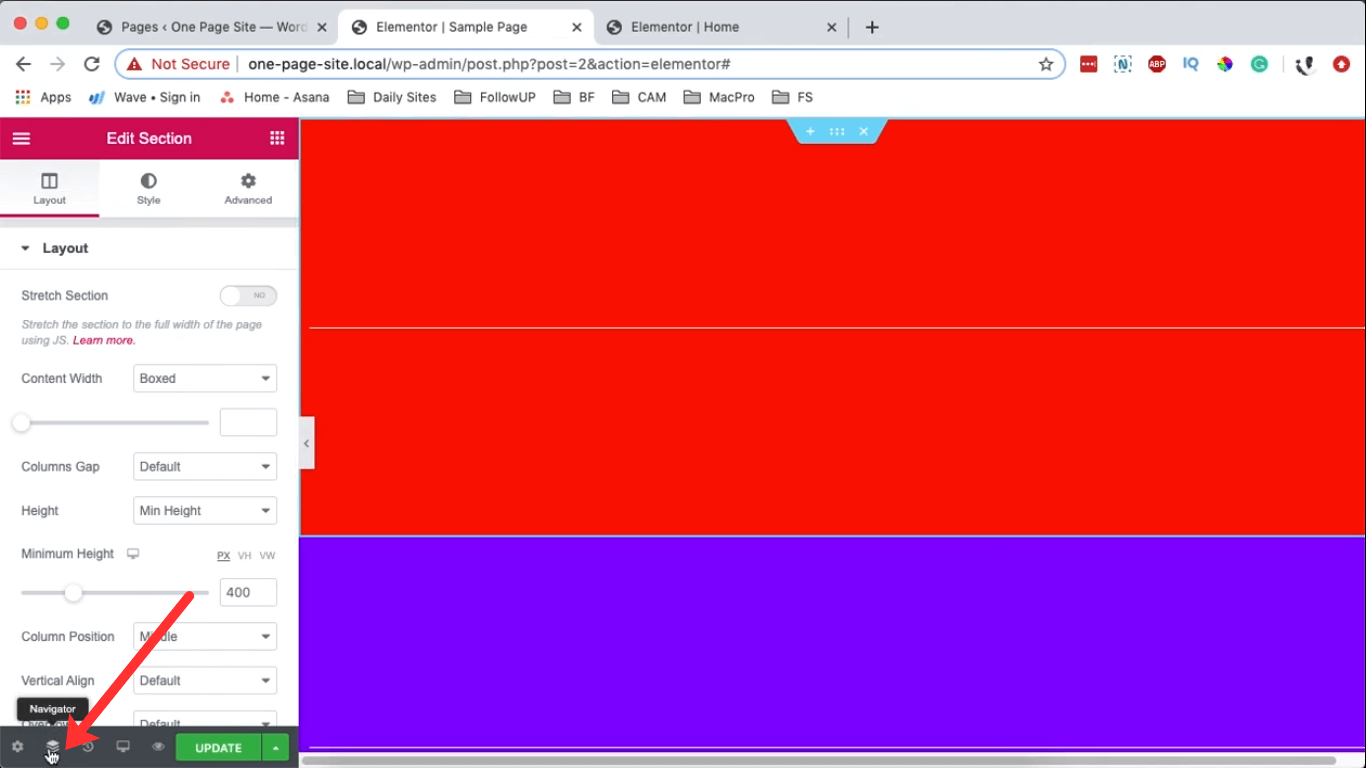
Upon clicking the navigation icon, your navigator appears at 02:18. It provides convenient access to your sections, aiding in seamless navigation. Additionally, clicking the 'eye' next to a section conceals it.
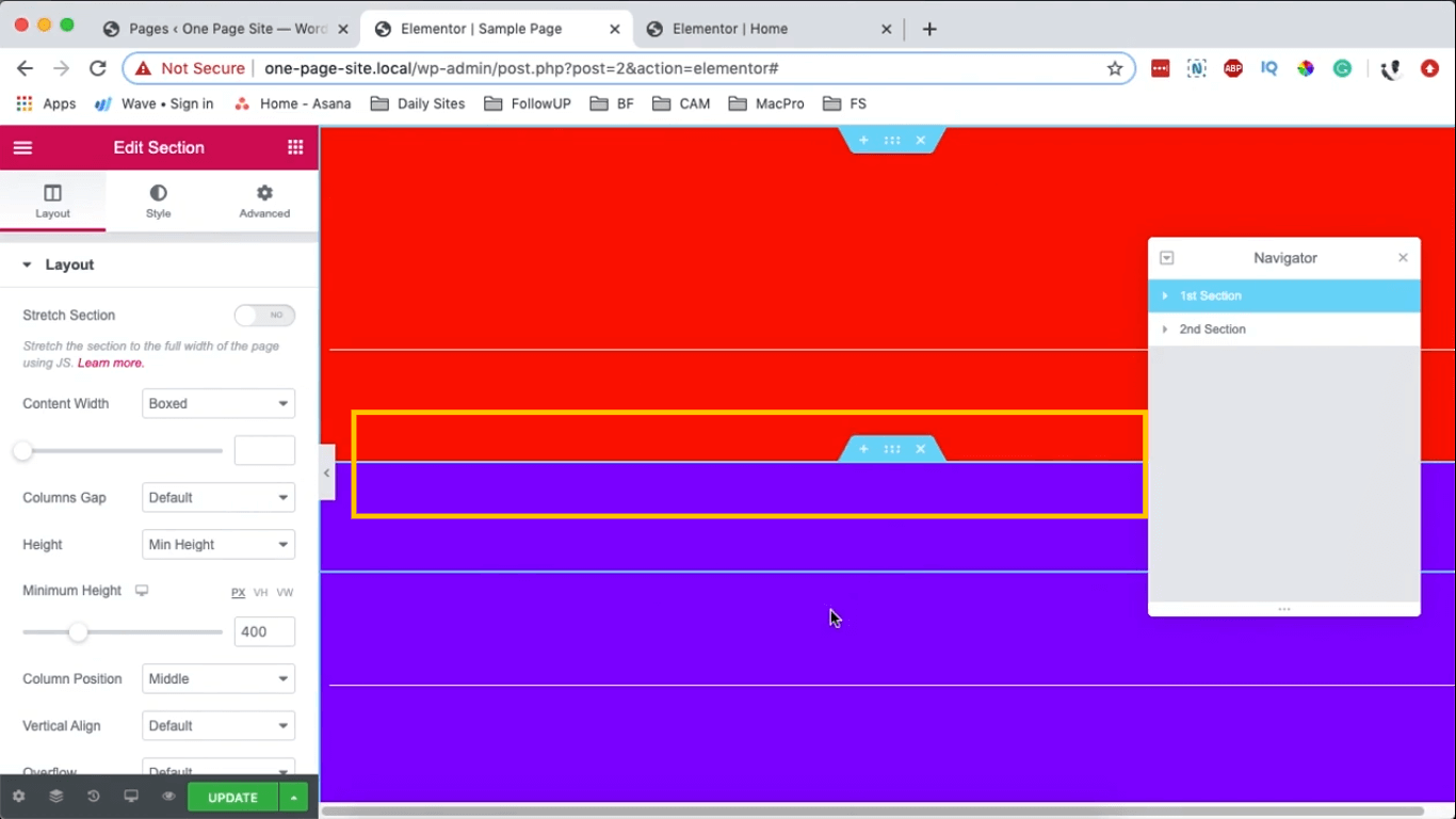
To superimpose the blue section onto the red one, choose the blue section, navigate to the Advanced options in the Edit Section area on the left, and set a Top margin of -100 pixels. This action shifts it over the first section, effectively placing it on top.
If you prefer the red section to appear above the blue section, choose the red segment, navigate to Advanced settings, adjust the Z-index to 10. This action will automatically position the red section in front of the blue section.
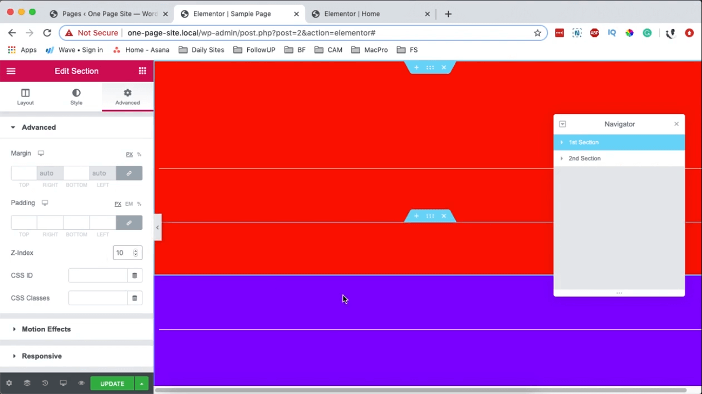
The blue section overlaps the red initially due to its higher priority. When the red section has a Z-index of 0, the blue section defaults to a Z-index of 1, placing it on top. In essence, the section with the higher Z-index automatically appears above the other.
Certainly! Here's a rephrased version:
Suppose you have more than two sections.
To observe the process, create an additional section.
Choose the blue section, duplicate it, select the duplicated section, and in the Advanced settings, adjust its Z-index to 0 and Margins to 0 pixels. In the Style section, you can assign it a different color.
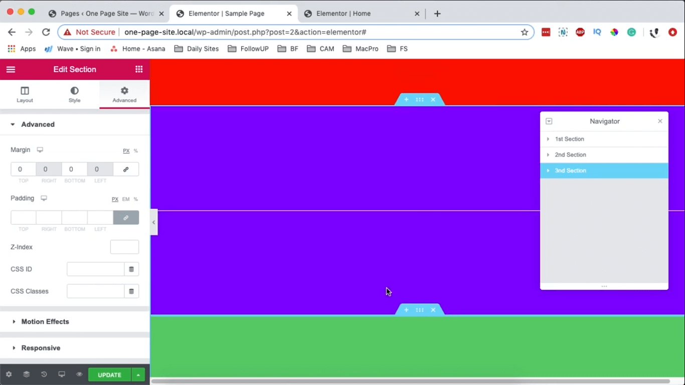
If you wish to have the blue section positioned above both the red and green sections, you need to assign a higher Z-index to the blue section. For instance, if the red section has a Z-index of 1 and the green section has the default Z-index of 1 as well, select the blue section and set its Z-index to 3.
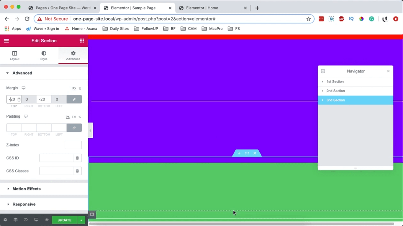
To observe this alteration clearly, choose the green section, go to Advanced settings, and apply a Margin of -20. This will shift the green section upwards, allowing you to visually confirm that the blue section is now positioned above both sections.
This is the way you can create overlapping sections in Elementor, and ensure that the overlap functions properly on various devices.
Wrapping Up
In Elementor, you may do that to overlap areas, and the overlap will even function on different devices.
Use the section below for any comments or queries. Also, spread the word to your acquaintances and continue to follow CodeWatchers.