
Who doesn't like animations? Animation plays a big role in website designing. Today we will learn how to create shapes using CSS and how to add animation effects to them. We used to use HTML solutions like Canvas or SVG to add such custom animations to the website, but today we will see how it is possible to design such a visual paradigm with Divi using custom CSS.
First, we will learn how to create a custom shape using CSS and then provide a unique scroll effect. We will do the whole thing using Divi's built-in features. So let's get started.
Preview
Our final design will look like that.
Animated Custom Shapes With CSS
Add: Row To The Initial Section
First, we will add the marked row structure of the image to the main section of the page.
Create Amazing Websites
With the best free page builder Elementor
Start Now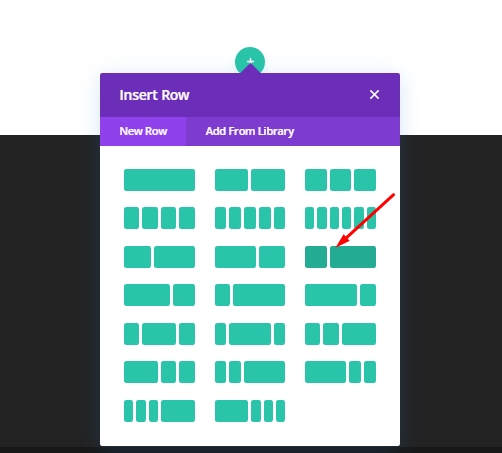
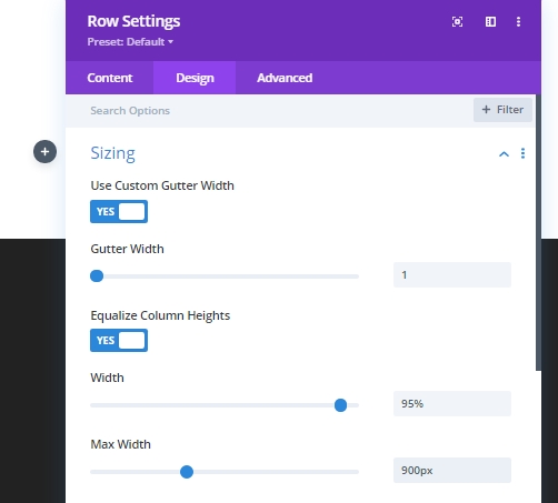
Now make some changes on the design tab row settings.
- Use Custom Gutter Width: Yes
- Gutter Width: 1
- Equalize Column Heights: YES
- Width: 95%
- Max Width: 900px
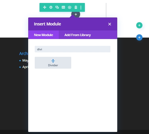
Add: Divider Module
We will add a divider module for spacing in the column that will contain the CSS shapes.
Now open the divider settings and make following changes.
- Show Divider: NO
- Height: 150px
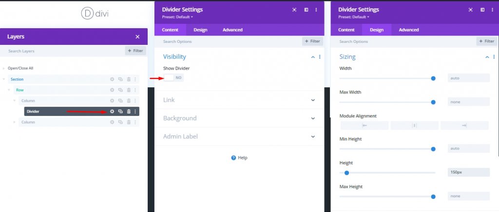
Since the position value of our shapes will be - absolute, we can adjust the spacing of the column just by adjusting the height of the divider. This way, you can also customize the divider as a design element.
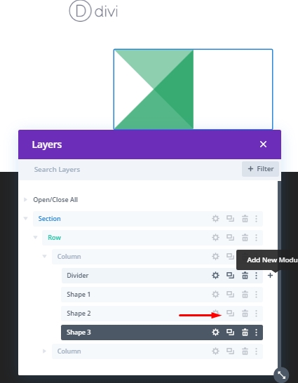
CSS Shape No 1
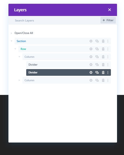
Now we will create CSS shapes using the divider module. I will use the surroundings border of the divider module to make shapes, not the module, to use other modules like text or code module later. Now, clone the previous divider module.
Now edit as instructed below.
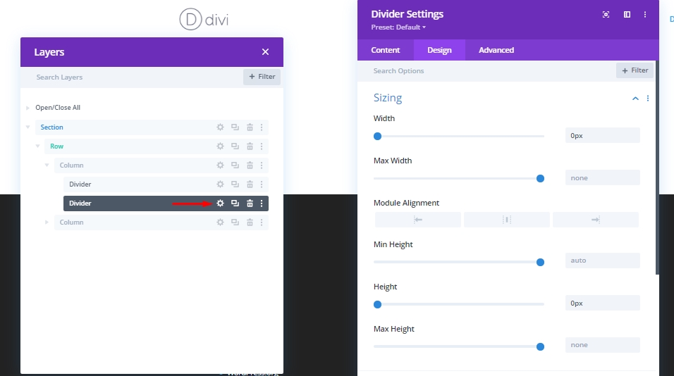
- Width: 0px
- Height: 0px
Border Options
Now, we'll create a triangle that points top right. Make adjustments to the divider border to create this design. Label the duplicated divider as - Shape 1. It will be helpful for future identification.
- Border Color: rgba(28,160,96,0.5)
- Top Border Width: 150px
- Left Border Width: 150px
- Left Border Color: transparent
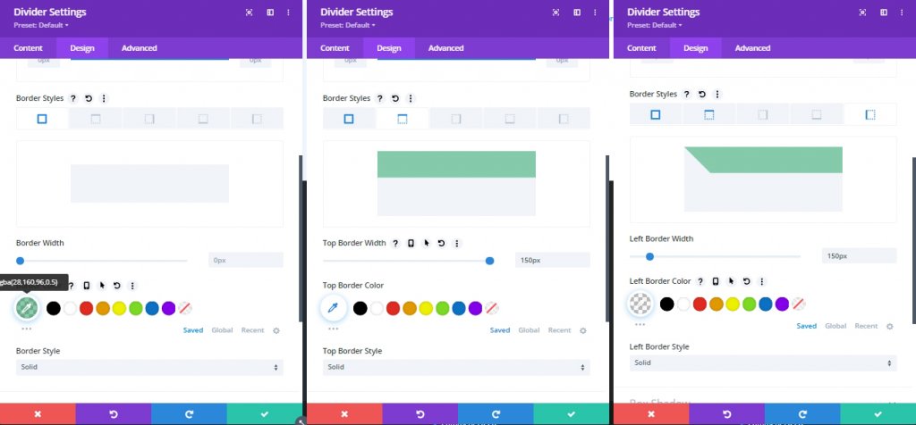
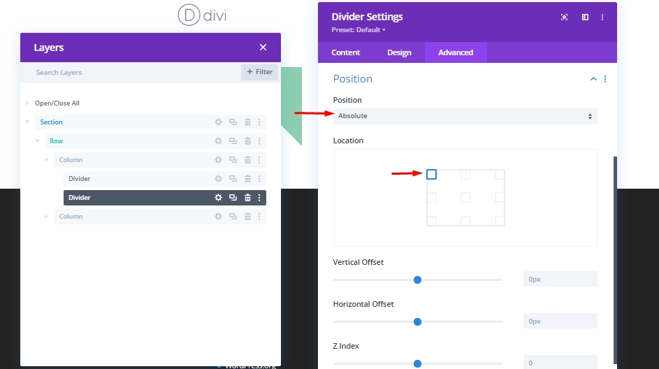
Since we will be adding scrolling animations to our designs later, the position value must be absolute in this shape and in the shapes that we will create ahead because the elements should remain correct sequence. Remember - all shapes have the same starting point. For this, change the following values.
- Position: Absolute
- Postion Location: Top Right (default)
We have just created our first CSS triangle. Now let's more forward.
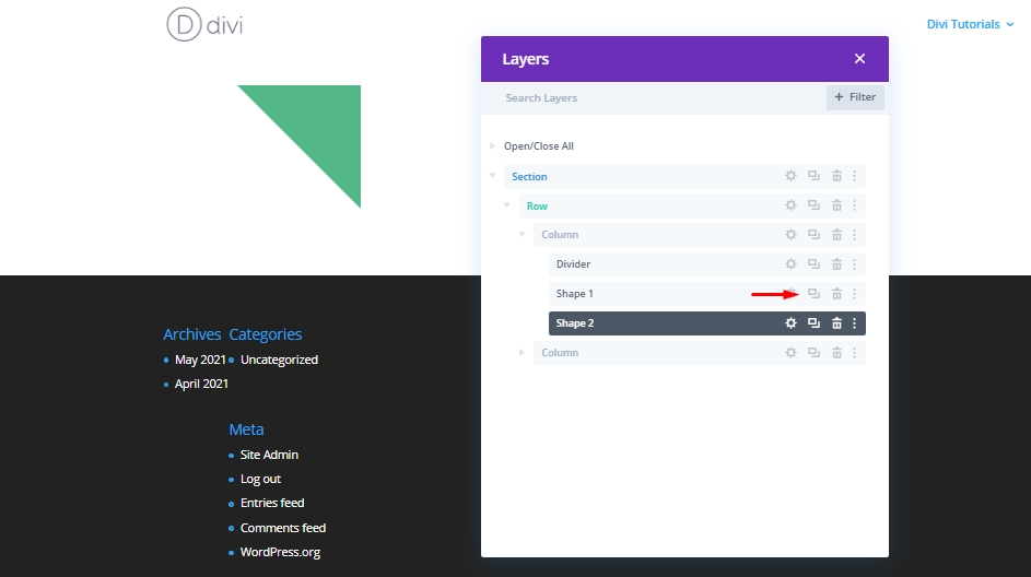
CSS Shape No 2
Now we will create another identical triangle by cloning our Divider module called Shape 1 and label it as Shape 2.
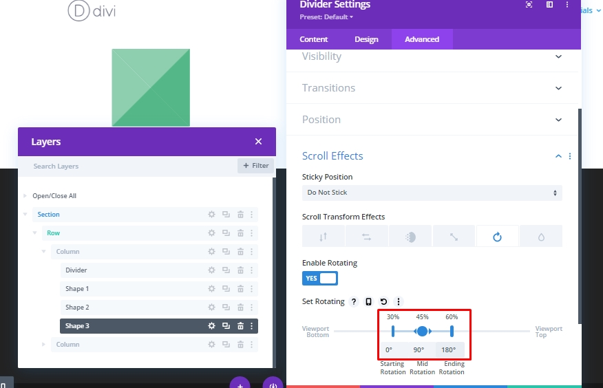
Scroll Animation
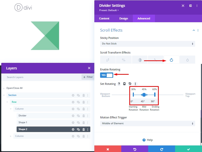
Now, open settings for shape 2 and make these changes.
- Scroll Transform Effects: Rotating
- Enable Rotating: YES
- Starting Rotation: 0° (at 30%)
- Mid Rotation: 45° (at 45%)
- Ending Rotation: 90° (at 60%)
CSS Shape No 3
This time, duplicate the shape 2 and label the duplicated divider as Shape 3.
Scroll Animation
Then, change the transform rotation values.
- Mid Rotation: 90°
- Ending Rotation: 180°
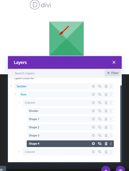
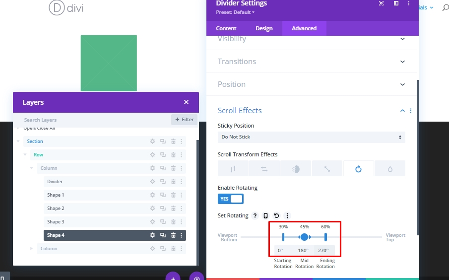
CSS Shape No 4
Again, duplicate the previous module and name it as "Shape 4".
Scroll Animation
Then, change the transform rotation values.
- Mid Rotation: 180°
- Ending Rotation: 270°
Scroll Animation Testing
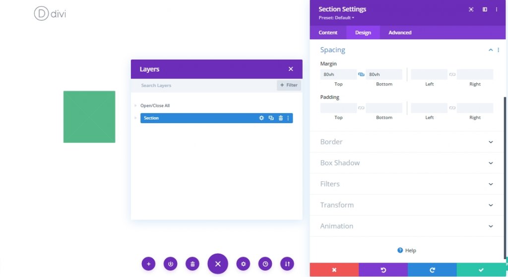
Now to test the scroll animation you need to add a temporary margin above and below the divider.
- Margin: 80vh top, 80vh bottom
Adding a Title
Having an animated title with such a design on a web page is quite good. So we will now add a title to it. Before that, we will add some CSS codes in the main element section of the Advanced tab of column 2 (where the title will be) so that our title stays vertically centered.
display:flex;
flex-direction:column;
align-items:center;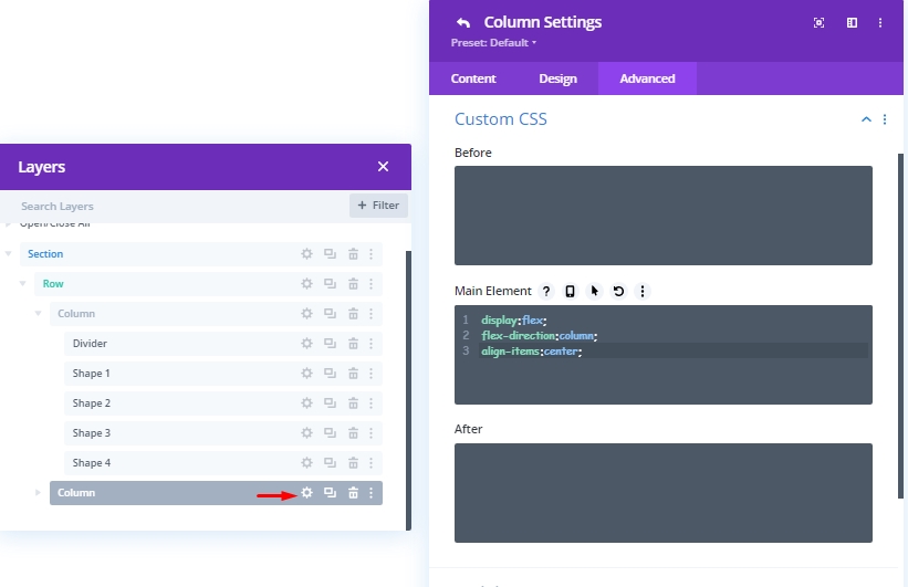
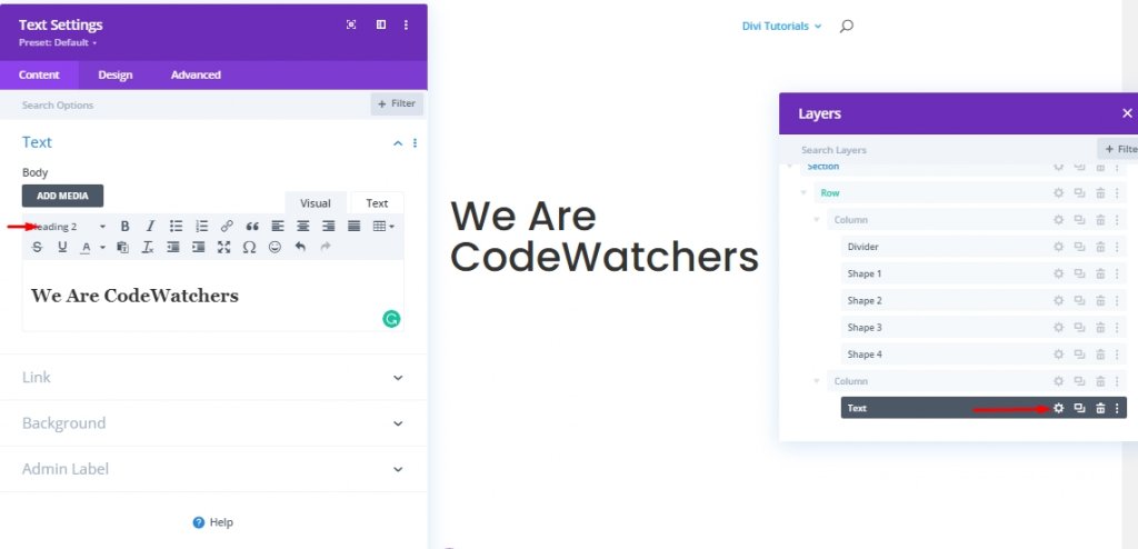
Now add a text module to this column 2 and add some H2 heading into this.
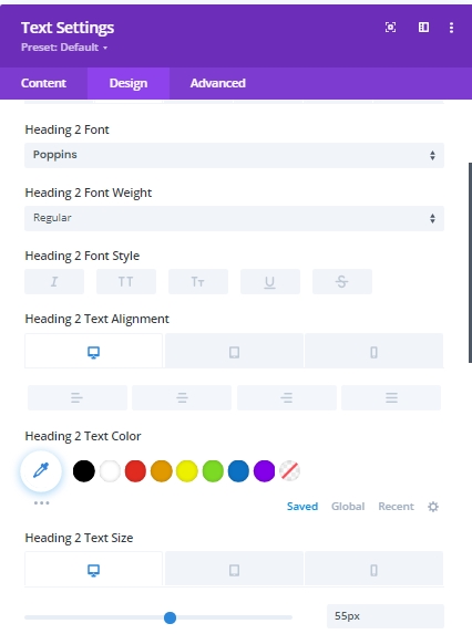
Now from the design tab, change the following settings.
- Heading 2 Font: Poppins
- Heading 2 Text Alignment: default (desktop), center (tablet and phone)
- Heading 2 Text Size: 55px (desktop), 45px (tablet), 35px (phone)
- Width: 100%
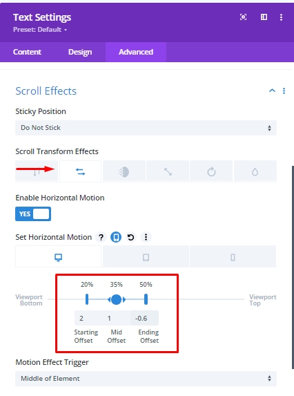
Now we'll add some scroll effect to this text.
- Scroll Transform Effects: Horizontal Motion
- Enable Horizontal Motion: YES
- Starting Offset: 2 (at 20%)
- Mid Offset: 1 (at 35%)
- Ending Offset: Desktop -0.6 (at 50%), Tablet and Phone 0 (at 50%)
Exploring Shaped From Different Angle
Now since we are done with designs, we can now explore different shapes for top triangle design. To do this, hold the command(for mac) and control(for windows) and select all 4 shapes and click settings of any shape. This will open combined settings for all these shapes. And see which design you like most.
Final View
All our work is done, now we will see how many types of designs we can add to our website.
Conclusion
People who want to bring a new dimension to their web design will always look for something exceptional like this type of design. Custom CSS shape with animated scrolling will definitely extend the beauty of your project. These are very easy to design with Divi, plus it doesn't need any extra plugins because all the features are built-in. I hope you'll like today's tutorial as it will give you a nice idea about CSS Shape animation. We'll be glad to your thoughts on today's article, and if you like this, a share will be mind-blowing.