
A sticky footer is an excellent way to display important information to your visitors. The footer remains at the edge of the screen as users scroll, allowing them convenient access to the information. This is ideal for storing contact data, special links, and other information. Fortunately, Divi makes it simple to create a sticky footer. In this lesson, we'll look at how to make one area of your Divi footer sticky, as well as how to alter it for desktop and mobile devices.
Preview
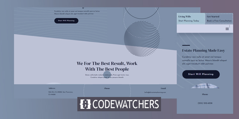
Before we start building the design, let's take a look at what we are going to accomplish!
This is how it will look like in mobile versions.
Benefits Of Sticky Footer
There are various benefits to having a sticky footer… First, pages with insufficient material to fill the screen's height will have a floating footer by default. A sticky footer keeps the footer from drifting at the bottom of the screen. This improves the page's appearance and makes it less distracting to readers.
Create Amazing Websites
With the best free page builder Elementor
Start NowAnother benefit is that it's an excellent spot to add calls to action or information that the user can utilize right now. For example, the sticky footer might contain contact information, sales advertisements, banner ads, and much more. Phone numbers are beneficial for phones because they may be made clickable.
Getting The Template
First, you need a footer template to use with the Divi Theme Builder. You can create your own or use one of the free templates available on the Elegant Themes site. Elegant Themes offers a lot of free header and footer designs that coordinate with many of the free Divi layout sets. After getting, the perfect template, unzip the template file after downloading it.

For my examples, we are using Divi's Estate Planning Layout Pack's free Header and Footer Template and a landing page from the Estate Planning Layout Pack for the page content.
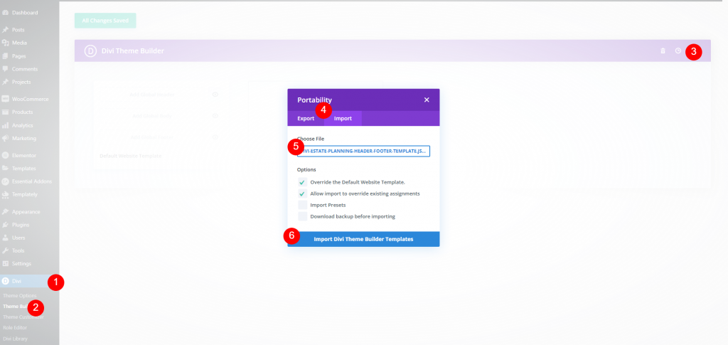
To upload the template, navigate to Divi > Theme Builder in the WordPress dashboard. Then, click the Portability icon in the upper right and select Import within the modal that opens. Next, click Choose File and navigate to your JSON file on your computer and select it. Finally, click the button Import Template at the bottom of the modal. Wait for the template to upload and save your settings.
Now we can edit the template.
Making Sticking Divi Footer
As we are working in the backend, we will do the setting first then we are going to check the changes.
Section Settings
In the footer, we are going to make one part of it sticky. This section contains the address, phone number, and email address. We'll make it smaller while it's sticky, and we'll make different changes to the desktop and footer. Hover your mouse over the portion you wish to make sticky and click the options icon.
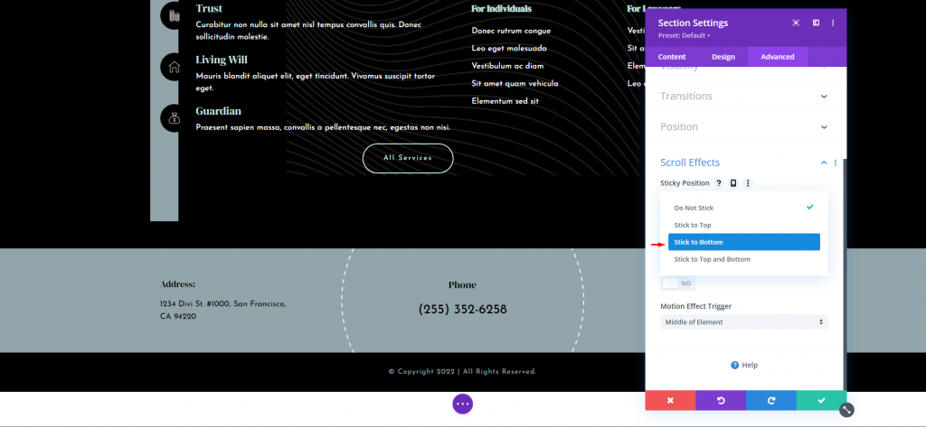
Scroll down to Scroll Effects after selecting the Advanced tab. This is the first setting, Sticky Position. Select Stick to Bottom from the dropdown box. This will make the sticky options available throughout the section.
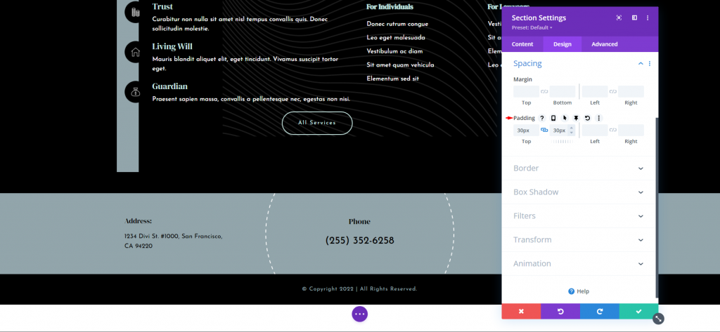
After that, navigate to the Design tab and scroll down to Spacing. It should already have padding on the top and bottom, but if it doesn't, add 30px to each.
- Padding: 30px, Top and Bottom
Float your mouse over the fields to see more options. Select the pin icon. This brings up the sticky settings for this setting.
There will be a desktop icon and a pin icon. The desktop icon will be highlighted. To alter the padding for the sticky status of the area, click the pin symbol. The top and bottom are both 0px.
- Sticky Padding: 0px, Top and Bottom.
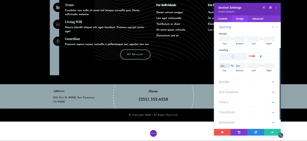
As you can see, the section is already shorter than it was. This allows the section to appear smaller when it is outside of its section and then grow to its full size when it is locked into position in the footer. That's all there is to it for the desktop settings. These settings will be followed by the tablet automatically.
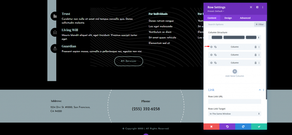
Column Settings
Now we will be making settings for mobile devices. Open the row settings option. Here, we are going to make changes to two of the columns. Click the gear icon for the first column.
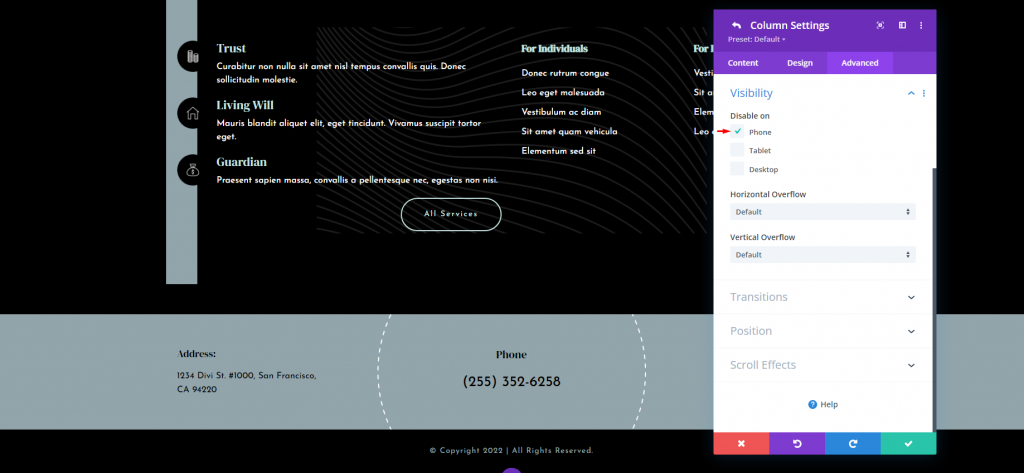
Once the column settings are open, go to the advanced tab and open visibility. Check the option for phone.
- Disable On: Phone
Now open the settings for the third column.
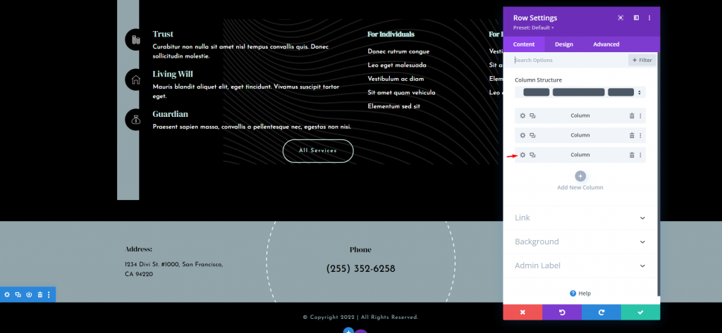
Repeat the same steps and disable the visibility on the Phone. Then save your changes.
Clickable Phone Number
Given that the mobile version of this sticky footer will only display the phone number, we'd like to make it clickable. This helps make use of the phone number that is still visible on the screen and provides a call to action. Click the settings button for the Text module that contains the phone number.
For phones only, we'll make the number clickable. The desktop and tablet will be unclickable. If you want it to be clickable on the desktop, don't click on the icon.
Choose the Phone icon. In the Body text editor, go to the Text tab and paste the following HTML for a clickable phone number:
<a href="tel:2553526258" style="color: black;">(255) 252-6258</a>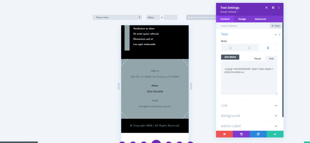
For my example, I'm going to use the template's number. Simply replace the number with yours. Because clickable links change to the default link color when clicked, I've added some inline CSS to change the color of the clickable link to black. Add the name or hex code to change the color.
You could also modify the label from Phone to Click to Call or something along those lines.
Finally, save your layout and quit your setting.
Final Preview
Here is the final view of our design. Hope this comes helpful to your website.
Have a look at the mobile view as well.
Ending Thoughts
That closes our overview of how to use the Divi Builder's sticky settings to make your Divi footer sticky. With a simple click, you can make the entire footer or any piece in the footer sticky. While the elements are sticky, the footer state options allow them to seem different. This opens you to a plethora of design possibilities for sticky footers.