
We usually notice the presence of newsletter forms in magazines or blogging websites. Forms of various eye-catching designs always attract our attention. Moreover, creatively designed forms are very active in the field of setting a positive effect on user experience. Forms have placeholders to let users know what type of value they should input. So how it would be if we set the placeholder and input fields name to the same and make the placeholder invisible when someone tries to add information of that field and make the labels name pop up which was not visible in the first place.
Sounds a bit complex? No worries, Today we will show you how to design a form on Divi where the placeholders of the form will be floating and will rise to the top while inputting the data. Let's get to it.
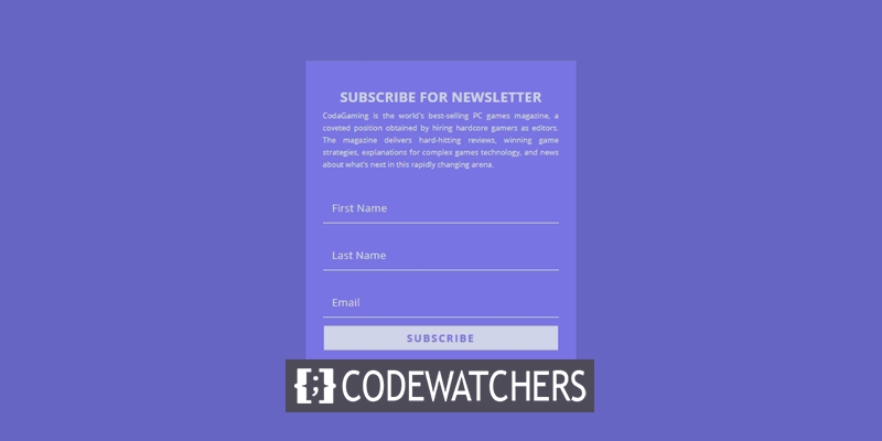
Preview
Take a quick look at how our todays form will look like.
Designing The Newsletter Form
Email Optin Form Building
Open the page with Divi builder where you want to add the form. move to section and add a one-column row.
Create Amazing Websites
With the best free page builder Elementor
Start Now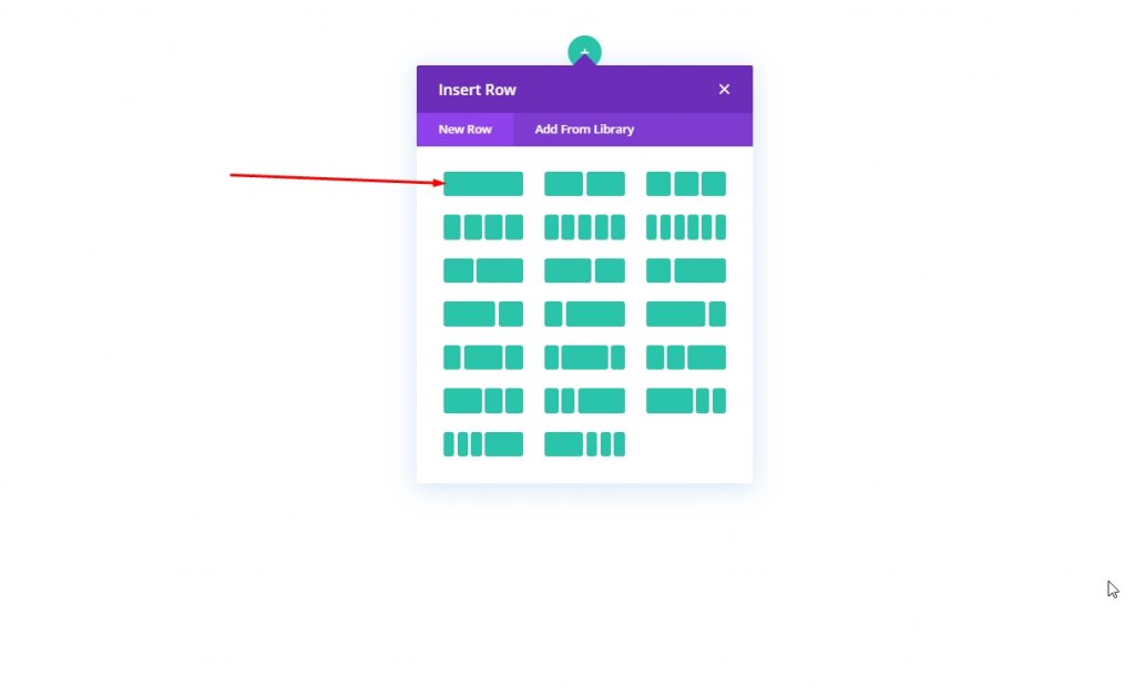
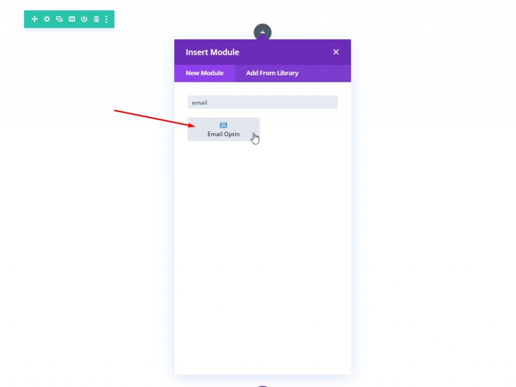
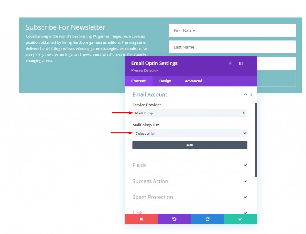
Now add an Email option form module to the column.
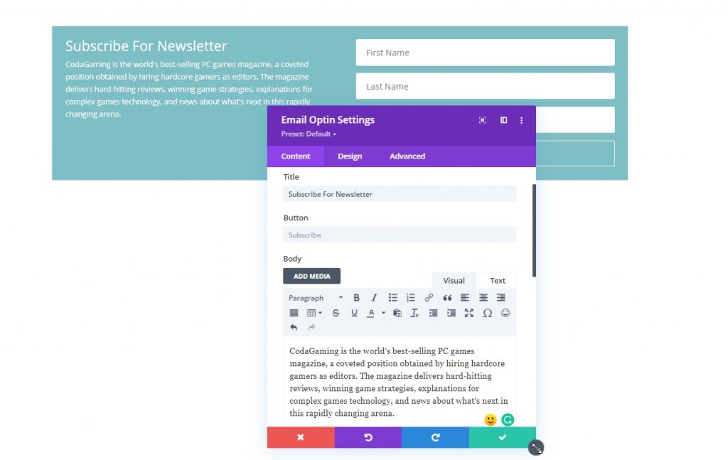
Open settings for the Email optin module. From the content tab, change the texts.
Remember to connect it with email provide. Without the connection, the form wont be appear on a live page.
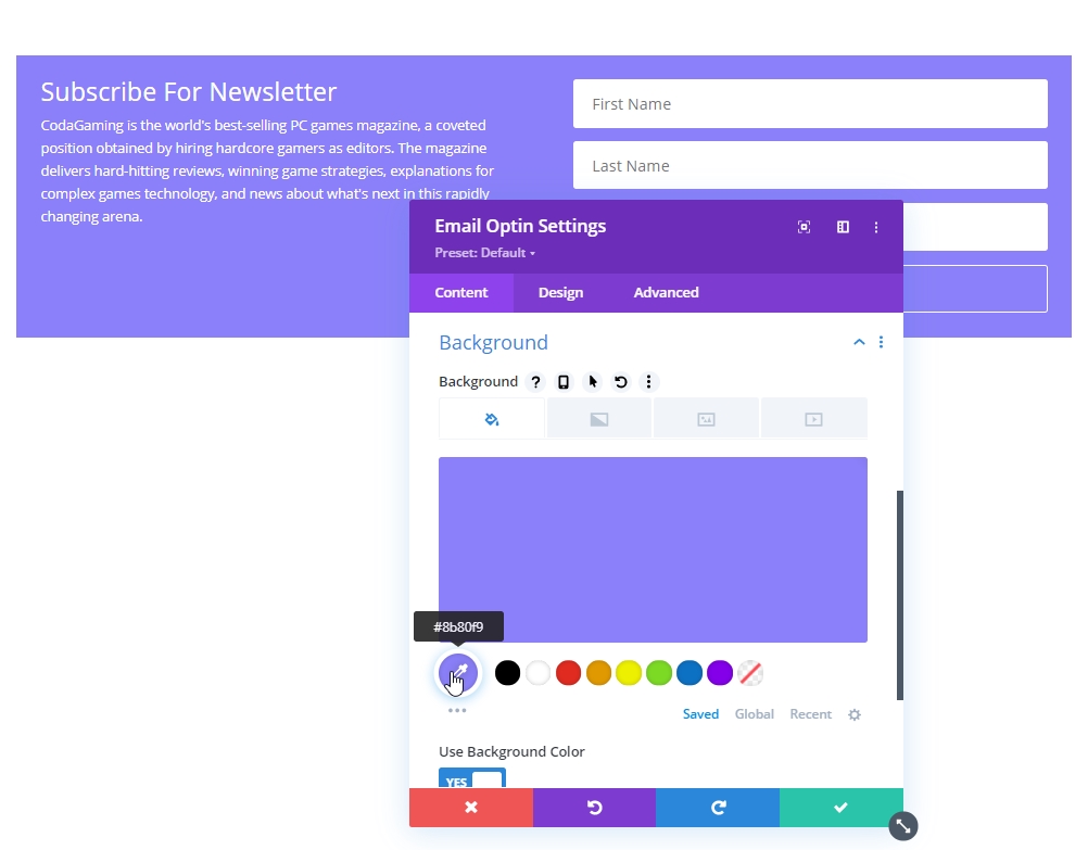
Next, add the a nice eye soothing color to the form.
- Background Color: #8B80F9
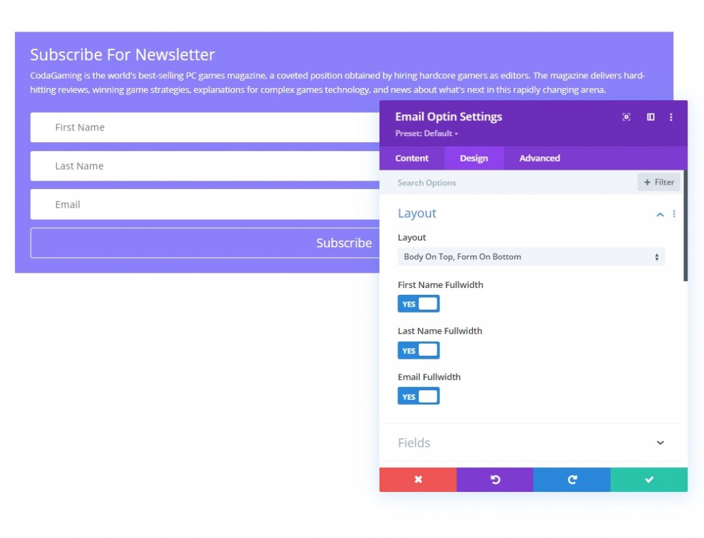
From the design tab, please update the form layout.
- Layout: Body On Top, Form On Bottom
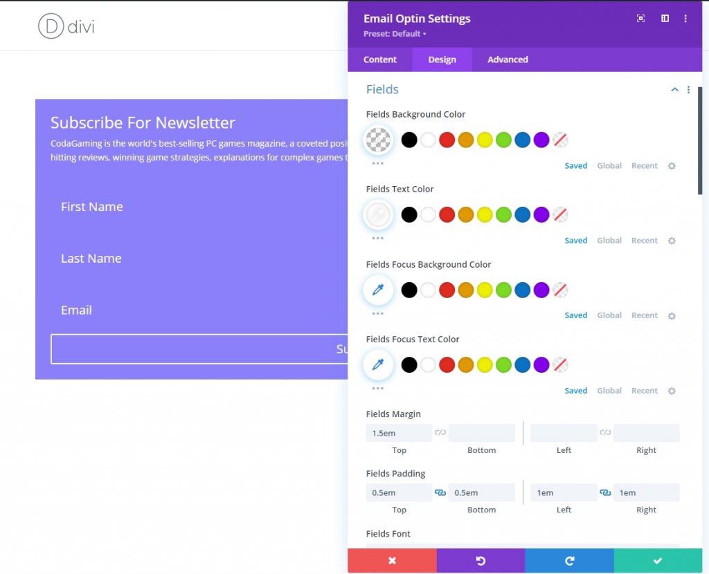
Now, change the field properties accordingly.
- Fields Background Color: transparent
- Fields Text Color: #ffffff
- Fields Margin: 1.5em top
- Fields Padding: 0.5em top, 0.5em bottom, 1em left, 1em right
- Fields Text Size: 1.2em
- Fields Line Height: 2em
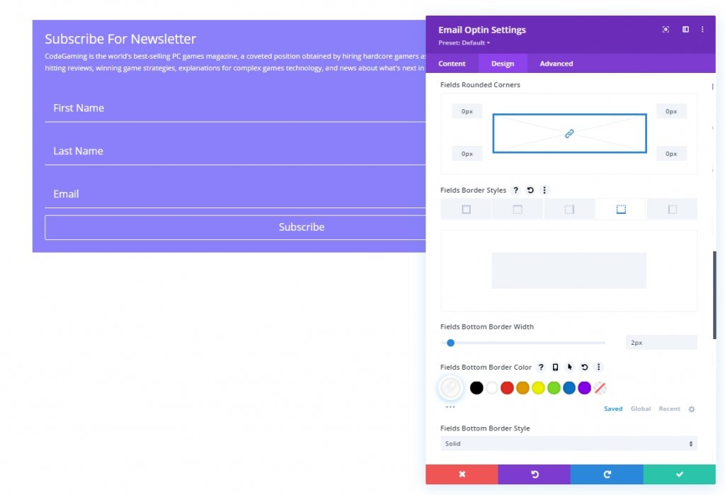
Next, we will change the border style.
- Fields Rounded Corners: 0px
- Fields Bottom Border Width: 2px
- Fields Bottom Border Color: #ffffff
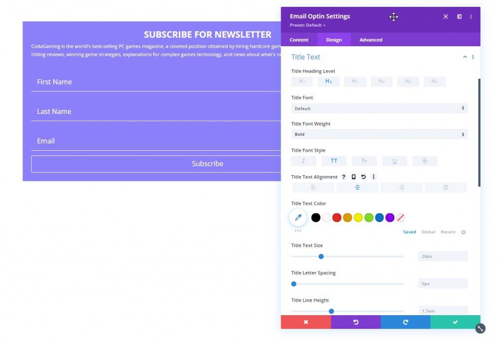
Now change the Title font styles:
- Title Font Weight: Bold
- Title Font Style: TT
- Title Text Alignment: Center
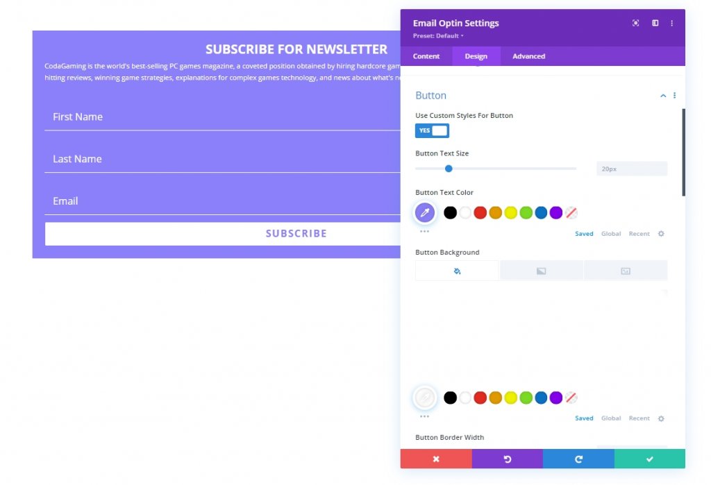
Now make changes to the button.
- Use Custom Styles for Button: YES
- Button Text Color: #8B80F9
- Button Background Color: #ffffff
- Button letter-spacing: 0.1em
- Button Font Weight: Bold
- Button Font Style: TT
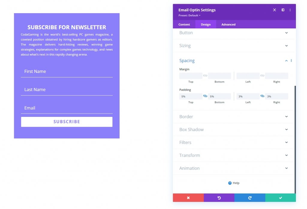
Now, let’s add a max-width and padding to the form. It's the last adjustment to our design.
- Max Width: 500px
- Padding: 5% top, 5% bottom, 3% left 3% right
Lastly, we will add a CSS class to our design so that we can target it in our coding section where we will add CSS and JQuery code to our design.
- CSS Class: et-float-labels
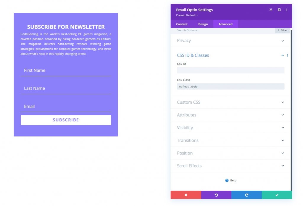
Custom Code Adding
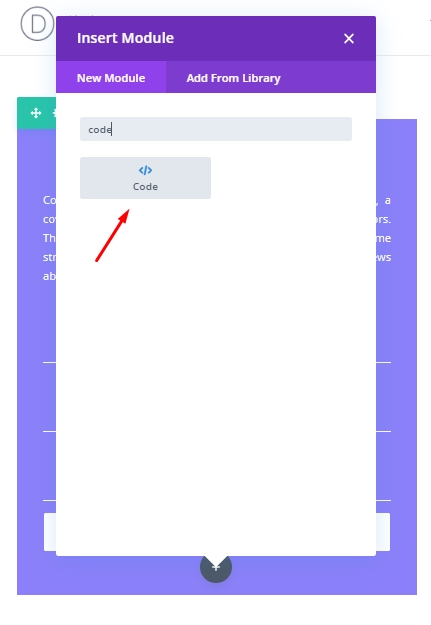
Add a code module beneath the design where we will add the CSS and JQuery code.
CSS Code
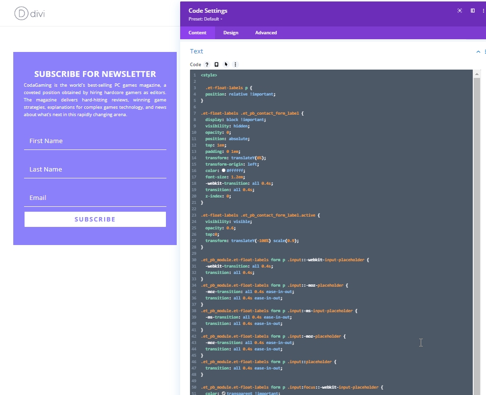
Now copy the code written below and paste it into the code module. Remember to keep the code inside the Style tag.
.et-float-labels p {
  position: relative !important;
}

.et-float-labels .et_pb_contact_form_label {
  display: block !important;
  visibility: hidden;
  opacity: 0;
  position: absolute;
  top: 1em;
  padding: 0 1em;
  transform: translateY(0%);
  transform-origin: left;
  color: #ffffff;
  font-size: 1.2em;
  -webkit-transition: all 0.4s;
  transition: all 0.4s;
  z-index: 0;
}

.et-float-labels .et_pb_contact_form_label.active {
  visibility: visible;
  opacity: 0.6;
  top:0;
  transform: translateY(-100%) scale(0.9);
}

.et_pb_module.et-float-labels form p .input::-webkit-input-placeholder {
  -webkit-transition: all 0.4s;
  transition: all 0.4s;
}
.et_pb_module.et-float-labels form p .input::-moz-placeholder {
  -moz-transition: all 0.4s ease-in-out;
  transition: all 0.4s ease-in-out;
}
.et_pb_module.et-float-labels form p .input:-ms-input-placeholder {
  -ms-transition: all 0.4s ease-in-out;
  transition: all 0.4s ease-in-out;
}
.et_pb_module.et-float-labels form p .input:-moz-placeholder {
  -moz-transition: all 0.4s ease-in-out;
  transition: all 0.4s ease-in-out;
}
.et_pb_module.et-float-labels form p .input::placeholder {
  transition: all 0.4s ease-in-out;
}

.et_pb_module.et-float-labels form p .input:focus::-webkit-input-placeholder {
  color: transparent !important;
  transform: translateY(0%);
  transform-origin: left;
}
.et_pb_module.et-float-labels form p .input:focus::-moz-placeholder {
  color: transparent !important;
  transform: translateY(0%);
  transform-origin: left;
}
.et_pb_module.et-float-labels form p .input:focus:-moz-placeholder {
  color: transparent !important;
  transform: translateY(0%);
  transform-origin: left;
}
.et_pb_module.et-float-labels form p .input:focus:-ms-input-placeholder {
  color: transparent !important;
  transform: translateY(0%);
  transform-origin: left;
}
.et_pb_module.et-float-labels form p .input:focus::placeholder {
  color: transparent !important;
  transform: translateY(0%);
  transform-origin: left;
}
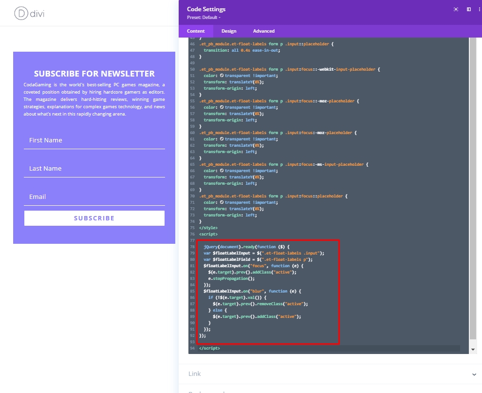
JQuery Code
Now, add Script tag and paste the following JQuery code in it.
jQuery(document).ready(function ($) {
  var $floatLabelInput = $(".et-float-labels .input");
  var $floatLabelField = $(".et-float-labels p");
  $floatLabelInput.on("focus", function (e) {
    $(e.target).prev().addClass("active");
    e.stopPropagation();
  });
  $floatLabelInput.on("blur", function (e) {
    if (!$(e.target).val()) {
      $(e.target).prev().removeClass("active");
    } else {
      $(e.target).prev().addClass("active");
    }
  });
});
Final View
So here is our final design look like.
Conclusion
So, you see having a creative newsletter form is very easy in Divi and you can make the floating labels email opt-in form in a very short time. Be assure of customizing the design according to your need. Custom codes are very important to make the labels floating, so put them inside the tags carefully. Hope you'll like this design and if so, share it with your Divi lover friends. Subscribe to our updates to get more Divi tutorials like this.