
Fullscreen headers take up the entire screen, regardless of the visitor's screen size. This is excellent for capturing the attention of users. It's also useful for leading them to your call to action. Fortunately, Divi's Fullwidth Header Module makes it simple to create a fullscreen header. We'll show you how to create a full-width header, make it fullscreen, and design it in this post. This method may be used to create any fullscreen hero section for your pages!
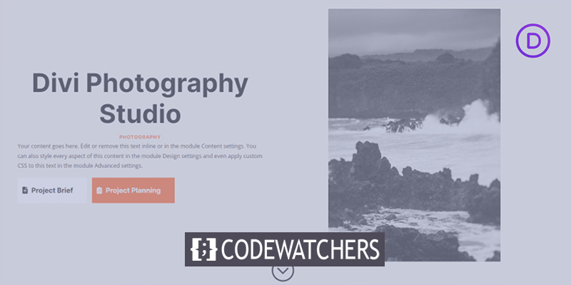
Design Preview
Let's take a look at how our design will look after we finish.
Structure Building
Begin by incorporating a full-width section into the page you're working on. Then, in the fullwidth section, add a Fullwidth Header Module.
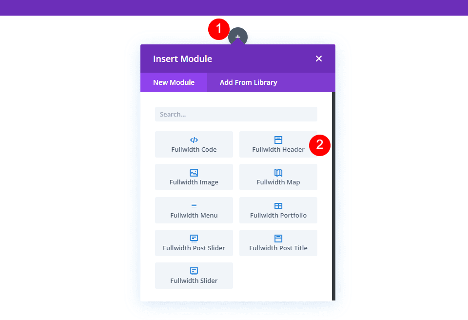
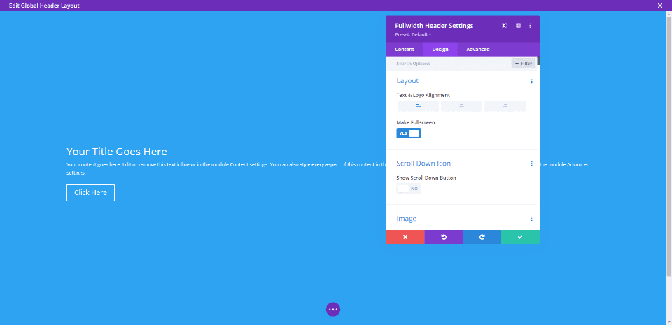
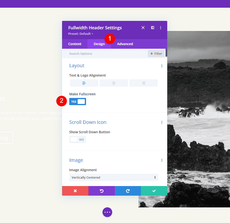
The module's settings will be displayed. Choose the Design tab. Enable the Make Fullscreen option.
Create Amazing Websites
With the best free page builder Elementor
Start Now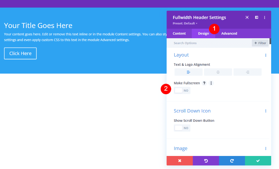
By just doing that, we now have got a full-screen header.
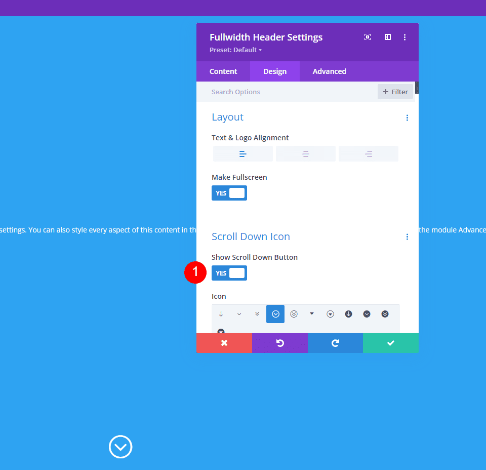
Enable the Icon For Fullscreen Header Scroll Down
We can also include a button that instructs the user to scroll down. However, we must enable it. In fullscreen mode, this button is always visible. The fullscreen header choice always matches the height of the visitor's screen.
Under the Layout choices in the module's settings, we'll see a section named Scroll Down Icon. To enable Show Scroll Down Icon, click the button.
Module Settings
Here are the steps for each section of the Fullscreen Header Module's settings.
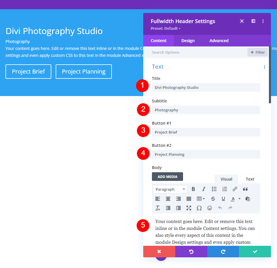
Text
First, enter the text that will appear in the full-width header. This comprises the title, sub-title, content (for which I'll use Divi's built-in dummy text), and button text.
- Title: Divi Photography Studio
- Subtitle: Photography
- Button 1: Project Brief
- Button 2: Project Planning
- Body: content
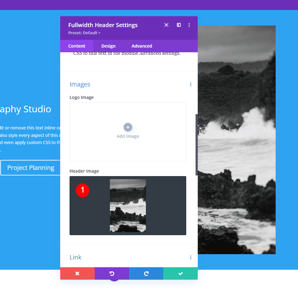
Images
After that, insert the image. This appears on the right side of the full-width header, repositioning the text to the left.
- Header Image: your choice
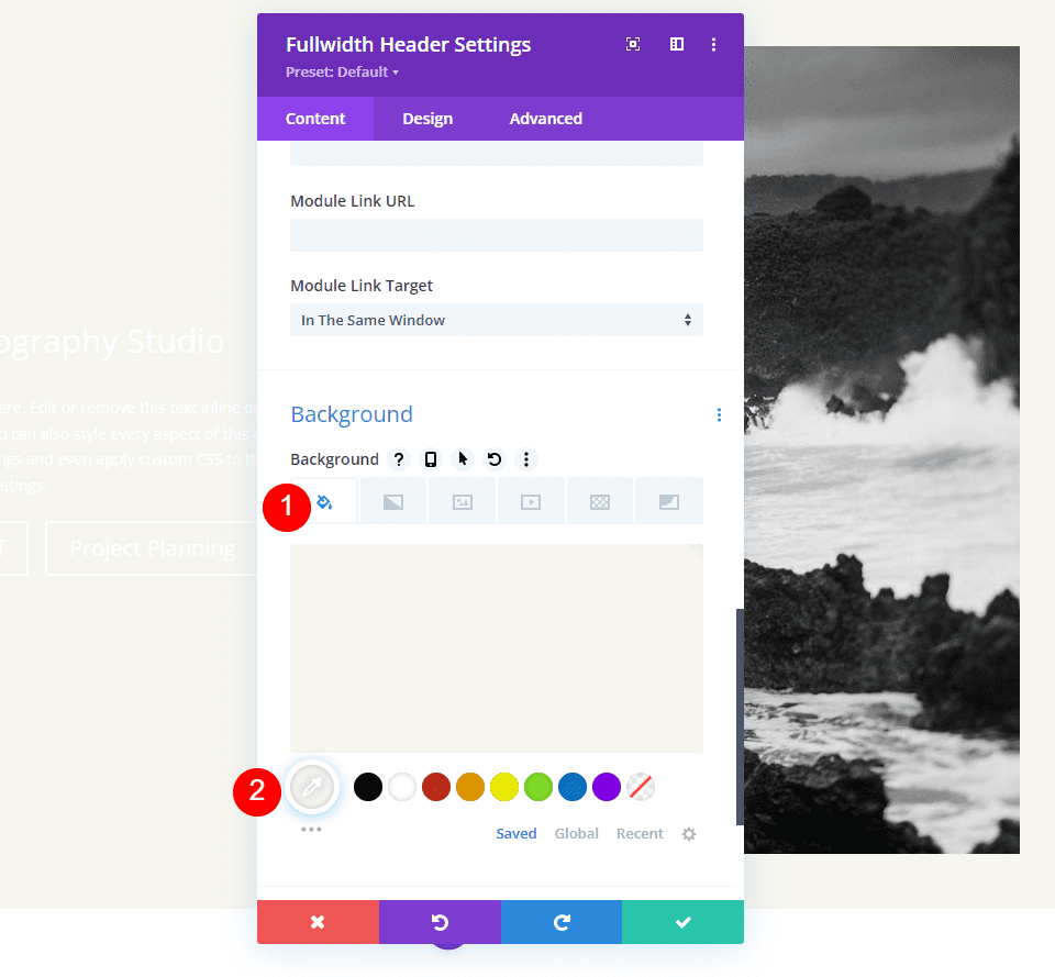
Background
Now, let's change the background color.
- Color: #f6f5ee
Layout
Go to the design tab and make the following change.
- Make Fullscreen: Yes
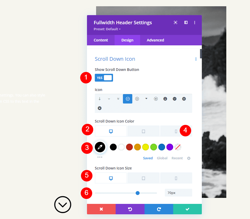
Scroll Down Icon
Then, turn on the Scroll Down Icon. For PCs and tablets, change the color to black, and for phones, to white. With the image I've chosen, the icon will appear towards the bottom of the image for phones, allowing it to be visible with the image's colors. Change the icon size for PCs to 70px, tablets to 60px, and phones to 50px.
- Show Scroll Down Button: Yes
- Icon Color: #000000 Desktop and Tablet, #ffffff Phone
- Size: 70px Desktop, 60px Tablet, 50px Phone
Title Text
Then we'll change the Title Text. Set the text to H1 and the font to Inter. Set the Color to black, the Weight to bold, and the Alignment to center.
- Heading: H1
- Font: Inter
- Weight: Bold
- Alignment: Center
- Color: #000000
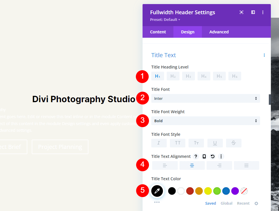
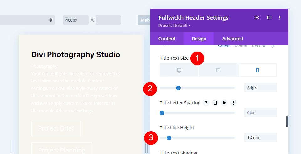
For the Font Size, we'll utilize three sizes: 75px for desktops, 40px for tablets, and 24px for phones. Line Height should be set at 1.2em.
- Size: 75px Desktop, 40px Tablet, 24px Phone
- Line Height: 1.2em
Body Text
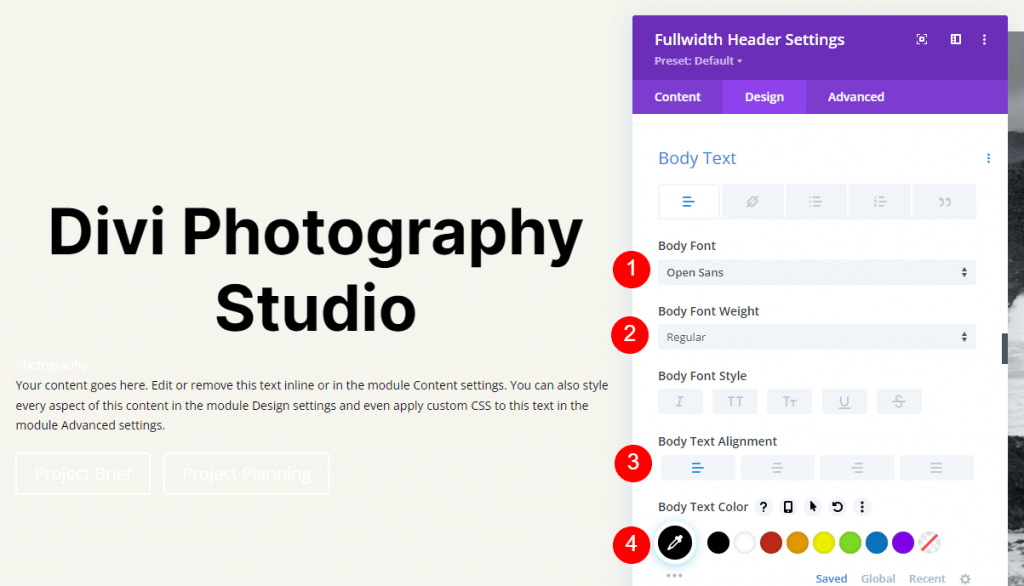
After that, scroll down to Body Text. Select Open Sans as the font. Set the color to black and the alignment to the left.
- Font: Open Sans
- Alignment: Left
- Color: #000000
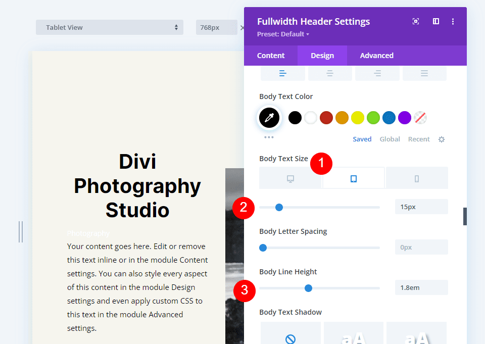
Set the Font Size for computers to 16px, tablets to 15px, and phones to 14px. Line Height should be set to 1.8em.
- Size: 16px Desktop, 15px Tablet, 14px Phone
- Line Height: 1.8em
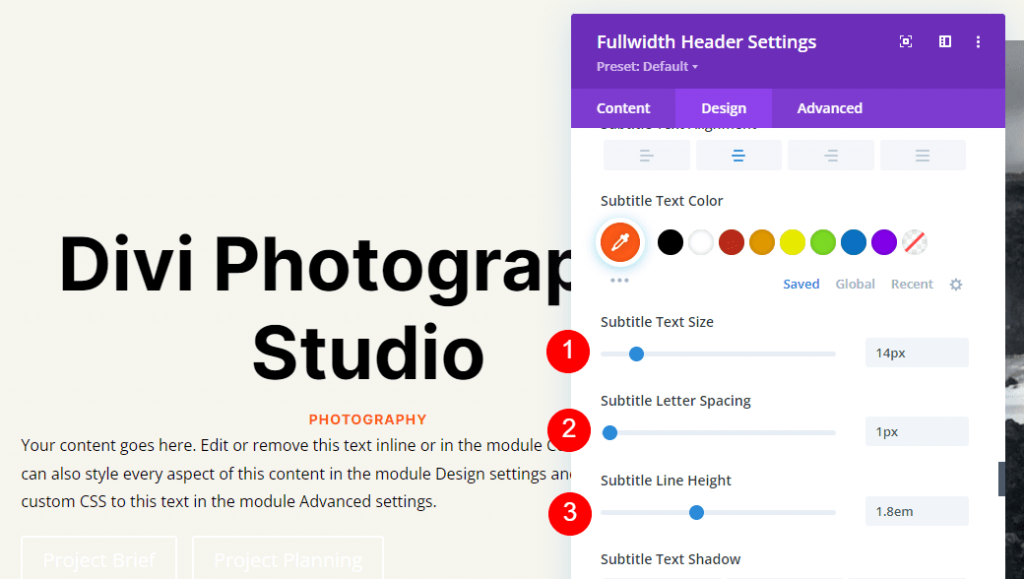
Subtitle Text
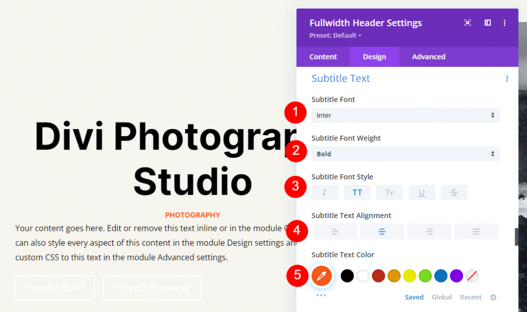
Scroll all the way down to Subtitle Text. Set the font to Inter. Make the Weight bold, the Style TT, the Alignment center, and the Color #ff5a17.
- Font: Inter
- Weight: Bold
- Style: TT
- Alignment: Center
- Color: #ff5a17
For all three screen widths, change the Size to 14px. Adjust the letter spacing and line height to 1px and 1.4em, respectively.
- Size: 14px
- Letter Spacing 1px
- Line Height: 1.8em
Button One
Next, go to Button One and choose Use Custom Styles for Button. Make the text color black.
- Use Custom Styles For Button: Yes
- Size: 20px Desktop, 18px Tablet, 16px Phone
- Text Color: #000000
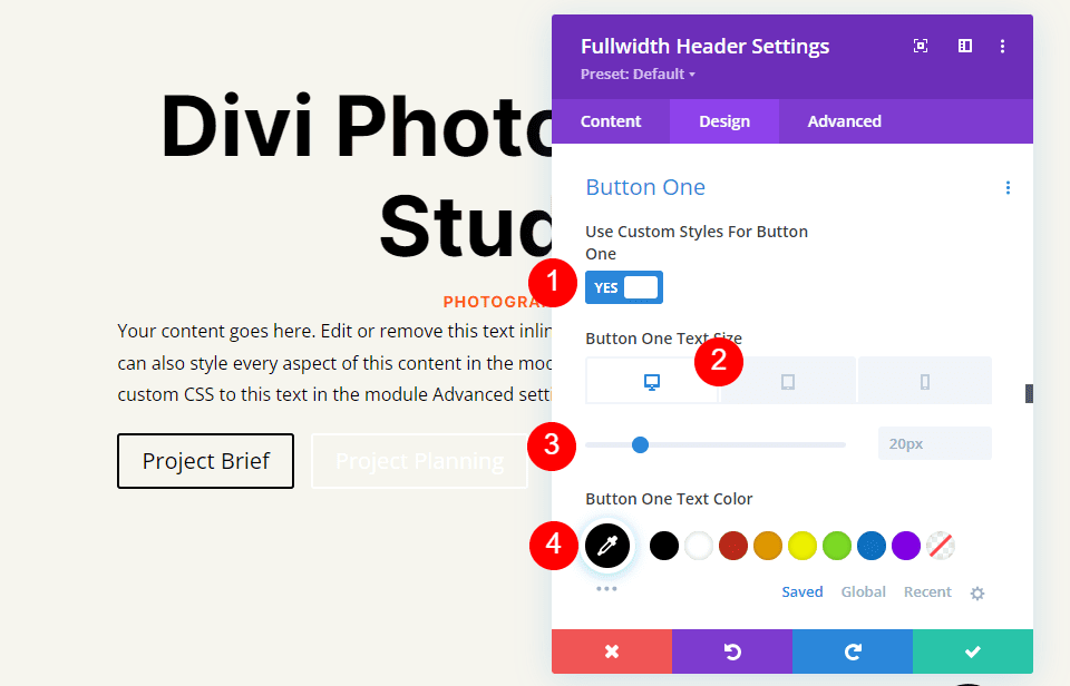
Modify the Border Width and Radius to 0px and the Background Color to white.
- Background Color: #ffffff
- Button One Border Width: 0px
- Button One Border Radius: 0px

Make the font Inter and the weight Bold.
- Font: Inter
- Weight: Bold
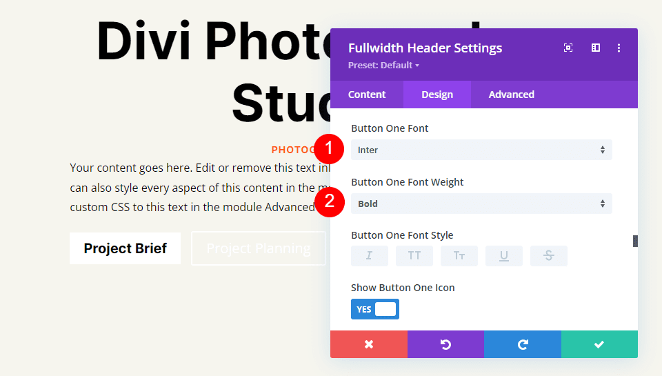
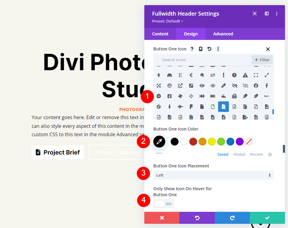
Next, choose your desired icon, alter the Color to black, place the Button on the left, and uncheck Only Show Icon On Hover For Button One.
- Icon: your choice
- Icon Color: #000000
- Button One Icon Placement: Left
- Only Show Icon On Hover For Button One: No
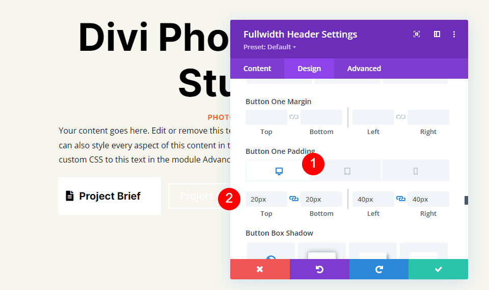
Finally, click Button One's Padding choices by scrolling down. For each screen size, we'll utilize a separate Padding. Use 20px for top and bottom and 40px for left and right on desktops. Update the Top and Bottom Padding to 16px for tablets. Change the Top and Bottom Padding on phones to 12px. Maintain the same Left and Right Padding for all three.
- Desktop Padding: 20px Top and Bottom, 40px Left and Right
- Tablet Padding: 16px Top and Bottom, 40px Left and Right
- Phone Padding: 12px Top and Bottom, 40px Left and Right
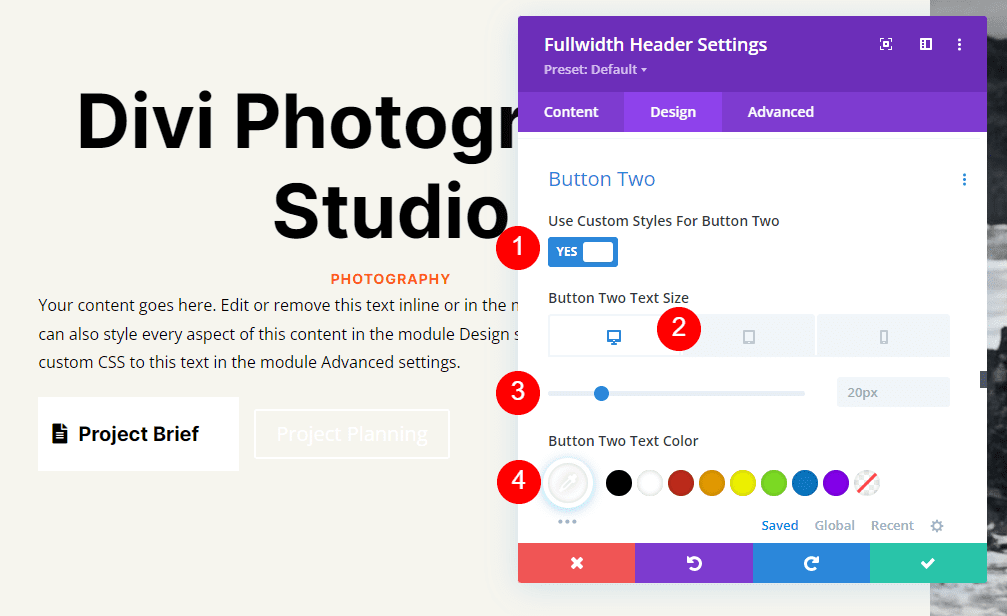
Button Two
Finally, go down to Button Two. Use Custom Styles for Button is selected. Set the font size for computers to 20px, tablets to 19px, and phones to 16px. Make the text color white.
- Use Custom Styles For Button: Yes
- Size: 20px Desktop, 18px Tablet, 16px Phone
- Text Color: #ffffff
Replace the background color with #ff5a17. Border Width and Radius should be set to 0px.
- Background Color: #ff5a17
- Button Two Border Width: 0px
- Button Two Border Radius: 0px

Then, set the Font to Inter and the Weight to Bold.
- Font: Inter
- Weight: Bold

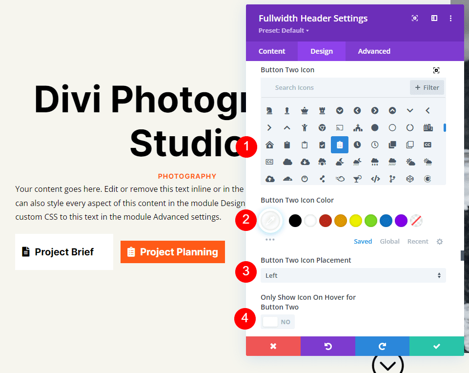
Select your chosen icon. Change the color to black, position the button to the left, and turn off Only Show Icon On Hover For Button Two.
- Icon: your choice
- Icon Color: #000000
- Button Two Icon Placement: Left
- Only Show Icon On Hover For Button Two: No
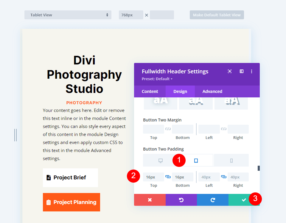
Finally, scroll down to the Padding settings for Button Two. Use 20px for top and bottom and 40px for left and right on desktops. Change the Top and Bottom Padding on tablets to 16px. Change the Top and Bottom Padding to 12px for phones. Save your work and exit the module.
- Desktop Padding: 20px Top and Bottom, 40px Left and Right
- Tablet Padding: 16px Top and Bottom, 40px Left and Right
- Phone Padding: 12px Top and Bottom, 40px Left and Right
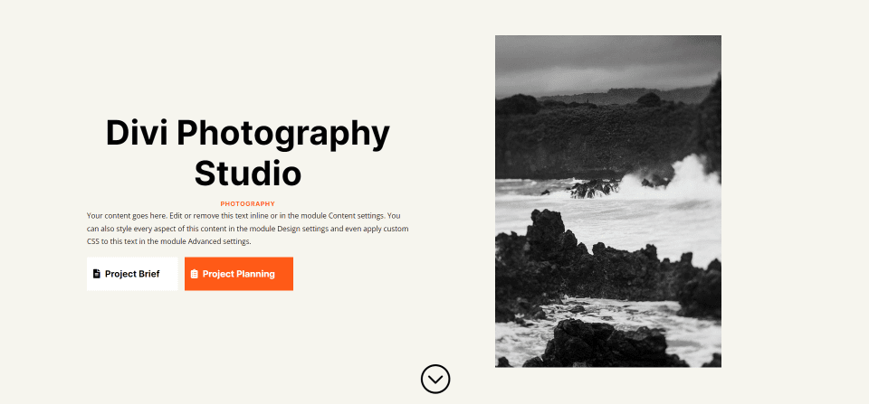
Fullscreen Header Results
This is how our full-width header appears on PCs, tablets, and smartphones.
Wrapping Up
That concludes our look at how to use your Divi Fullwidth Header Module to create a fullscreen header. The procedure is straightforward, and it looks beautiful on any device. Including the Scroll Down button is a nice visual cue that users can scroll. A fullscreen header is similar to a hero section in terms of design. With Divi's Fullscreen Header Module, you can design stunning fullscreen headers by following a few basic rules.