
A header captures the essence of a website because users can understand what they will get from this website from the header. It would not be wrong to call it a kind of invitation that helps attract visitors. If we want to highlight the hero section of our website, where the top navigation bar creates a distraction, should we omit the navigation bar? Never!

With Divi's Sticky option, we can design where the Hero section of our website will be displayed without the navigation bar after the website is loaded, and scrolling will unleash the header bar. It's a win-win situation. But how to design such? That is what we will see today.
Sneak Peak
We will have a look at our design outcome before we jump into the main section.
Build: Header Structure
Create Global Header From Dashboard
Go to "Theme builder" option under Divi from your dashboard and choose "Build Global Header" from the option shown in picture.
Create Amazing Websites
With the best free page builder Elementor
Start Now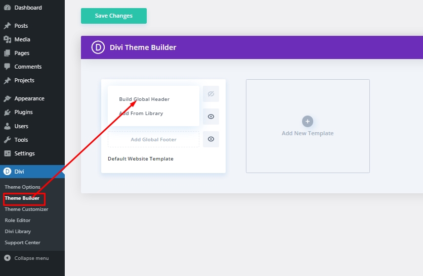
Settings: Global Header Section
Background Color
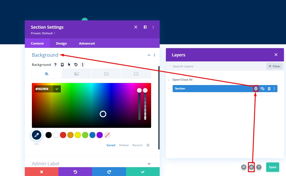
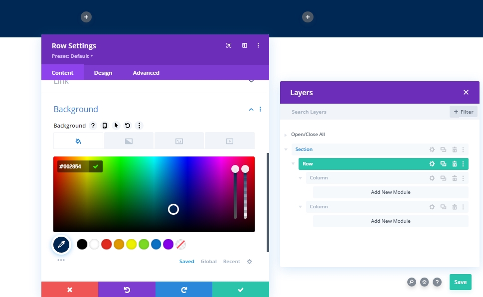
After selecting the header template, go with the "build from scratch." Then open the layer option, and you will see a pre-created section. Open settings for the section and change the background.
- Background Color: #002854
Spacing
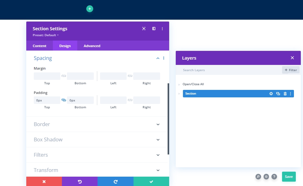
Under the design tab, alter some spacing values.
- Top Padding: 0px
- Bottom Padding: 0px
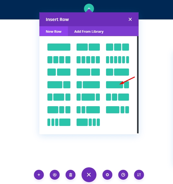
New Row Adding
Column Structure
Add the following row that is marked column structure to the section.
Background Color
Before we add any module to this row, let's make some adjustments. Start with the background color.
- Background Color: #002854
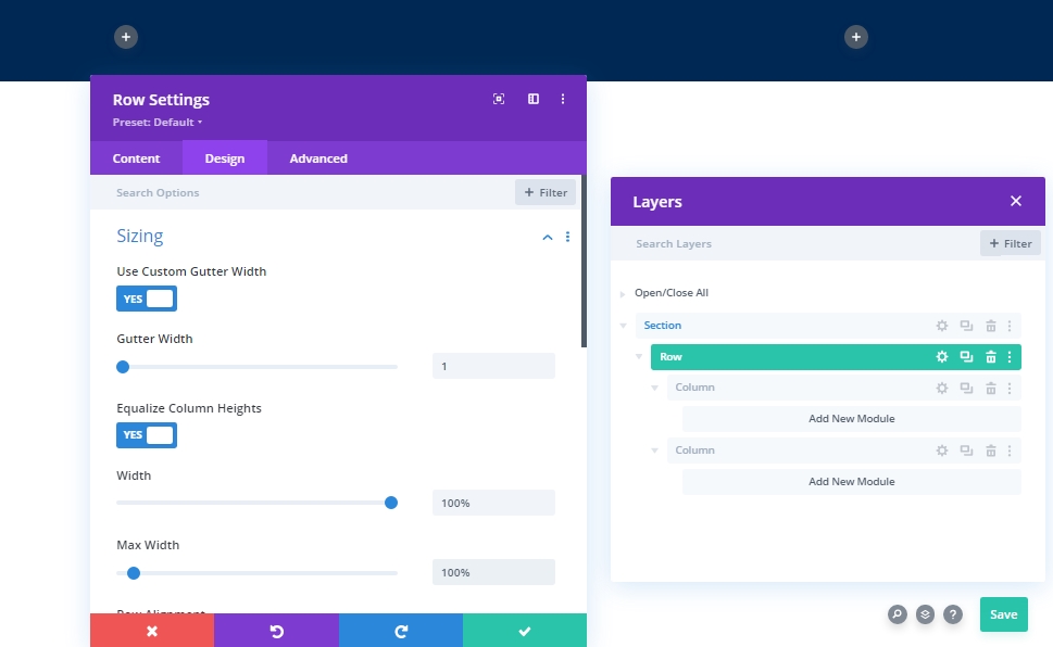
Sizing
Under the design tab, change sizing values of the row.
- Use Custom Gutter Width: Yes
- Gutter Width: 1
- Equalize Column Heights: Yes
- Width: 100%
- Max Width: 100%
Spacing
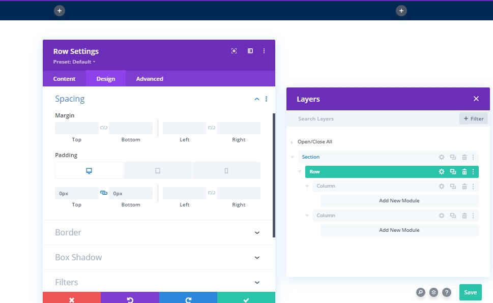
Now, change the padding values too.
- Top Padding: 0px
- Bottom Padding: 0px
- Left Padding: Tablet & Phone: 5%
- Right Padding: Tablet & Phone: 5%
Settings: Column 1
Background Color
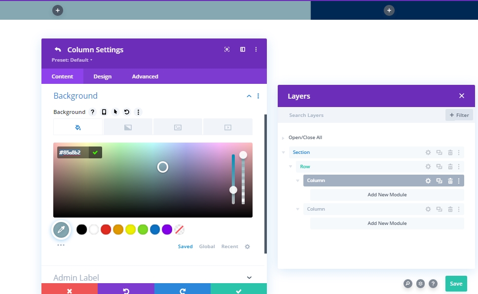
After designing the whole row, we will start designing column 1. First we will add a background color.
- Background Color: #85A8B2
Add: Menu Module To Column 1
Menu Selection
Now we will add a menu module to column 1. Choose a menu according to your choice.
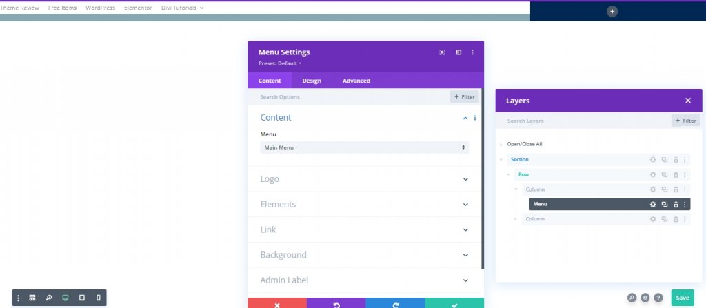
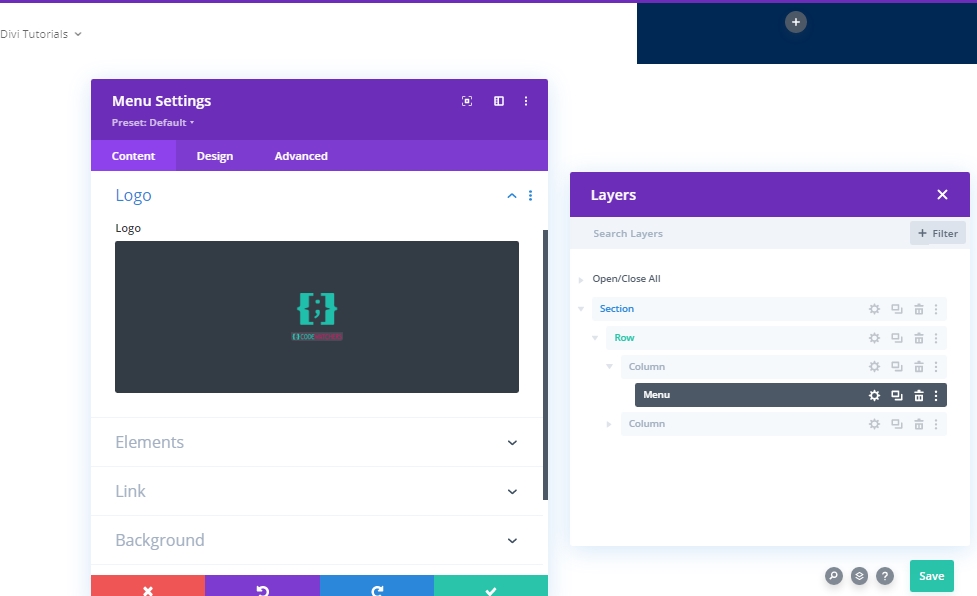
Logo
Now, add a logo to your header.
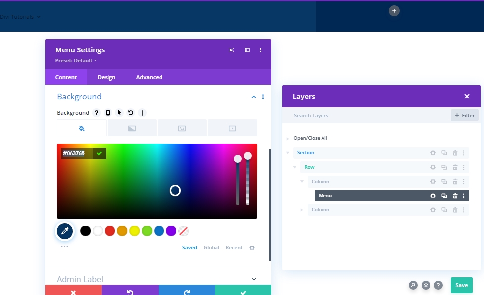
Background Color
Now add a background color.
- Background Color: #063765
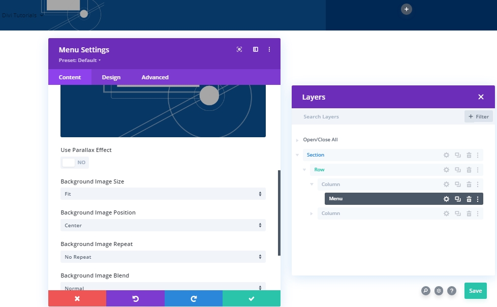
Background Image
Now add an image of your choice and make the following adjustments.
- Background Image Size: Fit
- Background Image Position: Center
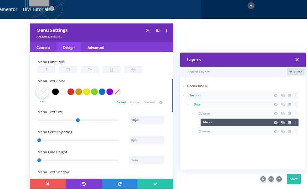
Settings: Menu Text
Move on to the module’s design tab and change the menu text size.
- Text Color: #ffffff
- Menu Text Size: 18px
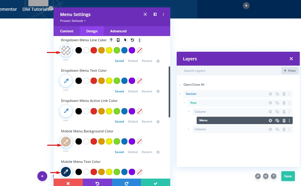
Settings: Drop down Menu
Now, alter the dropdown menu settings as follows :
- Dropdown Menu Line Color: rgba(0,0,0,0)
- Mobile Menu Background Color: #ddc1a7
- Mobile Menu Text Color: #063765
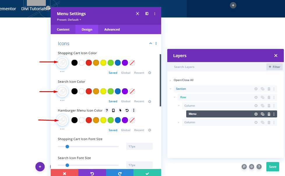
Settings: Icon
Now, turn all the icons white.
- Shopping Cart Icon Color: #ffffff
- Search Icon Color: #ffffff
- Hamburger Menu Icon Color: #ffffff
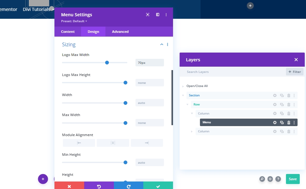
Sizing
Then, modify the logo sizing settings.
- Logo Max Width: 70px
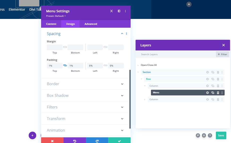
Spacing
Make some changes into padding.
- Top Padding: 1%
- Bottom Padding: 1%
- Left Padding: 5%
- Right Padding: 5%
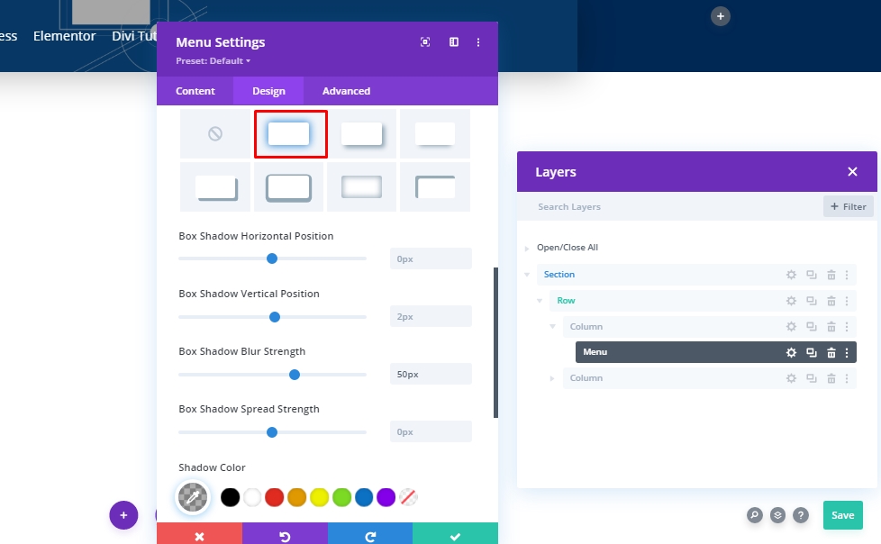
Box Shadow
Add some changes into custom box shadow.
- Box Shadow Blur Strength: 50px
- Shadow Color: rgba(0,0,0,0.3)
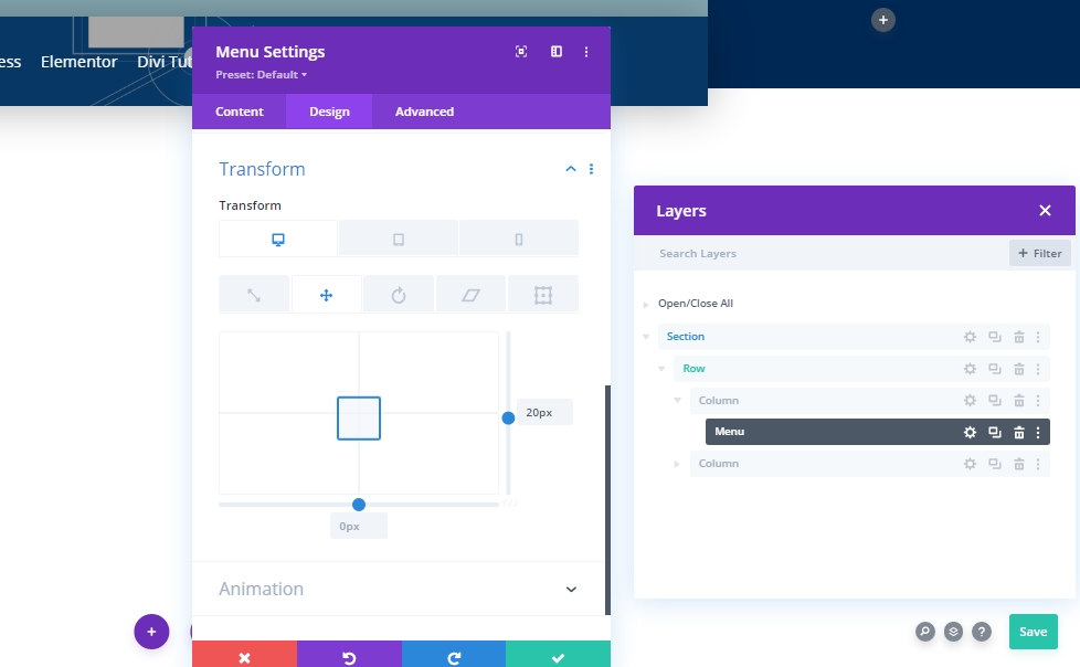
Transform Translate
Now, finish the module settings by modifying the transform translate settings as follows:
- Right: Desktop: 20px, Tablet & Phone: 0px
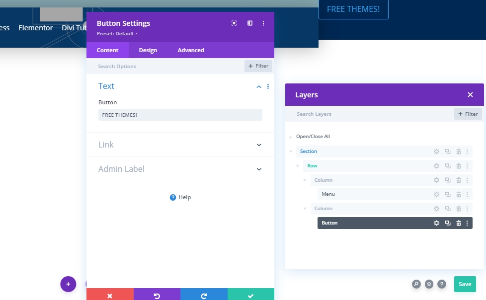
Add: Button Module To Column 2
Button Module Setting
Add button module to column 2 and add some text of your choice.
Button Alignment
From the design tab, change button alignment.
- Button Alignment: Right
Button Settings
Then, change the button style accordingly.
- Use Custom Styles For Button: Yes
- Button Text Size: 16px
- Button Text Color: #2a2a2a
- Button Background Color: #ffffff
- Button Border Width: 0px
- Button Border Color: rgba(0,0,0,0)
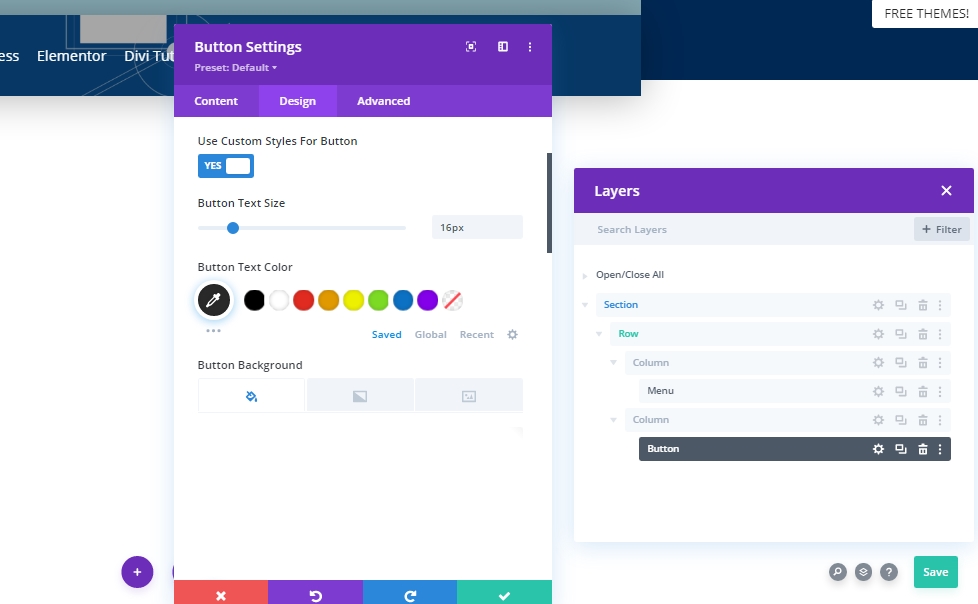
- Button Font Weight: Bold
- Button Font Style: Uppercase
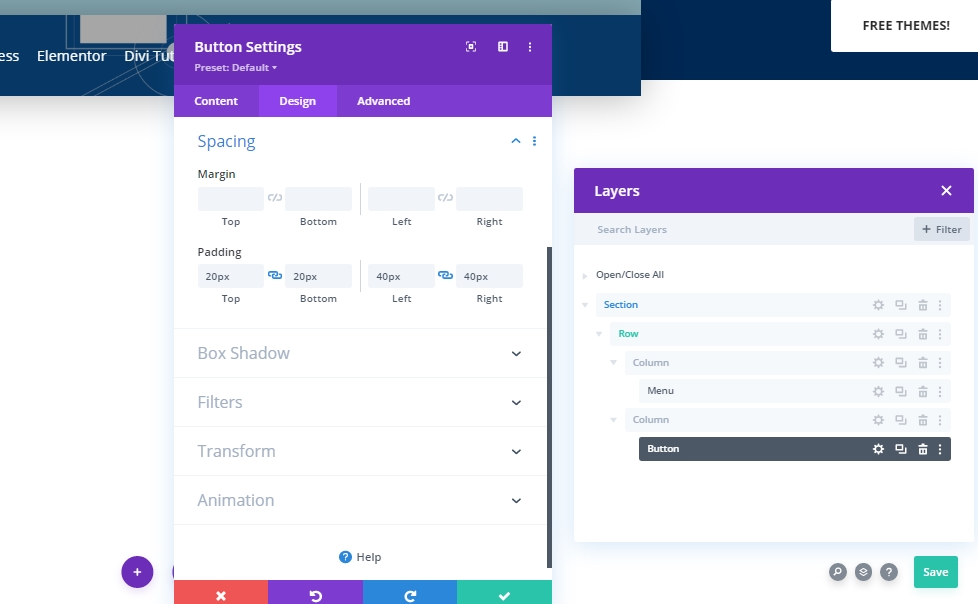
Spacing
Add some custom padding to make shape to the button.
- Top Padding: 20px
- Bottom Padding: 20px
- Left Padding: 40px
- Right Padding: 40px
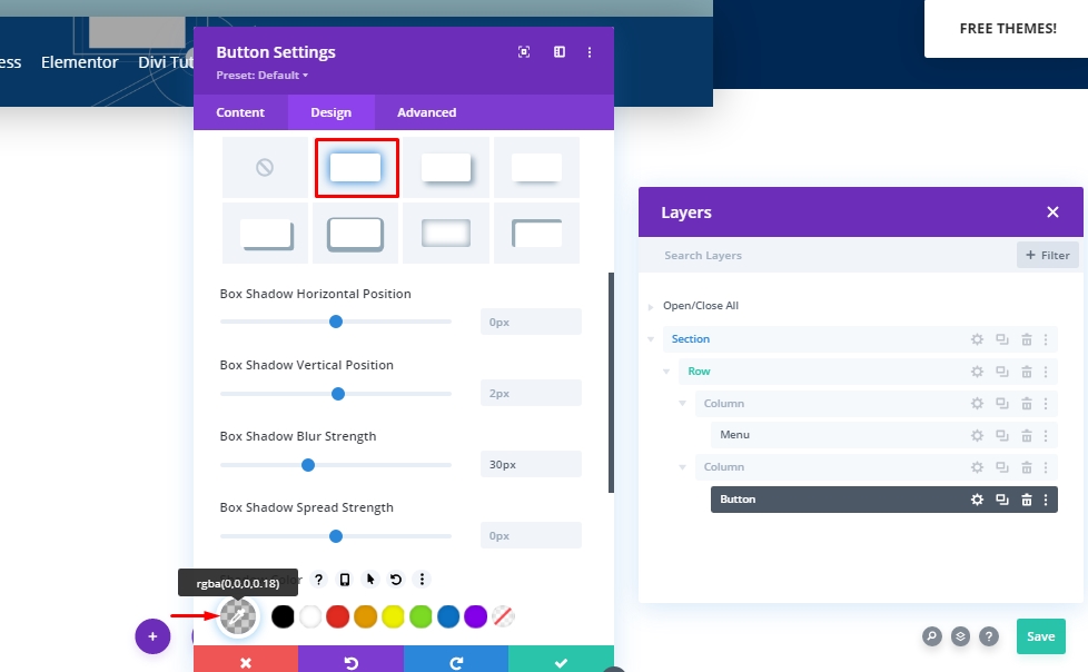
Box Shadow
Now we'll add a box shadow(marked one).
- Box Shadow Blur Strength: 30px
- Shadow Color: rgba(0,0,0,0.18)
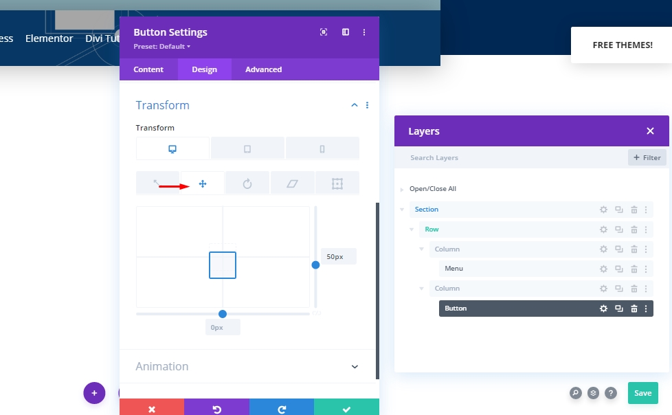
Transform Translate
We are almost done with the module. Finish it with some adjustments on the transform section.
- Right: Desktop: 50px, Tablet & Phone: 0px
Add: Sticky Effects To Header
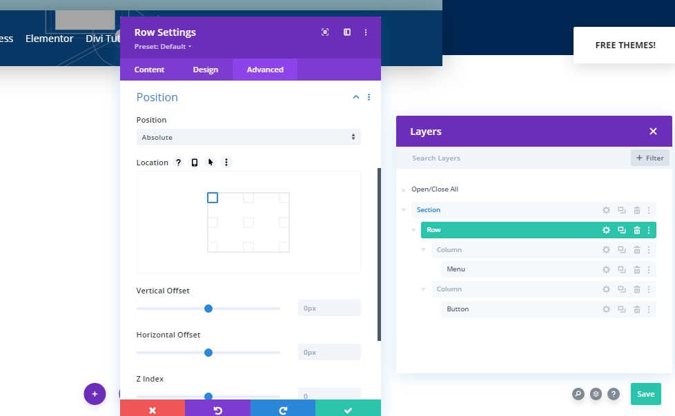
Row Settings
We have completed the construction of our header section structure. Now we will add a sticky effect to it. For this, we need to change some values from the row settings.
Position
First, make the position adjustments.
- Position: Absolute
- Location: Top Left
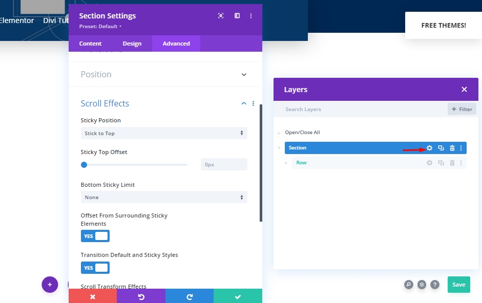
Sticky Settings - Scroll Effects
Next, we’ll open the section settings and allow it to stick to the top.
- Sticky Position: Stick to Top
- Bottom Sticky Limit: None
- Offset From Surrounding Sticky Elements: Yes
- Transition Default and Sticky Styles: Yes
Animation
Now we will add an animation so that visitors will not see the header during page loading.
- Animation Style: Fade
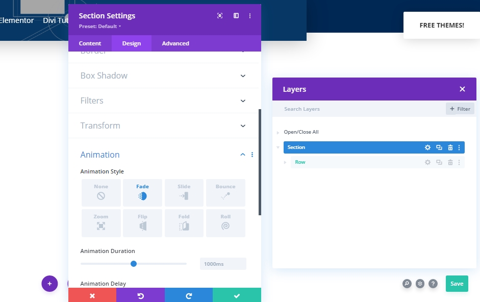
Transition Duration
By changing the value of the transition span, we will select how fast or slow the header will be visible during scrolling.
- Transition Duration: 800ms
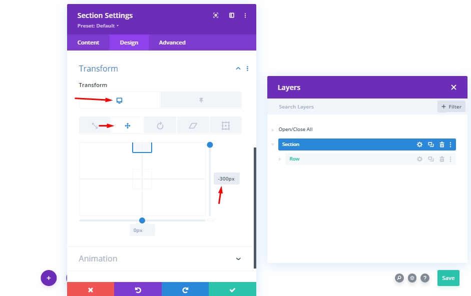
Transform Translate
Since we don't want to show our headers initially, we will add a negative value to the Y-Axis from the Transform settings.
- Right: -300px
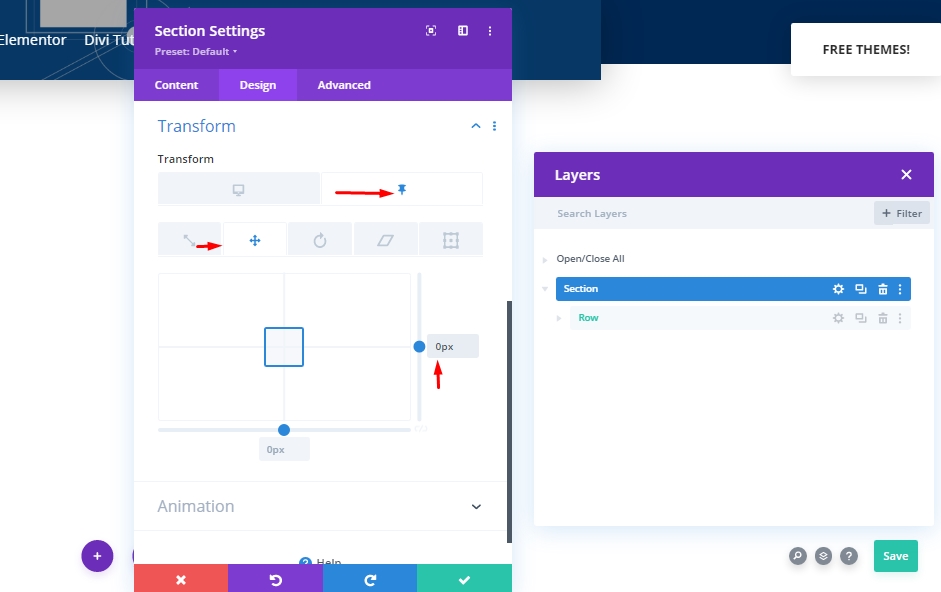
Now from the sticky settings, make the value 0 again. Means, it will show us the menu as soon we start scrolling.
- Sticky Right: 0px
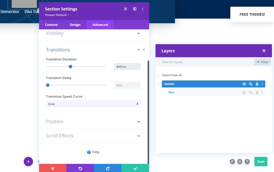
CSS Property For Visibility
In this section, we will add a CSS property to hide the elements that are not being used. It should be noted that this is not a mandatory task, but it is a good idea to do this.
visibility: hidden;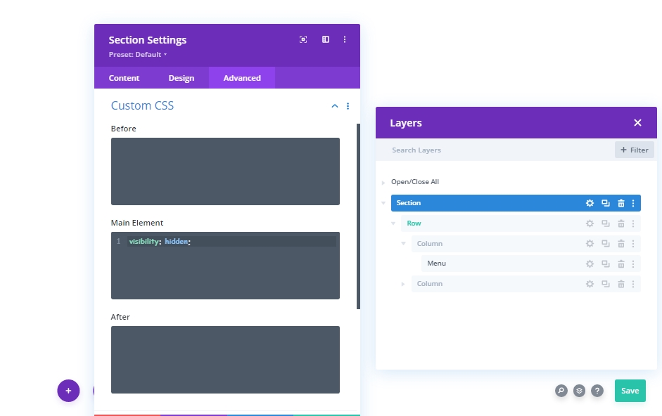
Now we'll again make our menu visible in a sticky state.
visibility: visible;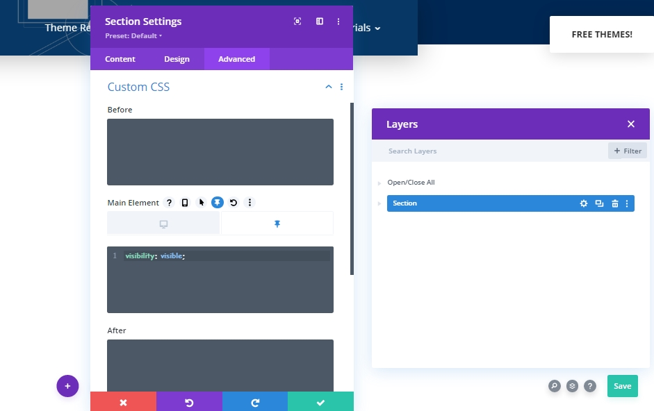
Final Result
Since we have done all the steps successfully , here is our final result.
Final Words
In today's tutorial, we have seen how to make visitors focused on the hero section and work on the navigation bar regarding visibility. Divi is a great theme with built-in features that allow us to design something unique and fun. We hope you'll like today's post and if you have any queries and questions, please, feel free to ask in the comment section.