
Those Pieces of a webpage that stay in place while the user scrolls down the page are sticky (or fixed) components. Such a characteristic has a broad spectrum of uses. The primary navigation menu may move along with the person. Alternatively, an opt-in email form glides along the page's left side. The user's overall experience may be enhanced by a simple design element. With Divi's built-in options for sticky settings, you can quickly and easily add this effect to your site.

In this guide, we'll show you how to use Divi's built-in sticky options to make any element on your page "sticky" (fixed), so you won't have to bother about plugins or code. Everything about it is straightforward, easy, and quick. So, without further ado, here we go.
Make Any Divi Page Element Sticky
To make any page element sticky, we will create a page and open it to edit with a Divi visual builder. We will use a premade layout for today's tutorial, but you can work on any element to apply this effect.
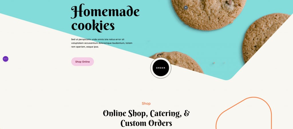
The next step is to select a Divi sticky element from the available options. While it might be anything on the website, our focus today will be on a single module. For example, let's select the "Shop Online" Button Module because it's a typical UI element.
Create Amazing Websites
With the best free page builder Elementor
Start Now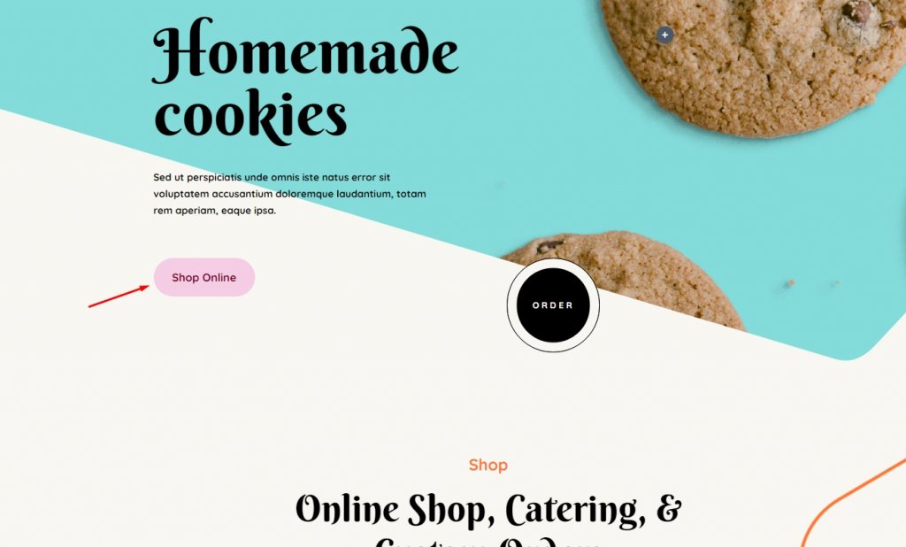
After that, click the settings icon to access the module's options and switch to the Advanced tab. Scroll to the bottom of the page and After that, click the settings icon to access the module's options and switch to the Advanced tab. Scroll to the bottom of the page and click on Scroll Effects. Stick to top, Stick to bottom and Stick Top and Bottom - pick according to your need. If you select Stick to Top, the element will stay in place when you scroll down. (Consider it as being moved lower by that portion of the viewport.) It will remain sticky even if the user moves their cursor upwards instead of being left behind.
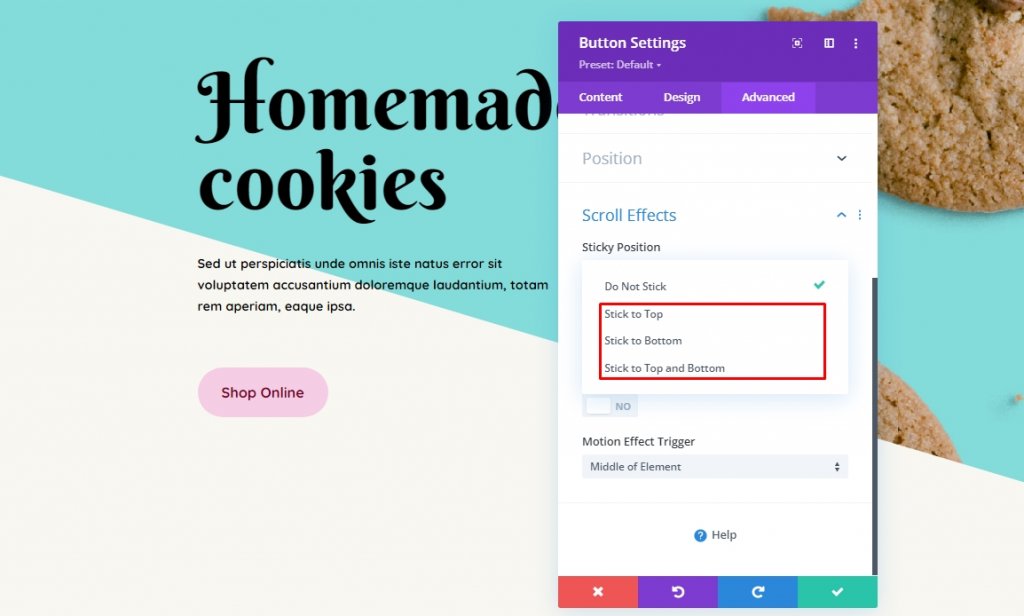
For the time being, go with the combo option called Stick to the Top and Bottom. That's all there is to it! Now the element is stuck. It's now possible to limit the element's scrolling to only specified page areas or certain distances away from the viewport's boundaries.
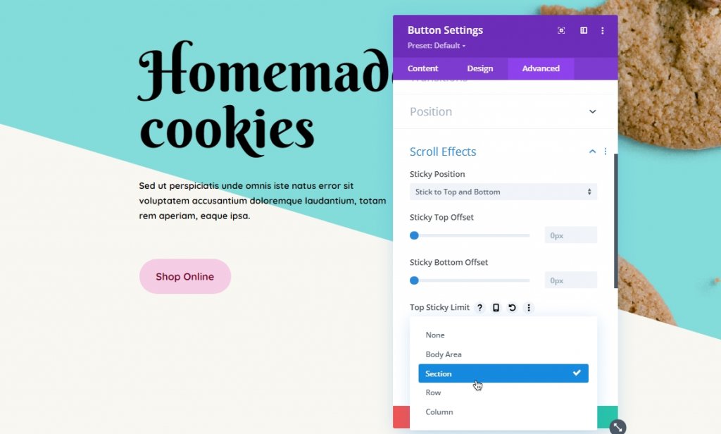
Once you've decided how you want the Divi element to stick, you can specify how far away from the top and/or bottom it should be when the user starts scrolling. In other words, if you want to choose 0px, the component will only be visible in the viewport's very edge. If you select 55px, the distance from the viewport's edge will remain constant after the page scrolls. When the viewport's advantage is that far away, it will start scrolling.
The Top/Bottom Sticky Dropdown limits let you choose where it is permanently stuck. Choose whether or not any element stays within its parent container (column, row, or section) by enabling the body area option, or you may let it stay on the entire page by disabling it. Either way, it's up to you how it's configured. If the user scrolls down the page, an element will stay in place until it reaches the bottom, but it will disappear if the user moves the cursor up the page.
If you're utilizing many sticky elements, you'll want to make sure they stay apart. Use the offset settings you entered above for other stick elements if necessary by turning on Offset from Surrounding Sticky Elements. Your sticky items may overlap while scrolling if this isn't done. That's something that no one desires.
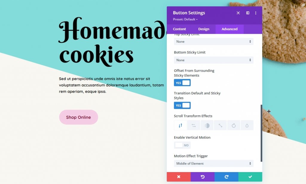
It's a lot of fun to play with the Transform Default and Sticky Styles option. Scroll Transform Effects let you customize an element's transition and animation. To draw more attention to the component that is currently following them, fade or rotate the element.
You may also use this option to make any sticky element seem entirely different. Click the thumbtack icon in the Design tab to make Sticky Styles active. Be aware that you'll only see this icon when you've already enabled Stickiness in Advanced – Scroll Effects.
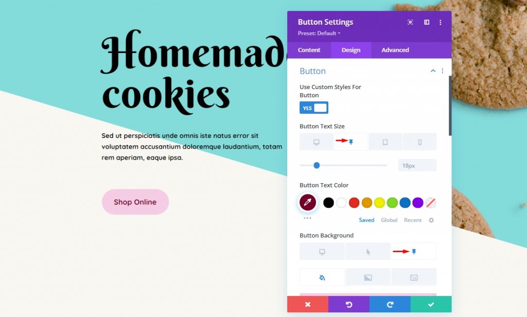
After there, you may customize the sticky element in the same way you would any other secondary Divi component. If you're on a smartphone, click the thumbtack tab rather than desktop or tablet. It's easy to make a sticky element seem unique from a static one with Divi's background, color, and size options.
We'd also like to note out that if you make a section sticky, the thumbtack icon will appear for all of the section's child elements, including rows, columns, and modules. They inherit the sticky attribute from their parent, although scrolling styles can be applied to them separately.
Z-Index Adjustments
Most of the designer like to keep the sticky element at the top of the page. That's where Z-index comes in, and you have set its value according to your need. Z-index option is available on Position settings under the Advanced tab. This setting indicates the depth of the element. So, an element with a higher Z-index value will seem more front appearing in comparison to other elements.
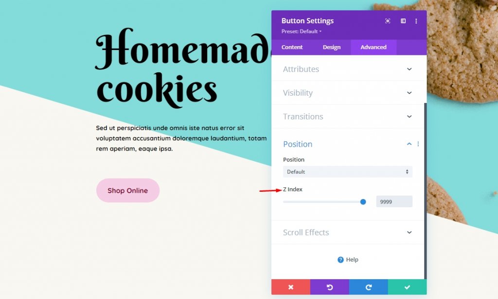
To make the sticky element appear higher on the page, you'll need to lower the Z-index of the rows or sections that it's contained within.
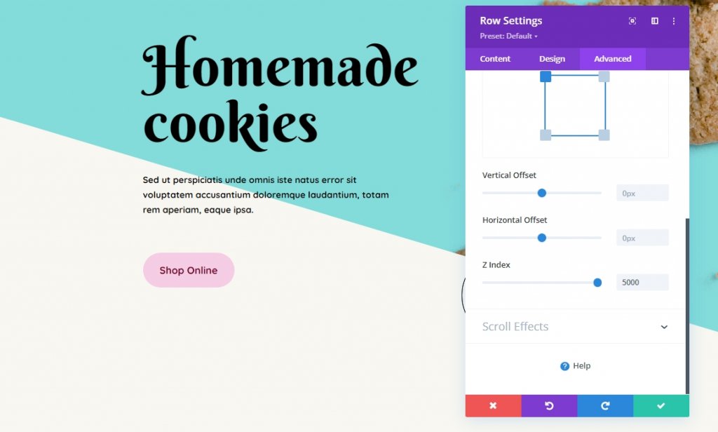
As we have set the Z-index value of the button and the row higher than other modules, it will float at the top of the entire page.
Final Words
You can use Divi's sticky element options to attach any module, row, column, or section anywhere as information flows. Whether it's a call to action (CTA), a submenu, a promotional offer, or anything else, Divi has given you some powerful options. Now it will be fun watching you put them into action! That's all for today. Hope this tutorial will be beneficial for you. Share the blog or our other writings on Divi sticky option with your friends and help them making stunning designs using the sticky option.