
Divi Builder's built-in options can be used to create all the beautiful designs. Sticky options and scroll effects are two of those awesome built-in features of Divi, and by harmonizing these together, we can execute some very nice designs. In today's tutorial, we will see how to easily design a page by merging sticky options and scroll effects, which will undoubtedly take the visitors' browsing experience one step further. We will design a page section where an image will float in from the left, and before that, a text will be slide in from the right side. It may sound complex but before we jump right into our tutorial, check the design sneak peek.
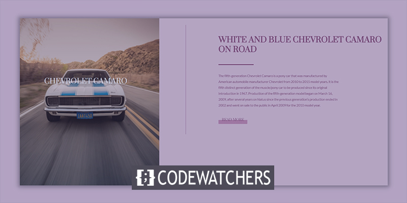
Sneak Peek
Here is the design layout that we will be creating today. This is a responsive design, so it will also work on tablets and mobile.
Building Design Structure
Initial Section Design
Gradient Background
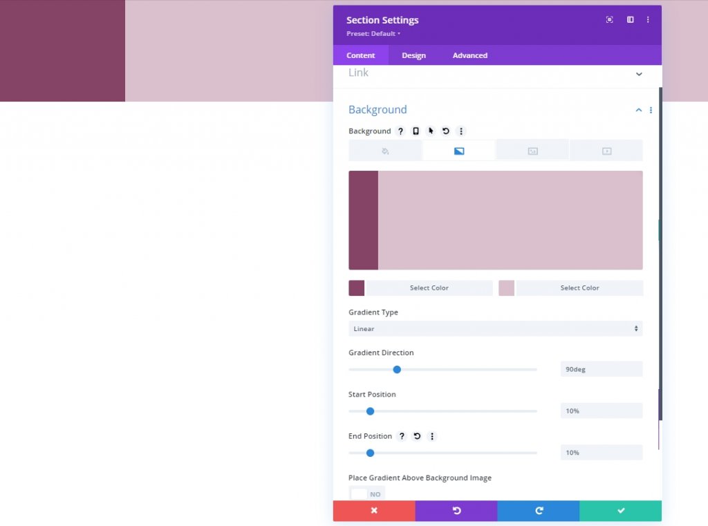
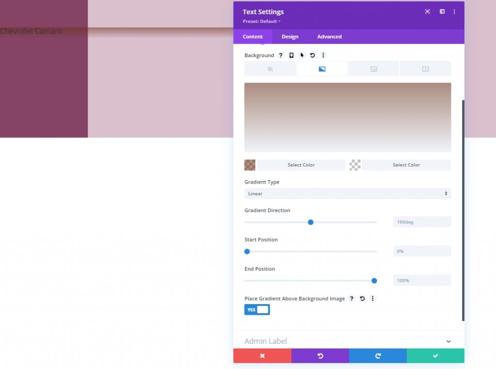
First, we will establish the structure, and later we will apply all the settings to make it sticky and give a smooth scrolling experience. Open the initial section settings and add a gradient background color.
- Color 1: #854466
- Color 2: #DABFCD
- Gradient Type: Linear
- Gradient Direction: 90deg
- Start Position: 10%
- End Position: 10%
Visibility
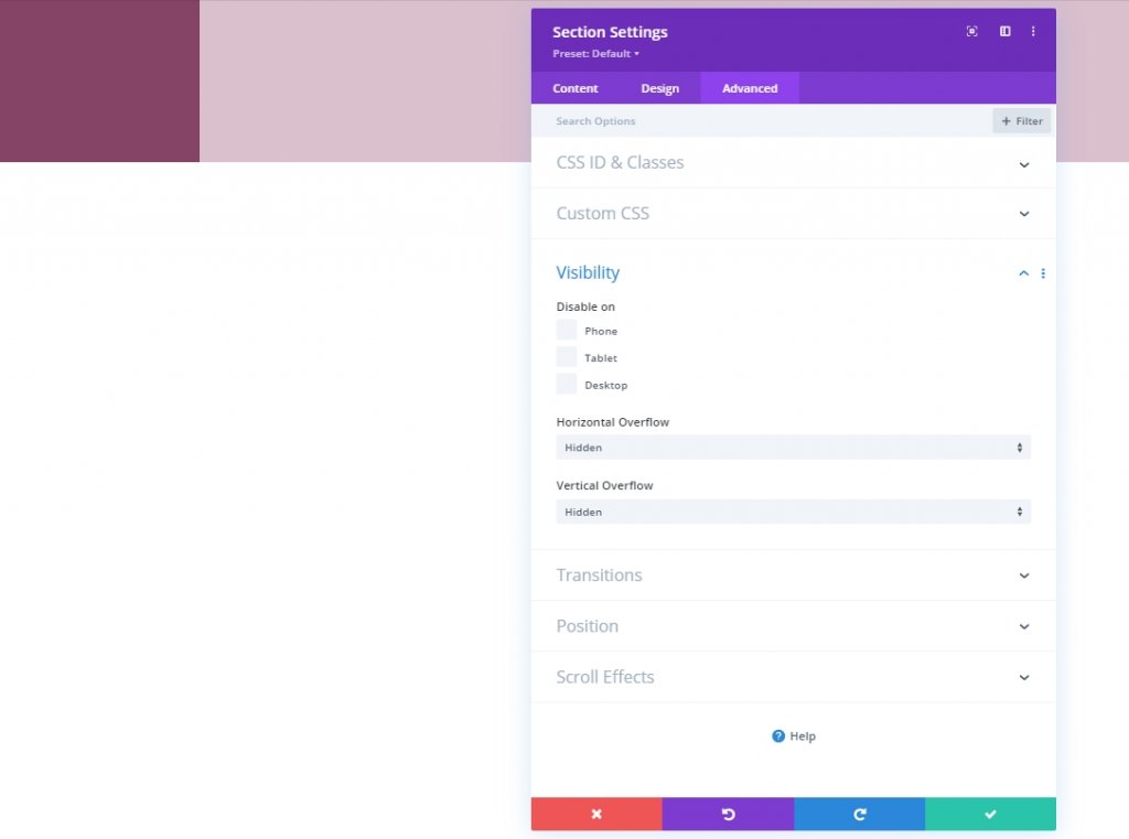
Move to the Advanced tab and let's hide the overflow visibility.
Create Amazing Websites
With the best free page builder Elementor
Start Now- Horizontal Overflow: Hidden
- Vertical Overflow: Hidden
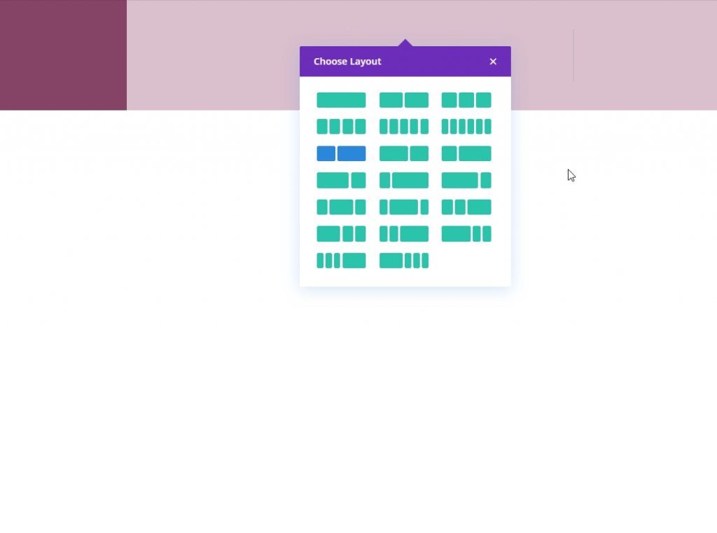
Row Adding
Column Structure
We'll add a new row with the following column structure.
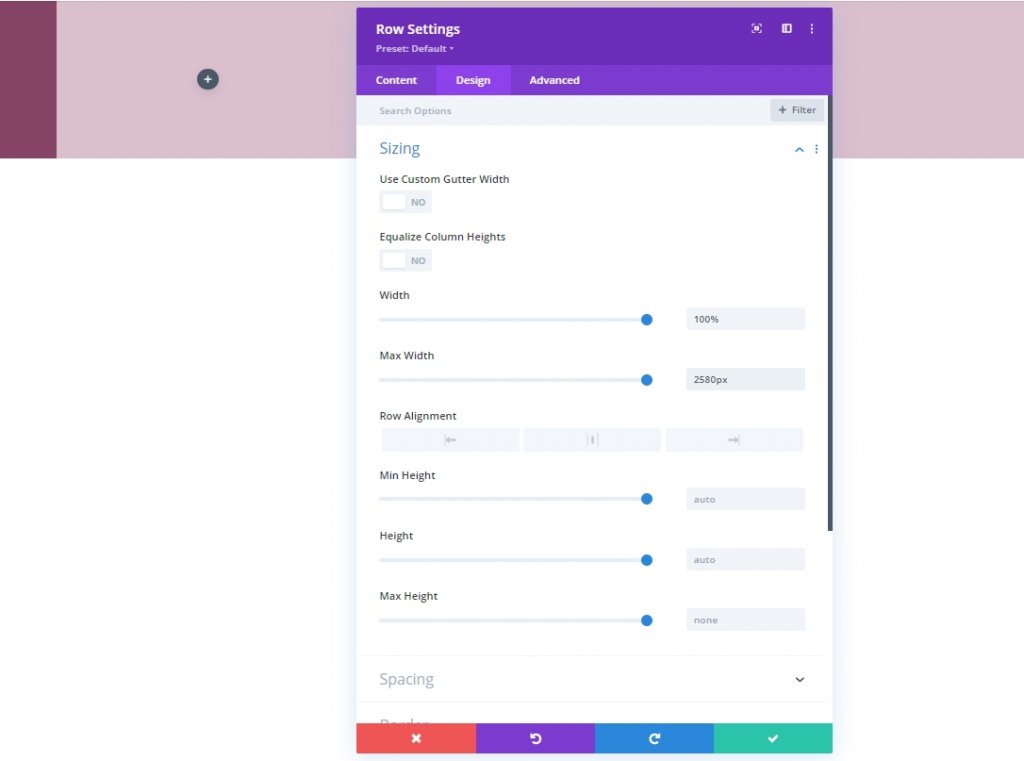
Sizing
Open the sizing settings for the newly added row and modify the settings as mentioned.
- Width: 100%
- Max Width: 2580px
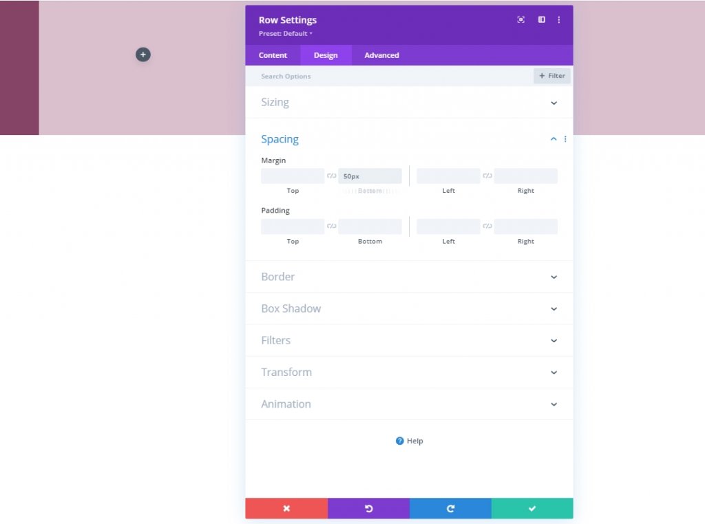
Spacing
Also, we need to add some bottom margin to our row.
- Bottom Margin: 50px
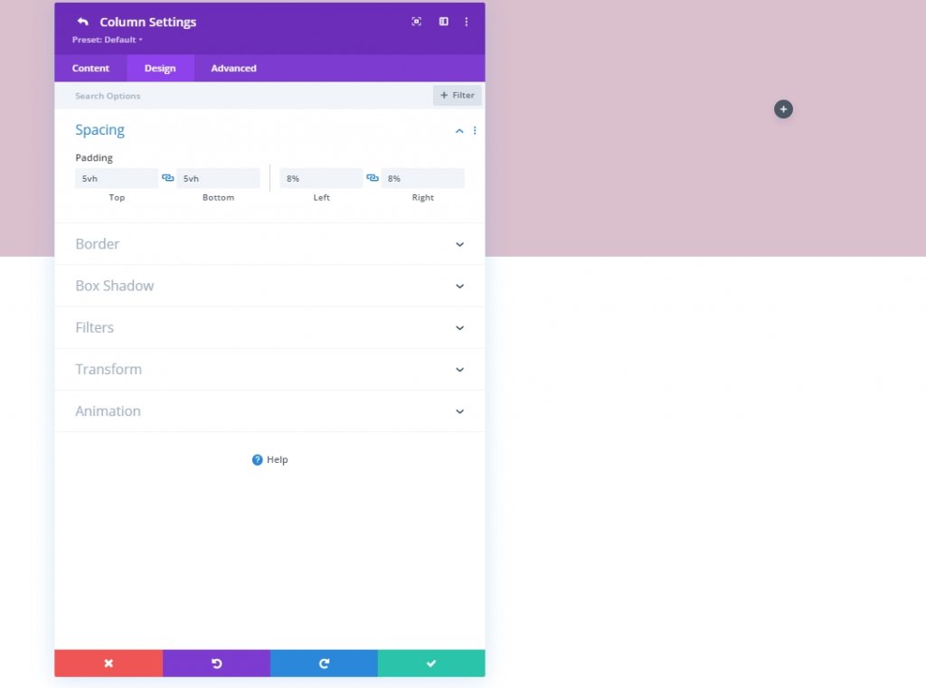
Column 2 Spacing
Now we'll move to column 2 settings and change padding values.
- Top Padding: 5vh
- Bottom Padding: 5vh
- Left Padding: 8%
- Right Padding: 8%
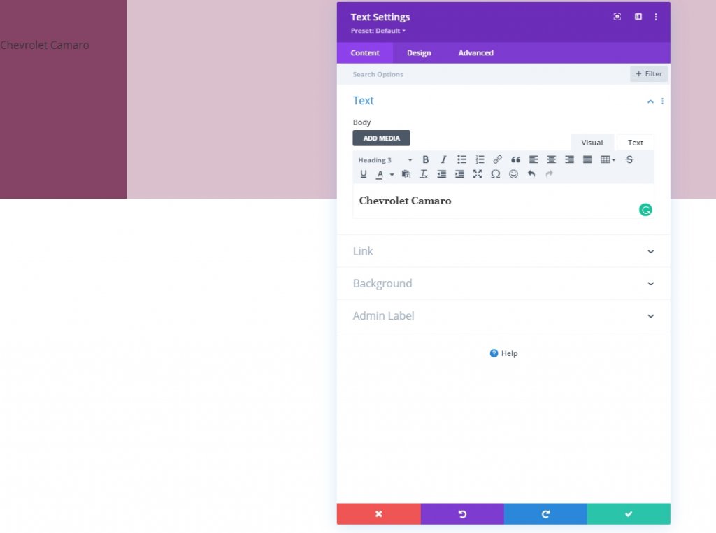
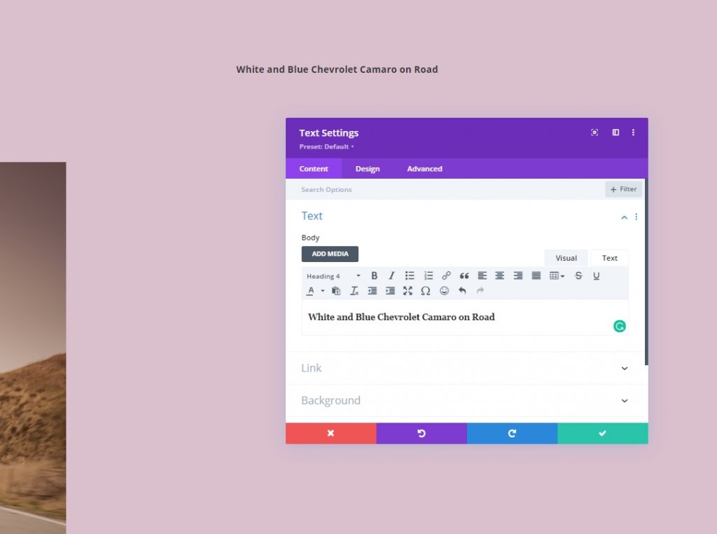
Column 1: Text Module
Add H3 Content
Add a Text module to column one and add some copies of your choice.
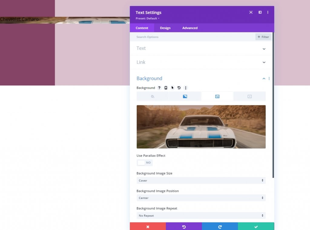
Gradient Background
Include the following gradient background next:
- Color 1: rgba(107,45,18,0.52)
- Color 2: rgba(255,255,255,0)
- Gradient Type: Linear
- Place Gradient Above Background Image: Yes
Background Image
Add an image of your choice and set it accordingly.
- Background image Size: Cover
- Background Image Position: Center
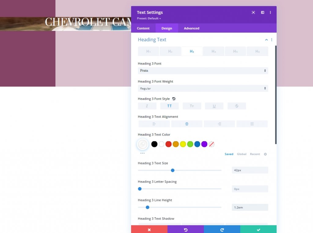
H3 Text Settings
From the design tab, now we will change the H3 settings.
- Heading 3 Font: Prata
- Heading 3 Font Style: Uppercase
- Heading 3 Text Alignment: Center
- Heading 3 Text Color: #ffffff
- Heading 3 Text Size: 42px
- Heading 3 Line Height: 1.2em
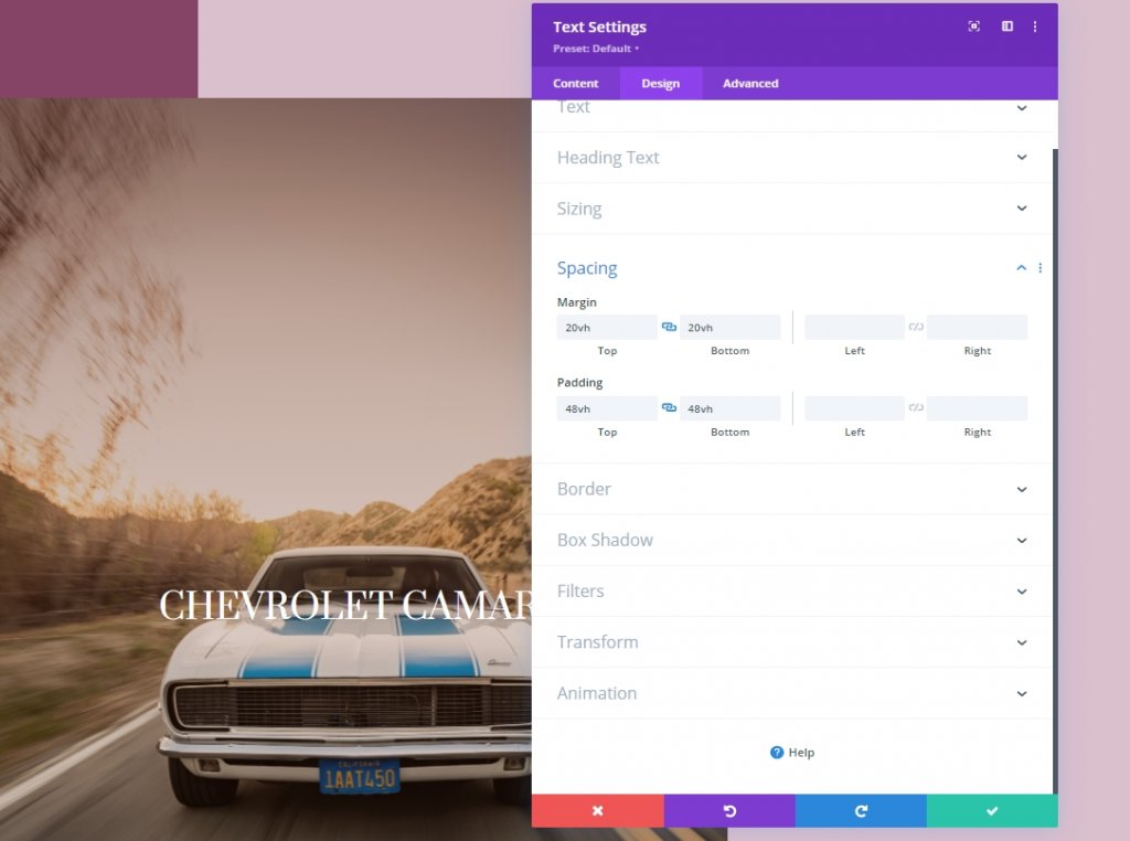
Spacing
Now change the spacing values for the module.
- Top Margin: 20vh
- Bottom Margin: 20vh
- Top Padding: 48vh
- Bottom Padding: 48vh
Add 1st Text Module to Column 2
Add H4 Content
We will add multiple text modules to column 2. Let's add the first text module and add some H4 heading copy on it.
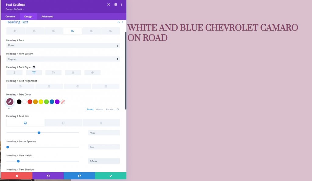
H4 Text Settings
Move on to the module’s design tab and change the H4 text settings as follows:
- Heading 4 Font: Prata
- Heading 4 Font Style: Uppercase
- Heading 4 Text Color: #854466
- Heading 4 Text Size: Desktop: 45px, Tablet: 40px and Phone: 35px
- Heading 4 Line Height: 1.3em
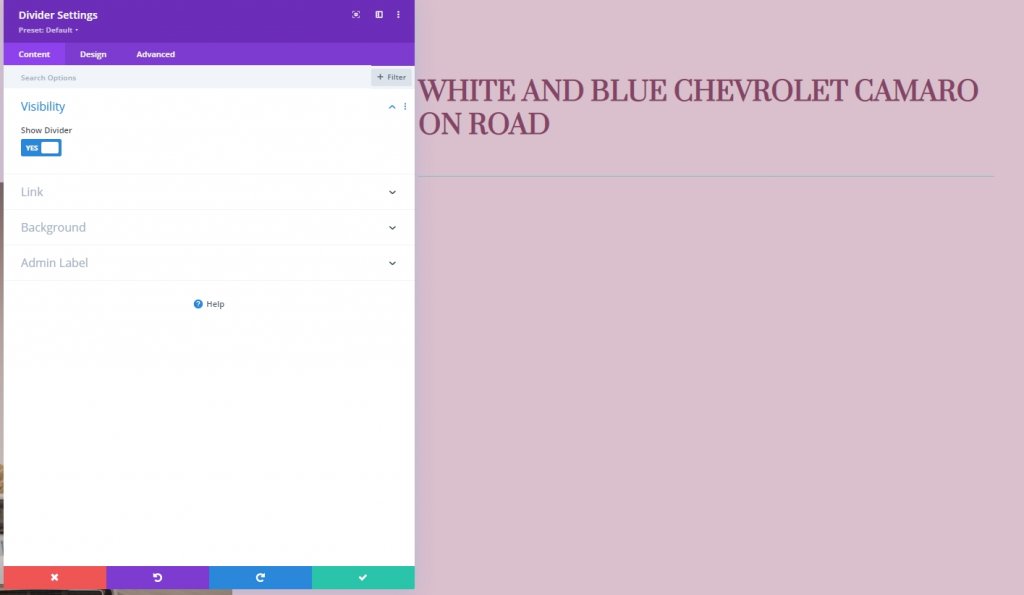
Add Divider Module to Column 2
Visibility
Now we'll add a divider module right under the text module and enable the divider visibility.
- Show Divider: Yes
Line
From the design tab, change the line color.
- Line Color: #854466
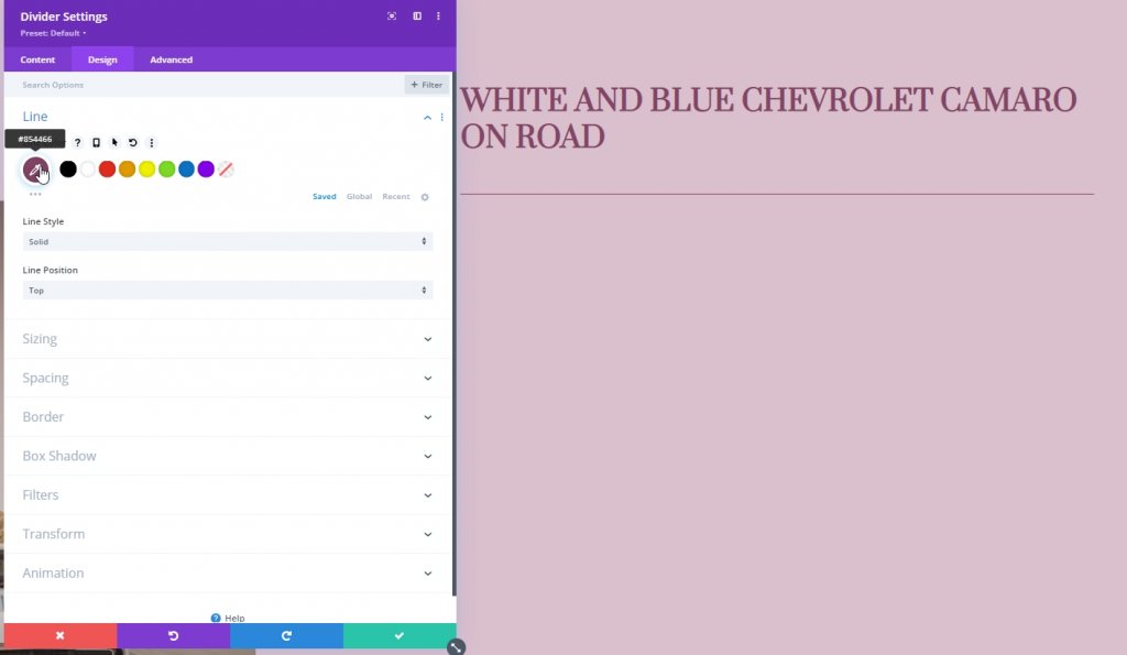
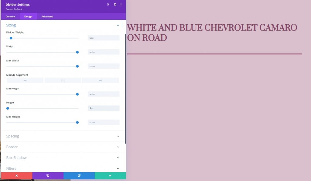
Sizing
It's time to modify the sizing settings.
- Divider Weight: 5px
- Height: 5px
Add 2nd Text Module to Column 2
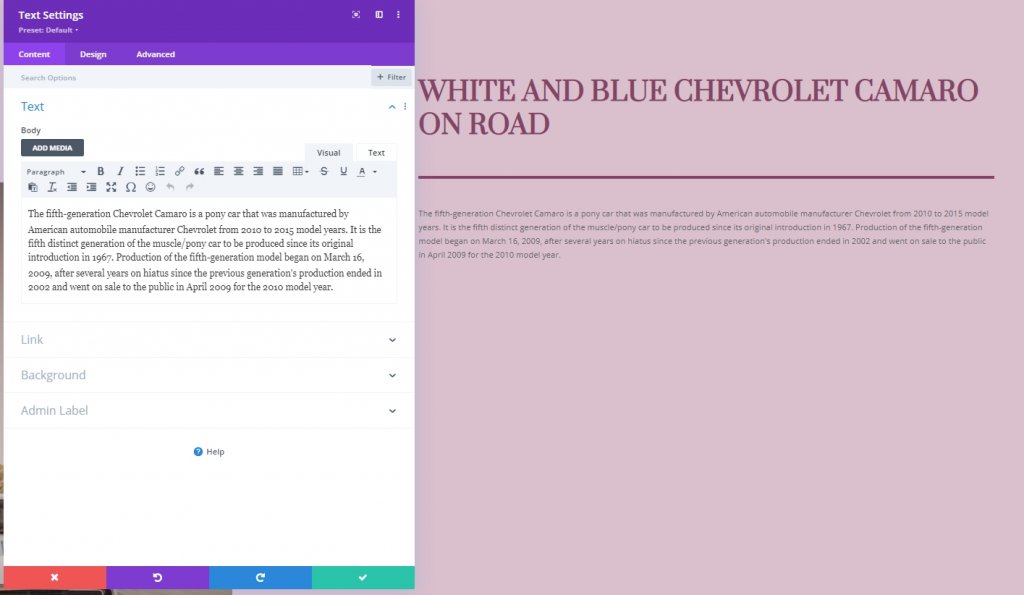
Add Description Content
Add another Text module to column 2. It will be right below the Divider Module. Also, add some description content of your choice.
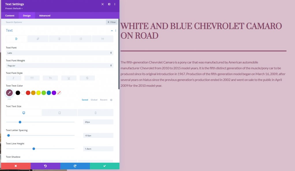
Text Settings
After adding the description, let's change the style settings for this module.
- Text Font: Lato
- Text Color: #854466
- Text Size: Desktop: 20px, Tablet and Phone: 16px
- Text Letter Spacing: -0.5px
- Text Line Height: 1.8em
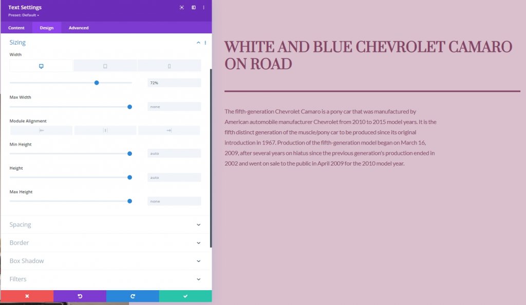
Sizing
Alter the sizing settings.
- Width: Desktop: 72% , Tablet and Phone: 100%
Add Button Module to Column 2
Add Copy
The final module we'll add to column 2 is a button module. Let's add it and also add some copy to it.
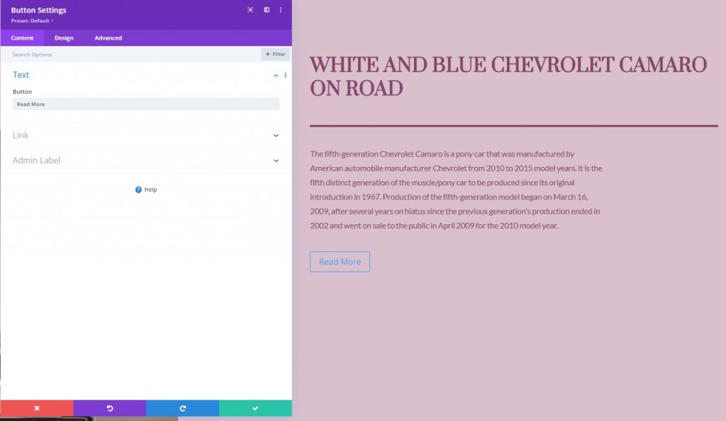
Button Settings
And lastly, change the button settings accordingly.
- Use Custom Styles For Button: Yes
- Button Text Size: 20px
- Button Text Color: #854466
- Button Gradient Background
- Color 1: rgba(43,135,218,0)
- Color 2: rgba(188,128,160,0.95)
- Start Position: 50%
- End Position: 50%
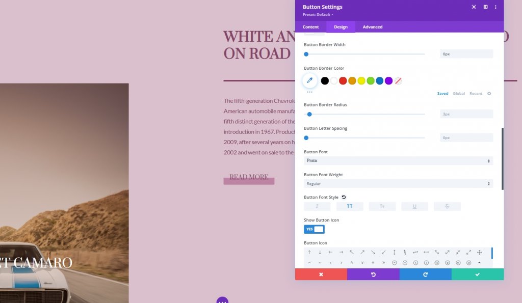
- Button Border Width: 0px
- Button Border Radius: 0px
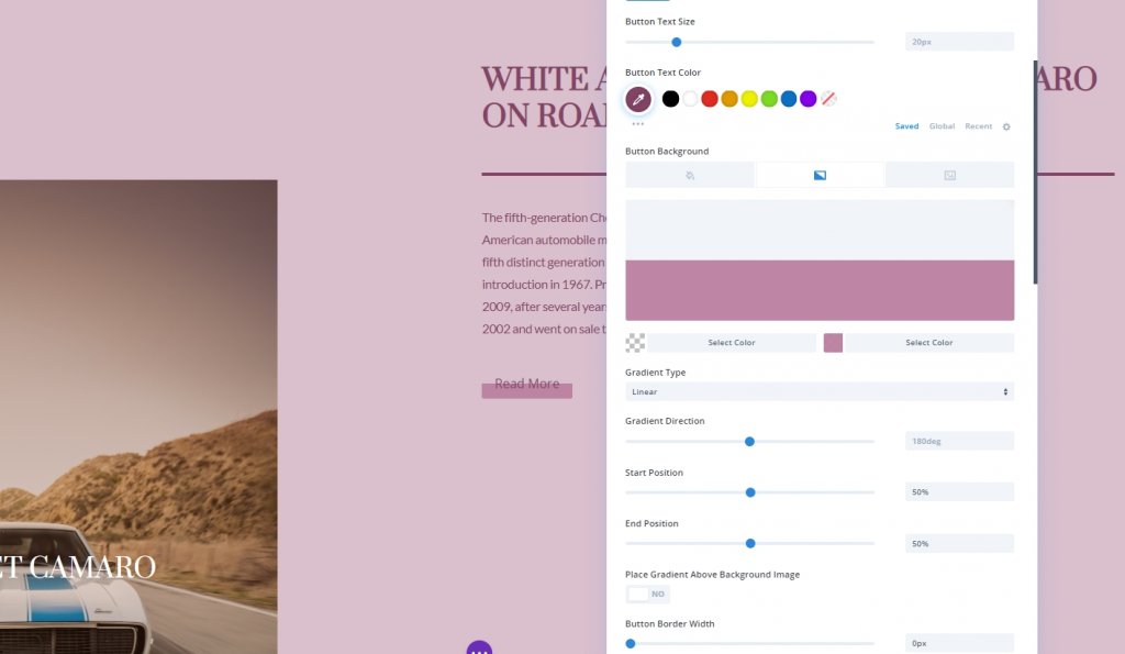
- Button Font: Prata
- Button Font Style: Uppercase
And we have successfully built the structure for today's design.
Sticky Effects
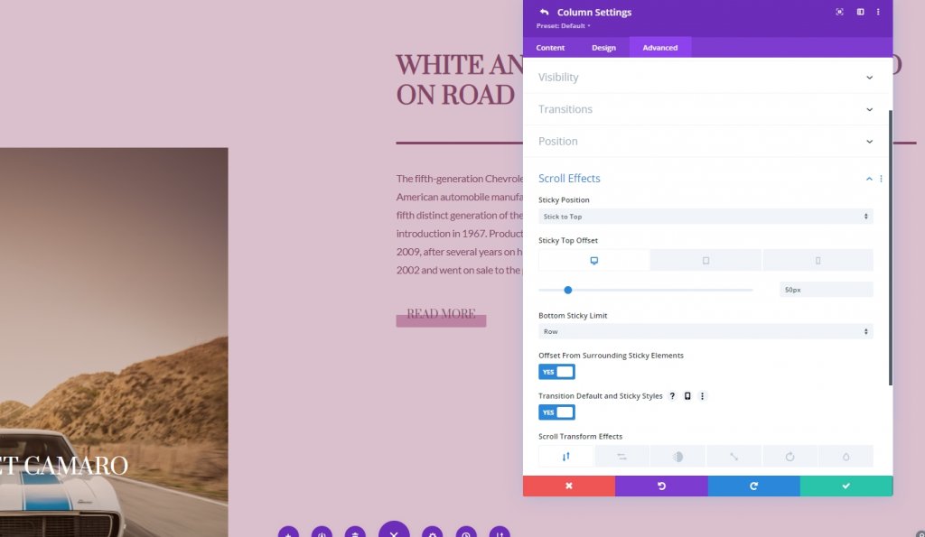
Column 2
As we have everything in place, we'll start adding sticky settings by opening column 2 settings. From the advanced tab, apply the following settings.
- Sticky Position: Stick to Top
- Sticky Top Offset: Desktop: 50px. Tablet and Phone: 80px
- Bottom Sticky Limit: Row
- Offset From Surrounding Sticky Elements: Yes
- Transition Default and Sticky Styles: Yes
Sticky Settings For Column 2
Sticky Border
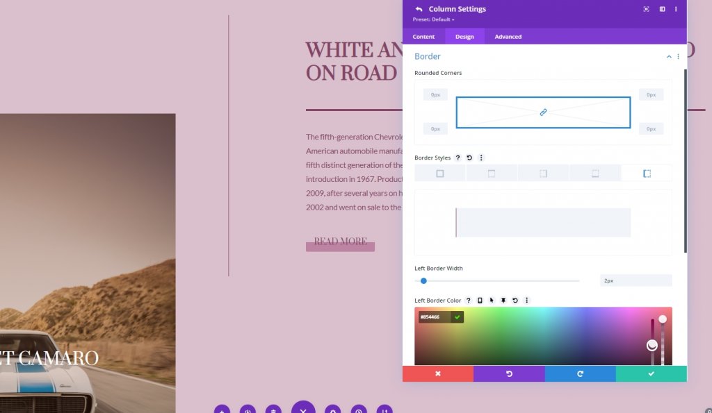
We have successfully made the column sticky. Now we'll add a border in column 2. To do that, let's move to border settings.
- Sticky Left Border Width: 2px
- Left Border Color: #854466
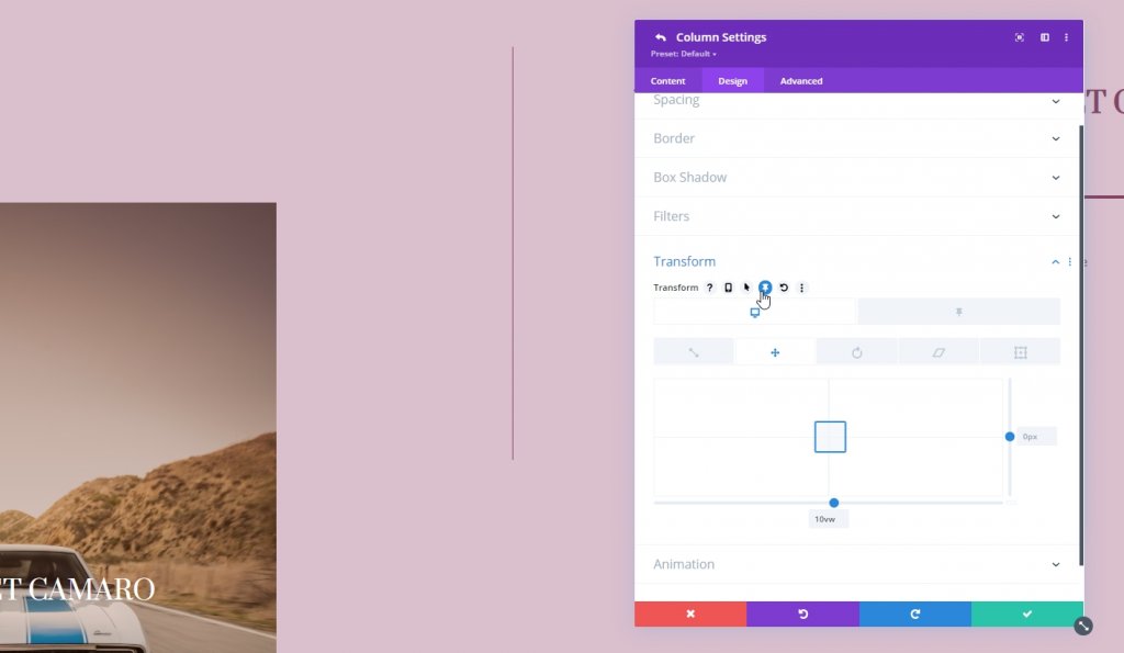
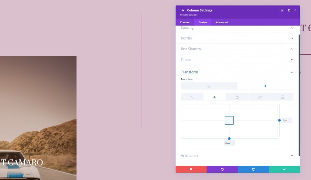
Transform Translate
adjust the transform translate values in the default sticky state.
- Bottom: 10vw
- Sticky Bottom: 0vw
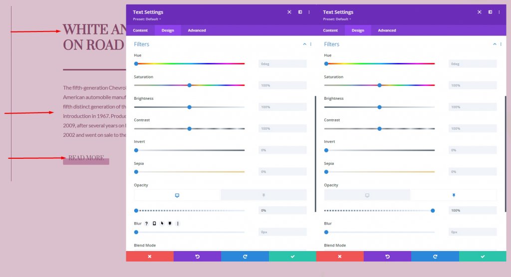
Sticky Opacity For Text Modules And Button Module
We’re changing the opacity in default and sticky state too.
- Normal State Opacity: 0%
- Sticky State Opacity: 100%
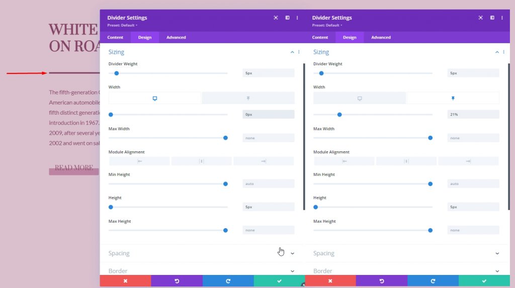
Sticky Settings For Divider Module
Sizing
Now, let's do some sticky settings for the divider module.
- Width: 0px
- Sticky Width: 21%
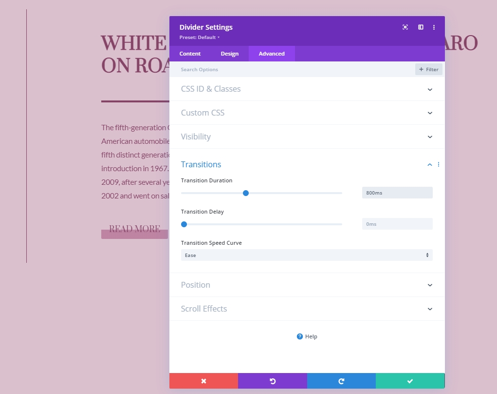
Transition
From the advanced tab, increase the transition timing.
- Transition Duration: 800ms
Scroll Effects
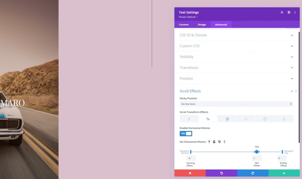
Column 1 Text Modules
Next, we will add the scroll effects. Let's start by applying it to the text module of column 1. Open text module settings. Move to the advanced tab and add horizontal motion.
- Enable Horizontal Motion: Yes
- Starting Offset: -5
- Mid Offset: 0 (at 72%)
- Ending Offset: 0
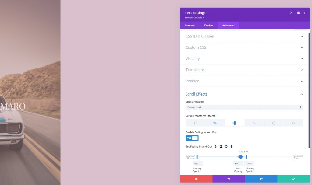
Add a Fading In And Out Scroll Effect
Finish the scroll effects settings by applying fading in and out configuration to the same module.
- Enable Fading In and Out: Yes
- Starting Opacity: 0%
- Mid Opacity: 0% (at 46%)
- Ending Opacity: 100% (at 52%)
Final View
As you can see, we have successfully created a design where we merged scroll effects and sticky options. It is completely responsive and looks excellent on every device.
Conclusion
Divi is mighty with its core features and can create outstanding layouts. This tutorial shows how we can get creative with sticky effects and scrolling options and design stunning pages. If you are a developer, then you should use this kind of design to impress your client. Also, share this tutorial with your friends and let us know what tutorial you want next. Thanks.