
Are you struggling to make your website responsive? One of the most common challenges website owners face is getting the container width just right. Whether you're using a pre-built theme or designing your website from scratch, it can be tricky to ensure that your content looks great on all devices.

If your website's container width is too wide, it can make your content difficult to read on smaller screens. On the other hand, if the container width is too narrow, you may end up with a lot of wasted space on larger screens.
The good news is that there are plenty of solutions available to help you tackle this challenge. Whether you're looking for tips on adjusting your theme's settings or want to learn more about responsive design best practices, we're here to help.
Why It's Important To Manage a Website's Container Width
Managing your container width in Elementor is an important aspect of creating a responsive website. When you're designing a website, you want it to look great on all devices, whether it's a desktop computer, tablet, or smartphone. However, different devices have different screen sizes, which means that your website may appear differently depending on the device being used to view it.
Create Amazing Websites
With the best free page builder Elementor
Start NowOne of the ways you can ensure that your website looks great on all devices is by managing your container width in Elementor. Elementor is a popular page builder for WordPress that allows you to create custom layouts and designs without needing to know how to code.
By managing your container width in Elementor, you can control how your content is displayed on different screen sizes. For example, you might want your content to be displayed in a single column on smaller screens, but in multiple columns on larger screens. By adjusting your container width, you can achieve this without having to create separate designs for each screen size.
Managing your container width in Elementor can also help you improve the overall user experience of your website. If your content is difficult to read or navigate on smaller screens, users may be more likely to leave your website and find what they're looking for elsewhere. By creating a responsive design with properly managed container widths, you can ensure that your website is easy to use and engaging for all users, regardless of the device they're using.
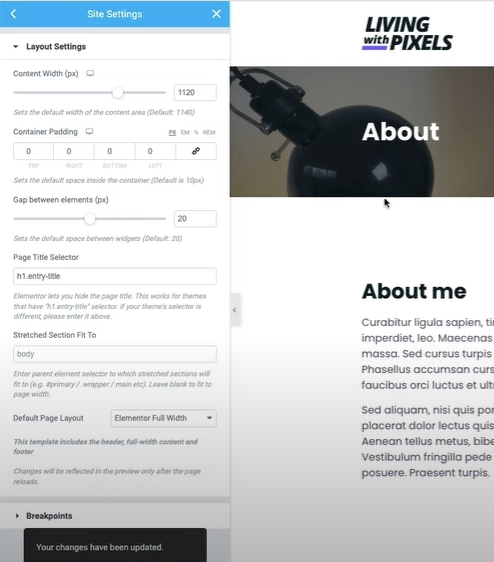
Turn Padding Off
Go to the site settings, then Layout, and turn container padding off. Then update it, otherwise, once you activate the code, it will create padding issues.
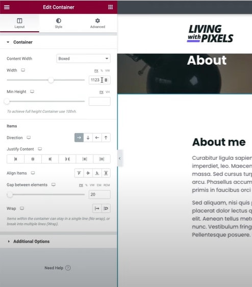
Manage Website Container Width In Elementor
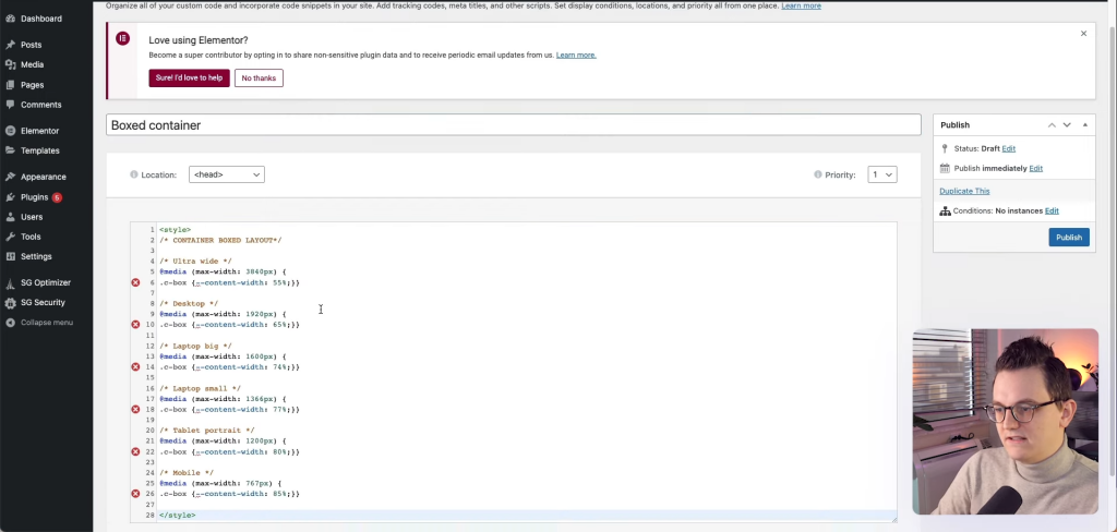
Previously we used pixels for mobiles and tablets and percentage ratios for larger displays such as laptops or desktops. But now it is possible to manage the width of all by using percentages. So, to make this happen here is the code that you need to use on your website -
<style>
/* CONTAINER BOXED LAYOUT*/
/* Ultra wide */
@media (max-width: 3840px) {
.c-box {--content-width: 55%;}}
/* Desktop */
@media (max-width: 1920px) {
.c-box {--content-width: 65%;}}
/* Laptop big */
@media (max-width: 1600px) {
.c-box {--content-width: 74%;}}
/* Laptop small */
@media (max-width: 1366px) {
.c-box {--content-width: 77%;}}
/* Tablet portrait */
@media (max-width: 1200px) {
.c-box {--content-width: 80%;}}
/* Mobile */
@media (max-width: 767px) {
.c-box {--content-width: 85%;}}
</style>
Once you copied this code, you can place it from three different places.
First, you can go to the settings icon on the elementor editor panel and then go to the advanced section to paste the code.
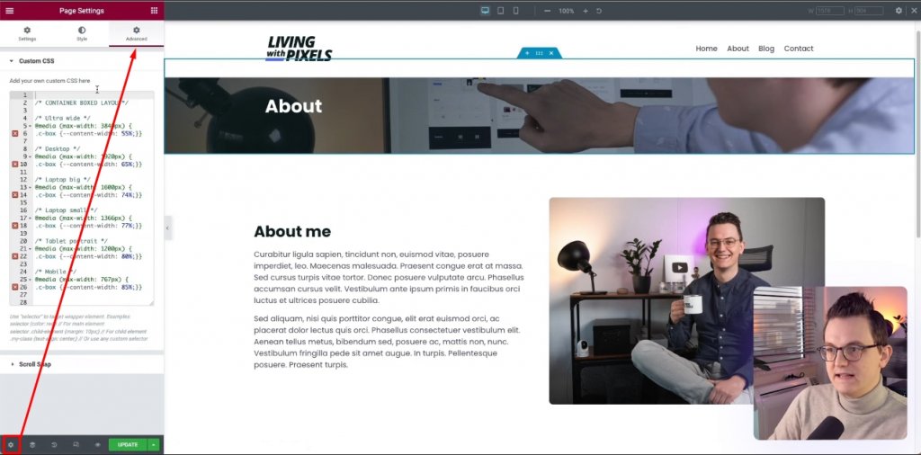
However, this is on the page level, so it might not be the best method.
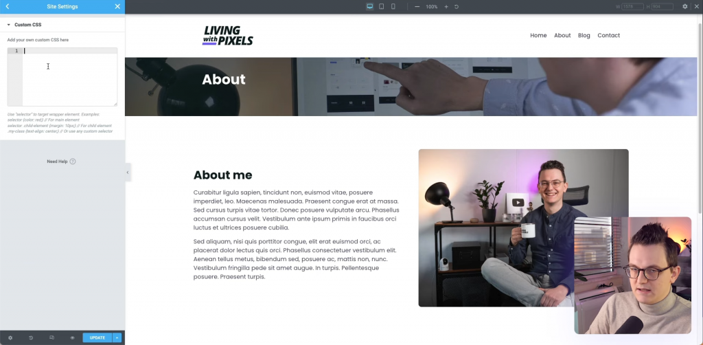
Apart from that, you can simply navigate to site settings and you'll see a custom CSS option there where you can paste the code. However, while putting your code these two ways, remove the style tag from the code because, by default, it's a stylesheet.
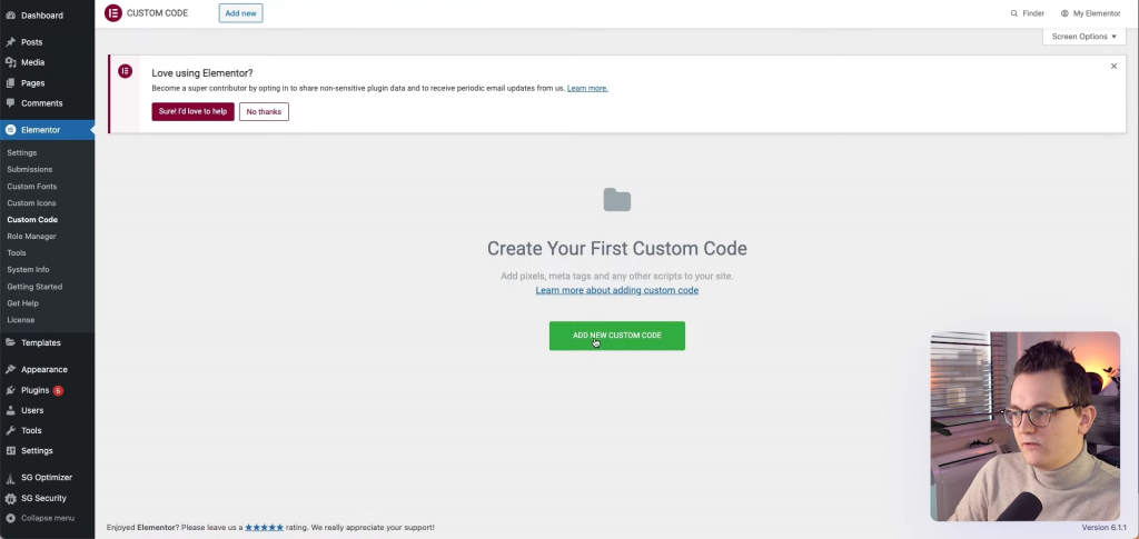
Another way is, from your WP dashboard, to navigate to Elementor > Custom Code.
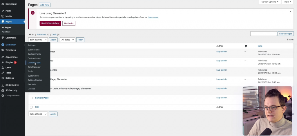
Now click on add new custom code.
Now give the code a name, and paste it there, now hit publish.
Code Activation
You have already pasted the code but its not activated yet. You can see, there is a class called C-box in the code.
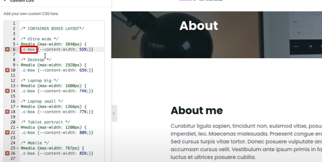
To make the code work, go to the container edit section and type "c-box" in the CSS Classes.
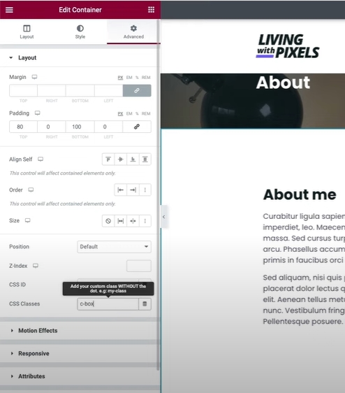
Now, delete the width value from the layout tab, to make the code work.
Wrapping Up
In conclusion, managing website container width in Elementor can be a crucial factor in creating a visually appealing and professional-looking website. By adjusting the container width, you can ensure that your website content is properly aligned and displayed on various devices and screen sizes.
Elementor provides several options for managing container width, including fixed, full width, and boxed layouts. Each option has its own benefits and drawbacks, and you should choose the one that best suits your website's design and functionality requirements.
Remember to keep in mind the importance of responsive design, as more and more users are accessing websites on mobile devices. Always test your website on various devices and screen sizes to ensure that it looks and functions as intended.
By following the tips and techniques outlined in this guide, you should be able to easily manage container width in Elementor and create a website that is both visually appealing and user-friendly. With a little bit of practice and experimentation, you can create a website that stands out from the crowd and effectively communicates your message to your audience.