
Images always have a massive impact on design, and maybe your website has an entire gallery. Divi unleashes great power by its modules, and the Divi gallery module is perfect for any image presentation. It's organized and lets you show images directly from the media library. Today, we will learn how to make image info with a revealing slide-down effect on Divi by hovering over the image. It's an effective design for photographers, event management, real estate business, etc. This is a responsive design, but we'll do some tweaks for smaller devices during the design. So, let's move towards the sneak peek and then we will learn how to create such a design.
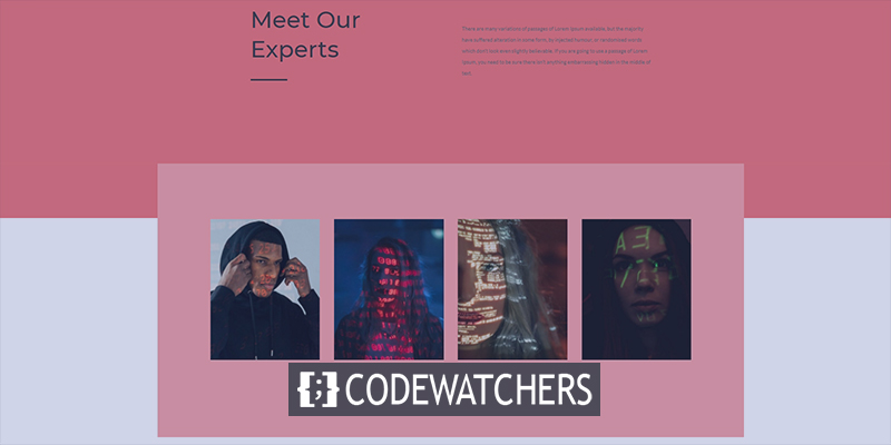
Sneak Peek
Lets have look to our todays design before we move ahead.
Part 1: Upload Images
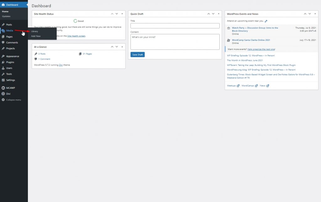
Media Library
To start designing, we have to add images to our library. For that, go to Library from Media.
Now click on Add new to upload new images.
Create Amazing Websites
With the best free page builder Elementor
Start Now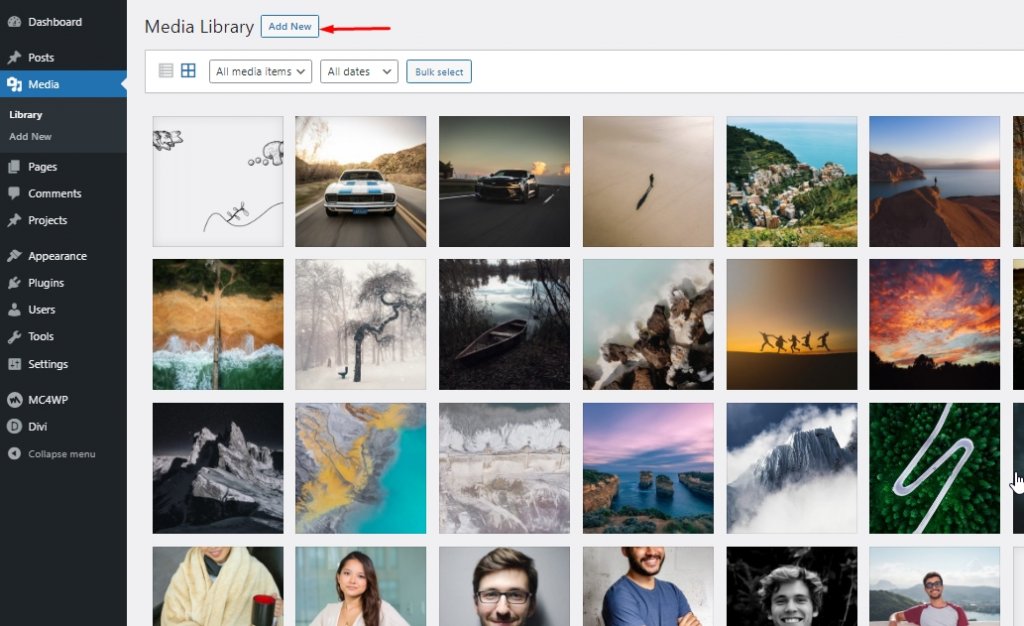
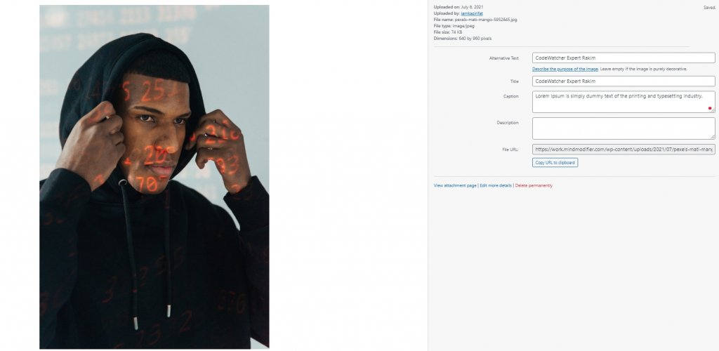
Now add captions and titles to the images. Try to make word limit same for all image.
Part 2: Designing
Section One
Background Color
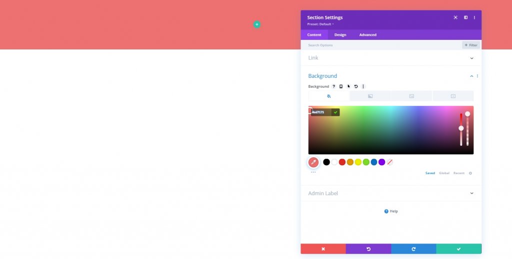
Now open a page or create a new one to make the design. Then open the page with Divi builder and select "build from scratch". Then, we will add a background color to the initial section of the page.
- Background Color: #ed7171
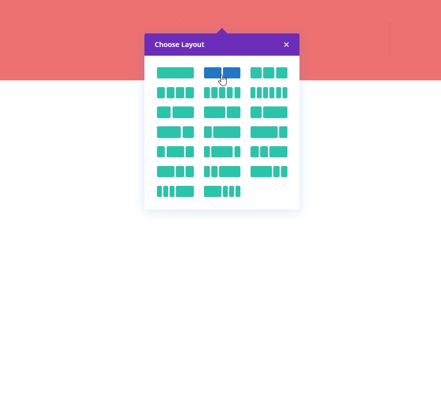
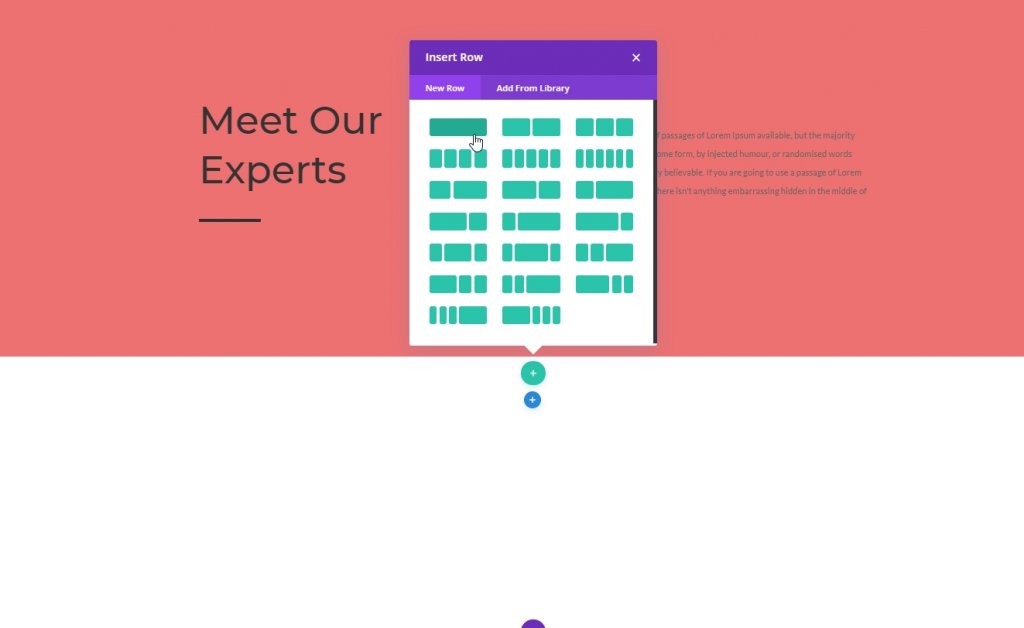
Adding Row
Column Structure
Lets add a row with following structure.
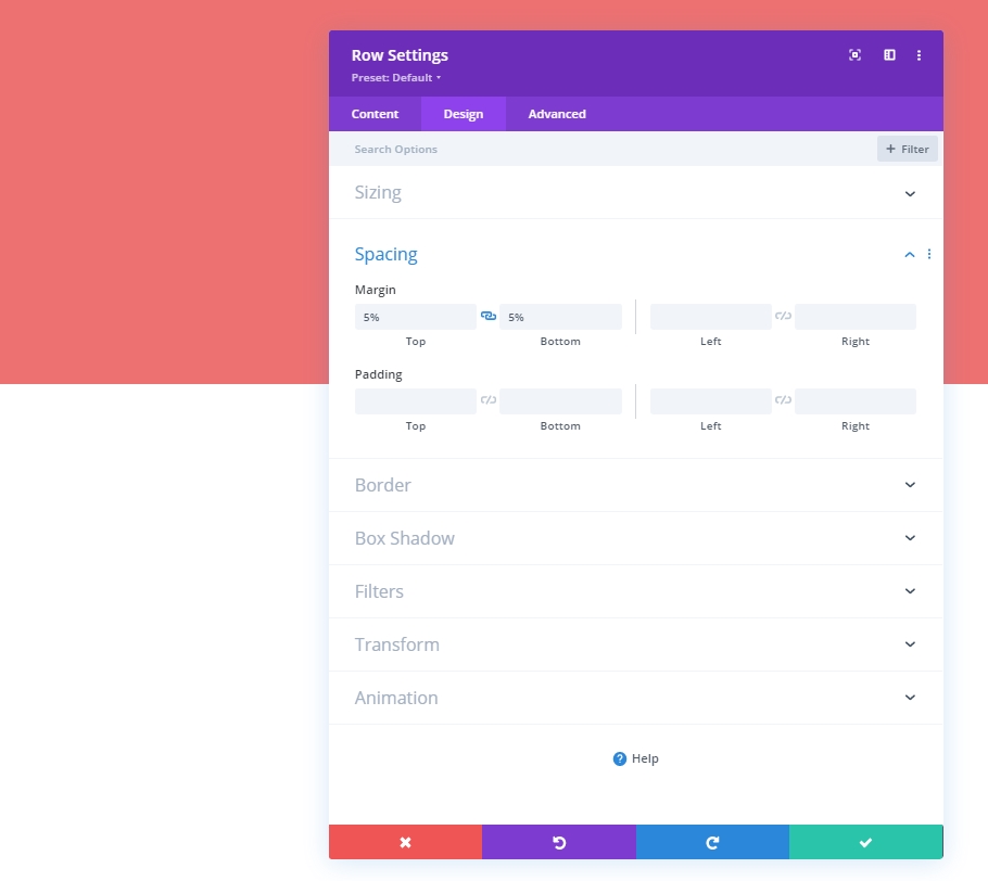
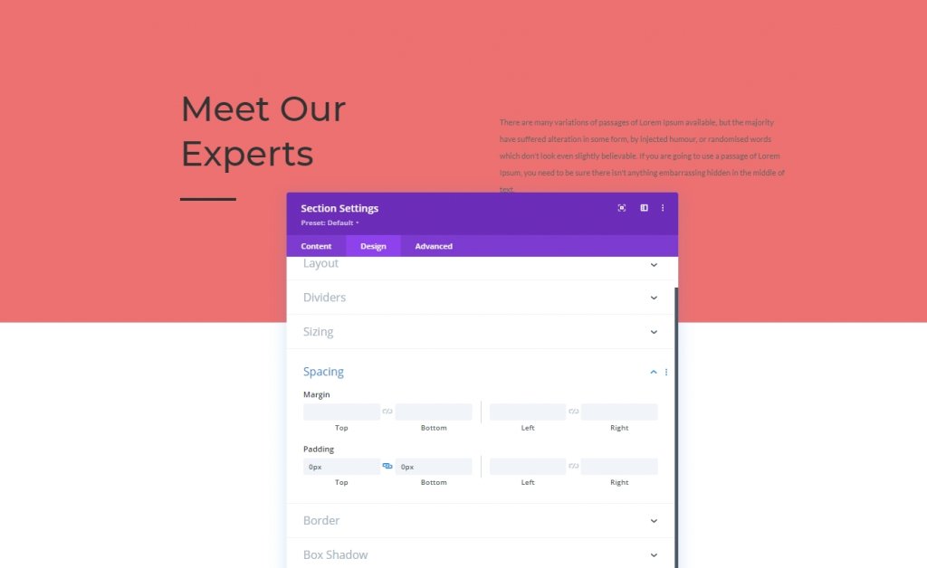
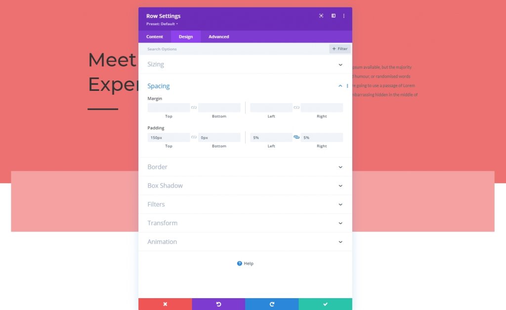
Spacing
Before we add any moduel to the column, we need to set spacing values.
- Top Margin: 5%
- Bottom Margin: 5%
Column 1: Text Module
H2 Content
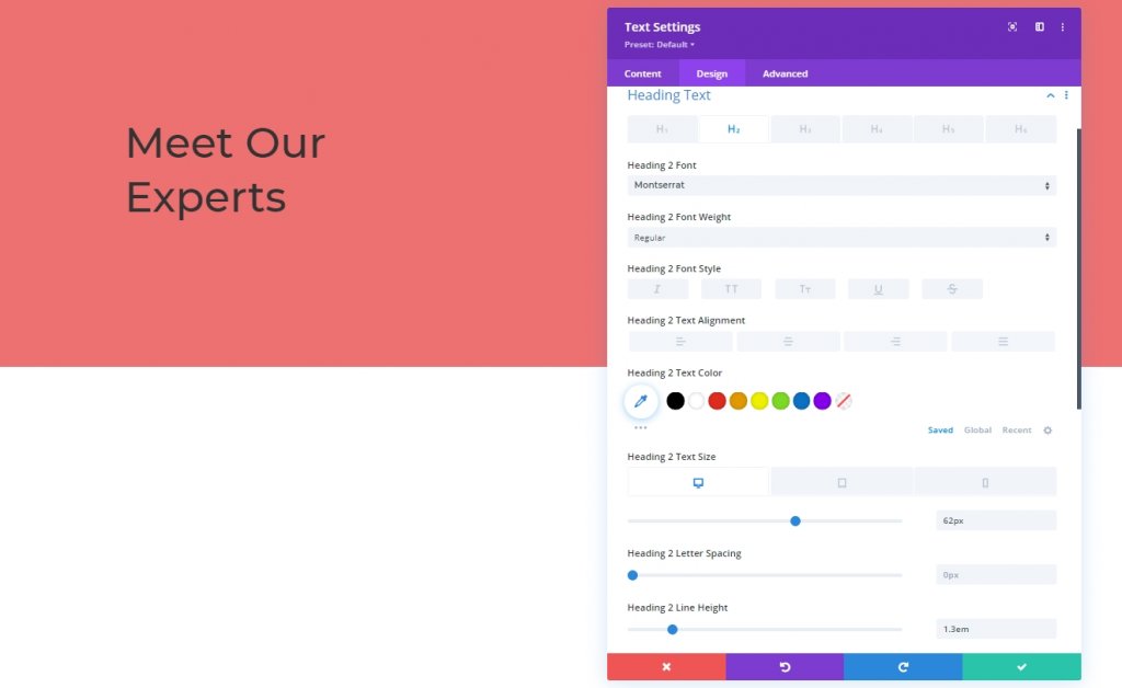
Now we will add a text module on the first column and add some H2 content.

H2 Text Settings
Move to the Design tab and change the H2 style.
- Heading 2 Font: Montserrat
- Heading 2 Text Size: Desktop: 62px, Tablet: 48px & Phone: 32px
- Heading 2 Line Height: 1.3em
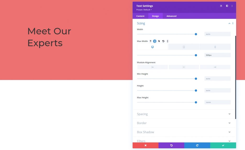
Sizing
Modify the module’s max width across different screen sizes too.
- Max Width: Desktop: 500px, Tablet: 400px & Phone: 250px
Column 1: Divider Module
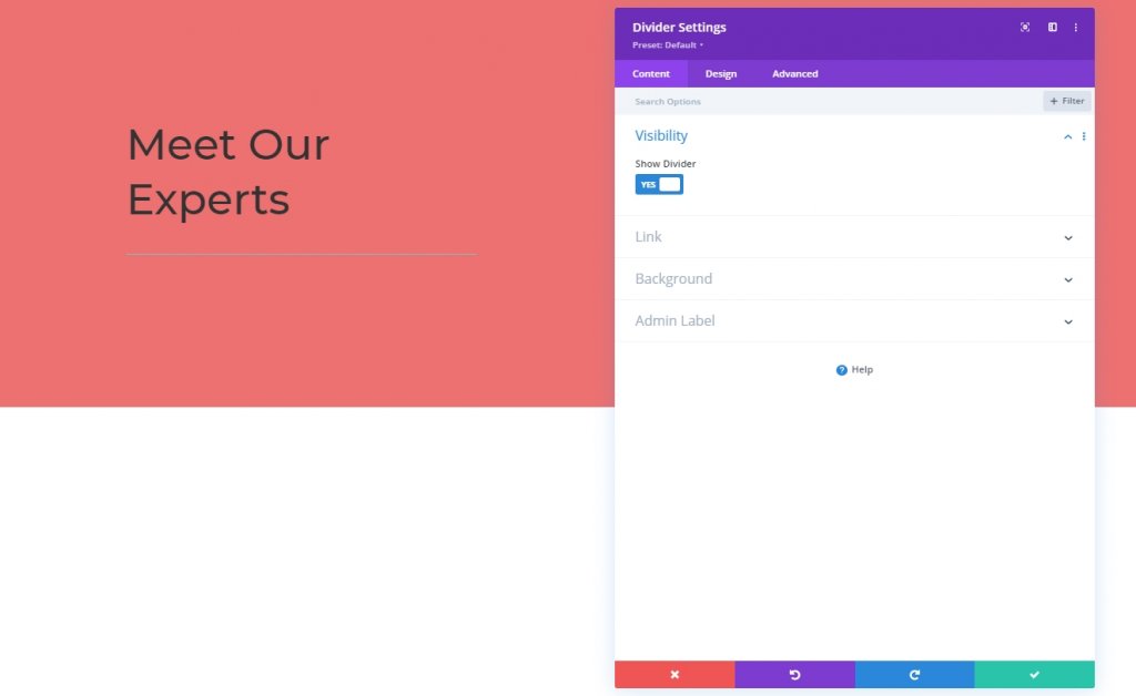
Visibility
Finally we will add a divider module to column 1. Turn the visibity options on.
- Show Divider: Yes
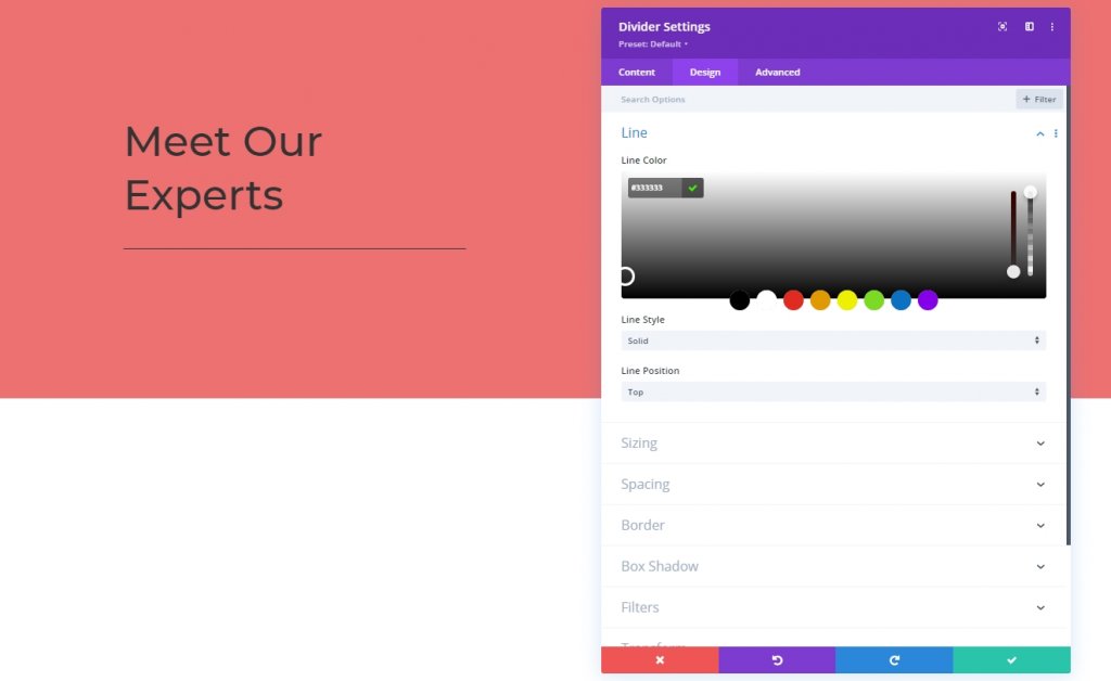
Line
The the line color from design tab.
- Line Color: #333333
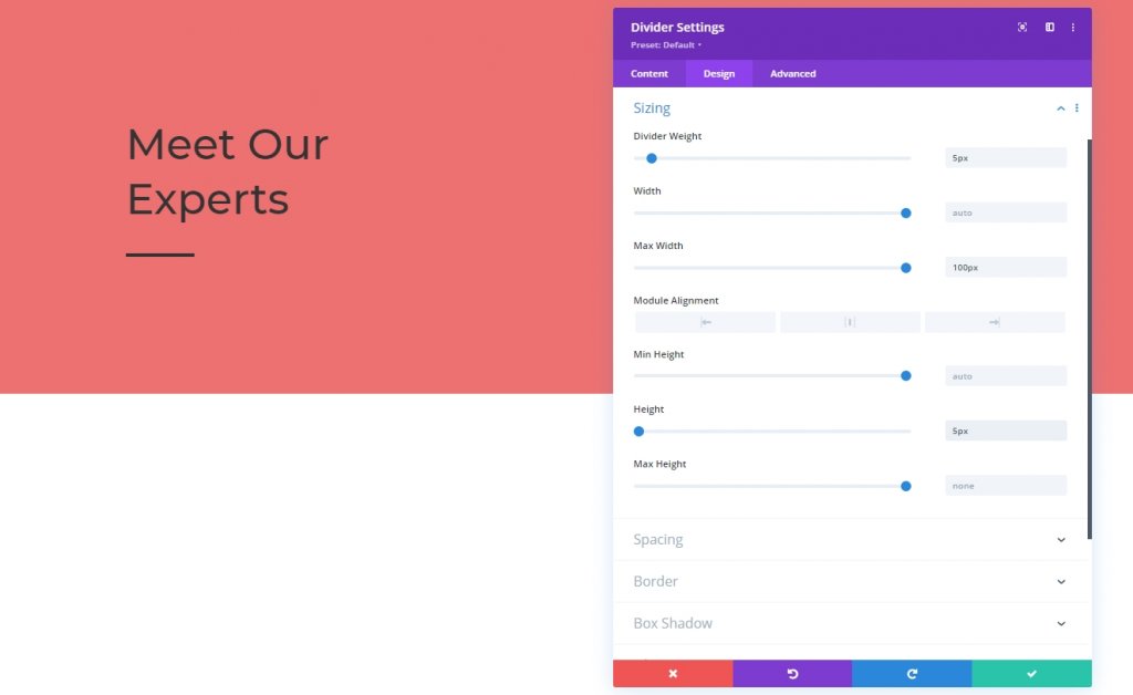
Sizing
Next we will alter the sizing settings of divider module.
- Divider Weight: 5px
- Max Width: 100px
- Height: 5px
Column 2: Text Module
Text Content
Now we will add a text module on the second column and add some copies
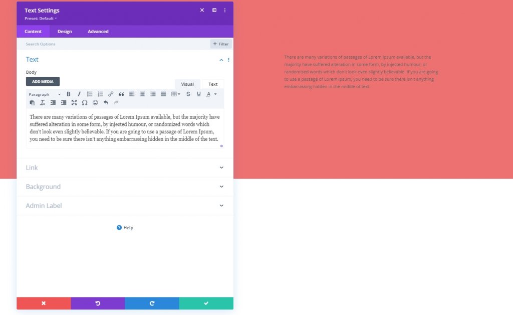
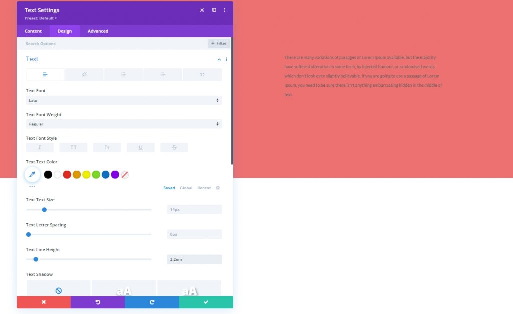
Text Settings
We'll update the text module settings .
- Text Font: Lato
- Text Line Height: 2.2em
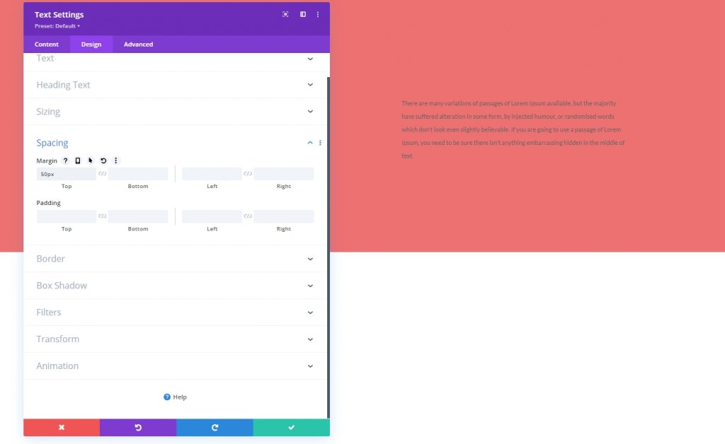
Spacing
Let's add some to margin to our text.
- Top Margin: 50px
Section Two
Now we'll add another section below the first one.

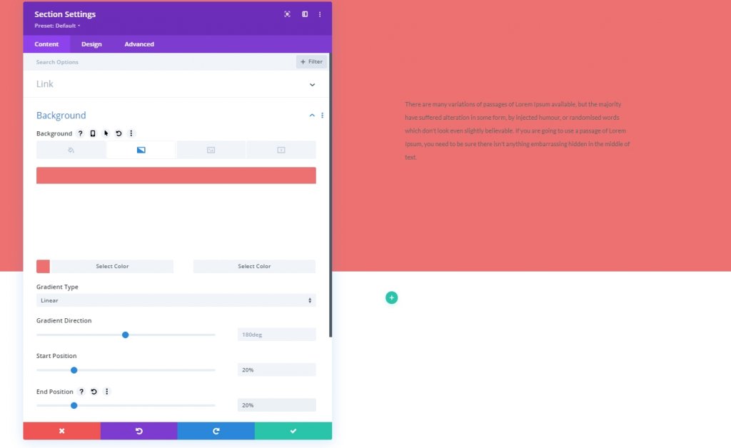
Gradient Background
Let's apply a gradient background color to our newly created section.
- Color 1: #ed7171
- Color 2: #ffffff
- Gradient Type: Linear
- Start Position: 20%
- End Position: 20%
Spacing
From the section's design tab, modify the padding values.
- Top Padding: 0px
- Bottom Padding: 0px
Adding Row
Column Structure
Let's add a row using marked column structure to our section two.
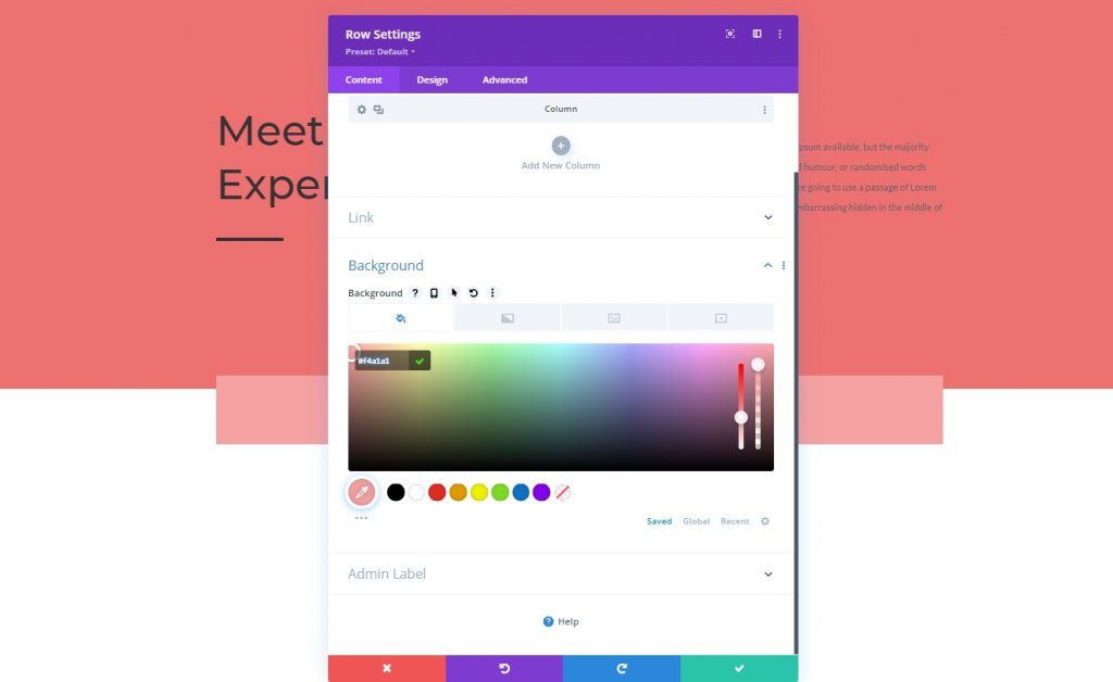
Background Color
Before adding any module, apply a background color to the row.
- Background Color: #f4a1a1
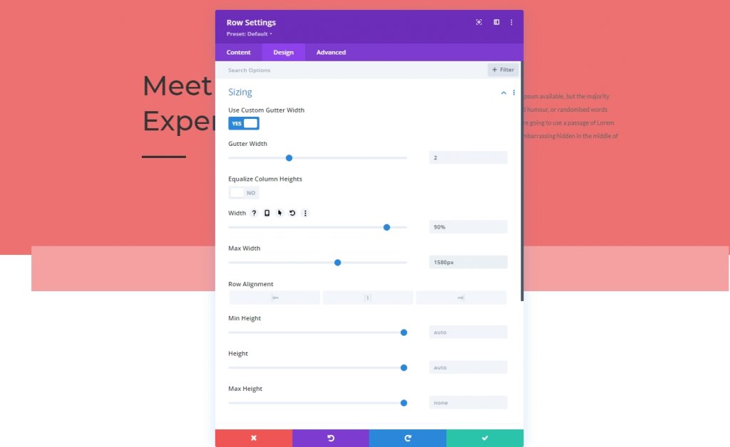
Sizing
Adjust the sizing values.
- Use Custom Gutter Width: Yes
- Gutter Width: 2
- Width: 90%
- Max Width: 1580px
Spacing
Alter the spacing values as follows.
- Top Padding: 150px
- Bottom Padding: 0px
- Left Padding: 5%
- Right Padding: 5%
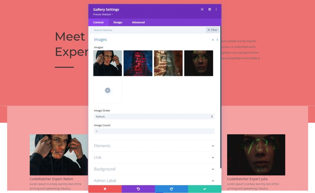
Adding: Gallery Module
Select Uploaded Images
Lets get a gallery modue on the row and add images we uploaded earlier.
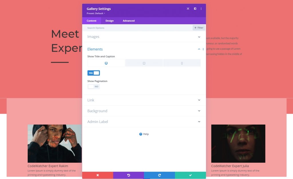
Elements
We mentioned earlier that we'd do some tweaks during the design. Because the hover effects only work on desktops. For smaller devices, the touch will attempt as a lightbox effect. This is a responsive design, but the title and caption will show in desktop mode. Also, we'll disable the pagination from elements settings.
- Show Title and Caption: Desktop: Yes, Tablet & Phone: No
- Show Pagination: No
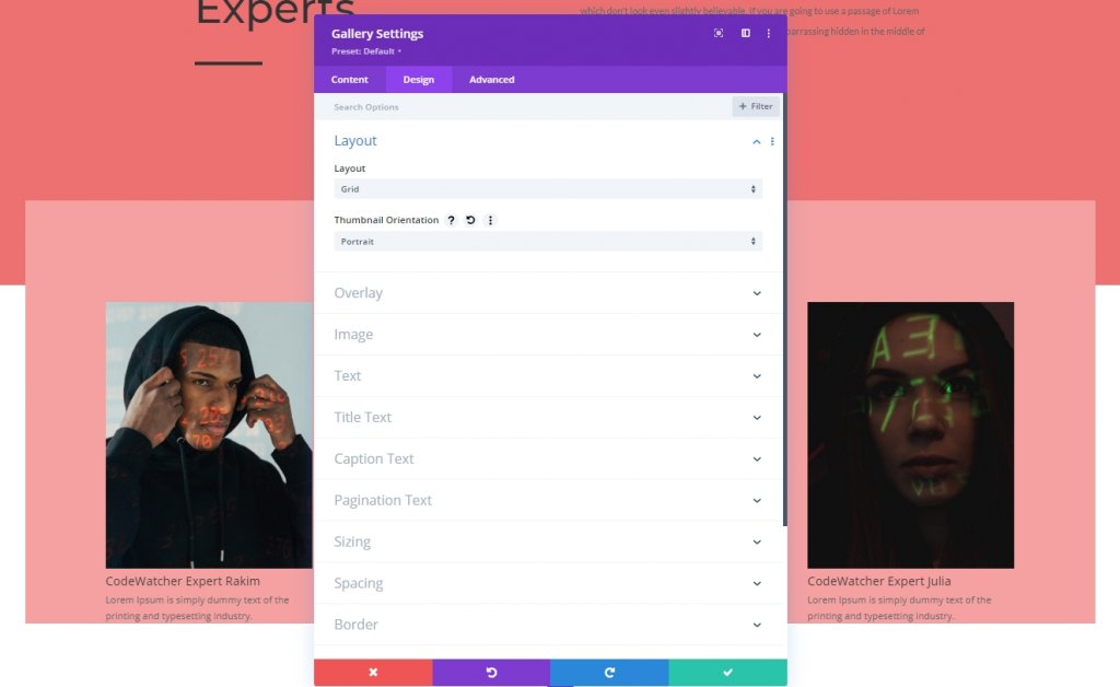
Layout
From design tab, change modules layout.
- Layout: Grid
- Thumbnail Orientation: Portrait
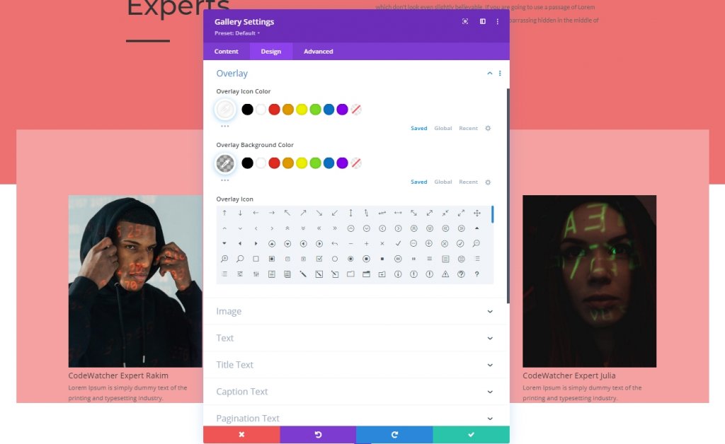
Overlay
Also, modify the overlay settings.
- Overlay Icon Color: #ffffff
- Overlay Background Color: rgba(0,0,0,0.25)
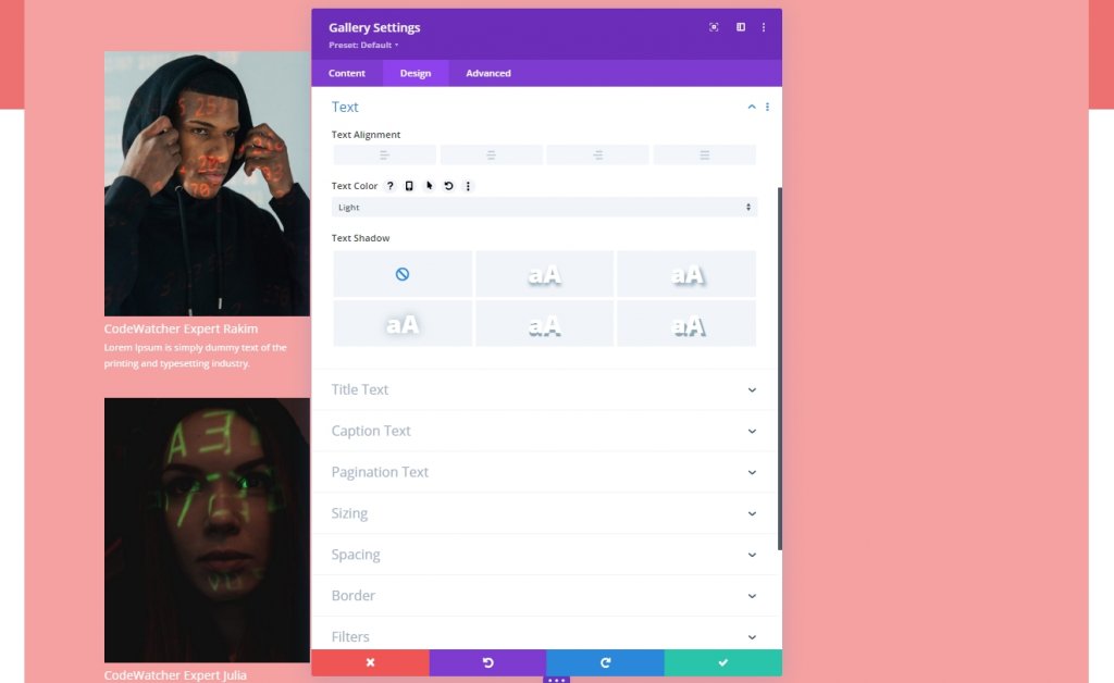
Text Settings
Move to text section to change color of the text.
- Text Color: Light
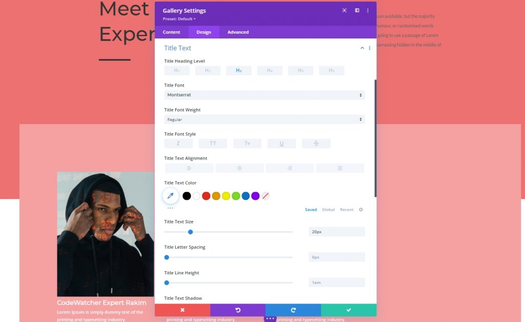
Title Text Settings
Then style the title text.
- Title Heading Level: H3
- Title Font: Montserrat
- Title Text Size: 20px
Caption Text Settings
We'll be changing the caption settings.
- Caption Font: Lato
- Caption Text Color: #ffffff
- Caption Letter Spacing: 0.5px
- Caption Line Height: 1.9em

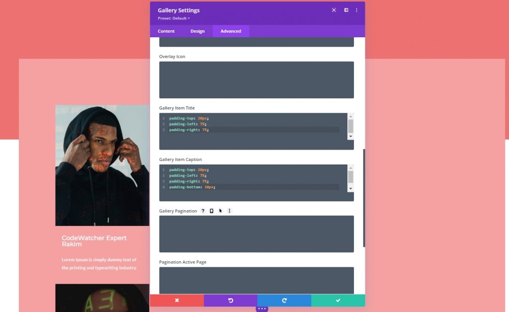
Gallery Item CSS
From the advanced tab, add the following CSS code on the gallery item title CSS box.
padding-top: 20px;
padding-left: 7%;
padding-right: 7%;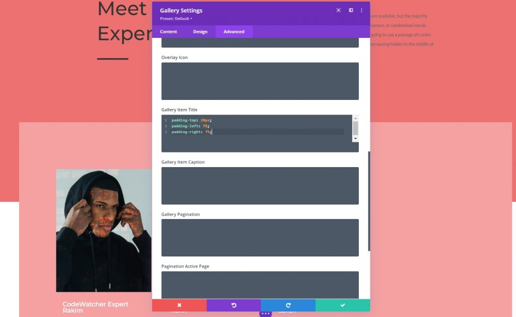
Gallery Item Caption CSS
Then add the following code on gallery item caption CSS box.
Part Three: Reveal Effect Apply
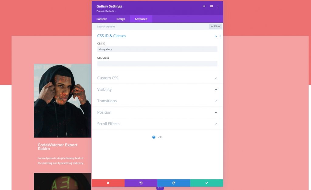
Gallery Module CSS ID
We have finished our design, and now it's time to apply the reveal effect to the gallery. So, we'll add a CSS ID to our gallery module.
- CSS ID: divi-gallery
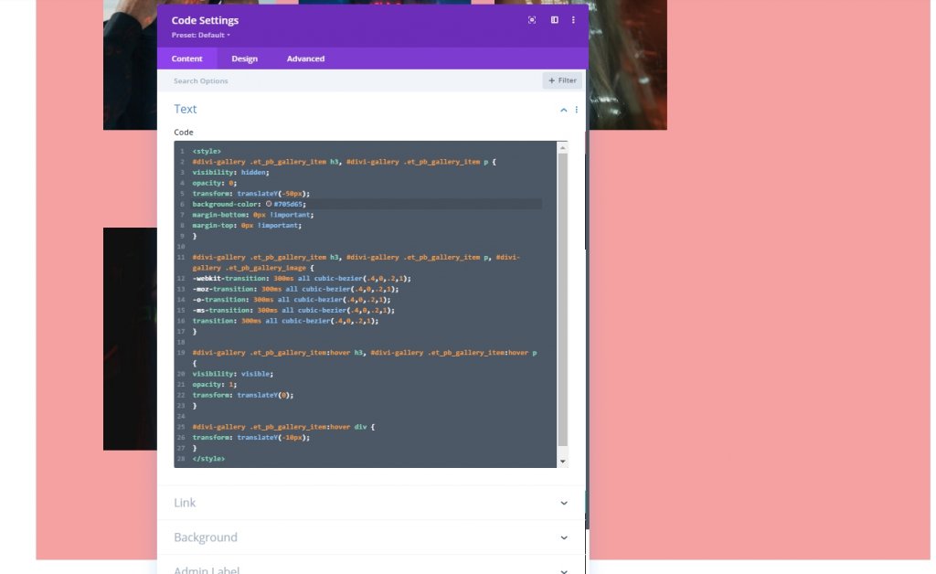
Adding Code Module
Now, we will add a code module right under the gallery module. Then we'll add CSS code.
CSS Code
Make sure to put the CSS code inside the Style tags.
#divi-gallery .et_pb_gallery_item h3, #divi-gallery .et_pb_gallery_item p {
visibility: hidden;
opacity: 0;
transform: translateY(-50px);
background-color: #705d65;
margin-bottom: 0px !important;
margin-top: 0px !important;
}

#divi-gallery .et_pb_gallery_item h3, #divi-gallery .et_pb_gallery_item p, #divi-gallery .et_pb_gallery_image {
-webkit-transition: 300ms all cubic-bezier(.4,0,.2,1);
-moz-transition: 300ms all cubic-bezier(.4,0,.2,1);
-o-transition: 300ms all cubic-bezier(.4,0,.2,1);
-ms-transition: 300ms all cubic-bezier(.4,0,.2,1);
transition: 300ms all cubic-bezier(.4,0,.2,1);
}

#divi-gallery .et_pb_gallery_item:hover h3, #divi-gallery .et_pb_gallery_item:hover p {
visibility: visible;
opacity: 1;
transform: translateY(0);
}

#divi-gallery .et_pb_gallery_item:hover div {
transform: translateY(-10px);
}
And we are done. Save the design and lets check final results.
Final Result
We have successfully gone through all the steps, and this is our outcome.
Ending Thoughts
It is effortless to design any creative with a Divi theme; you just need to have good knowledge about Divi Builder and, in some cases coding knowledge. In today's tutorial, you have seen how to design a gallery where hovering on image slides down the information. We hope you enjoy the design shown in today's tutorial. To get more tutorials on Divi, subscribe to our website newsletter and leave us any comments on the tutorial.


