
In June 2019, it was studied that smartphones accounted for about 50% of Google searches, which makes it very important to keep smartphone users in mind while working on the user experience of your website.
Widgets are frequently added to the website's sidebar or footer to encourage engagement. However, some of these widgets look great on Desktop screens but terrible on Mobile Phone screens.
Which makes the website owners want to hide or disable these widgets on Mobile Phones. In this tutorial, we will understand how can we disable a widget for Mobile Phone screens only.
Widget Options
Monitor all of the dashboard widgets! Assign a range of things to your sidebars, footer and any toolbar widgets.
Widget Options provides sleek settings below each widget to fully monitor and regulate the display and design of each widget.
Widget Options allow you to limit widget visibility to a particular page, blog, or category.
Once you have installed the above mentioned plugin, you need to go to Appearance and then Widgets in your WordPress dashboard.
Create Amazing Websites
With the best free page builder Elementor
Start Now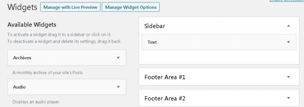
You will be able to see your active and inactive widgets on this page. Go ahead and decide the widget you want to edit.
Once you have selected the widget you want to edit, you will see a new option below added by the Widget Options plugin. You need to choose a small mobile icon and choose the devices you want to disable your widget on.
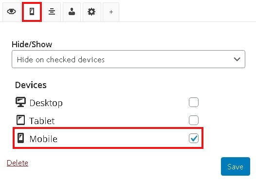
Now, click on the Save button to save all the changes and then check out your site on the mobile screen to confirm that your widget is not appearing anymore.
How To Build A SmartPhone Version Of A Widget
You might want to have a different version of a widget for smartphone or tablets that looks more attractive.
The Widget Options Plugin also allows you to do this. You can just create another widget and limit its appearance to Mobile and Tablets. We're going to move ahead and understand how.
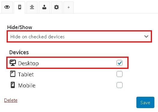
Go to Appearance and then Widgets to open the widget that you want to display on Mobiles and Tablets. Then, press that mobile icon below. Then choose Hide on checked devices from the Hide/Show panel and later on check the Desktop box.
Save the changes, and your widget will be limited to mobile and tablet screens only. That's all for this tutorial. We hope this helped you in making your site much more attractive.
Make sure you follow us on Facebook and Twitter to get updated about our future content.


