
People prefer interactive design websites. Divi gives us the opportunity to design everything that can change through user interaction, and such designs are quite popular at present. Today we will see step by step how to design a seamless hover grid with Divi where there will be a grid layout with a simple title at the beginning, and hovering over the grid blocks will change the style, and the background image will float.
So let's get started without delay.
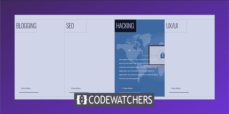
Design Preview
Before we start today's tutorial, let's see what our design outcome will look like.
Part 1: Building The Structure
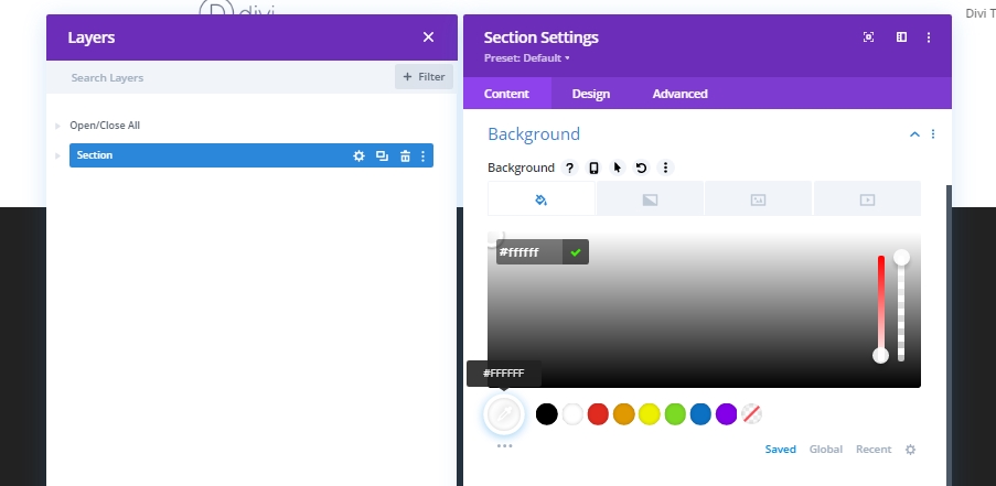
Section Settings
Background Color
When we go to Divi Builder to do a new design, a section is auto-created initially. Let's change the settings of that section as follows.
Create Amazing Websites
With the best free page builder Elementor
Start Now- Background Color: #ffffff
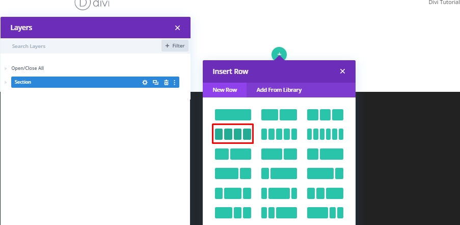
Add: Row 1 To Section
Column Structure
Now add a 4-column row to the section.
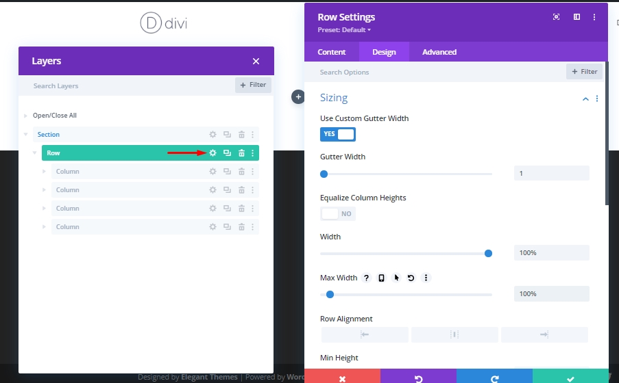
Sizing
We will change the size of this row from the settings without adding any separate modules.
- Use Custom Gutter Width: Yes
- Gutter Width: 1
- Width: 100%
- Max Width: 100%
Spacing
Now we will add the required spacing value.
- Top Padding: 0px
- Bottom Padding: 0px

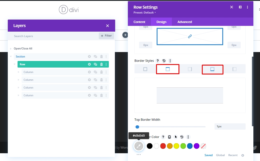
Border
We will finish the exterior work of the design section of the row by adding a border and color to this row.
- Top & Bottom Border Width: 1px
- Top & Bottom Border Color: #d3d3d3
Column 1 Setting
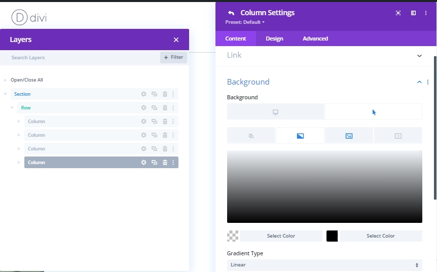
Gradient Background For Hover
Now we will work on the settings of column 1. Let us first add a gradient background.
- Color 1: rgba(255,255,255,0)
- Color 2: #000000
- Gradient Type: Linear
- Start Position: 30%
Hover Background Image
Now, we'll add an image to the background that will expose on hover.
- Background Image Size: Cover
- Background Image Position: Center

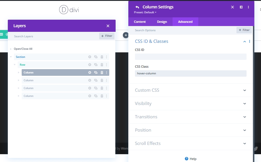
CSS Class
We will finish the column settings for now by adding a CSS class to the Advanced tab.
- CSS Class: hover-column
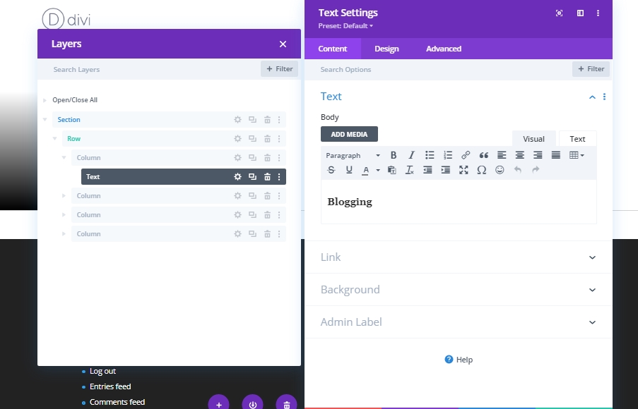
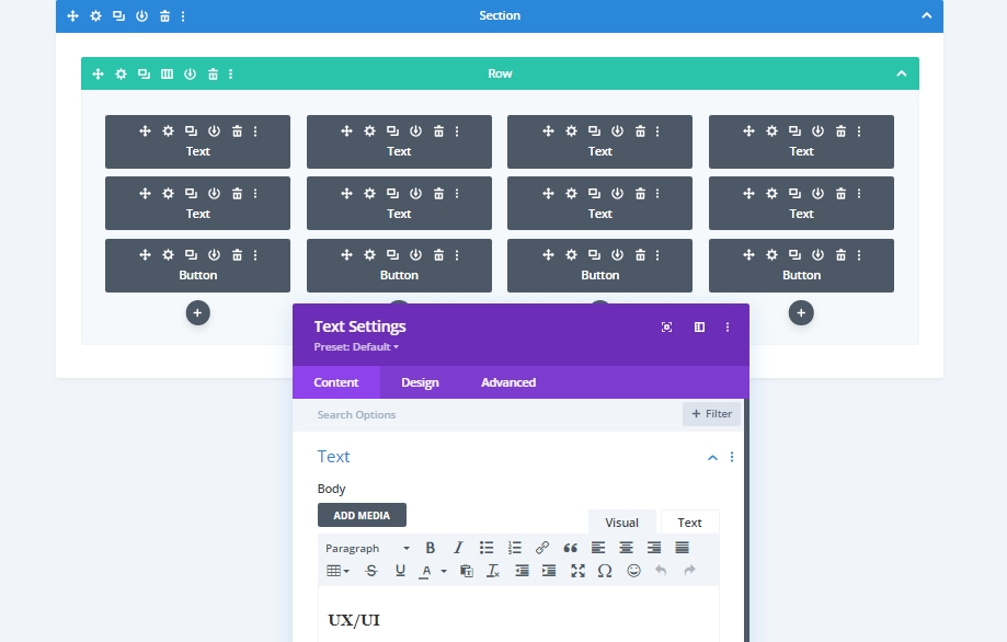
Column 1: Add Text Module 1
H3 Content
Now we will add a text module in column 1. There you can give the text of your choice.
H3 Content Settings
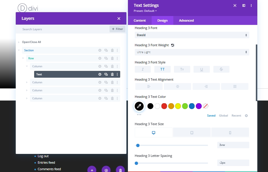
Make the following settings from the Heading Text section of Design tab.Heading 3 Font: Oswald
Heading 3 Font Weight: Ultra Light
Heading 3 Font Style: Uppercase
Heading 3 Text Color: #0a0a0a
Heading 3 Text Size:
- Desktop: 3vw
- Tablet: 7vw
- Phone: 14vw
Heading 3 Letter Spacing: -2px
Sizing
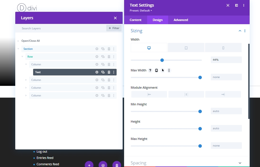
Let's change the value in the sizing section to resize the width for different screen sizes.
Width:
- Desktop: 44%
- Tablet: 48%
- Phone: 50%
Spacing
Lets make some adjustment on spacing. These values are appropriate for the heading we are using on this tutorial. You might have to change it for your heading.
- Bottom Margin: 25vh
- Top Padding: 5%
- Bottom Padding: 5%
- Left Padding: 3%
- Right Padding: 0%

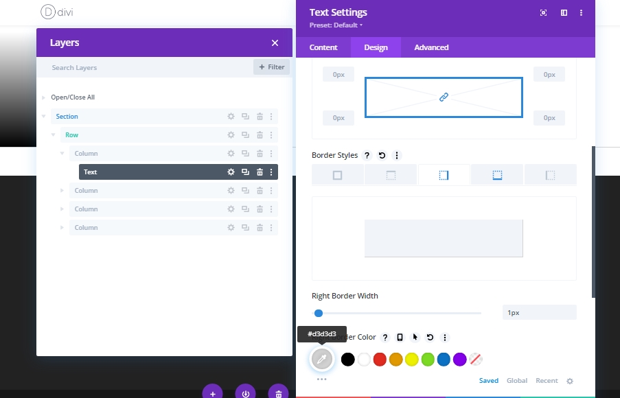
Border
Add some border to this text module.
- Right & Bottom Border Width: 1px
- Right & Bottom Border Color: #d3d3d3
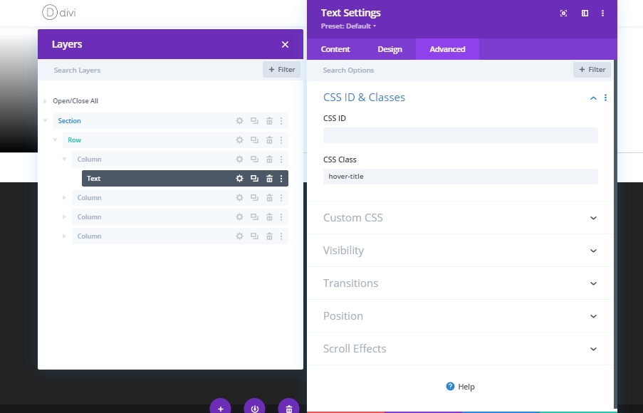
CSS Class
We will finish the settings of this text module by adding a CSS class.
- CSS Class: hover-title
Column 2: Add Text Module 2
Add Content
Add a text module right beneath the previous text module and write something about this section or anything of your choice.
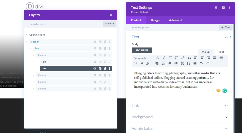
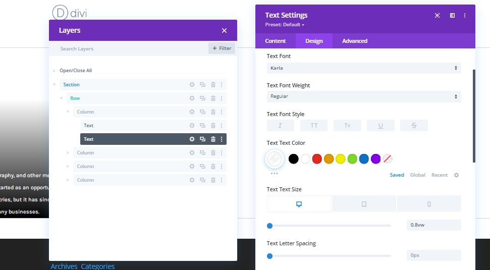
Text Settings
Move to the design tab of the text module and follow the instruction to change values. Text Font: Karla
Text Color: #ffffff
Text Size:
- Desktop: 0.8vw
- Tablet: 2vw
- Phone: 3.6vw
Text Line Height: 2.2em
Spacing
Now add some spacing to the text.
- Bottom Padding: 10%
- Left Padding: 9%
- Right Padding: 9%

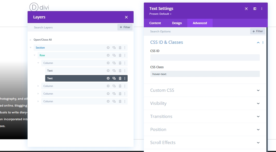
CSS Class
Finally, close the modules settings by adding a CSS Class.
- CSS Class: hover-text
Column 2: Add Button Module
Add Text
Next, add a button module below the previous text module and add some copy according to your choice.
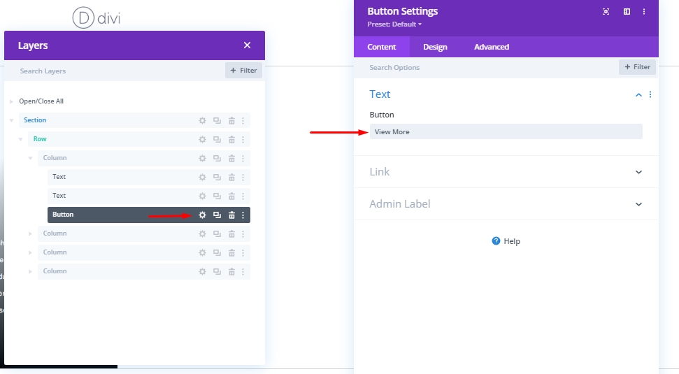
Button Settings
Change the button settings with the values mentioned below.
- Use Custom Styles For Button: Yes
- Button Text Size: Desktop: 1vw, Tablet: 2.5vw & Phone: 4vw
- Button Border Width: 0px
- Button Border Radius: 0px
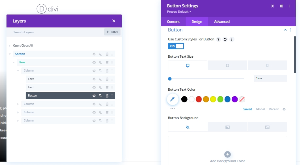
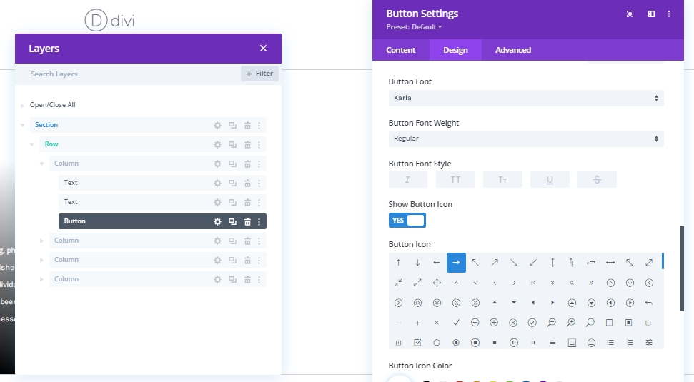
- Button Font: Karla
- Show Button Icon: Yes
- Button Icon Placement: Left
- Only Show Icon On Hover for Button: No
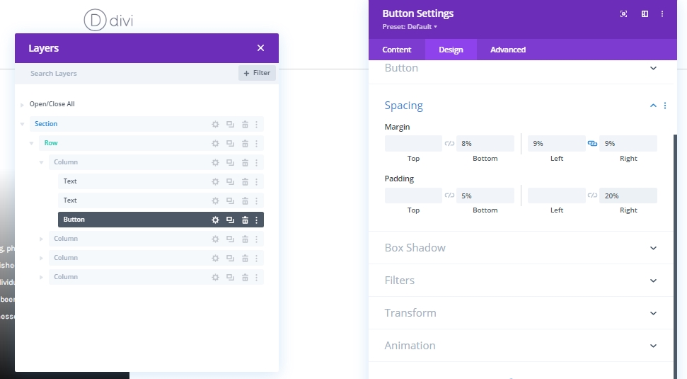
Spacing
Now add some spacing setting to this button module.
- Bottom Margin: 8%
- Left Margin: 9%
- Right Margin: 9%
- Bottom Padding: 5%
- Right Padding: 20%
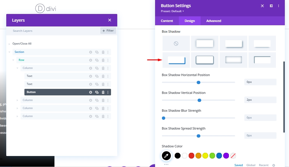
Box Shadow
Add a shadow to the button from box shadow.
- Box Shadow Horizontal Position: 0px
- Box Shadow Vertical Position: 2px
- Shadow Color: #000000
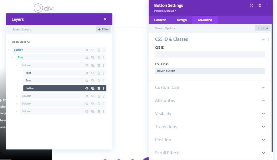
CSS Class
Lastly, we'll add this CSS Class before closing the button module settings.
- CSS Class: hover-button
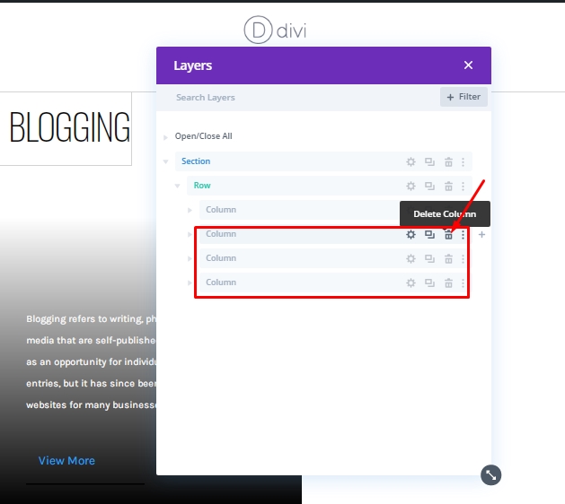
Use Column 1 Again
Delete Column No -2,3 & 4
We have created our 1st column and this is what we can use again and again. So, we will delete the rest of the columns.
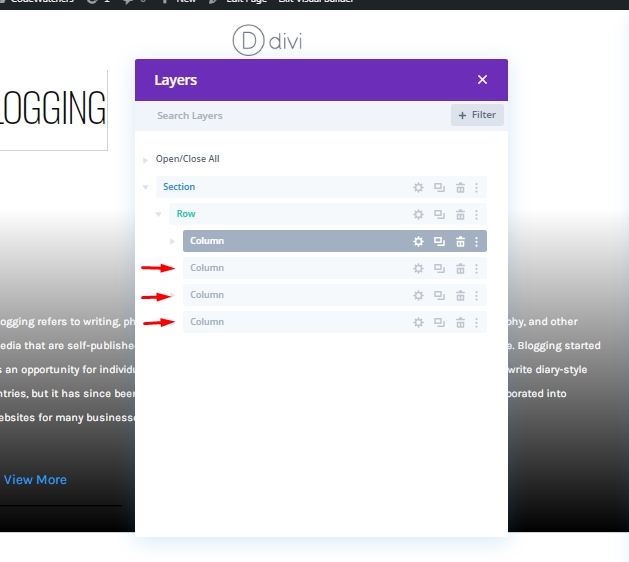
Column 1: Cloning
We will duplicate column 1 three times to re-use it.
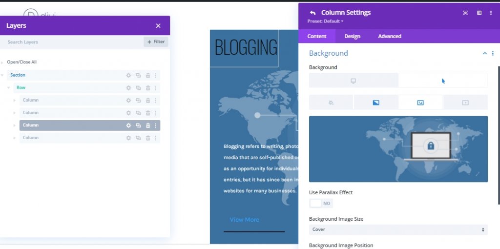
Change Background Image On Cloned Columns
Now we will change the background image of the columns we got through cloning.
Change Content On Cloned Columns
Now modify the content on cloned columns.
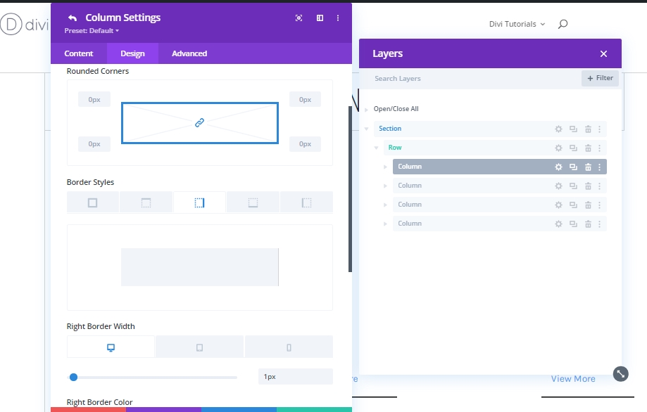
Unique Column Borders
Column 1
Now we will apply a unique border to each column. Let's start with column 1.
- Right Border Width: Desktop: 1px, Tablet: 1px & Phone: 0px
- Right Border Color: #d3d3d3
- Bottom Border Width: Desktop: 0px, Tablet: 1px & Phone: 1px
- Bottom Border Color: #d3d3d3
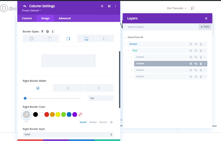
Column 2
Next, move to column 2 for border adjustments.
- Right Border Width: Desktop: 1px, Tablet: 0px & Phone: 0px
- Right Border Color: #d3d3d3
- Bottom Border Width: Desktop: 0px, Tablet: 1px & Phone: 1px
- Bottom Border Color: #d3d3d3
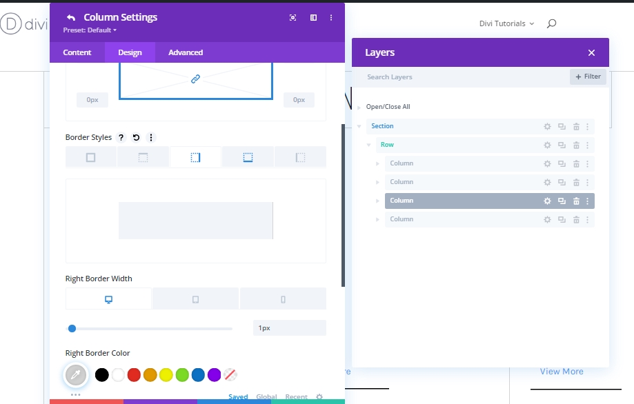
Column 3
And finally we have column 3.
- Right Border Width: Desktop: 1px, Tablet: 1px & Phone: 0px
- Right Border Color: #d3d3d3
- Bottom Border Width: Desktop: 0px, Tablet: 0px & Phone: 1px
- Bottom Border Color: #d3d3d3
Part 2: Add Custom CSS Code
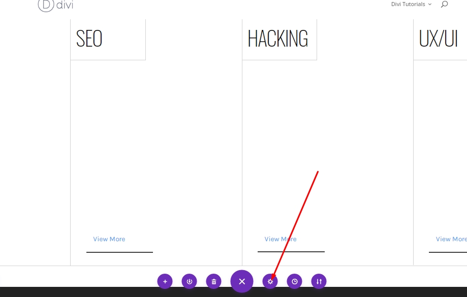
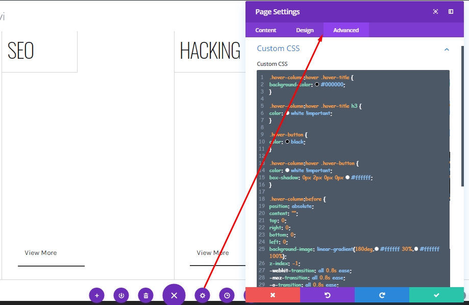
Page Settings Option
Since we've finished creating the entire design structure, we'll now add custom CSS code to our design from the Page Settings option. This CSS code will help to trigger the hover effect we are expecting.
Add: CSS Code
Now copy the following CSS code and paste it on "Custom CSS" under the advanced tab.
.hover-column:hover .hover-title {
background-color: #000000;
}

.hover-column:hover .hover-title h3 {
color: white !important;
}

.hover-button {
color: black;
}

.hover-column:hover .hover-button {
color: white !important;
box-shadow: 0px 2px 0px 0px #ffffff;
}

.hover-column:before {
position: absolute;
content: "";
top: 0;
right: 0;
bottom: 0;
left: 0;
background-image: linear-gradient(180deg,#ffffff 30%,#ffffff 100%);
z-index: -1;
-webkit-transition: all 0.8s ease;
-moz-transition: all 0.8s ease;
-o-transition: all 0.8s ease;
-ms-transition: all 0.8s ease;
transition: all 0.8s ease;
opacity: 1;
}

.hover-column:hover::before {
opacity: 0;
}
Final Output
We have done all the work successfully. Our design will look like that.
Closing Remarks
Today we saw a sample of how many beautiful designs can be created using Divi's built-in feature. Today we have created a simple grid that shows just an interesting effect of hovering. Hopefully, this will play an important role in your future WordPress designing. If you have any comments or questions, please let us know in the comments. Also, if you like this tutorial, a share will be outstanding.