
Business cards are a popular way to introduce a corporate individual to a person. It carries all the necessary information about that individual and delivers his useful contact info. How about a virtual business card on a website that flips and does the same job?" It will definitely be more dynamic, and social links will be attached to it so anyone can easily contact the individual. Well, this sounds really interesting and we will learn about this design today, on Divi! So. let's get started.
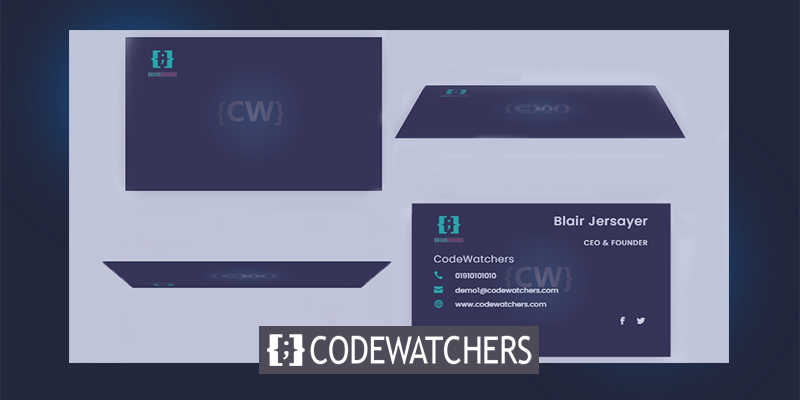
Design Preview
Today we will build this design. Looks interesting, huh?
Part 1: Design Of Business Card That Flips On Click
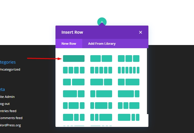
Add: Row 1
Start with adding an one-column row to the regular section.
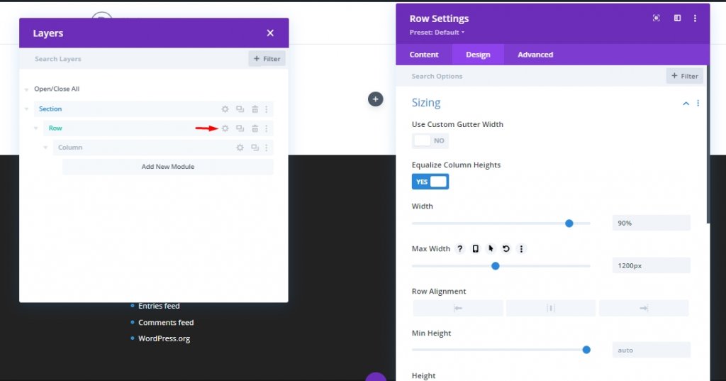
Update the following Settings.
Create Amazing Websites
With the best free page builder Elementor
Start Now- Equalize Column Heights: YES
- Width: 90%
- Max Width: 1200px
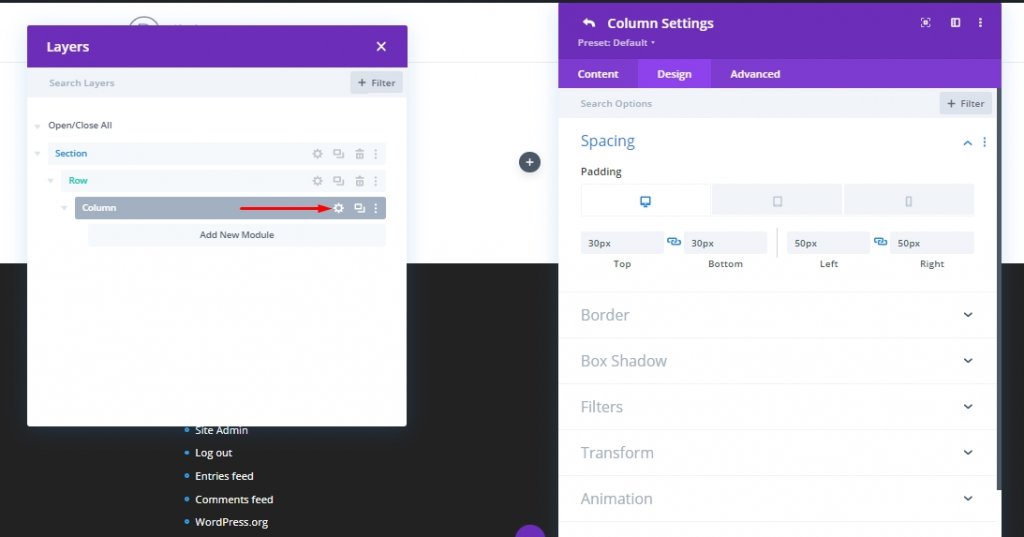
Open the column setting and add some padding to it.
Padding
- Desktop - 30px on top and bottom, 50px on left and right.
- Tablet - 30px on top and bottom, 50px on left and right.
- Phone - 15px on top and bottom, 15px on left and right
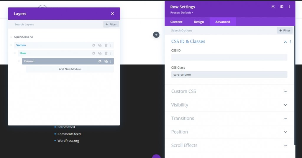
Add the following CSS Class from advanced tab. This code will work as a trigger to click for our flip animation.
- CSS Class: card-column
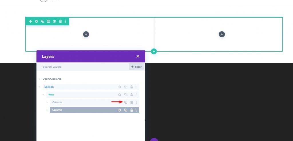
Column Cloning
Now duplicated previous column. Now we have a to-column layout and each of them have same padding and CSS Class.
Building The Back Card
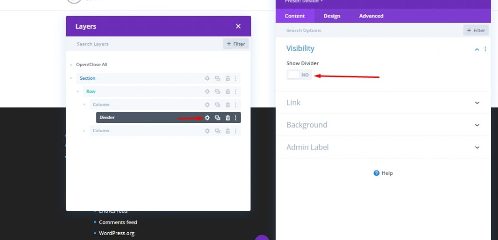
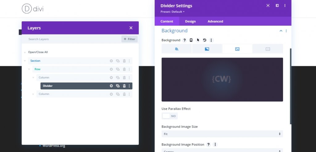
First, we will create the business card that will usually be on the back and come to the front when clicked. Here we will put all the information about an individual. We will call it back card. To create this, we will attach a Divider in column 1. Then we turn off the divider visibility from the divider setting because we will only use the divider to attach the image to the card.
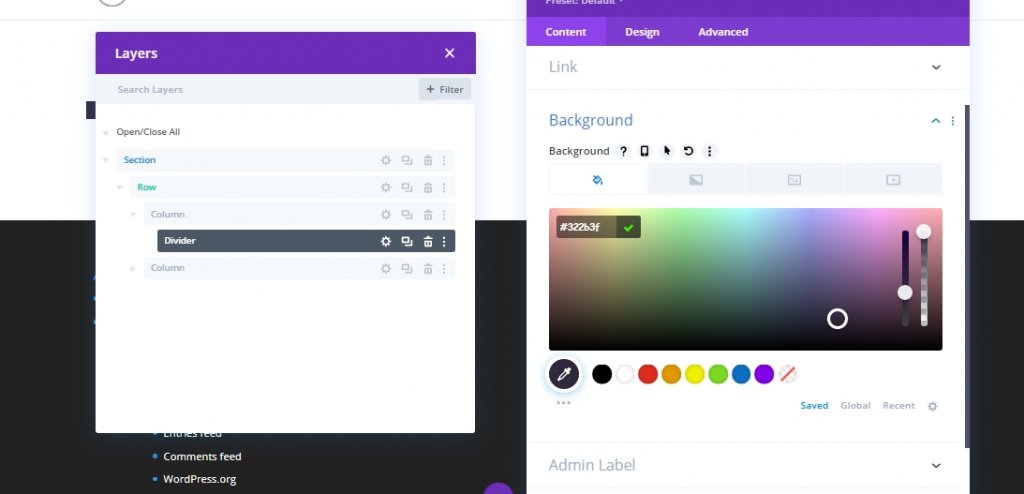
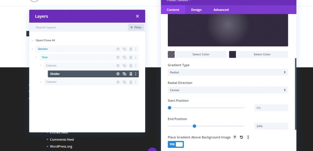
Background Color
- Background Color: #322b3f
Background Gradient
- Background Gradient Left Color: rgba(50,43,63,0.72)
- Background Gradient Right Color: #322b3f
- Gradient Type: Radial
- End Position: 34%
- Place Gradient Above Background Image: YES
Background Image
- Background Image: [upload image or portrait of team member]
- Background Image Size: fit
- Background Image Position: Center
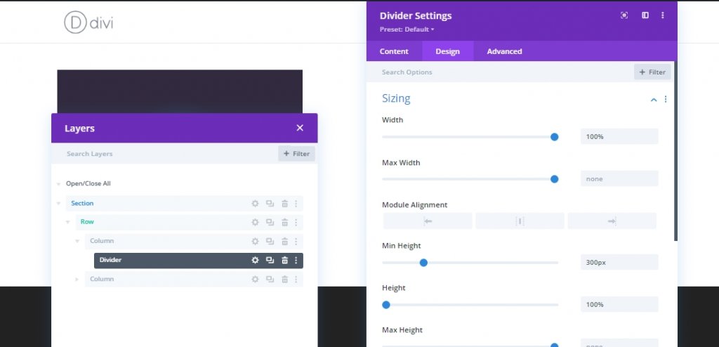
Sizing
- Width: 100%
- Min Height: 300px
- Height: 100%
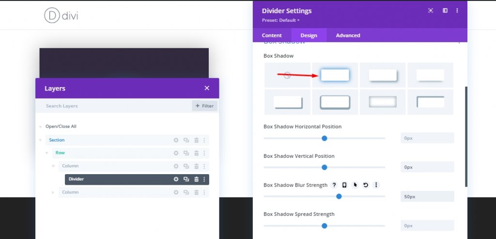
Box Shadow
- Box Shadow: see screenshot
- Box Shadow Vertical Position: 0px
- Box Shadow Blur Strength: 50px
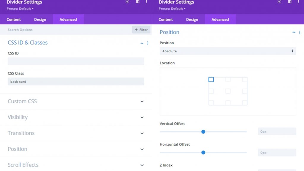
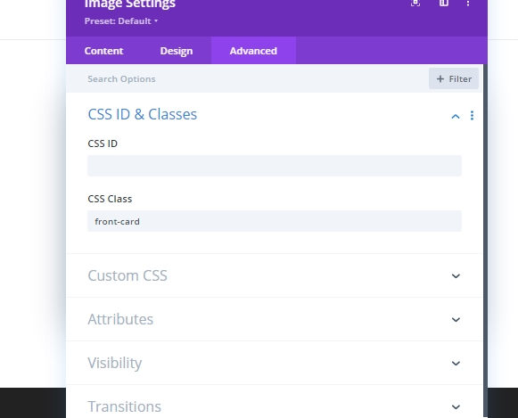
CSS Class & Position
Now add the CSS class to the divider and update the position.
- CSS Class: back-card
- Position: Absolute
Add: Logo On Back Card
We have our back card in place, we'll add logo on it now.
Now upload the logo. Size should be around 60px*60px.
CSS Class
- CSS Class: card-content
Position
- Position: Absolute
- Vertical Offset: 30px (desktop and tablet), 15px (phone)
- Horizontal Offset: 50px (desktop and tablet), 10px (phone)
Add: Cardholder Name
Now add a text module under logo module to the card for name. And update the name of the person you want to feature.
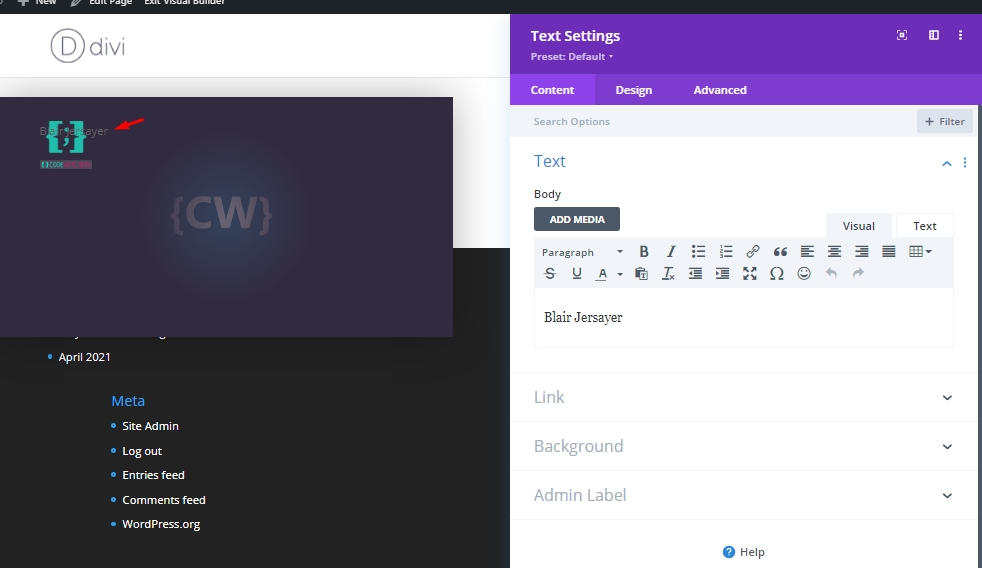
Make this following changed on design tab.
- Text Font: Poppins
- Text Text Color: #ffffff
- Text Text Size: 28px (desktop and tablet), 22px (phone)
- Letter Spacing: 1px
- Text Alignment: Right
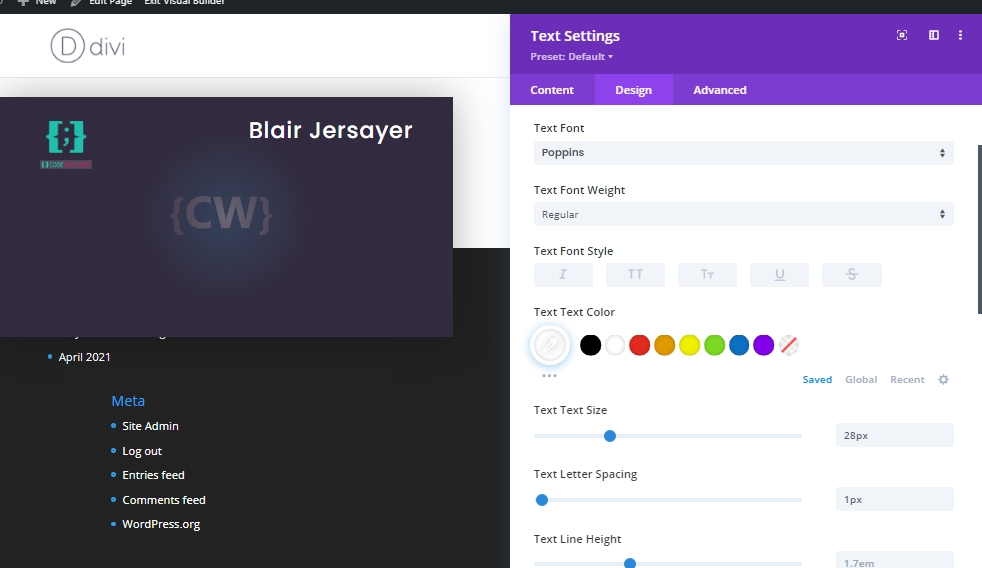
Add: The Job Position
Duplicate the previous text module to add the job position. An edit the body content and make adjustments on the design tab.
- Text Font Style: TT
- Text Text Size: 16px (desktop and tablet), 14px (phone)
- Margin: 15px bottom
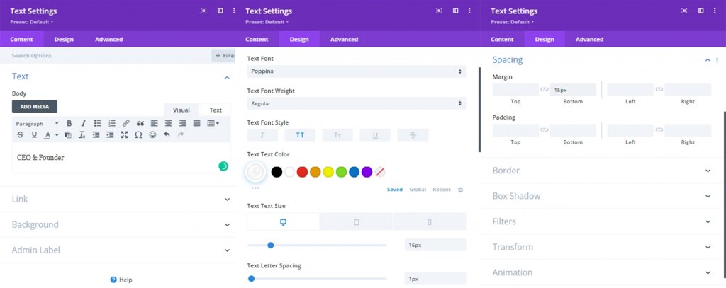
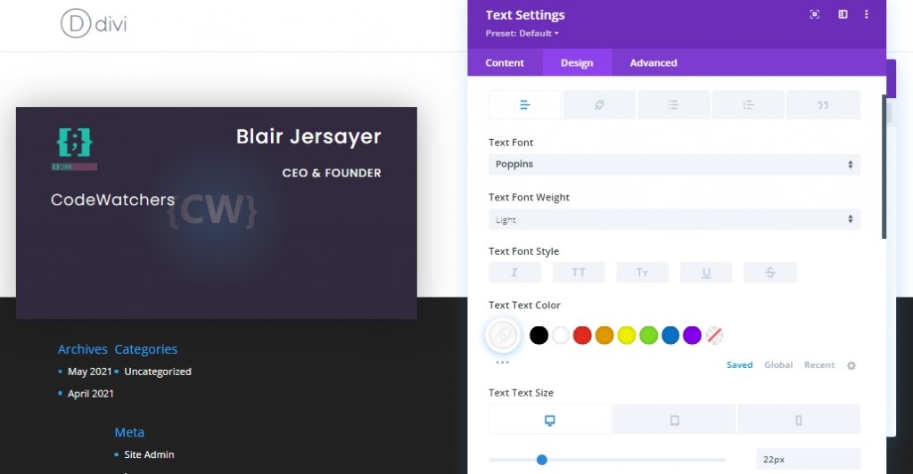
Add: Company Name
To add the company name, duplicate the previous text module and change the body content.
- Text Font Weight: Light
- Text Font Style: default
- Text Text Size: 22px (desktop and tablet), 18px (phone)
- Text Alignment: Left
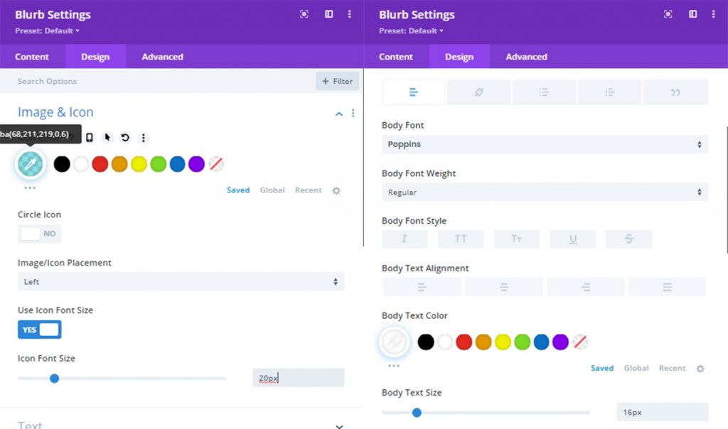
Add: Contact Number
To add the contact number of the individual. add a blurb module under the company text module. update the body content with phone number and add a icon.
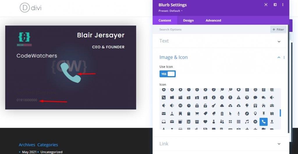
From the design settings, update the following:
- Icon Color: #20BFAC
- Image/Icon Placement: Left
- Use Icon Font size: YES
- Icon Font Size: 20px
- Body Font: Poppins
- Body Text Color: #ffffff
- Body Text Size: 16px
- Margin: 10px bottom
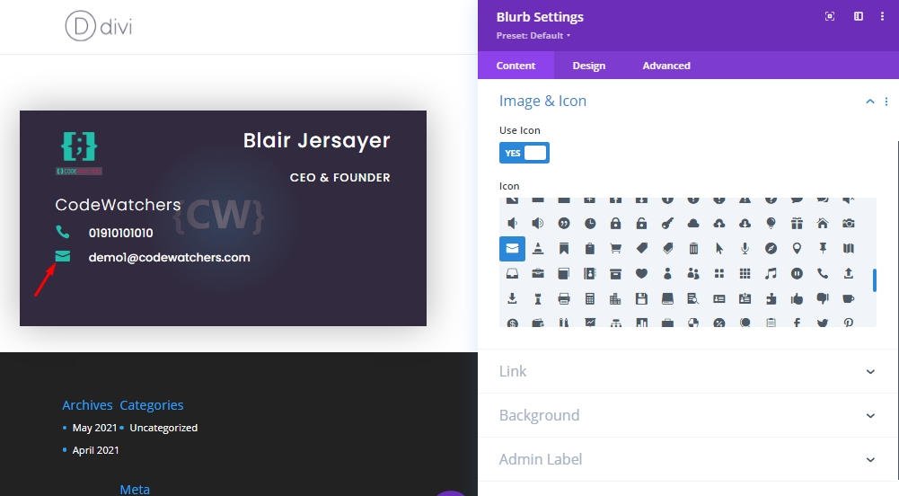
Add: Email Address
Duplicate the previous blurb module and update the body content as email address. Then, update the icon as an envelope.
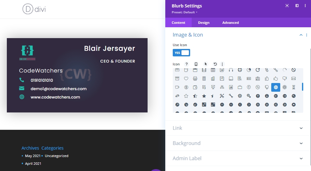
Add: The Website
Do same as we did for email section. Copy the previous blurb module and change the content.
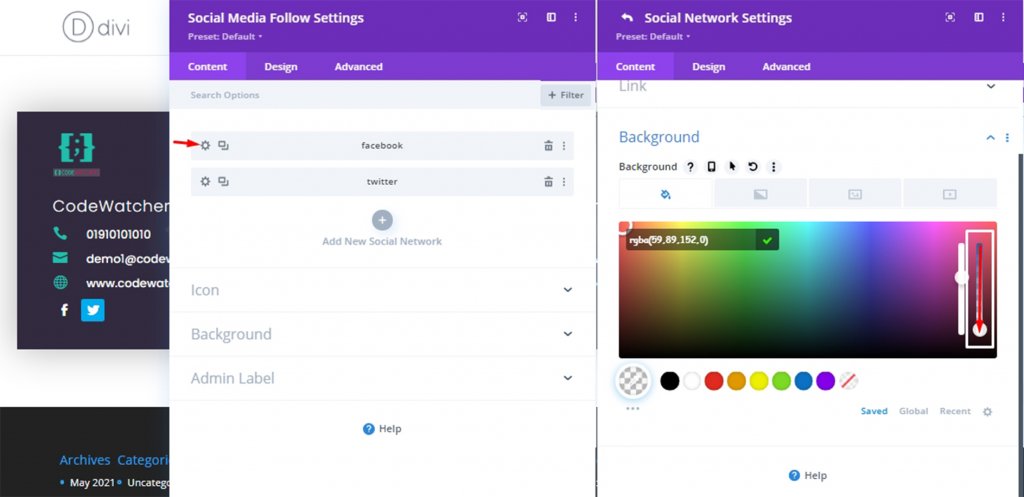
Add: Social Media Icons
The final module we'll add on back card is social media follow module. Add this module under last blurb module.
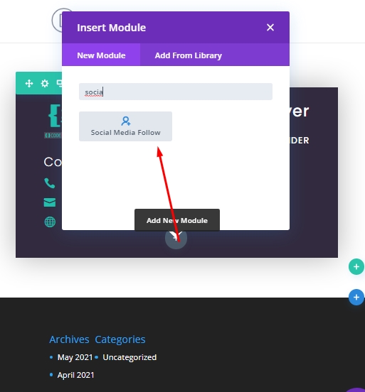
From the settings, make every social icon transparent and add a URL if you need it. To make all icons transparent, open each social media module and drag the white marked bar down. It will change the do the job.
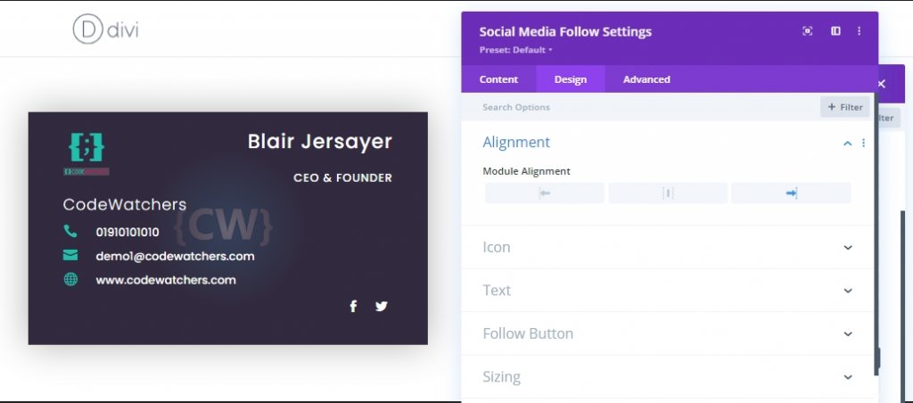
Also, from the design tab, align the social media follow icons in right.
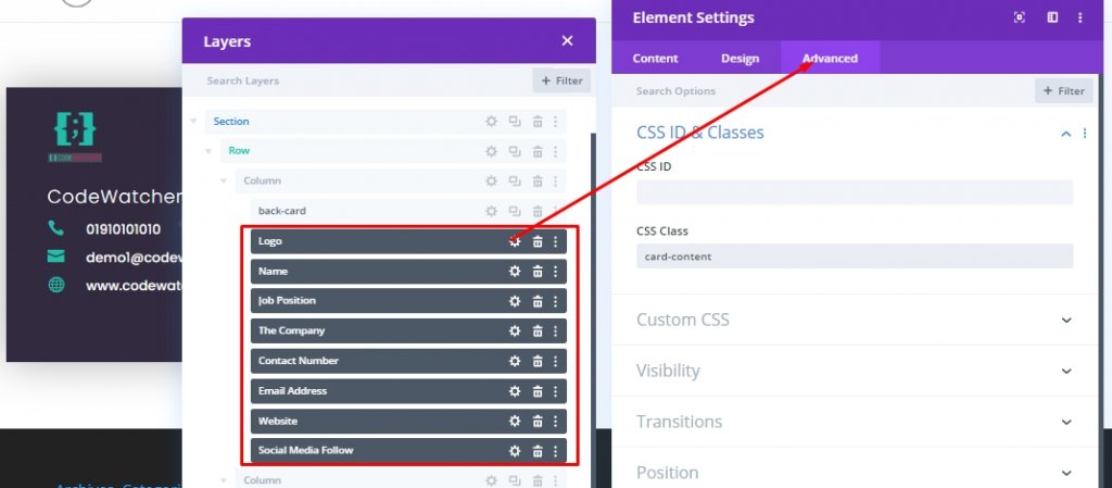
Add: Same Class To All Modules
Since the placement and customization of all our modules are done, we will now select them using Divi's multi-select feature and add a common CSS class. In keeping with this CSS class, we will add CSS code that will show the before the card's content through flip animation.
- CSS Class: card-content
Hold "Cmd" or "Ctrl" and click on elements to select them. Then click on a settings from any module and make the adjustment.
Building The Front Card
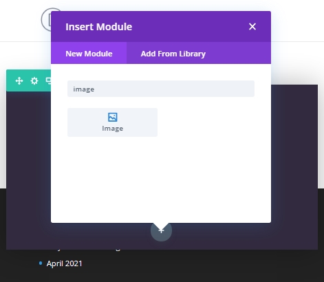
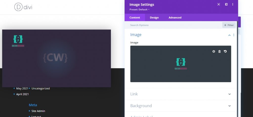
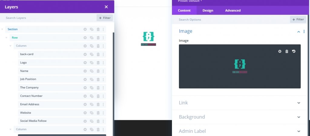
Our back card is done and now we will work on the front card which will sit in the place of the back card and hide its content in the back. We will design the front card through an image module in column 2 which will replace the card in column 1. At first, We'll add an image module on column 2 and add a logo(60px*60px) on the module.
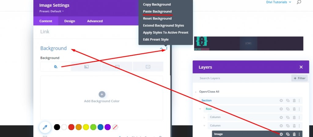
Now, open the divider module settings from back card and copy background.
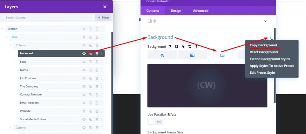
Now open the image settings for front card and paste it.
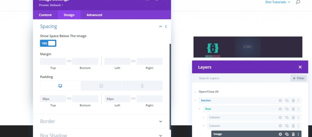
From the design section, update the spacing of the image as follows:
- Padding (desktop and tablet): 30px top, 50px left
- Padding (phone): 15px top, 10px left
Advanced Settings
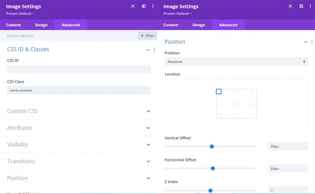
From the advanced tab, give this image a CSS Class.
- CSS Class: front-card
Add the custom CSS on main element.
height: 100%;
width: 100%;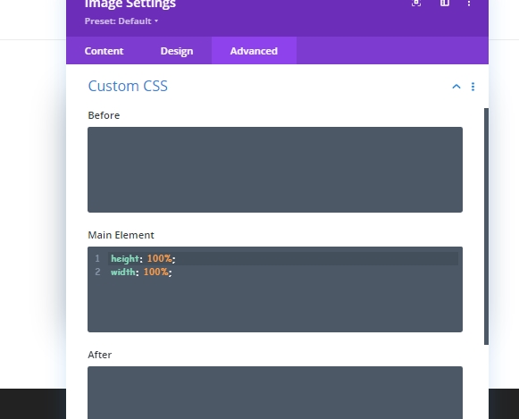
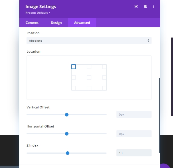
Also, Update the position Settings.
- Position Absolute
- Z Index: 13
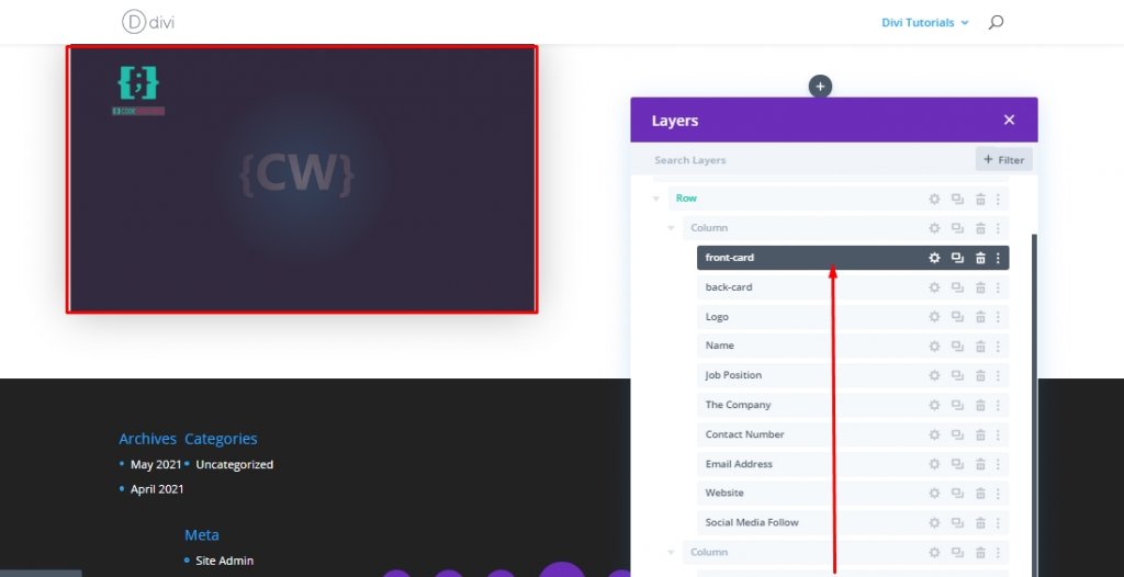
Now, as you are done with front card, drag it over back card module in column 1.
Part 2: Adding Custom Code
Finally, we will add some customized CSS and JQuery code to bring flip animation to our business card design. For this, add a code module below column 1.
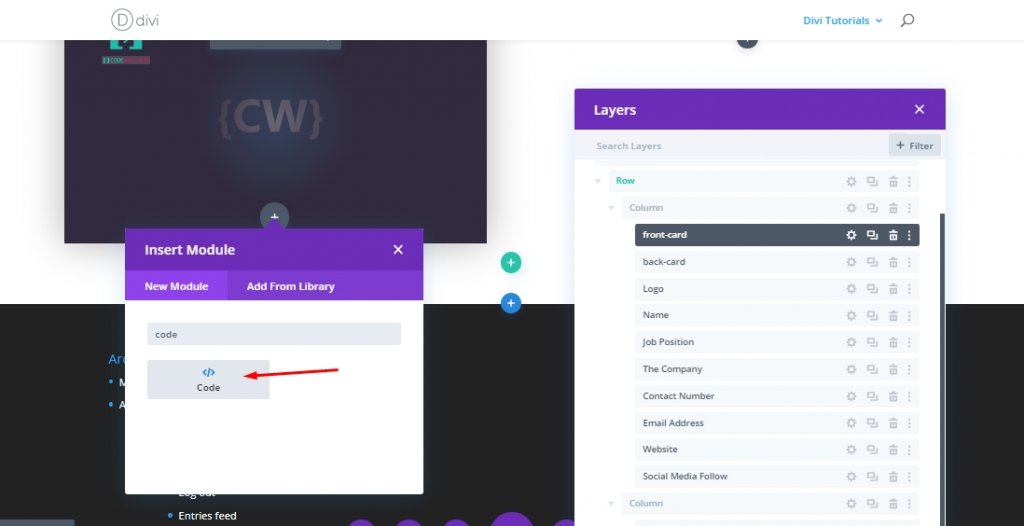
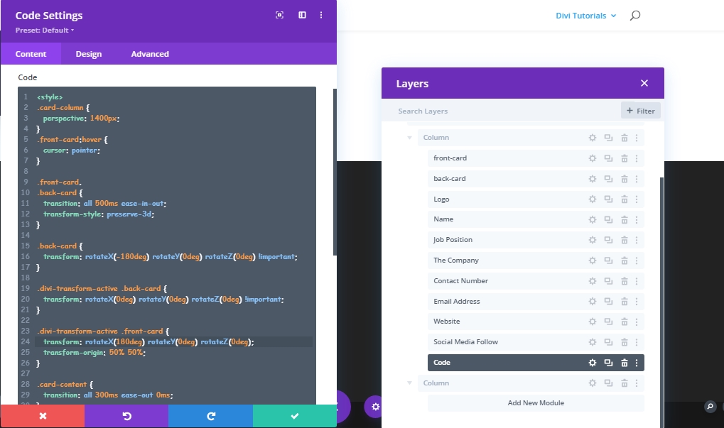
Add: CSS Code
Now add the code below inside the code module. Make sure to keep then inside a Style tag.
.card-column {
  perspective: 1400px;
}
.front-card:hover {
  cursor: pointer;
}

.front-card,
.back-card {
  transition: all 500ms ease-in-out;
  transform-style: preserve-3d;
}

.back-card {
  transform: rotateX(-180deg) rotateY(0deg) rotateZ(0deg) !important;
}

.divi-transform-active .back-card {
  transform: rotateX(0deg) rotateY(0deg) rotateZ(0deg) !important;
}

.divi-transform-active .front-card {
  transform: rotateX(180deg) rotateY(0deg) rotateZ(0deg);
  transform-origin: 50% 50%;
}

.card-content {
  transition: all 300ms ease-out 0ms;
}

.divi-transform-active .card-content {
  transition: all 300ms ease-out 500ms;
  opacity: 1 !important;
}

.divi-transform-active .front-card {
  opacity: 0;
  visibility: hidden;
}
Add: JQuery Code
Add the following JQuery code below the CSS Code. Dont forget to keep them inside Script tags.
(function ($) {
  $(document).ready(function () {
    $cardColumn = $(".card-column");
    $cardContent = $(".card-content");

    $cardContent.css("opacity", "0");

    $cardColumn.on("click", function (e) {
      $(this).addClass("divi-transform-active");
      e.stopPropagation();
    });
    $(document).on("click", function (e) {
      if ($(e.target).is($cardColumn) === false) {
        $cardColumn.removeClass("divi-transform-active");
      }
    });
  });
})(jQuery);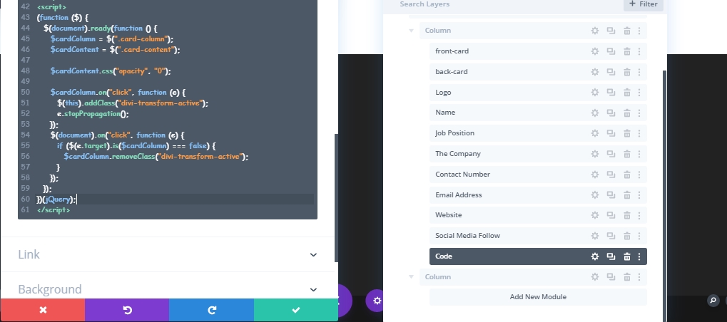
Creating More Business Cards
To add more business cards of your teammates, we need to clone the column as many times as you need. But, make sure you have deleted the code modules from cloned cards because having two code modules will break the design.
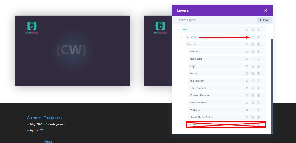
Now modify every card according to every person you want to feature here.
Final View
After all the work we have done, our design looks like this. Click each card and it will flip and show information about the individual. Then, click outside and it will go back to its previous position.
Conclusion
The interactive business card is a great way to display your teammates on the website. You can use this to show information about our projects, share ideas, and many more! Hit share if you find this tutorial useful and if you have any questions or queries, you can comment below.