
We sometimes need to display team members on our websites, this is an excellent way to showcase our dexterous team members to the outer world. We can display their image, name, and designation in the company. To give them more exposure, you can add their social media links to the design. Now, usually, people add these links beneath the name and designation, but it's time to make the smart move and modify the way of design. In today's Divi tutorial, we will see how to create a team member page with hovering social media icons over the image. Let's not waste more time and get to do it!
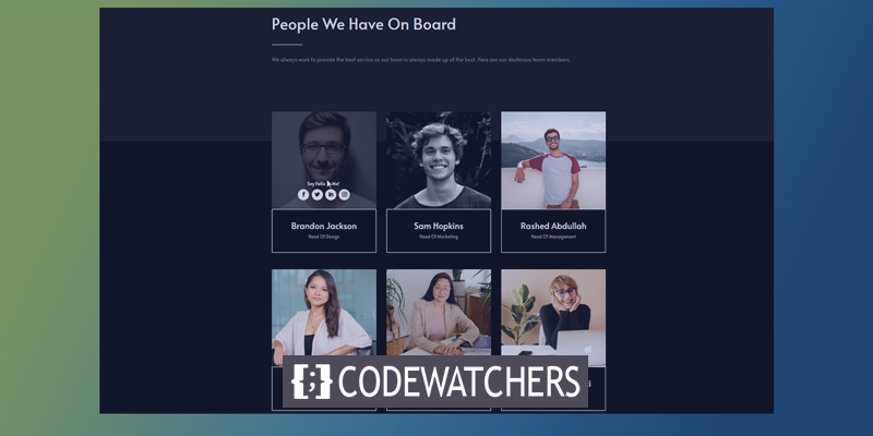
Sneak Peak
This will be our todays design.
Part 1: Design Module
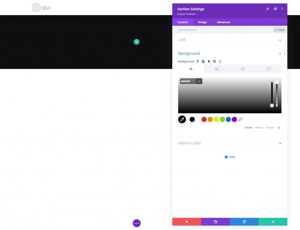
Settings: Section One
Background Color
Start by changing the color of the initial section to the page you’re working on. Open the section settings and change the background color.
- Background Color: #0f0f0f
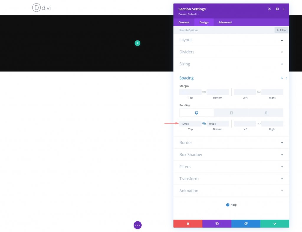
Spacing
Now from the design tab and change the spacing settings.
Create Amazing Websites
With the best free page builder Elementor
Start Now- Top Padding: Desktop & Tablet: 100px & Phone: 50px
- Bottom Padding: Desktop & Tablet: 100px & Phone: 50px
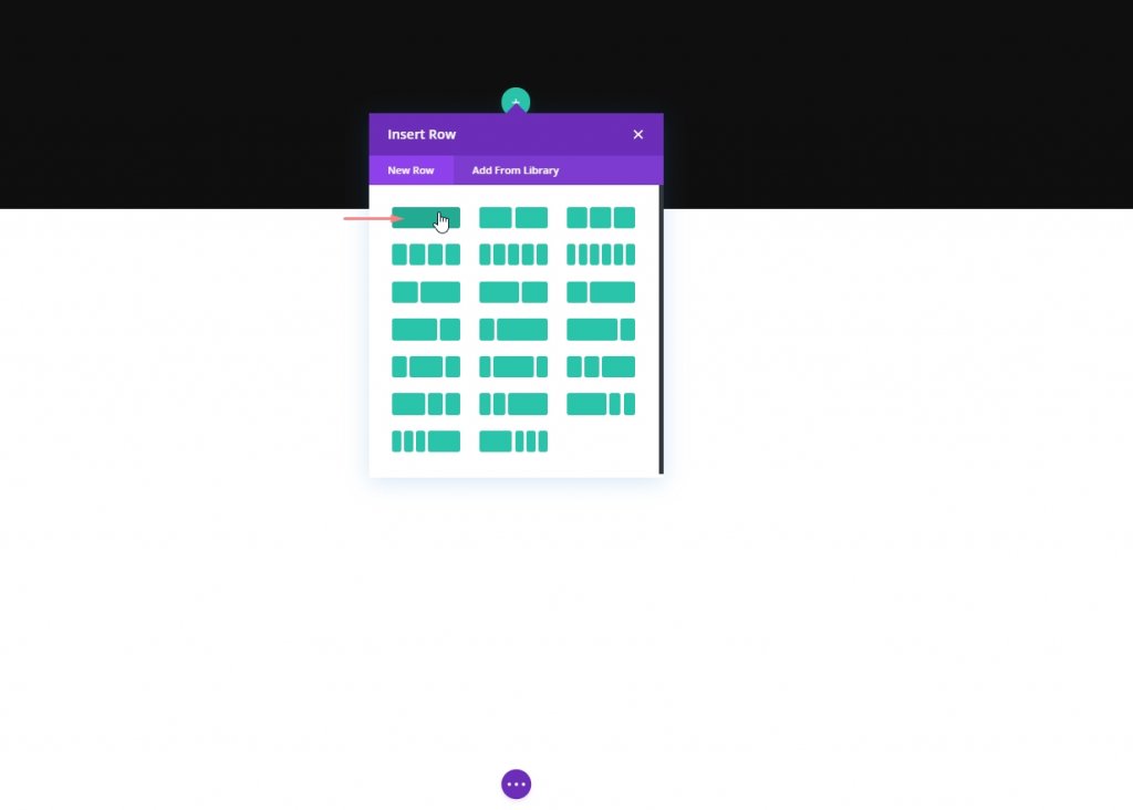
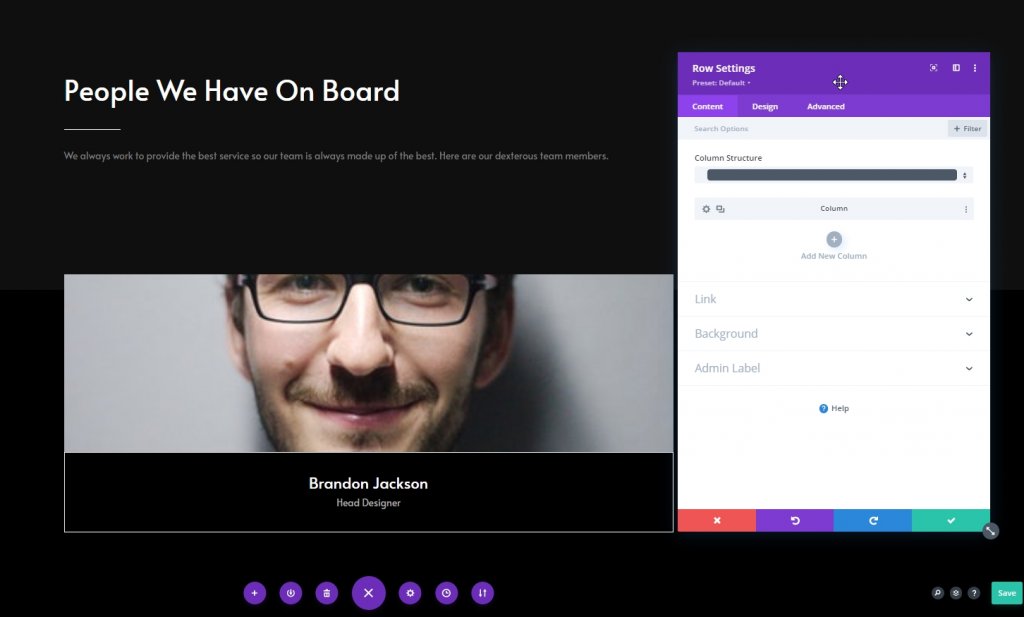
New Row Adding
Column Structure
Now add a new row with following column structure.
Column: Text Module 1
Add H1 Content
Now let's add some context of our choice to this module with H1 content.
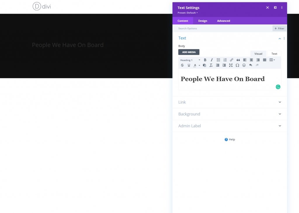
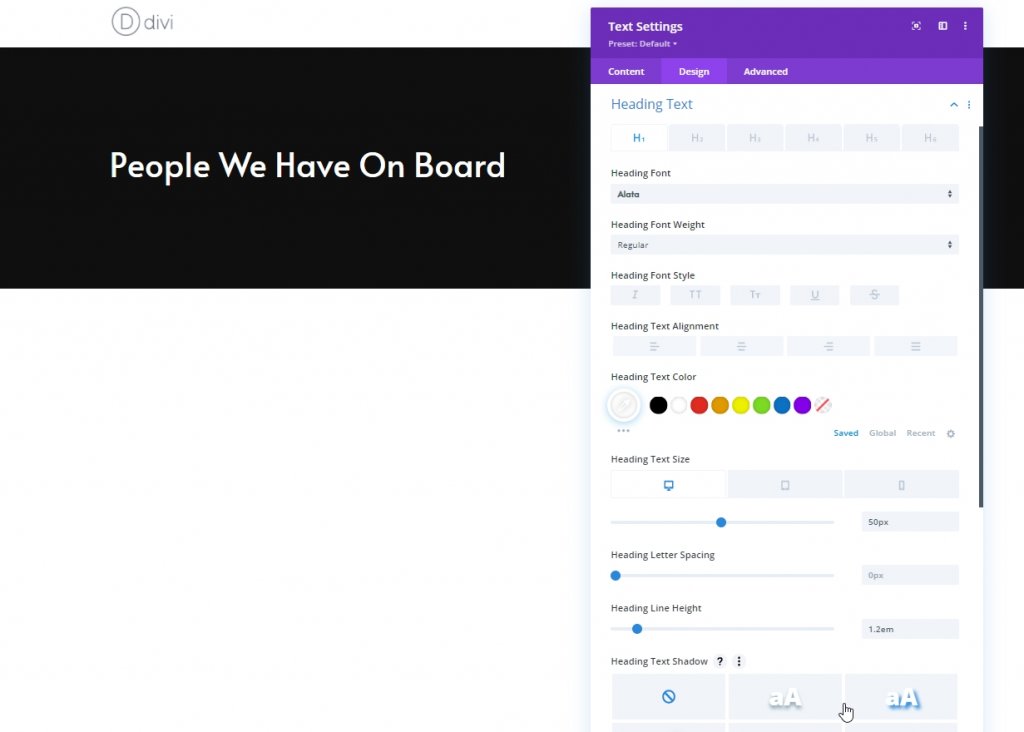
H1 Text Settings
Now make some changes to the module from design tab. First, change heading settings.
- Heading Font: Alata
- Heading Text Color: #ffffff
- Heading Text Size: Desktop: 50px, Tablet: 45px & Phone: 35px
- Heading Line Height: 1.2em
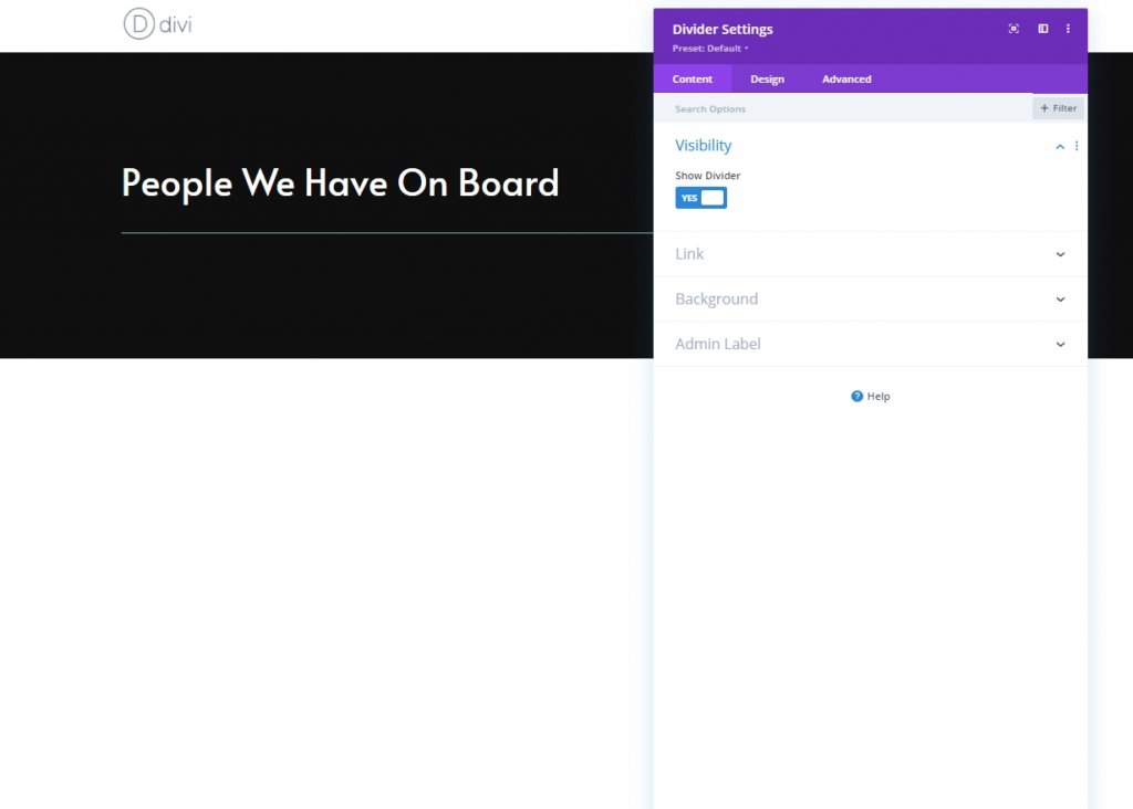
Column: Divider Module
Visibility
Let's add a Divider Module. Make sure the “Show Divider” option is enabled.
- Show Divider: Yes
Line
From the design tab, change the line color.
- Line Color: #ffffff
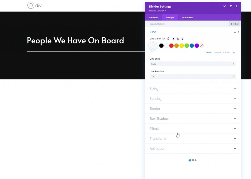
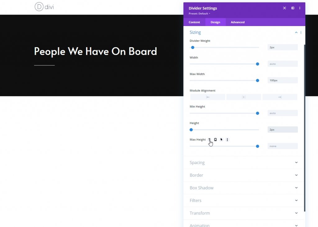
Sizing
Change the sizing of this divider module.
- Divider Weight: 2px
- Max Width: 100px
- Height: 2px
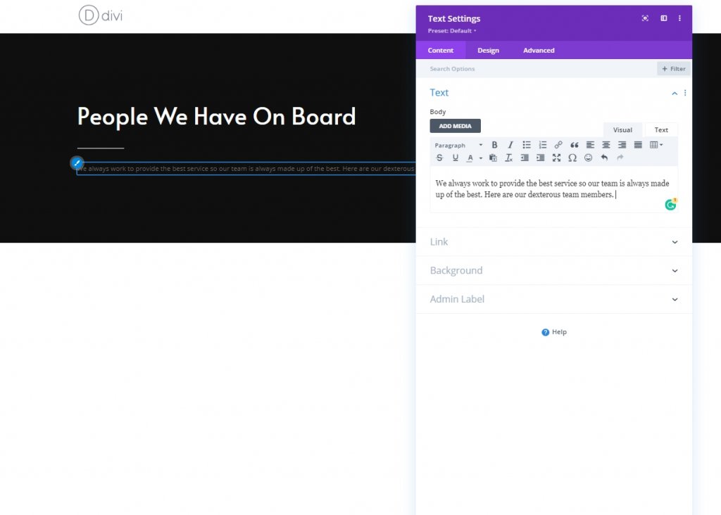
Column: Text Module 1
Add Descriptive Context
Here we'll add another text module where we'll put some content of our choice.
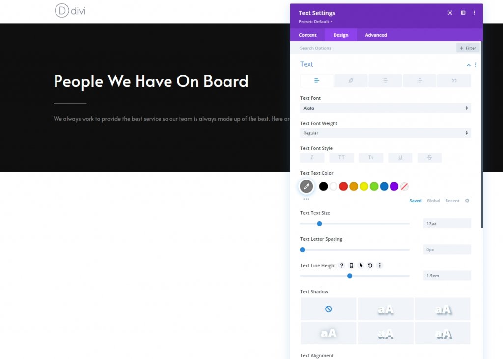
Text Settings
From design tab, change the text settings accodingly.
- Text Font: Alata
- Text Color: #7c7c7c
- Text Size: 17px
- Text Line Height: 1.9em
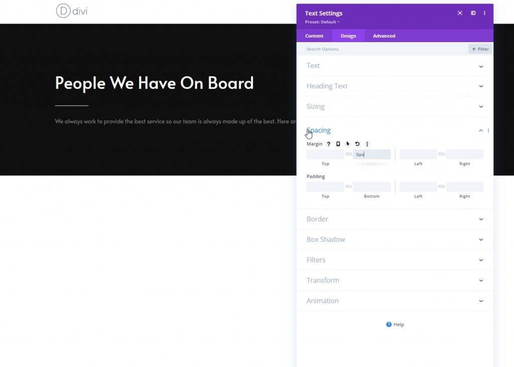
Spacing
From spacing section, make the following change.
- Bottom Margin: 0px
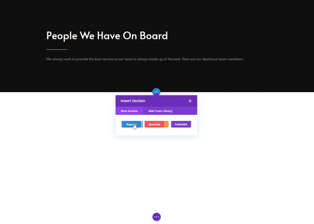
Adding & Settings: Section Two
Now add another regular section below the previous one.
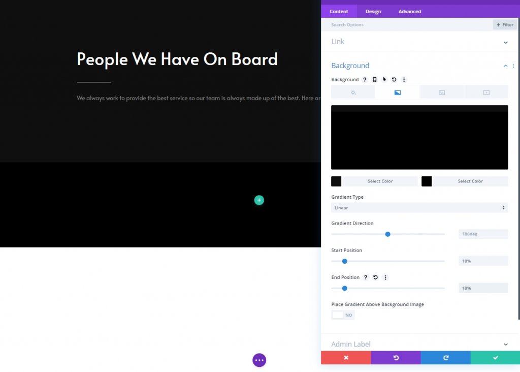
Gradient Background
Now use a gradient background for this section.
- Color 1: #0f0f0f
- Color 2: #000000
- Start Position: 10%
- End Position: 10%
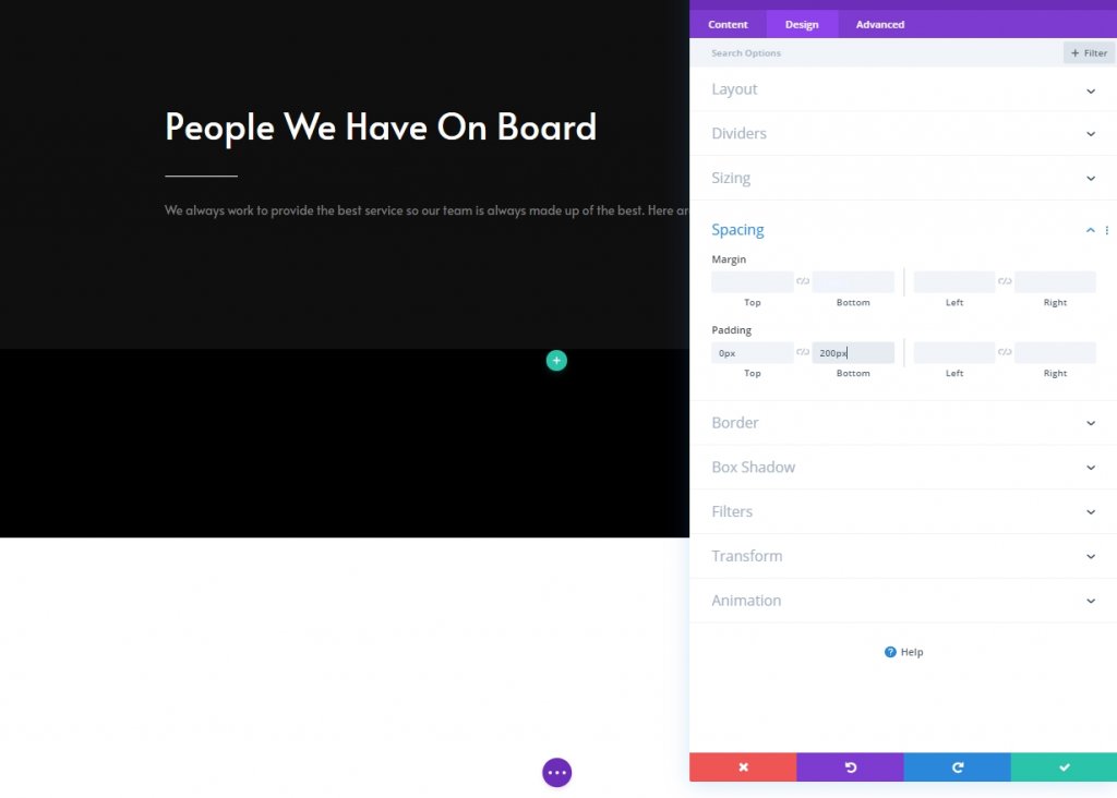
Spacing
Next, modify the spacing settings.
- Top Padding: 0px
- Bottom Padding: 200px
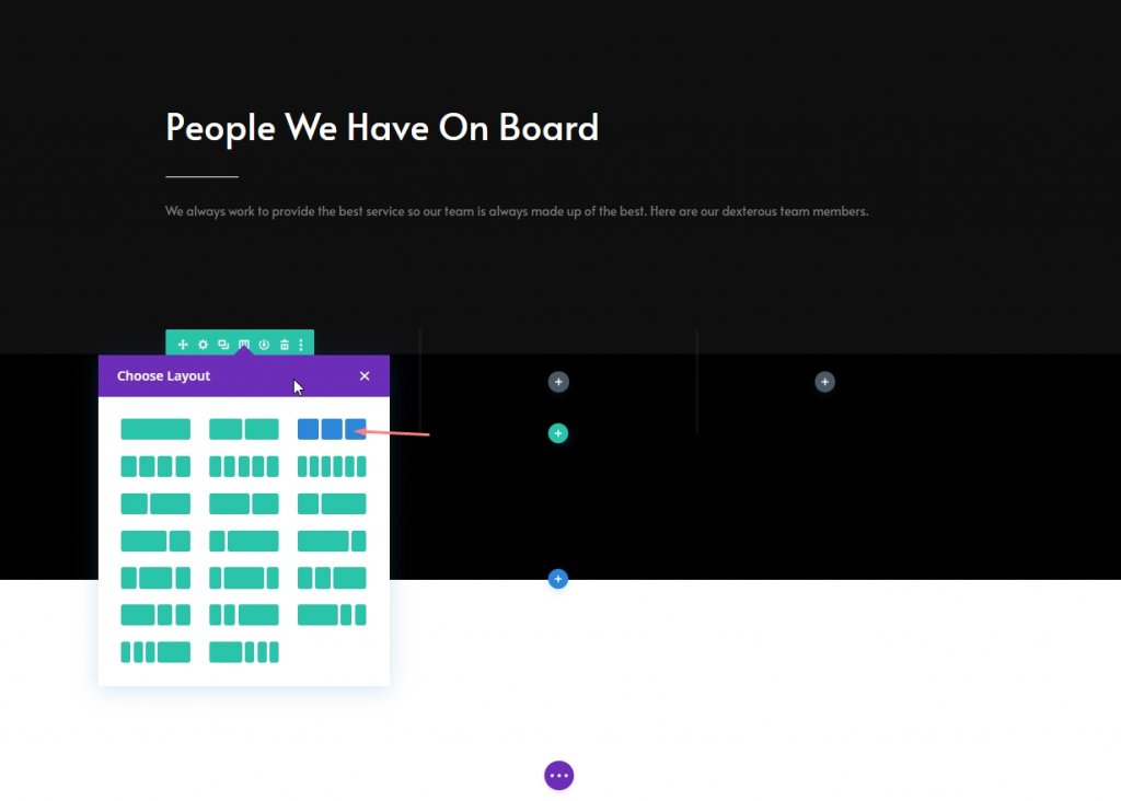
New Row Adding
Column Structure
Now add a new row on this section with following column structure.
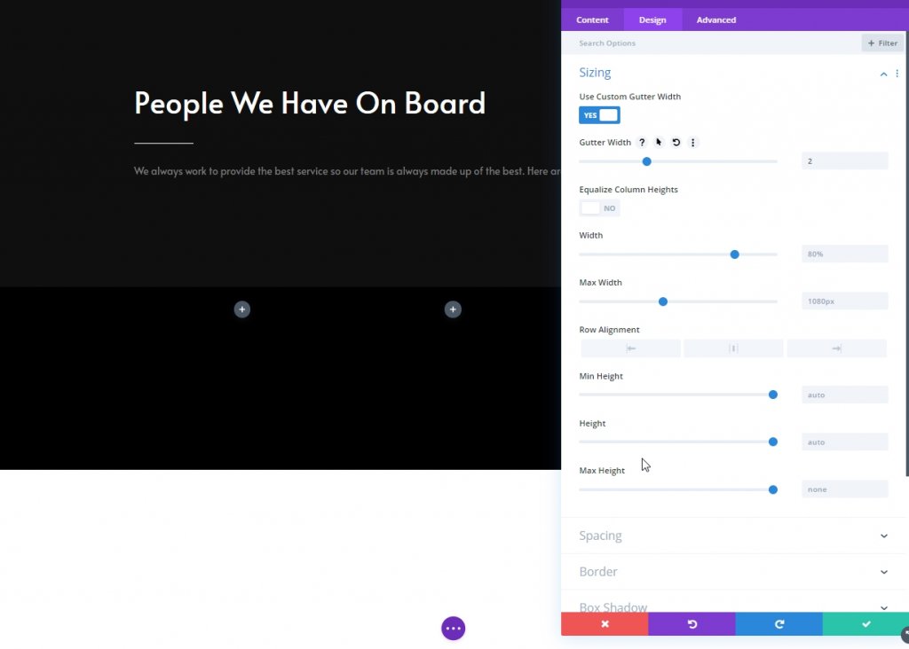
Sizing
Open the row settings and change the sizing settings as follows:
- Use Custom Gutter Width: Yes
- Gutter Width: 2px
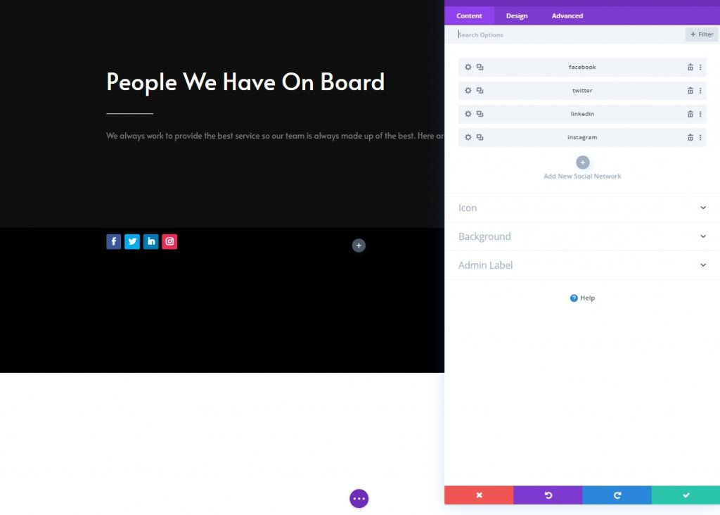
Column 1: Social Media Follow Module
Add Social Networks
Now, we will add a social media follow module to column 1 and put desired social media connections
Remove Background Color From Social Media Icons
Click settings for each icon and then go to background and select transparent. Also you can click on color and remove it.
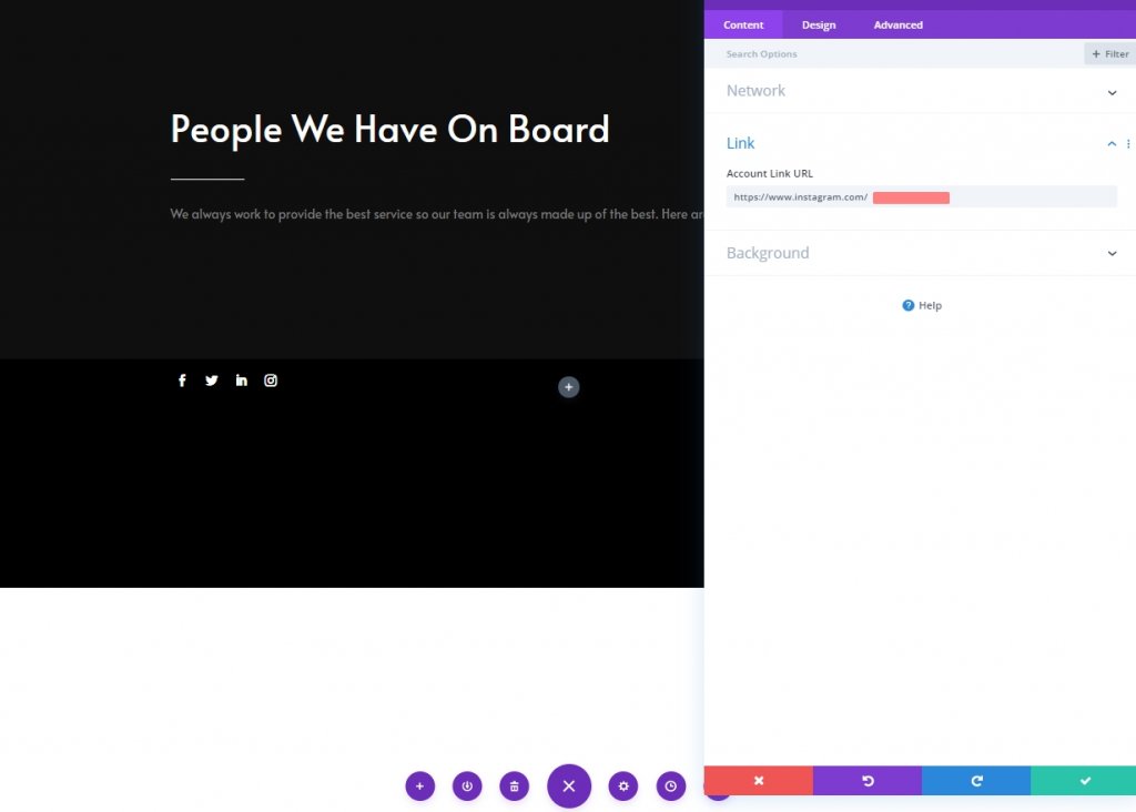
Add Link to Each Social Network
Add a corresponding link to each social network too.
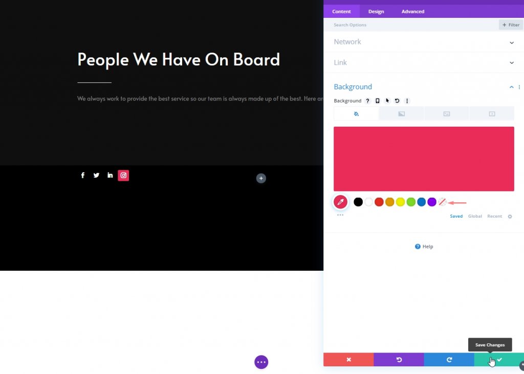
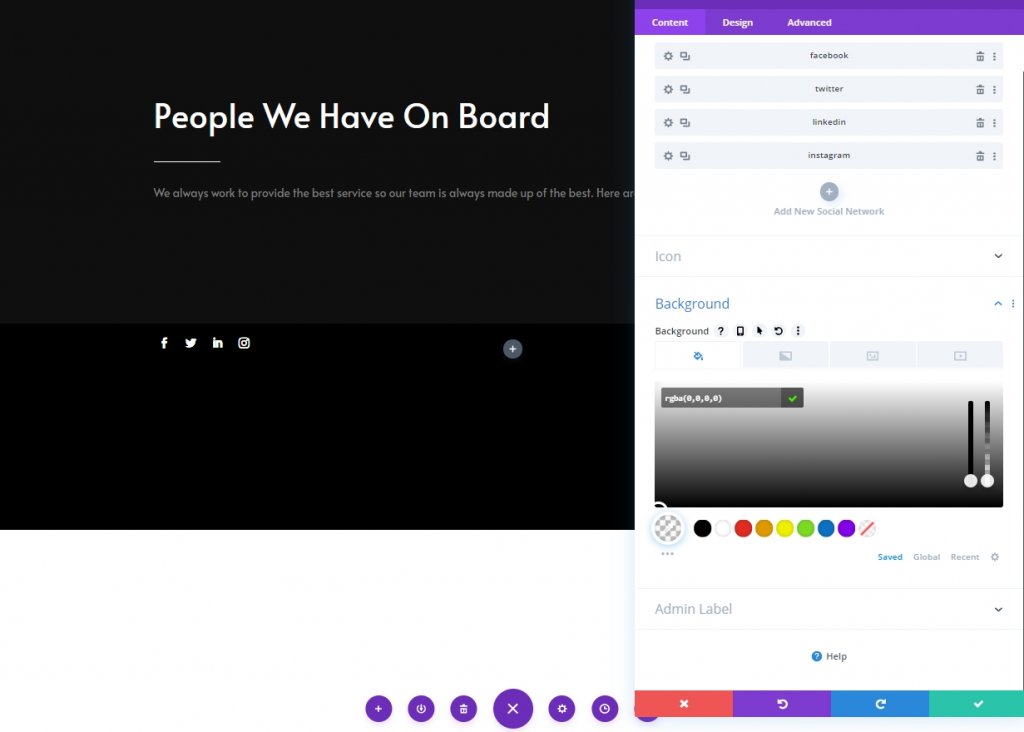
Default Background Color
From the module settins option, add this color as background.
- Background Color: rgba(0,0,0,0)
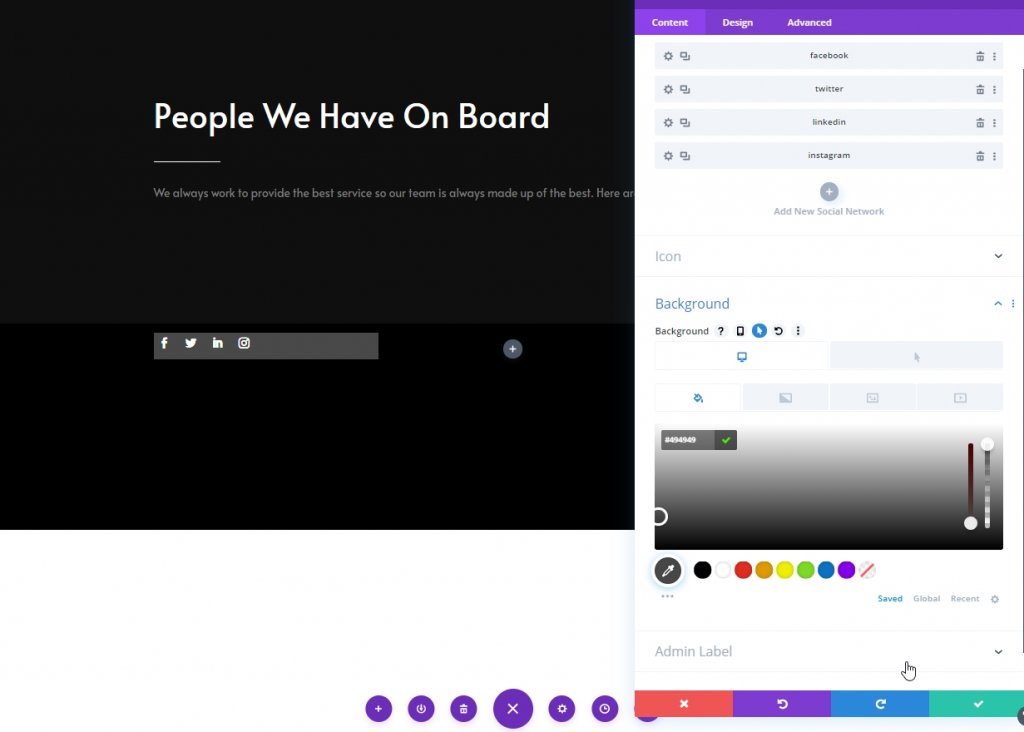
Hover Background Color
Change the background color for hover effect.
- Hover Background Color: #494949
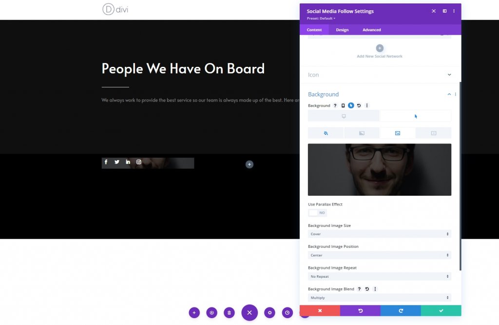
Background Image
Then, upload a team member image as background.
- Background Image Size: Cover
- Background Image Blend: Multiply
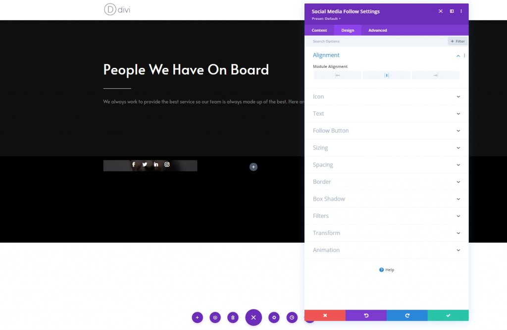
Alignment
From the module’s design tab, change the alignment settings.
- Module Alignment: Center
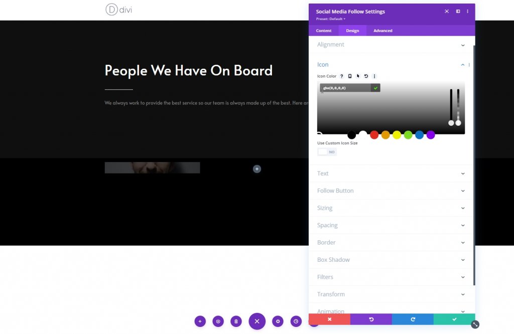
Icon
Now change the icon color.
- Icon Color: rgba(0,0,0,0)
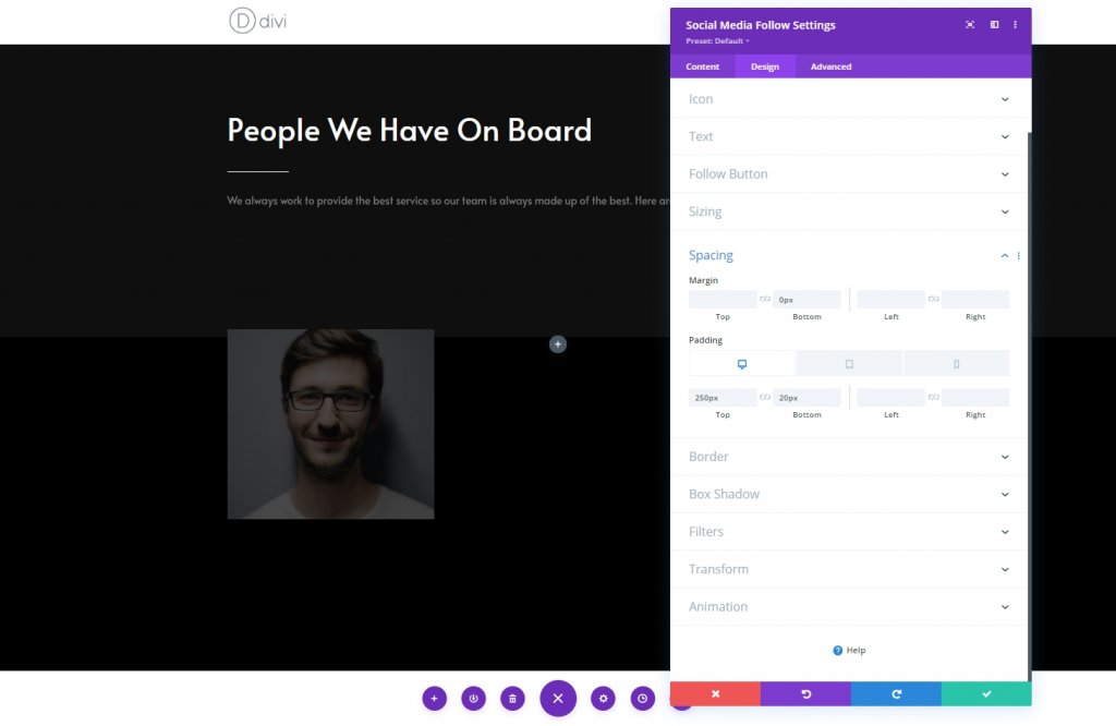
Spacing
Then, go to the spacing settings and apply the following values:
- Bottom Margin: 0px
- Top Padding: Desktop: 250px, Tablet: 450px & Phone: 200px
- Bottom Padding: 20px
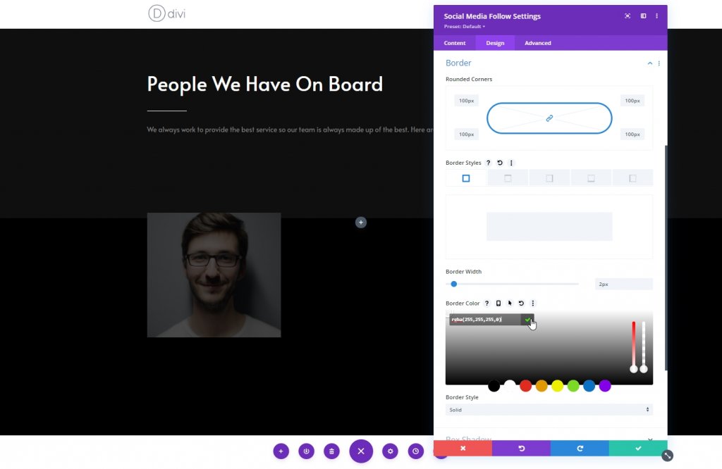
Border
Now, change the border setting accordingly.
- All Corners: 100px
- Border Width: 2px
- Border Color: rgba(255,255,255,0)
Hover Border
Now, use a border for hover.
- Hover Border Color: #ffffff
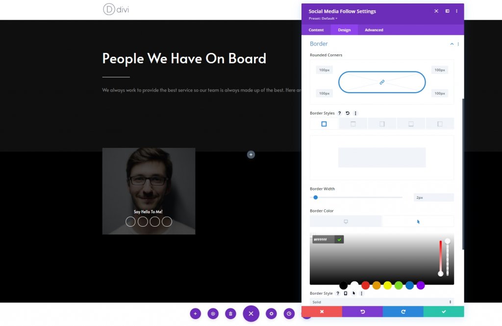
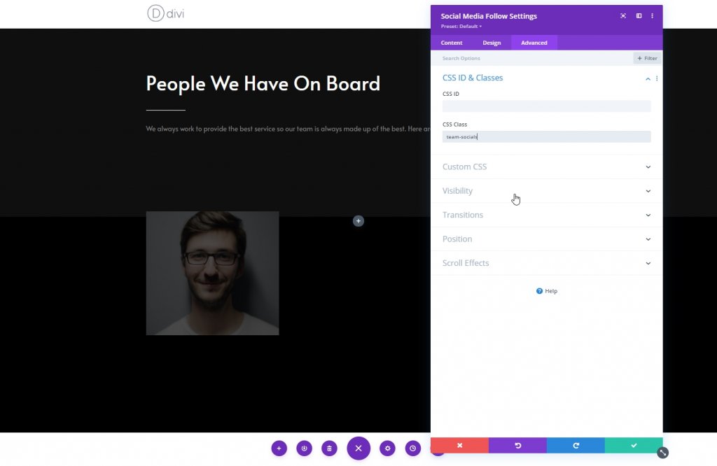
CSS Class
Now from the advanced tab, add a custom CSS class.
- CSS Class: team-socials
Hover Before Element
Now, finish the module settings by applying the following CSS code to the before element. Make sure to put it on hover.
content: "Say Hello To Me!";
font-family: "Alata";
color: white !important;
position: absolute;
margin-top: -30px;
padding-left: 30px;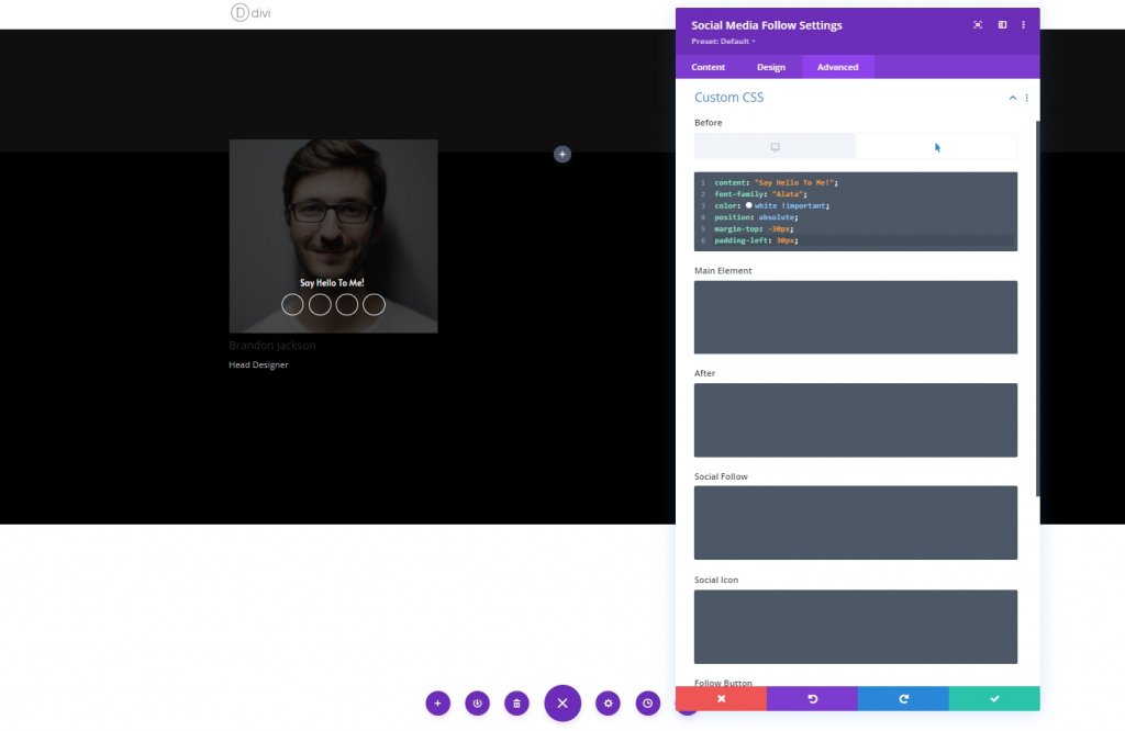
Column 1: Person Module
Add Content
The final module we will use in this column is a person module. add the module and pout information inside it.
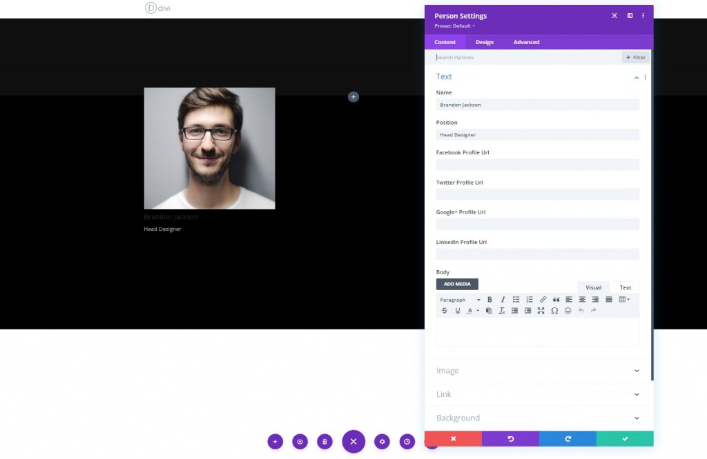
Text Settings
From the design tab of the person module and change the text settings as follows:
- Text Alignment: Center
- Text Color: Light
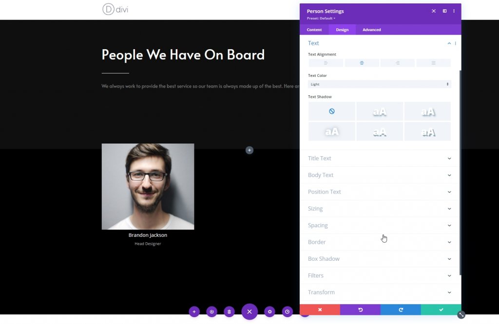
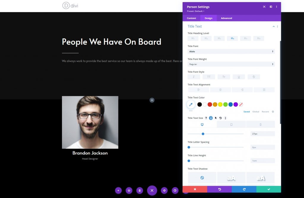
Title Text Settings
Now modify the title text area.
- Title Font: Alata
- Title Text Size: Desktop: 27px, Tablet: 25px & Phone: 22px
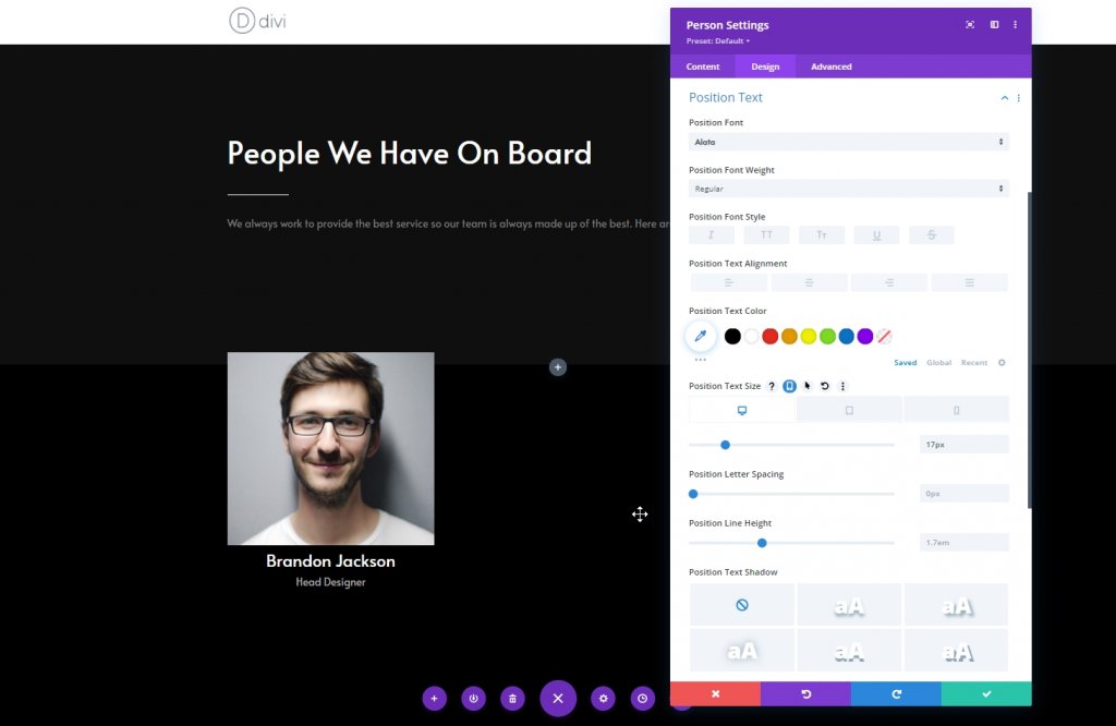
Position Text Settings
Change the settings for position text .
- Position Font: Alata
- Position Text Size: Desktop: 17px & Tablet & Phone: 15px
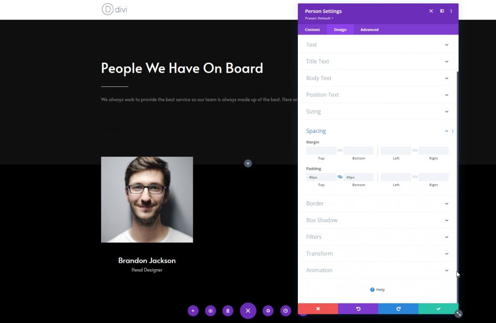
Spacing
Apply some custom top and bottom padding to the spacing settings.
- Top Padding: 40px
- Bottom Padding: 40px
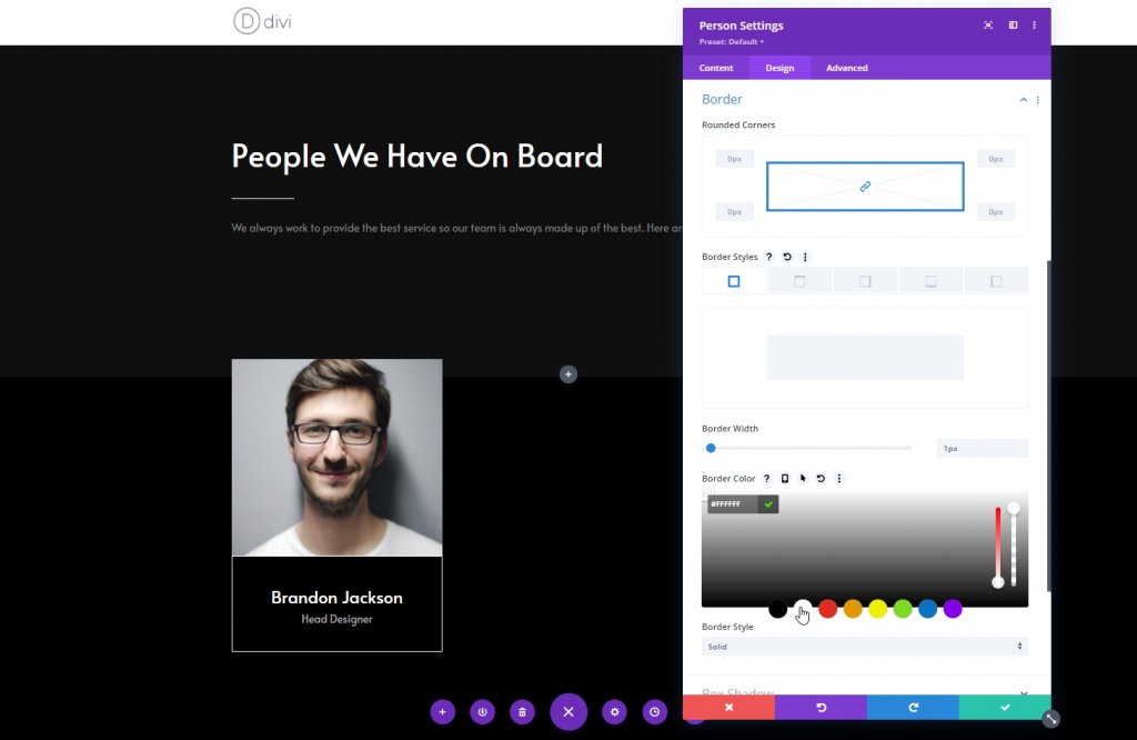
Border
Now apply the following border settings and finish the column.
- Border Width: 1px
- Border Color: #ffffff
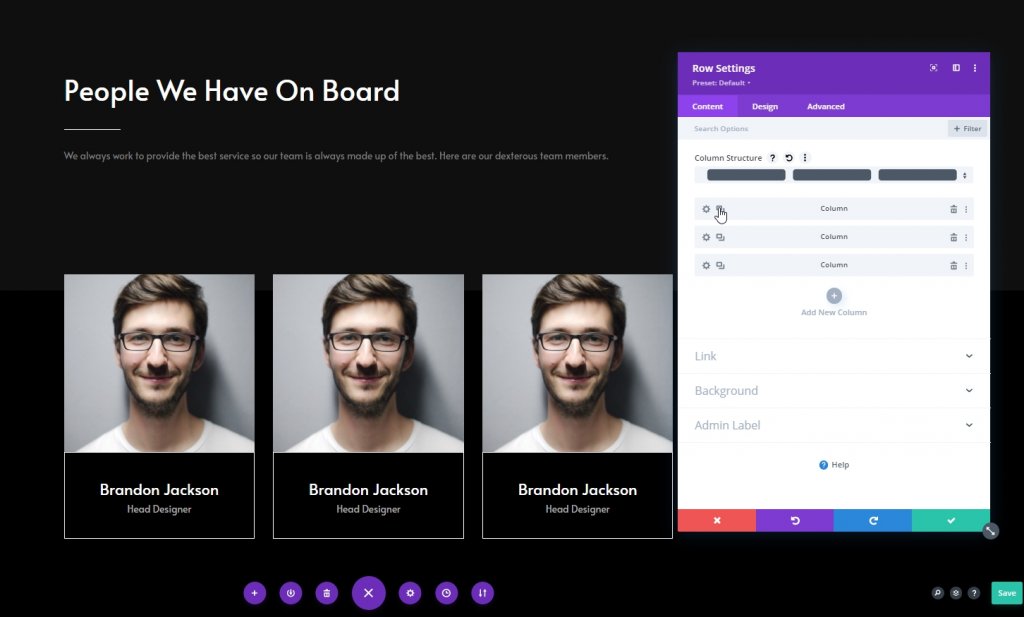
Remove Other Columns
Now delete the columns for the section.
Clone Column Twice
Now duplicate the column one two times.
Clone Entire Row
Now, duplicate the entire row as more as you need. Here we will duplicate it once.
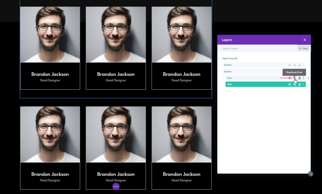
Change Duplicated Contents
Now we will change the images, social media links, person info for every individual.
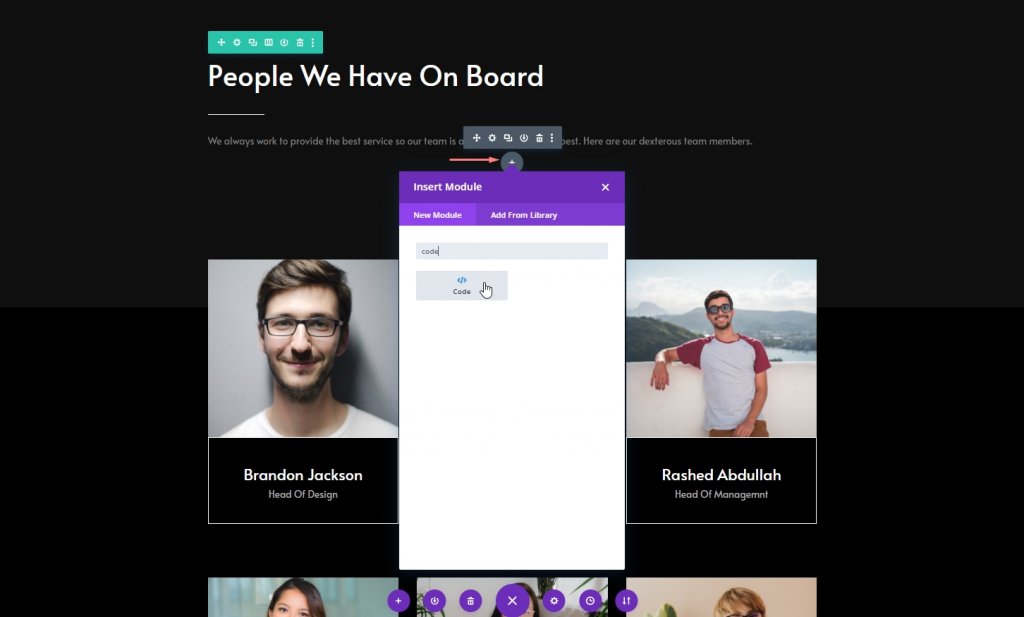
Part 2: Code Module
Code Module In Section 1
Now, add a code module below the text module of section one.
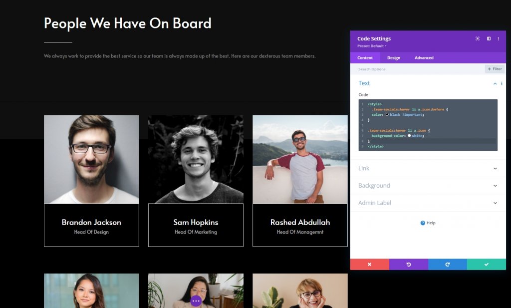
Add CSS Code
Now copy the following lines of CSS code and paste it to the code module and you’re done. Don't forget to put them inside Style tag.
.team-socials:hover li a.icon:before {
  color: black !important;
}

.team-socials:hover li a.icon {
  background-color: white;
}
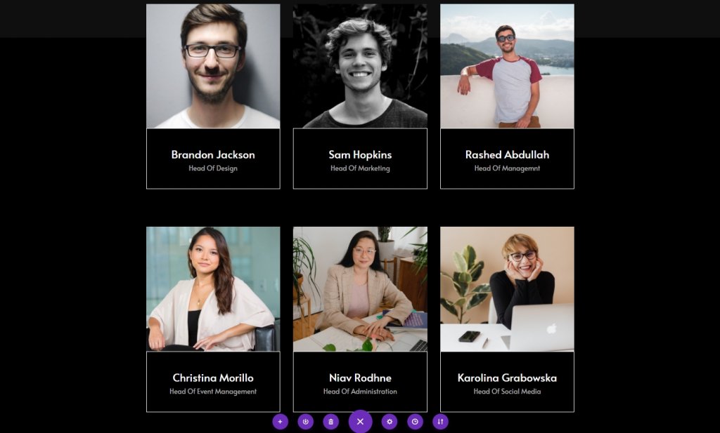
Final Result
As far we have completed all the steps successfully, this is what our results look like.
Conclusion
In today's tutorial, we have tried to show how creatively we can design a team member page. Using the hovering effect of the Divi theme, the social connections of the team members can be shown in such an aesthetic way. We hope you find today's tutorials useful, a share with your surroundings will encourage us to come up with more new and amazing Divi tutorials.


