
Food menus are a very important part of a restaurant website. Because it provides a customer an overall idea about the food pricing. Now, if you want to make a creative restaurant menu for your website, you should definitely look inside Divi.
Today, we will be leading you to an eye-catching restaurant menu design that has a gluey effect - by using Divi's built-in sticky option. Our design will create separate the entire menu into different categories and allows visitors o see which category they're at! So, let's do it.
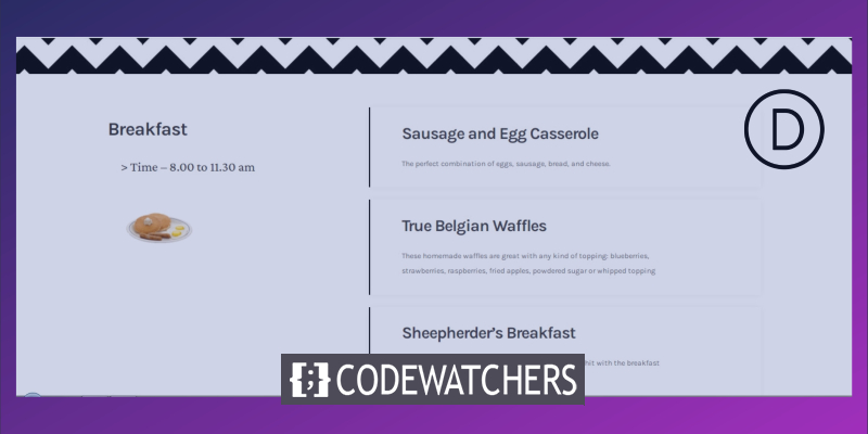
Glimpse Of Our Final Design
Let's take a quick look at the final result of our today's design.
Desktop View
Mobile View
Element Structure Creating
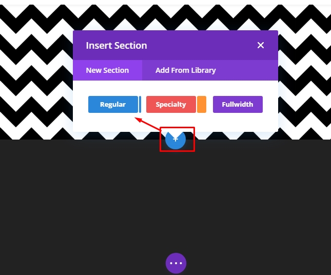
Adding New Section
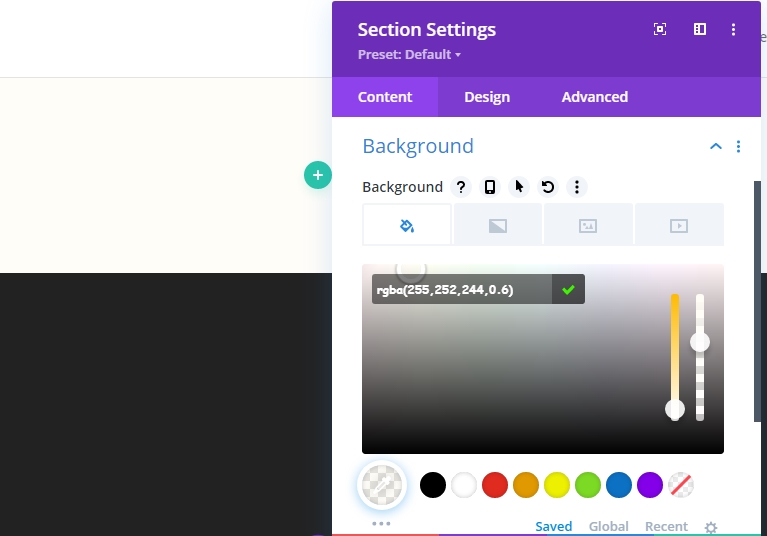
Background Color
Add a new page from your dashboard and open it with Divi builder. Go with "Build From Scratch." Now, open section settings and add a background color.
Create Amazing Websites
With the best free page builder Elementor
Start Now- Background Color: rgba(255,252,244,0.6)
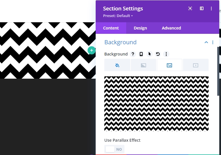
Background Image
Now, use a pattern image as background. There are a lot of pattern images available at google, so pick one of your choices.
- Background Image Size: Actual Size
- Background Image Position: Top Center
- Background Image Repeat: Repeat X (horizontal)
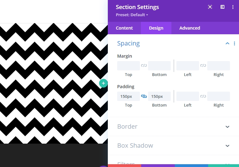
Spacing
Alter the spacing values.
- Top Padding: 150px
- Bottom Padding: 150px
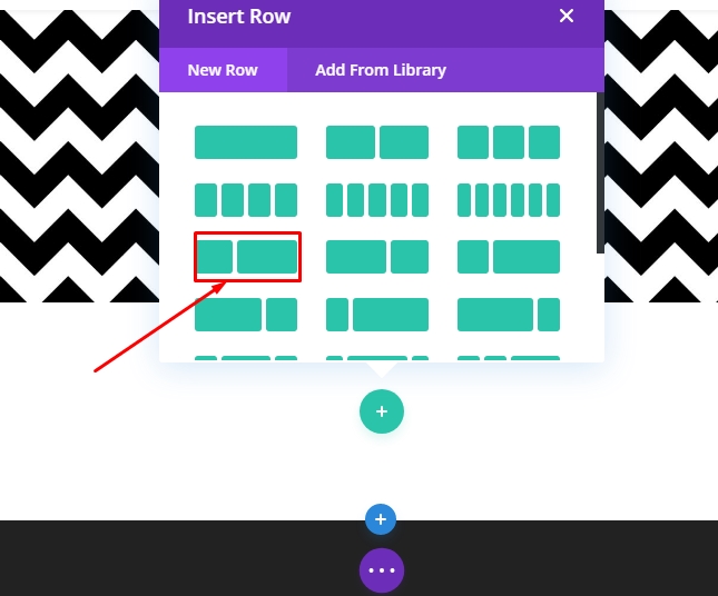
New Row Adding
Column Structure
Add a new row below the image using the following column structure. Pick "Regular" from the "New Section" tab.
Now choose the following column structure.
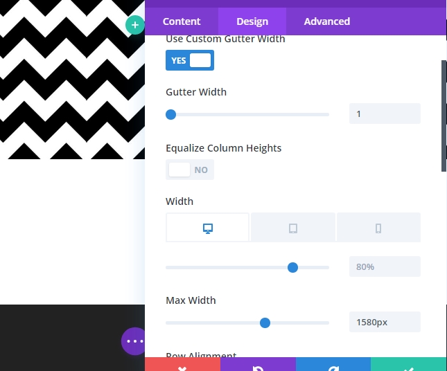
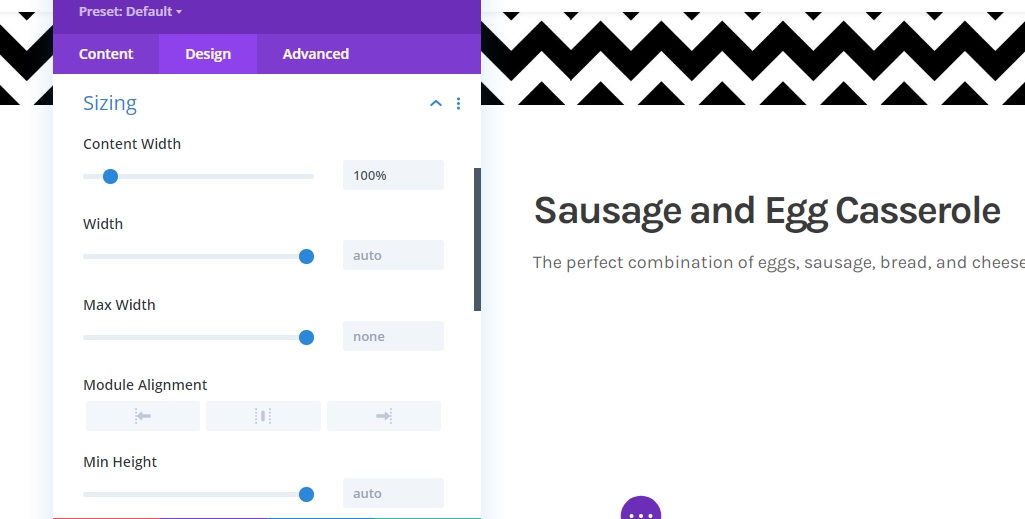
Sizing
Now open the row settings and change the values as given below.
- Use Custom Gutter Width: Yes
- Gutter Width: 1
- Width: Desktop & Tablet: 80%, Phone: 95%
- Max Width: 1580px
- Row Alignment: Center
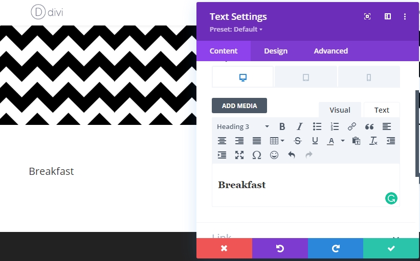
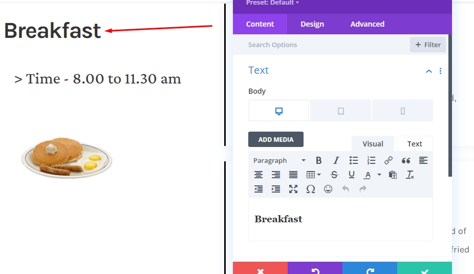
Add Text Module 1 To Column 1
Add H3 Content
Well, now we will add modules to our structure. Let's start with a text module in column 1. Add some H3 content of your wish.
H3 Text Settings
Go to the design tab of the module and change the following settings.
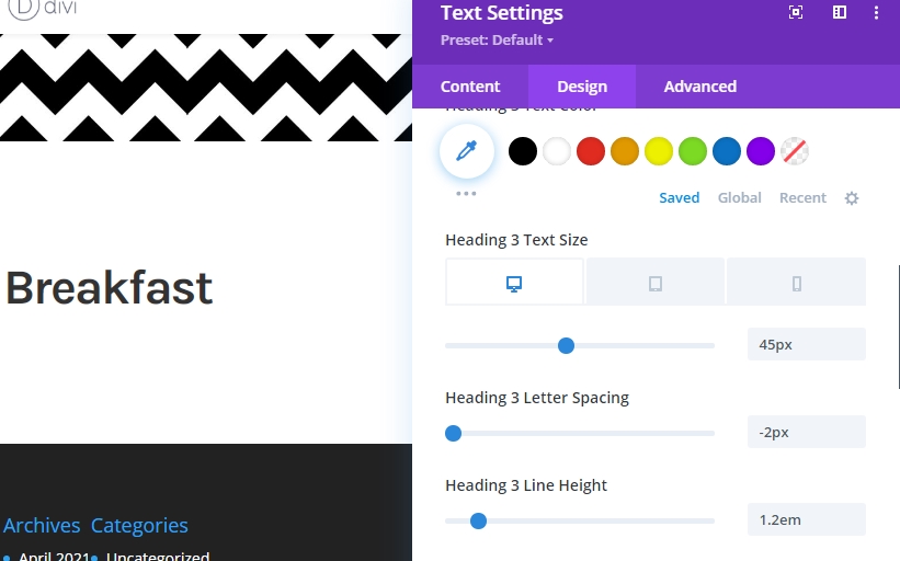
- Heading 3 Font: Karla
- Heading 3 Font Weight: Bold
- Heading 3 Text Size: Desktop & Tablet: 45px, Phone: 35px
- Heading 3 Letter Spacing: -2px
- Heading 3 Line Height: 1.2em
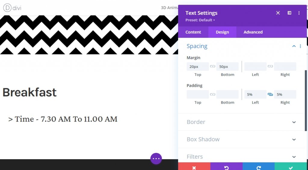
Spacing
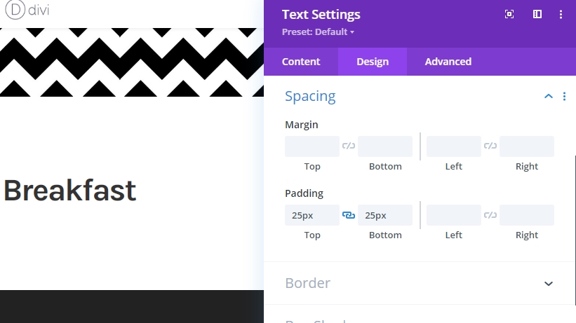
Let's add some top and bottom padding.
- Top Padding: 25px
- Bottom Padding: 25px
Add Text Module 2 To Column 1
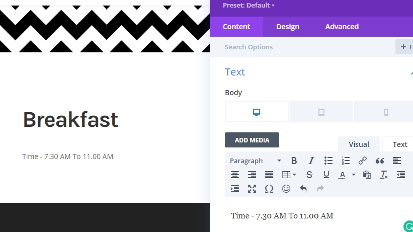
Add Content
Add a text module beneath the previous module and add some words from your choice.
Text Setting
Change the modules settings.
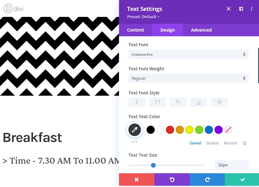
- Text Font: Crimson Pro
- Text Color: #3a3a3a
- Text Size: 32px
Spacing
Finish the module settings by changing the spacing values.
- Top Margin: 20px
- Bottom Margin: 50px
- Left Padding: 5%
- Right Padding: 5%
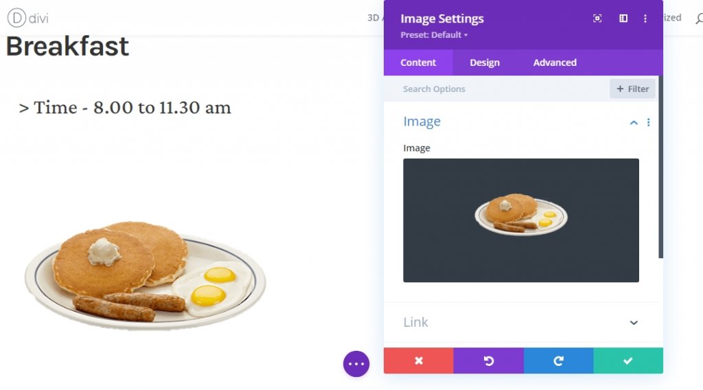
Add Image Module To Column 1
Image Upload
The final element we need in column 1 is an image. Add an image module, and then add an image of your choice.
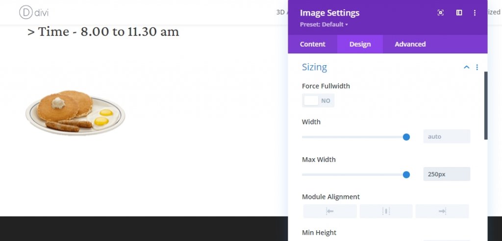
Sizing
Add a maximum width from the sizing settings.
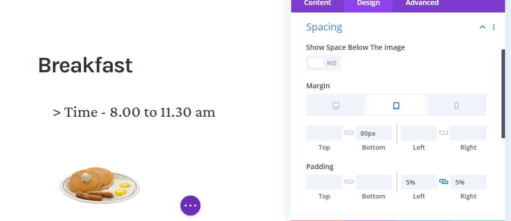
Spacing
Now complete the module settings by implementing the following changes to spacing.
- Bottom Margin: Tablet: 80px, Phone: 50px
- Left Padding: 5%
- Right Padding: 5%
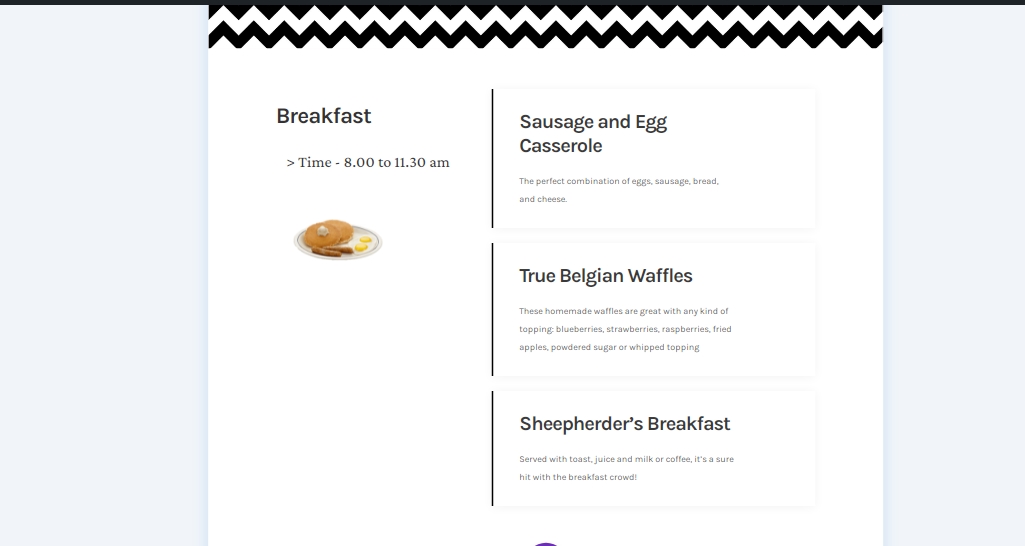
Add Blurb Module To Column 2
Content Adding
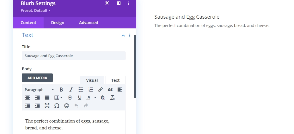
Add some content of your choice on a new blurb module on column 2. This module is a text based module that delivers more info about an individual topic.
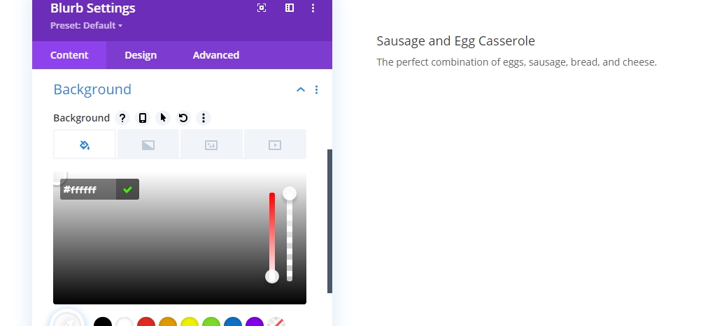
Background Color
Add a white background color from the content tab.
- Background Color: #ffffff
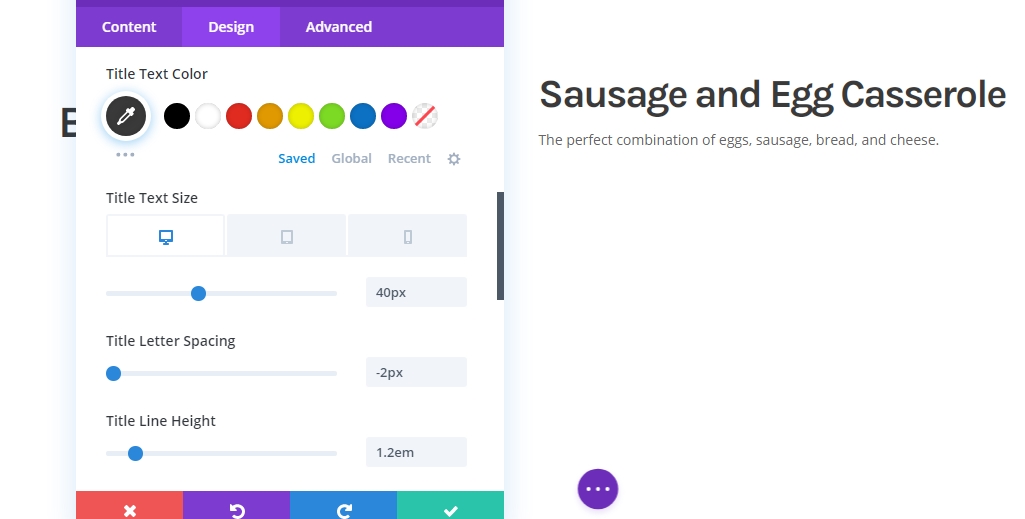
Title Text Settings
Now move to the design section and change the following values.
- Title Font: Karla
- Title Font Weight: Bold
- Title Text Color: #3a3a3a
- Title Text Size: Desktop: 40px, Tablet: 35px, & Phone: 30px
- Title Letter Spacing: -2px
- Title Line Height: 1.2em
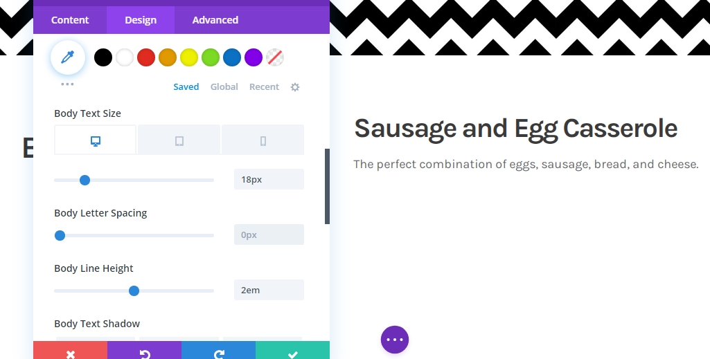
Body Text Settings
Edit the body text settings like mentioned below.
- Title Font: Karla
- Title Text Color: #3a3a3a
- Title Text Size: Desktop: 18px, Tablet: 25px, & Phone: 20px
- Title Letter Spacing: -0.5px
- Title Line Height: 2em
Sizing
Now modify the sizing.
- Content Width: 100%
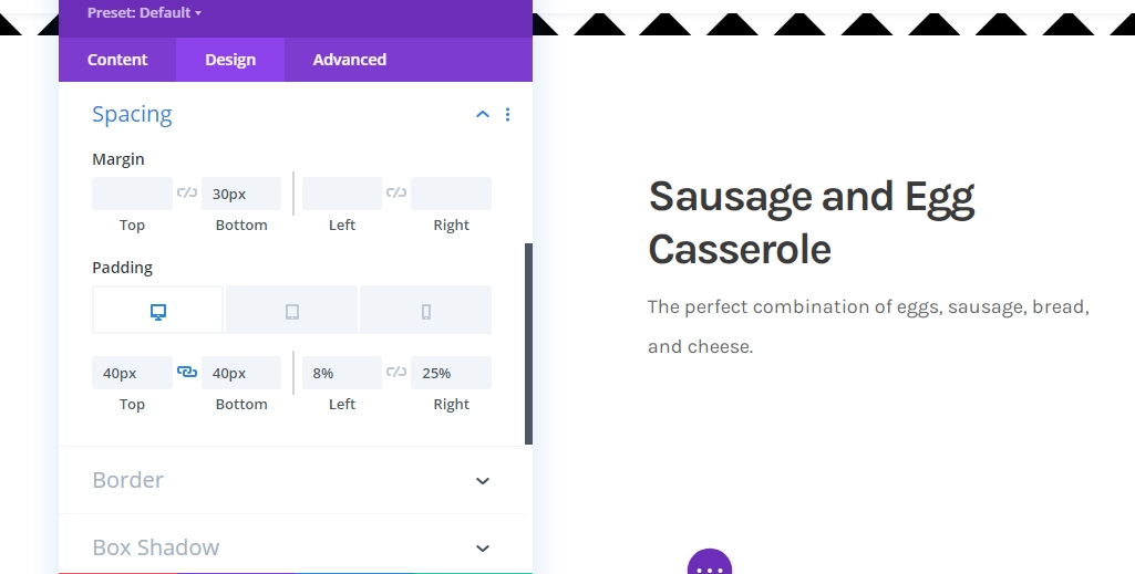
Spacing
Move to the spacing settings and alter the values accordingly.
- Bottom Margin: 30px
- Top Padding: 40px
- Bottom Padding: 40px
- Left Padding: 8%
- Right Padding: Desktop: 25%, Tablet & Phone: 8%
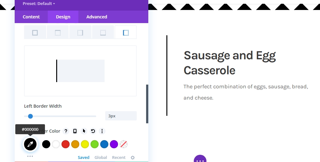
Border
Its time to apply border settings.
- Left Border Width: 3px
- Left Border Color: #000000
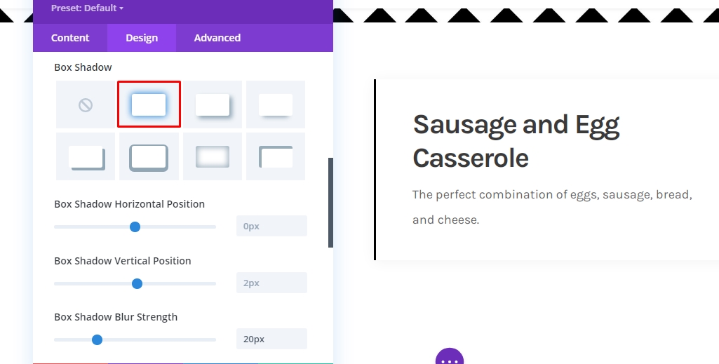
Box Shadow
We’re using a box shadow as well.
- Box Shadow Blur Strength: 20px
- Shadow Color: rgba(0,0,0,0.05)
Blurb Title CSS
To finish the module settings, we need to add the following line of CSS code to the blurb title CSS box in the advanced tab.
margin-bottom: 20px;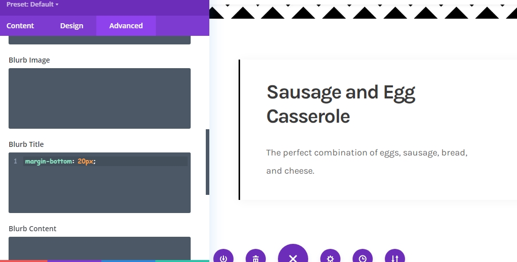
Clone Blurb Module
Now your restaurant may have a variety of items for breakfast. You don't need to create every section from scratch because Divi allows you to copy your module as many times as you need. So, clone the blurb module according to your item.
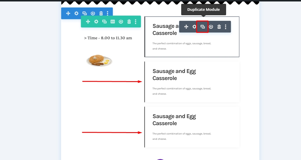
And, then change the content inside the items.
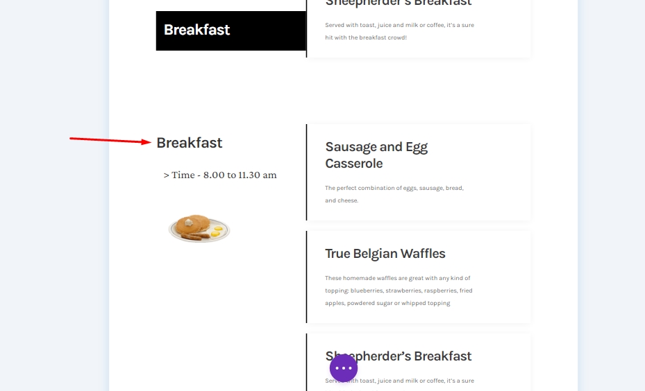
Apply Sticky Effects
Text Module 1 In Column 1
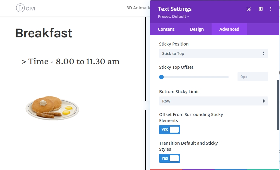
As we have all the elements structured, no we will focus on adding sticky effects. For that, open the first text module in column 1.
Make Module Sticky
Switch to the advanced tab and make the following sticky settings:
- Sticky Position: Stick to Top
- Bottom Sticky Limit: Row
- Offset Surrounding Sticky Elements: Yes
- Transition Default and Sticky Styles: Yes
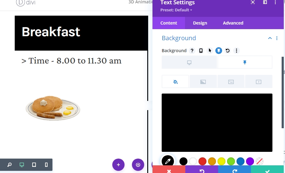
Sticky Style For Module
Background Color
As we now have a sticky module, we can apply sticky styles to it. First of all, select black as sticky background color.
- Sticky Background Color: #000000
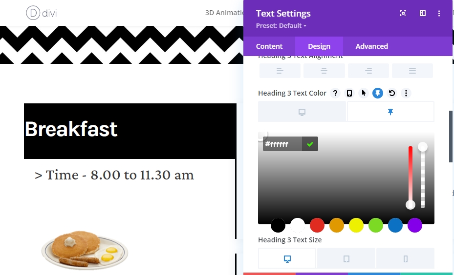
Text Color
Then, alter the sticky H3 text color to white.
- Sticky Heading 3 Text Color: #ffffff
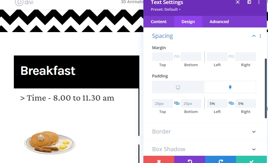
Spacing
And conclude the sticky styles by adding the following responsive sticky padding values:
- Sticky Left Padding: 5%
- Sticky Right Padding: 5%
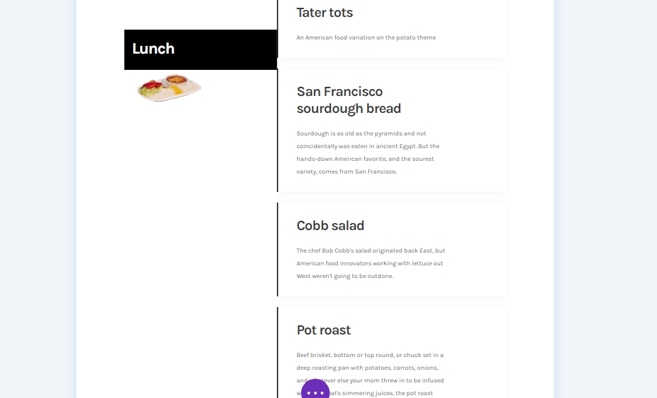
Clone The Entire Row For Reuse
After you are done with the sticky effects of the breakfast section, you might want to add the lunch and diner section. So, duplicate the whole row for re-use.
Change All The Content For Second Row
Make sure you have altered the content for seconds row.
Final Result
So our final design looks like this.
Desktop View
Mobile View
Conclusion
Today in this post, we tried to show you how creative you can customize your next website menu with Divi's sticky option. This is a great interactive way to display foods to customers. If you have any suggestions or tutorial requests, please share your thoughts in the comment box. If you found this article useful, a share will be lovely.