
Divi gives us a huge opportunity to decorate our websites in various ways, and there are many options available inside the Divi that really can create stunning designs. Have you ever thought about creating a header where your logo will stand across the primary and secondary menu bar? Well, that's what we will learn today. It's an innovative way to display your header. So let's not waste more time and see how to do that!
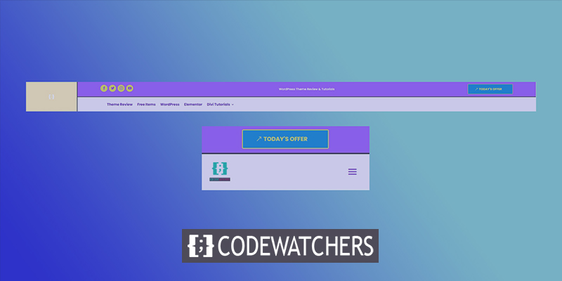
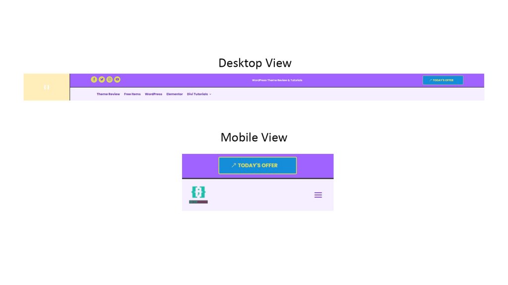
Sneak Peak
This is the header design we are going to create today.

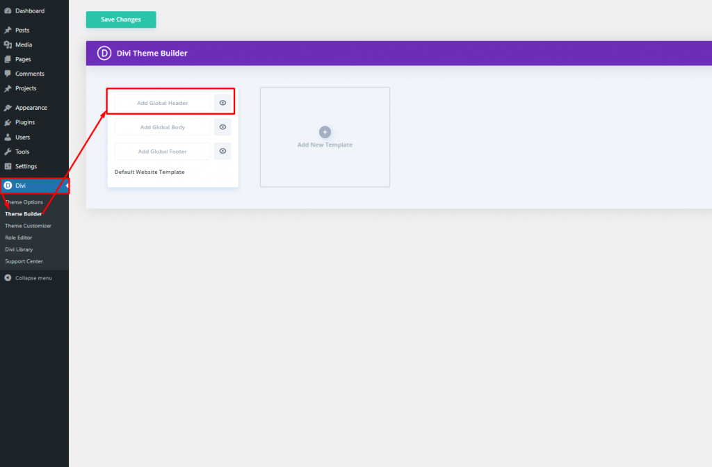
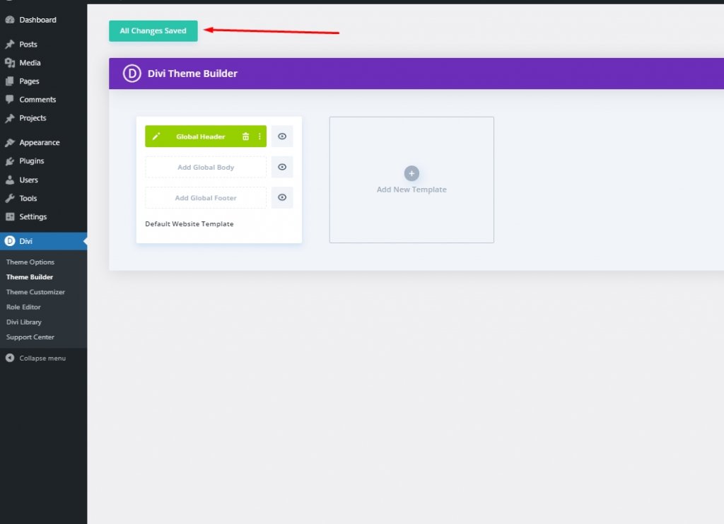
Section One: Global Header Template
First of all, we need to create a global header template. To do that, let's go to the "Divi > Theme Builder" option from Dashboard and click on "Add Global Header."
Click on "Add Global header" option and you will see a drop down menu. Select "Build Global Header" and move forward.
Create Amazing Websites
With the best free page builder Elementor
Start Now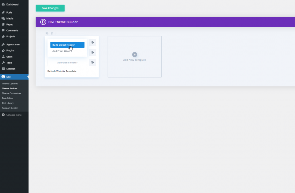
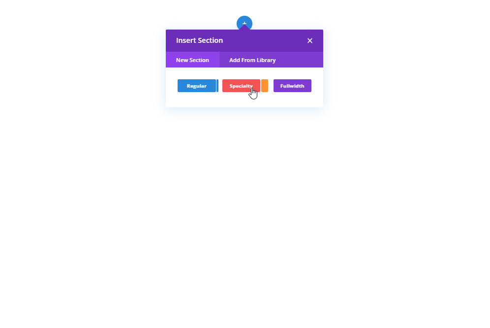
Section Two: Header Designing
Adding: Specialty Section
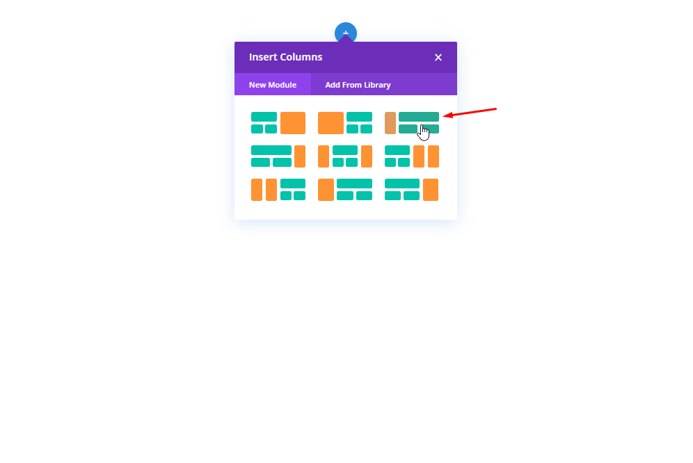
We'll pick Specialty section to make this design.
Column Structure
Please, select the marked column structure for the section.
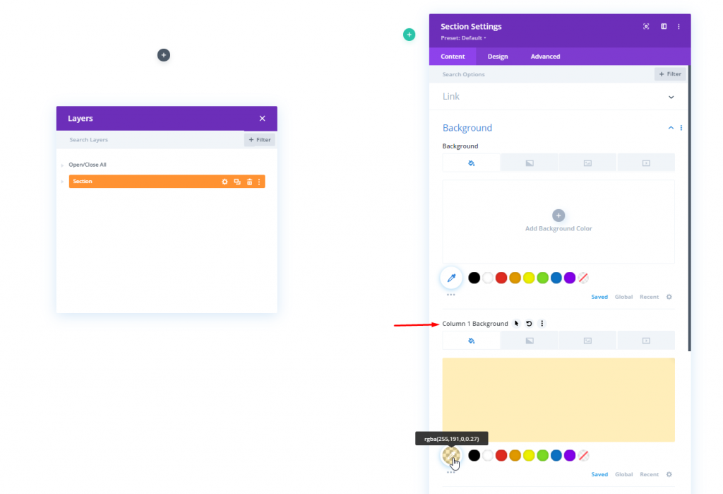
Background Color: Column 1
Now, open the column 1 setting of the newly created Specialty section and change the background color.
- Background Color: rgba(255,191,0,0.27)
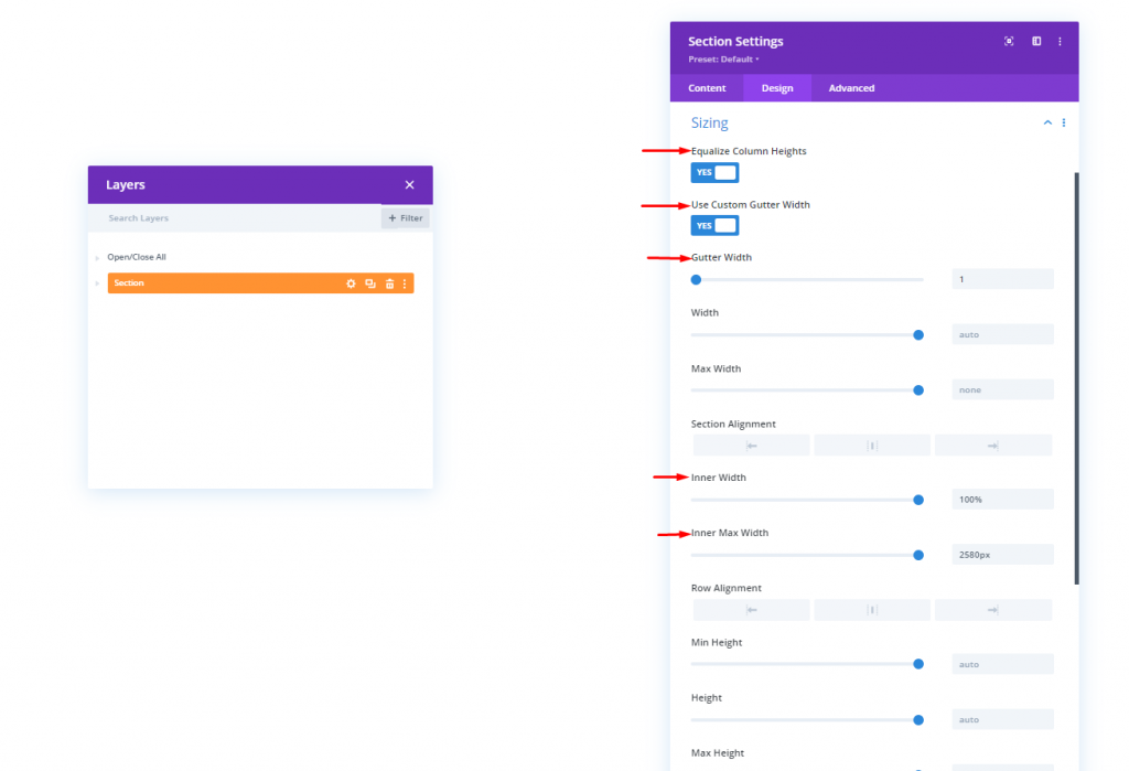
Sizing
Change the following values from Design tab.
- Equalize Column Heights: Yes
- Use Custom Gutter Width: Yes
- Gutter Width: 1
- Inner Width: 100%
- Inner Max Width: 2580px
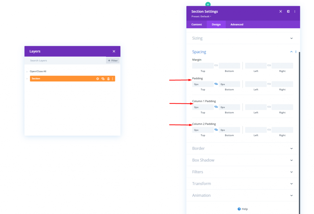
Spacing
Now move to the Spacing setting from the same Design tab.
- Top Padding: 0px
- Bottom Padding: 0px
- Column 1 Top Padding: 0px
- Column 1 Bottom Padding: 0px
- Column 2 Top Padding: 0px
- Column 2 Bottom Padding: 0px
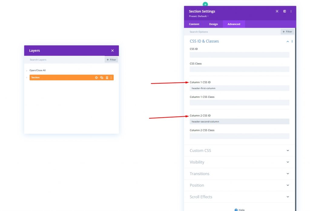
Column CSS IDs
Under the Advanced tab, let's apply a custom CSS ID to both columns.
- Column 1 CSS ID: header-first-column
- Column 2 CSS ID: header-second-column
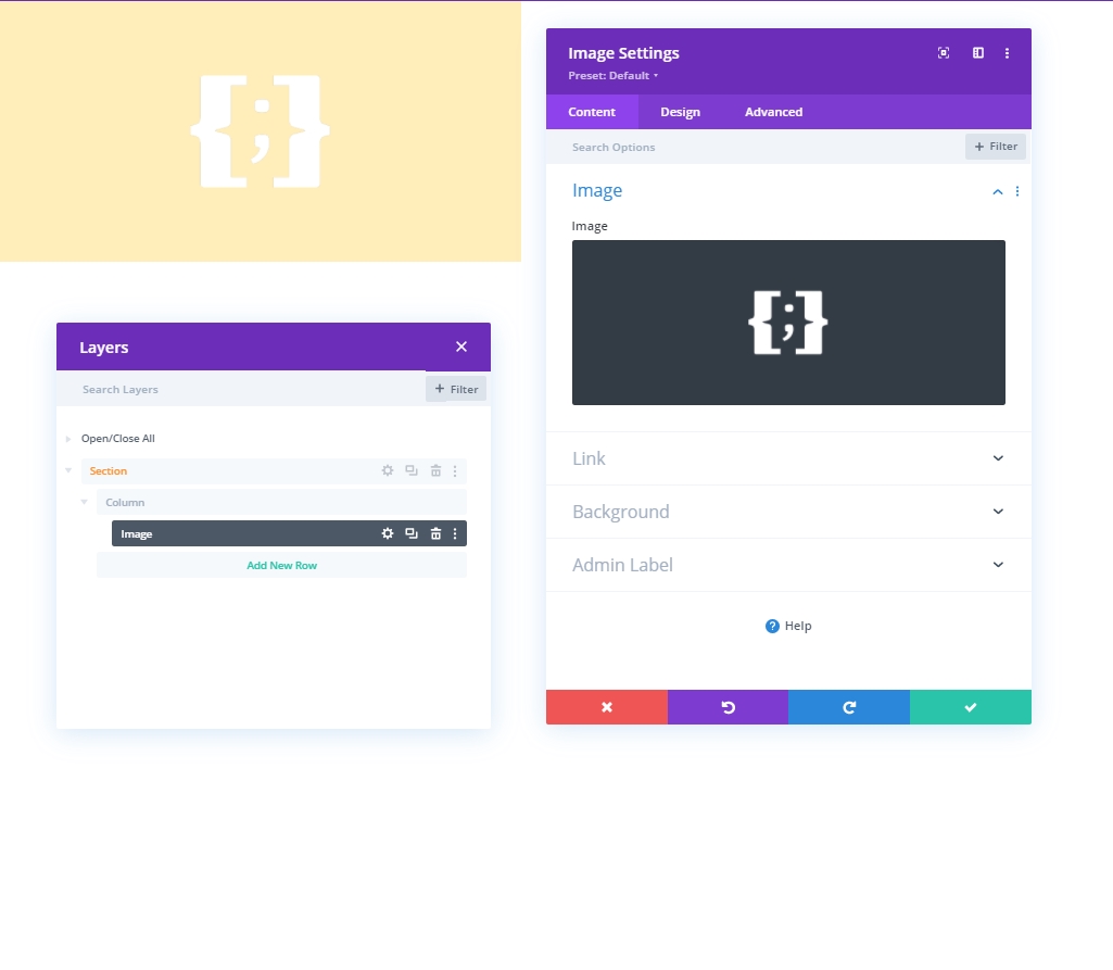
Adding: Image Module To Column 1
Image Upload
Now add an image module to column 1 and insert your logo.
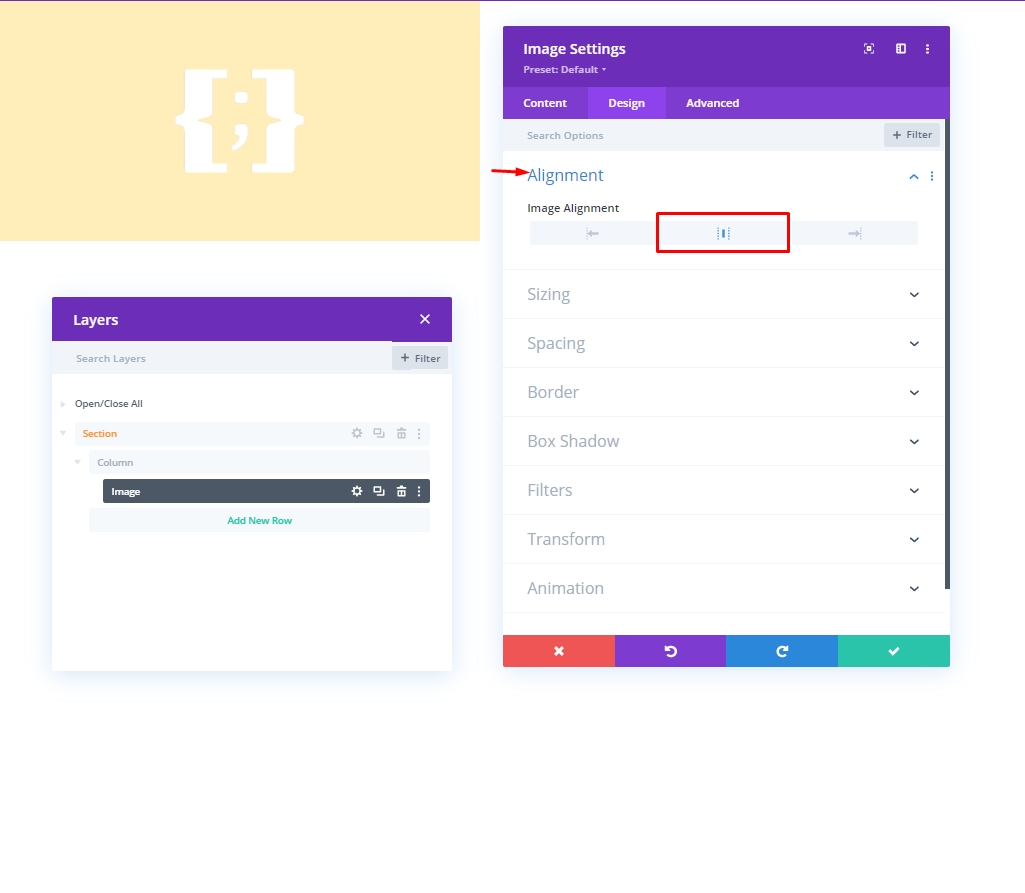
Alignment
Now move to the design tab and make changes to image alignment.
- Image Alignment: Center
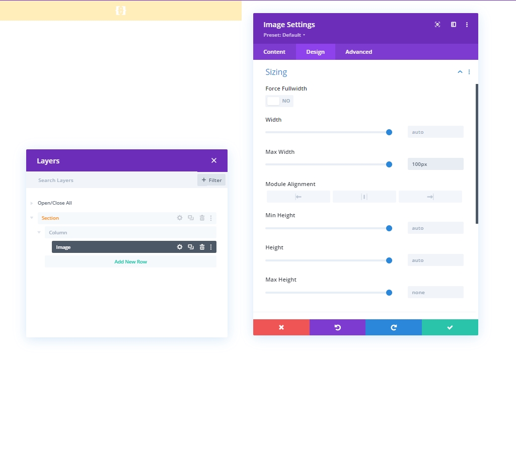
Sizing
From the sizing section, change the max width value.
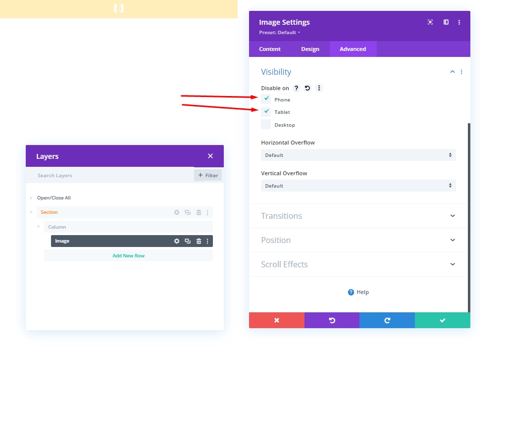
Visibility
Now, hide this particular module from smaller devices, we'll disable the visibility of mobile and tablet.
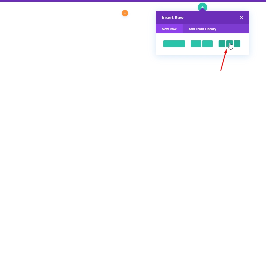
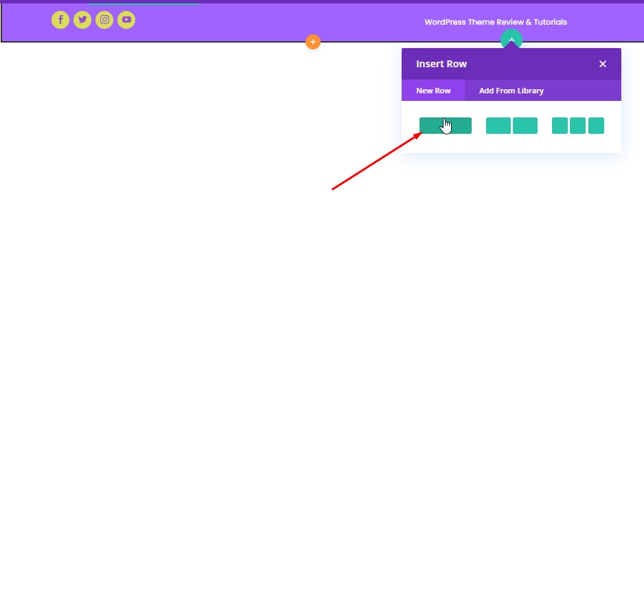
Adding: Row 1 To Column 2
Column Structure
We'll add the marked column structure on our Specialty sections column 2. This will act as our first Row.
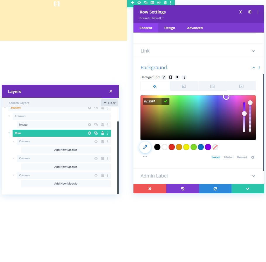
Background Color
Apply the background color from the row settings.
- Background Color: rgba(161,99,255,0.1)
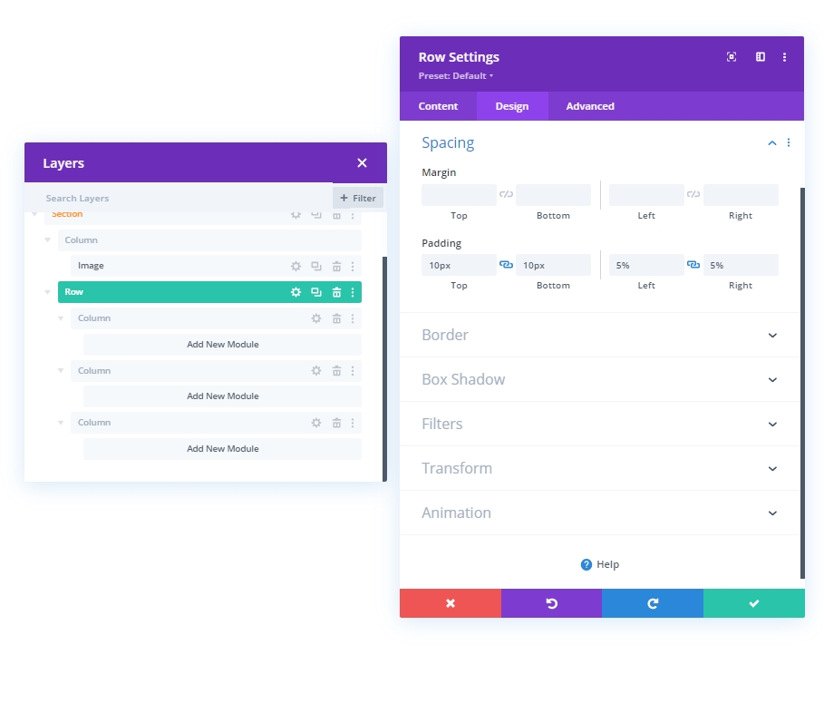
Spacing
From the Design tab, change the spacing settings as follows:
- Top Padding: 10px
- Bottom Padding: 10px
- Left Padding: 5%
- Right Padding: 5%
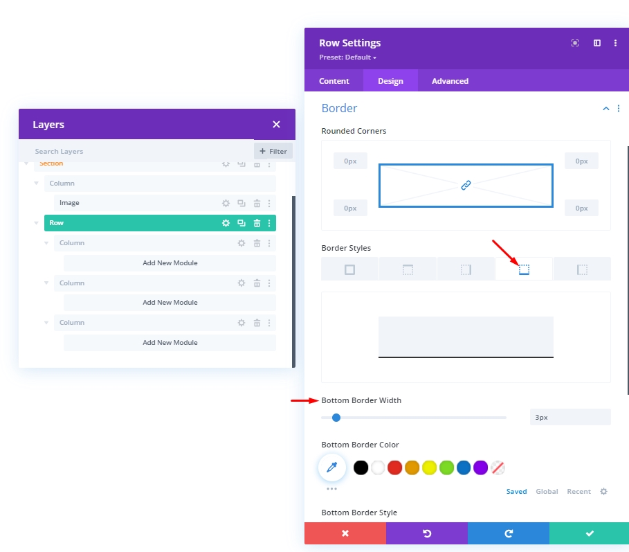
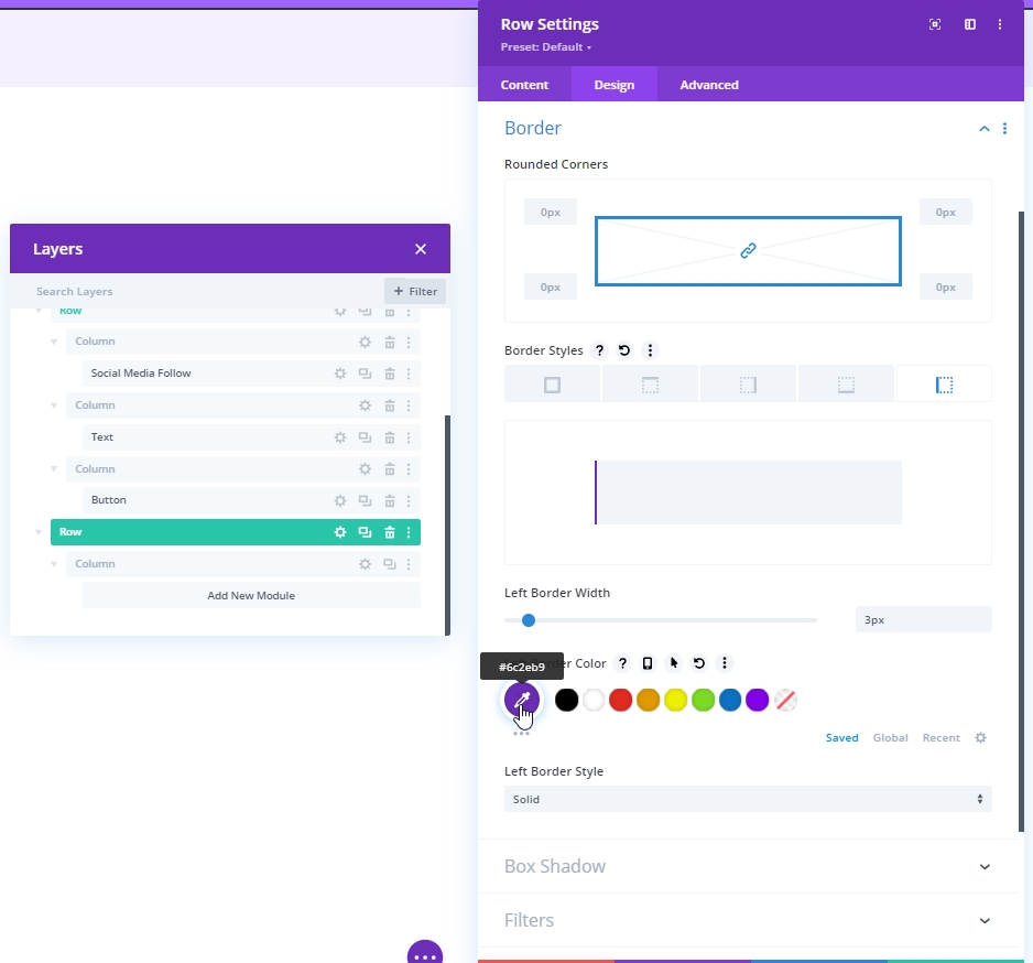
Border
Now, make some changes into border settings.
- Bottom Border Width: 3px
- Left Border Width: Desktop: 3px, Tablet & Phone: 0px
- Border Color: #6c2eb9
Main Element CSS
Now, write down the CSS Code in the "Main Element" block from the Advanced tab.
display: flex;
justify-content: center;
align-items: center;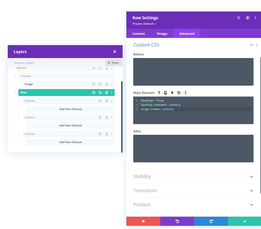
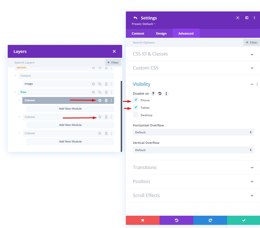
Visibility: Hide Column 1 & 2
We'll hide the column 1 & 2 visibility for smaller devices for designing simplification. This will make our design cleaner.
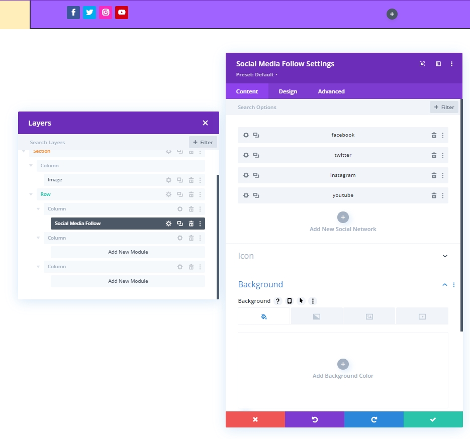
Adding: Social Media Module To Column 1
Social Network Addition
Let's add a social media follow module to column one. Pick your desired social media platform and add here.
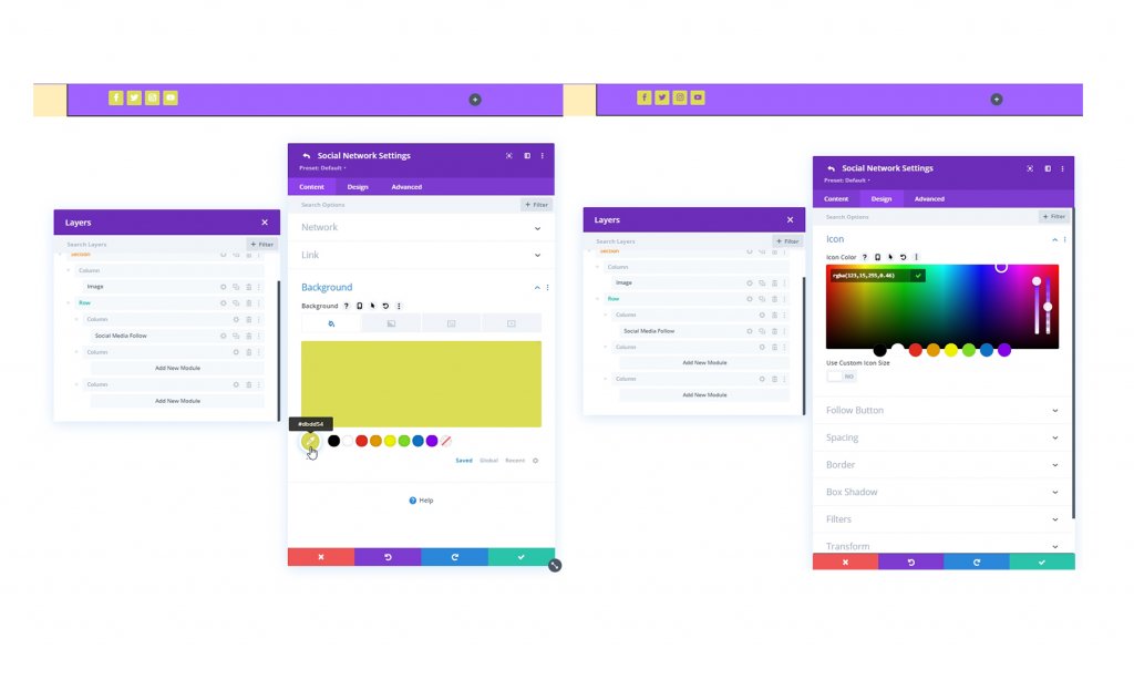
Change Color For Background & Icon
We'll make some color tweaks to Social Media Follow module.
- Background Color: #DBDD54
- Icon Color: rgba(123,15,255,0.46)
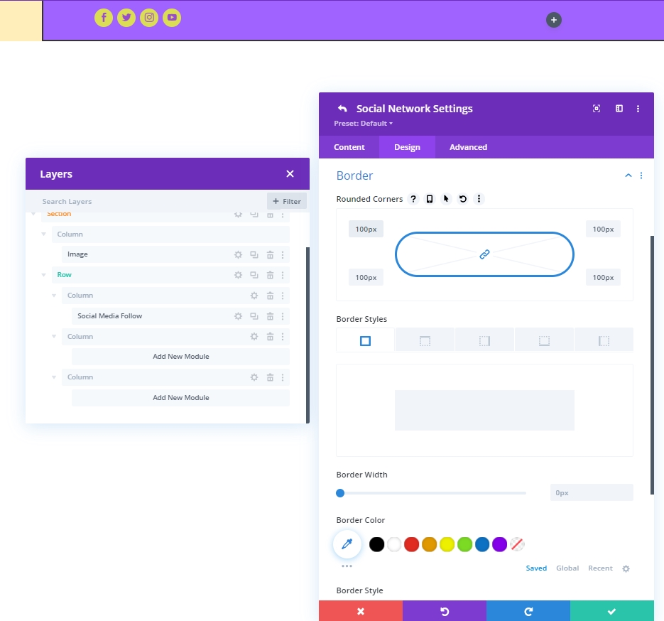
Border
Now from border settings, make our social icons rounded.
- All Corners: 100px
Adding: Text Module To Column 2
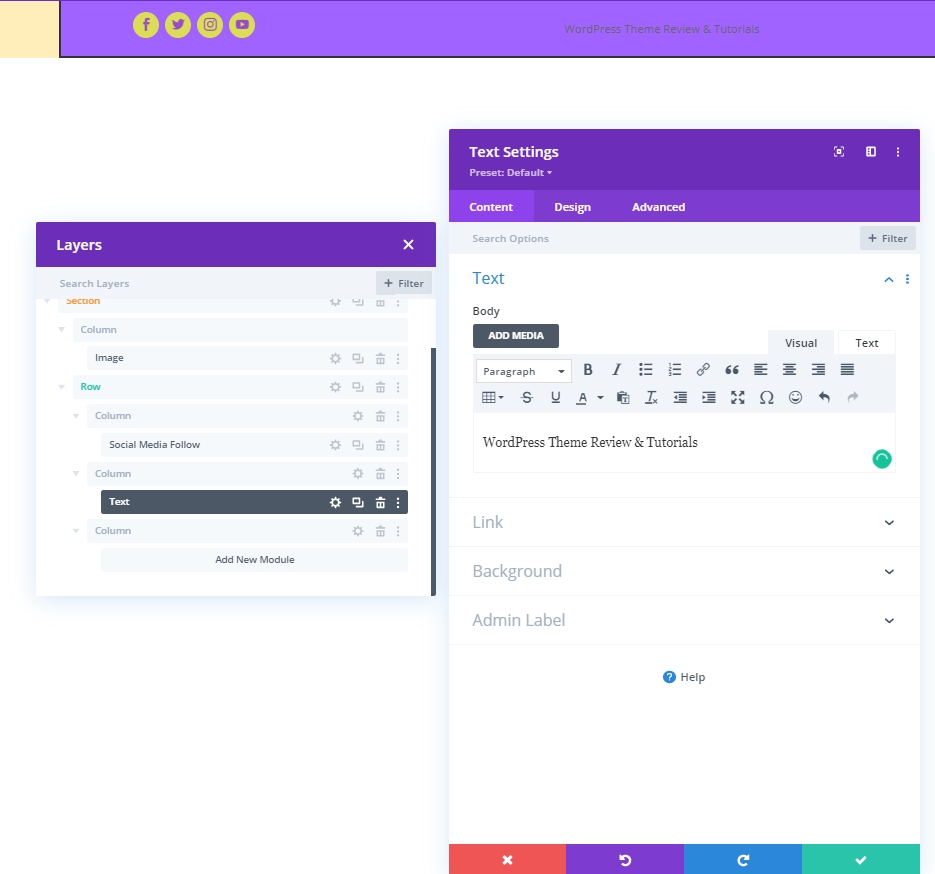
Module & Content
Add a text module to Column 2 and add a tagline or anything according to your choice.
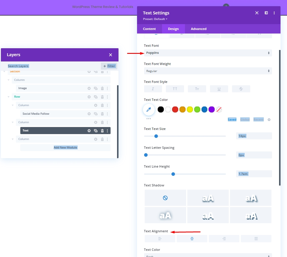
Text Settings
Change the text style.
- Text Font: Poppins
- Text Alignment: Center
Adding: Button Module To Column 3
Module & Content
In Column 3, add a button module and content of your choice.
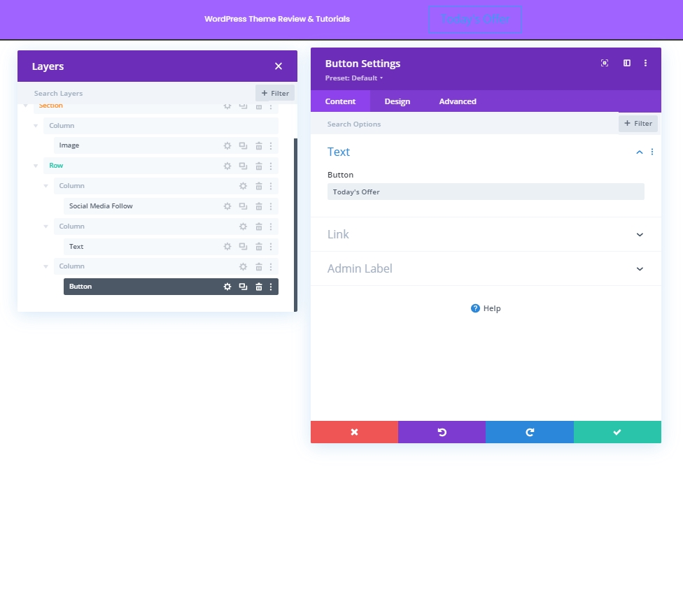
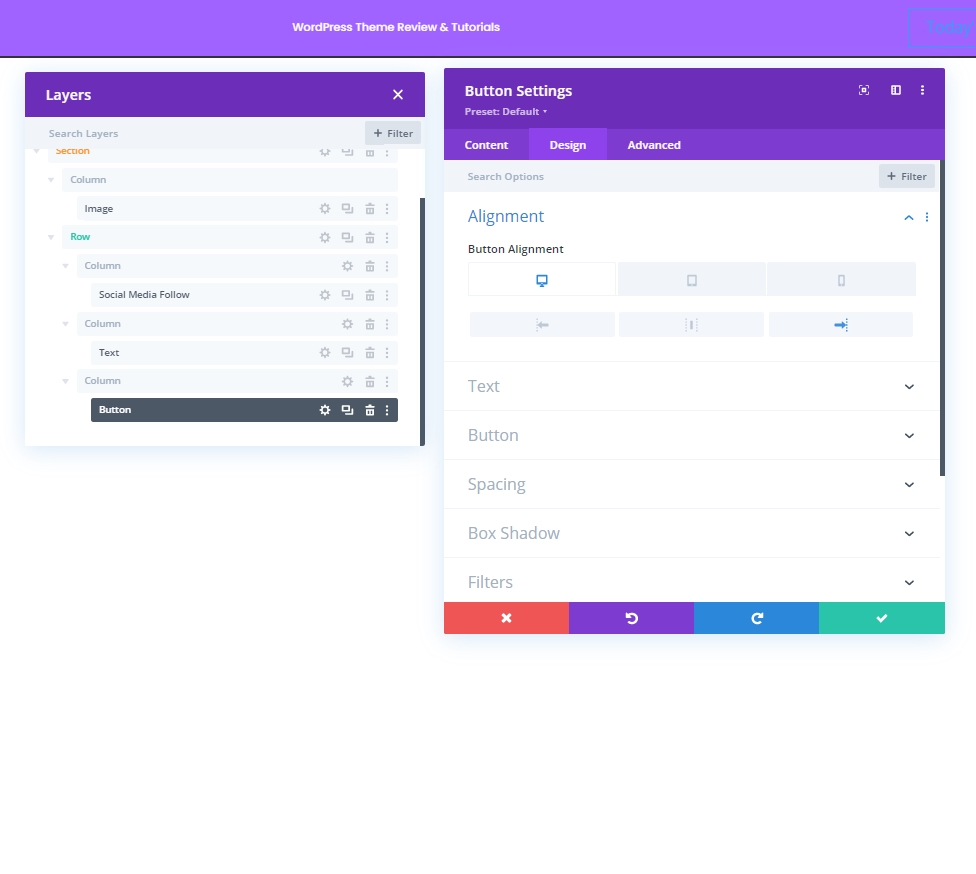
Button Alignment
From the design tab, change the alignment for the button so it can be placed perfectly on different screen size devices.
- Button Alignment: Desktop: Right, Tablet & Phone: Center
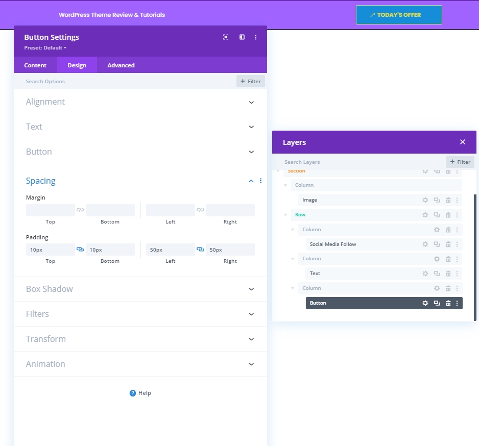
Button Settings
Now make some adjustment to button to make it more attractive.
- Use Custom Styles For Button: Yes
- Button Text Size: 14px
- Button Text Color: #DBDD54
- Button Background Color: #158DD8
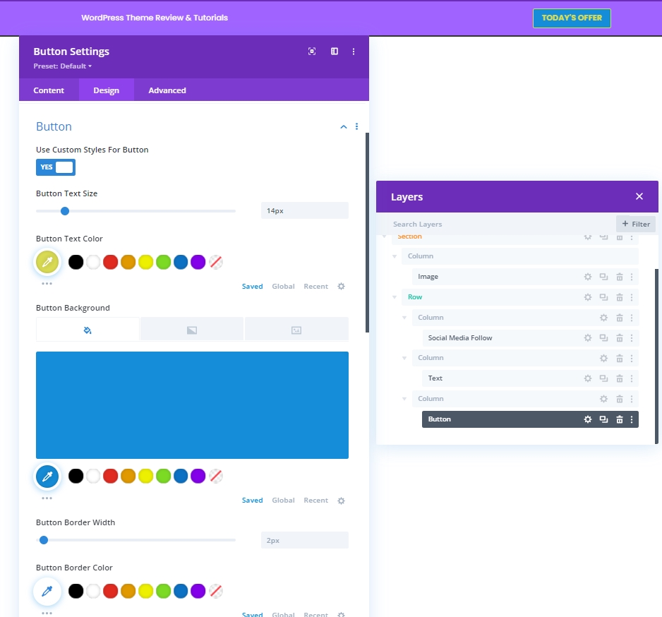
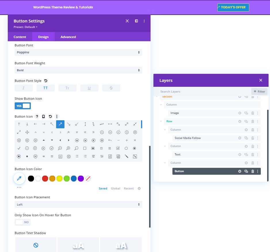
- Button Font: Poppins
- Button Font Weight: Bold
- Button Font Style: Uppercase
- Show Button Icon: Yes
- Button Icon Placement: Left
Spacing
Now make the following changes to padding values.
- Top Padding: 10px
- Bottom Padding: 10px
- Left Padding: 50px
- Right Padding: 30px
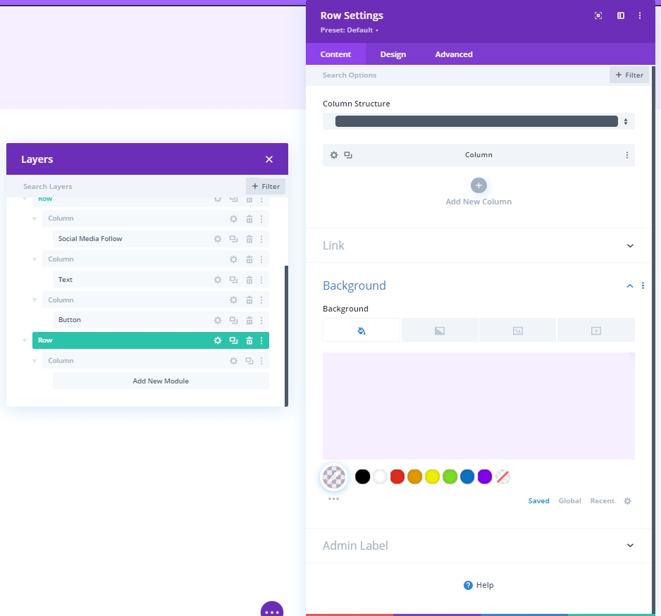
Adding: Row 2 To Column 2
Column Structure
Now, we'll add the last row to this column module.
Background Color
Apply the following color as background.
- Background Color: rgba(161,99,255,0.1)
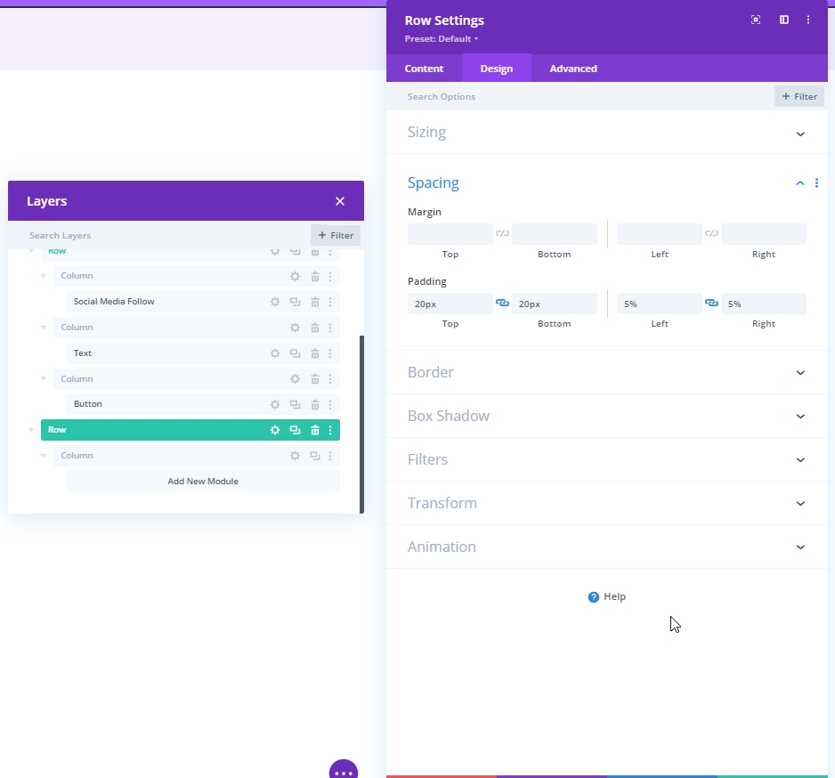
Spacing
Adjust the row’s spacing settings.
- Top Padding: 20px
- Bottom Padding: 20px
- Left Padding: 5%
- Right Padding: 5%
Border
Then, apply the following border settings:
- Left Border Width: Desktop: 3px, Tablet & Phone: 0px
- Left Border Color: #6c2eb9
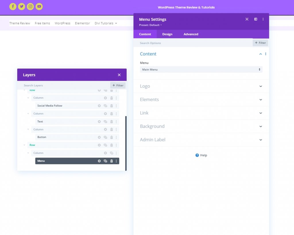
Adding: Menu Module To Column 2
Now, pick the menu of your need and set it.
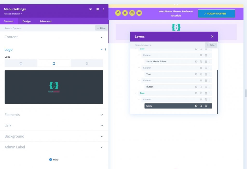
Upload Logo For Tablet & Phone
Add a logo for smaller screen size devices.
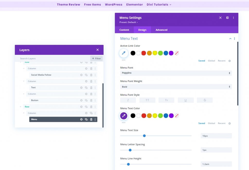
Menu Text Settings
Now make some adjustments to the menu text so that it looks more organized.
- Menu Font: Poppins
- Menu Text Color: #6c2eb9
- Menu Text Size: 16px
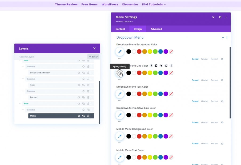
Dropdown Menu Text Settings
Now add a line color to our dropdown menu.
- Dropdown Menu Line Color: rgba(0,0,0,0)
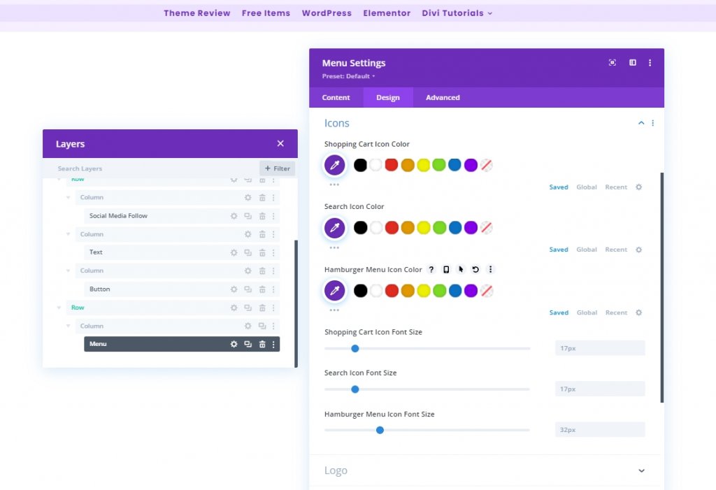
Icons Settings
Now, change the icon settings.
- Shopping Cart Icon Color: #6c2eb9
- Search Icon Color: #6c2eb9
- Hamburger Menu Icon Color: #6c2eb9
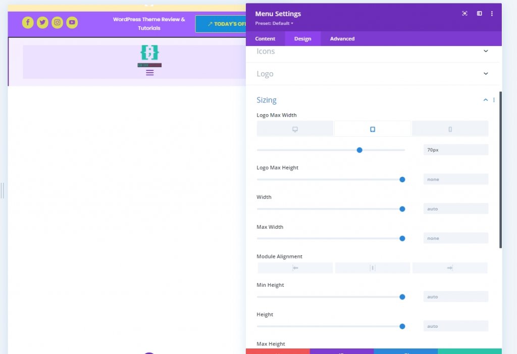
Sizing
Apply a logo max width on tablet and phone.
- Logo Max Width: Tablet: 70px & Phone: 50px
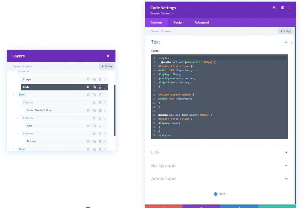
Adding: Code Module To Column 1
To bring changes to our header design, we will be doing a bit of CSS adjustments. In order to do that, add a code module in column 1. Now copy the code below and paste it to that module. Make sure to put them between Style code.
@media all and (min-width: 980px) {
#header-first-column {
width: 10% !important;
display: flex;
justify-content: center;
align-items: center;
}

#header-second-column {
width: 90% !important;
}
}

@media all and (max-width: 980px) {
#header-first-column {
display: none;
}
}
Section Three: Save The Design
We are done with designing. Everything is perfectly placed and now let's save the design and see the outcome. Click the cross icon on the top right. It will bring you to Dashboard and click on save the design.
Final Look
So this is how our final design look like.
Conclusion
We have mentioned earlier that, with Divi, you can bring more and more creativity to your design. There are many ways to make your website presentable, and Divi can provide all that support. I hope today's tutorial will help you to build a unique header for your website. Feel free to share your thoughts, and if you like this tutorial, a friendly share will make you AWESOME!