
A nice login form helps to increase the user experience of your website. The idea of our today's tutorial is to create a login form using Divi Builder, which will pop up when you click on the login button on the home page. Most of the time, when we click on the login button, we are redirected to the login page, when a simple pop-up form is much more convenient and refreshing. So today, we will learn to design a creative pop-up login form. This we will create with the help of Divi's login module and some button modules. So let's start today's tutorial without delay.
Note: We will only work with front-end design. If someone has trouble logging in, for example, someone needs to reset their password, we need to move to the traditional login page. For people who are enamoured with custom-made login pages, this tutorial is a perfect fit.
Preview
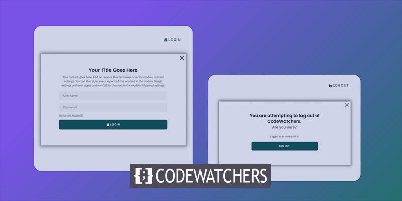
Here is today's design preview. We can see, clicking on the login button pushes the login forms to appear, and when we click on logout, a warning pop-up before the logout.
Popup Login Form with Login/Logout Buttons
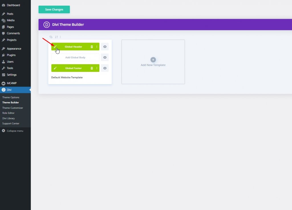
To get started with design, you first need to go to Divi > Theme Builder from the dashboard. We will be using a premade template for the header and footer because the login or logout button is usually placed in the header. Click of Add global header from the Default website template and choose to add from the library.
Create Amazing Websites
With the best free page builder Elementor
Start Now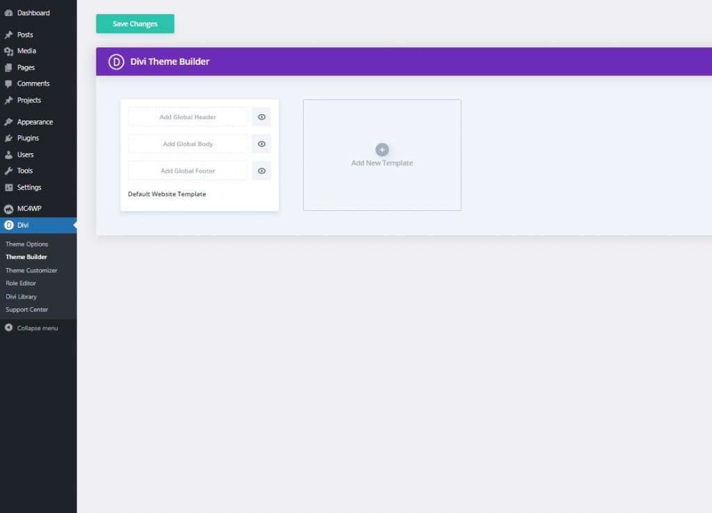
Now we have to download Divi's Crowdfunding layout packs header and footer from this page. Enter your Email Id and click download.
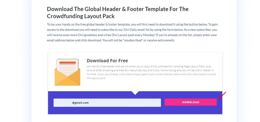
Then you will see an option for download again and click it. Now, unzip the file after the download is finished and get back to Divi builder and click the portability option.
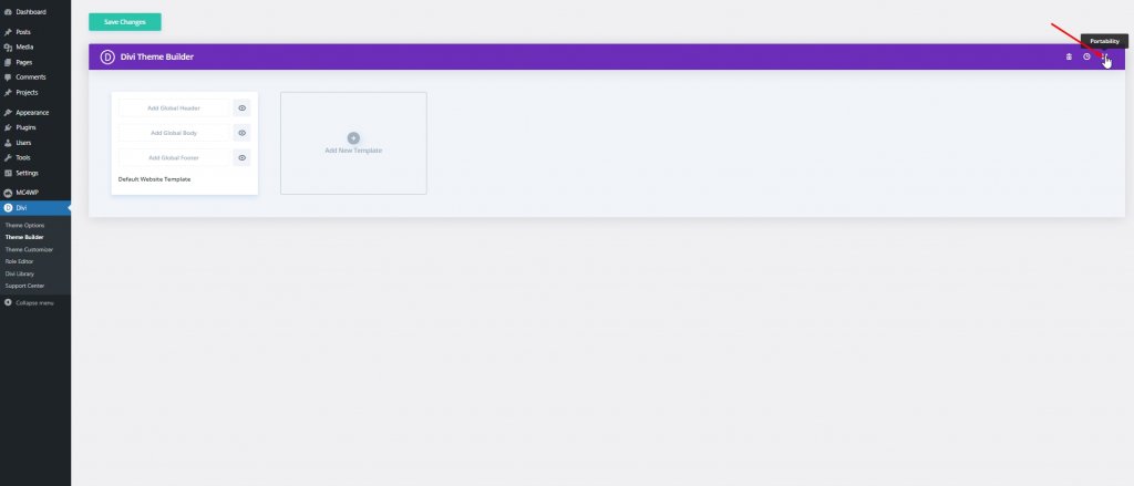
Now follow the further procedure as written below.
- Select the import tab from the portability pop-up.
- Upload the downloaded Json file from unzipped folder.
- Click import button.
- Then click edit to make adjustments of header.
Part 1: Creating Login/Logout Button
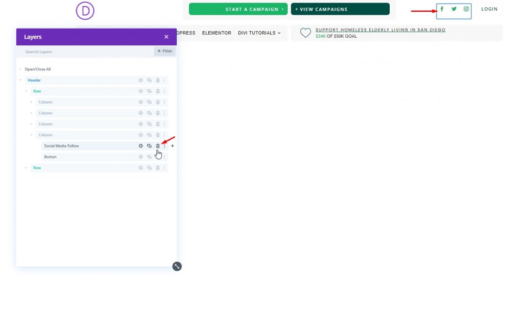
First, open the layers so we can see all elements easily. From the header section top row, delete social media modules.
Login Button Creating
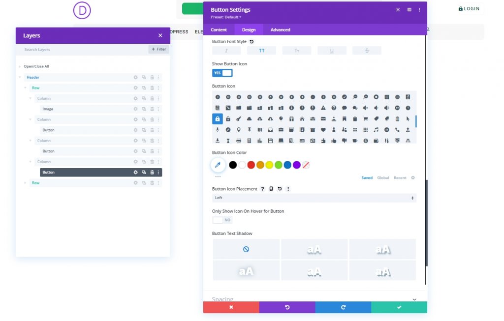
There is already a login button on the top rows 4th column. We will modify it.
Update the following under the design tab:
- Button Icon: lock icon (see screenshot)
- Button Icon Placement: Left
- Only Show Icon On Hover for Button: NO
- Padding: 0.5em top, 0.5em bottom, 2em left, 0.7em right
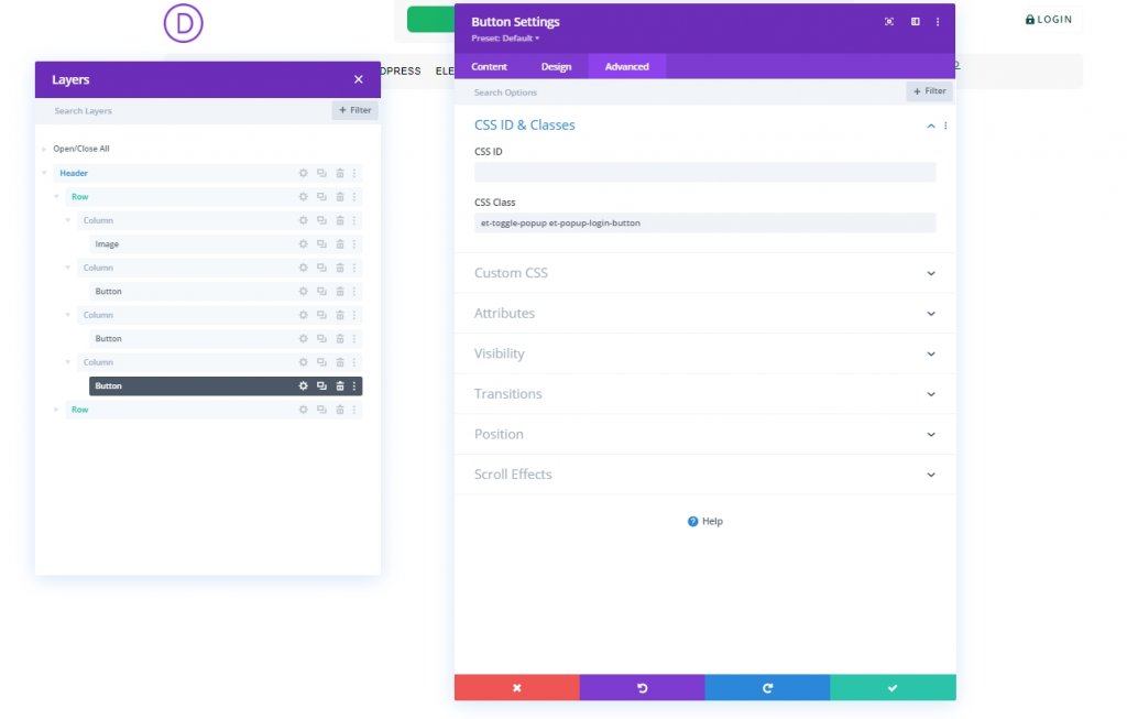
Add two custom CSS Classes to the button from the advanced tab as follows:
- CSS Class: et-toggle-popup et-popup-login-button
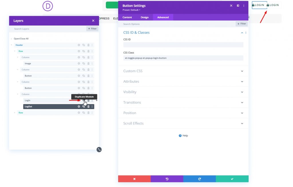
Logout Button
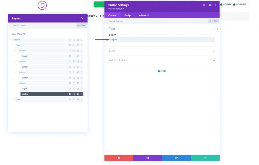
To create our logout button, clone the existing Login button in column 4. Also, label them for further identification.
Change the cloned button text as "Logout".
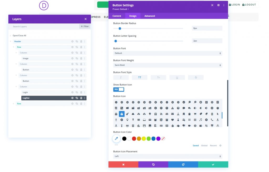
Change the button icon from the design tab as marked below.
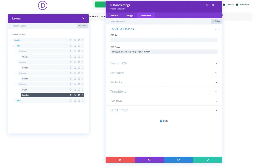
Lastly, change the CSS Class from the advanced tab.
- CSS Class: et-toggle-popup et-popup-logout-button
Part 2: Creating Popup Page
We have created the buttons successfully. No, we will design the popup section that will act as a form. To create that, add a regular section under the header section.
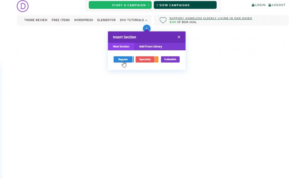
Section Adding & Settings
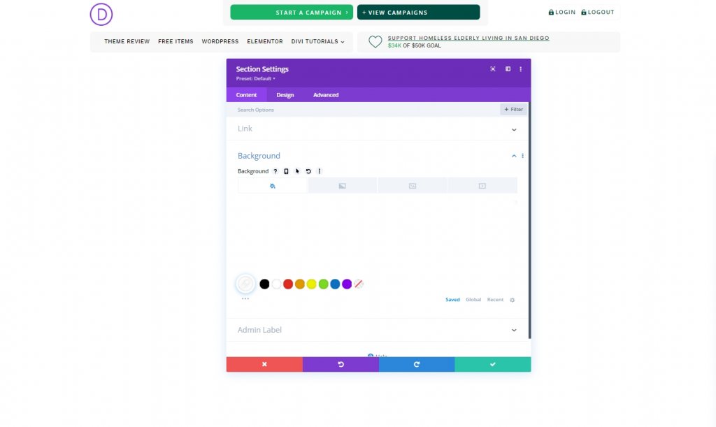
Let's give the section a white background.
- Background Color: #ffffff
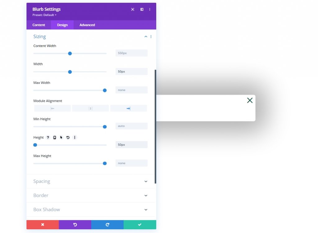
Make the following adjustments on the design tab of the section.
- Width: 100%
- Max Width: 800px (desktop), 80% (tablet), 100% (phone)
- Section Alignment: Center
- Height: auto (desktop and tablet), 100% (phone)
- Max Height: 100%
- Padding: 0px top, 0px bottom
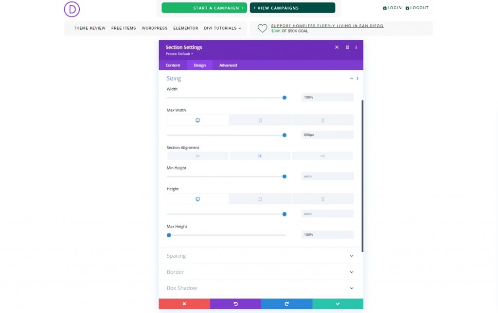
- Rounded Corners: 10px
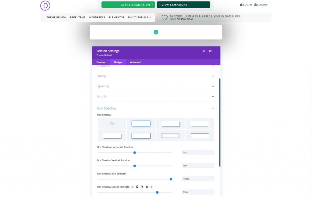
- Box Shadow: see screenshot
- Box Shadow Vertical Position: 0px
- Box Shadow Blur Strength: 100px
- Box Shadow Spread Strength: 50px
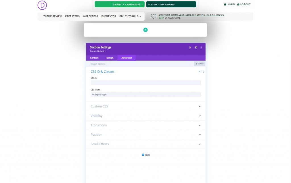
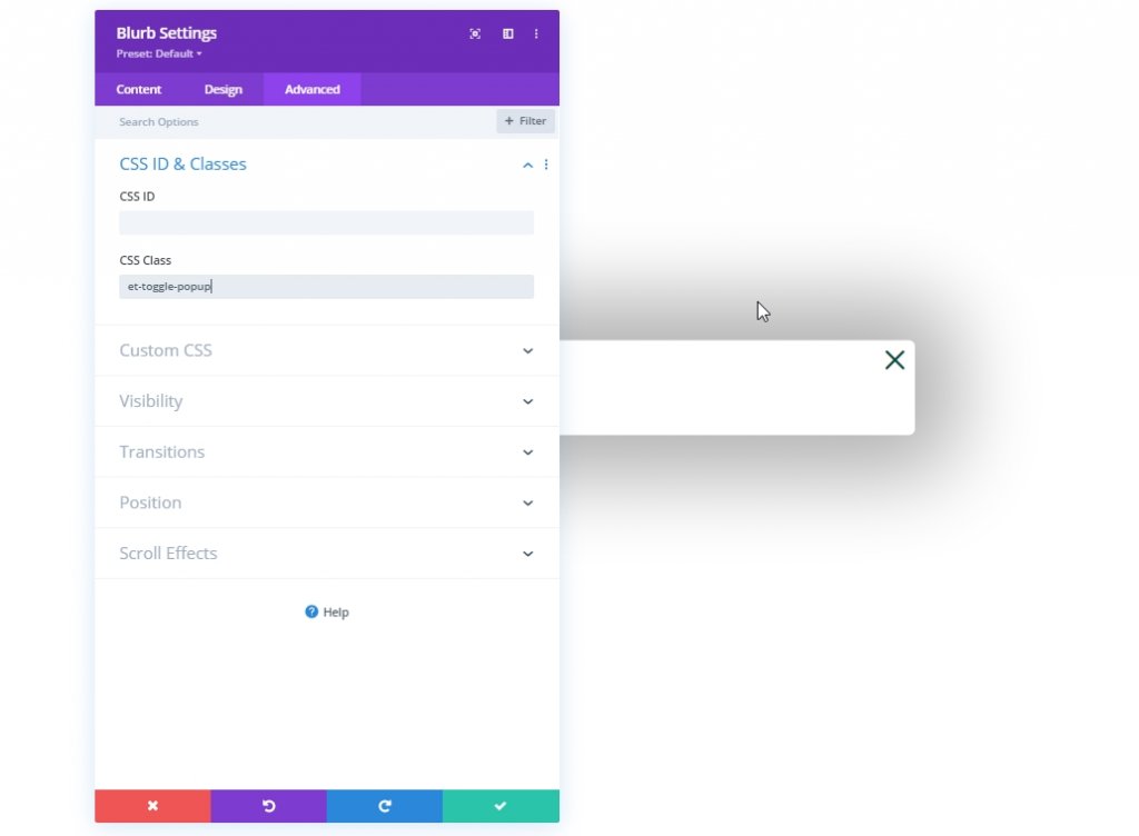
Let's add a CSS class from the advanced tab.
- CSS Class: et-popup-login
Then add the following CSS code in the main element.
overscroll-behavior: contain;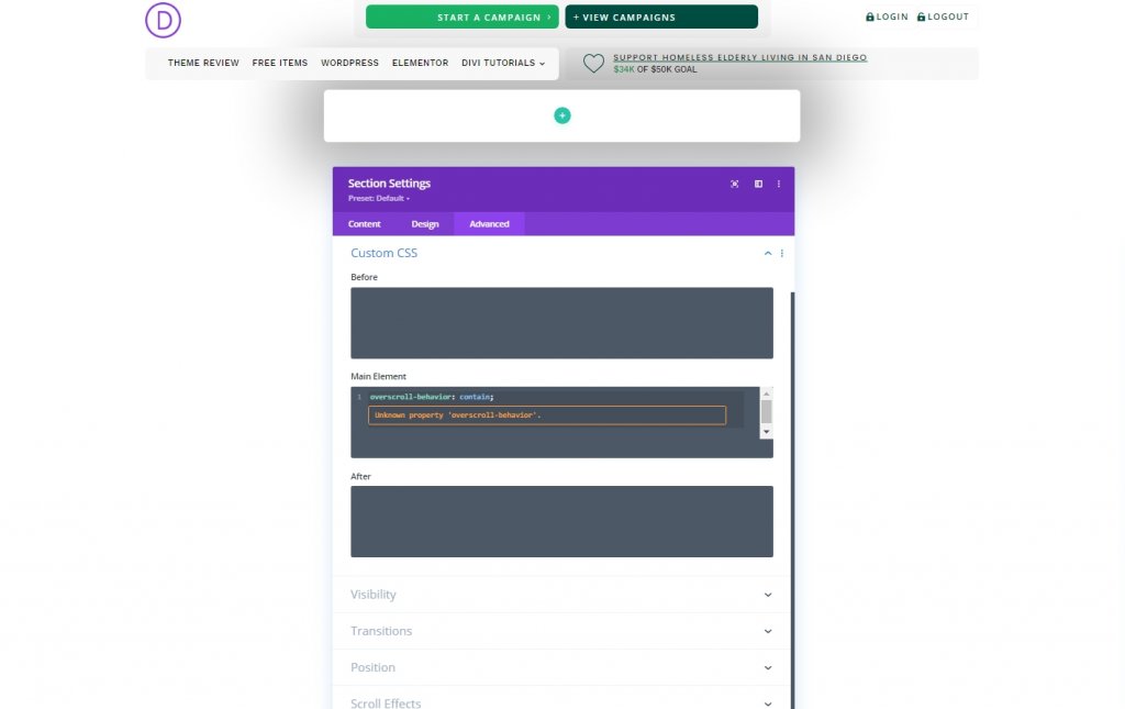
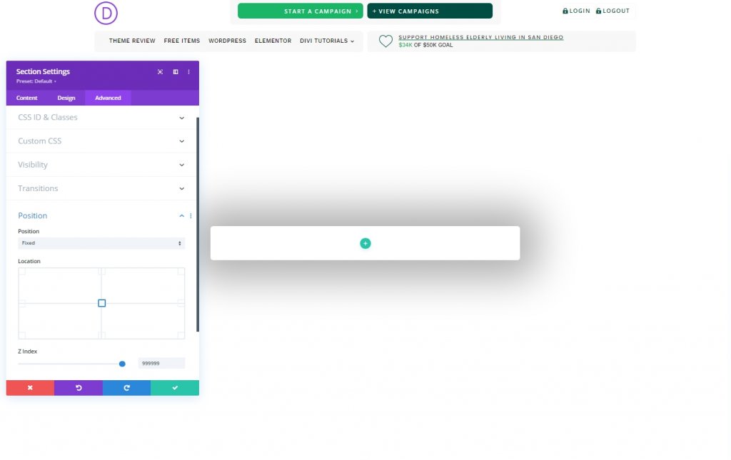
Then, make some adjustments on Visibility and position.
- Horizontal Overflow: hidden
- Vertical Overflow: auto
- Position: Fixed
- Location: Center Center
- Z Index: 999999
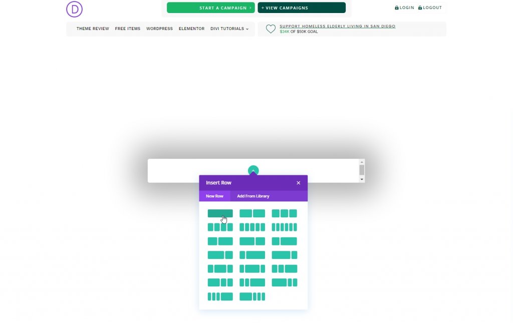
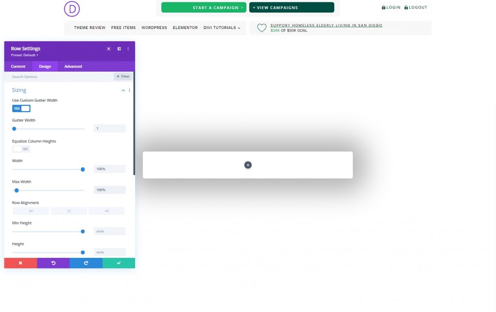
Row Adding & Settings
Let's add a one-column row to the new section.
Open the row settings and make the following adjustments.
- Use Custom Gutter Width: YES
- Gutter Width: 1
- Width: 100%
- Max Width: 100%
- Padding: 0px top, 5vh bottom
Part 3: Creating the Close Popup Icon
We will use a blurb module to create a popup closing icon.
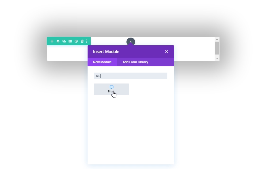
Delete module texts from settings and add the following icon.
- Use Icon: YES
- Icon: “x” icon (see screenshot)
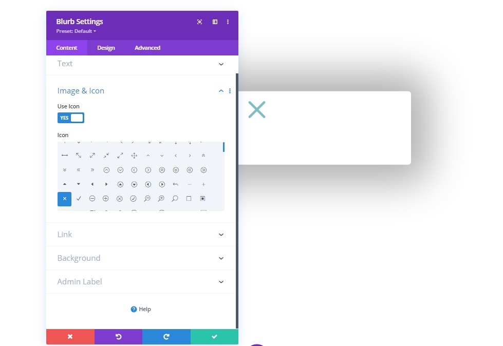
Apply the following settings from the design tab.
- Icon Color: #004e43
- Image/Icon Alignment: Centered
- Use Icon Font Size: YES
- Icon Font Size: 50px
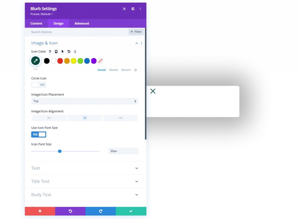
- Width: 50px
- Module Alignment: Right
- Height: 50px
Add a CSS class to the blurb module from the advanced tab.
- CSS Class: et-toggle-popup
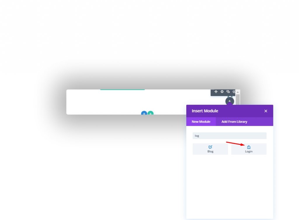
Part 4: Creating The Form
Our login form has two designs, one for logging in and another for logging out. So, there will be two different login form modules. The first one will appear when a user is logged out and needs to log in, and another is the user is logged in and want to log out. Easy concept, let's get back to work.
Creating Logged Out Form
Let's add a login module to create our logged out form.
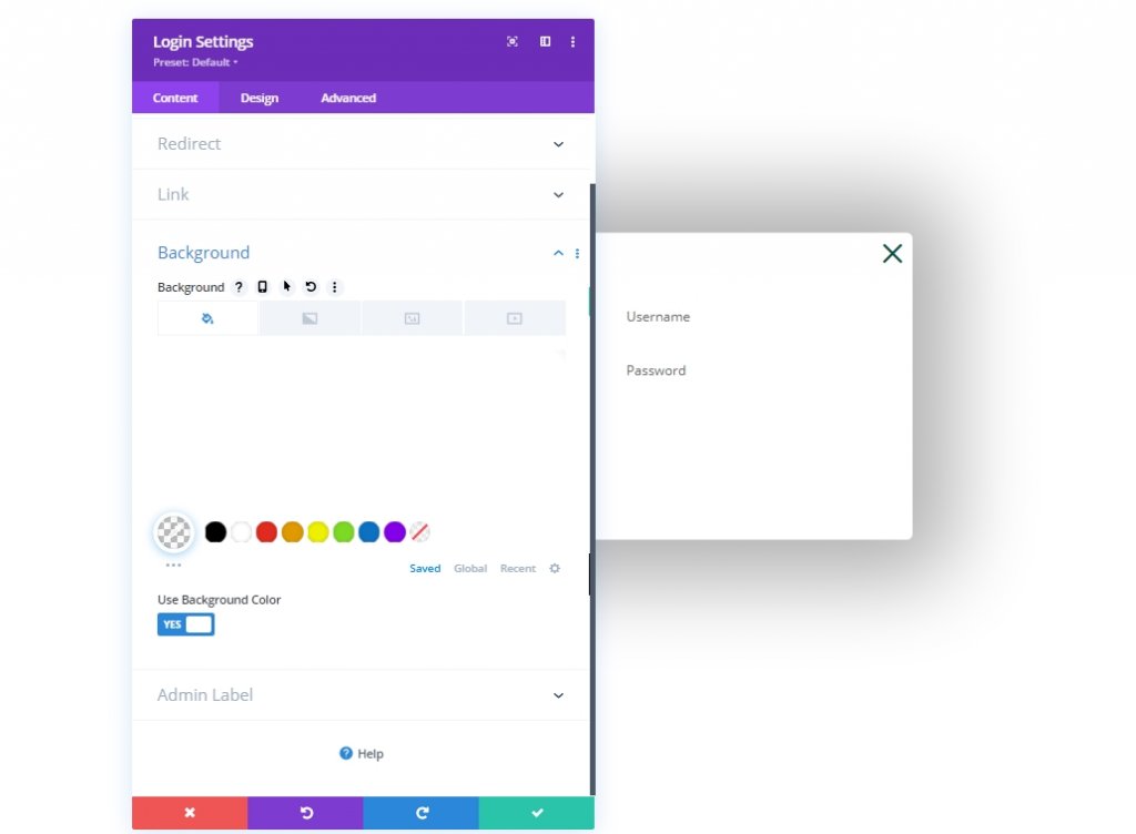
Now open the settings of the form module and modify on the content tab.
- Redirect To The Current Page: YES
- Use Background Color: NO
Design Tab
- Fields Background Color: rgba(0,78,67,0.05)
- Fields Focus Background Color: rgba(0,78,67,0.15)
- Text Alignment: Center
- Text Color: Dark
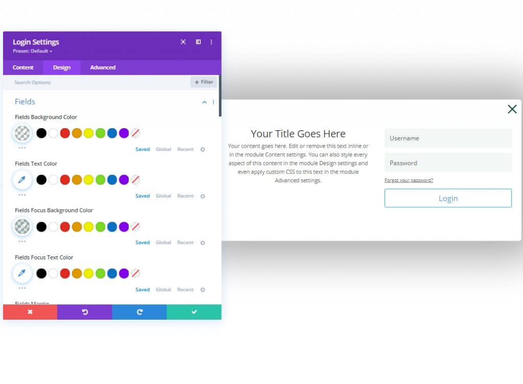
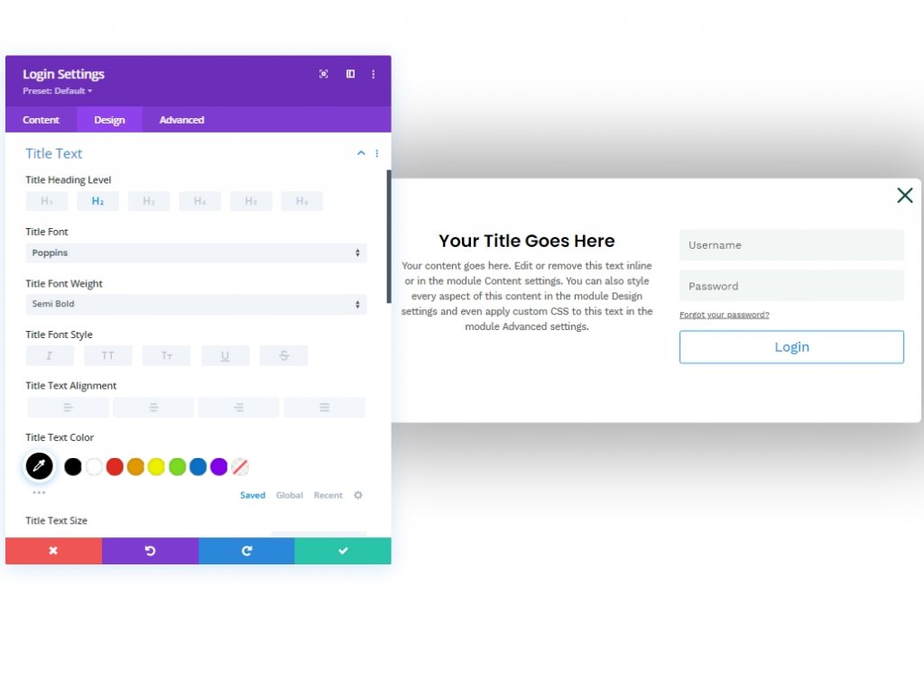
- Title Font: Poppins
- Title Font Weight: Semi Bold
- Title Text Color: #000000
- Title Line Height: 1.3em
- Body Font: Work Sans
Now let's get back to the header section from layers. Then, open the settings from for button from the 4th column of the 1st row. Move to the design tab and open the button option. Then, click on the three-dot option and select "copy button style".
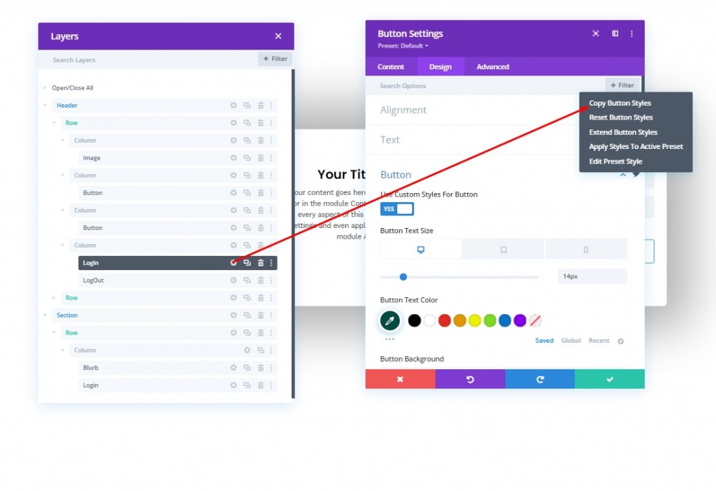
Now paste it to the login form we just created.
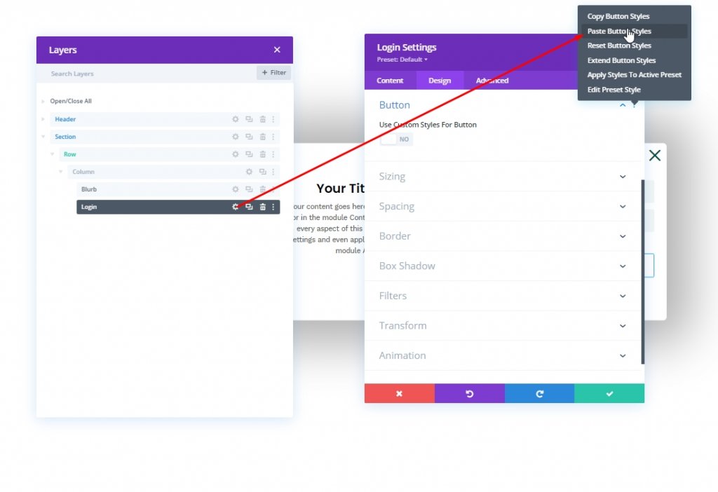
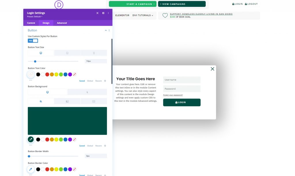
We'll update the button style for our login form.
- Use Custom Styles For Button: YES
- Button Text Color: #ffffff
- Button Background Color: #004e43
- Button Background Color (hover): #00683c
- Button Border Width: 0px
- Button Padding: 15px top, 15px bottom
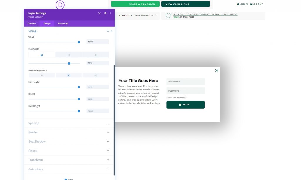
Let's upload the sizing settings too.
- Width: 100%
- Max Width: 80% (desktop), 90% (tablet), 95% (phone)
- Module Alignment: Center
Now move to the advanced tab and add CSS class and custom CSS as written below.
- CSS Class: et-logged-out-form
Add the following code to the Login description box.
width: 100% !important;
float: none !important;
Then add this code to the Login Form box.
width: 100% !important;
padding: 0px !important;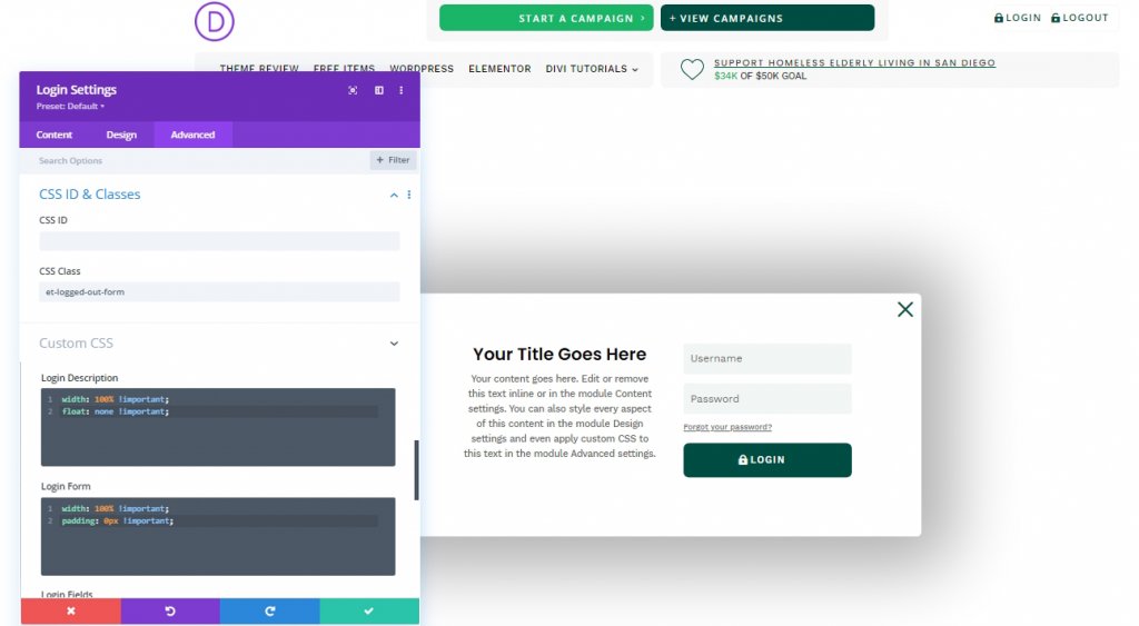
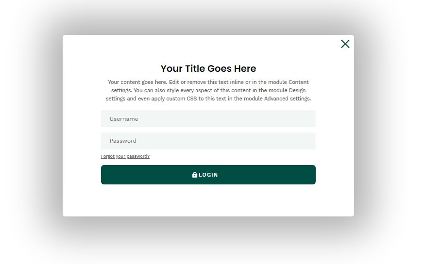
This makes the login form something like this.
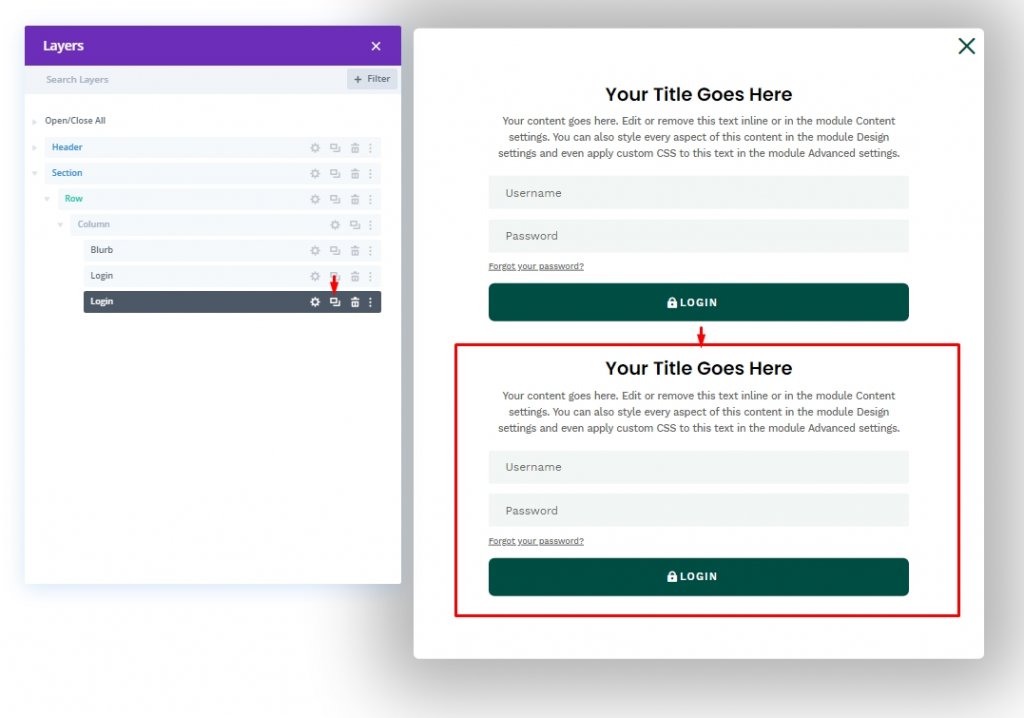
Creating the “Logged In” Form
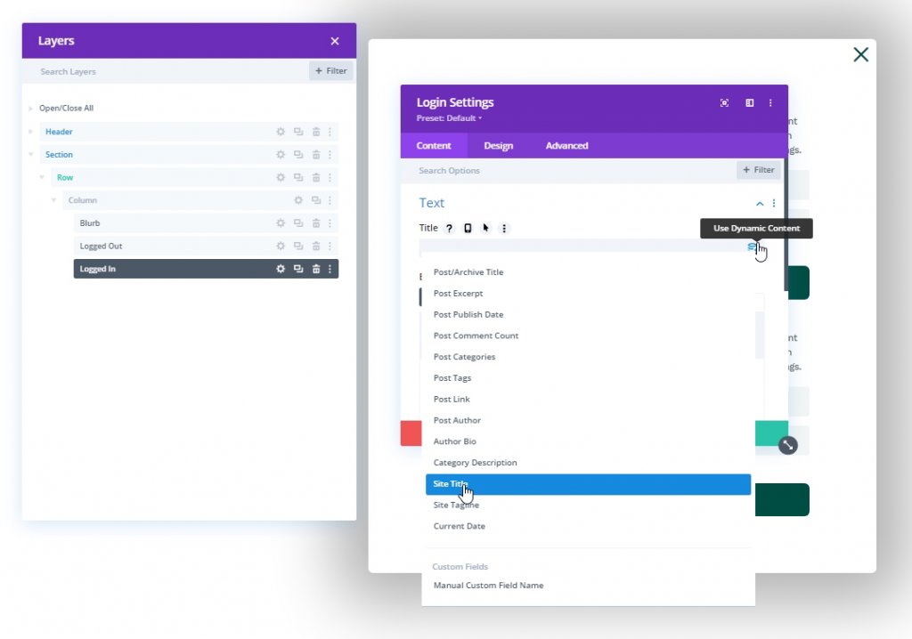
We are done with the "Logged Out" form and now let's create the "Logged In" form with different content to extend the user experience. To do that, let's clone the existing login form.
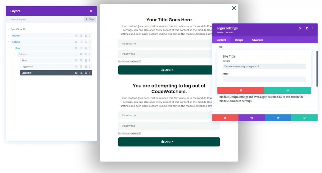
Now, update names for each form. Then open the "Logged In" form from the content tab open text setting. Then from the title box, you'll have a drop-down menu to the right side. Open it and select "Site Title".
Open dynamic site title settings and update them as follows.
- Before: “You are attempting to log out of “
- After: “. “
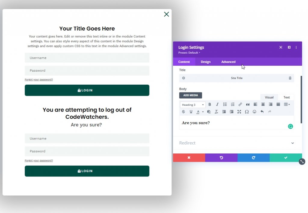
Now edit the description settings according to your choice, but please put the description as Header 3.
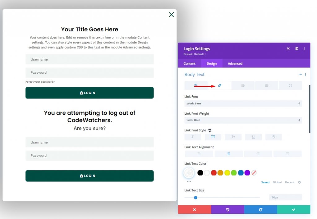
In many website login forms, we have seen a custom message attached to the "logout" link. We'll customize the body text option from the advanced tab to create that.
- Select the link tab under body text options.
- Link Font: Work Sans
- Link Font Weight: Semi Bold
- Link Font Style: TT
- Link Text Alignment: center
- Link Text Color: #ffffff
Move to the advanced tab and add a CSS class and Custom CSS.
- CSS Class: et-logged-in-form
Custom CSS for Login Form:
display:none;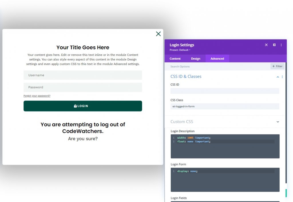
Part 5: Custom Codes
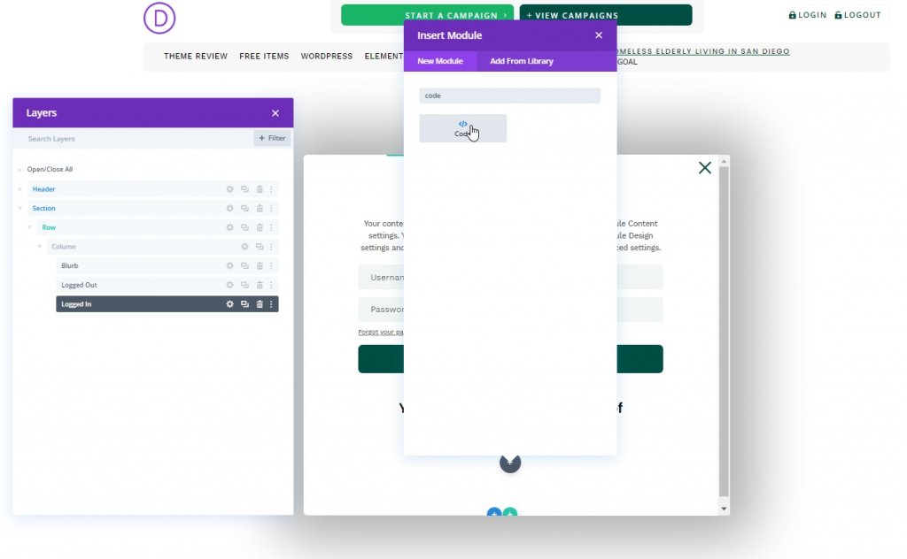
We need to add a code module to add custom codes. Let's add a code module under the last login module.
CSS Code
Add the given CSS code on the module within Style Tags.
/* hide popup section */
.et-popup-login {
  display: none;
}

/* hide login button when logged in */
.logged-in .et-popup-login-button {
  display: none !important;
}

/* hide logout button when logged out */
.et-popup-logout-button {
  display: none !important;
}

/* show logout button when logged in */
.logged-in .et-popup-logout-button {
  display: inline-block !important;
}

/* hide logged out form when logged in */
.logged-in .et-logged-out-form {
  display: none !important;
}

/* hide logged in form when logged out */
.et-logged-in-form {
  display: none !important;
}

/* show logged in form when logged in */
.logged-in .et-logged-in-form {
  display: block !important;
}

/* style logout link within logged in form */
.et-logged-in-form a {
  display: block;
  padding: 15px 1em;
  border-radius: 8px;
  background: #004e43;
  max-width: 400px;
  margin: 20px auto 0px;
}
.et-toggle-popup {
  cursor: pointer;
}

/* show hidden elements in visual builder */
body.et-fb .et-popup-login,
body.et-fb .et-logged-out-form {
  display: block !important;
}
body.et-fb .et-popup-login-button {
  display: inline-block !important;
}
JQuery Code
Now ass the following JQuery code on the module within Script Tags.
(function ($) {
  $(document).ready(function () {
    $(".et-toggle-popup").click(function (e) {
      e.preventDefault();
      $(".et-popup-login").fadeToggle(500);
    });
  });
})(jQuery);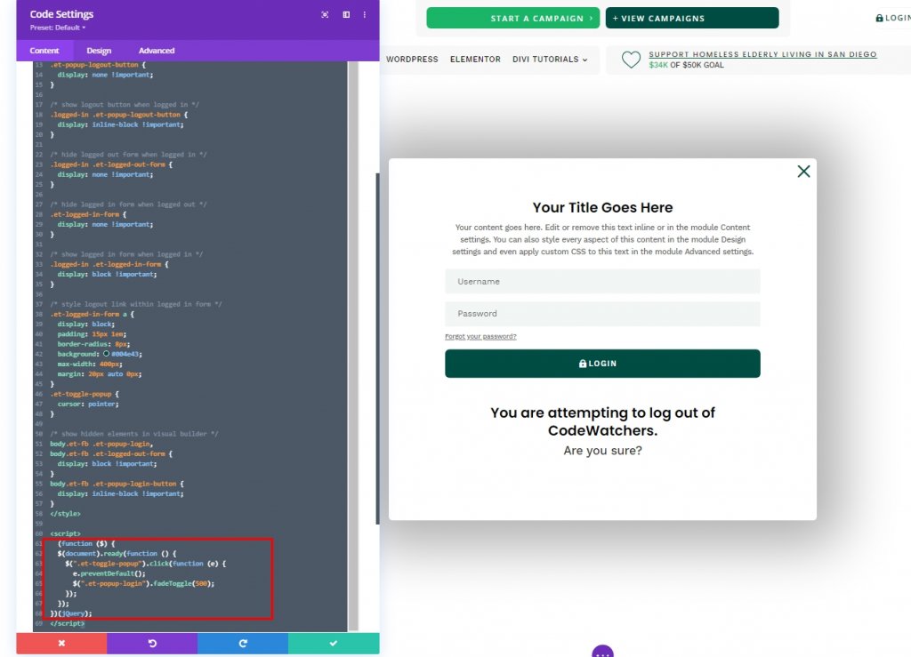
Design Result
So, here is the outcome of our design. Everything is in place and works perfectly.
Final Words
Today you saw how to design a creative custom login form with Divi's login module. This way, you can match the website aesthetics on a custom login panel. I hope you'll find this tutorial useful, and if so, a share will be splendid!