
"Frequently Asked Question(FAQ)" is a special section where a service provider shares important information or clarifies doubts that people usually ask. This is a vital section for any website that provides any service because people usually visit their first to find answers to their queries. A FAQ page with creative design is a great way to tell how beauty thirsty you are, and at the same time, you care about their inquires.
FAQ section is a fixed section with several questions and answers. It is essential to keep them organized. In today's tutorial, we will learn how we can use Divi to design a creative FAQ section with clickable tabs.
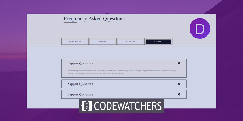
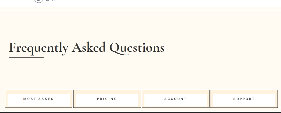
Sneak Peek
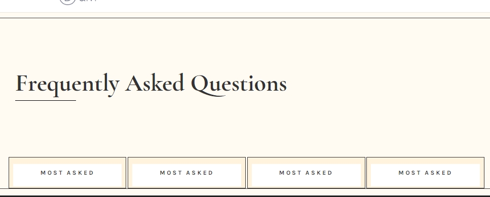
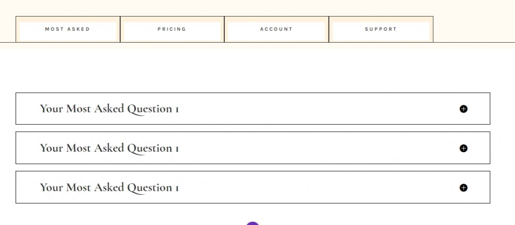
This is how our final design will look like.
Building The Structure
Add: Section 1
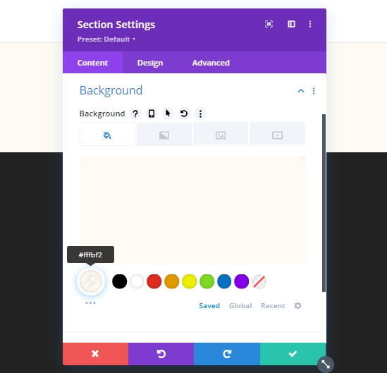
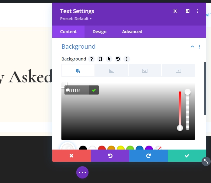
Background Color
We will start by adding a background color on the initial section of our working page. Open the section settings and apply the background color.
Create Amazing Websites
With the best free page builder Elementor
Start Now- Background Color: #fffbf2
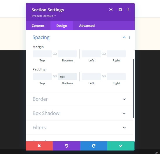
Spacing Settings
We'll make some adjustments on spacing.
- Bottom Padding: 0px
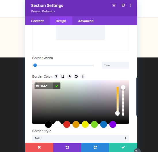
Border Settings
Now, we will apply a custom border to the section.
- Border Width: 1vw
- Border Color: #fffbf2
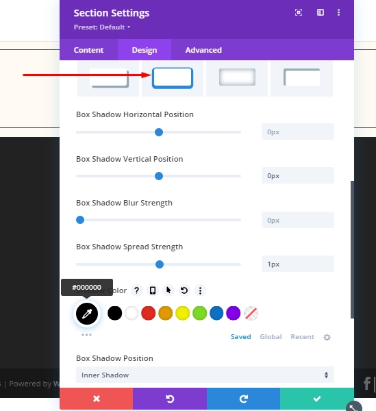
Box Shadow Settings
Add a box shadow.
- Box Shadow Vertical Position: 0px
- Box Shadow Spread Strength: 1px
- Shadow Color: #000000
- Box Shadow Position: Inner Shadow
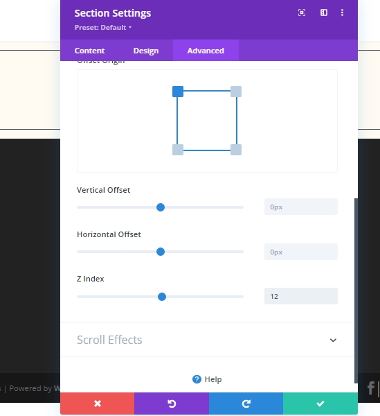
Z Index Settings
Increase the Z-index value in advanced tab and we are done with this section settings.
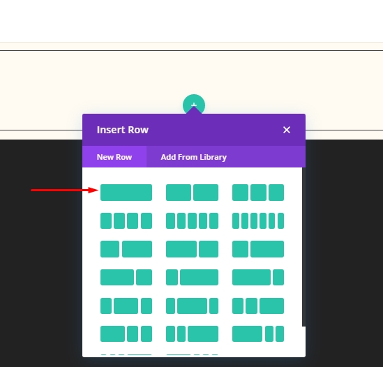
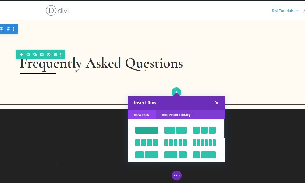
Add: Row 1 On Section 1
Column Structure
Add a new row (mentioned in the image) to the newly finished section.
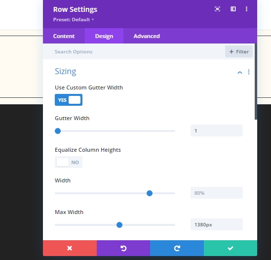
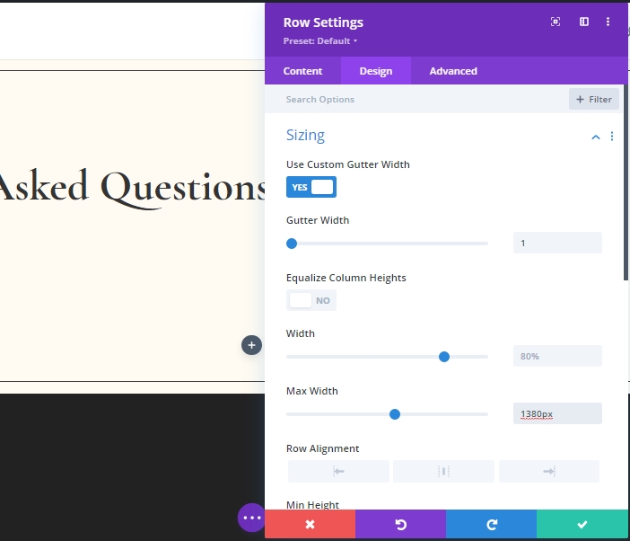
Sizing Settings
Open the row settings and make the following adjustments.
- Use Custom Gutter Width: Yes
- Gutter Width: 1
- Max Width: 1380px
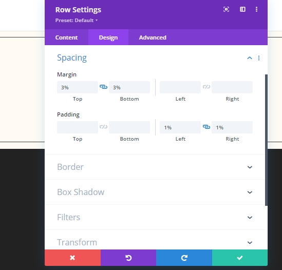
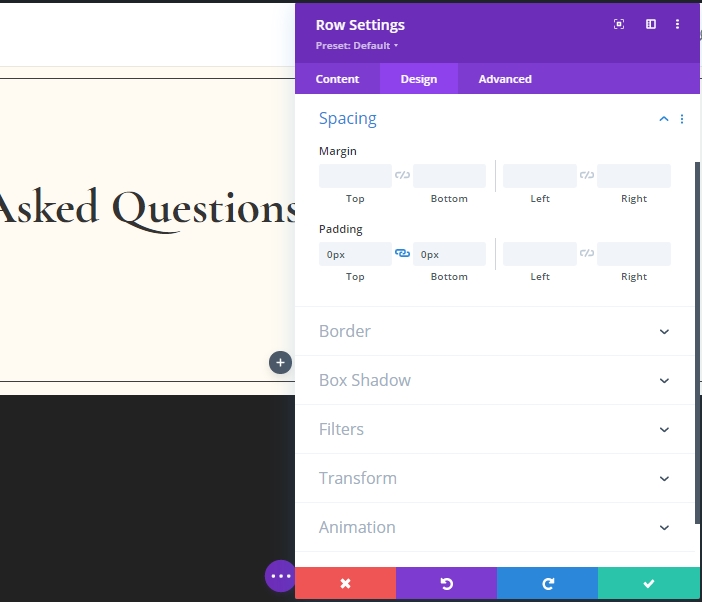
Spacing Settings
Make some adjustments on the spacing tabs too!
- Top Margin: 3%
- Bottom Margin: 3%
- Left Padding: 1%
- Right Padding: 1%
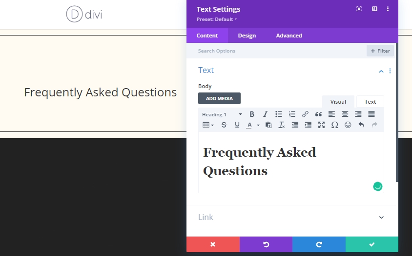
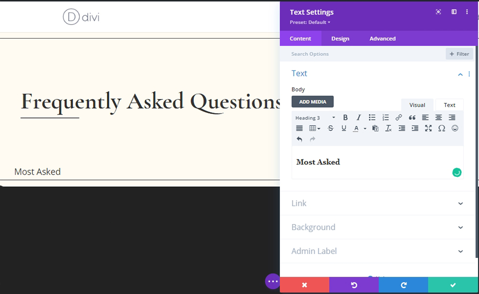
Add: Column Text Module
H1 Content
Add a text module to the row and add some H1 tag.
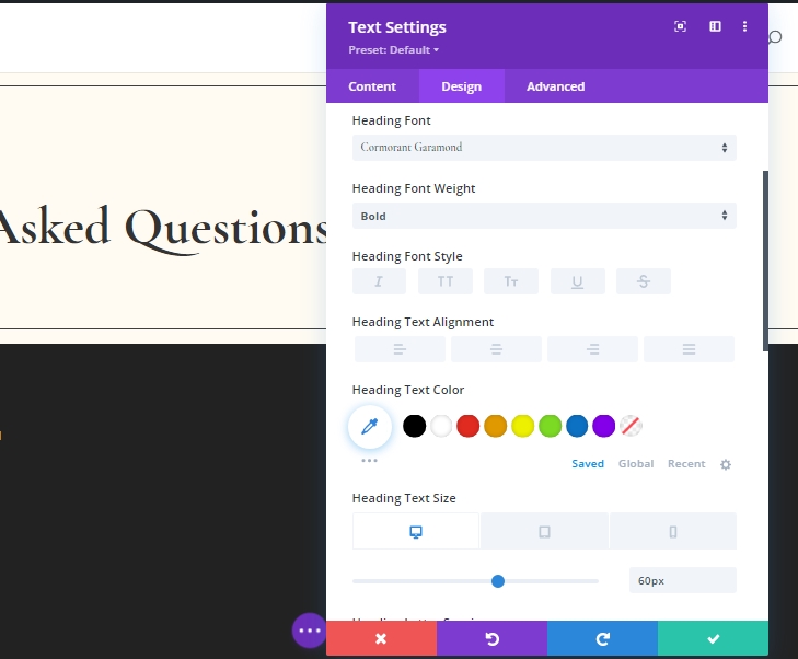
H1 Text Settings
Modify the H1 texts settings.
- Heading Font: Cormorant Garamond
- Heading Font Weight: Bold
- Heading Text Size: Desktop: 60px, Tablet: 42px, and Phone: 36px
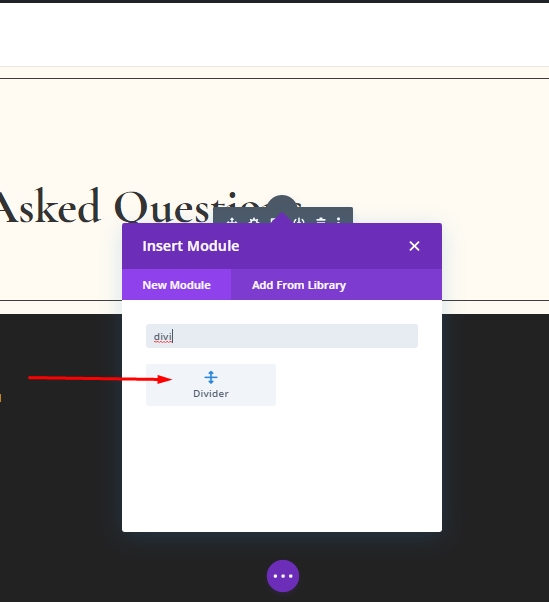
Add: Divider Module On Column
Add a divider module below text module.
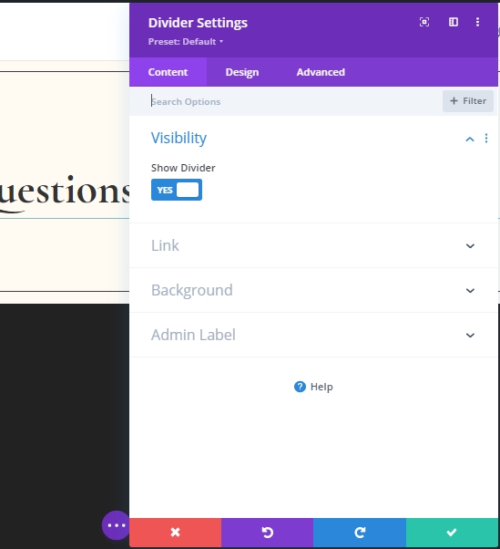
Visibility Setting
Ensure that Show Divider Option is enabled.
- Show Divider: Yes
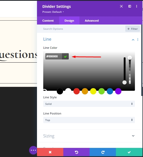
Line Settings
Switch to the design tab and change the color of the divider.
- Line Color: #000000
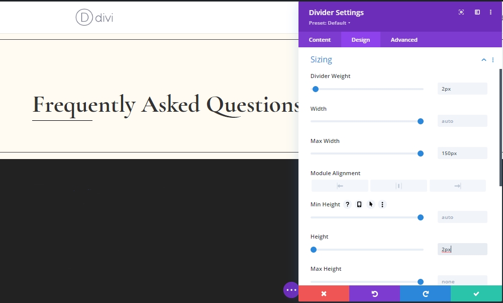
Sizing Settings
Below line settings, make some adjustments to sizing.
- Divider Weight: 2px
- Max Width: 150px
- Height: 2px
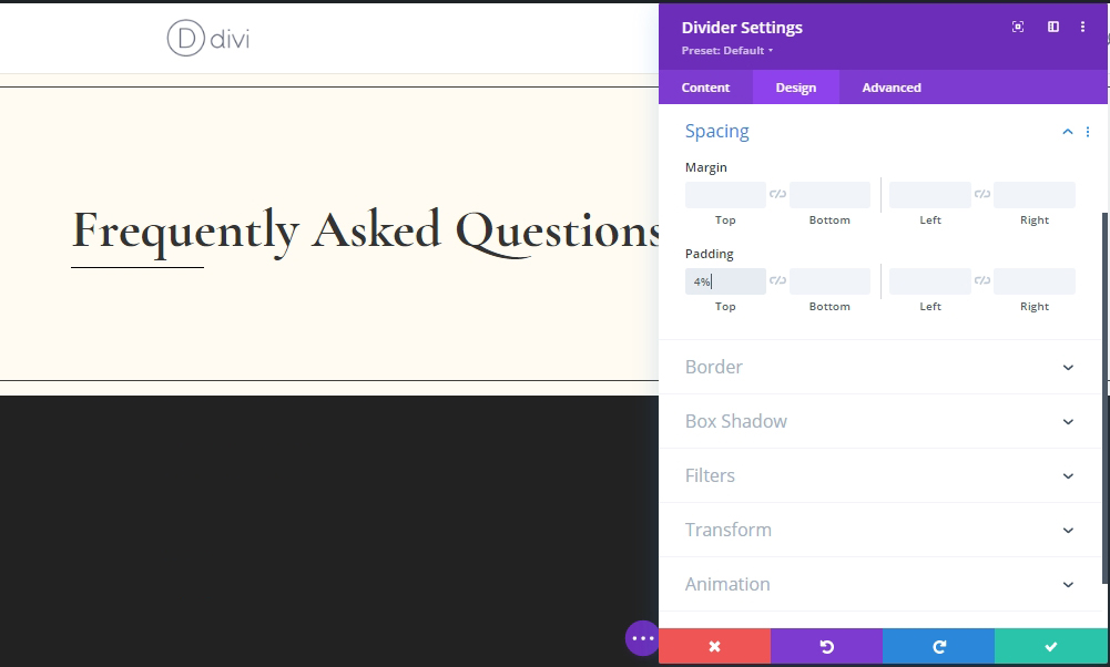
Spacing Settings
Now, add some margin from the spacing settings.
- Top Margin: 4%
Add: Row 2 On Section 1
Column Structure
Add a 2nd row below the 1st one with same column structure.
Sizing Settings
Change the sizing settings of newly created row from design tab.
- Use Custom Gutter Width: Yes
- Gutter Width: 1
- Max Width: 1380px
Spacing Settings
Make some little adjustments on spacing section too.
- Top Padding: 0px
- Bottom Padding: 0px
Add: Column Text Module 1
H3 Content
Add a new Text module and add some H3 content.
Background Color
Add a background color.
- Background Color: #ffffff
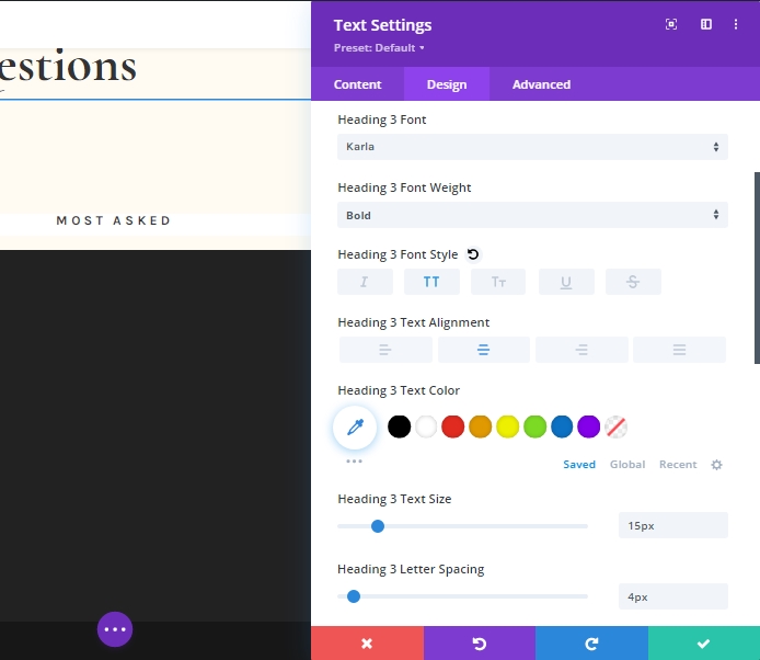
H3 Content Settings
Make these settings to H3 text.
- Heading 3 Font: Karla
- Heading 3 Font Weight: Bold
- Heading 3 Font Style: Uppercase
- Heading 3 Text Alignment: Center
- Heading 3 Text Size: 15px
- Heading 3 Letter Spacing: 4px
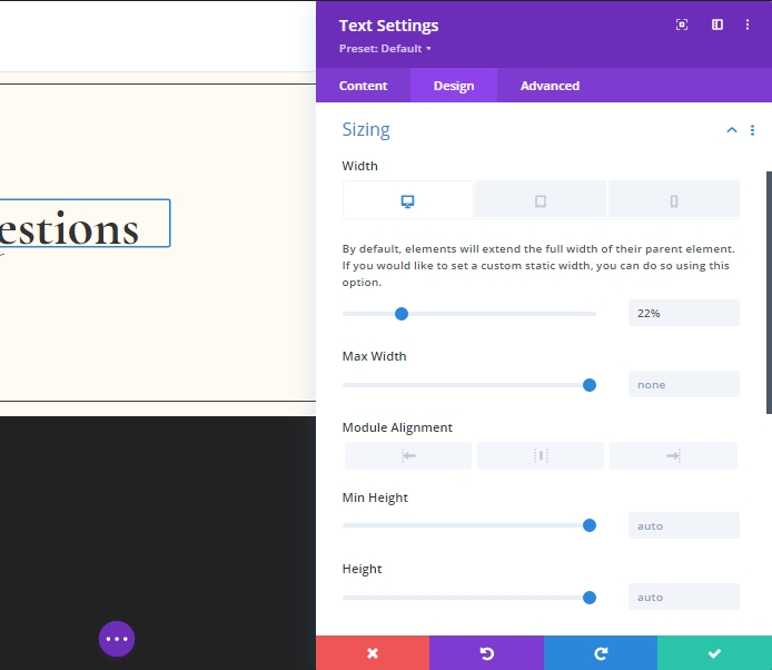
Sizing Settings
Change the sizing settings for different screen sizes.
- Width: Desktop - 22%, Tablet & Mobile - 44%
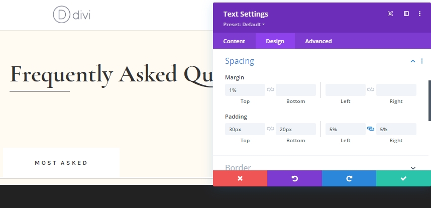
Spacing Settings
Customize spacing values.
- Right Margin: 1%
- Top Padding: 30px
- Bottom Padding: 20px
- Left Padding: 5%
- Right Padding: 5%
Border
Add a border to our running design.
- Border Width: 1px
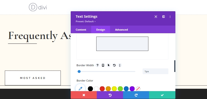
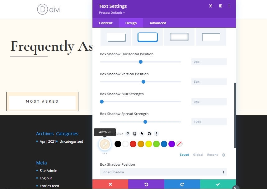
Box Shadow
Add a box shadow to make the design more vibrant.
- Box Shadow Vertical Position: 0px
- Shadow Color: #fff3dd
- Box Shadow Position: Inner Shadow
Main Element CSS
As a final task for this text module, we will add a custom CSS code from the advanced tab. This CSS will combine with the entire text design and allow to display multiple module side by side of the same category
display: inline-block;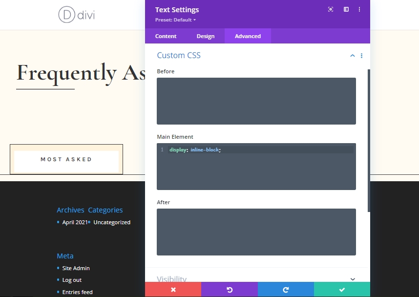
Duplicate The Text Module 3 Times
Now clone the newly finished text module 3 times.
Change Content On Cloned Modules
Now change the content on cloned modules according to you need.
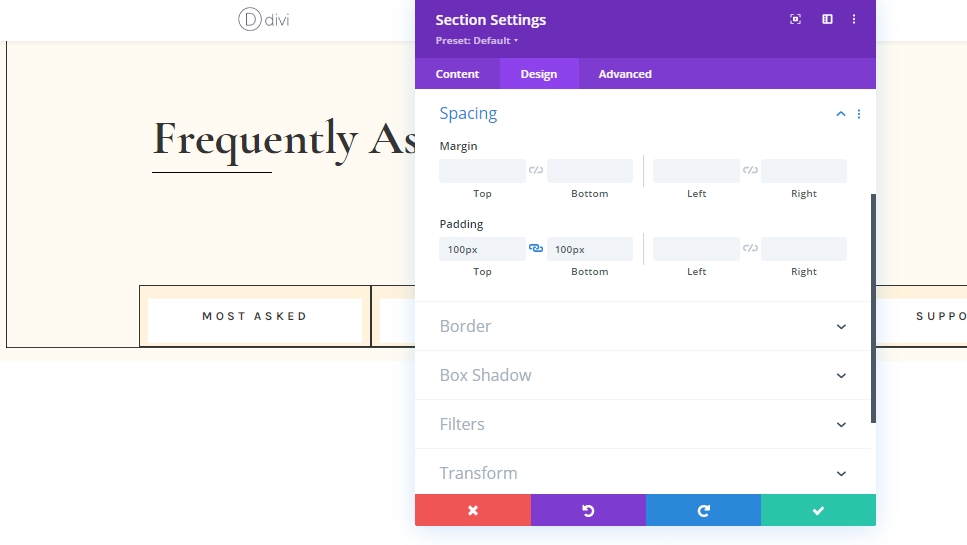
Add: Section 2
Spacing
Now, add a "Regular" section right beneath the previous one and change the spacing settings from the design tab.
- Top Padding: 100px
- Bottom Padding: 100px
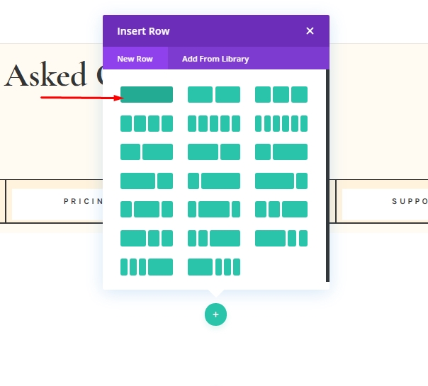
Add: Row 1 On Section 2
Column Structure
Now, add a new row to this section. Use the column structure marked on the image.
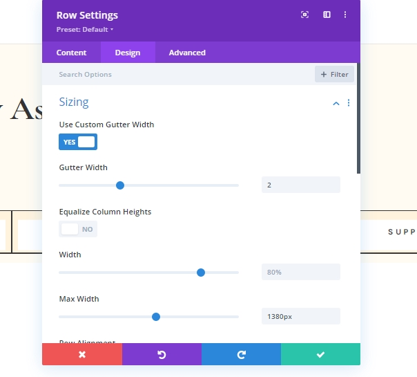
Sizing Settings
Open the row settings and make adjustments on sizing from design tab.
- Use Custom Gutter Width: Yes
- Gutter Width: 2
- Max Width: 1380px
Add: Toggle Module 1 On Column
Add Content
Add a Toggle module on the row and add content.
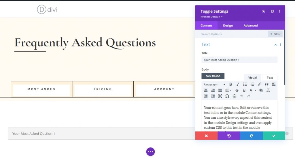
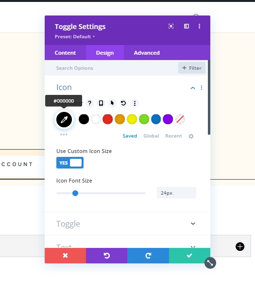
Icon Settings
From the design tab, make adjustments on icon settings.
- Icon Color: #000000
- Use Custom Icon Size: Yes
- Icon Font Size: 24px
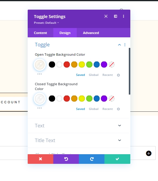
Toggle Settings
Change the toggle settings .
- Open Toggle Background Color: #fffbf2
- Closed Toggle Background Color: #ffffff
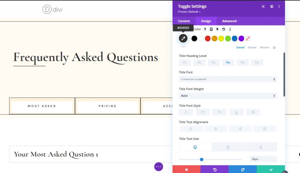
Title Text
Its time for customize the title text.
- Open Title Text Color: #333333
- Title Text Color: #333333
- Title Heading Level: H4
- Title Font: Cormorant Garamond
- Title Font Weight: Bold
- Title Text Size: Desktop: 36px, Tablet: 34px, and Phone: 28px
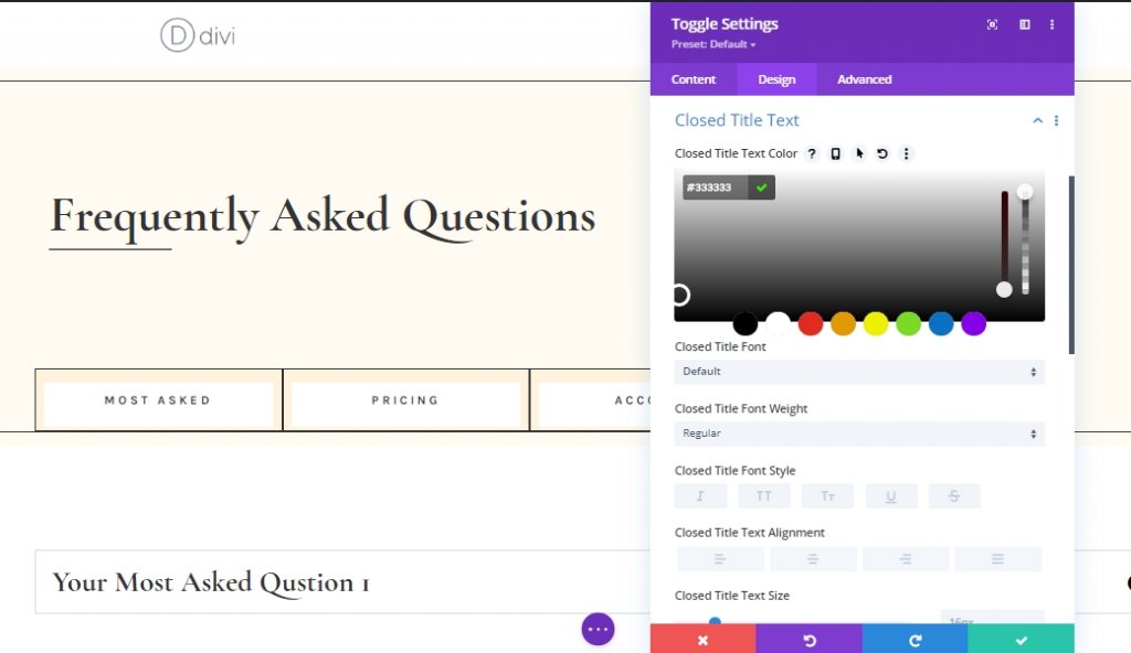
Closed Title Text
Change color for close title text.
- Closed Title Text Color: #333333
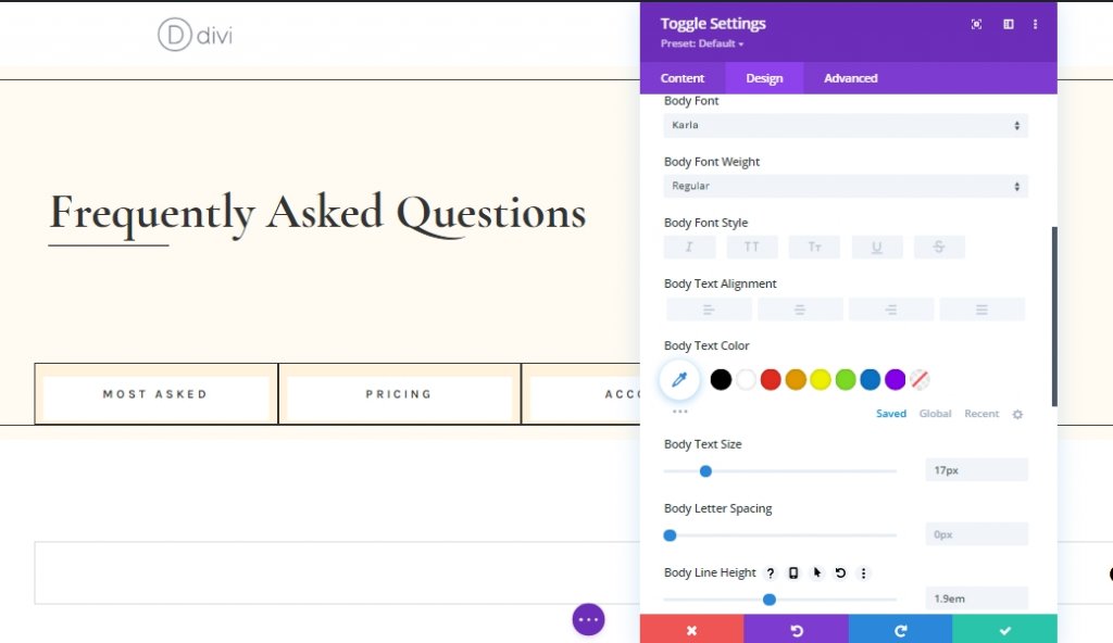
Body Text
We'll customize the body text too.
- Body Font: Karla
- Body Text Size: 17px
- Body Line Height: 1.9em
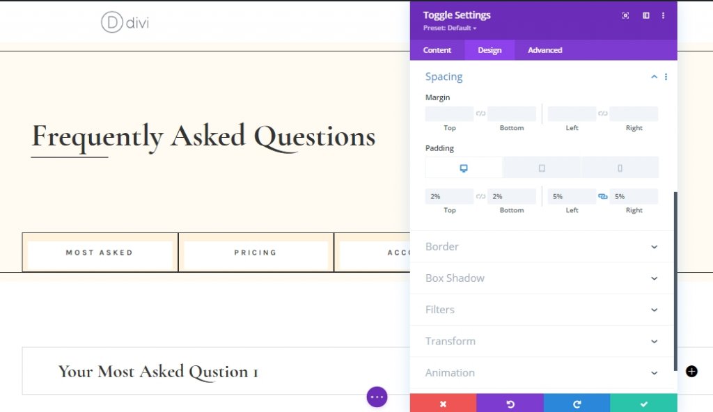
Spacing Settings
Now, change some spacing values to make it responsive.
- Top Padding: Desktop: 2%, Tablet: 4%, and Phone: 6%
- Bottom Padding: Desktop: 2%, Tablet: 4%, and Phone: 6%
- Left Padding: 5%
- Right Padding: 5%
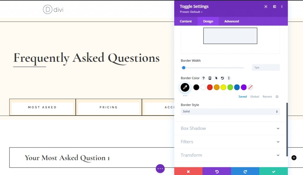
Border Settings
Then, change the border color into black.
- Border Color: #000000
Toggle Content CSS
From the advanced tab, add a CSS code to the toggle content area.
margin-top: 30px;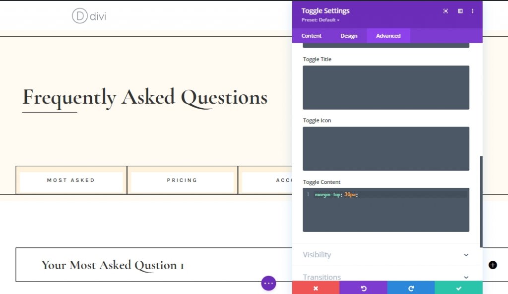
Duplicate The Toggle Module
As we are done with our first toggle module, clone it as many times you need.
Add Unique Content
Change all the content from cloned toggle modules. This way it will look more unique.

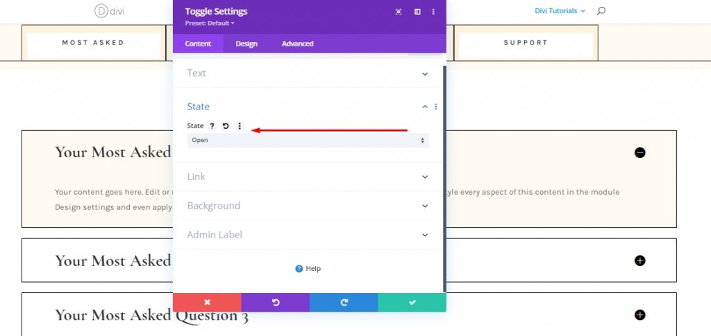
Toggle Module State Settings
Expand the Toggle module 1 and change the state.
- State: Open
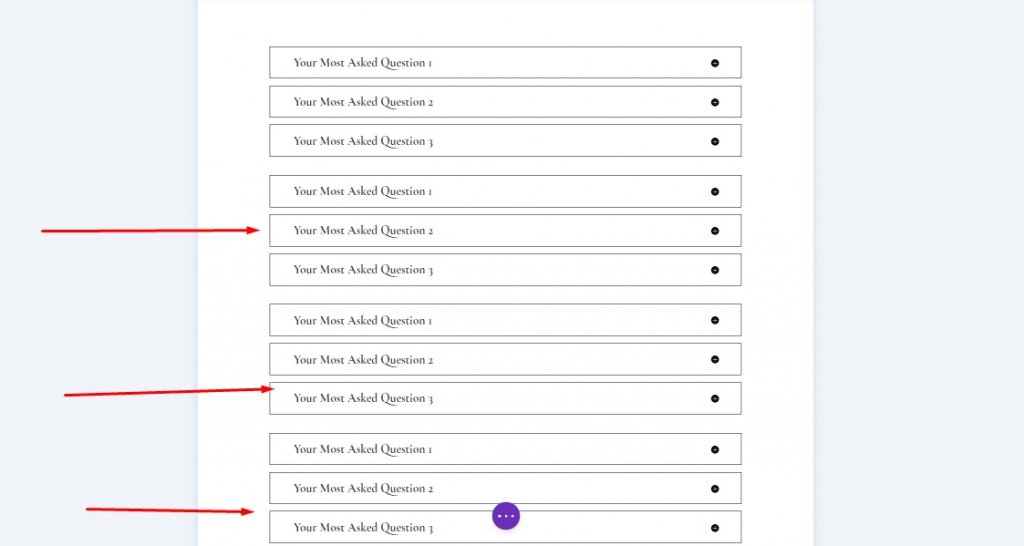
Duplicate Entire Row 3 Times
We have now completed our 1st set of toggle modules. Now we will clone it three times. There will be four toggle module rows. 4 rows for four sections we have created earlier.
Change Content On Duplicated Modules
Change content on cloned modules according to your need.
Functionality Adding
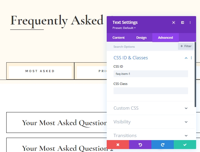
Section 1 Row 2: Consecutive CSS ID Adding
Now we will add some custom CSS ID to our modules. Here we are trying to make a design where a visitor will click on FAQ tabs, and the following FAQ toggles will expand. To make this design functional, open each text module from "Row 2 On Section 1" and add the following consecutive CSS IDs.
- Text Module #1: faq-item-1
- Text Module #2: faq-item-2
- Text Module #3: faq-item-3
- Text Module #4: faq-item-4
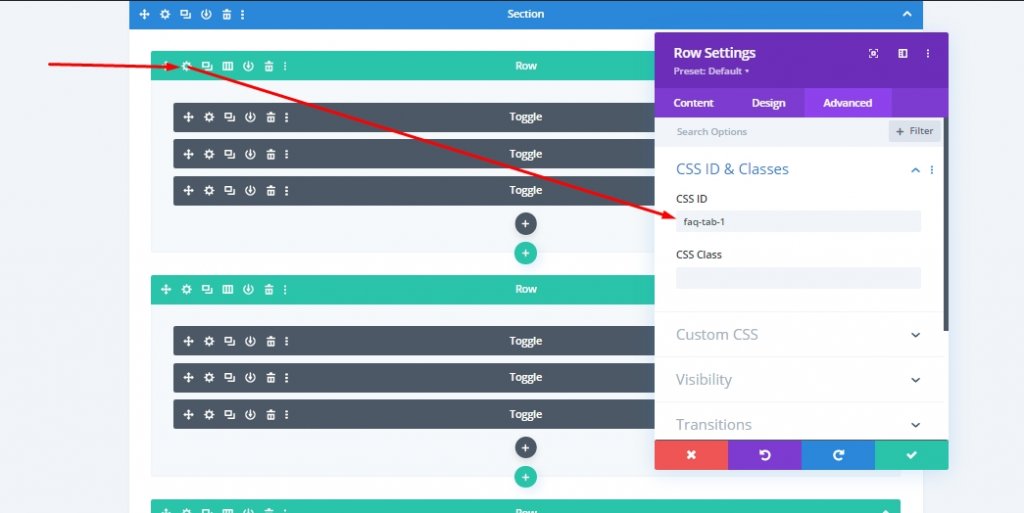
Section 2 All Row: Consecutive CSS ID Adding
Then we will add CSS IDs to all four rows that contains toggle module in Section 2. Also, we will maintain the same consecutive order.
- First Row: faq-tab-1
- Second Row: faq-tab-2
- Third Row: faq-tab-3
- Fourth Row: faq-tab-4
Add: Code Module To Row 1 On Section 1
Since we have rightly placed all the consecutive CSS IDs, we will now add some CSS and JQuery codes to our page. Add a new Code module in the 1st row of section 1 (below divider module).
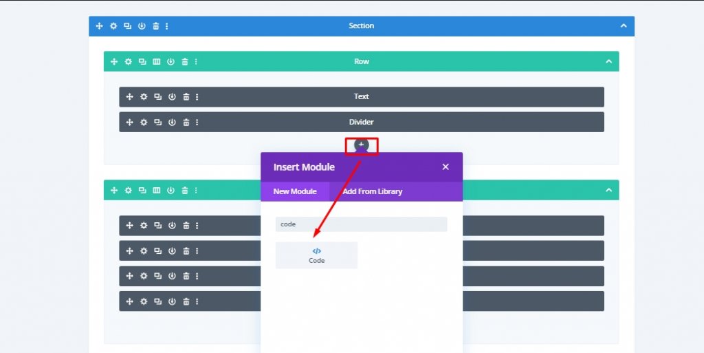
Make sure style and script tags are added in the advanced tab.
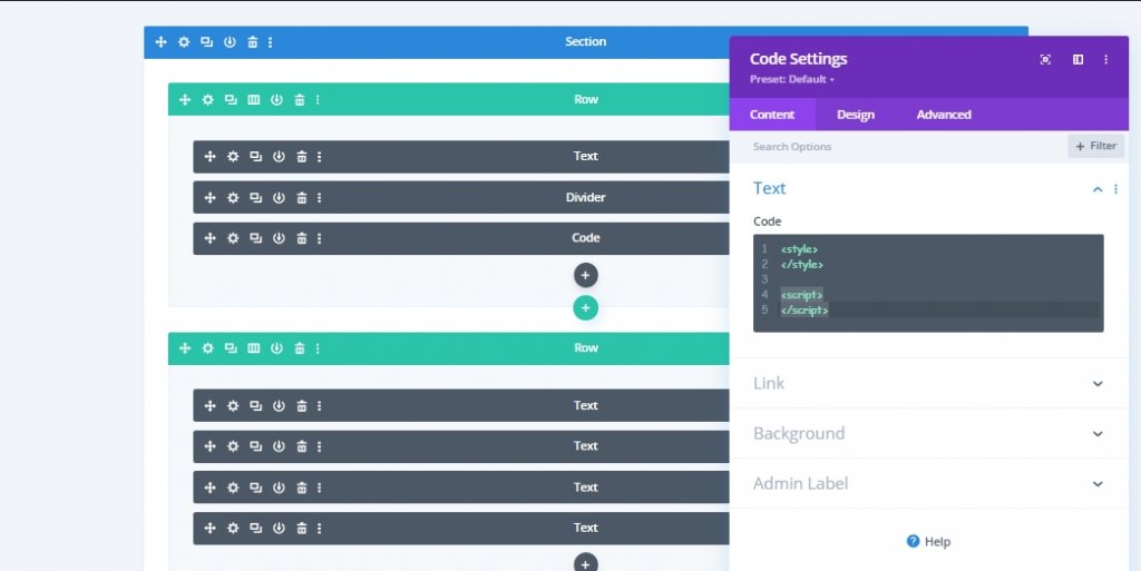
Add: CSS Code
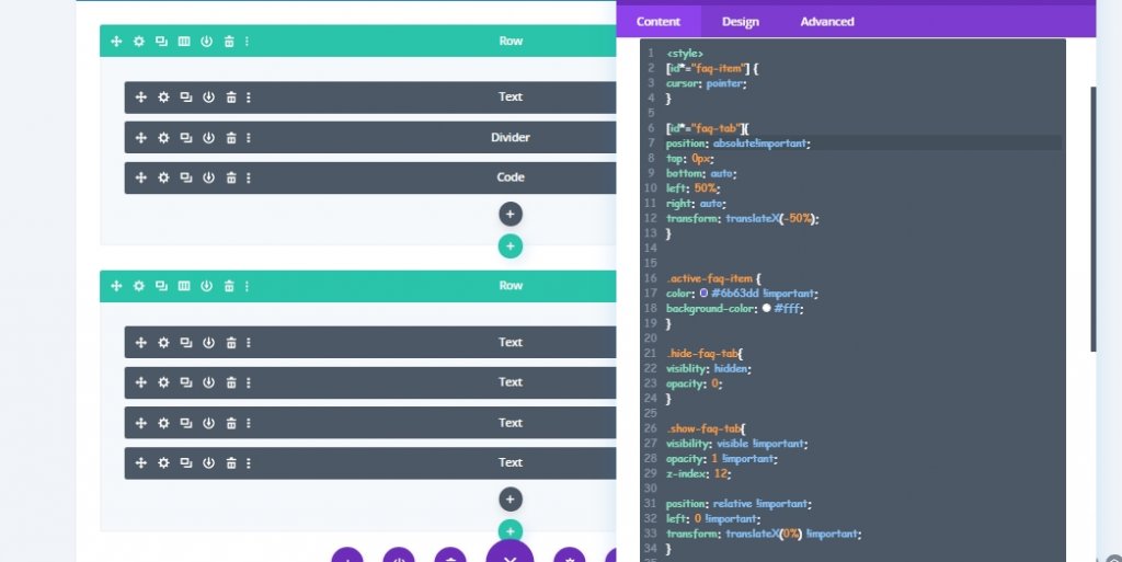
Copy and paste the following code between style tags.
[id*="faq-item"] {
cursor: pointer;
}

[id*="faq-tab"]{
position: absolute!important;
top: 0px;
bottom: auto;
left: 50%;
right: auto;
transform: translateX(-50%);
}


.active-faq-item {
color: #6b63dd !important;
background-color: #fff;
}

.hide-faq-tab{
visiblity: hidden;
opacity: 0;
}

.show-faq-tab{
visibility: visible !important;
opacity: 1 !important;
z-index: 12;

position: relative !important;
left: 0 !important;
transform: translateX(0%) !important;
}

.faq-item-active {
background-color: #000 !important;
color: #fff !important;
}

.faq-item-active h3{
color: #fff !important;
}
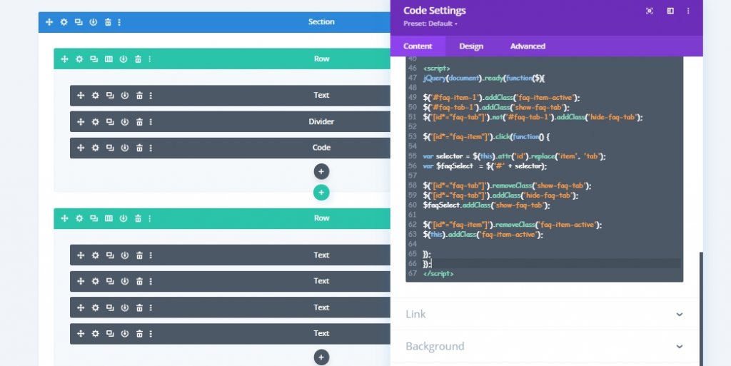
Add: JQuery Code
Now add some JQuery code between script tags.
jQuery(document).ready(function($){

$('#faq-item-1').addClass('faq-item-active');
$('#faq-tab-1').addClass('show-faq-tab');
$('[id*="faq-tab"]').not('#faq-tab-1').addClass('hide-faq-tab');

$('[id*="faq-item"]').click(function() {

var selector = $(this).attr('id').replace('item', 'tab');
var $faqSelect  = $('#' + selector);

$('[id*="faq-tab"]').removeClass('show-faq-tab');
$('[id*="faq-tab"]').addClass('hide-faq-tab');
$faqSelect.addClass('show-faq-tab');

$('[id*="faq-item"]').removeClass('faq-item-active');
$(this).addClass('faq-item-active');

});
});
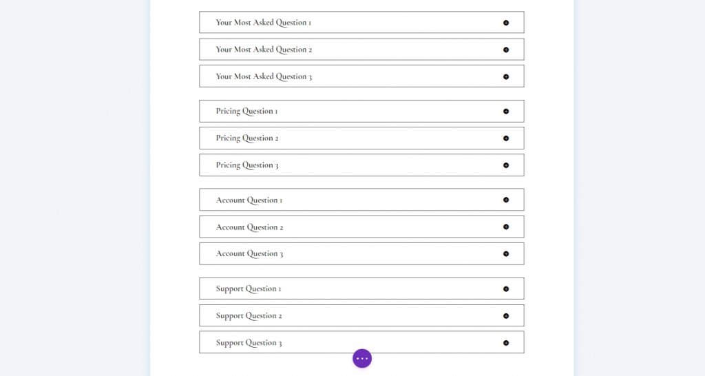
Final Result
We are done with the job, and our custom-designed FAQ section will look like this.
Final Words
We can make all types of beautiful designs through Divi, which will keep the visitors on the website for a long time. Today's interactive FAQ page design is one of those many. If you want to see more such Divi tutorials, let us know in the comments. Also, if you want us to do the tutorial of your choice, let us know. If you enjoyed today's tutorial, a share would inspire us to bring more tutorials for you.