
Have you ever thought about creating a page that has an extraordinary sticky heading anchor link navigation system on that very page? Well! Divi has opened the door of numerous possibilities for web devs. You can create all sorts of magnificent designs through Divi. Today we will design a content webpage that will allow our users to explore it via sticky headings as anchor links. The headings will sequentially stick at the top of the page, and visitors can click just on headings to jump right on the section. Sounds cool! Then let's get on to today's tutorial, where we'll be creating this style with Divi's built-in feature called -"Sticky Option."
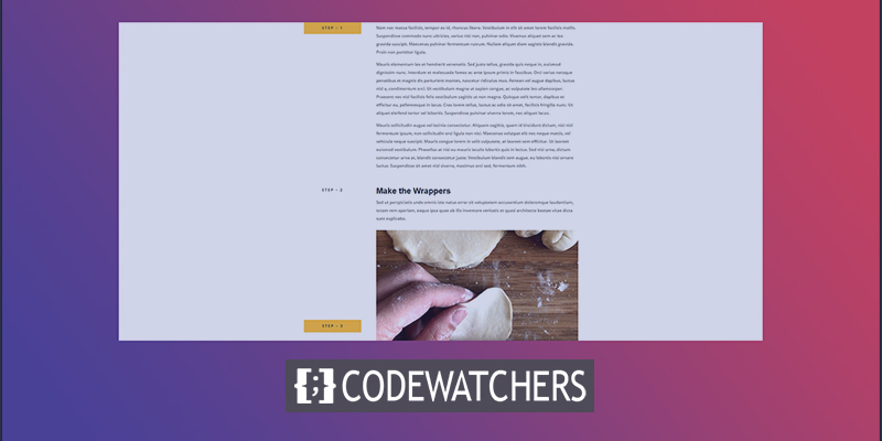
Design Preview
This is what our todays design will look like.
Section One: Getting Started
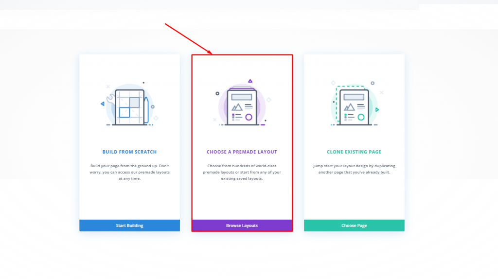
We believe you have successfully installed and activated the Divi theme. Now, add a new page from your dashboard and open it with Divi builder. Here we'll go with the second option that says, "Choose a premade layout."
We'll be looking from Meal Kit Layout Pack > Meal Kit Recipe Page Layout from the library. Click to pick it.
Create Amazing Websites
With the best free page builder Elementor
Start Now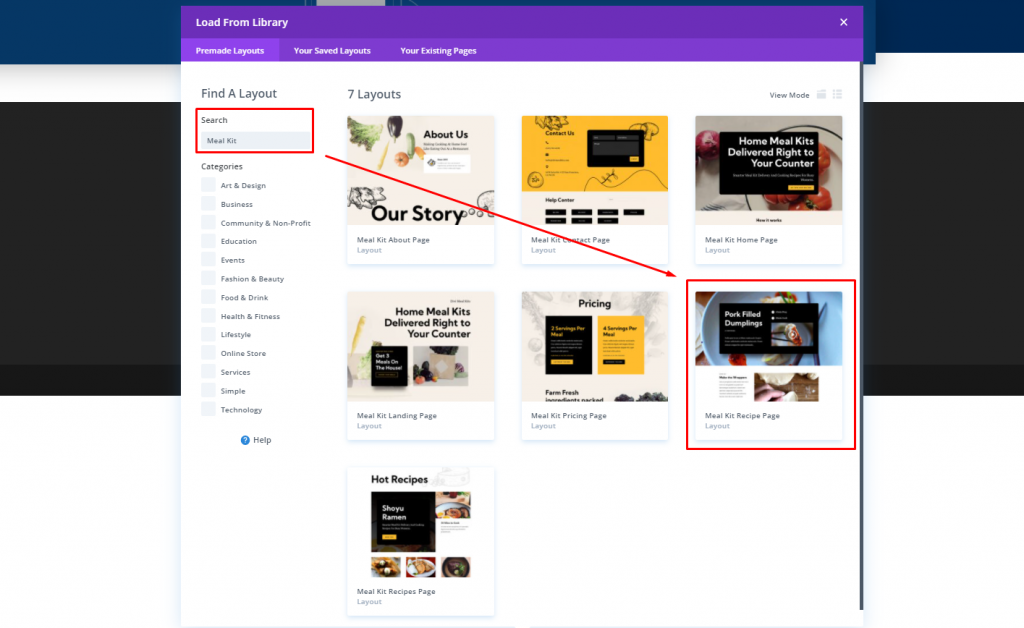
We'll activate the layout by "Use this Demo" option.

Section Two: Layout Modification
Delete The Rows
After you are done with layout importing, delete the last two bottom row.
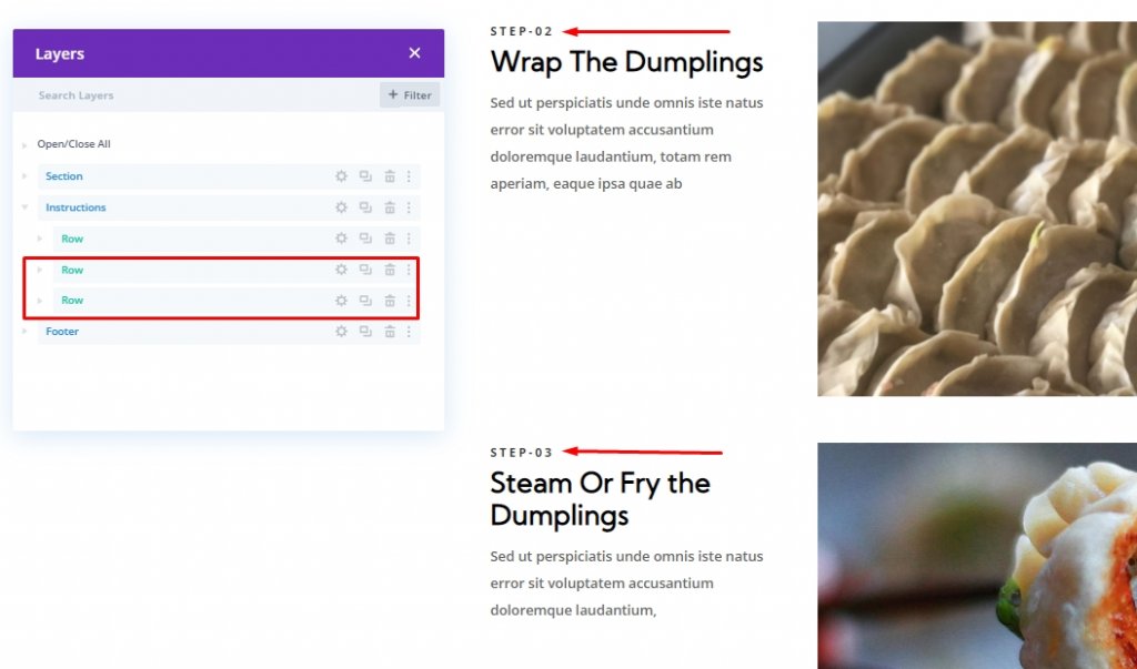
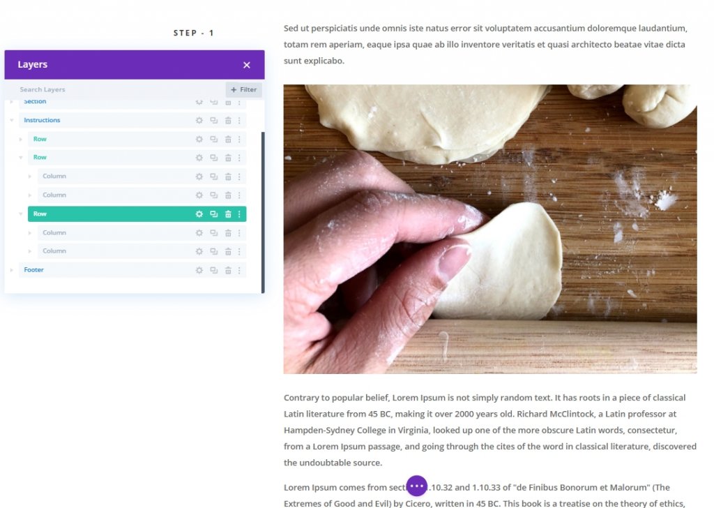
Now, you are left with one row called "Step-1".
New Row Creating & Content Adding
Add the marked row under the first one.
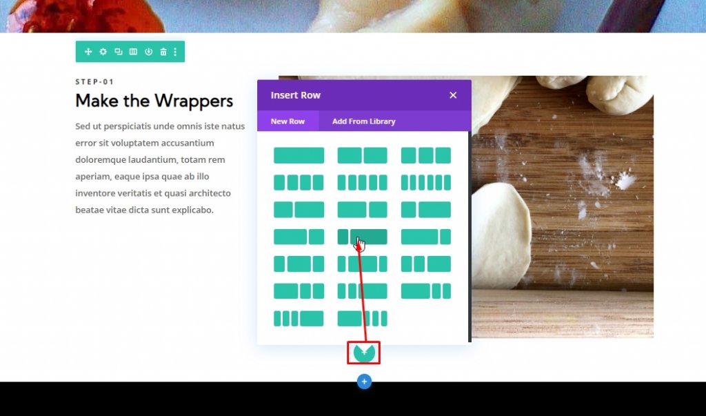
Now, select multiple module together and drag it to the newly created row.
Section Three: Creating Sticky Heading
In this layout, there will be four rows and each of those will contain a sticky header on their left column. We will create the first one and duplicate that for rest of the rows.
Step One: Create The Sticky Header For The First Row
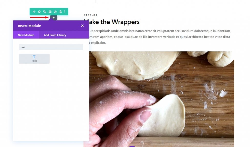
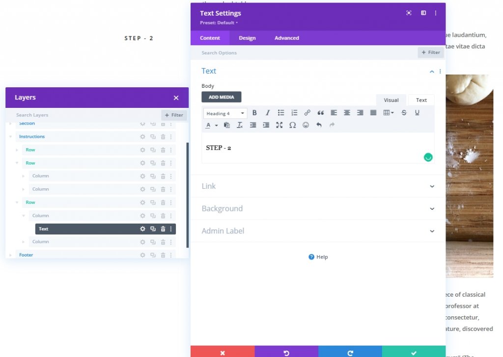
Add a text module to the left column. This will be our sticky heading for this row.
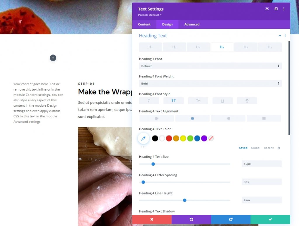
Now update the following settings under design tab. Make sure to do changes on H4 header.
- Heading 4 Font Weight: Bold
- Heading 4 Font Style: TT
- Heading 4 Text Alignment: Center
- Heading 4 Text Size: 15px
- Heading 4 Letter Spacing: 3px
- Heading 4 Line Height: 2em
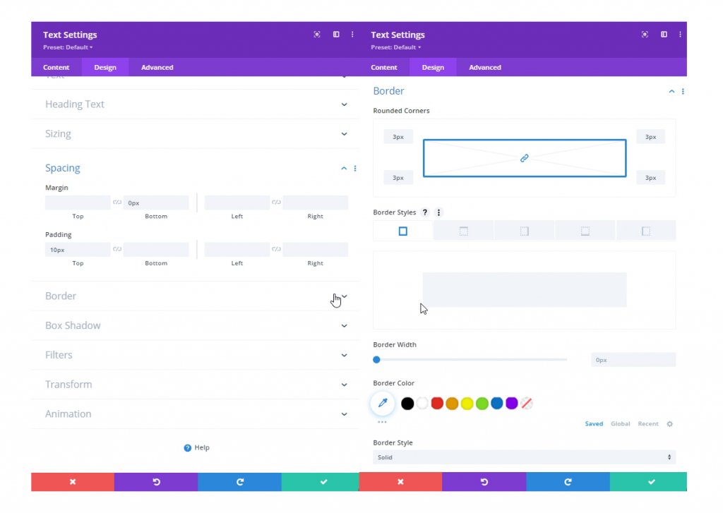
Also, update the spacing and rounded corner settings.
- Margin: 0px
- Padding: 10px
- Rounded Corners: 3px
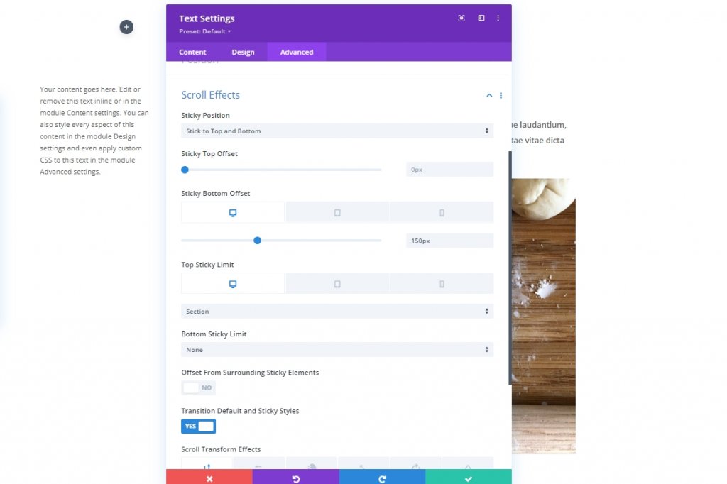
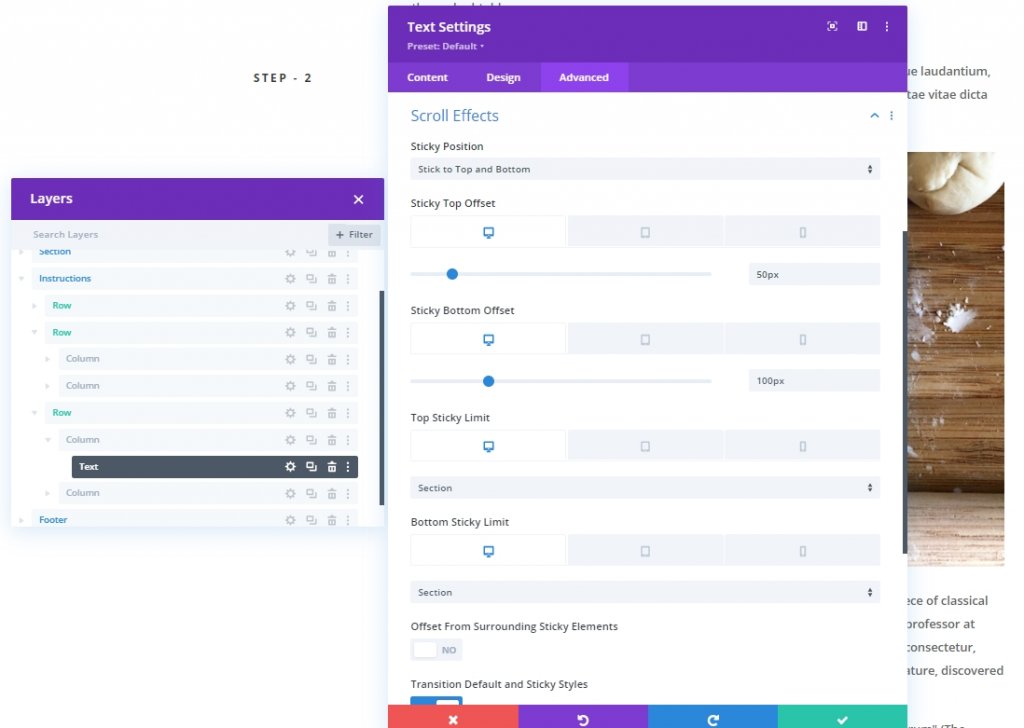
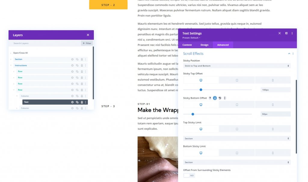
Under the advanced tab, update the following settings on sticky effects.
- Sticky Bottom Offset: 150px (desktop), 0px (tablet)
- Top Sticky Limit: Section (desktop), None (tablet)
- Bottom Sticky Limit: Section (desktop), Row (tablet)
- Offset From Surrounding Sticky Elements: NO
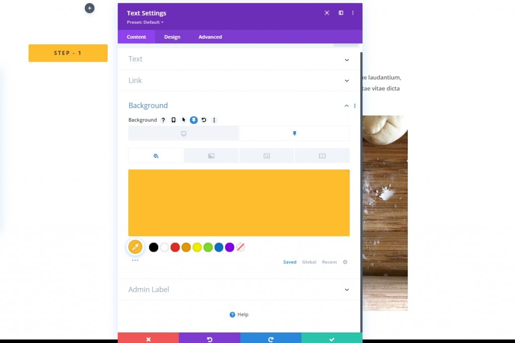
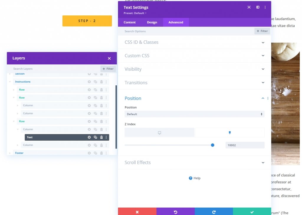
Now, go back to content tab and change the text as you need. Also put the text with H4 heading because earlier we modified H4 settings. Also, change the sticky background color.
- Sticky Background Color: #febd2d
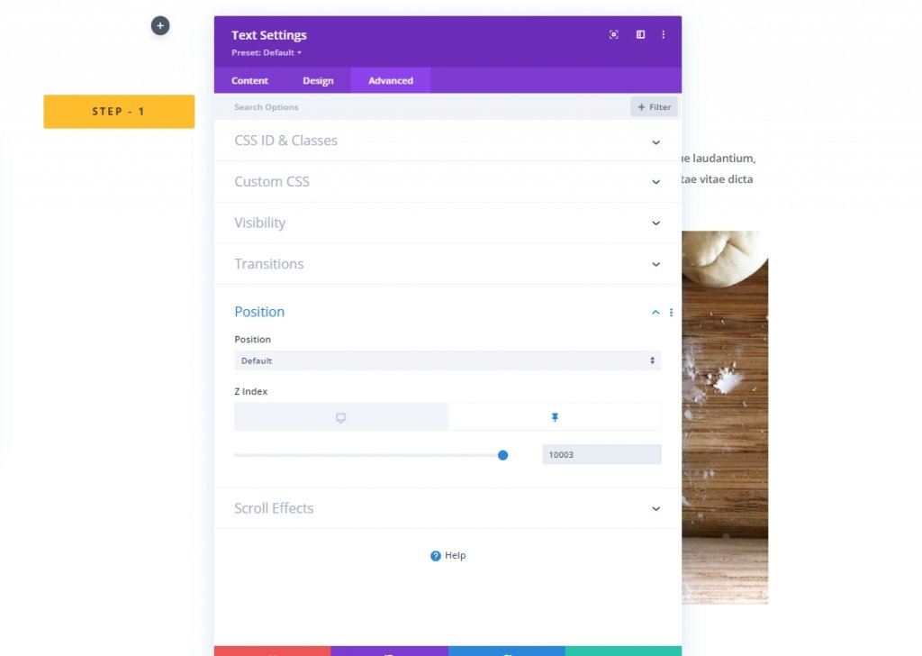
Go back to the advanced tab and update Z-index in sticky state. This will keep the text top on mobile devices.
- Z Index (sticky): 10003
Add More Content
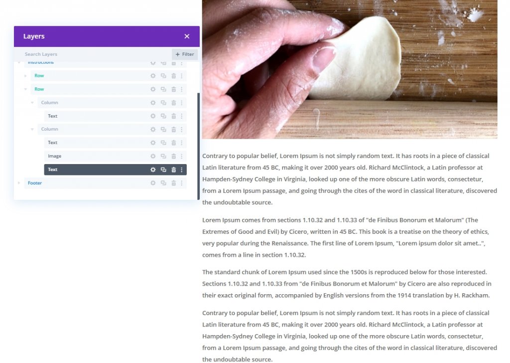
We need to attach some more content under the image so we have enough content to scroll through. So add another text module under the image and add some writings of your choice.
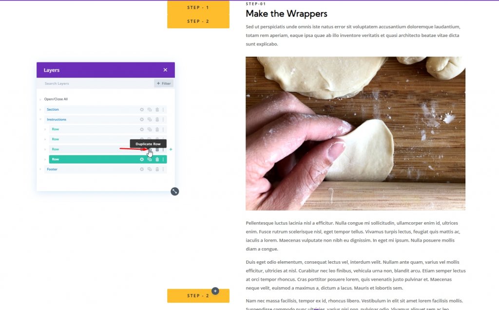
Duplicate Row 1
Finally, make a replica of row one by duplicating it.
Step Two: Create The Sticky Header For The Second Row
Now change the H4 heading in column 1.
Now change the sticky settings.
- Sticky Top Offset: 50px (desktop), 0px (tablet)
- Sticky Bottom Offset: 100px (desktop)
- Top Sticky Limit: Section (tablet)
Update the Z-index value.
- Z index(sticky): 10002
Duplicate Row 2
Then, again make a replica of row two by duplicating it.
Step Three: Create The Sticky Header For The Third Row
Again, change the H4 in column 1 and name it as Step - 3.

Now change the sticky options for the text.
- Sticky Top Offset: 100px (desktop)
- Sticky Bottom Offset: 50px (desktop)
Again, update the Z-index value for third row.
- Z index(sticky): 10001

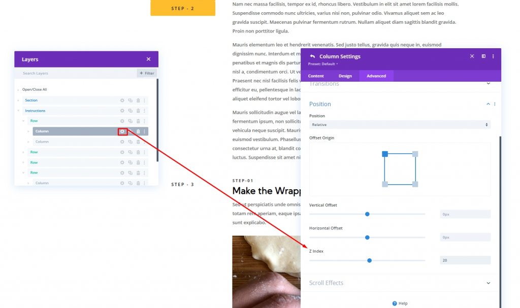
Update Z Index For Each Column One
We have already put a Z-index value to all the H4 headings. Now, we'll also update the value for each column that contains those sticky headings. Open each column and update the value.
- Row 1 > Column 1 : Z-index = 20
- Row 2 > Column 1 : Z-index = 19
- Row 3 > Column 1 : Z-index = 18
Section Three: Anchor Links For Sticky Headings
Now we'll assign CSS ID to the rows so that the user can easily operate the entire page via them.
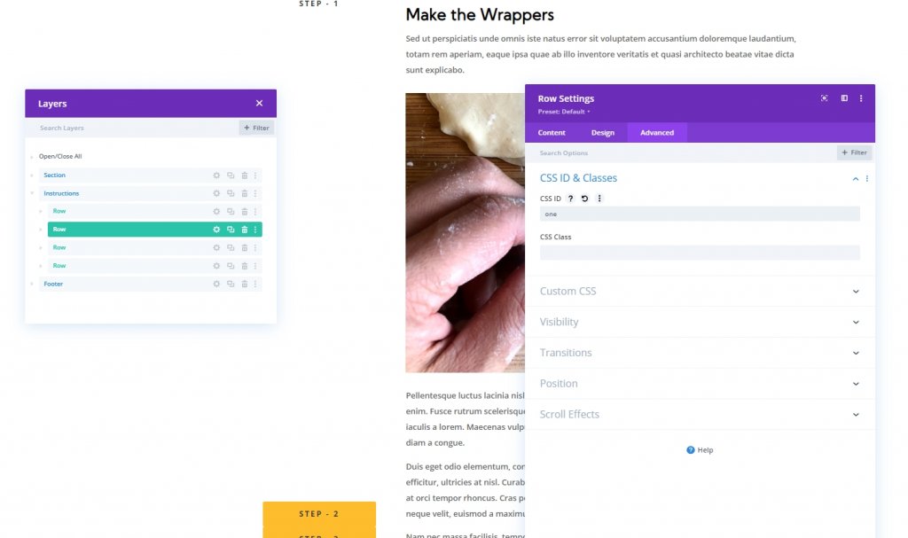
Row 1: Anchor Link
Open row 1 settings and add the following CSS id.
- CSS ID: one
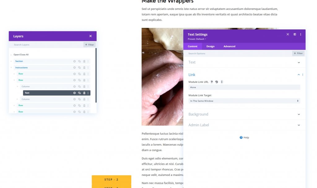
Now, Open the text module settings in column 1 or row 1 and add the module link URL.
- Module Link URL: #one
Row 2: Anchor Link
Open row 2 settings and add the following CSS id.
- CSS ID: two

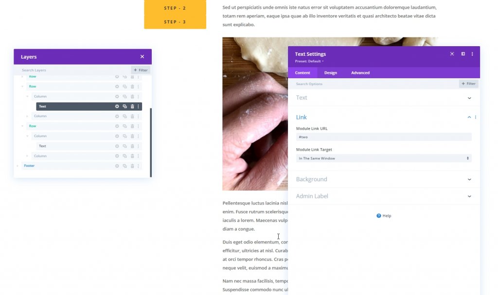
Now, Open the text module settings in column 1 or row 1 and add the module link URL.
- Module Link URL: #two
Row 3: Anchor Link
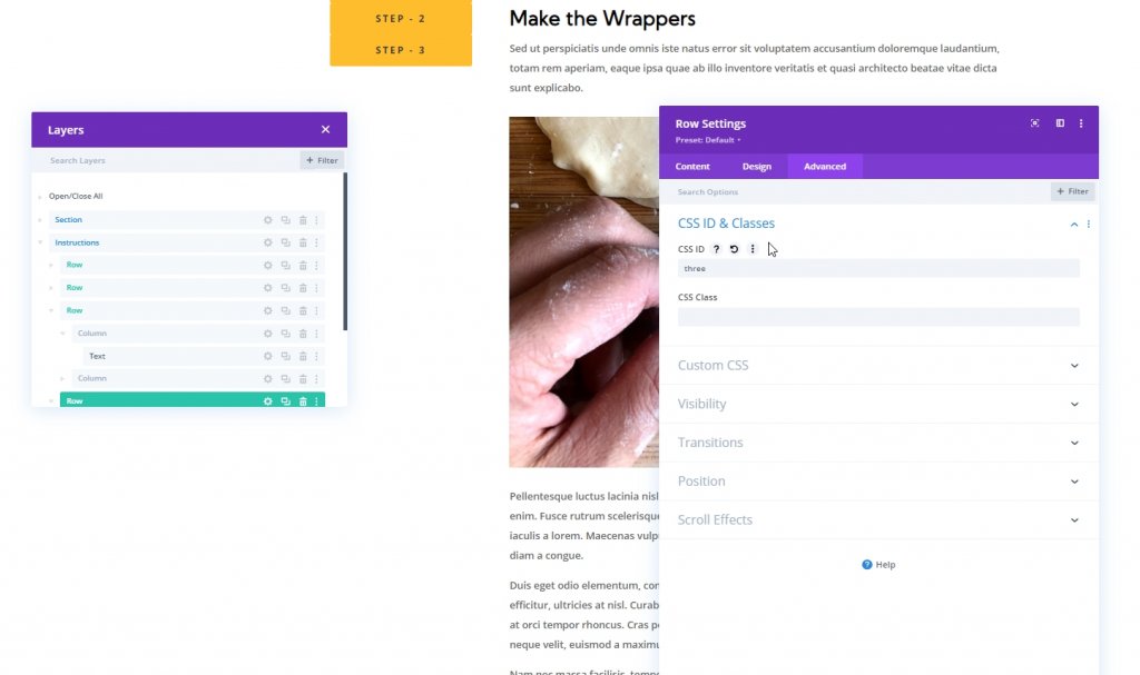
Open row 3 settings and add the following CSS id.
- CSS ID: three
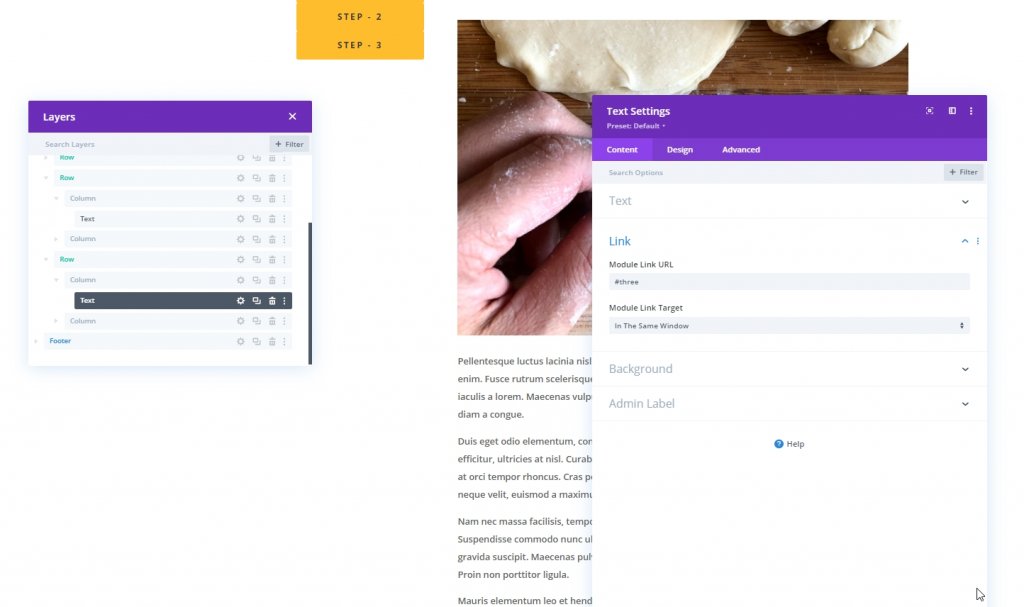
Now, Open the text module settings in column 1 or row 1 and add the module link URL.
- Module Link URL: #three
Final View
So, here is our scrolling sticky heading for a unique anchor link navigation design.
Final Words
Honestly, using a sticky heading in web design brings more charm, and it helps visitors take a walk through the content. Using anchor links can enhance your visitors by boosting the user experience in a lot of ways. These built-in options of Divi give you more and more ways to provide a better website for your visitors. Hopefully, this tutorial will help you through making a sticky heading with unique anchor link navigation. Scrolling Sticky Heading For Unique Anchor Link Navigation. Please, let us know what more topics we can share with you. Have a good time with Divi.