Looking for a free way to generate stunning charts with Elementor? This tutorial will show you how to make a chart using Elementor for free.
If you offer your data in a distinctive graph or chart, it will be more appealing to the audience than plain text. Using distinctive and professional-looking charts on your website can increase interaction. Most productive website owners represent their material graphically rather than writing extensive paragraphs.
In Elementor, you can generally display the information visually, but the chart widget is not available in the page builder. To use the chart widget, you must first install an additional plugin.
Create Engaging Charts In Elementor
Install the Elementor Addon Elements WordPress plugin to build charts in Elementor free. The plugin is free, and you can use it to access the chart widgets. Look for it on the plugins store, then install and activate it.
Create Amazing Websites
With the best free page builder Elementor
Start Now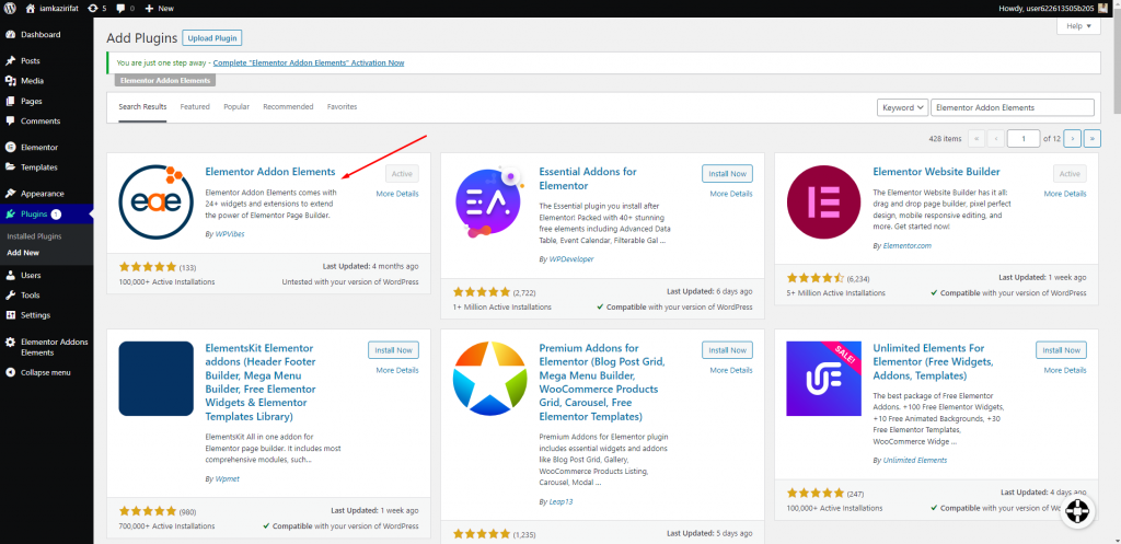
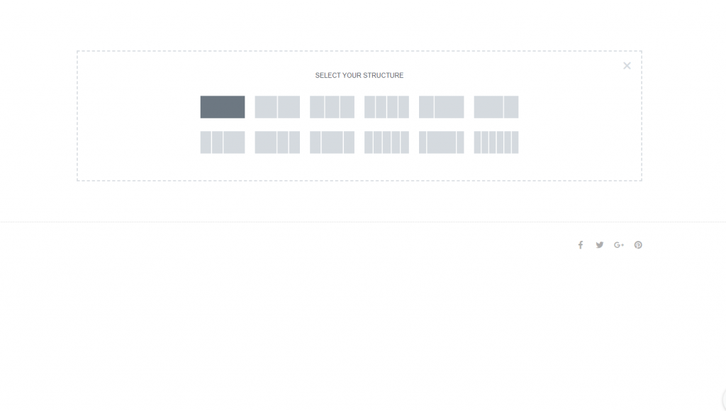
To add a section, open the page in the Elementor editor and click the "+" icon. After you've added the section, select a column for it.
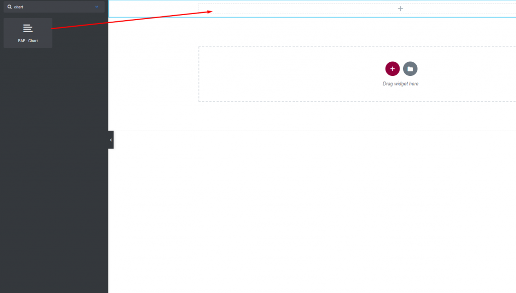
Now, look for the chart widget in Elementor Addon Elements and place it in your newly created column.
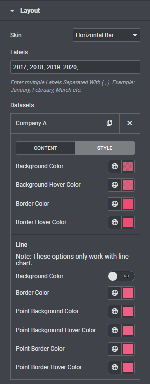
A default chart will appear here. You must now customize it. The skin choice can be found under the Layout tab. You can set the chart too - from the skin option.
- Vertical bar - The chart bar will be displayed vertically.
- Horizontal bar - The chart bar is displayed horizontally.
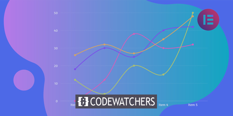
- Line - The chart bar will be displayed as a line.
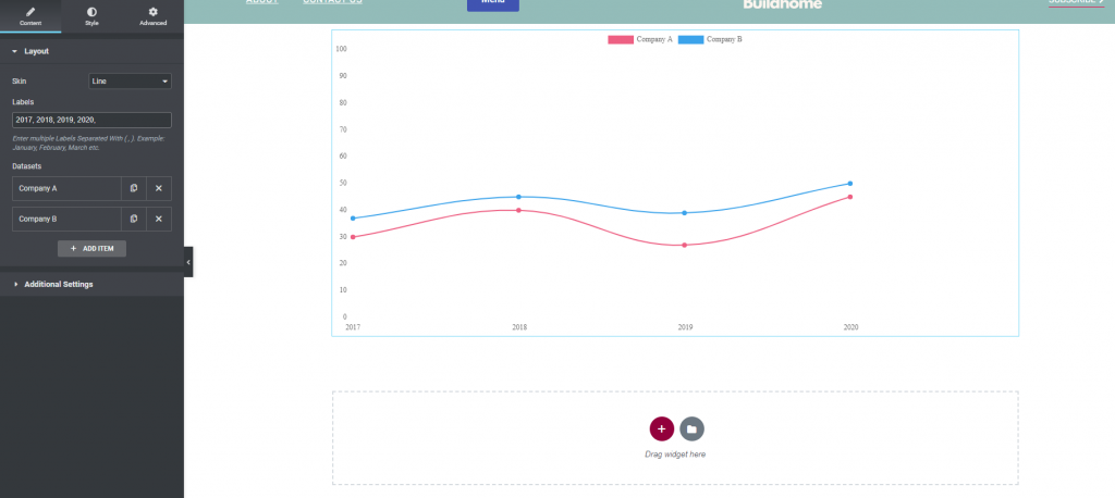
When you set the skin as a line-up, the chart bar will look like this.
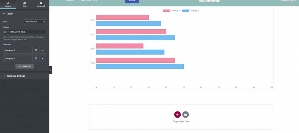
If lines were horizontal, it would look like this.
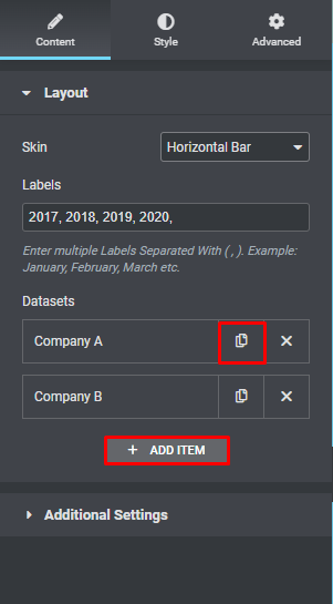
You can enter the level in the label field. Following that, you will be able to see the dataset item. By clicking the Add item button, you can add an item. To delete an item, use the "X" icon, and to duplicate it, copy the icon.
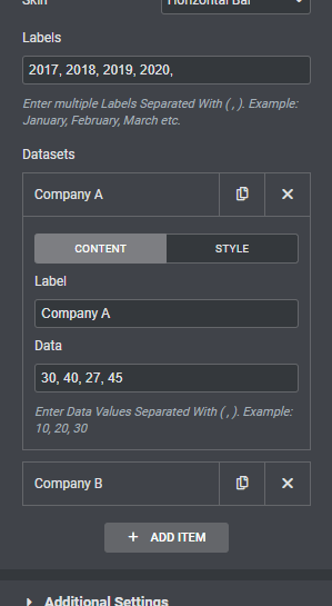
To modify an item, click on it and the edit option will appear. You can change the name and dataset from the content tab of the edit item.
Proceed to the style choice to personalize the item. You can change the background color, background hovers color, border color, and border hover color in this section.
There is a distinct style choice for the line chart skin. You can change the background, border, point background, and hover color.
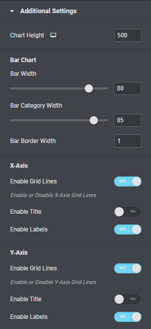
Now proceed to the extra setting where you can set a bar height depending on whether the skin is vertical or horizontal. Following that, you can configure the bar width, category width, and bar border width.
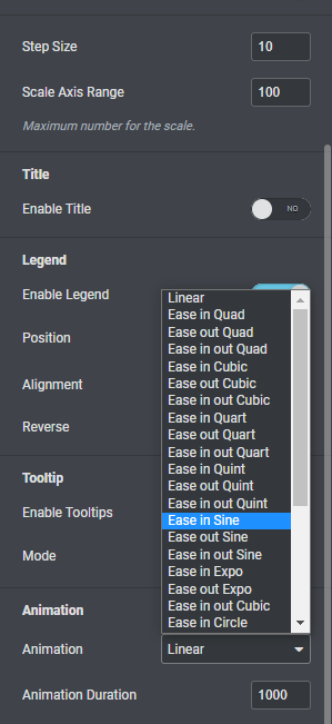
After that, you can toggle the grid line, title, and labels for the x and y axes.
You may also toggle the legend and tooltip options on and off. The animation option allows you to select several animations for the bar chart, as well as the animation duration time.
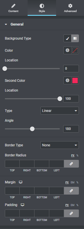
To style the char section, go to the style tab. Under the General tab, you may change the background color to classic or gradient, enable the blend mode, add border color, border radius, padding, margin, and more.
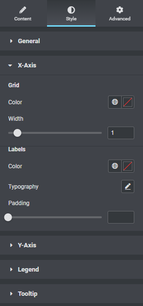
You can change the grid color and width from the x-axis menu. Label colors, typeface, and padding can all be customized.
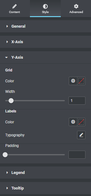
Likewise, you can lay out the grid and label the y-axis.
Tooltip background color, border, arrow size, font, and other options are available via the tooltip option.
That's all. Your chart section is complete.
Wrapping Up
Following the process, you will be able to construct a gorgeous bar area on your website using Elementor for free. Elementor always enables the creation of attractive websites by providing limitless possibilities. Hopefully, this tutorial will be useful to you, and if it is, please share it with your friends. Check out other Elementor tutorials as well.