
Image overlays are one of the great ways to engage visitors by showing additional information to your visitors. Usually, this happens when the mouse hovers an element or image. Since that's quite popular, you might have already noticed many WordPress plugins that help you to achieve that. If you love Divi like me, you might wonder how to do it with Divi? That's what we're going to cover today.

In this tutorial, we are going to show you how to design custom image overlays in Divi Builder. These overlays will toggle and reveal elements when the mouse moves over them. What you might see interesting is that you can have better control over the design only using Divi built-in options. We might end-up using some CSS code, which will make things looks further better.
Expected Result
Here is a quick look at what you might get by the end of this tutorial.
Required Components Before Getting Started
Before jumping in the tutorial, you need to meet some requirements as they are required to be able to reproduce this tutorial. You'll therefore need :
Create Amazing Websites
With the best free page builder Elementor
Start Now- Install and activate Divi
- Create a new page in WordPress and use the Divi Builder on the frontend
- Choose the option "Build From Scratch".
If you have a blank page after that, then you're ready to go.
Creating Custom Image Overlays in Divi
Building the Section, Row, and Columns
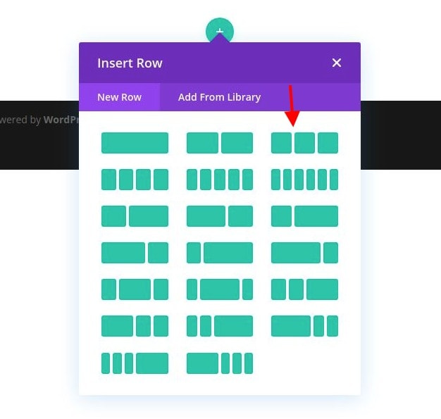
We'll start by selecting a three-column row inside the default section.
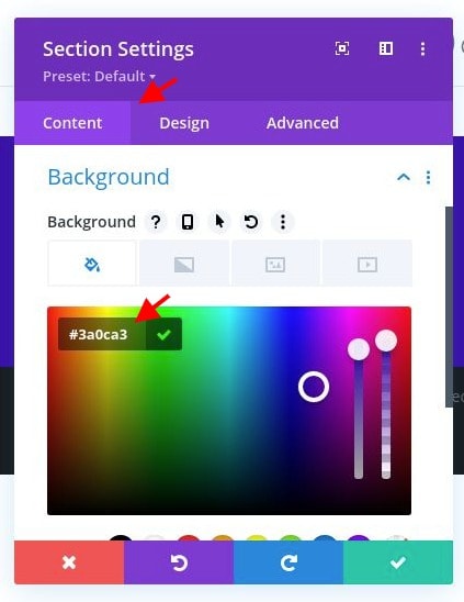
Open the section settings and use the following background color:

- Background Color: #3a0ca3
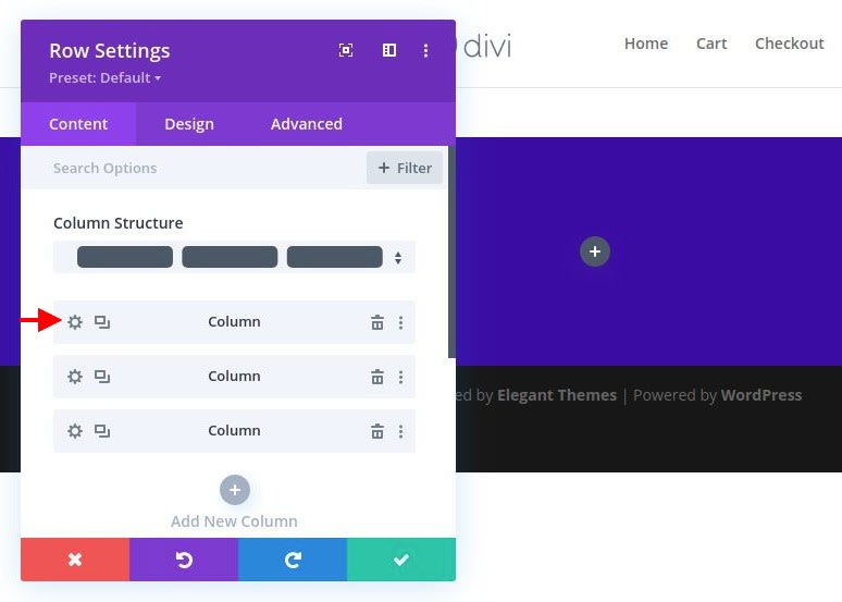
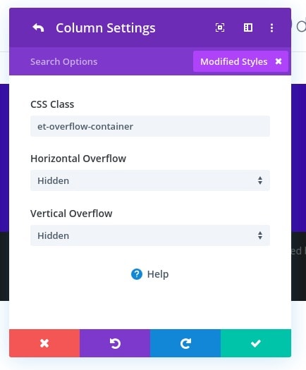
Next, move to the settings for column 1 and change the following options :
- CSS Class: et-overflow-container
- Horizontal Overflow: Hidden
- Vertical Overflow: Hidden
The CSS Class is needed to trigger the hover effects of the overlay items that we are going to build. The hidden overflow is needed to because we are going to have a hover effect that scales the image beyond the column container.
Adding the Image
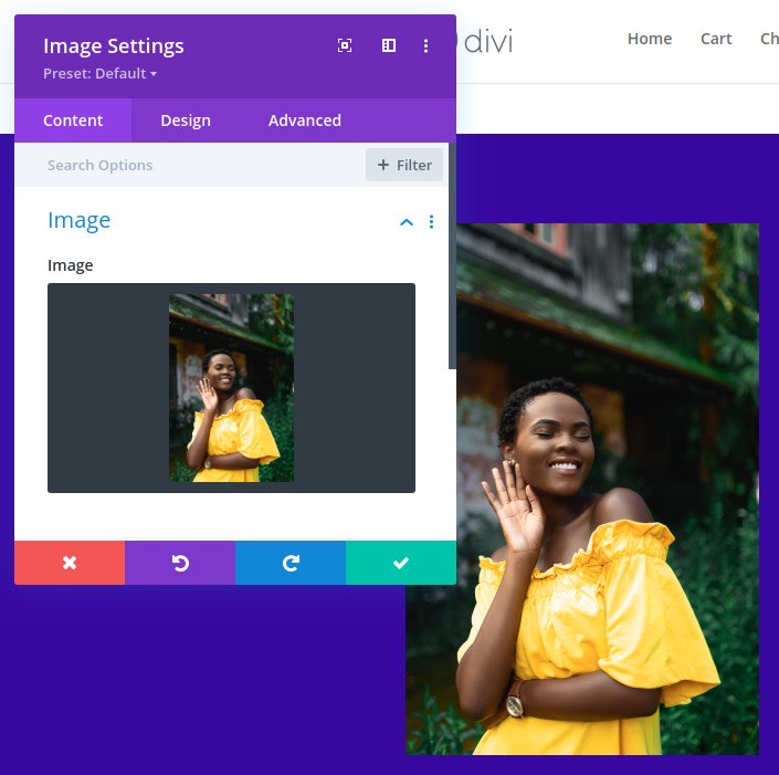
Now that the section, row, and column are ready, go ahead and add a new image module to column 1. This will be the main image behind our overlay designs.
Upload an image that is in a portrait. I’m using one that is roughly 1280px by 1920px. Make sure it is wide enough to span the full width of the column on all browser sizes.
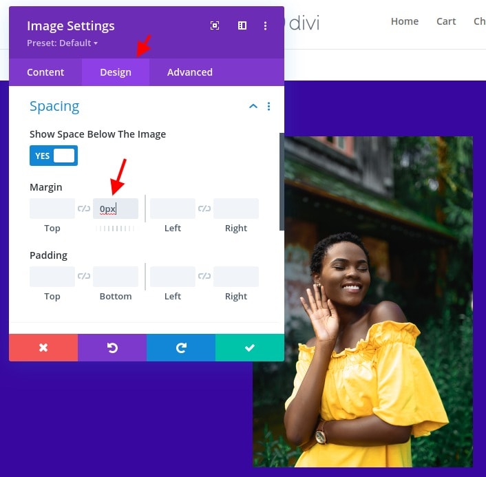
From the design tab, change the following:
- Margin: 0px bottom
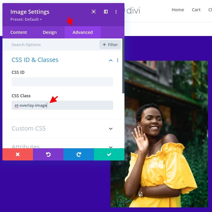
Within the advanced tab, add the following CSS Class:
- CSS Class: et-overlay-image
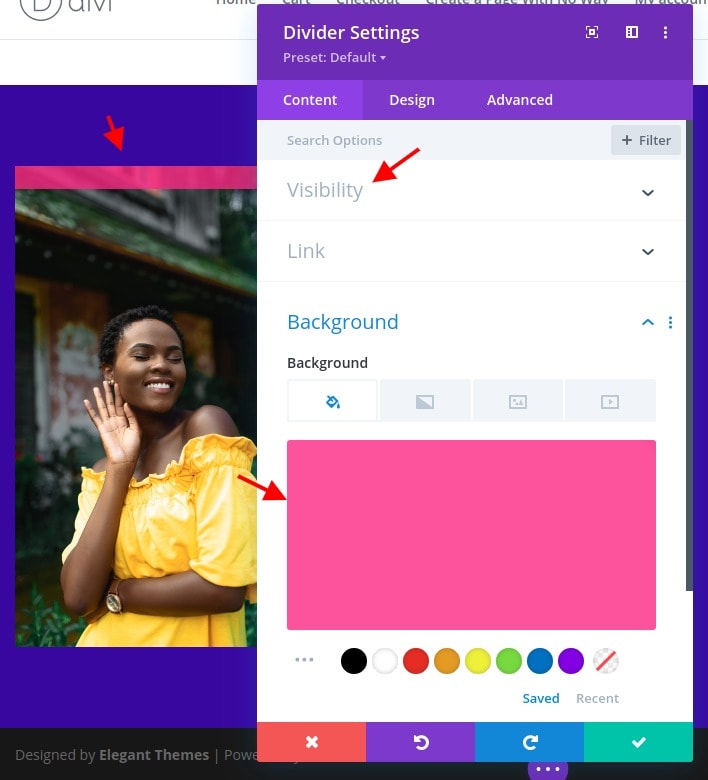
Choosing The Image Overlay Color Using A Divider Module
In order to create the image overlay color, we are going to use a divider module. The idea is to create a cover over the image by defining the divider in full height and width that covers the column, in order to make it fit perfectly over the image. Once set, you can adjust the background color of the divider module to get the overlay color as you want.
So let's first add a divider module under the image.
Then position the divider as absolute so that it will appear on top of the image:
- Position: Absolute

Within the content tab, update the following:
- Show Divider: NO
- Background Color: rgba(247,37,133,0.8)
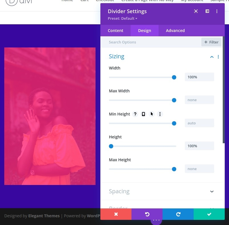
Then change the height and width of the divider:
- Width: 100%
- Height: 100%
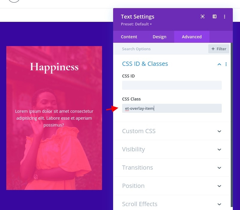
Once the design defined, add the following CSS Class to the divider:
- et-overlay-item
Warning: This class should be added to all overlay design components that you want to show only on hover. If you don’t want the element to be hidden initially, don't use it.

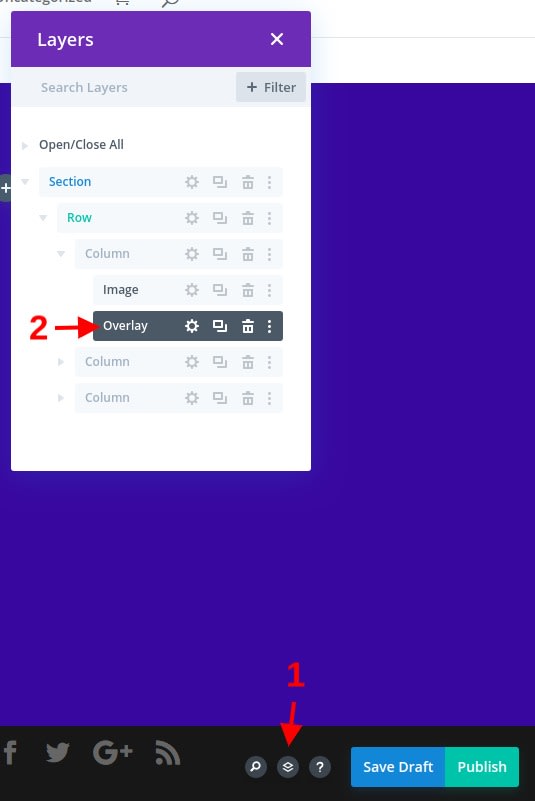
Optionally you might label the divider turned into an overlay with a clearly identifiable name. That can be made from the layer and you can use "Overlay".
Adding the Overlay Heading Text
Under the divider module, add a new text module. This will be used as our overlay heading text and will appear at the top of the image on hover.
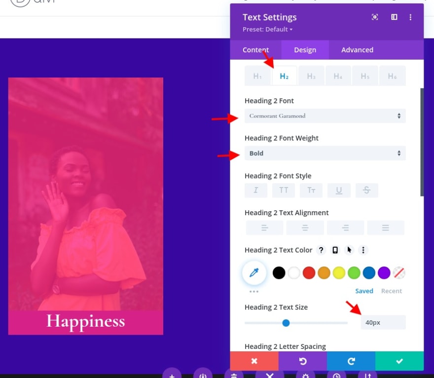
Change the content with an H2 heading:
<h2>Happiness</h2>
You can also change the label of the text module for referencing later.
Under the text design settings, change this:
- Text Alignment: Center
- Text Color: Light
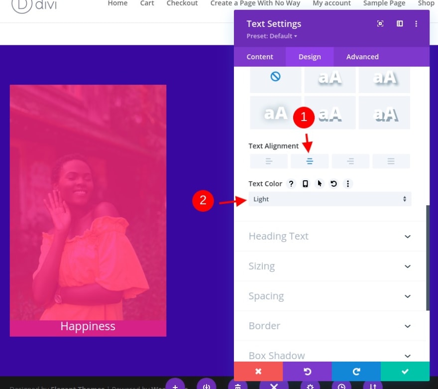
- Heading 2 Font: Cormorant Garamond
- Heading 2 Font Weight: Bold
- Heading 2 Text Size: 40px
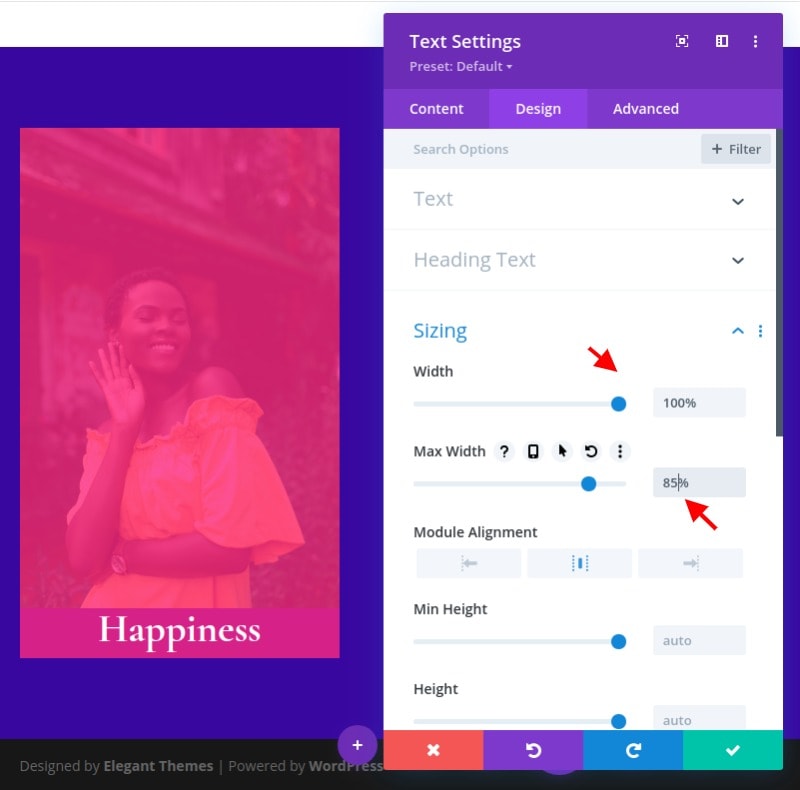
- Width: 100%
- Max-Width: 85%
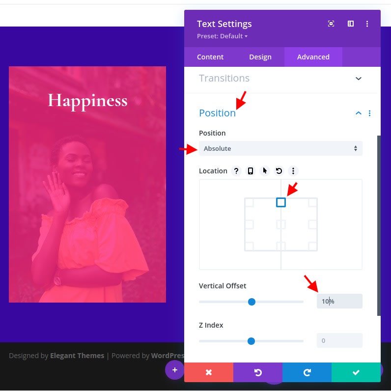
Within the advanced tab, change the position as follows:
- Position: Absolute
- Location: top center
- Vertical Offset: 10%
Warning: The vertical offset may need to be adjusted according to the size of the aspect ratio of the image.
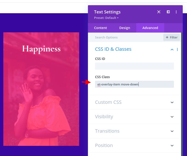
Then, add the following CSS Classes to the text module:
- CSS Class: et-overlay-item move-down
In addition to “et-overlay-item” class, we are adding an additional “move-down” class in order to use custom CSS to move the heading downward slightly on hover.
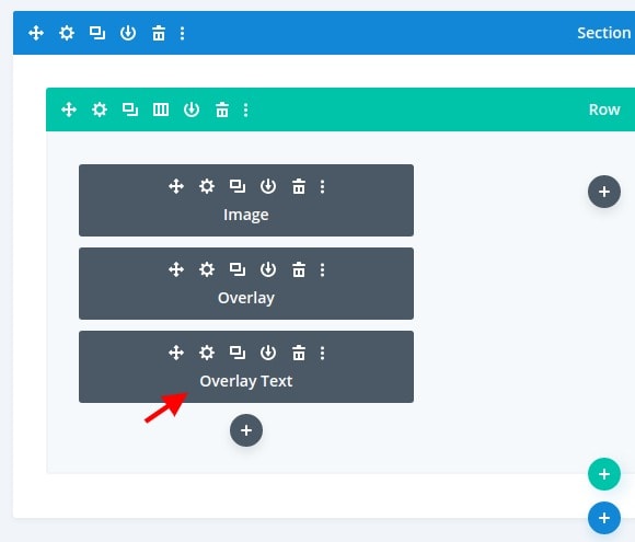
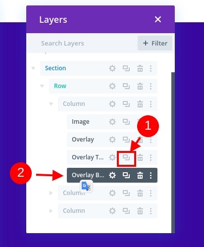
Creating the Overlay Body Text
To create the overlay text, we can duplicate the text module used for the overlay heading. Before changing the settings, let's give that module a different label. This time, we'll use "Overlay Body".
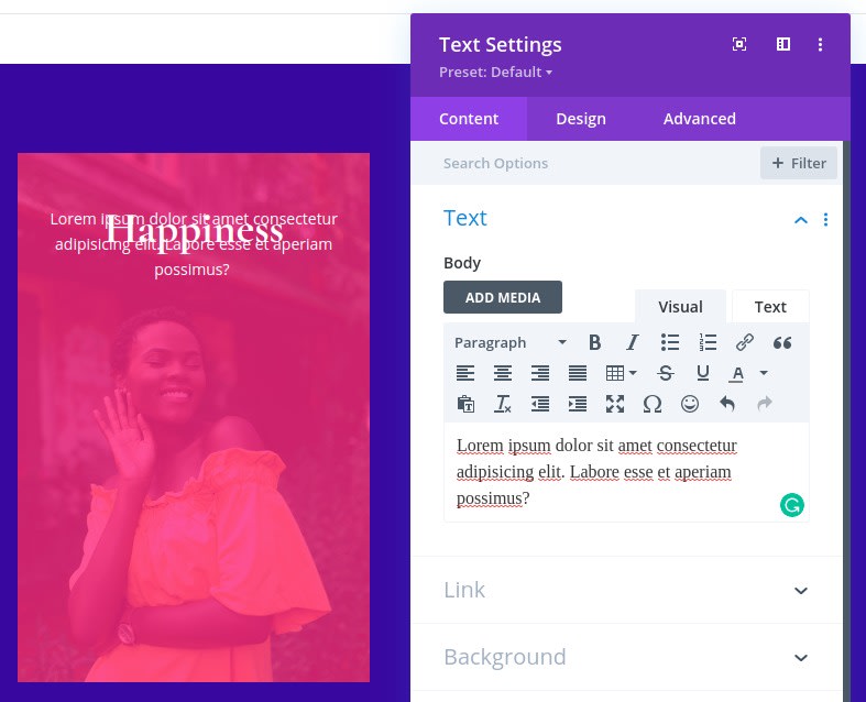
Open the text settings for the new text module and update the body content with a few sentences of paragraph text.
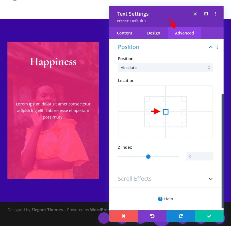
Under the advanced tab, change the absolute location of the module to the center.
Since we don’t want this one to move on hover (only appear), update the CSS Class to only included the following:
- CSS Class: et-overlay-item
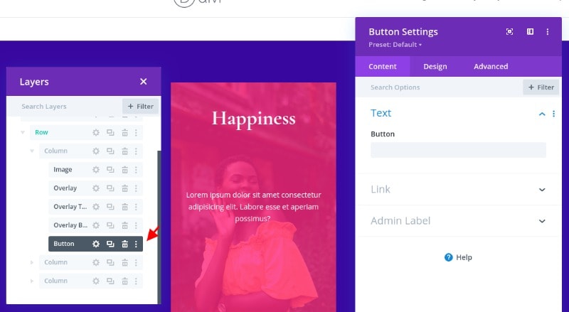
Creating the Overlay Button
The last overlay element on this image will be the button. To create the button, add a new button module under the “body text” text module.
Before updating the design, let's change the position of the button as follows:
- Position: absolute
- Vertical Offset: 10%
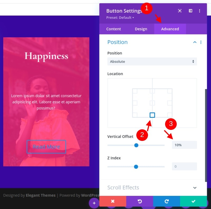
Now the button should be centered at the bottom portion of the image.
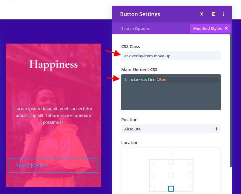
While in the advanced tab, update the CSS Class and add a snippet of custom CSS to the Main Element as follows:
- CSS Class: et-overlay-item move-up
- Main Element CSS:
min-width: 15em
Note that here there is an additional class added to the button in order to move it upward slightly on hover. That will complement the heading text downward movement on hover.
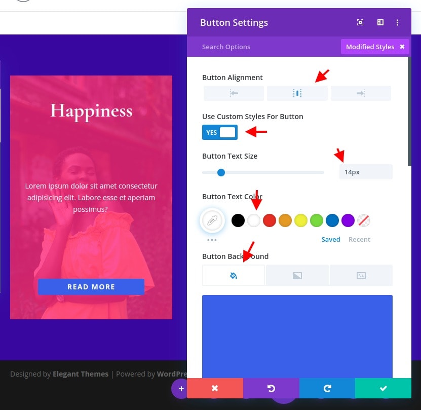
Then update the following design settings:
- Button Alignment: Center
- Button Text Size: 14px
- button Background Color: #4361ee
- button Border Width: 0px
- Button Letter Spacing: 0.1em
- Button Font Weight: Bold
- Button Font Style: TT
- Padding: 0.8em top, 0.8em bottom, 0px left, 0px right
Complementing With Custom Code Module
Before moving to the other version, let's add some CSS to add the hover effect. To do this, add a code module under the button.
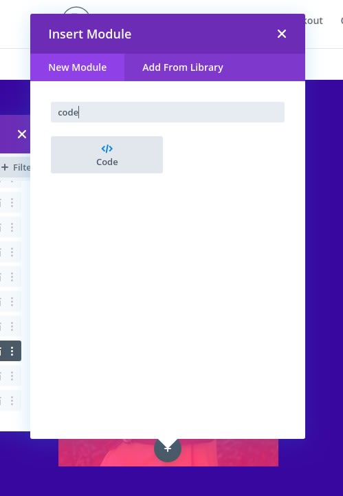
Then paste the following CSS inside the code content. Don’t forget to wrap the code in the necessary script tags.
<style>@media alland (min-width: 981px) {.et-fb-root-ancestor .et-overlay-item {opacity: 1; /*shows hidden overlay items when using the visual Divi Builder*/}.et-overlay-item {opacity: 0; /*hides overlay items by default*/margin-bottom: 0px;}.et-overlay-item, .et-overlay-image {transition: all400ms !important; /*sets transition speed of all overlay items*/}.et-overlay-container:hover .et-overlay-item {opacity: 1; /*reveals hidden overlay items on hover*/}.et-overlay-container:hover .et-overlay-image {/*add new styles here to change image on hover*/}.et-overlay-container:hover .et-overlay-image.et-scale{transform: scale(1.2); /*adjust scale of image here*/}.et-overlay-container:hover .et-overlay-image.et-rotate{transform: scale(1.4)rotateZ(10deg)!important; /*adjust rotation of image and scale needed for rotation here*/} .et-overlay-container:hover .et-overlay-item.move-up {margin-bottom: 15%!important; /*adjust how far you want the overlay item to move up*/}.et-overlay-container:hover .et-overlay-item.move-down {margin-top: 10%; /*adjust how far you want the overlay item to move down*/}}</style>

The code has some commented so that you can understand where you can adjust the CSS as needed.
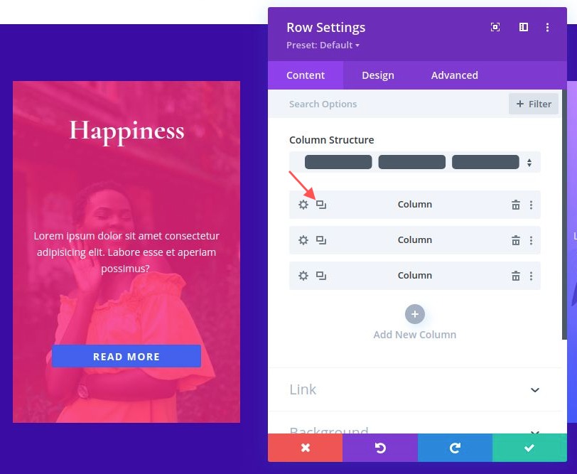
Duplicating the Column For Other Sections
Although we already have two additional empty columns to work with, it is easier to transfer all the modules and design within the first column over to a new column by duplicating the entire column. To do this, open the layers modal, delete the two empty columns, and then duplicate the column containing the image overlay design twice. You should have a total of three columns with identical designs.
I'll let you decide what is the set of colors you'll apply to column 2 and 3. Let's not see what is the final result.
Final Results
Now that our three designs are complete (hope you've changed the design for the 2 remaining columns), let’s check out the final results of our designs.
Summary
Creating an image overlay is actually possible with Divi. There are countless designs you can create out visually with the Divi builder and it only takes a small amount of custom CSS to apply some hover effects.