
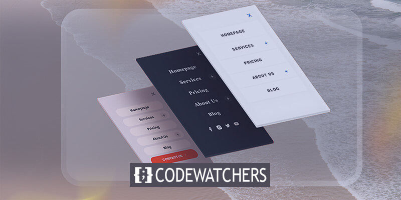
Creating a wide mobile menu for your WordPress site using Divi can significantly enhance user experience on mobile devices. The default hamburger menu often falls short for complex navigation needs. This article will guide you through customizing your Divi menu to create a full-width mobile menu that's both functional and visually appealing. We'll explore using the Theme Builder, adjusting the menu module, and applying custom CSS to achieve the desired result. Whether working with a child theme or directly in Divi's Theme Customizer, these techniques will help you craft a mobile-friendly navigation that stands out from the default Divi menu.
Why Use Wide Divi Menu On Mobile Devices
In today's mobile-first world, optimizing your website's navigation for mobile devices is crucial. While the default Divi menu with its hamburger icon works well for simple sites, a wide mobile menu can offer several advantages:
- Improved Visibility: A wide menu utilizes the full screen width, making menu items more prominent and easier to read on smaller screens.
- Enhanced User Experience: By displaying more options at once, users can navigate your site more efficiently without repeatedly opening and closing a compact hamburger menu.
- Customization Opportunities: A wide mobile menu allows for greater customization of menu styles, including background color, menu font size, and even the incorporation of social media icons.
- Branding Consistency: You can maintain your site's visual identity across desktop and mobile versions by customizing the mobile menu to match your overall design.
- Reduced Clicks: Users can access all primary menu items without additional taps, streamlining their journey through your site.
- Versatility: Wide menus can accommodate more complex navigation structures, including mega menus, which are challenging to implement in a traditional mobile menu.
- Distinctive Design: A custom-wide menu sets your site apart from those using the default Divi menu, potentially increasing user engagement and retention.
By leveraging Divi's Theme Builder and applying custom CSS, you can create a mobile menu that not only looks great but also enhances your WordPress site's overall mobile user experience.
How To Create A Wide Divi Mobile Menu
For those familiar with Divi Theme Builder tutorials, a common feature missing from the default header is the fullscreen menu option. While challenging to develop, this step-by-step tutorial is designed to help users create an engaging fullscreen menu experience.
Create Amazing Websites
With the best free page builder Elementor
Start NowCodeWatcher has an extensive collection of Divi tutorials, offering solutions to problems that Divi users often face. Look around for more.
Theme Builder Header
For this to work, the Menu module must be used within a Theme Builder header template. You're ready to begin if you're already familiar with the Divi Theme Builder.
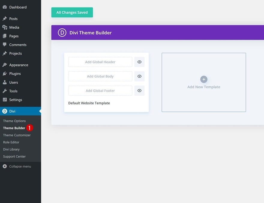
The first step is to navigate to Divi > Theme Builder and either add or edit the header template. To apply the menu site-wide, use the first template to create a global header. If you prefer it to appear on specific pages or want to test it, create a new template and apply a custom header.
Menu Module Adjustment
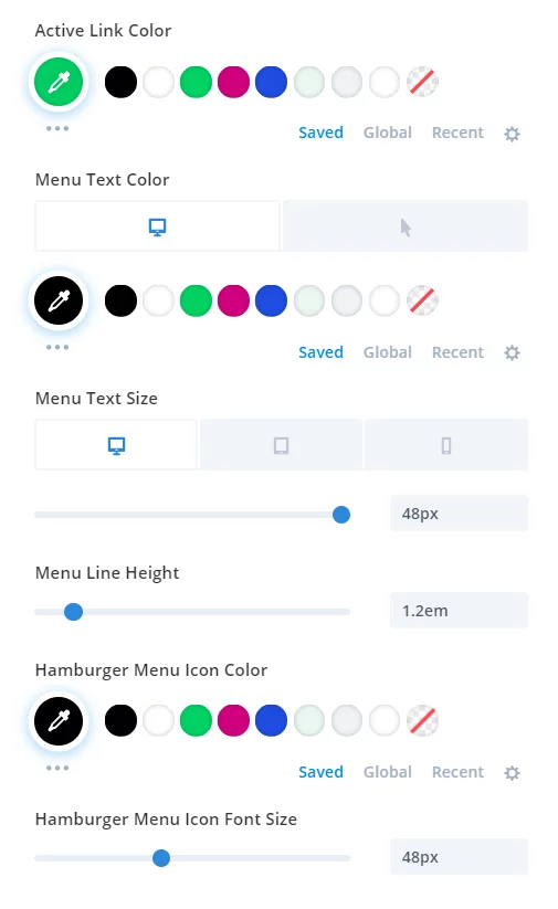
Once inside the header template, start by adding a single-column row and inserting the Menu module. While no mandatory adjustments are required for the Menu module settings, there are some recommended tweaks:
- Set the text color under the Design tab > Menu Text toggle.
- Increase the text font size in the Design tab > Menu Text toggle, and adjust it for Desktop, Tablet, and Phone.
- Set the text line height to 1.2em.
- Customize the hamburger menu color in the Design tab > Icons toggle.
- Increase the font size of the hamburger menu icon in the Design tab > Icons toggle.
These adjustments are optional, but they can help you quickly achieve an impressive design. Scroll down for a screenshot of the menu created—it's truly stunning!
Custom CSS To The Section
Now, instead of adding a CSS class directly to the module, we'll apply the custom CSS class to the blue section. This is the same section where the Menu module was added in the previous step.
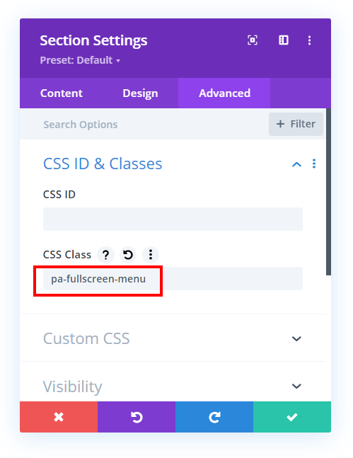
To do this, open the section settings, navigate to the Advanced tab, and expand the Custom CSS & IDs toggle. In the CSS Class input field, enter “pa-fullscreen-menu
Now comes the most important tutorial part: the free code snippets! This code performs several functions, so it's recommended to reference both the video tutorial and the code comments for a full understanding. Otherwise, feel free to simply copy and paste the code.
/*align the hamburger menu to the right right*/

.pa-fullscreen-menu .et_pb_menu__wrap {
	justify-content: flex-end !important;
}


/*hide the desktop version of the menu*/

.pa-fullscreen-menu .et_pb_menu__wrap .et_pb_menu__menu {
	display: none !important;
}


/*show the mobile version of the menu on desktop*/

.pa-fullscreen-menu .et_pb_menu__wrap .et_mobile_nav_menu {
	display: block !important;
	align-items: center !important;
}


/*style the opened menu*/

.pa-fullscreen-menu .opened #mobile_menu1 {
	width: 100vw !important;
	position: fixed !important;
	top: 0em !important;
	left: 0vw !important;
	height: 100vh !important;
	display: flex !important;
	justify-content: center !important;
	flex-direction: column !important;
	opacity: 1 !important;
	visibility: visible !important;
	transition: visibility 0.3s, opacity 0.3s ease-in-out;
	padding: 0 !important;
}


/*style the closed menu*/

.pa-fullscreen-menu .closed #mobile_menu1 {
	background-color: #fff !important;
	text-align: center !important;
	width: 100vw !important;
	position: fixed !important;
	left: 100vw !important;
	top: 0em !important;
	height: 100vh !important;
	display: flex !important;
	justify-content: center !important;
	align-items: center !important;
	flex-direction: column !important;
	transition: visibility 0.3s, opacity 0.3s, left 1s, ease-in-out;
	opacity: 0 !important;
	visibility: hidden !important;
}


/*remove the bullet points from the list items*/

.pa-fullscreen-menu #mobile_menu1 li {
	list-style: none !important;
	text-align: center !important;
	width: 100%
}


/*move the menu to the top above other elements*/

.pa-fullscreen-menu .et_pb_menu__wrap span.mobile_menu_bar {
	z-index: 999999 !important;
}


/*change the opened menu icon*/

.pa-fullscreen-menu .et_pb_menu__wrap .opened .mobile_menu_bar:before {
	content: "\4d" !important;
}


/*make the hamburger menu fixed position on mobile*/

.pa-fullscreen-menu .opened .mobile_menu_bar {
	position: fixed !important;
}


/*remove the default blue border top on the mobile menu*/

.pa-fullscreen-menu .et_mobile_menu {
	border-top: none;
}


/*remove the default background color on menu items*/

.pa-fullscreen-menu .et_mobile_menu .menu-item-has-children>a {
	background-color: transparent;
}


/*remove the default hover background color and adjust opacity*/

.et_mobile_menu li a:hover {
	background-color: transparent;
	opacity: 1;
}


/*remove the default border bottom on menu items*/

.pa-fullscreen-menu .et_mobile_menu li a {
	border-bottom: none;
}
You can apply the codes through the following systems -
- Divi Assistant Plugin: If using the Divi Assistant plugin, paste the code into the CSS tab within the custom code window of the Divi Visual Builder.
- Child Theme: Add the code to the style.css file for those using a child theme. If you don't have a child theme, you can either generate one directly on your site or download the free child theme provided.
- Divi Theme Options Integration: Alternatively, paste the code in the Divi > Theme Options > Custom CSS code box.
And you are done!
Wrapping Up
Creating a wide mobile menu for your Divi WordPress site enhances user experience on mobile devices while maintaining your site's aesthetic appeal. By utilizing the Divi Theme Builder, adjusting the menu module, and applying custom CSS, you can transform the default hamburger menu into a full-width navigation powerhouse.
This customization not only improves visibility and accessibility but also allows for greater design flexibility, incorporating elements like social media icons and custom background colors. Remember, the key to success lies in balancing functionality with design. Whether you're a seasoned developer or a Divi novice, these techniques provide the tools to craft a mobile menu that stands out in the crowded digital landscape.