
Most people who use the Divi theme builder confirm its performance whether it is in terms of the functionality of the website created or in terms of customization options which are almost limitless. Creating sticky headers has been smooth since the arrival of the theme builder, but we find that many people don't know how to create them without using additional code. However, it is quite easy to do it also thanks to Divi's sticky options. In fact, not only is it easier, but this method offers more possibilities for customizing the design.

We will therefore take the time, in this tutorial, to show you how to create an ultra personalized sticky header using the Divi settings. We will arrange for this header to be personalized as follows:
- We will have a top header bar + a menu bar
- The section containing the sticky menu bar is configured in such a way that when you come back to the top, the header bar reappears
- The sticky section's (and its elements) design styles will change once the section is turned sticky
All this will be articulated around two main parts: The first devoted to the creation of the Header Element Structure inside a new Header Template, and the second to the application of Custom Sticky Effects.
1. Building the Header Element Structure in a new Header Template
Create New Global Header Template
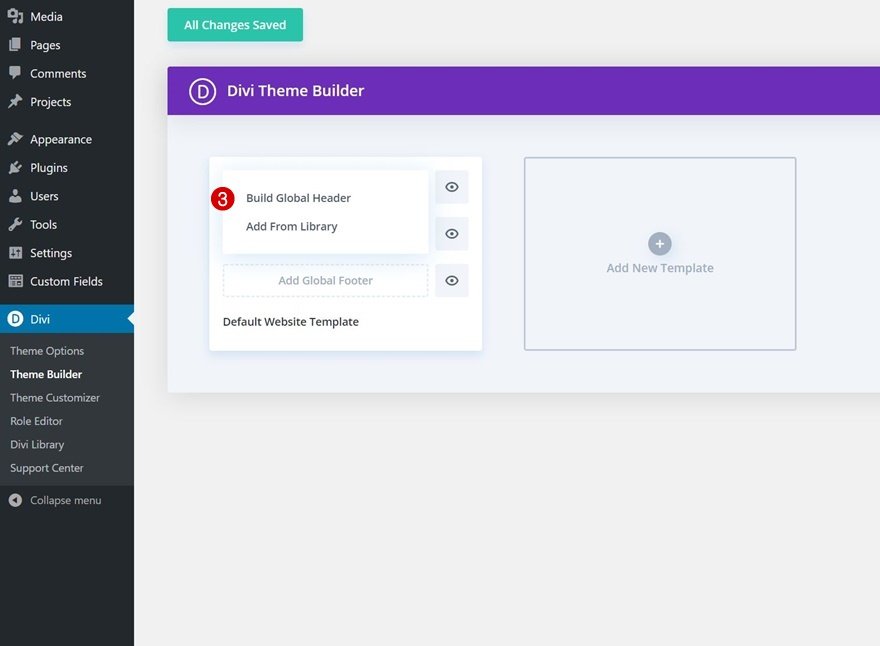
The first step is to get the Global Header Template and download it on the Divi builder theme. On Divi, you will create a new global or custom header.
Create Amazing Websites
With the best free page builder Elementor
Start Now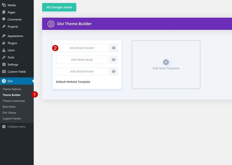
Set Section #1
Inside the template editor, you’ll notice a section. This is where we'll start to create the element structure of our header. So, open it, and let's start the configuration.
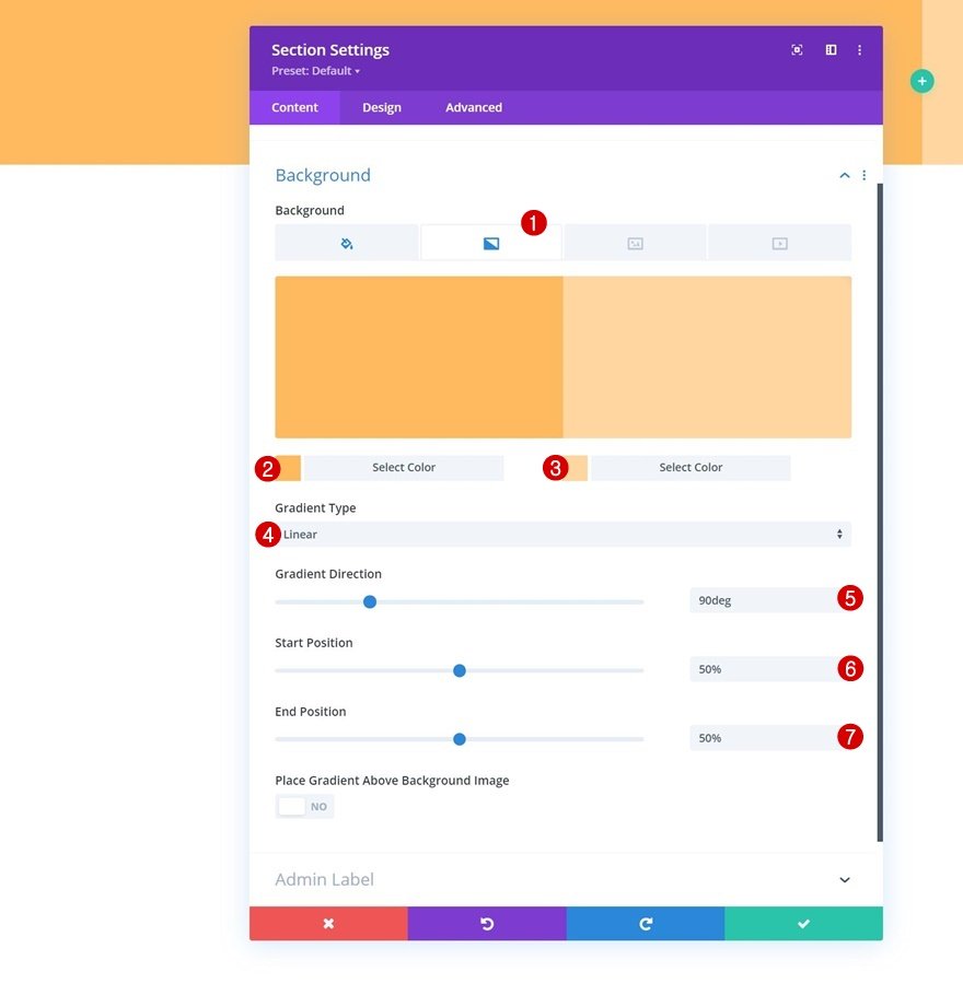
Gradient background
We will first apply the gradient background as follows:
- Color 1: #ffba60
- Color 2: #ffd6a0
- Gradient Direction: 90deg
- Start Position: 50%
- End Position: 50%
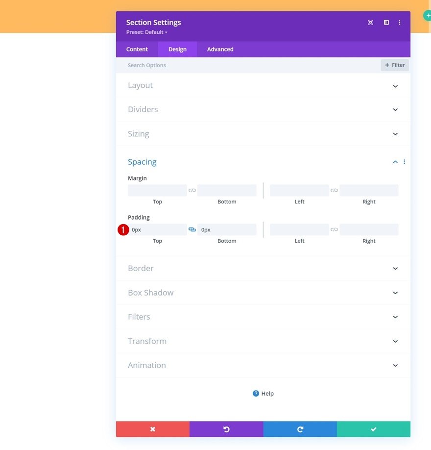
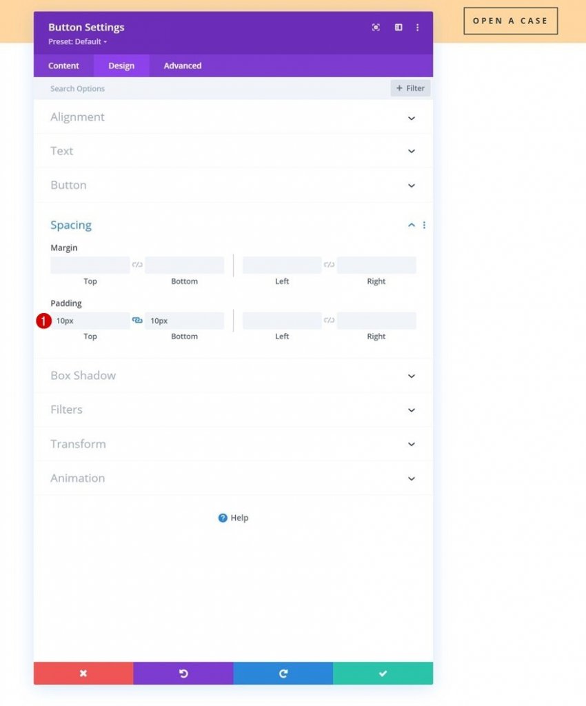
Spacing
You must remove all default top and bottom padding next.
- Top Padding: 0px
- Bottom Padding: 0px
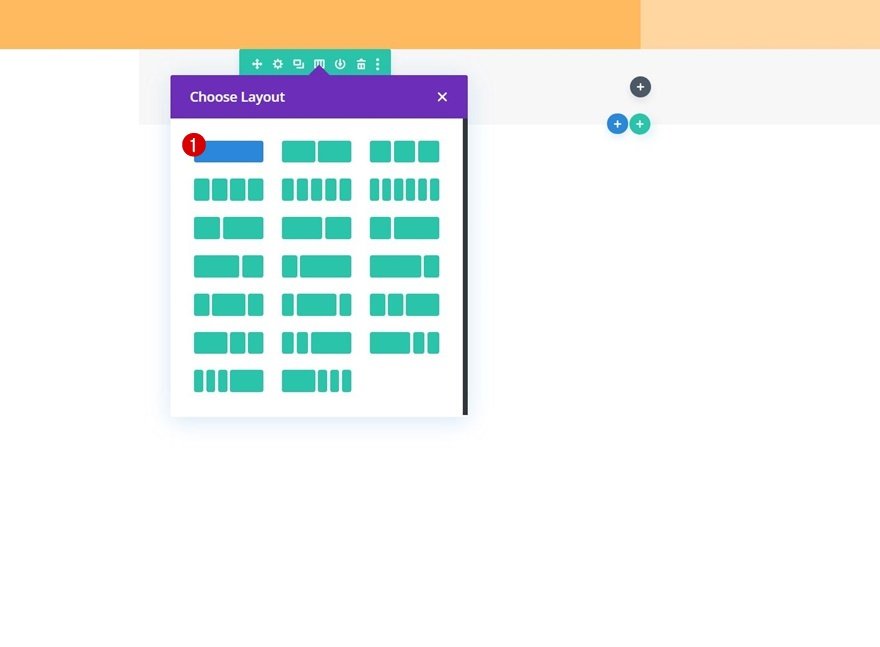
Add a new Row
To create our top header bar, we’ll add a new row to our section.
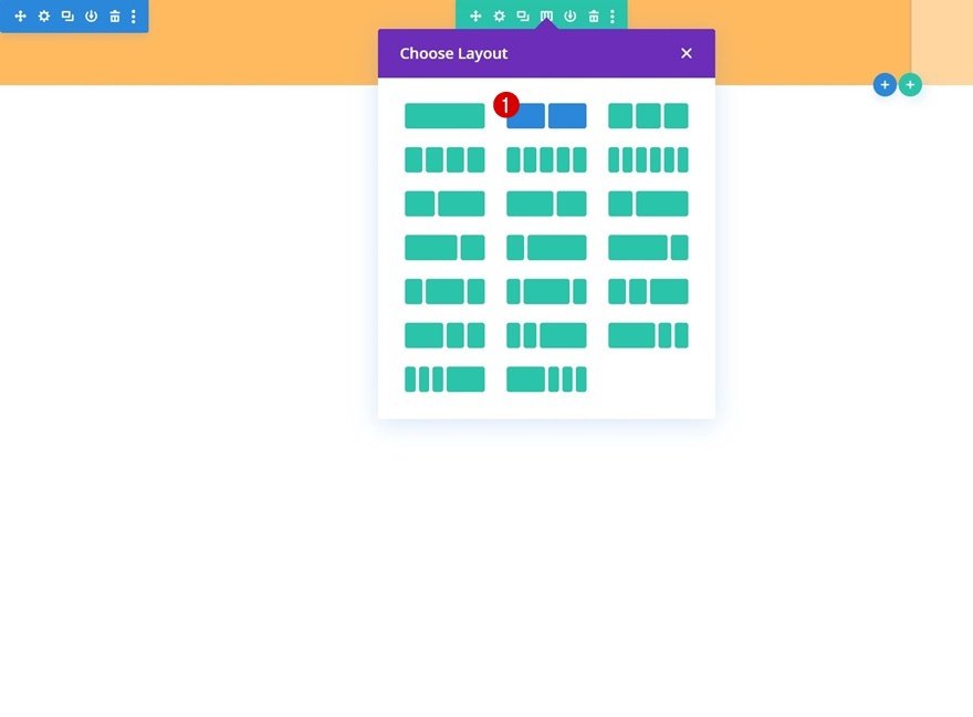
Column Structure
The new row should be defined using the following column structure:
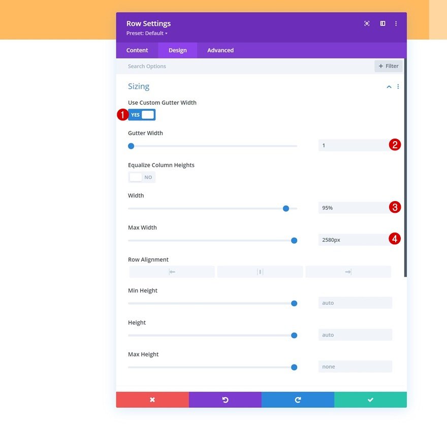
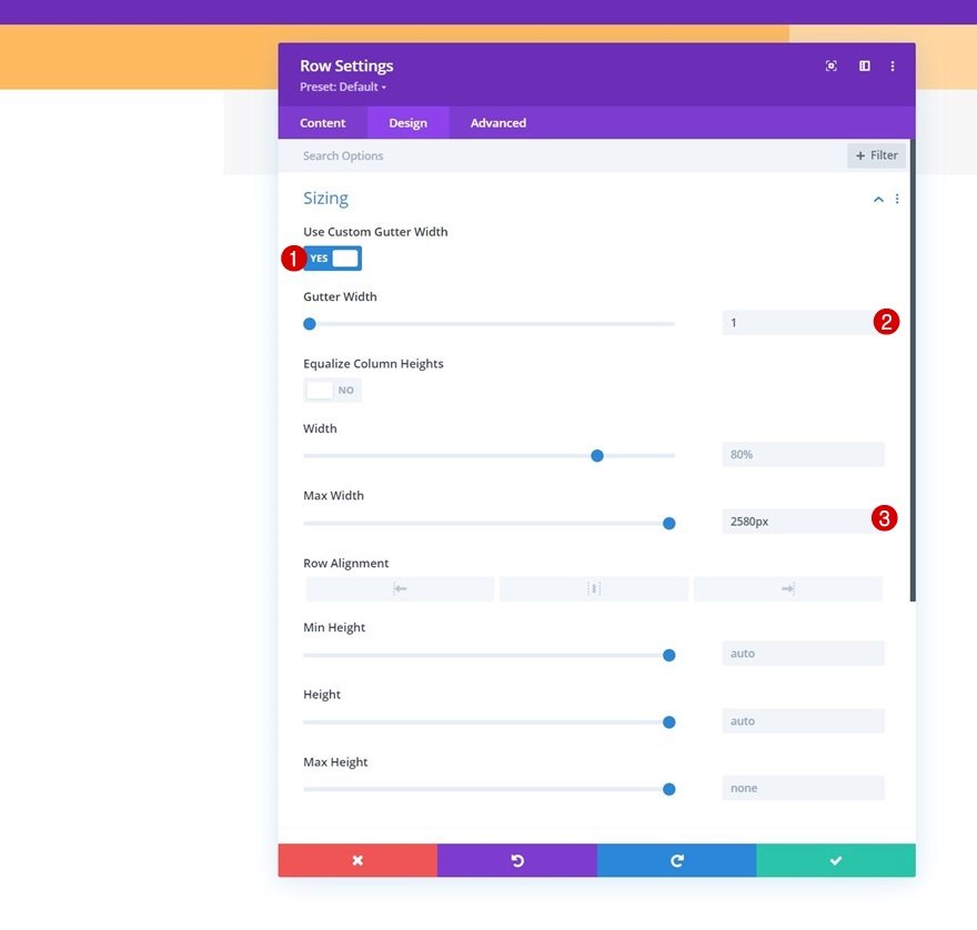
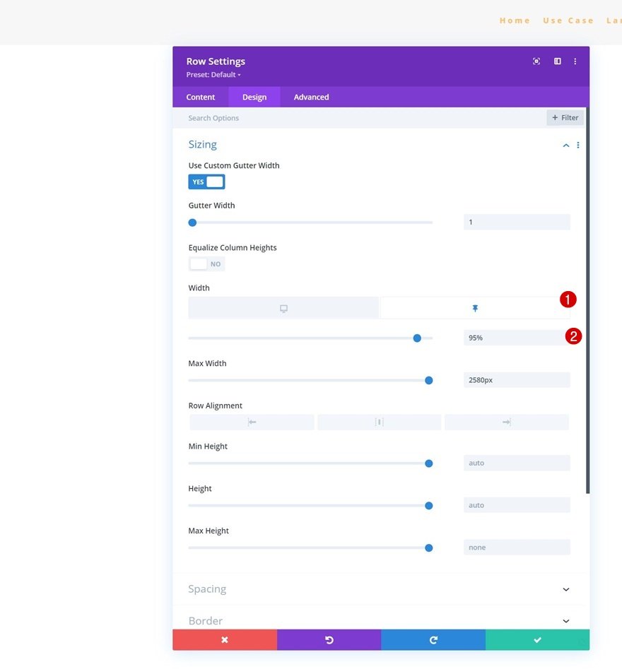
Sizing
Without adding any modules yet, open the row settings and modify the sizing settings as follows:
- Use Custom Gutter Width: Yes
- Gutter Width: 1
- Width: 95%
- Max Width: 2580px
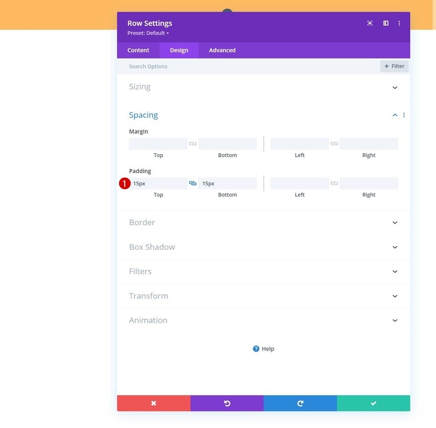
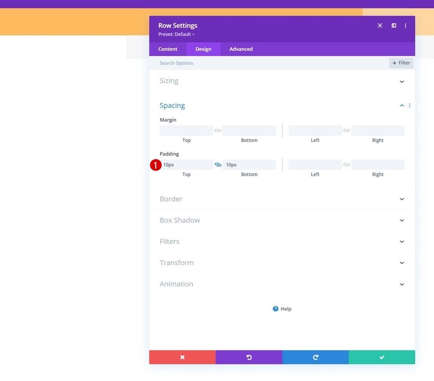
Spacing
At this level, you will add some custom top and bottom padding.
- Top Padding: 15px
- Bottom Padding: 15px
Main Element CSS
Now you'll add one line of CSS code to the row's main element in the advanced tab. The goal here is to make sure that the columns remain next to each other on smaller screen sizes.
| 01 | display: flex; |

Add Social Media Follow Module to Column 1
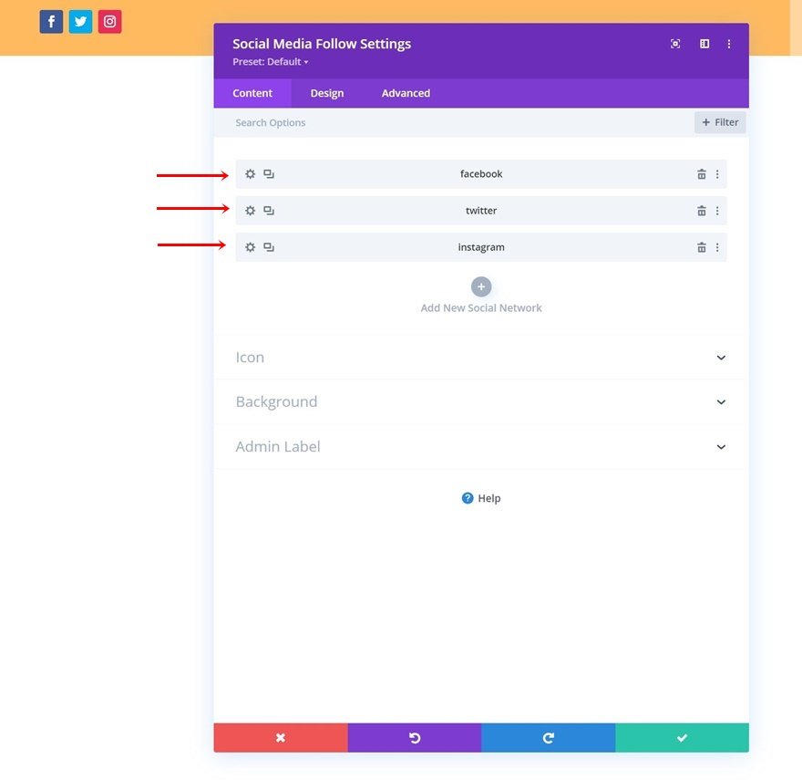
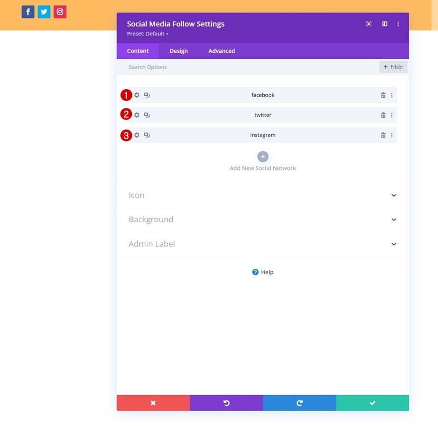
We can now add modules. Let's start in column 1 with a Social Media Follow Module.
Add Social Networks of Choice
You will add the social networks of your choice along with their corresponding links.
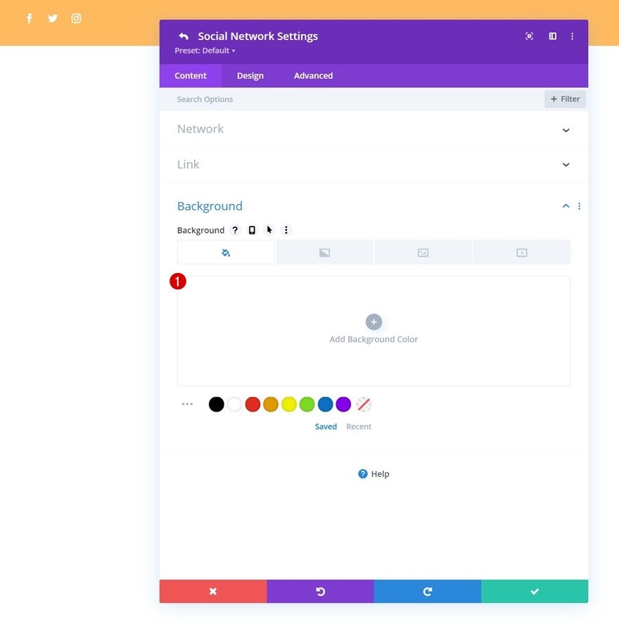
Then, you have to remove Each Social Network’s Background Color.
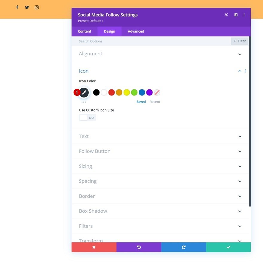
Icon Settings
Go back to the general module settings and change the icon color in the design tab.
- Icon Color: #26333a
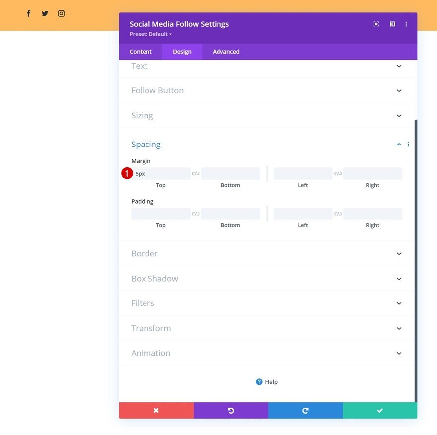
Spacing
Add some top margin.
- Top Margin: 5px
Add Button Module to Column 2
In column 2, the only module we need is a Button Module. You will first add a copy of your choice.
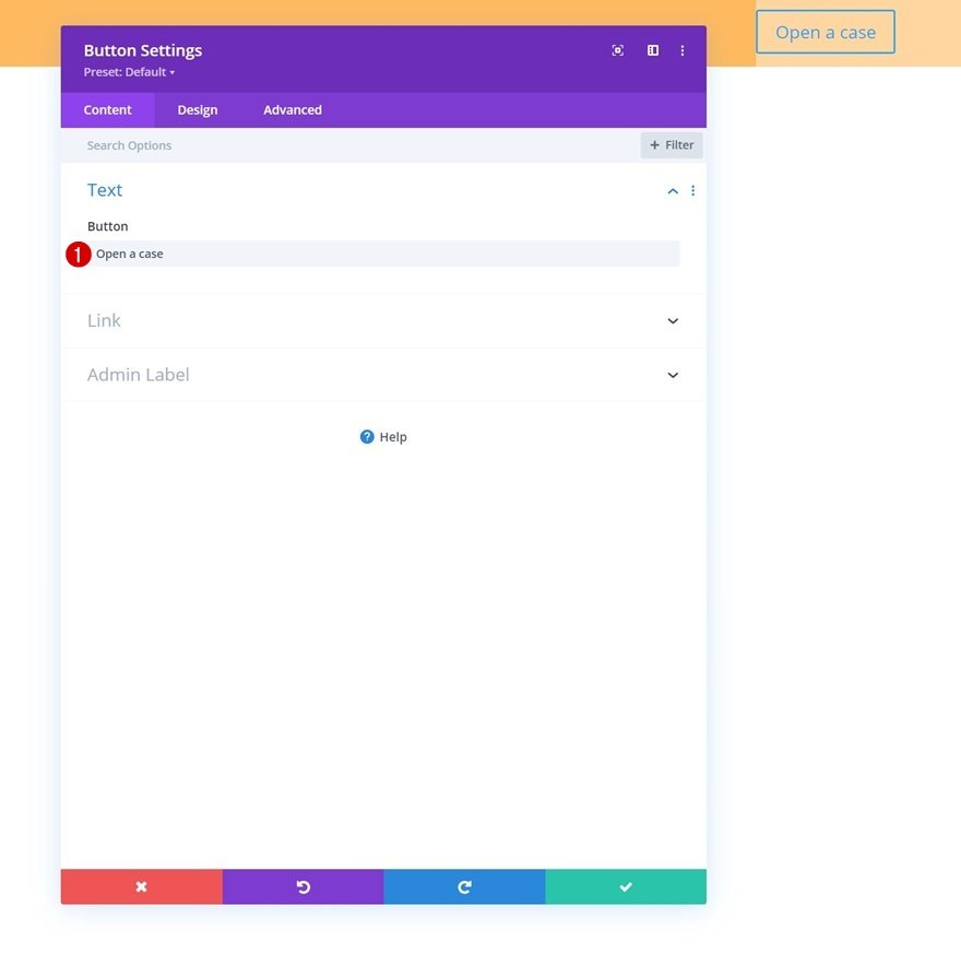
Then you add a link.

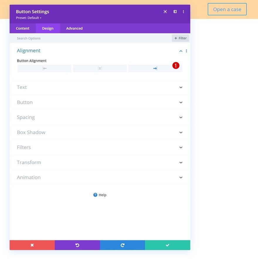
After that, you need to go on to the design tab and change the button alignment.
- Button Alignment: Right
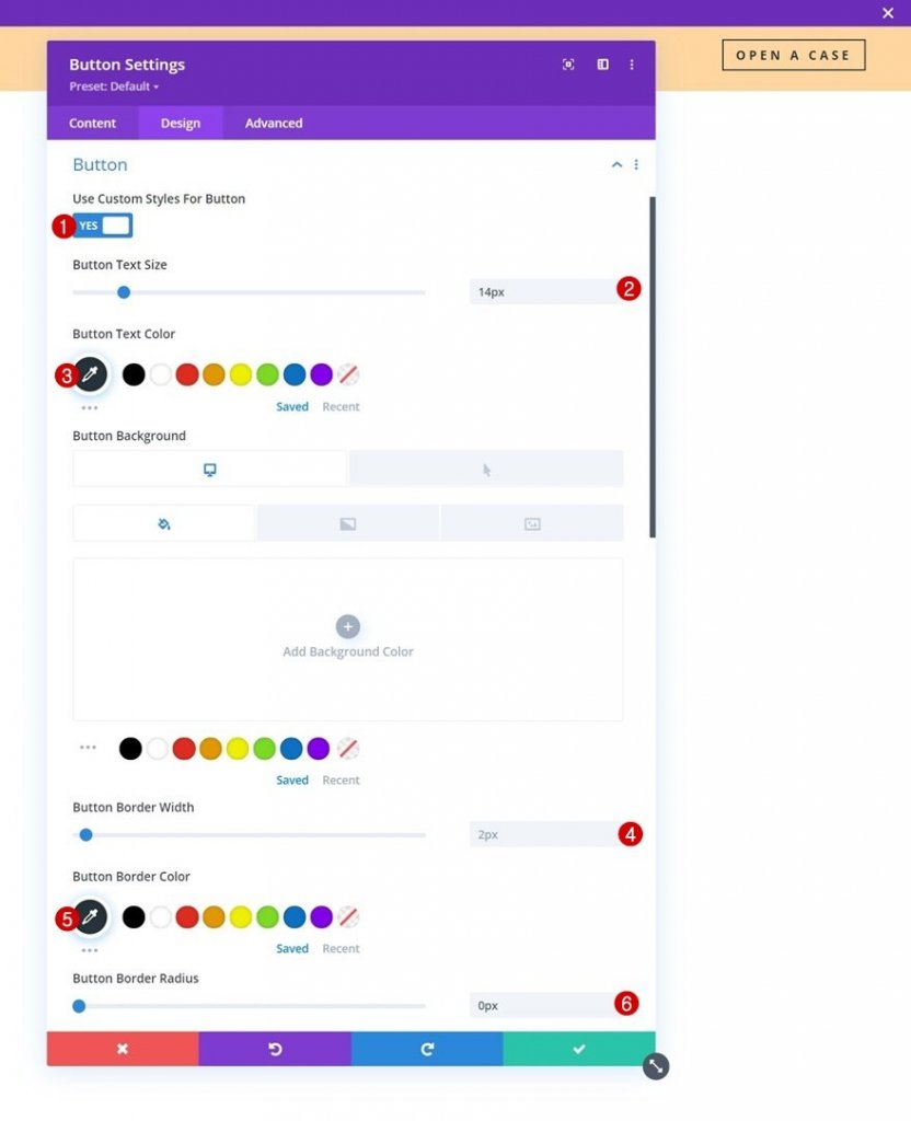
Let's configure some styling elements for the button:
- Use Custom Styles For Button: Yes
- Button Text Size: 14px
- Button Text Color: #26333a
- Button Border Width: 2px
- Button Border Color: #26333a
- Button Border Radius: 0px
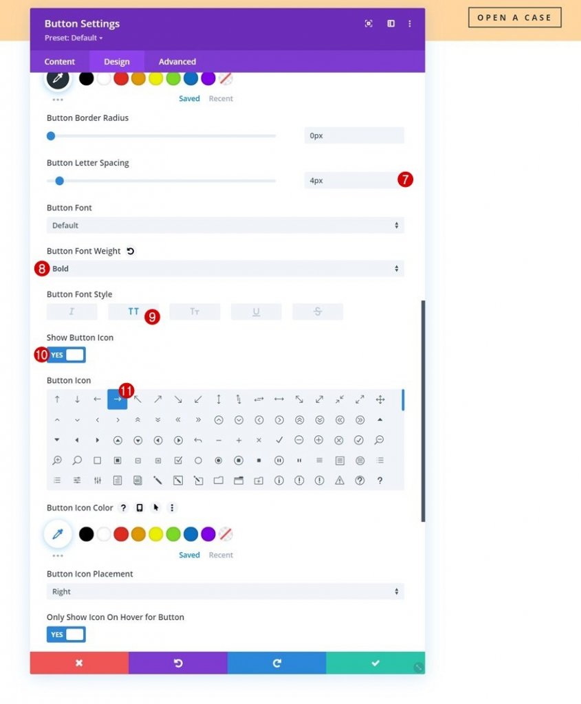
- Button Letter Spacing: 4px
- Button Font Weight: Bold
- Button Font Style: Uppercase
- Show Button: Yes
And we’ll complete the module settings by adding some top and bottom padding to the spacing settings.
- Top Padding: 10px
- Bottom Padding: 10px
The configuration of section 1 is now complete. Now we are going to add a second dedicated section to the menu, which will be turned sticky in the second part of this tutorial.
Add Section #2
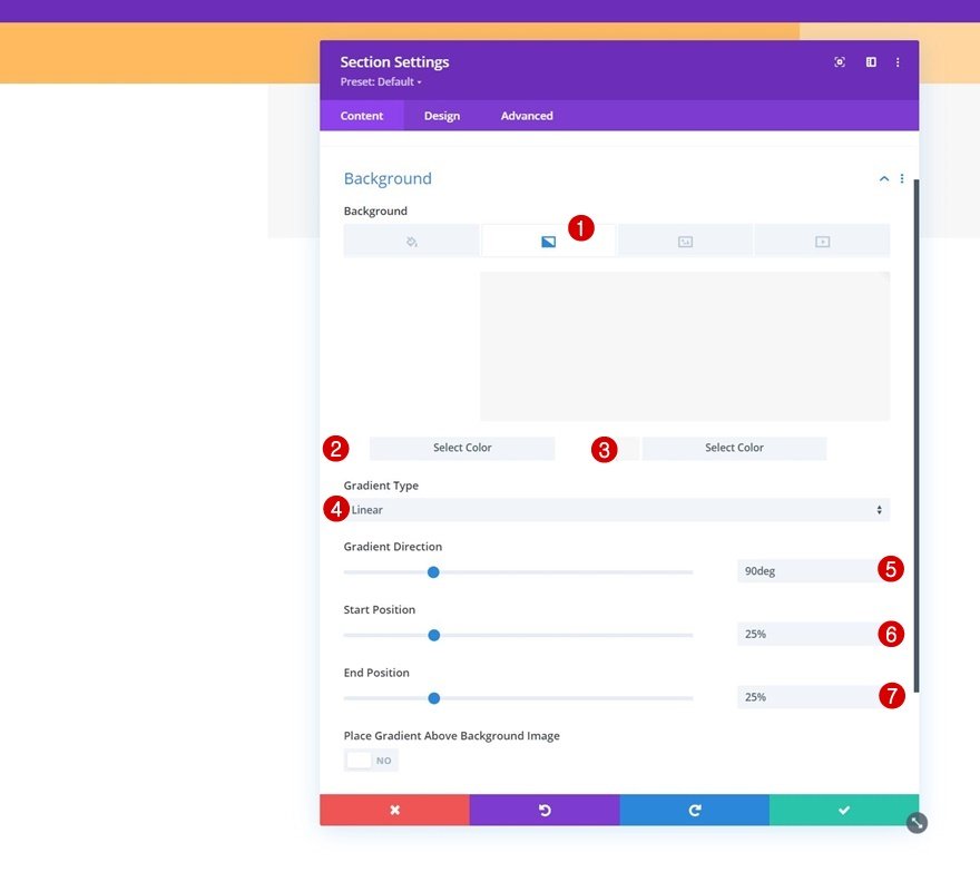
Section 2 dedicated to the menu will be added right below the previous one. As in section 1, we will first configure the Gradient Background.
- Color 1: #ffffff
- Color 2: #f7f7f7
- Gradient Type: Linear
- Gradient Direction: 90deg
- Start Position: 25%
- End Position: 25%
Move on to the section’s design tab and remove all default top and bottom padding.
- Top Padding: 0px
- Bottom Padding: 0px

Add new Row
We will need to use the following column structure:
Then, move on to the row's design tab and change the sizing settings as follows:
- Use Custom Gutter Width: Yes
- Gutter Width: 1
- Max Width: 2580px
Remove all default top and bottom padding next.
- Top Padding: 10px
- Bottom Padding: 10px
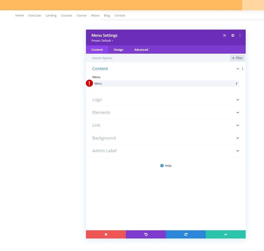
Add Menu Module to Column
You have to add a Menu Module to the row’s column and select a dynamic menu of your choice.
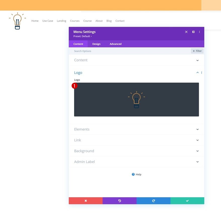
Upload a logo next.
After that, you can remove the module’s default white background color.
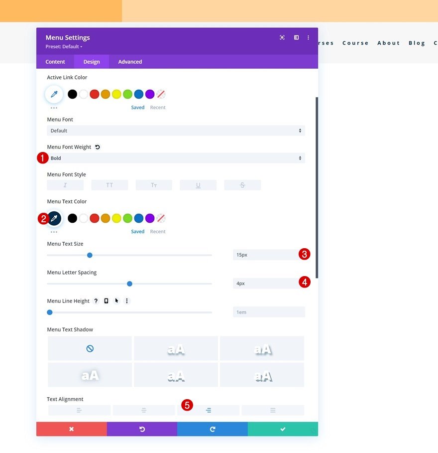
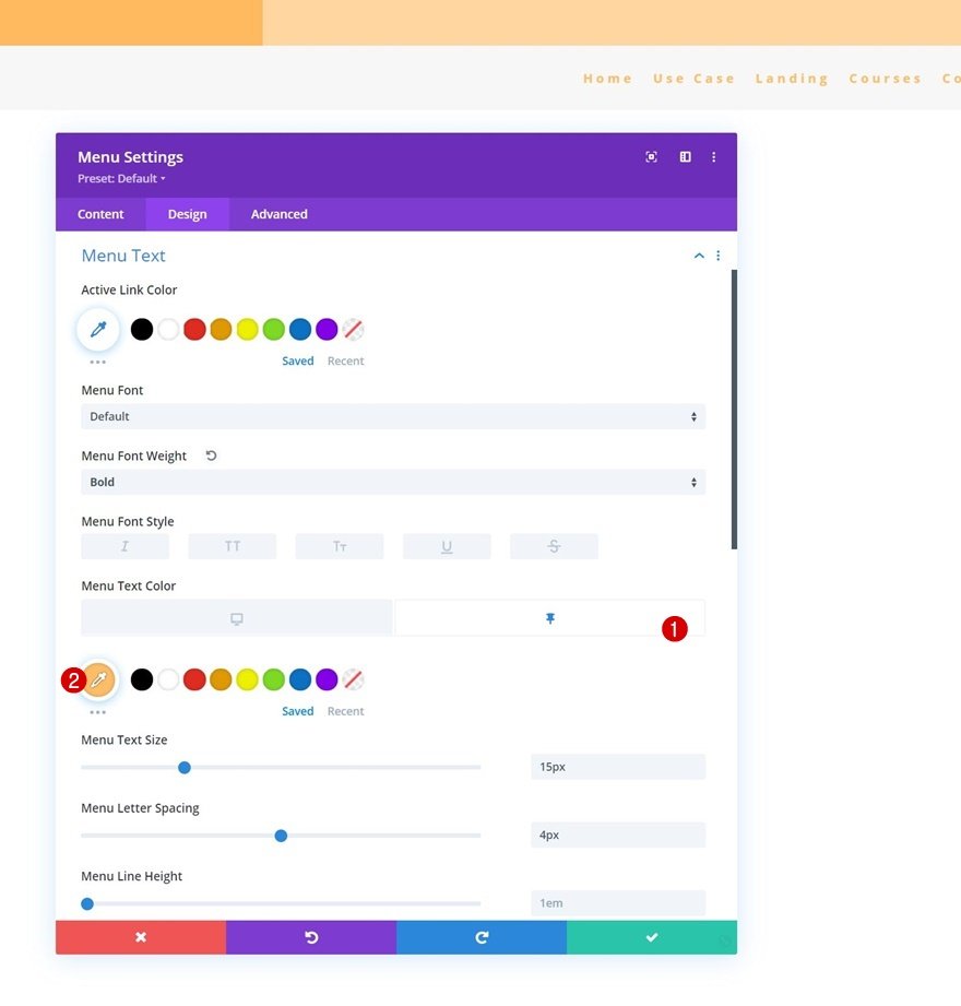
Move on to the design tab and style the menu text settings too.
- Menu Font Weight: Bold
- Menu Text Color: #002d4c
- Menu Text Size: 15px
- Menu Letter Spacing: 4px
- Text Alignment: Right
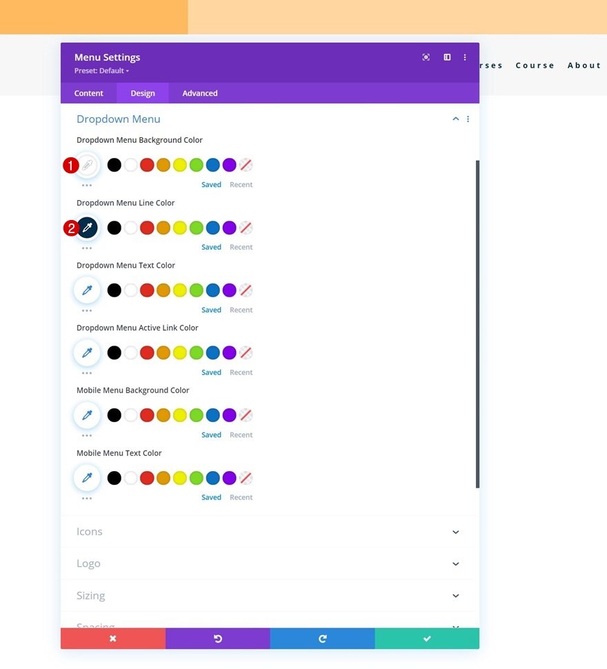
Now, make some changes to the dropdown menu settings.
- Dropdown Menu Background Color: #ffffff
- Dropdown Menu Line Color: #002d4c
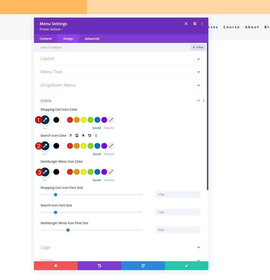
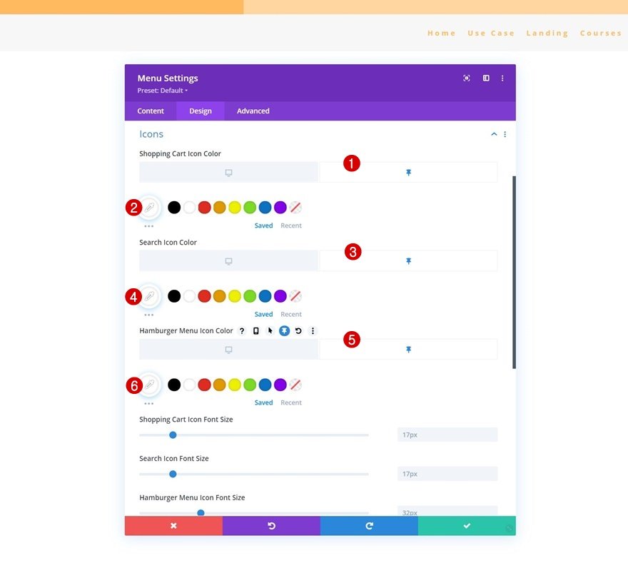
Along with the icons settings.
- Shopping Cart Icon Color: #002d4c
- Search Icon Color: #002d4c
- Hamburger Menu Icon Color: #002d4c
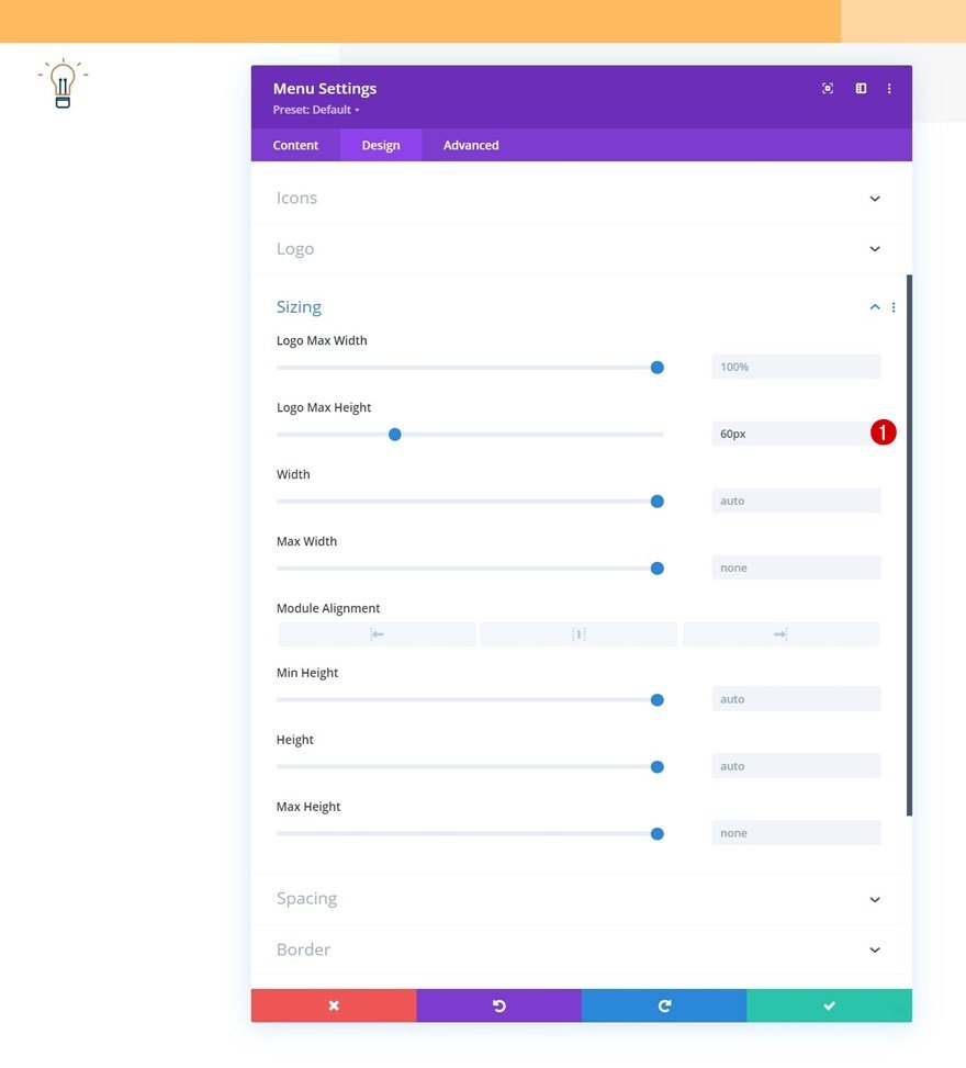
And complete the module settings by adding a logo max height to the sizing settings.
- Logo Max Height: 60px
And here is the Header Element Structure designed in full in a New Header Template. All that's left to do is apply custom Sticky Effects.
2. Application of Custom Sticky Effects
It’s time to turn our second section sticky and change the design style of it and its elements in a sticky state.
Make Section # 2 sticky
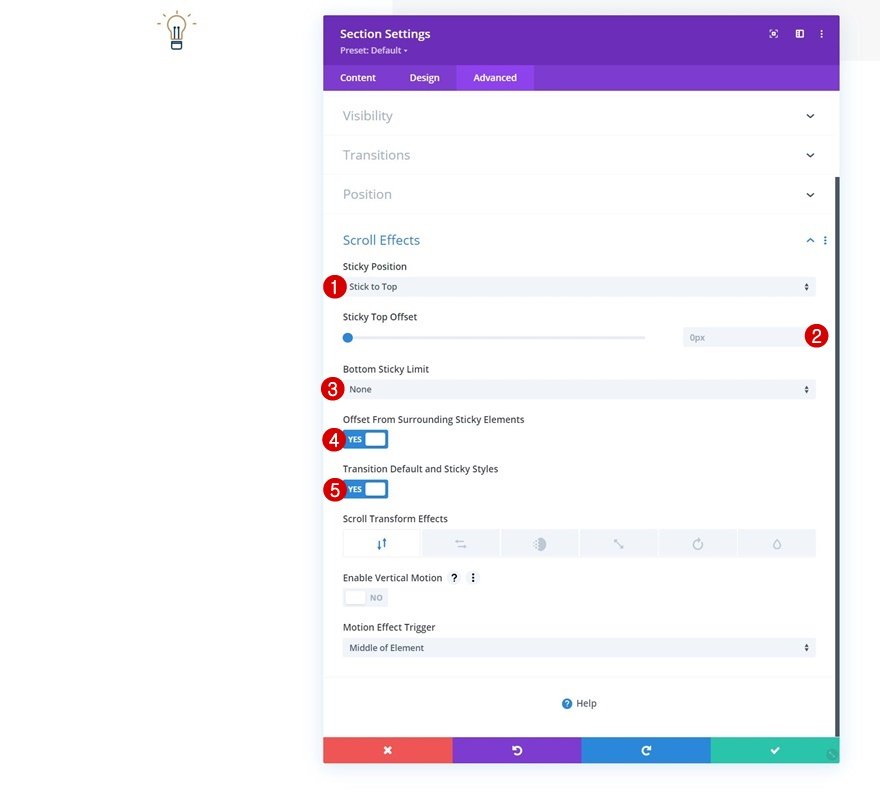
For that, you need to open the second section's settings and move on to the advanced tab. There, go to the scroll effects settings and apply the following sticky options:
- Sticky Position: Stick to Top
- Sticky Top Offset: 0px
- Bottom Sticky Limit: None
- Offset From Surrounding Sticky Elements: Yes
- Transition Default and Sticky Styles: Yes
Once the section becomes sticky, an additional option will appear inside our section, row, and module settings: the Sticky Option
By clicking on this option, a new alternative style will be created for all the elements that you want to make sticky.
Modify Section’s Gradient Background in Sticky State
Go to the second section’s background settings and apply the following sticky gradient background:
- Color 1: #26333a
- Color 2: #1e272f

Stretch Row in Sticky State
Next, open the row containing the Menu Module and modify the width in a sticky state.
- Width: 95%
Change Menu Text Color in Sticky State
Just configure the following Text Color Menu:
- Menu Text Color: #ffbd68
Change Menu Icon Colors in Sticky State
Along with the icon colors.
- Shopping Cart Icon Color: #ffffff
- Search Icon Color: #ffffff
- Hamburger Menu Icon Color: #ffffff
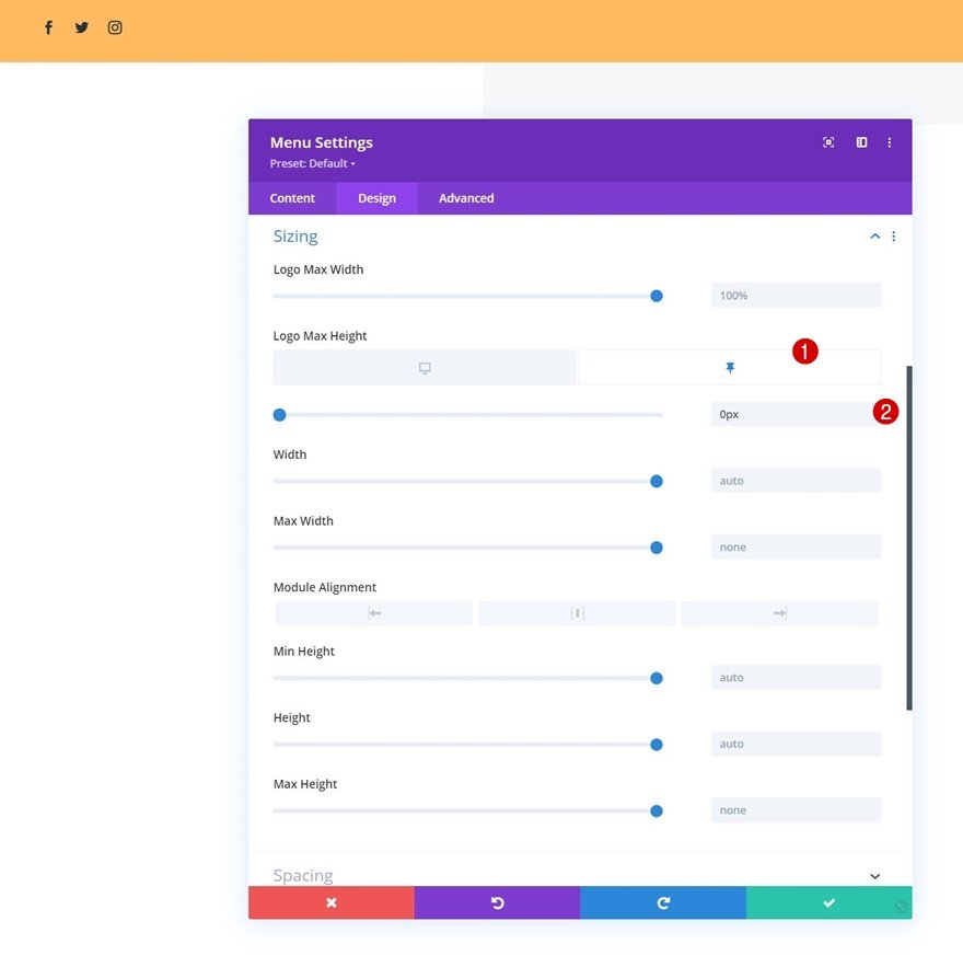
Remove Logo Height in Sticky State
You must remove the logo by reducing its maximum size to 0. So when the section's sticky settings are enabled, the logo will be removed from our header.
- Logo Max Height: 0px
That is all! Make sure you save all Divi Theme Builder changes once you’ve completed your header design and preview it on your website.
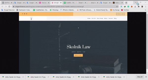
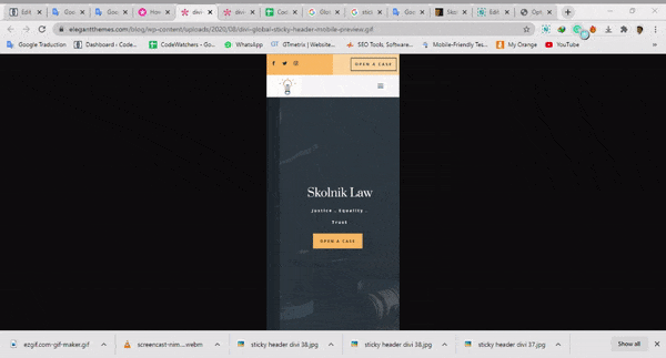
Preview
We will now see the result of our work on different screen sizes.
Desktop
Mobile
Final Thoughts
We hope this article will help you easily create a sticky header using Divi and its options provided for. The Divi sticky options provide you with countless possibilities to improve the user experience and design you create. You should be able to handle everything without a hitch.
If you are interested in more content, we recommend that you follow us on Facebook and Twitter.