
Sticky footer bars may be invaluable to any website, specifically for mobile devices. As the user travels down the page, a sticky footer bar remains constant (or stuck) at the edge of the screen. It is so close to the thumb that it is more beneficial to mobile users (particularly on phones). That is most likely why designers frequently add navigation buttons within sticky footer bars. It can improve mobile navigation UX.
This article will show you how to make mobile sticky footer bars in Divi. The static position is the cornerstone of every sticky footer bar, and it is easily controlled with Divi's built-in sticky position options. We'll demonstrate how to leverage the sticky position and the Divi design tools to create three distinct, sticky footer bar designs with four navigation buttons. This is ideal for any firm trying to improve the mobile UX of its website.
Now let's get started.
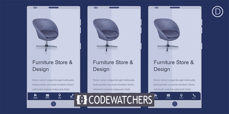
Design Preview
Here is a quick demo of the design we are going to create today.
Create Amazing Websites
With the best free page builder Elementor
Start NowSticky Footer Bar For Mobile
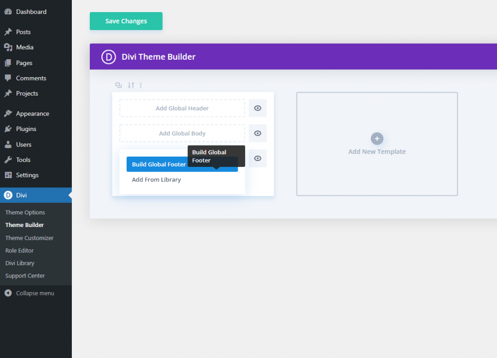
Section 1: Creating New Footer Template
To begin, go to the Theme Builder and click to create a new global footer in the default website template.
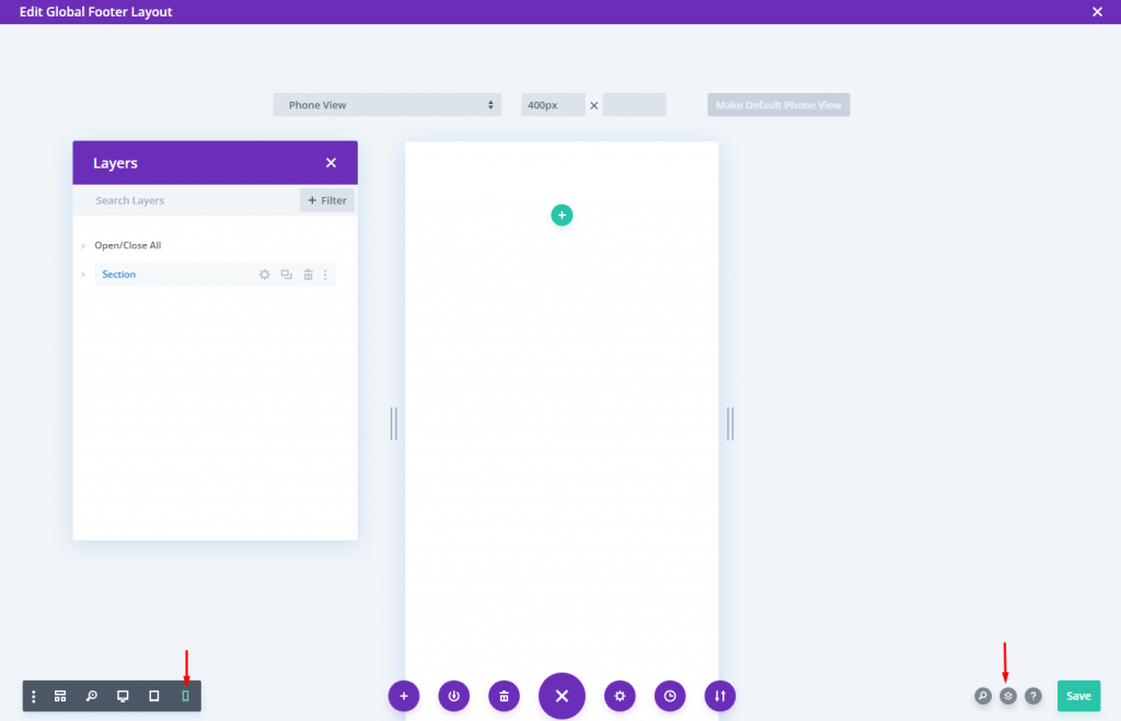
Activate Mobile View & Layers
Open the options menu at the bottom of the page once you're within the footer layout editor.
To open the builder's phone view, click the phone symbol on the left side. This will assist us in visualizing how the sticky footer would appear on mobile as we design.
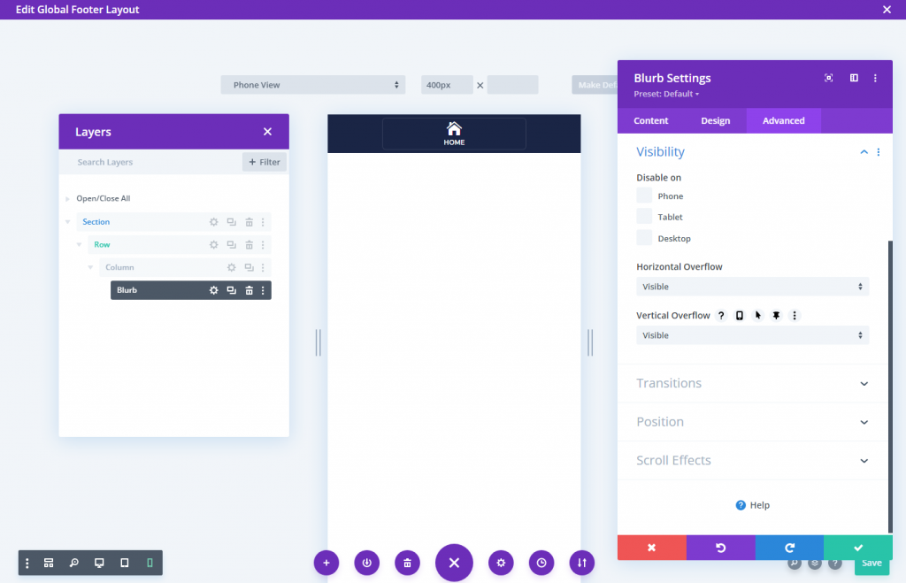
Then, click the layers symbol to open the layers modal on the right. This will aid in selecting elements when they become too close together.
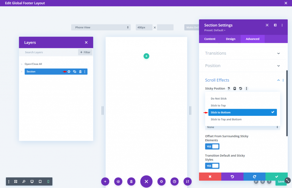
Section 2: Sticky Section Creating
We can use the current default regular section to construct the sticky section.
Open the section's options and, under the advanced tab, pick the Stick to Bottom sticky position option.
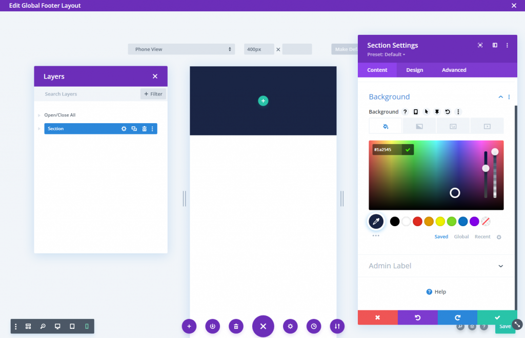
On the content tab, apply a background color to the section.
- Background Color: #1a2545
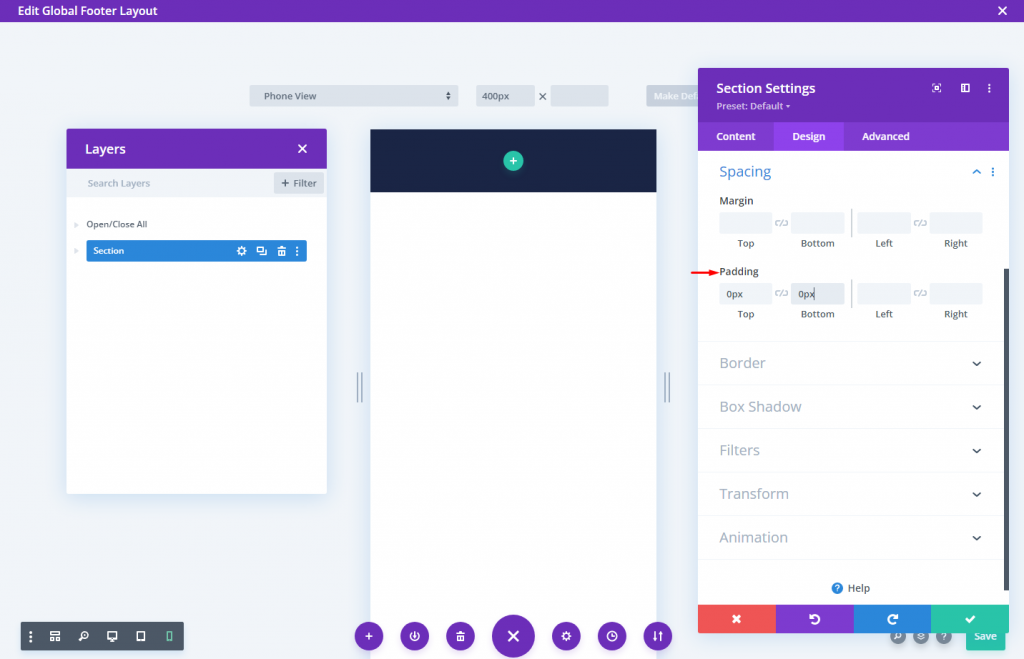
From the design tab, Change the padding values:
- Padding: 0px top, 0px bottom
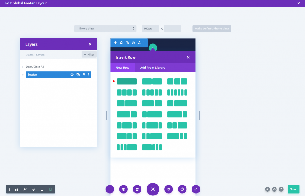
Creating The Row
Now add a one-column row.
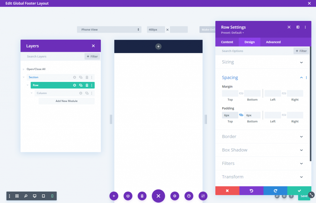
Change the row setting as follows.
- Gutter Width: 1
- Width: 94%
- Padding: 6px top, 6px bottom
To ensure that the additional columns we'll be adding remain nearby (don't stack) on mobile, we'll need to add a quick CSS snippet that uses the Flex property to keep things aligned beautifully.
Insert custom CSS to the main element in the advanced tab:
display:flex;
align-items:center;
justify-content:center;
flex-wrap:nowrap;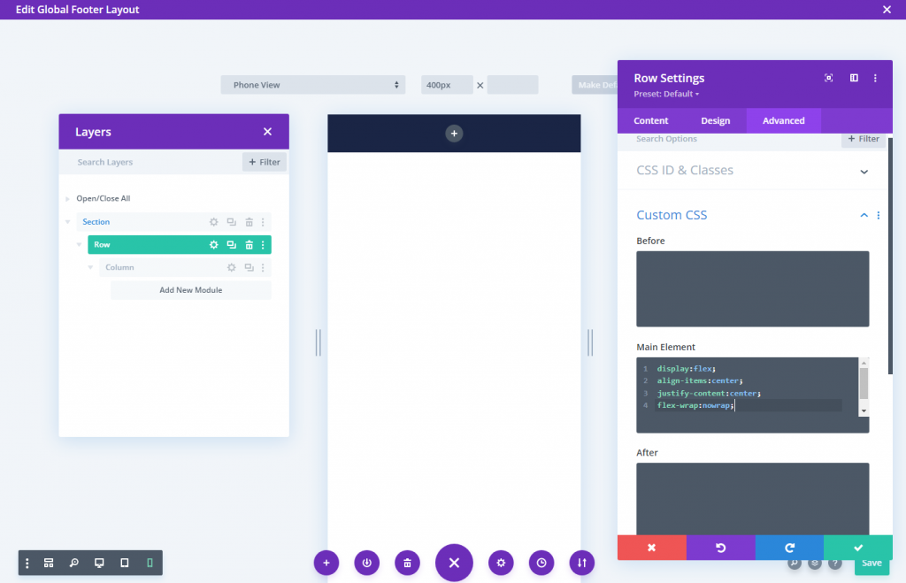
Section 3: Footer Bar Buttons
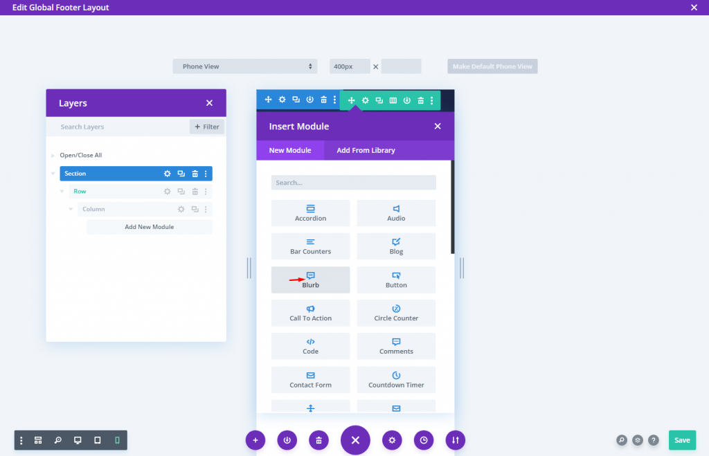
The blurb module will be used to build the bottom bar buttons. This enables us to design a button that looks like a mobile app (a small icon with a title underneath it); it's ideal for mobile navigation.
Insert a new blurb module inside the column.
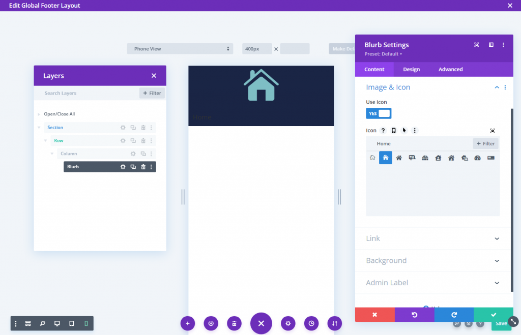
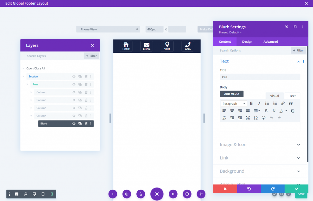
Update the blurb content:
- Title: Home
- Body: leave empty
- Use Icon: YES
- Icon: As screenshot
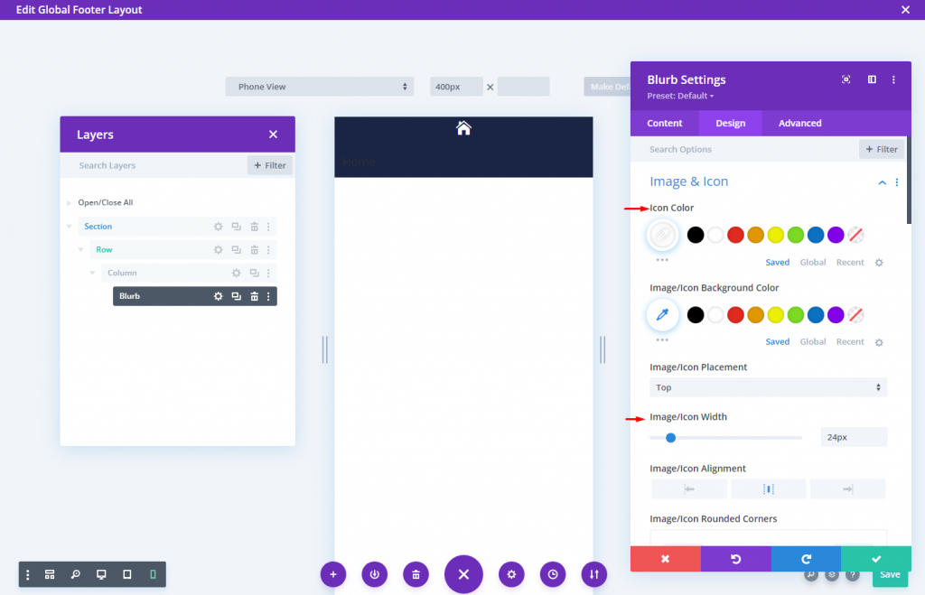
From the design tab, change the icon settings.
- Icon Color: #fff
- Icon Width: 24px
Then update the Title Text and Sizing options as follows:
- Title Font: Montserrat
- Title Font Weight: Semi Bold
- Title Font Style: TT
- Title Text Alignment: Center
- Title Text Color: #fff
- Title Text Size: 10px
- Max Width: 60px
- Module Alignment: Center
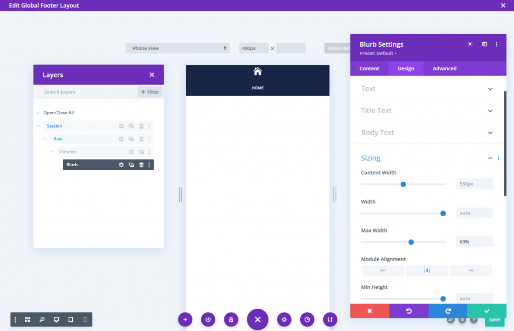
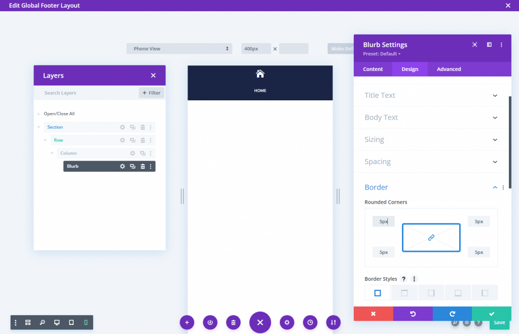
Add the following padding and make the corners round.
- Padding: 5px (top, bottom, left, right)
- Rounded Corners: 5px (top, bottom, left, right)
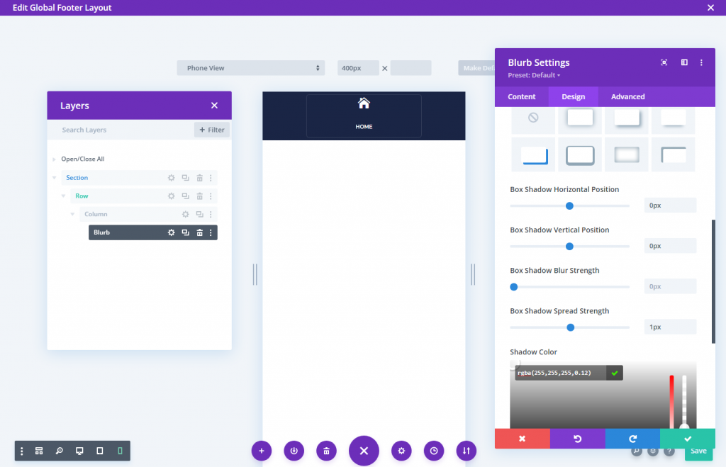
Use box shadows to add a border around the blurb. It will not take any additional place in our design.
- Box Shadow: see screenshot
- Box Shadow Horizontal Position: 0px
- Box Shadow Vertical Position: 0px
- Box Shadow Spread Strength: 1px
- Shadow Color: rgba(255,255,255,0.12)
To remove the space between the icon and text in the blurb module, use the following CSS code.
Blurb Image CSS
margin-bottom: 0px;Blurb Title CSS
padding-bottom: 0px;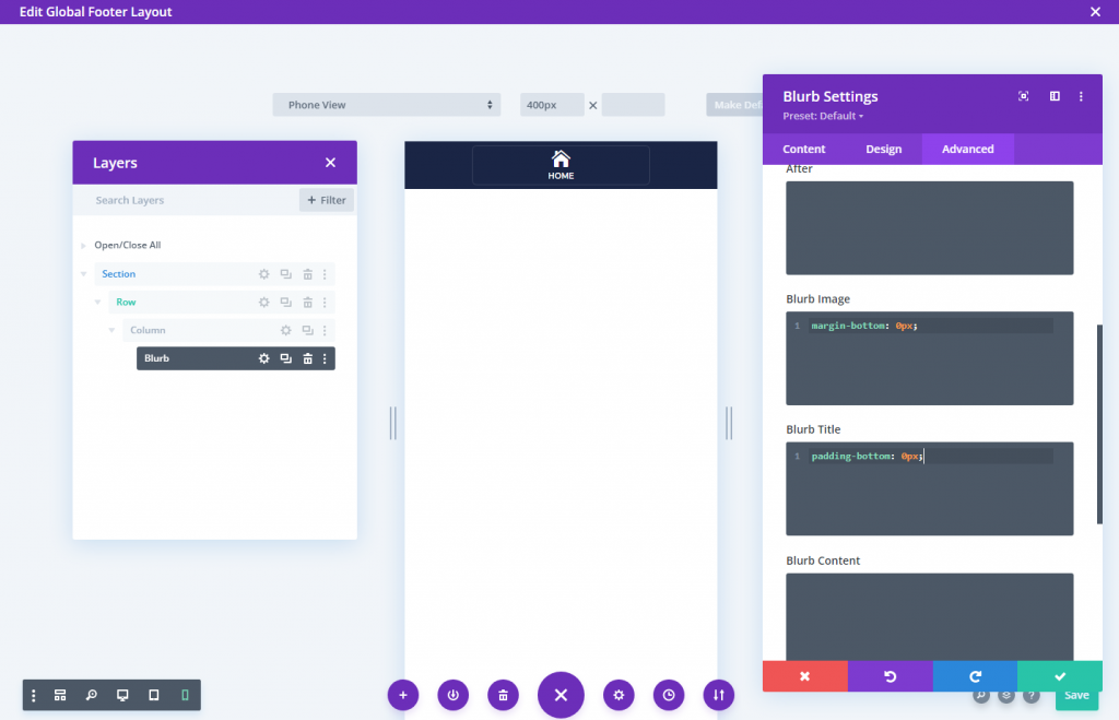
Also, change the vertical and horizontal overflow options visible to make the mobile settings option available on mobile.
Duplicate the columns for more buttons
We can replicate the column (bearing the blurb module) three times to make the remaining three buttons. This will result in four columns, each with identical buttons.
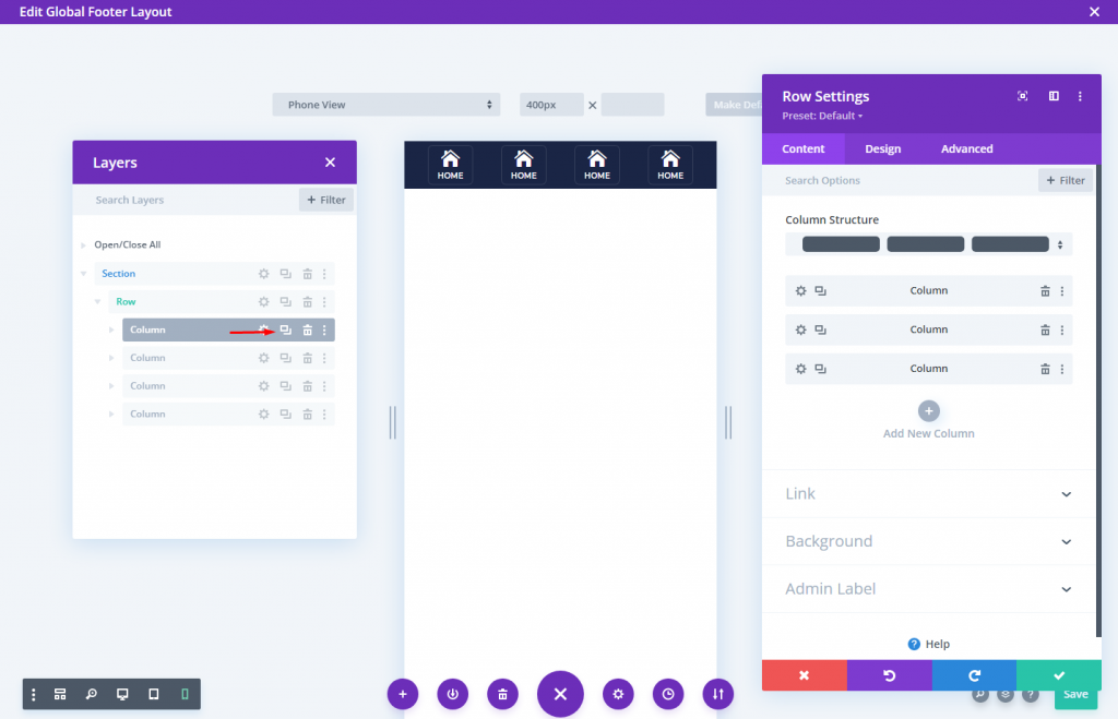
Change the icon and text once the columns are cloned.
Section 4: Save The Design
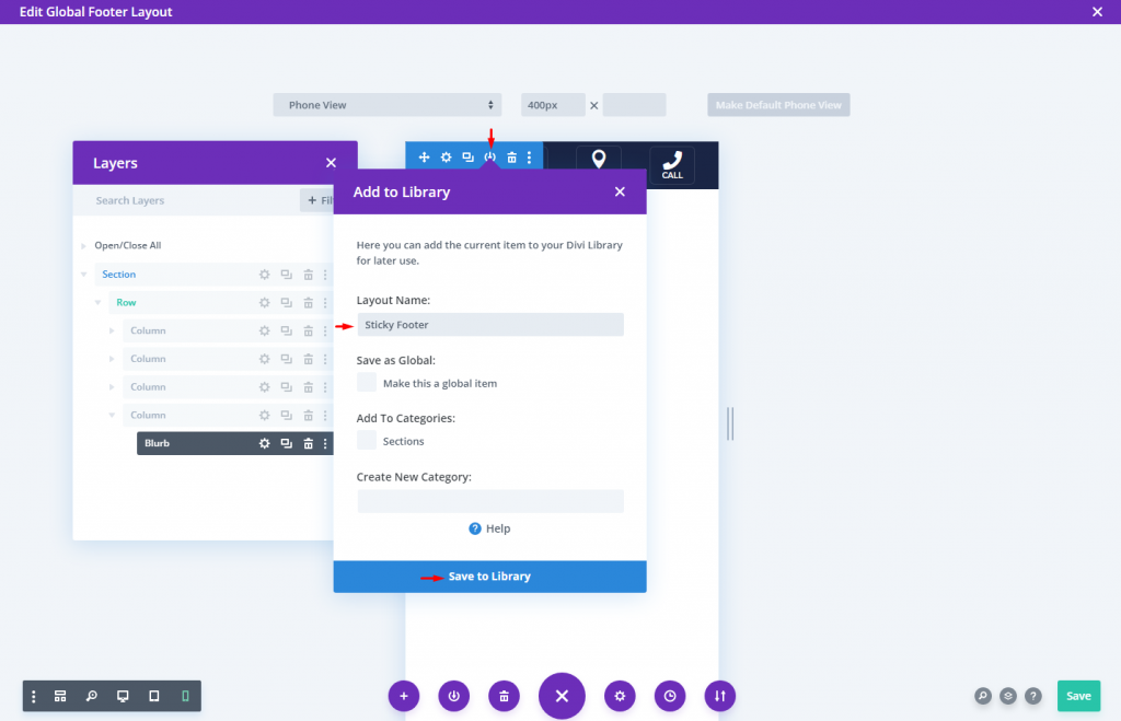
Save the section to the Divi Library now so you may put the sticky footer wherever you want later.
To save it, mouse over the section and click the Save to Library icon in the section settings box. After that, name the layout and save it to the library.
That's it and we are done.
Final Result
The final outcome of our design looks very beautiful.
Wrapping Up
It's easy to make a sticky footer bar in Divi. I mean, with a few clicks, you can make a section (or row) stick to the bottom of the page. The rest is up to you regarding how you want to style the footer bar and what information you want to include. The footer bar designs in this lesson are intended for mobile use and are more valuable and versatile, so you can have a sense of how to create them on your own. Don't be frightened to try out more innovative designs!