
Image Overlay is a very creative medium to provide an attractive viewing experience to website visitors. Custom animations and hovering effects are a great way to showcase an image, and it is very popular with everyone these days. In today's tutorial, we will see how to create beautiful image overlays with split text animation through Divi.
We have divided today's tutorial into three parts. In the first part, we will see how to create a custom image overlay and in the next part, we'll add some code into the design. And finally, we will see how to create a unique image overlay design using Divi's built-in option.
Let's get started without delay.
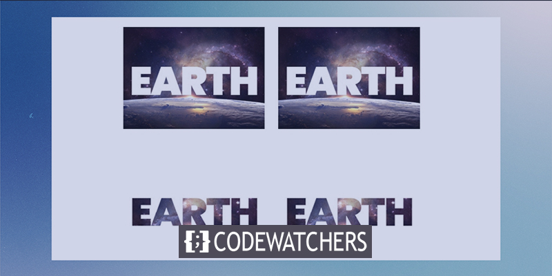
Preview
Before we start today's tutorial, have a look at our design that we are going to learn today.
Create Amazing Websites
With the best free page builder Elementor
Start NowBefore We Start
Divi is a great WordPress theme that delivers impressive features and serves the true purpose of a multipurpose WordPress theme. Its easy-to-use page builder has a lot of functionality that can create awesome designs. Get the theme and activate it after installation.
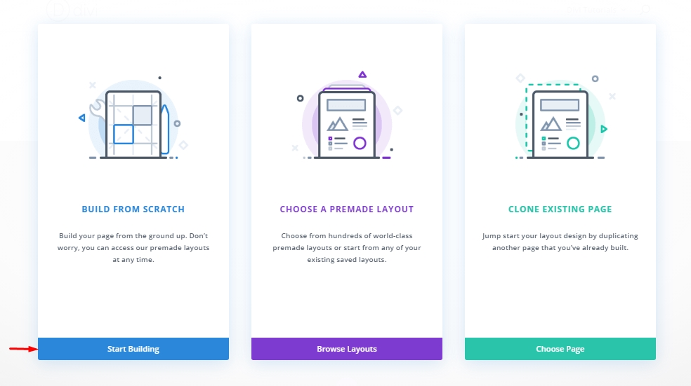
Create a new page from the WordPress dashboard and open the page for edit with Divi builder. Choose "Build From Scratch" and we are ready to work!
Section 1: Building The Design
We mentioned earlier that we would create the structure of our design in the first part. As soon we are done with the setup of the image overlay with split text shutters, we will load the animation on the next part.
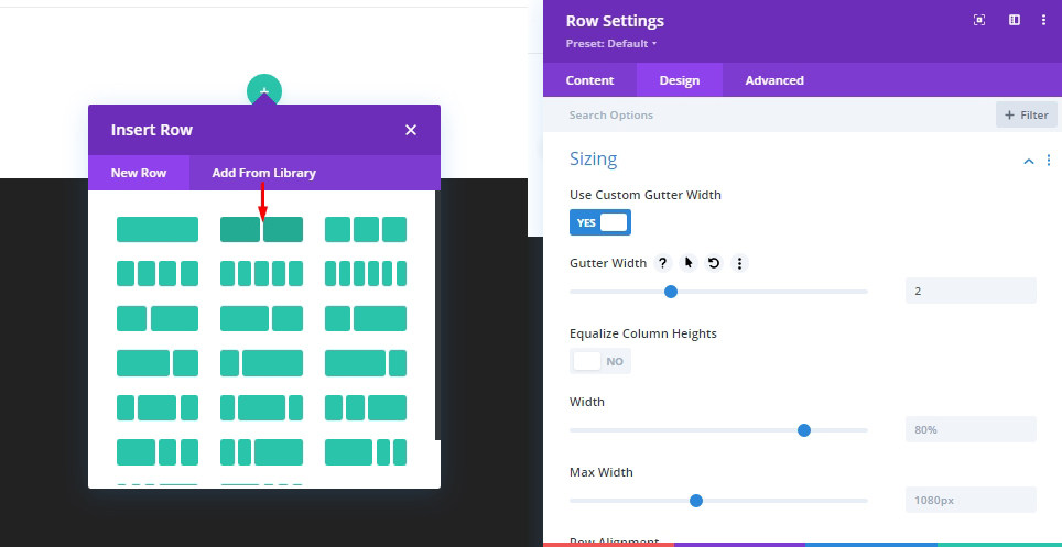
Add: Row 1
Row Settings
Add a regular 2 column row on the section and before adding any further modules, change the following settings.
- Gutter Width: 2
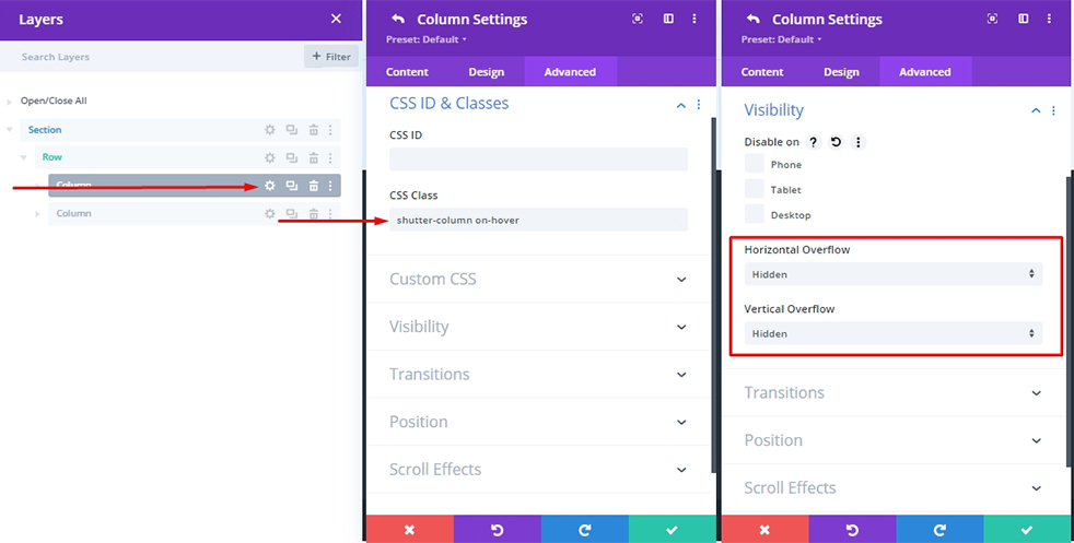
Column Settings
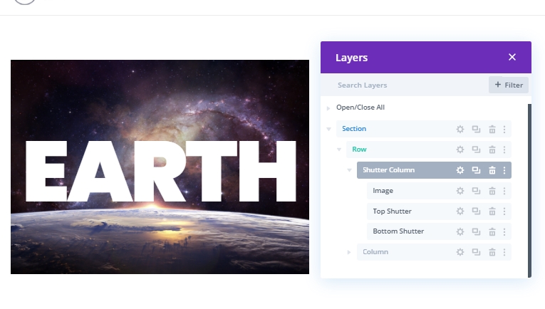
Columns will hold our images and shutter overlay elements, so this will be our main container. Also, this column will initiate the shutter animation hover effects. Simply, when a mouse comes inside this column - the entire animation will get started and, soon as the mouse is out, it will return to the previous state.
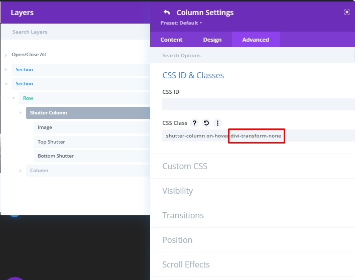
Add the CSS Class to the column to select our column as "shutter column" and to animate it later "on hover."
- CSS Class: shutter-column on-hover
Also make the following adjustments.
- Horizontal Overflow: Hidden
- Vertical Overflow: Hidden
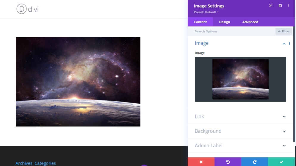
Add: Image Module
Now we'll add our main image that will sit behind our shutter overlay with an image module.
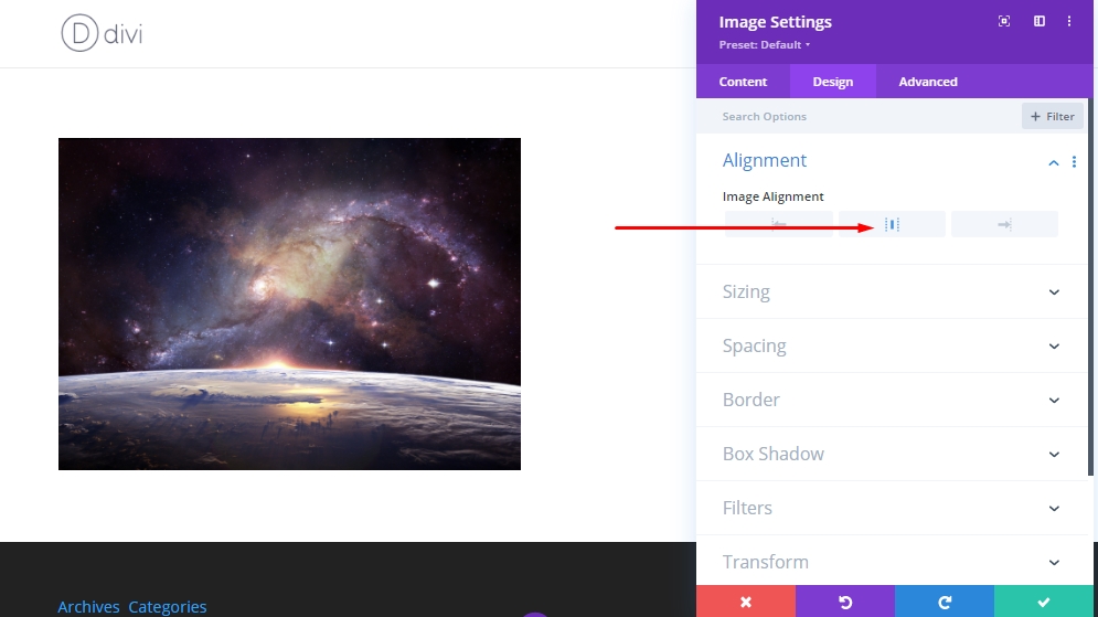
Now make a slight change on alignment under design tab.
- Image Alignment: Center
Creating A Top Shutter Split Text
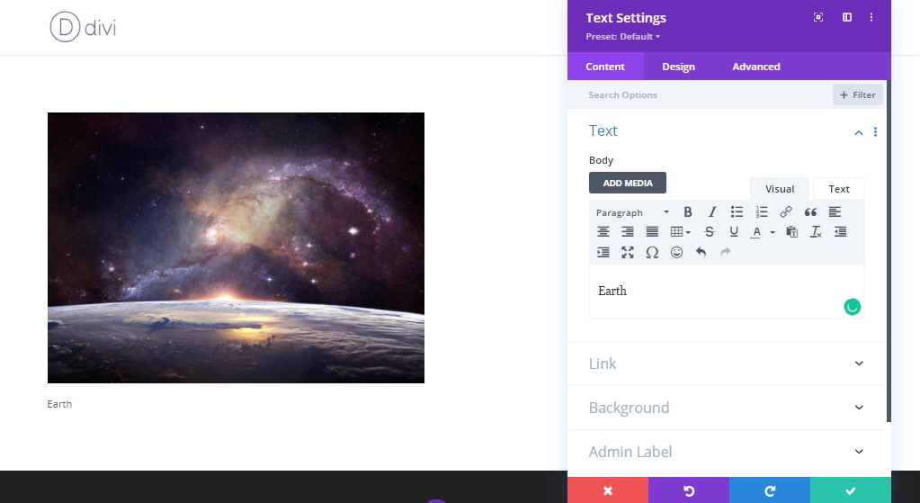
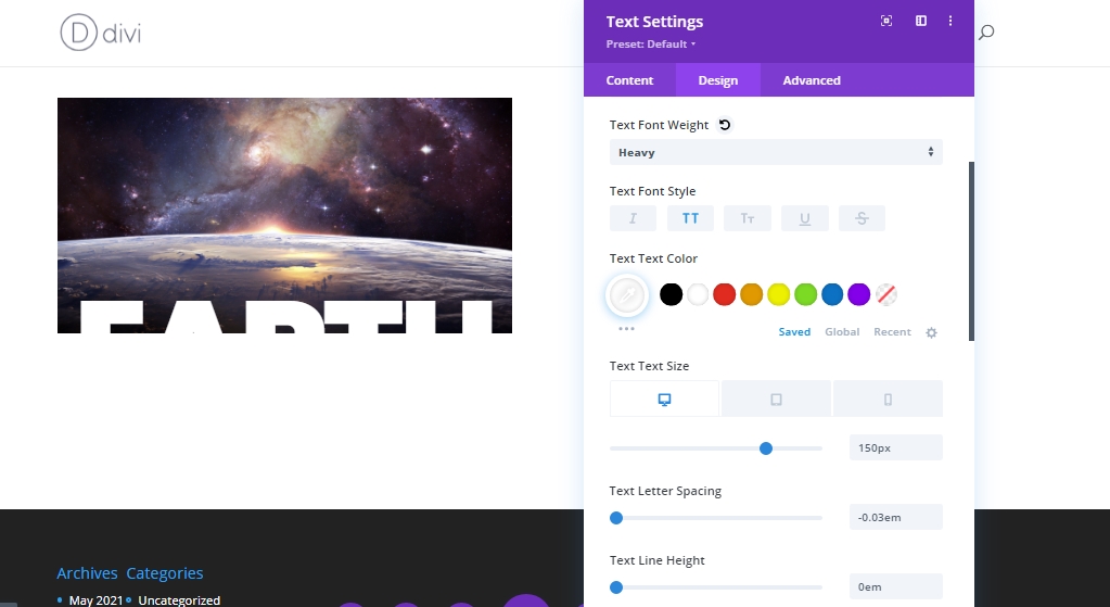
As our image is placed, we will add a text module beneath the image module to add a top shutter.
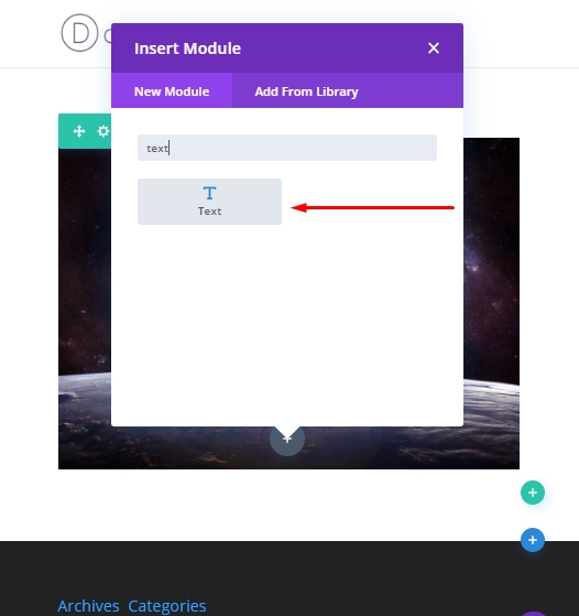
Update The text module with a text.
Open design tab, make these adjustments.
- Text Font: Poppins
- Text Font Weight: Heavy
- Text Font Style: TT
- Text Text Color: #ffffff
- Text Text Size: 150px (desktop), 20vw (tablet and phone)
- Text Letter Spacing: -0.03em
- Text Line Height: 0em
- Text Alignment: Center
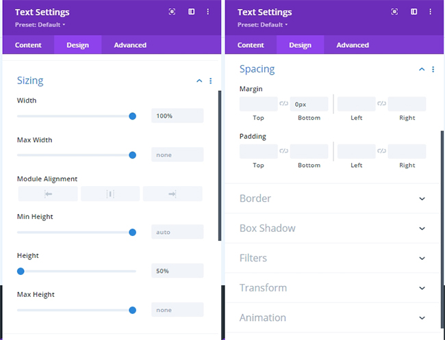
Now update the sizing and spacing settings.
- Width: 100%
- Height: 50%
- Margin: 0px bottom
Now, add the following CSS class on from the advanced tab.
- CSS Class: top-shutter
Later, we'll use the class to toggle on and off the transform animation with custom code. Then, add this CSS code to the Main Element.
display:flex;
align-items:flex-end;
justify-content:center;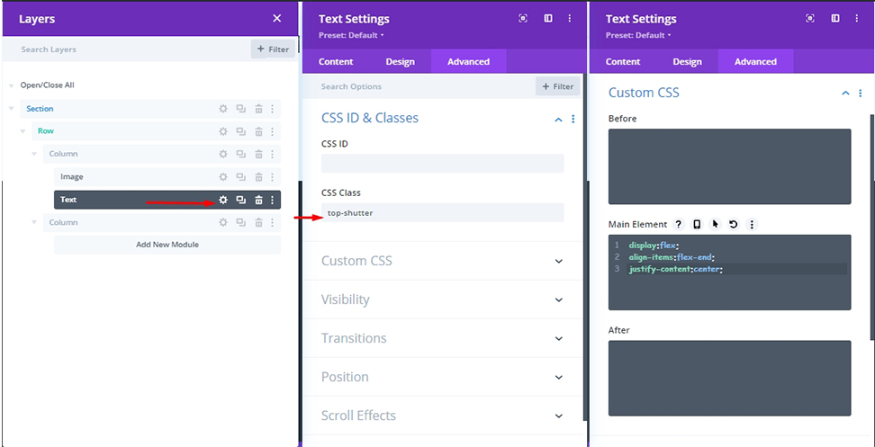
To bring our text in position, we need to make these changes.
Creating A Bottom Shutter Split Text
Since our top shutter split text is done, duplicate the text module to create a bottom shutter split text. You don't need to add any CSS Class; as we just cloned the previous module, the CSS Class is already there. But we need to make some adjustments to the CSS code on Main Element.
display:flex;
align-items:flex-start;
justify-content:center;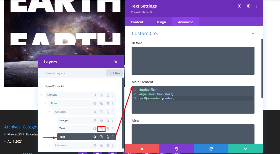
Reference to "flex-start," the text is vertically aligned at the top of the module. In the previous text module, we have set the line height at 0, So the bottom half of the whole text will be visible.
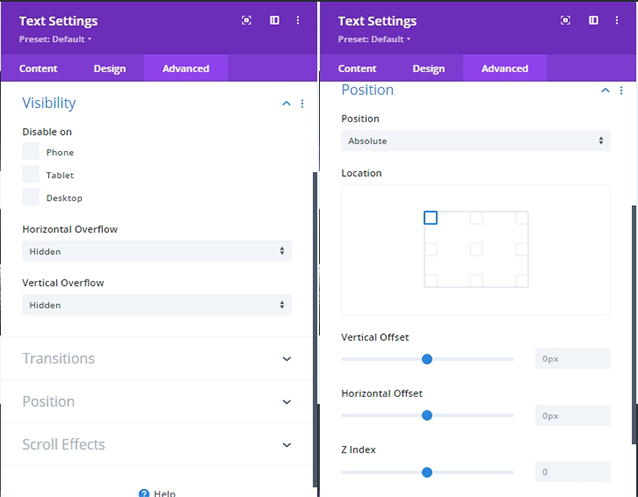
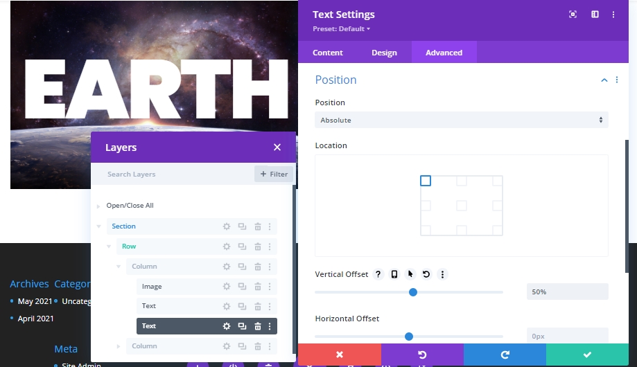
Add a absolute position with a vertical offset.
- Vertical Offset: 50%
Now, we have successfully made the structure of our today's tutorial where we'll do animation with the coding in the next part. Let's rename the modules for better future understandings.
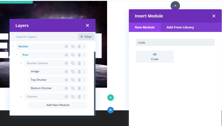
Section 2: The Code
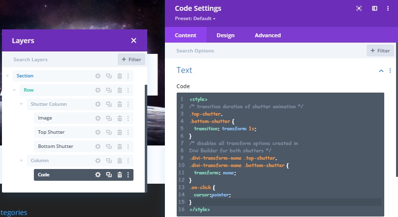
To bring shutter animation effect on our structure, we need some CSS and JS code. We'll use a Code module for that. Add the code module at top of the right column.
The CSS code
Paste the following CSS code inside a style tag.
/* transition duration of shutter animation */
.top-shutter,
.bottom-shutter {
  transition: transform 1s;
}
/* disables all transform options created in
Divi Builder for both shutters */
.divi-transform-none .top-shutter,
.divi-transform-none .bottom-shutter {
  transform: none;
}
.on-click {
  cursor:pointer;
}
The JS Code
Then, add the following JQuery code inside a script tag.
(function ($) {
  $(document).ready(function () {
    /*
  Toggle shutter transform animation on hover.
  To work, Divi Column with shutters must include
  these CSS Classes: "shutter-column on-hover divi-transform-none".
  */
    $ShutterColumnToHover = $(".shutter-column.on-hover");

    $ShutterColumnToHover.hover(function () {
      $(this).toggleClass("divi-transform-none");
    });

    /*
  Toggle shutter transform animation on click.
  To work, Divi Column with shutters must include
  these CSS Classes: "shutter-column on-click divi-transform-none".
  */
    $ShutterColumnToClick = $(".shutter-column.on-click");

    $ShutterColumnToClick.on("click", function (e) {
      $(this).toggleClass("divi-transform-none");
      e.stopPropagation();
    });

    $(document).on("click", function (e) {
      if ($(e.target).is(".shutter-column.on-click") === false) {
        $ShutterColumnToClick.addClass("divi-transform-none");
      }
    });
  });
})(jQuery);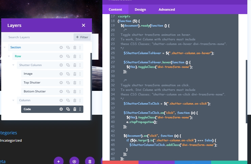
Section 3: Split Text Shutter Animation Design
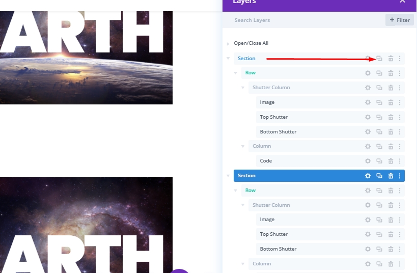
Now, we'll duplicate the first section of our design to create our first shutter animation.
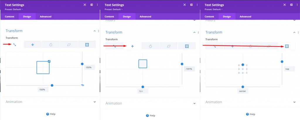
Add: Top Shutter Transform Properties
Usually, when we animate something using CSS Transform Properties, there is no transform style for that element at the beginning. Then after hovering over the element, we can see that style. In Divi, we will reverse the whole process. We will first transform that element using Divi Builder. The advantage of this is that we can edit everything visually. Then when the styling is done, we will initially disable it using a CSS class. Then toggle it on and off when the user interacts with the overlay.
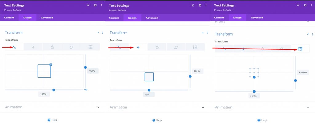
To add the transform design to the top shutter, open the top shutter text module settings and update the following:
- Transform Scale (X and Y): 150%
- Transform Translate Y-axis: -101%
- Transform Origin: top center
If you edit everything correctly, then the top shutter text will no longer be visible because we want the whole image to be exposed after the animation transition.
Add: Bottom Shutter Transform Properties
For the Bottom Shutter, update the following transform design options:
- Transform Scale (X and Y): 150%
- Transform Translate Y-axis: 101%
- Transform Origin: bottom center
Add: CSS Class To Disable Transform Property (Initially)
We already know that after designing transform properties for shutter animation, we will disable transform designs using a small CSS class. Because of the custom CSS code we added earlier, the design will appear without any transform designs in place.
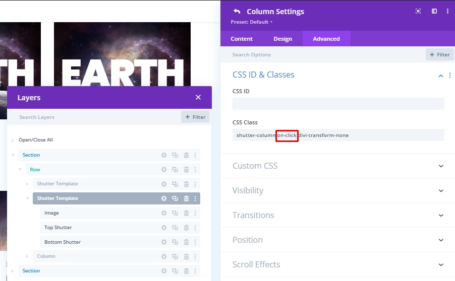
Add: On- Click Functionality
Our 1st animation was on the hover effect. So, hovering would actually trigger the animation with the mouse cursor over the image and text. Now we will see how we can do this with the mouse click without hovering.
Very simple, we will omit the "on-hover" command and add the "on-click" command to the section.
- CSS Class: shutter-column on-click divi-transform-none
So the design will look like this.
Reversing The Animation
Now, if we want, we can make an animation where the whole image will stay exposed and the text will come when we hover - meaning just the opposite of what we have now. We can get such animations easily by removing the "divi-transform-none" CSS class.
Another Design
Here we have another design.
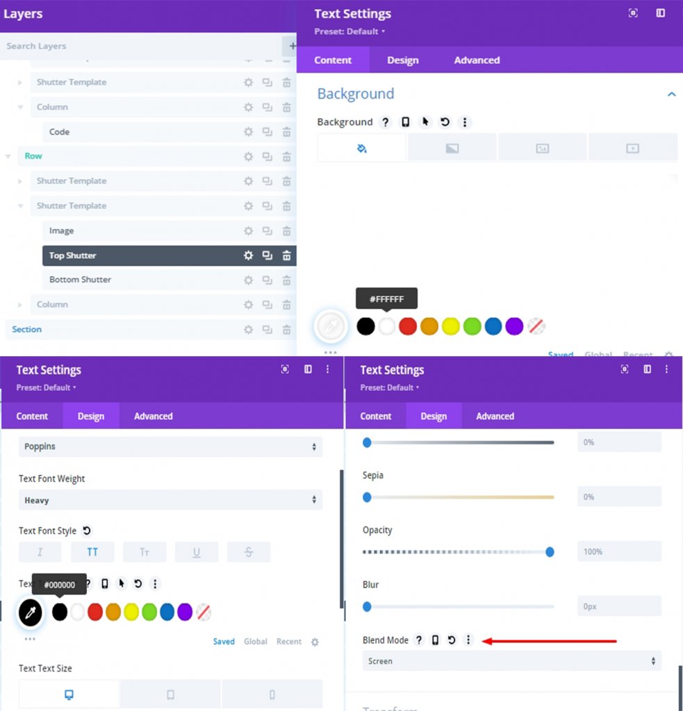
Update Shutters
Select top and bottom text modules from each shutter template. Then open the element settings for both and update the following:
- Background: #ffffff
- Text Text Color: #000000
- Blend Mode: Screen
Final Design
Our final design will look like this.
Conclusion
Any design including split text shutter design, can be done very easily through Divi. It is a very effective way to attract visitors. Hopefully, today's tutorial will add a new dimension to your website design. If you like this tutorial, don't forget to let us know in the comments box.