
Are you familiar with creating stunning websites using Divi? You should probably know that the grid layout is a core feature of the Divi Builder. Usually, you start by creating a row and chose to create multiple columns for that row. With the column in place, that's where you'll add modules. We can make things go further, by adding more grids for those modules.

Throughout this tutorial, we'll explore how to extend Divi's grid layout by creating CSS grid layouts for Divi modules with a single column. The CSS grid is (using CSS Flex) is very popular to create responsive grids for content with just a few CSS lines. We can then organize all our modules to be responsive. Consider this as an additional layout for modules that you can add to a Divi column. The good point here is that all our nested modules will have the same height and width without the need of setting padding and height values.
Final Result Preview
Before starting, let's see what you'll be able to achieve by the end of this tutorial.
Creating a Custom CSS Grid Layout For Divi Modules
Part 1: Adding The Modules to a Divi Column
One of the first things that we need to do, is to organize our modules into grid layouts. We'll add all the modules we want to use to our column. Let's start by creating a new one-column row to the default regular section.
Create Amazing Websites
With the best free page builder Elementor
Start Now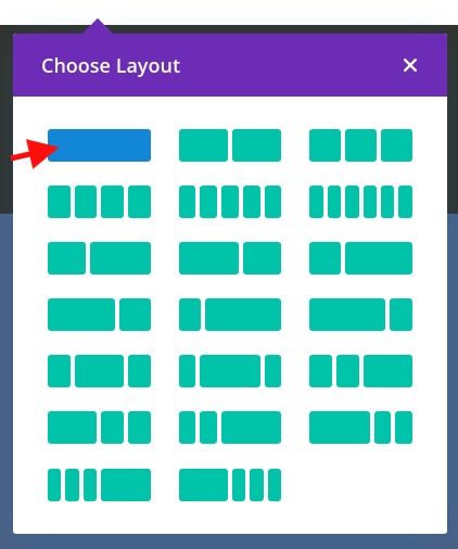
Creating the Modules
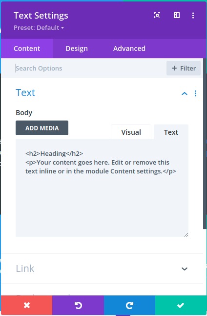
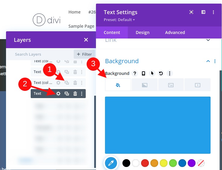
Within the columns, w e'll add the text module. We'll then change the content settings as follows :
- Add an H2 heading above the paragraph text
- Background Color: #444444
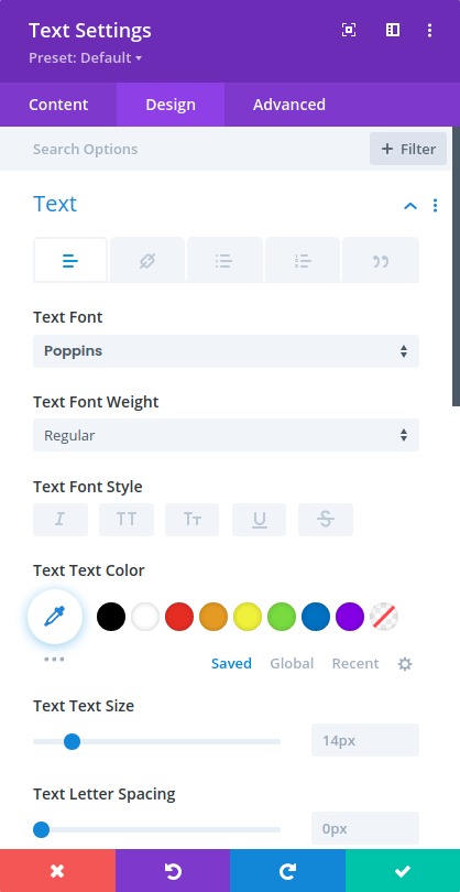
We'll also update the design settings as follows:
- Text Font: Poppins
- Text Color: Light
- Select the H2 tab under Heading Text
- Heading 2 Font Style: TT
- Padding: 10% top, 10% bottom, 10% left 10% right
NOTE: To make it very simple, we are going to keep using multiple text modules with various background colors to show a distinction between each module.
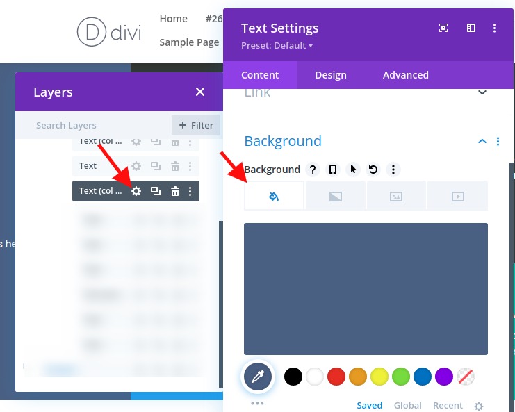
Switch to the layers view and create the next text module as follows:
- Duplicate the text module.
- Open the text settings for the duplicate module.
- Update the Background Color
- Background Color: #4c6085
You can repeat this process to create the third text module as follows:
- Duplicate the previous text module.
- Open the text settings for the duplicate module.
- Update the Background Color
- Background Color: #39a0ed
We'll repeat the process one more time to create the fourth text module as follows:
- Duplicate the previous text module.
- Open the text settings for the duplicate module.
- Update the Background Color
- Background Color: #13c4a3
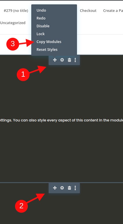
To create the next four modules, use the multiselect feature to select all four modules. Then copy and paste the modules in the same column to create a total of eight text modules.
Part 2: Let's create the CSS Grid LayoutFor the Modules
Now that all our modules are added, let's create a grid for those.
Row Settings
For this example, we are using a one-column layout so that we can display our module grid in a full-width layout. Now, we'll need to update the row settings to make sure the row takes the full width of the page. We'll also need to take out the default gutter width so that no additional margins are added to our modules.
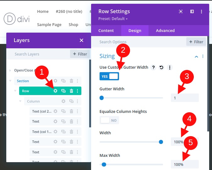
Open the row settings and update the following:
- Gutter Width: 1
- Width: 100%
- Max-width: 100%
Adding CSS Grid to the Column to Build the Grid Layout for the Modules
This is an important step in the tutorial that creates the layout for the modules using the CSS Grid property.
To do this, we are going to add three lines of CSS to the Column that will determine the layout of our modules.
Open the column settings and, under the advanced tab, paste the following CSS inside the Main Element:
display:grid;grid-template-columns: 25% 25% 25% 25%;grid-auto-rows: auto;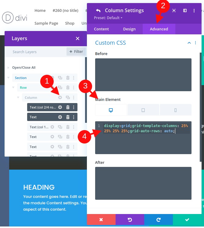
The first line of CSS lays out the content (or modules) according to the CSS grid module.
display:grid
On the second line of CSS, we'll define the column template of the grid. In this case, our grid will have four columns that have 25% in width.
grid-template-columns: 25% 25% 25% 25%
The third line mentions the rows that will be automatically generated. This means the height of each row will be determined by the vertical height of the content (or modules) within the row.
grid-auto-rows: auto
Adjust Grid Layout on Mobile
Now, we'll also need to adjust the grid layout on mobile devices as needed.
To be able to do that, we'll just need to add some CSS to both tablet and mobile that changes the number of columns and the width of each column.
In this example, we are going to change the grid layout for the modules on tablets to be two columns that are each 50% in width.
Let's open the responsive options and select the tablet tab under the main element and paste the following CSS:
display:grid;grid-template-columns: 50% 50%;grid-auto-rows: auto;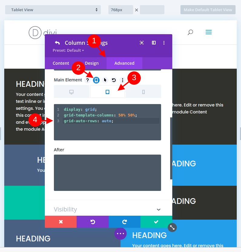
For phone display, we want a single-column layout. To create this, paste the following CSS under the Phone tab Main Element:
display:grid;grid-template-columns: 100%;grid-auto-rows: auto;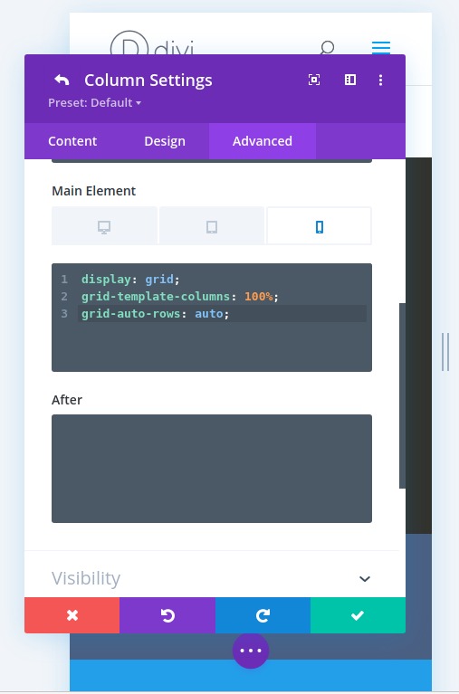
Part 3: Making Changes to the Grid Modules
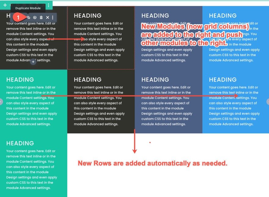
Adding a New Module to the Grid and How it Reacts
Now that we have each module to the Grid, if we add more modules, the other will be pushed to the right and new rows will be created. Since we need one more module for this layout anyway, duplicate the first text module to see how the other modules adjust within the grid.
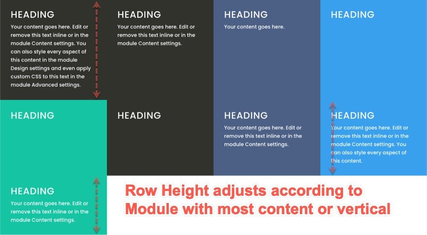
How Grid Responds to Modules with Different Amounts of Content
In the meantime, all the modules have the same amount of content, so we can't really see how the grid will handle modules that have various heights. To see how this works, change the amount of paragraph text within each module. Notice that the modules will remain the same height as the module with most content in the same row. From now the row's height will also be determined by the module with the most content (or vertical height).
Changing the Position of Modules On The Grid
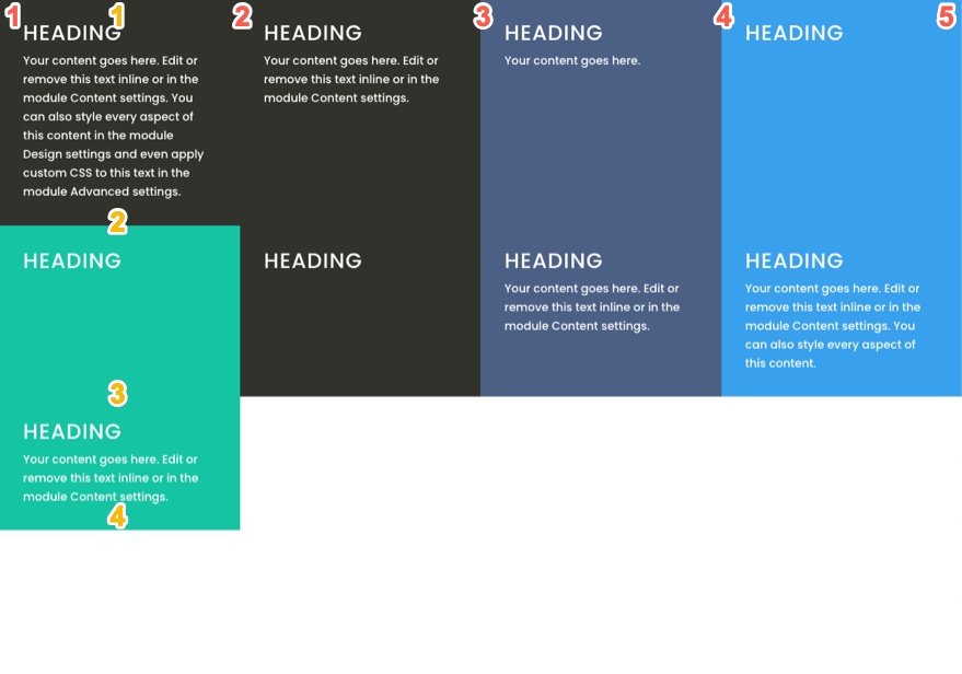
The items of the CSS grid can be positioned using the built-in numbering system on the grid module. Each line on the grid represents a number. For the columns, the line numbers start at 1 and continue horizontally. Each line number sits at the beginning and end of each column. So, for our column structure, the line number starts from 1 on the left of the first column and ends at 5 on the right of the fourth column. And, since we have three rows, the line numbers for rows start at 1 at the top of the first row and till 4 at the bottom of the third row.
If we want to change the position of a module (or grid item) in CSS Grid, we can set define where we want a certain module to be placed in the grid. Doing this will override the default placement of the module in the grid.
For this example, we'll move the first text module to a different position. For that, we just need to add two lines of CSS to the module.
Open the settings for the first text module and paste the following custom CSS to the main element:
grid-column: 2/4;grid-row: 2/3;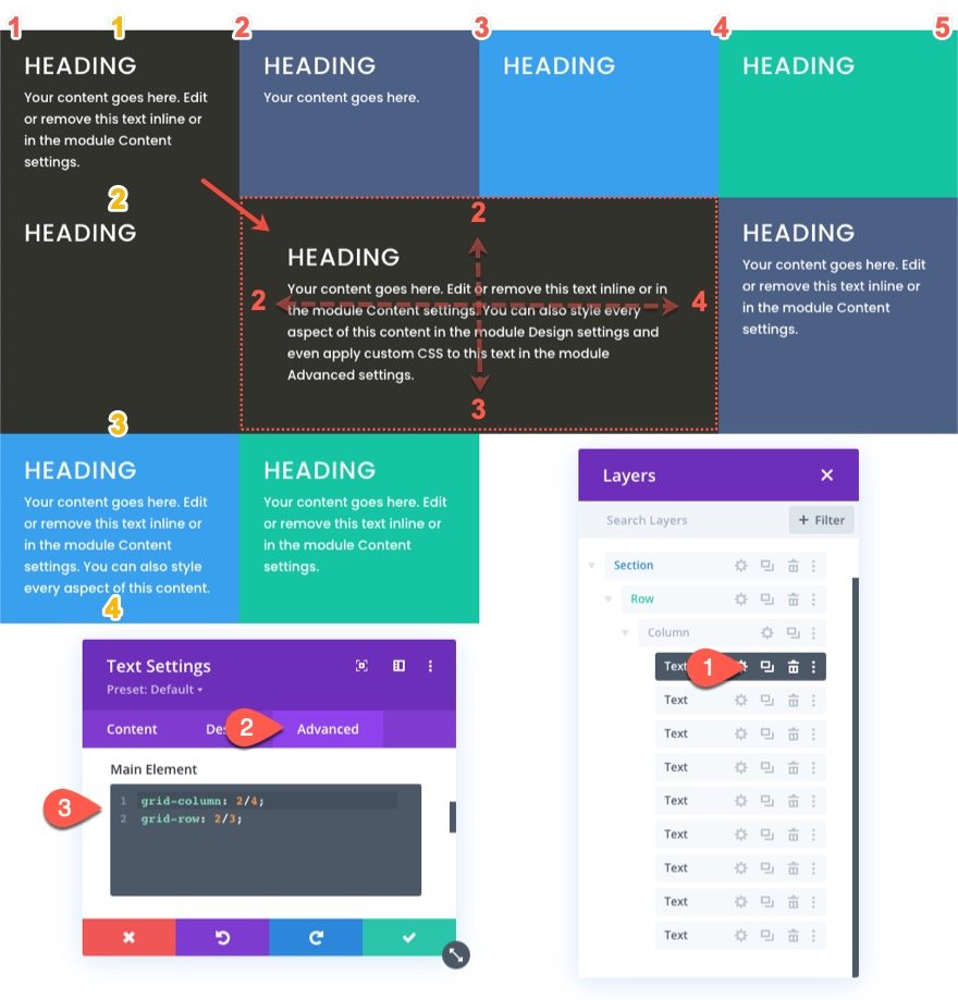
The first line of CSS defines the position of the module horizontally by telling the module to start on column line 2 and end on column line 4.
grid-column: 2/4
The second line of CSS defines the position of the module (or grid item) vertically by telling the module to start on row line 2 and end on row line 3.
grid-row: 2/3
For tablet and phone display, we will bring the module back to the original location. This is helpful for keeping your main header at the top of the page.
So for that, select the tablet tab under the responsive option for the main element and paste the following CSS:
grid-column: auto;grid-row: auto;
Now the position of the module will go back to the original (automatic) flow of the grid items.
Let’s go ahead and position a few more modules (or grid items) using this method.
We'll now position the third text module (now in the second column of the top row) at a new set location within the grid. This new position will start at column line 1 and end on column line 2 and also start at row line 2 and end on row line 4.
To do this, open the settings for the third text module and paste the following custom CSS to the main element:
grid-column: 1/2;grid-row: 2/4;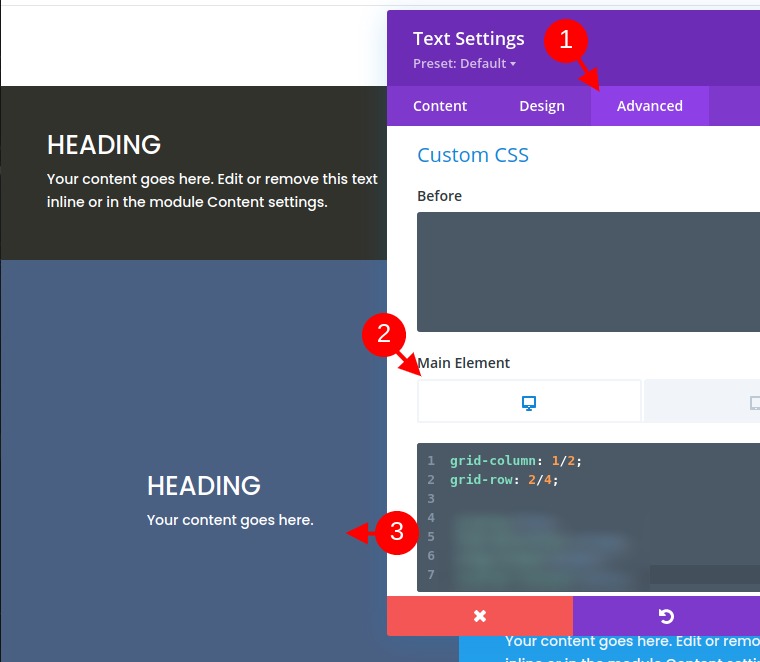
We can now change the position for mobile by adding the following CSS for tablet:
grid-column: auto;grid-row: auto;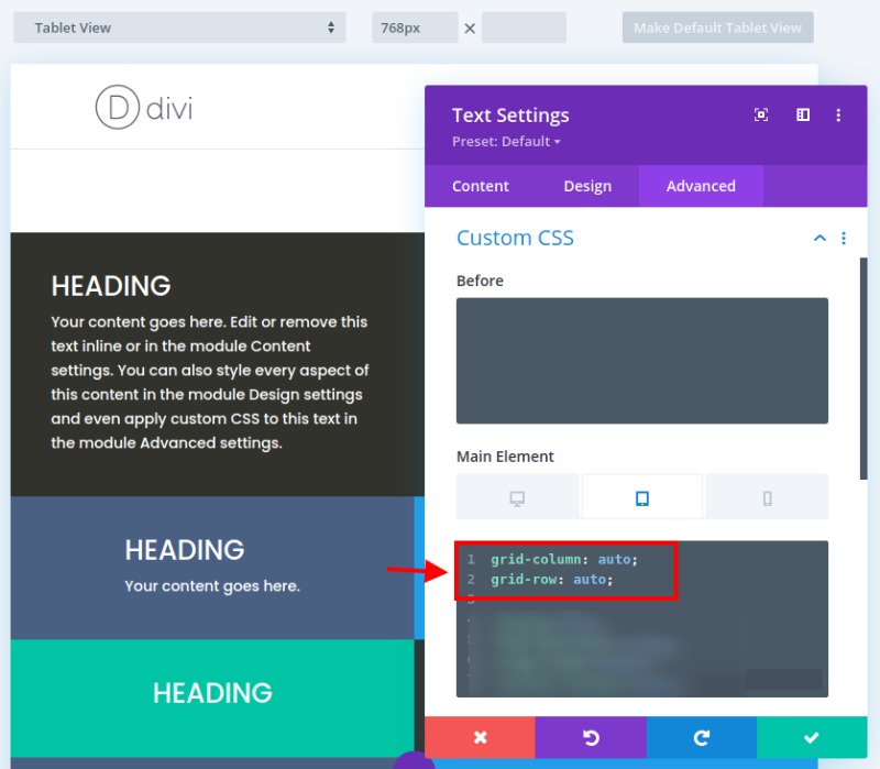
For our last modification, we'll position the seventh module at a new set location within the grid. This new position will start at column line 4 and end on column line 5 and also start at row line 2 and end on row line 4.
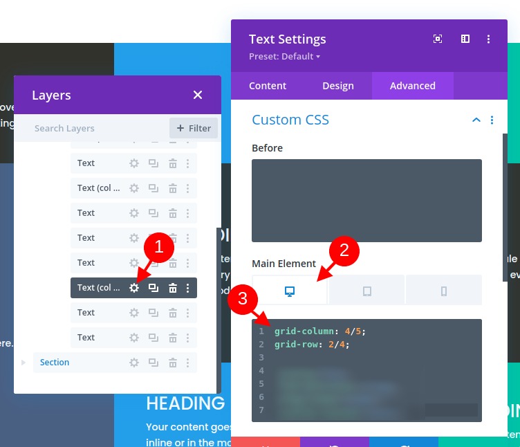
For that, let's open the settings for the seventh text module and paste the following custom CSS to the main element:
grid-column: 4/5;grid-row: 2/4;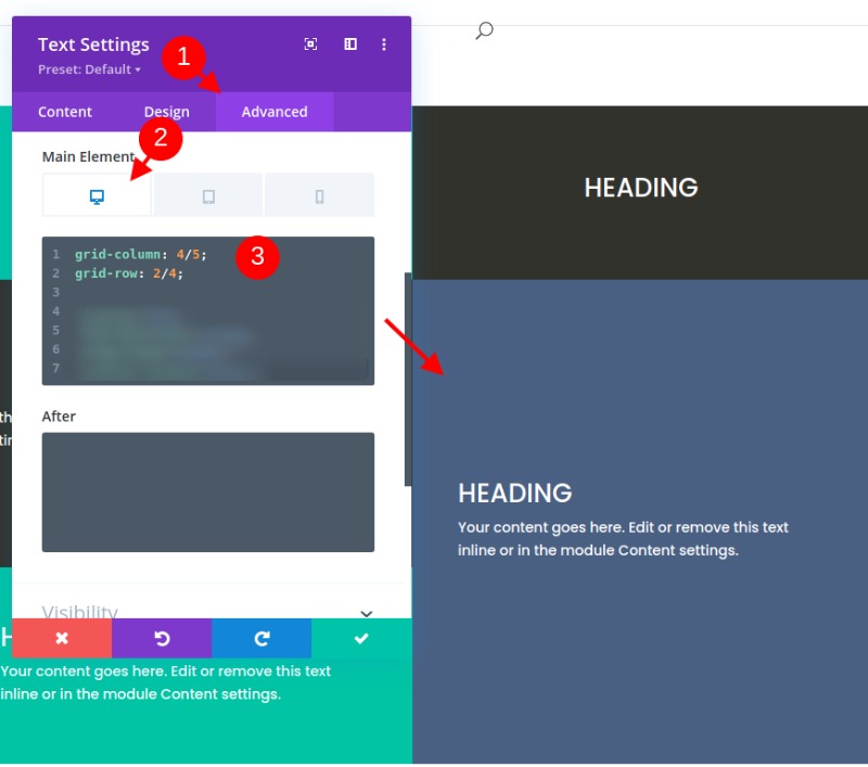
Now paste the following CSS for tablet display.
grid-column: auto;grid-row: auto;Aligning Module (or Grid Item) Content to Center
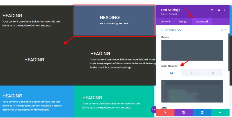
You're probably tired of instruction, but if we stop here, we will miss out on a helpful way to align (or center) our module content vertically. Having module content vertically centered is a nice feature of a grid layout because it makes everything more symmetrical and aesthetically pleasing.
So for that, we can add a snippet of CSS that uses the flex CSS property to align and justify the content to the center. We need to add this snippet to each of the modules. We can use multi-select to select all the modules (or grid items) that don’t already have custom CSS to the main element (because we don’t want to override those modules with custom positions). Then open the element settings by opening the settings for one of the selected modules. Under the Advanced tab, paste the following CSS on the Main Element:
display:flex;flex-direction:column;align-items:center;justify-content:center;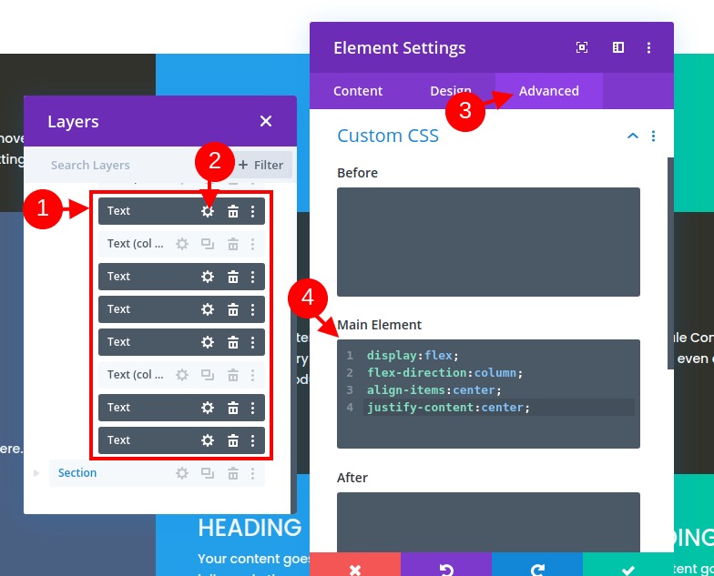
We can now go back to our other three modules (module #1, #3, and #7) individually and add the same snippet of CSS in addition to the CSS that was used to give the module a custom position on the grid. Make sure to add the CSS snippet under the existing CSS for both desktop and tablet.
Final Result
Here is how what we did so far looks like.
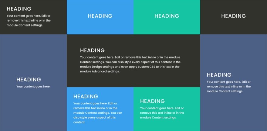
Can you notice how the modules (or grid items) adjust smoothly on different browser widths for a nice responsive design.
Real Example Using Different Modules and Designs
If you want to see a real example using this grid system, then you can use different modules. Here is what you can create using that technique. This is available on the Fitness Gym Layout Pack.

In All Yours Now
In this tutorial, we've been working on creating a CSS grid layout for Divi modules. While the process does rely on some custom CSS, it’s surprisingly not that much, considering the powerful results we can have from it. It is nice to be able to control the layout of all your modules at the column level when needed for more unique Divi layouts. If you're a CSS addict and would like to dive furthermore, you should check out this complete guide to consider more possibilities.
We'll be glad so see how successful you are with on the comments section.