
The new Divi performance update offers a slew of options for improving page load times. Today, we're going to share some helpful suggestions and shortcuts for creating a Divi page quickly from the ground up. Indeed, these guidelines are really suggestions rather than rules. It's always going to depend on your page's primary goals. A complicated project may need sacrificing some performance, and vice versa. It's all about maintaining a balance between design and speed, but you may significantly speed up your Divi site by following these guidelines.
Tip 1 - Optimizing Content Placed Above the Fold
There's a performance feature called Critical CSS in Divi's new feature set. With above-the-fold-CSS, it can detect the necessary CSS to load the page flawlessly while delaying loading the remainder of the page's CSS. By itself, this contributes to faster page load times without your involvement. However, you can also focus on the content that appears above the fold for those who prefer going the additional mile.
Hero Section Of 4-Module
Initially, it may be tempting to provide your visitors with as much information as possible, but that's precisely what you want to avoid with a hero. The stronger your material is, the more relevant your style and visual appeal are. To make your Divi page load faster, keep the number of modules you utilize above the fold to a minimum. In a perfect scenario, you'd use:
- Title
- Paragraph
- Button
Maybe you need to add some images to make the subject clearer to your audience. In that case, try to avoid images as a background. Instead of background, use them as a module inside a container. Keep the container width max because it helps to use smaller images. Definitely, this will boost your website speed, so the 4 module hero section concept is -
Create Amazing Websites
With the best free page builder Elementor
Start Now- Title
- Paragraph
- Button
- Optimized Image
Use Full Screen Hero Section
Fullscreen hero designs are prominent for a reason. It not only improve the ventilation of your design, but they also aid in crucial CSS operations. As long as you go with a fullscreen hero, nothing else will appear above the fold on your monitor, no matter what size it is. The minimum height for a Divi fullscreen hero is "100vh," which can be found in the section settings. The use of min-height helps ensure a section is displayed at its fullest width in all browsers. Anything you put inside the section will become a part of your hero's look going forward. The other option is to utilize Divi's in-built fullscreen header.

If you don't want a fullscreen hero, you can divide the content above the fold into portions. Divi will automatically detect content above the fold. In other words, if you design a large section that spans the fold and below, all of its CSS (and elements' CSS) will be loaded. Creating many sections will assist you to prevent having too many components classified as above the fold.
Avoid Animation In Hero Section
Anything above the fold that slows down loading time should be avoided including animation. That doesn't mean you should avoid it. You can easily employ animations along with the page and/or within your hero. Having a good balance is vital.
Above The Fold Content For Tablet & Mobile
Last but not least, Critical CSS allows you to modify your smartphone design. Above-the-fold material must be tailored for various screen sizes. It's all about optimizing the design for both web and mobile. You can, for example, conceal the full hero image on mobile to improve page speed.
Tip 2 - Use Smart Styles
How It Works
Divi has reportedly decreased duplicate style in a recent performance update. You need to surf in Divi presets to activate smart styles. This allows you to share layouts with various elements in the same way without assigning them to a new block.
Using 1 or 2 Presets For Section & Row
Sections and rows are two-element categories typically overlooked while discussing presets. Sections and rows can have parameters just like modules. This would not only help limit produced CSS but also maintain page design integrity. Suppose you want to establish a vertical rhythm by regularly using 100px padding at the top and bottom of each section. Divi presets can help you with that. Make a new section preset that utilizes these padding settings and apply it to each new section you add or set it as the default section preset.
You may also create a row preset with custom width and height. Try out these presets and see how they help you develop faster pages.
Preset For Modules
Modules can use smart styles too. Here, you'll see how each module looks similar. You can create a preset for the blurb module to keep your CSS section constant for a section.
Tip 3 - Designing for Speed
Dynamic Modules
When choosing modules for your page, please remember that they will be retrieved dynamically. Not using a module does not influence page performance. Each module you add should be evaluated for “value”. Ideally, you'll optimize your Divi content so you don't have to sacrifice modules.
Find and optimize your design's LCP
Finding and refining your Largest Contentful Paint might also help speed up your page. In brief, your LCP determines your page loading score. By optimizing the LCP of your design, you can substantially reduce page loading time.
Animation Style
We have customizable modules and capabilities. A feature will not be retrieved if it is not used on your page, resulting in a faster page. For this reason, it's important to choose a visual style and stay with it. You can, for example, use motion effects and center all animation on your page around that. Or you can use the usual animation settings. This not only allows for a lighter website but also predictability, which is usually a good thing for the user experience.
Fonts Selection
Fonts are valuable components in web design. Try to not use more than two fonts because the more font you use, the more loading time will be needed.
Tip 4 - Manual Optimization
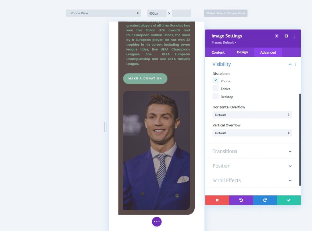
Image Scalling For Mobile
Using responsive content in Divi will also help improve mobile page speed. This is arguably one of the nicest features on tiny screens. It takes a lot more work, but it's worth it. Utilize image editing tools to reduce the image size and use the smaller photos on mobile instead of the larger ones on the desktop. This will dramatically decrease image file size and improve mobile page speed.
Image Compression
Keep your image format JPEG as much as you can because it makes smaller file sizes. PNG is only useful if you need more opacity in your photo to boost the design, but even then, you can discover a solution. Avoid bigger file types like GIF. Video is usually not allowed, especially if it is to be projected in the background. Also, minimize your files before uploading them to your WordPress media library.
Final Words
Divi's new performance features are an important great step, but none of that matters unless you construct your website with it in mind. Divi handles the details so you can focus on designing a beautiful but functional website. If you have any ideas on how to make a Divi website more efficient, let us know in the comment. Also, please share this post with your friends and family so they can benefit from it as well.