
With the help of Divi Builder, we can do many unique and creative designs. Today we will see how to create a dynamic 3D animation using Divi visual page builder which is interactive with the movement of the mouse cursor. Usually, we do hover or click animation on an object but here, we will animate an object that will move in different directions with the mouse movement. Also, you’ll see how to add a hovering 3D effect to an object that performs interactive animation and bring life into the design!
We will use Divi builder for the design and later on, we will add some CSS and jQuery code to create the animation functionality that will make the design alive! You can use this design to display your products in a new way to your visitors!
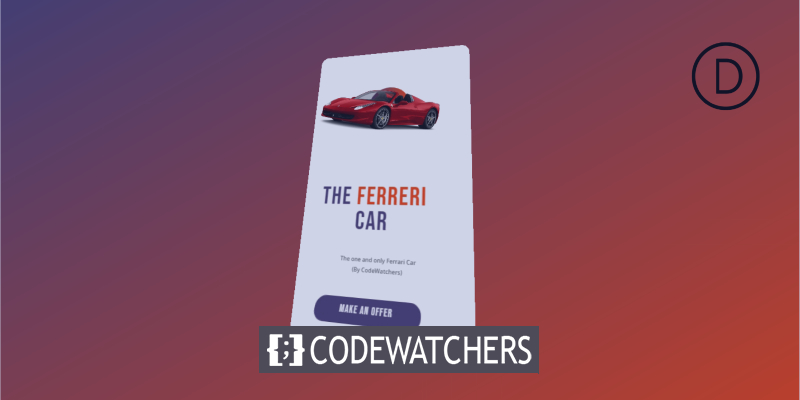
Final Design
If everything goes right as we plan, then our final design will look a lot like that.
Creating A Dynamic 3D Mousemove Effect On Divi
Task 1: Page Setup
Since you want to create this effect on your webpage, we believe you have already installed the latest version of Divi. Now, “Add a page” from the dashboard, title it as you need and expand it with Divi builder.
Create Amazing Websites
With the best free page builder Elementor
Start Now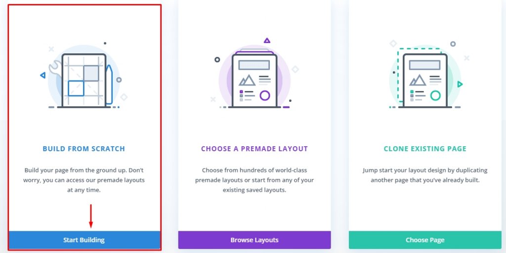
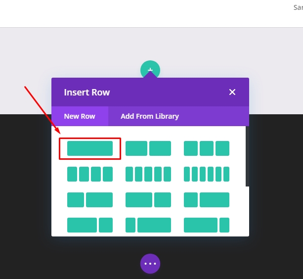
Now Choose “Build From Scratch” and start ahed.
Task 2: Creating A Hover Container & Card
To activate the 3D animation on hover, we will target the row. We will call it “Hover container”. On the other hand, the column will act as a Card, that will animate with the child elements during the hovering over the row.
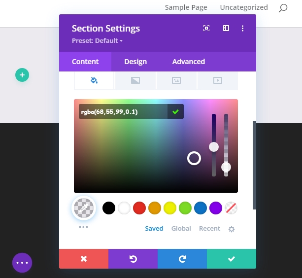
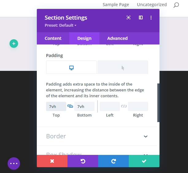
Section Styling
Open the default section settings and update the following
- Background Color - RGBA(68,55,99,0.1). Here 0.1 is opacity.
- Add "7vh" padding both on top and bottom.
Hover Container
Now add a one-column row to the prepared section.
Now update the row setting with the following changes.
- Enable "Custom gutter width" and change the value to 1
- Width 100%
- Max Width: 70% (desktop), 60% (tablet), 50% (mobile)
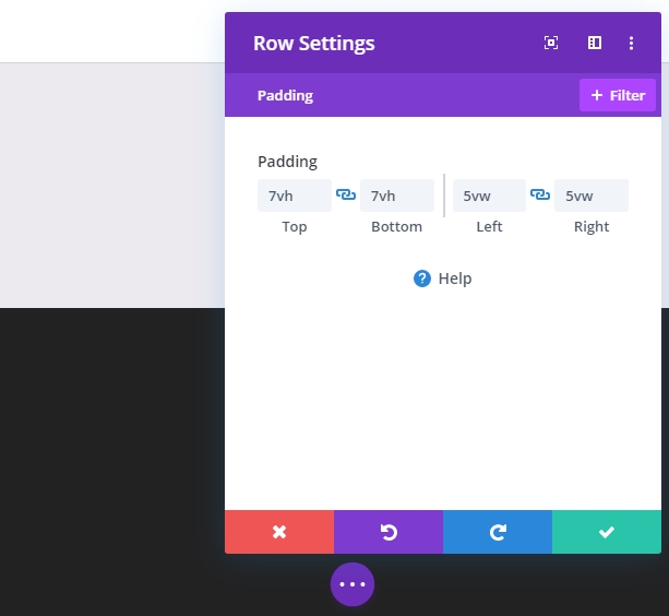
- Padding: 7vh on top and bottom, 5vw on left and right.
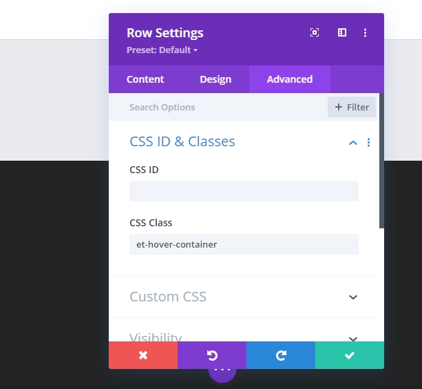
Under the advanced tab, add a custom CSS Class.
- CSS Class: et-hover-container
Also, add the CSS code to the main element.
display:flex;
align-items:center;
justify-content:center;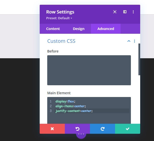
The Card
After finishing the row update, open the setting for the column to style the card.
- Background Color #ffffff
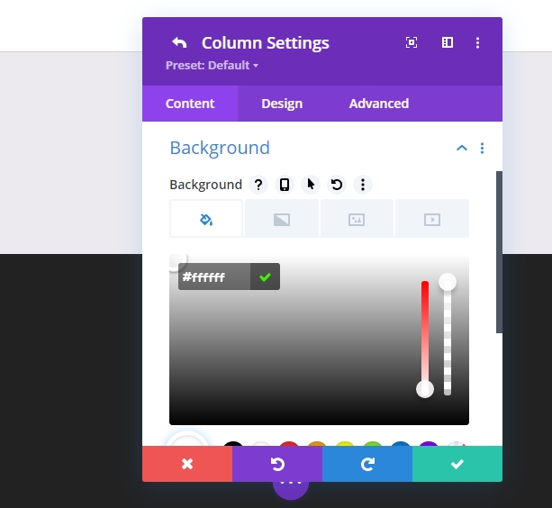
- Padding: 7vh top, 7vh bottom, 5% left, 5% right
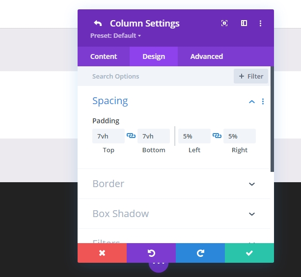
- Rounded Corners: 30px
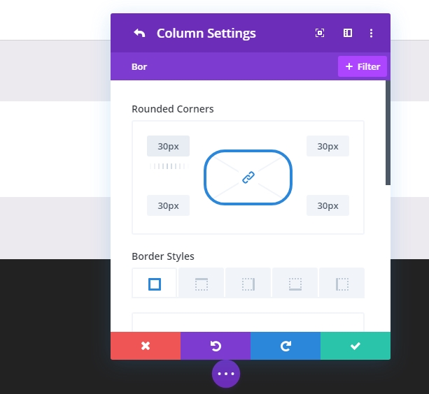
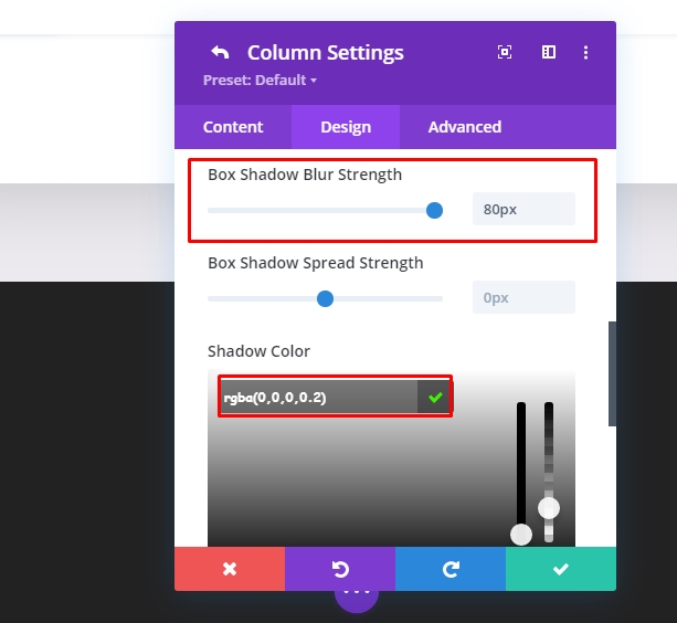
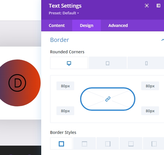
- Box Shadow: See screenshot
- Box Shadow Vertical Position: 0px
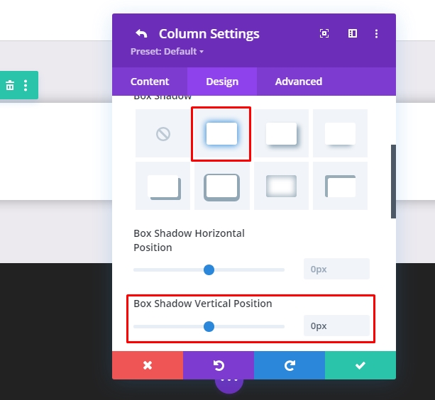
- Box Shadow Blur Strength: 80px
- Shadow Color: rgba(0,0,0,0.2)
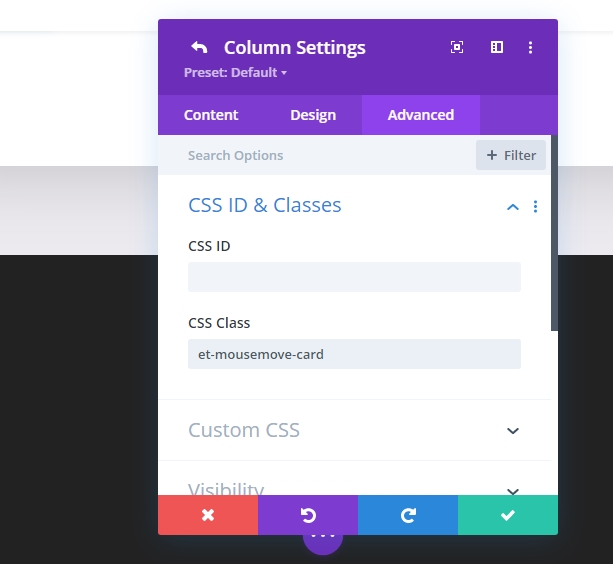
Under the advanced tab, add a custom CSS Class.
- CSS Class: et-mousemove-card
Also, add this CSS code under main element.
max-width: 600px;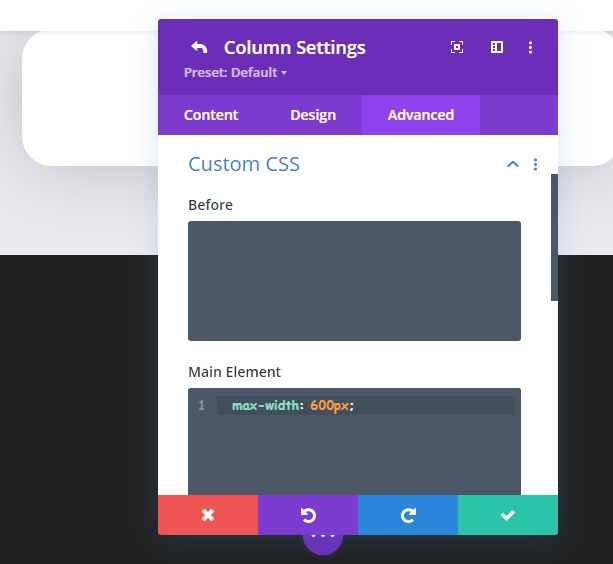
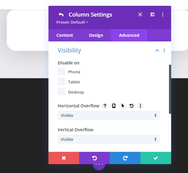
Now set the overflow properties to visible for both horizontal and vertical overflow.
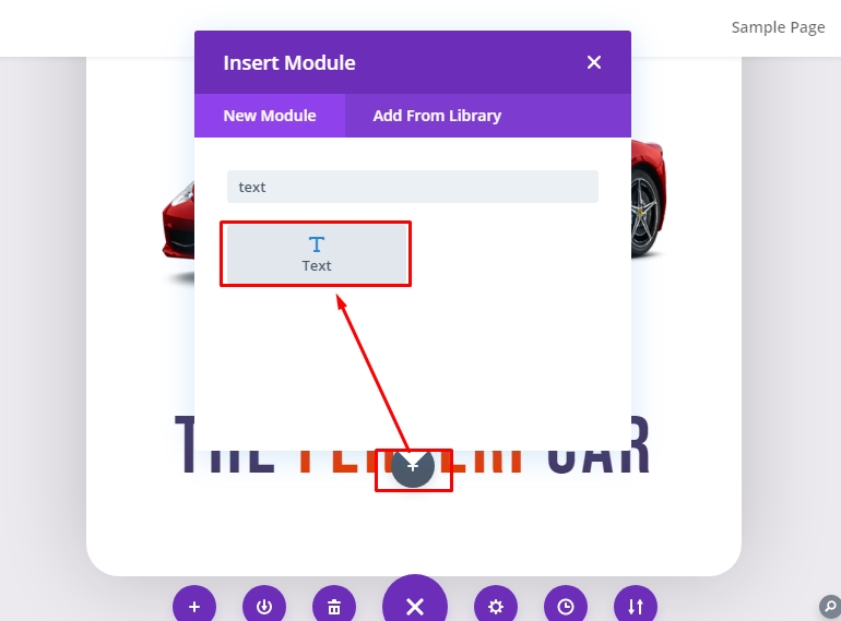
Task 3: Creating The Card Element
The Circle Background With Logo
For the very first element of our card, we are going to add a circle background that includes our logo that will sit behind our main product image.
Now add "Text" on the column and remove the default text to keep the body empty.
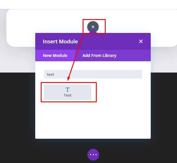
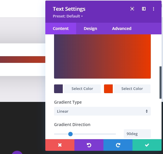
Its time to add a gradient background.
- Gradient Background Left Color #443763
- Gradient Background Right Color #EA3900
- Set Gradient Direction to 90 deg
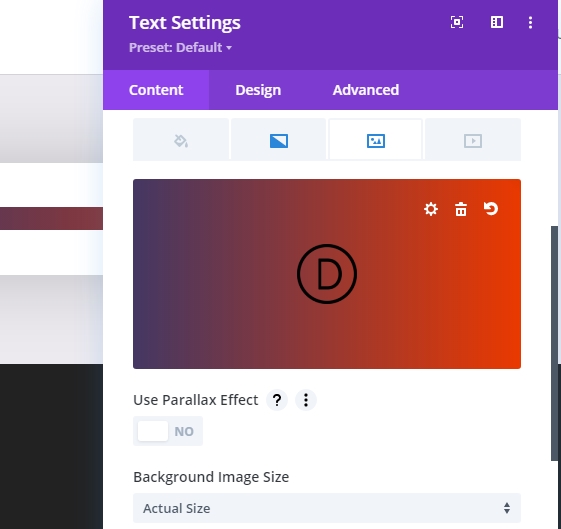
Along with the gradient color, add a logo as a background image. The image size should be 60px by 60px and set the background image size value to "Actual Size"
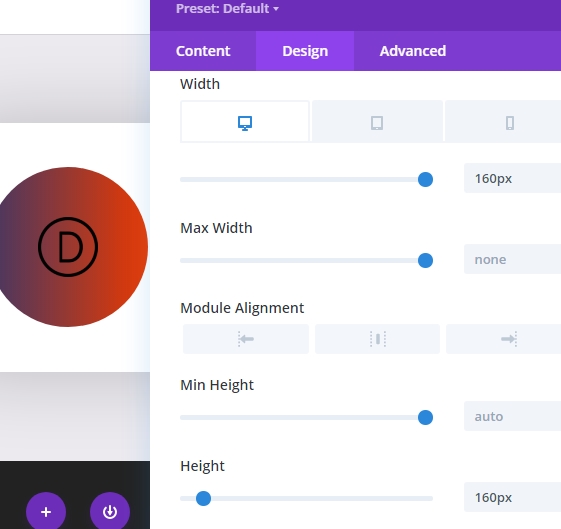
On the "Design" tab, change the values as following on the "Sizing" section. Set width value 160px for desktop, 150px for tablet and 80px for smartphone.
Also, set the height value the same as the width. Lastly, set rounded corners to value 80% under the "Border" section.
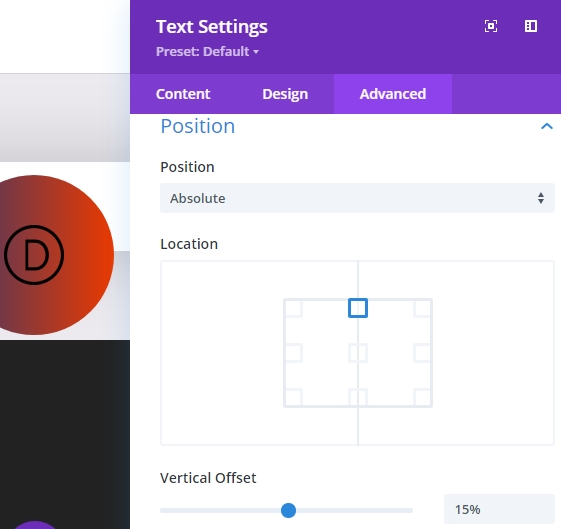
On the "Advanced" tab, update the positions as given below.
- Position : Absolute
- Location : Top Center
- Vertical Offset : 15%
The Card Image
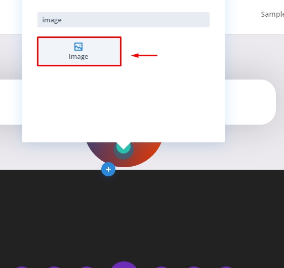
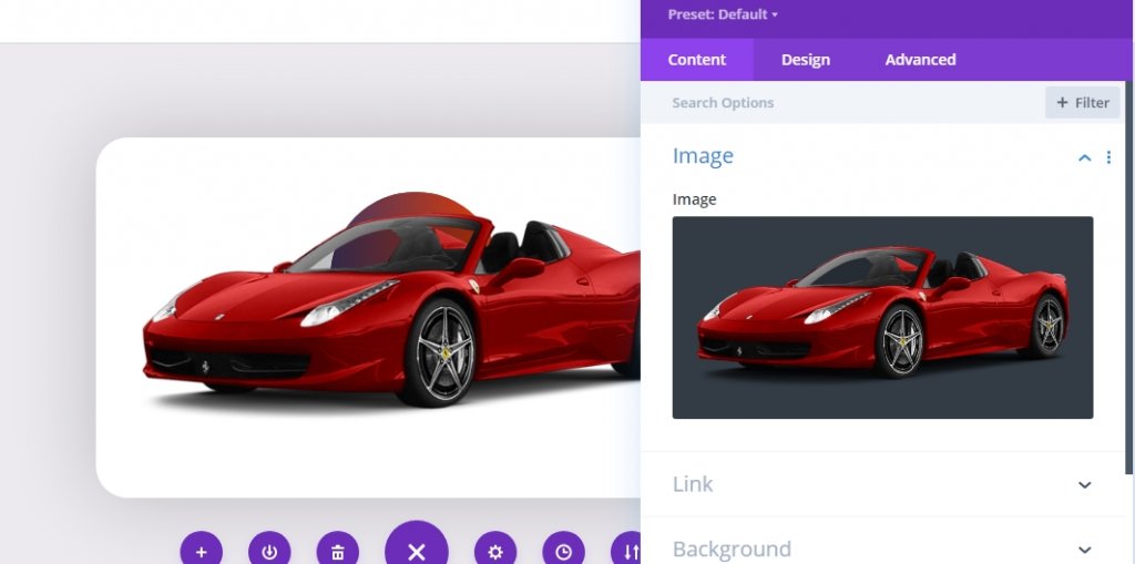
Now, as we are done with the logo part, let's add the product image on the Card. We will add a new image module under the previous text module.
Now upload an image of the product. Make sure the image is transparent and its in Png format. Here, we are using image of a red ferrari.
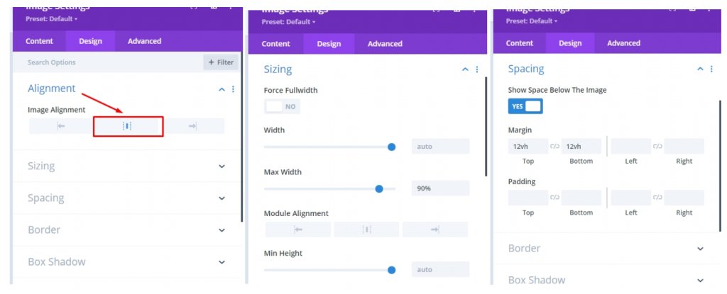
On the "Design" tab, change the values as mentioned below.
- Image Alignment: Center
- Width: 90%
- Margin: 12vh top and 5vh bottom (adjust the values according to your need)
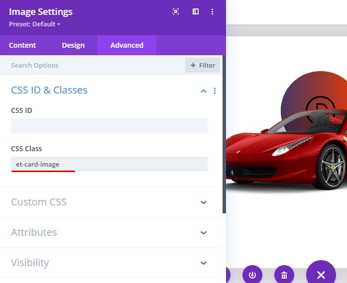
On the "Advanced" tab section, add a custom CSS Class for the image.
- CSS Class: et-card-image
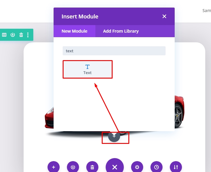
The Car Heading
Now we will create a heading for the Card. With our car image in position, let's add a text module under the image to create our card heading.
In the body, remove the default text and add the H2 heading of HTML given below.
<h2>The <span style="color: #ea3900:"> Ferrari</span> Car</h2>
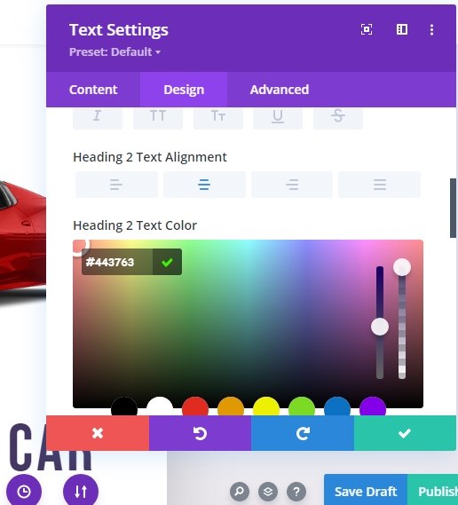
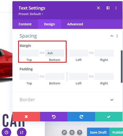
Now, on the design section change the following values:
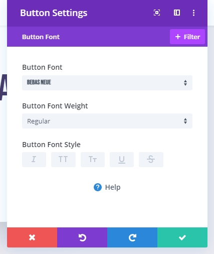
- Heading 2 Font : Bebas Neue
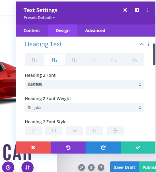
- Heading 2 Text Alignment : Center
- Heading 2 Text Color: #443763
- Heading 2 Text Size : 75px for desktop, 60px for tablet and 45px for mobile.
- Heading 2 Letter Spacing : 0.05em
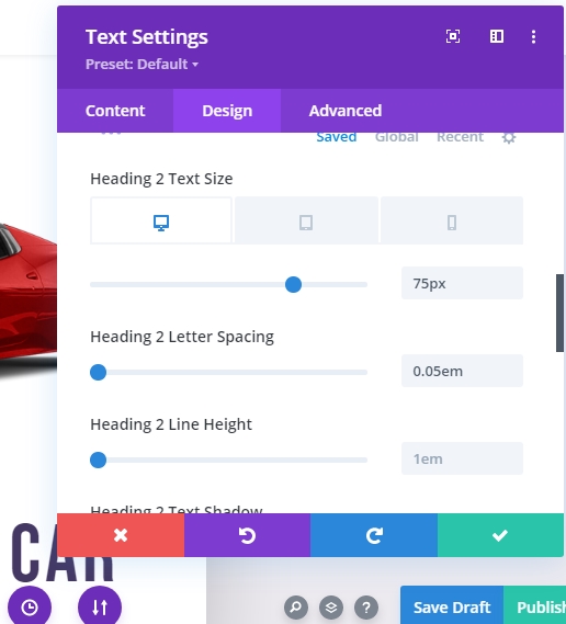
- Margin : 4vh at Bottom
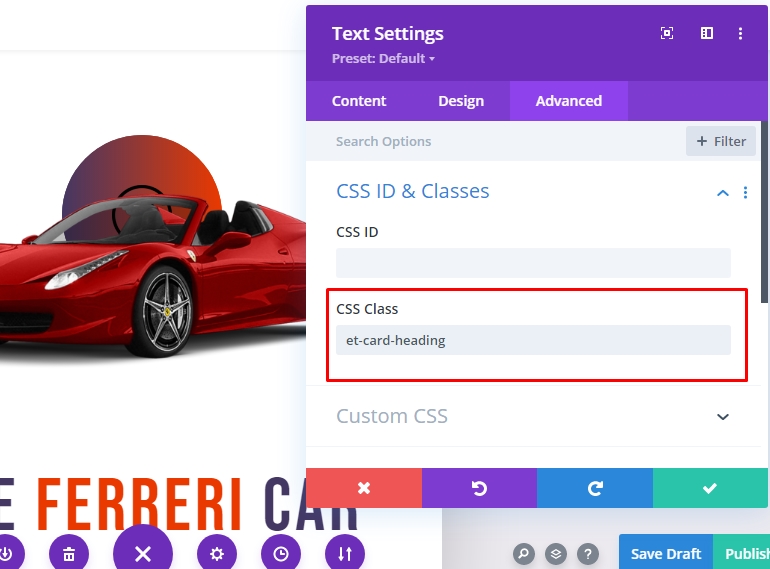
On the "Advanced section" add a custom CSS class
- CSS Class: et-card-heading
The Card Info
Now we will add the information about the card. We will add another text module for info because that will allow us to add different 3D animation effects to each of them. Let's add a new text module under the heading text module.
Now add the following text content to the body.
<p>The one and only Ferrari Car <br>(By CodeWatchers)</p>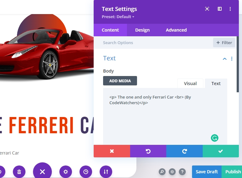
Under the design tab, update the following:
- Text Font Weight : Semi Bold
- Text Size : 18px (desktop) and 16px (tablet and phone.)
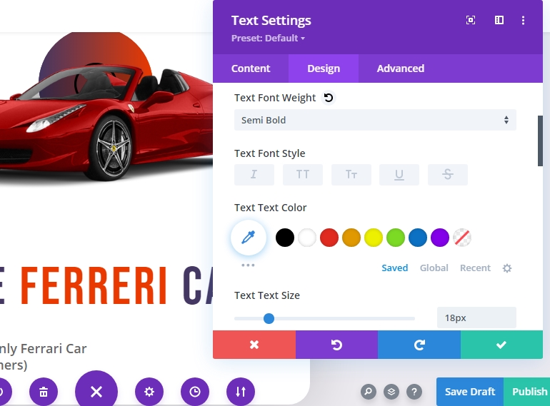
- Text Line Height : 1.8em
- Text Alignment : Center
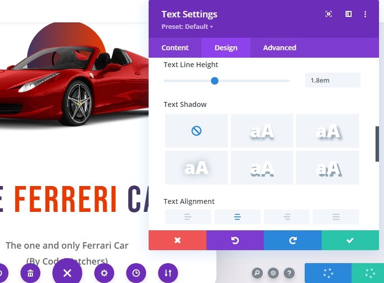
- Margin : 4vh
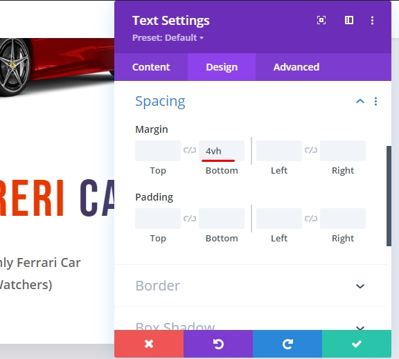
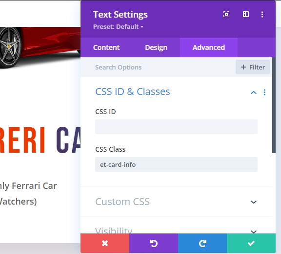
Now add a custom CSS class to this module.
- CSS Class: et-card-info
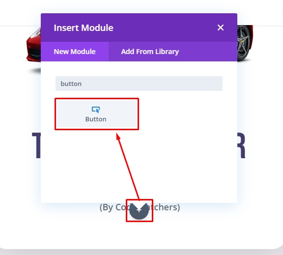
The Button
Now add a new button module under the info text module. This will add a button on the card.
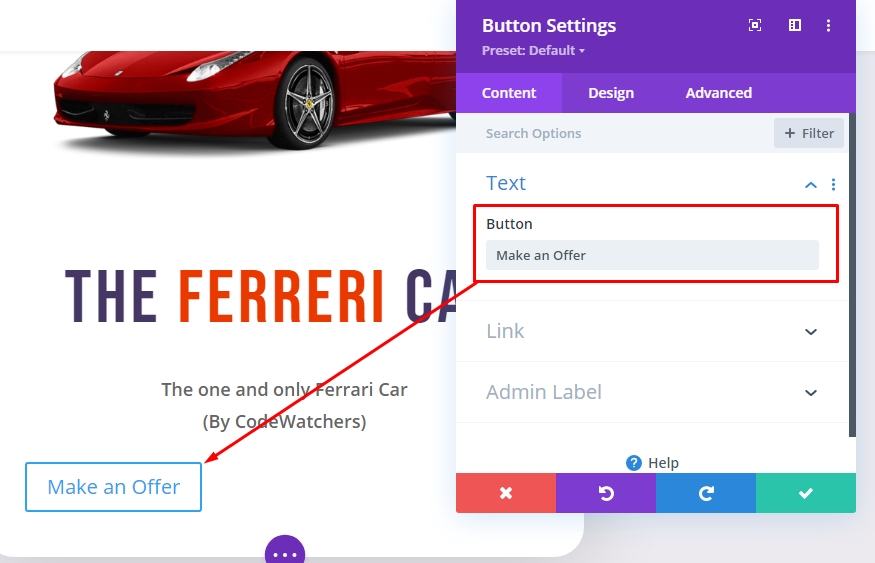
On the "Content" tab of button settings, Change the button text.
- Button Text: Make an offer.
On the "Design" tab, style the button as mentioned below.
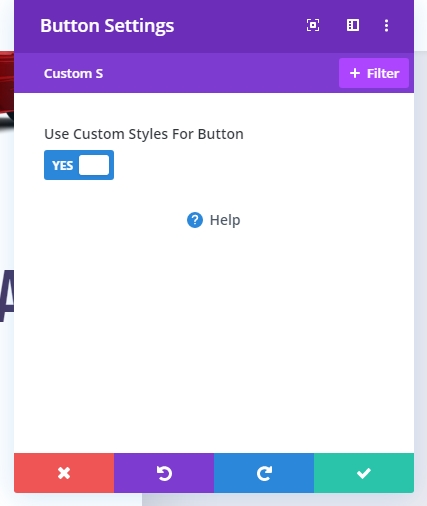
- Use Custom Styles for Button: YES
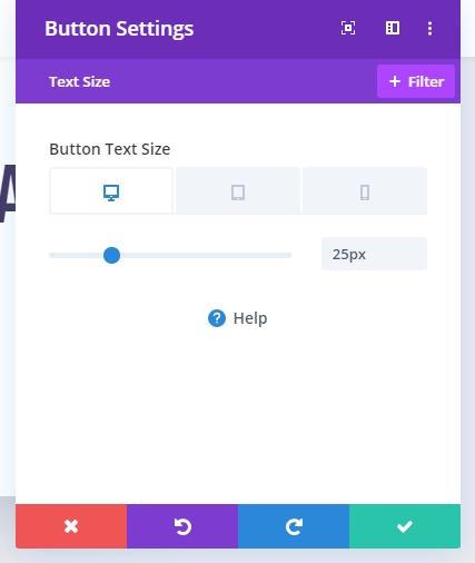
- Button Text Size: 25px (desktop), 20px (tablet), 16px (phone)
- Button Text Color: #ffffff

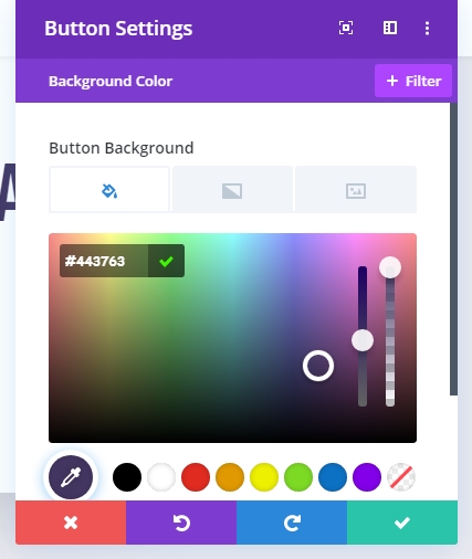
- Button Background Color: #443763
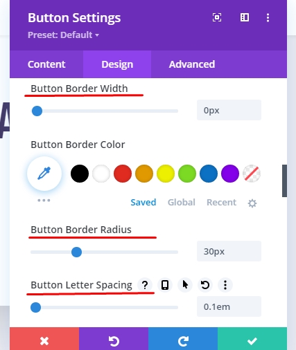
- Button Border Width: 0px
- Button border Radius: 30px
- Button Letter Spacing: 0.1em
- Button Font: Bebas Neue
- Padding (desktop): 0.5em top, 0.5em bottom, 3em left, 3em right
- Padding (phone): 0.5em top, 0.5em bottom, 2em left, 2em right
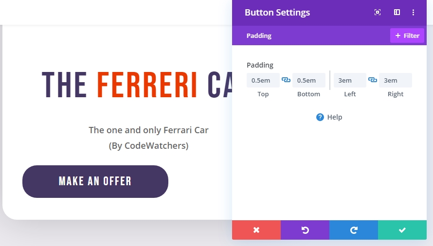
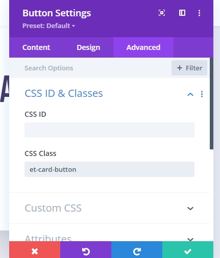
Now add a custom CSS class
- CSS Class: et-card-button
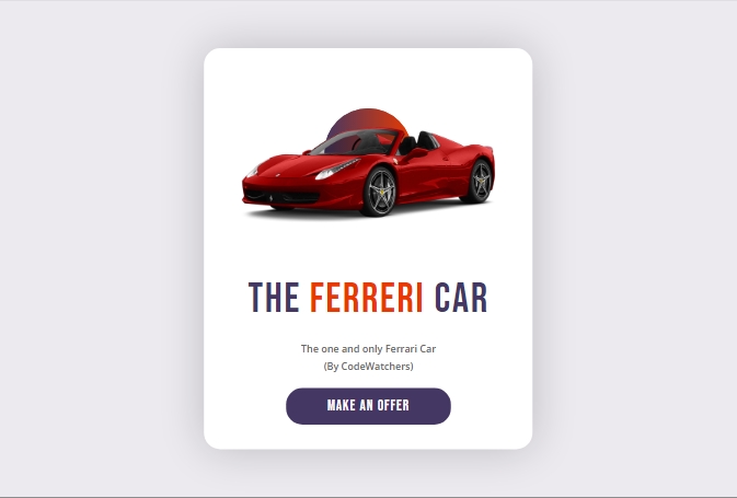
Result Till Now
Here is our final design output without the animation.
Now we'll add some custom code to bring life on this design.
Task 4: Adding CSS & JQuery Custom Code
Since our design is complete, we will now add CSS and JQuery code to give our newly created columns and card elements to give it a dynamic 3D mouse move animation effect.
To do so, add a new code module under the button module.
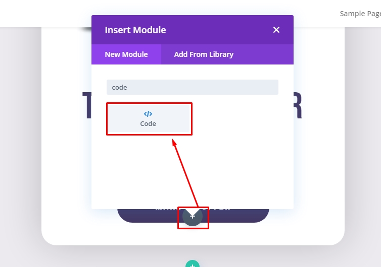
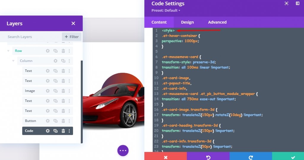
Paste the given custom CSS code in the box and make sure to wrap the code in the "Style" tag.
<style>
/*add perspective to row for 3d perspective of child elements*/
.et-hover-container {
perspective: 1000px;
}

/*preserve-3d needed for 3d effect on card elements*/
.et-mousemove-card {
transform-style: preserve-3d;
transition: all 100ms linear !important;
}

/*transition timing function and duration for card elements*/
.et-card-image,
.et-popout-title,
.et-card-info,
.et-mousemove-card .et_pb_button_module_wrapper {
transition: all 750ms ease-out !important;
}

/*transform styles for card elements*/
.et-card-image.transform-3d {
transform: translateZ(150px) rotateZ(10deg) !important;
}
.et-card-heading.transform-3d {
transform: translateZ(150px) !important;
}
.et-card-info.transform-3d {
transform: translateZ(50px) !important;
}
.et-mousemove-card .et_pb_button_module_wrapper.transform-3d {
transform: translateZ(150px) rotateX(20deg) !important;
}
</style>
The CSS code will look like this under content tab of Code module.
Below the CSS, add the following JQuery and make sure the code is inside the "Script" tags.
<script>
jQuery(document).ready(function ($) {
//Items
var $hoverContainer = $(".et-hover-container");
var $mousemoveCard = $(".et-mousemove-card");
var $cardImage = $(".et-card-image");
var $cardHeading = $(".et-card-heading");
var $cardInfo = $(".et-card-info");
var $cardButton = $(".et-mousemove-card .et_pb_button_module_wrapper");

//Moving Animation Event
$hoverContainer.on("mousemove", function (e) {
let xAxis = (window.innerWidth / 2 - e.clientX) / 25;
let yAxis = (window.innerHeight / 2 - e.clientY) / 25;
$mousemoveCard.css(
"transform",
`rotateY(${xAxis}deg) rotateX(${yAxis}deg)`
);
});

//Animate on Hover
$hoverContainer.hover(function () {
$mousemoveCard.toggleClass("transform-3d");
$cardHeading.toggleClass("transform-3d");
$cardImage.toggleClass("transform-3d");
$cardButton.toggleClass("transform-3d");
$cardInfo.toggleClass("transform-3d");
});

//Pop Back on mouseleave
$hoverContainer.on("mouseleave", function () {
$mousemoveCard.css("transform", `rotateY(0deg) rotateX(0deg)`);
});
});
</script>
The following code should look like this into the code panel.

Now save the entire work and check the entire work in a live page.
Final Output
So our entire design looks like this. Cool huh!
Final Words
The 3D animation we saw in today's tutorial is very easy and fun to learn. This is a unique and advanced animation effect that can be controlled by mouse movement. We can design this through some simple CSS and JQuery coding. Undoubtedly, Divi is a powerful page builder and through customized coding, it is possible to bring a magical design to websites.


