
Demo/ Preview items can be a successful marketing tactic if you use them on your website. It's is particularly useful when it comes to promoting digital products such as ebooks. You tease them with a taste of what's to come, so they'll be clamouring for more. In today's article, we'll teach you how to use Divi's scrollable tablet to display teaser material. Using Divi's built-in features, we'll turn a column into a scrollable container (intended to look like a tablet) that can hold any type of information. You can promote the first few chapters of any ebook designs from your portfolio or other content with this tool.
Come on, let's go for it!
Design Glimpse
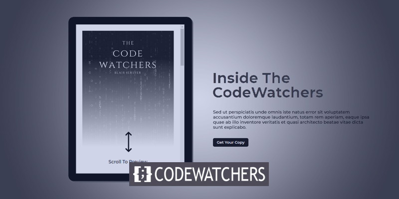
Here you can see how a scrollable content previewing tablet will look like after we finish the design.
Design Segment Part 1: Container Structure
Create a new page from the dashboard and move ahead with Edit with Divi. Then select Build From Scratch and start building.
Create Amazing Websites
With the best free page builder Elementor
Start Now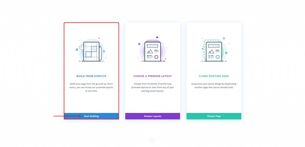
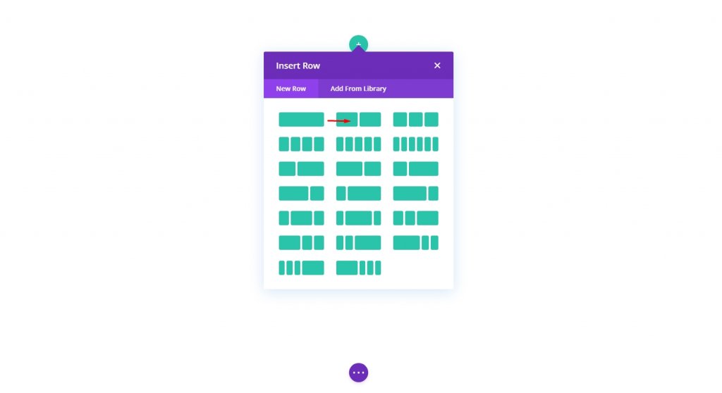
Row Adding
Let's start with a two-column row. Remember, we are creating this on the default section.
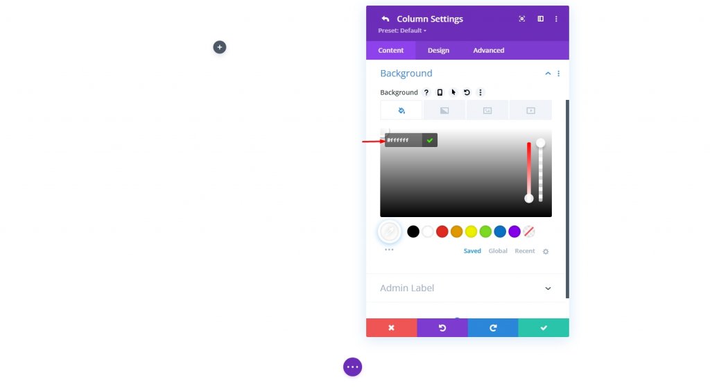
Settings: Column 1
Background Color
Then, go to Column 1's options and give it a white background.
- Background Color: #ffffff
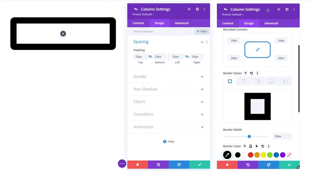
Border And Padding
Now, add some padding to the column and add a border on it.
- Padding: 25px (top, bottom, left, right)
- Rounded Corners: 20px
- Border Width: 30px
- Border Color: #000000
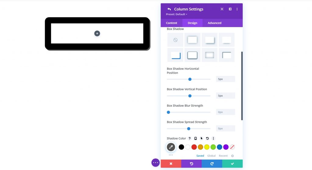
Box Shadow
To make this design a bit more detailed and depth, let's add a bow shadow to it.
- Box Shadow: see screenshot
- Box Shadow Horizontal Position: 5px
- Box Shadow Vertical Position: 5px
- Shadow Color: #555555
Custom Height & Width Using CSS
To make content browsable, set the column's height to a specific value. The content will now exceed the column's maximum size. We want to keep the tablet's aspect ratio stable, so setting a full width for the column makes sense. Go to the Advanced tab and make the following changes to the column's height and width:
Add the following custom CSS to the Desktop version on Main Element under the Custom CSS option.
height:650px;
max-width: 488px;
Now add the code to the mobile version.
max-height: 500px;
max-width: 375px;
float:none;
margin: 0 auto;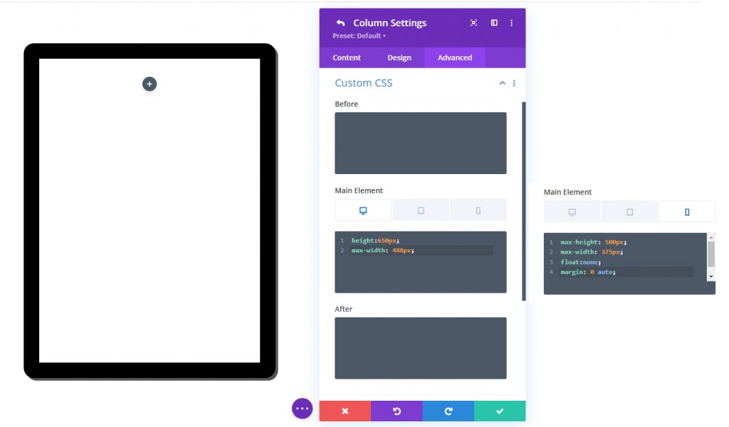
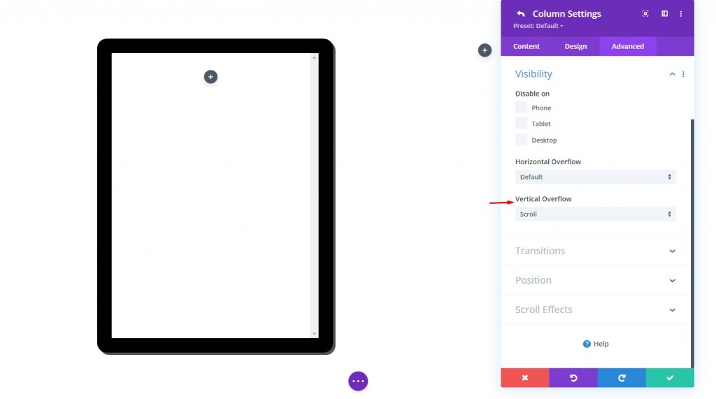
Vertical Overflow: Scroll
Content will eventually overflow due to the column's new set height. Set the visible vertical overflow option to "scroll" to ensure that the overflowing material may be observed by scrolling the column.
- Vertical Overflow: Scroll
Design Segment Part 2: Add Content To The Tablet
Now we are going to add some content to the column or tablet. You can display anything inside made by Divi modules. Here we will be doing an Ebook showing where there will be some content, a cover image, and an action button created by the blurb module.
CTA Button With Image Background
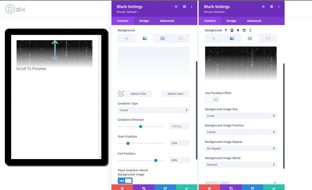
We will add a blurb module to the tablet that will inform the visitor to scroll. Apart from the blurb icon and text, we will use a background image as a Cover preview.
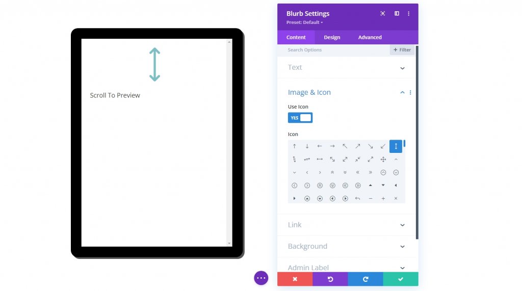
Blurb Module Settings
Make the following adjustments to the blurb module.
- Title: Scroll to Preview
- Use Icon: YES
- Icon: see screenshot
- Background Gradient Left Color: transparent
- Background Gradient Right Color: #ffffff
- Start Position: 20%
- End Position: 85%
- Place Gradient Above Background Image: YES
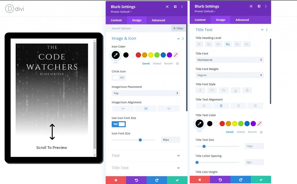
Change the following settings from the design tab.
- Icon Color: #000000
- Icon Font Size: 80px (desktop and tablet), 70px (phone)
- Title Font: Montserrat
- Title Text Alignment: center
- Title Text Color: #000000
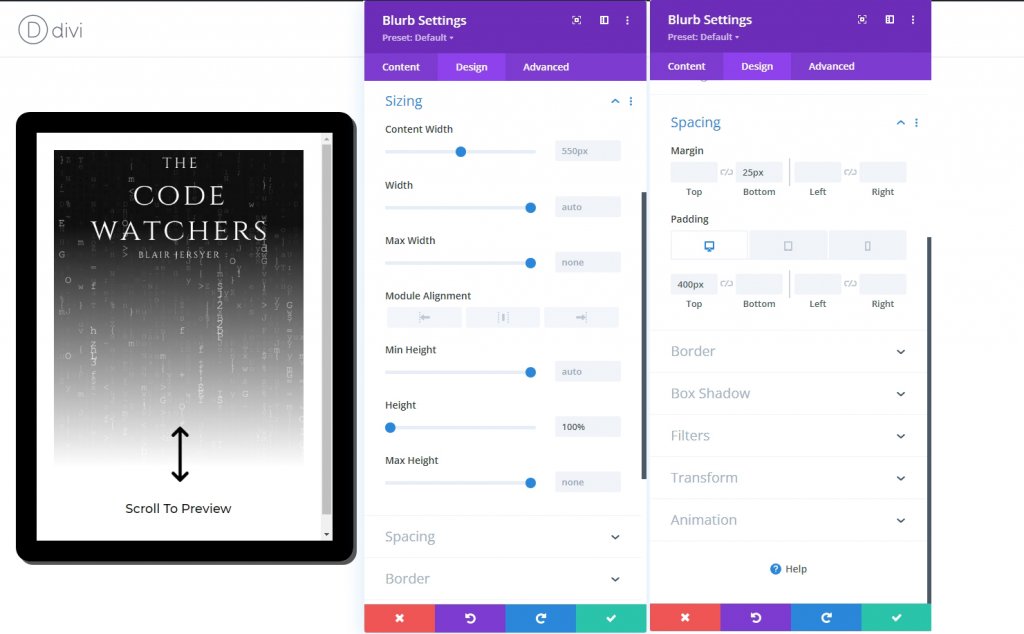
We can adjust the blurb's height to match the column's height to fill the tablet. Because our column has a predetermined size, this height percentage works. Once we've added top padding, we'll be able to relocate the icon and title to the column's bottom.
To size and space the blurb, update the following:
- Height: 100%
- Margin: 25px bottom
- Padding: 400px (desktop and tablet), 270px (phone)
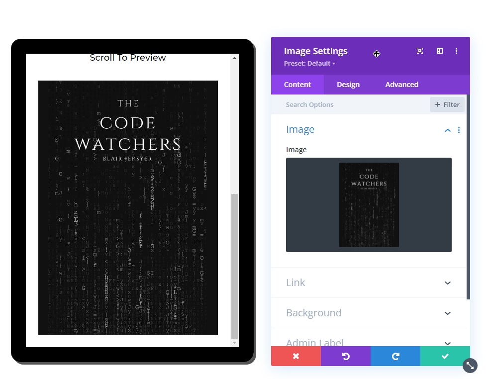
Book Cover Image
The next item we are going to add is a cover image. Add an image module under the previous blurb module.
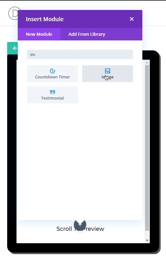
Use the same image used on the blurb module.
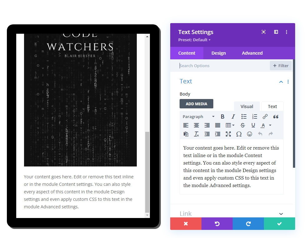
Text Content
The last item on the tablet we will add is some text content. Use text module for it.
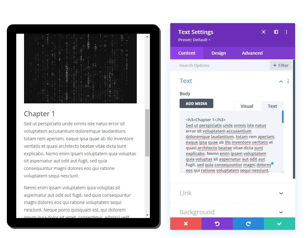
Then add the following code to the body from the Text section.
<h3>Chapter 1</h3>
Sed ut perspiciatis unde omnis iste natus error sit voluptatem accusantium doloremque laudantium, totam rem aperiam, eaque ipsa quae ab illo inventore veritatis et quasi architecto beatae vitae dicta sunt explicabo. Nemo enim ipsam voluptatem quia voluptas sit aspernatur aut odit aut fugit, sed quia consequuntur magni dolores eos qui ratione voluptatem sequi nesciunt.

Nemo enim ipsam voluptatem quia voluptas sit aspernatur aut odit aut fugit, sed quia consequuntur magni dolores eos qui ratione voluptatem sequi nesciunt. Neque porro quisquam est, qui dolorem ipsum quia dolor sit amet, consectetur, adipisci velit, sed quia non numquam eius modi tempora incidunt ut labore et dolore magnam aliquam quaerat voluptatem. Ut enim ad minima veniam, quis nostrum exercitationem ullam corporis suscipit laboriosam, nisi ut aliquid ex ea commodi consequatur? Quis autem vel eum iure reprehenderit qui in ea voluptate velit esse quam nihil molestiae consequatur, vel illum qui dolorem eum fugiat quo voluptas nulla pariatur?

<h3>Chapter 2</h3>
Sed ut perspiciatis unde omnis iste natus error sit voluptatem accusantium doloremque laudantium, totam rem aperiam, eaque ipsa quae ab illo inventore veritatis et quasi architecto beatae vitae dicta sunt explicabo. Nemo enim ipsam voluptatem quia voluptas sit aspernatur aut odit aut fugit, sed quia consequuntur magni dolores eos qui ratione voluptatem sequi nesciunt. Neque porro quisquam est, qui dolorem ipsum quia dolor sit amet, consectetur, adipisci velit, sed quia non numquam eius modi tempora incidunt ut labore et dolore magnam aliquam quaerat voluptatem. Ut enim ad minima veniam, quis nostrum exercitationem ullam corporis suscipit laboriosam, nisi ut aliquid ex ea commodi consequatur? Quis autem vel eum iure reprehenderit qui in ea voluptate velit esse quam nihil molestiae consequatur, vel illum qui dolorem eum fugiat quo voluptas nulla pariatur?
From the design tab, update the following styles.
- Heading 3 Font: Montserrat
- Heading 3 Font Weight: Ultra Bold
- Heading 3 Text Alignment: Center
- Heading 3 Line Height: 1.3em
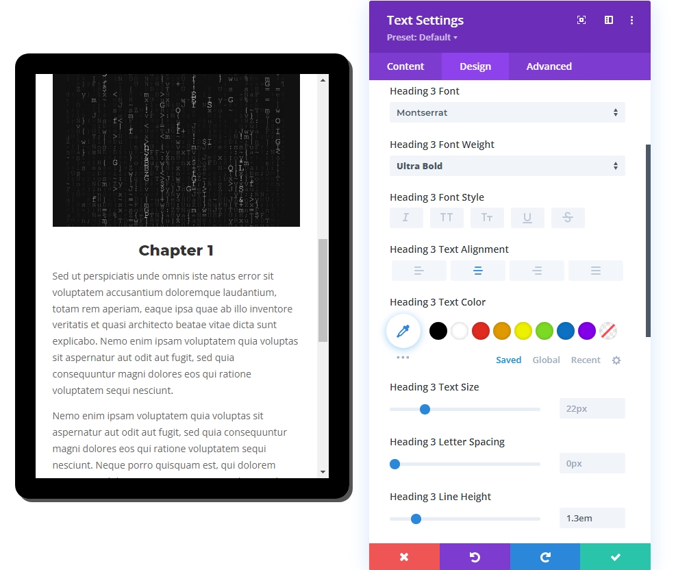
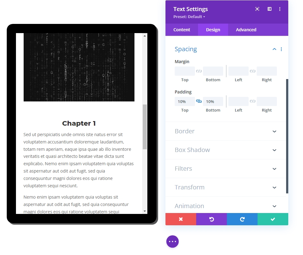
- Padding: 10% (Top & Bottom)
Design Segment Part 3: Final Touch Up
Row Setting - Updated
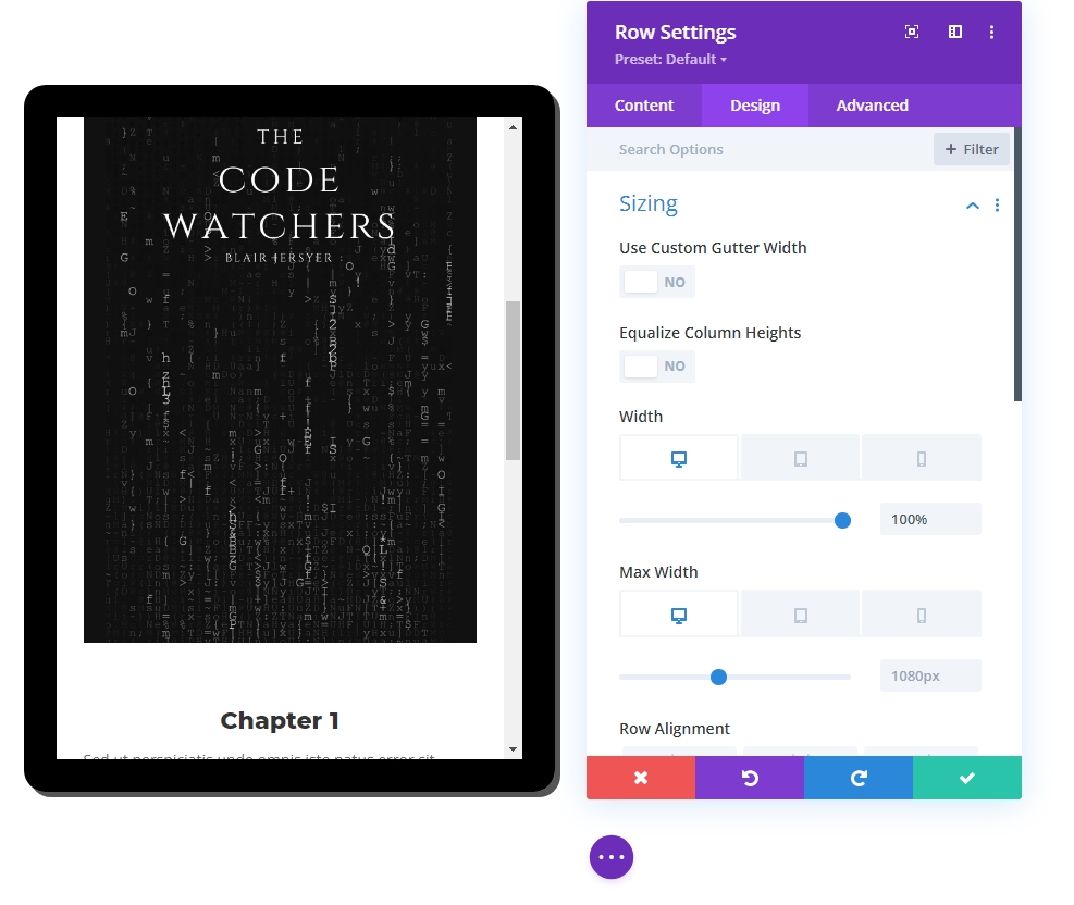
Now that we have all the contents in place let's adjust row settings to make it more responsive.
- Width: 100% (desktop), 90% (tablet and phone)
- Max Width: 1080px (desktop), 488px (tablet and phone)
Column 2 Contents
So far, we have only done the work of column 1. Now we will add some content in column 2 to make our design more attractive and captivating. We will add text modules and button modules to make the design more natural.
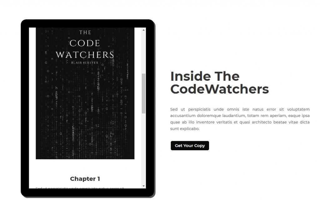
Final Output
So, here is a beautiful content previewing tablet made by Divi.
Wrapping Up
The most significant benefit of this previewing module/tablet design is that we may use it in various situations. As a result, since the tablet is essentially a Divi column, the material you wish to feature may be designed using any number of Divi modules (text, image, button). If you need to offer preview/sneak peek content on your website in the future, hopefully, this will be useful. Share your thoughts on the comment section, and don't forget to share with your friends because they might need it!