
Various reasons might make sites owners wants to display an image preview with a before and after state. Web design firms can display before and after of their designed website; fitness centers can show before and after pictures of people to highlight the different between their body shapes; photographers can display before and after for edited images, etc.

Usually, websites settle for a simple design that displays each photo adjacent to one another. We will change this traditional design with an interactive scroll animation effect in Divi in today's tutorial. Here, the user will see the before and after an image as they scroll down the page. This is a better way to engage users to scroll down your site and the transformation in a unique way.
We will build this using only Divi's built-in options; no extra custom code or plugins needed.
Let's do it!
Create Amazing Websites
With the best free page builder Elementor
Start NowDesign Preview
Things Before We Start
To start the design, you need to install and activate Divi theme. Now, create a new page from WordPress dashboard and open it with Divi builder. Go with "Build from scratch" option.
Creating A Before And After Image Preview
Now we will start creating our scroll animated before and after images in Divi. To make this happen, we will first need to create a two-column row that will not wrap on mobile. Each of the columns will also need to have the overflow hidden so that the before and after images will slide out and in to view within each column on scroll. Once the columns are in place, we will add our images to each column and add the styling and horizontal scroll animation. Once that is in place, we will add the before and after heading text above the images.
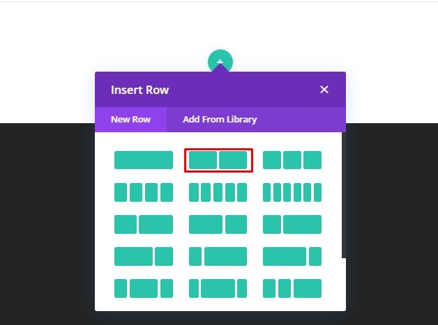
Part 1: Adding The Two Column Row
Start by adding a two-column row to the regular section of Divi builder.
Row Settings
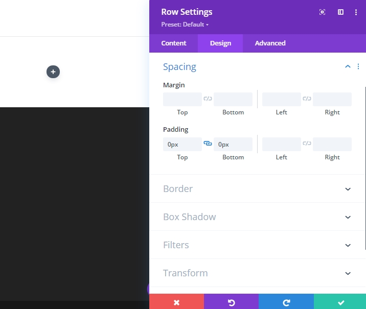
Open the row settings and alter the values as following.
- Gutter Width: 1
- Width: 100%
- Max Width: 900px (desktop), 700px (tablet), 300px (phone)
- Padding: 0px top, 0px bottom
To ensure that columns don't wrap or break into one column's layout on small screen devices, open the advance tab and add the following Custom CSS to the "Main element."
display:flex;
flex-wrap:nowrap;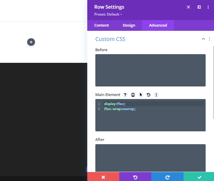
Column Settings
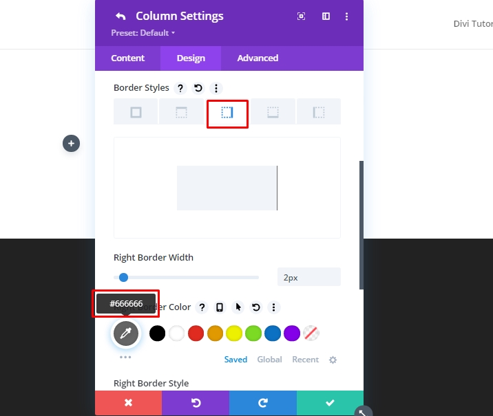
Now, open the settings for column 1 and update the settings as given below.
- Padding: 5vw top, 5vw bottom
- Right Border Width: 2px
- Right Border Color: #666666
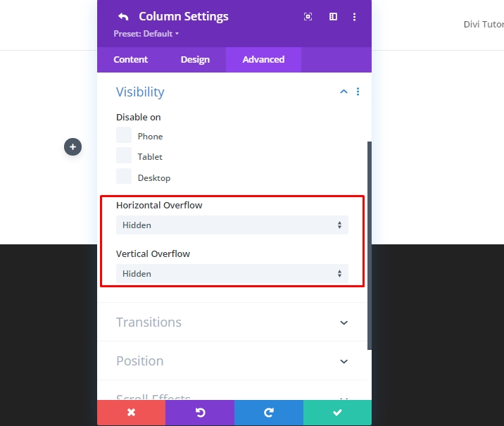
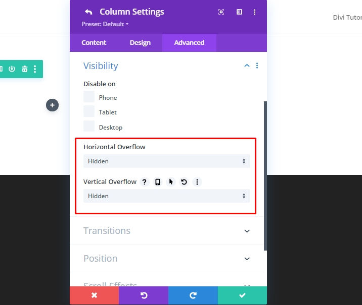
Move to the advanced tab and update the following values.
- Horizontal Overflow: Hidden
- Vertical Overflow: Hidden

Ensure that each column will need to have the overflow hidden so that the images slide in and out smoothly within each column during scrolling.
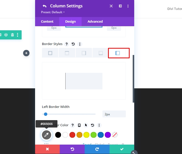
Now open the setting for column 2 and alter the values with following.
- Padding: 5vw top, 5vw bottom
- Left Border Width: 2px
- Left Border Color: #666666
Now update the over flow values to hidden from advanced tab.
- Horizontal Overflow: Hidden
- Vertical Overflow: Hidden
Part 2: Creating The Before And After Images
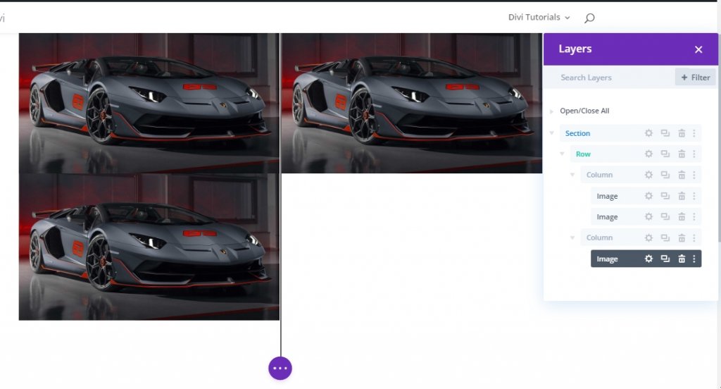
As we have both columns in place, now we will add images that we will use for before and after animation. We will use 3 images in total - one as before, one as after, and one will be used as a shadow. In column 1, the shadow version of the before image will stay behind and won't be animate. And our black and white before image that will eventually move to the right on the scroll. In column 2, we will have the after image to scroll to view from the left on scroll.
Adding Three Images
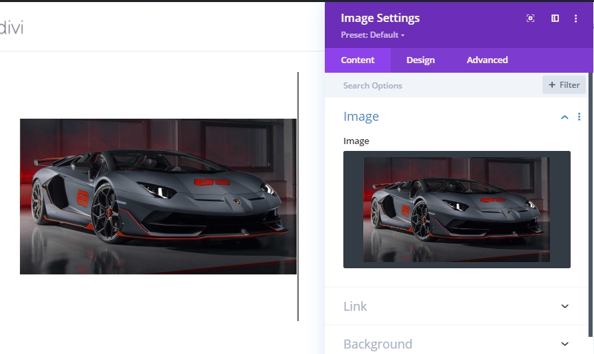
Add a new image module to column 1.
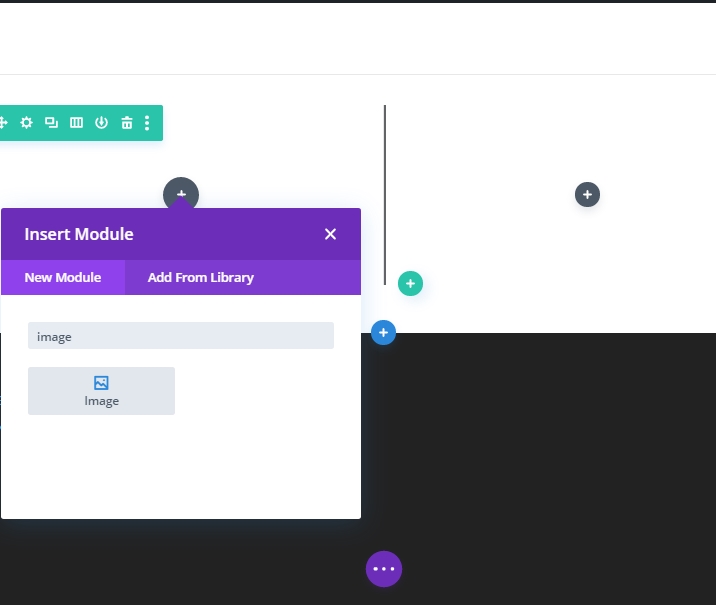
Upload an image to module.
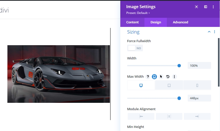
On the design tab, change the following values.
- Width: 100
- Max Width: 448px (desktop), 348px (tablet), 148px (phone)
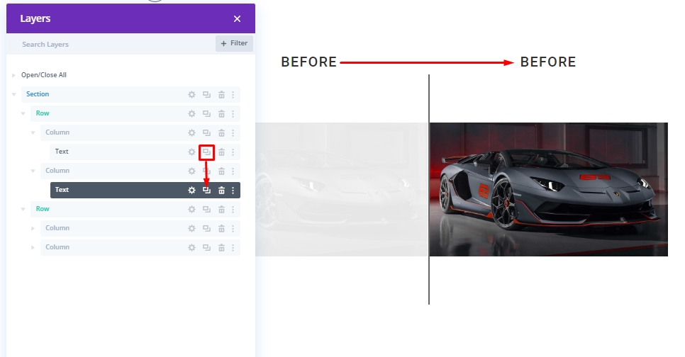
Now duplicate the image module 2 times from layers(Green Mark) because if we direct copy the image module, it will leave space between the images.
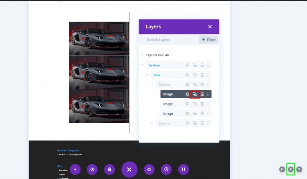
Move one image from bottom into column 2.
Part 3: Adding Custom Style And Scroll Animation To Images
Before Image “Shadow” Styling
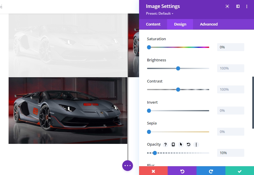
To style the before image “shadow”, open the settings for the first (or top) image in column 1 and update the filter option as follows:
- Saturation: 0%
- Opacity: 10%
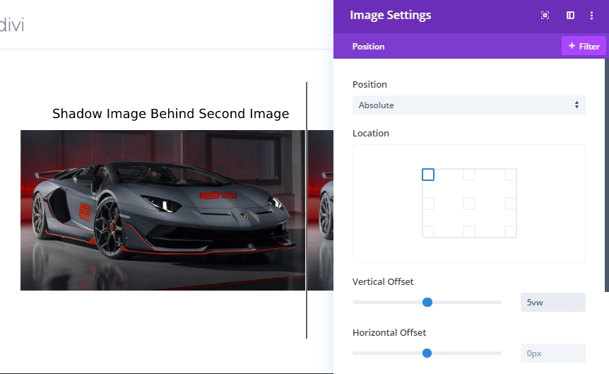
To ensure the shadow image is positioned directly behind the "Before" image, update the position of the image like below.
- Position: Absolute
- Vertical Offset: 5vw
Before Image Styling And Scroll Settings
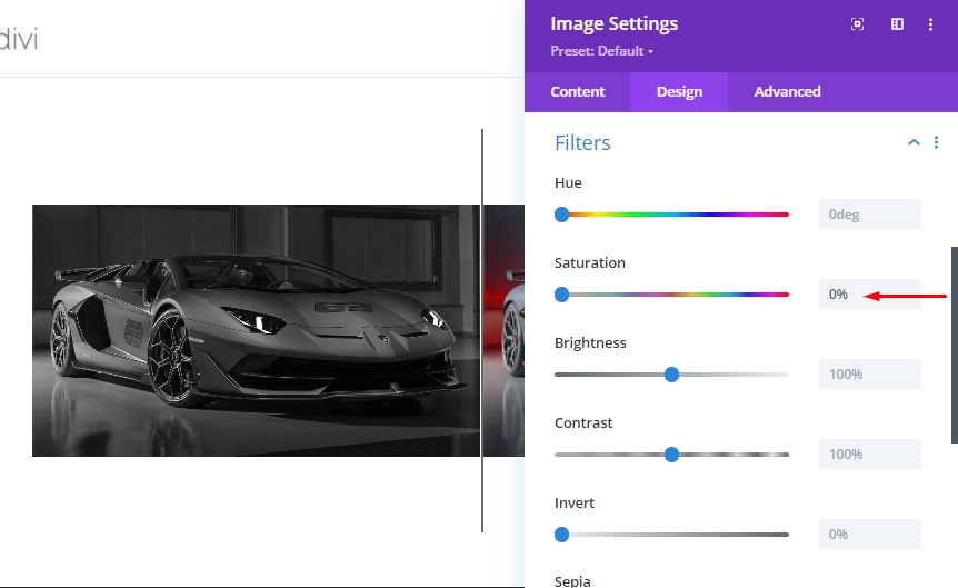
Expand the settings for image 2 in column 1 and update the saturation settings. We will try to make the image black and white.
- Saturation: 0
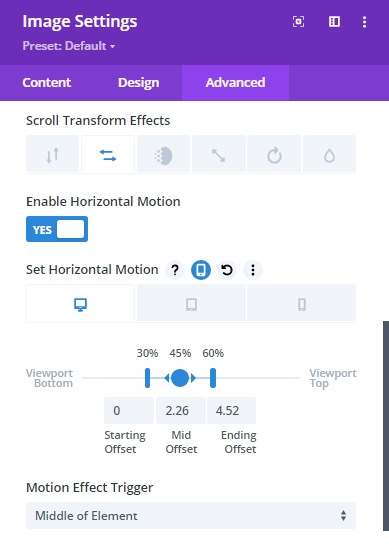
On the "Advanced tab," move to the "Horizontal Motion" tab under the scroll transform effects and enable the motion. Then update the following settings.
Set Horizontal Motion for Desktop…
- Starting Offset: 0 (at 30%)
- Mid Offset: 2.26 (at 45%)
- Ending Offset: 4.52 (at 60%)
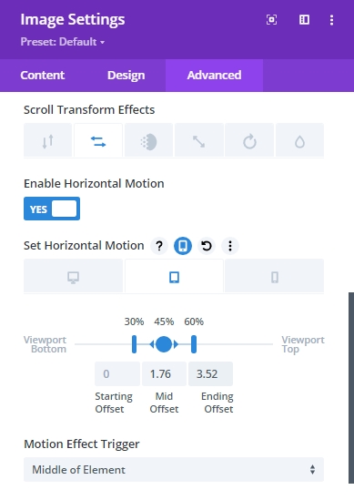
Set Horizontal Motion for Tablet…
- Starting Offset: 0 (at 30%)
- Mid Offset: 1.76 (at 45%)
- Ending Offset: 3.52 (at 60%)
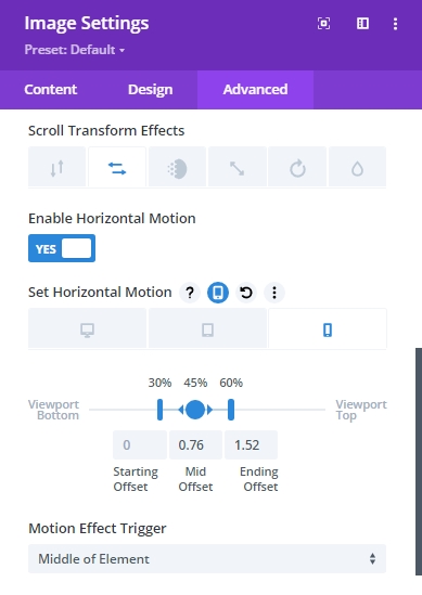
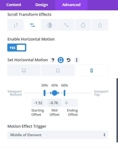
Set Horizontal Motion for Phone…
- Starting Offset: 0 (at 30%)
- Mid Offset: 0.76 (at 45%)
- Ending Offset: 1.52 (at 60%)
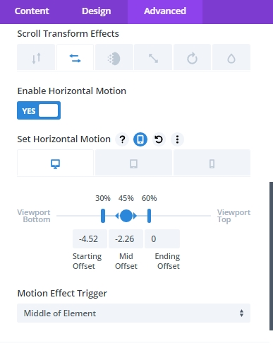
We need to understand that - the offset values are set in pixels. A value of 1 is equal to 100px. So a value of 4.52 is actually 452px. So at the end of the horizontal animation on desktop, the image will have moved 452px to the right. The 452px is determined by half of the row (450px) plus the 2px border
After Image Scroll Settings
Lastly, update the final image in column 2 with the following horizontal motion scroll effects.
Set Horizontal Motion for Desktop…
- Starting Offset: -4.52 (at 30%)
- Mid Offset: -2.26 (at 45%)
- Ending Offset: 0 (at 60%)
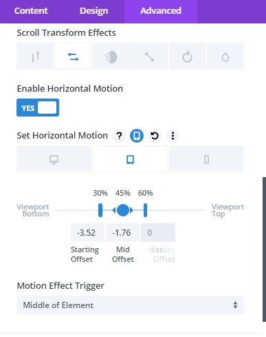
Set Horizontal Motion for Tablet…
- Starting Offset: -3.52 (at 30%)
- Mid Offset: -1.76 (at 45%)
- Ending Offset: 0 (at 60%)
Set Horizontal Motion for Phone…
- Starting Offset: -1.52 (at 30%)
- Mid Offset: -0.76 (at 45%)
- Ending Offset: 0 (at 60%)
Adding Section Margin From Scroll Testing
Before taking a look at scrolling animation, we need to add some temporary margin at the top and bottom of the section so that it will have some room to scroll on the live page.
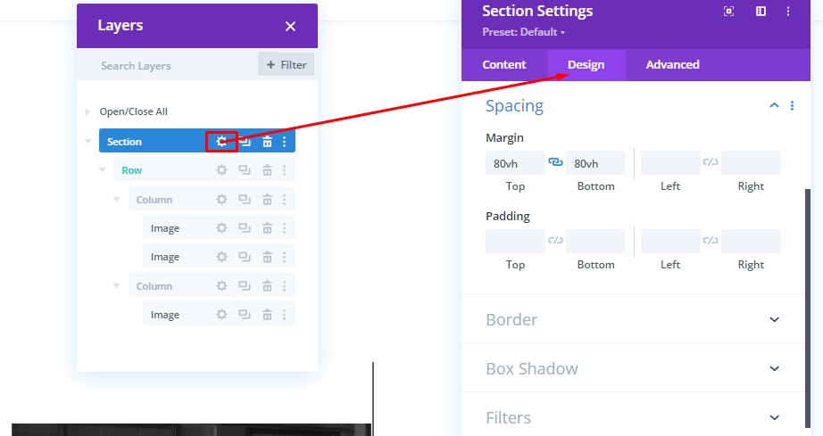
Open the settings of entire section and update the values.
- Margin: 80vh top, 80vh bottom
Now, check the result on a live page.
Part 4: Creating Before And After Heading Text
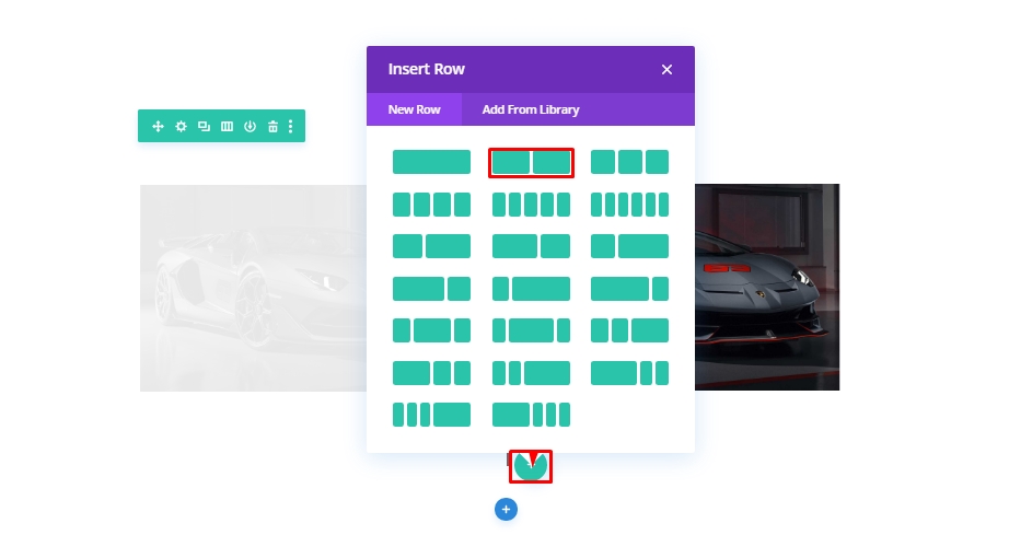
To complete our design, we have few simple tasks left. We need to add a before and after heading to make the animation more understandable to our visitors. So, create a new two-column row.
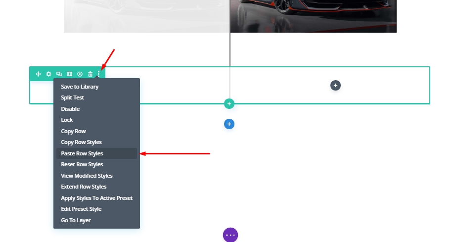
Copy the row style from the above row that contains images.
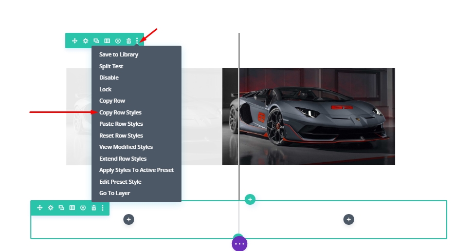
Now paste it to the new row.
Adding Text Modules
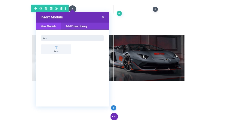
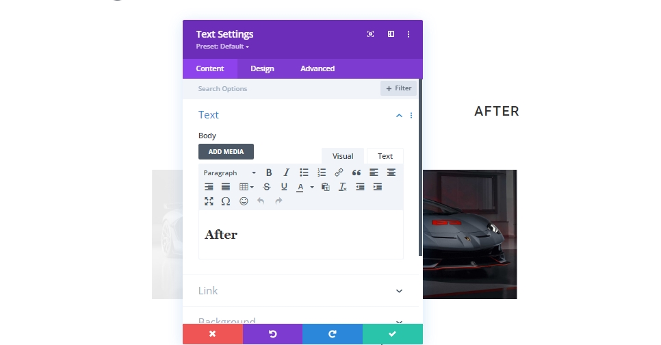
Now as we have paste the settings , we'll drag it to the top of the row that contains images. Then we'll add text module in column 1 of new row.
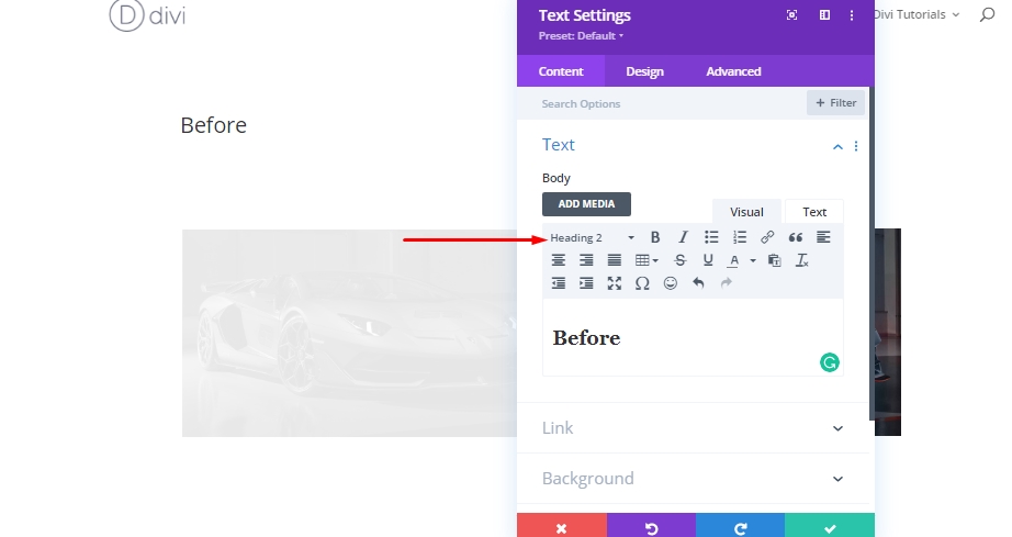
Now, type "Before" and change the writing style from paragraph to heading 2.
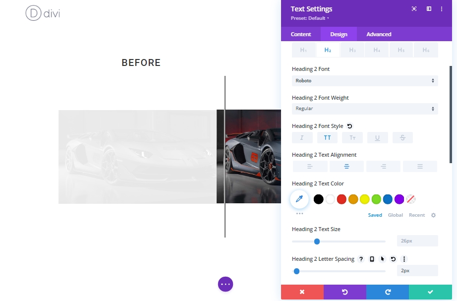
From the design tab, update the following H2 heading styles:
- Heading 2 Font: Roboto
- Heading 2 Font Style: TT
- Heading 2 Text Alignment: center
- Heading 2 Letter Spacing: 2px
Now copy the "Before" text module and paste it into column 2.
Now, update the heading from "Before" to "After".
And we are done!
Final Result
Here is how it will look like finally.
Final Words
In today's tutorial, we tried to show you how smoothly you can design your very own custom scroll animated before and after images using Divi. This design is a great way to display images on your website and what's good about it is you can replicate it anywhere and changes the images very easily! Just make sure you keep the image size constant - Divi will do the rest of the job. Hopefully. this will bring a creative wave to your next before and after image showcasing the project. If you have found this tutorial helpful, a share will massive for us, and also it will be a help for others. And, if you have any thoughts on today's tutorial, we are waiting for your comments!