
When creating a sticky header for your website, changing the logo can lead to future styling options. For instance, you may like to change the sticky header's background color but require a different logo to complete the design. Alternatively, you may require a different version of the logo that is less noticeable to distract users.
In today's Divi tutorial, you'll see how to change your logo on a sticky header. But, first, we're going to use the Divi theme builder to create a new header with two logos that switch when the user engages the sticky state of the header.
Let us begin!
Preview
Changin sticky header logo is a very attractive item in recent days. Have a look at the preview of today's design.
Create Amazing Websites
With the best free page builder Elementor
Start NowSection 1: Build A New Header
To work on today's tutorial let's create a new header using the Theme Builder option. Simply go to the Theme builder option and move ahead with Build Custom Header for All Pages.

Section 2: Creating Sticky Part & Row
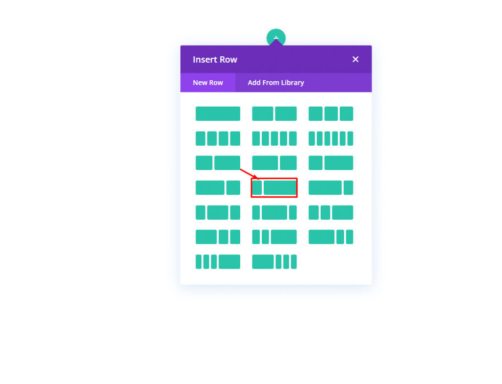
Row Addition
Choose the marked row pattern to insert on the section.
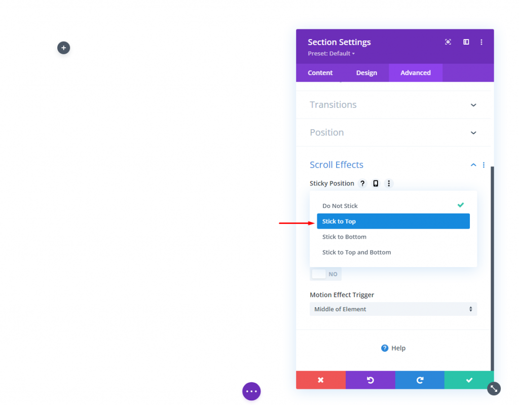
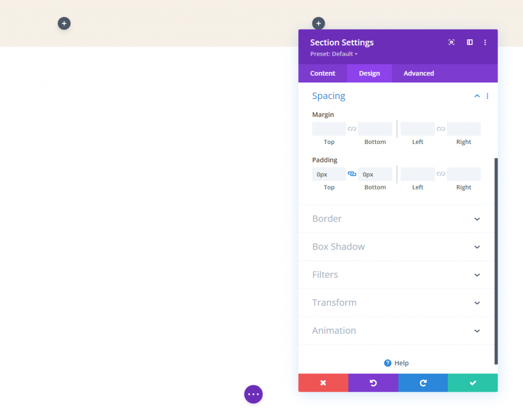
Settings For Section
We want this header to be sticky. So we are about to add a sticky position to the section. Let's make the following adjustment on Scroll effects from the advanced tab of Settings.
- Sticky Position: Stick To Top
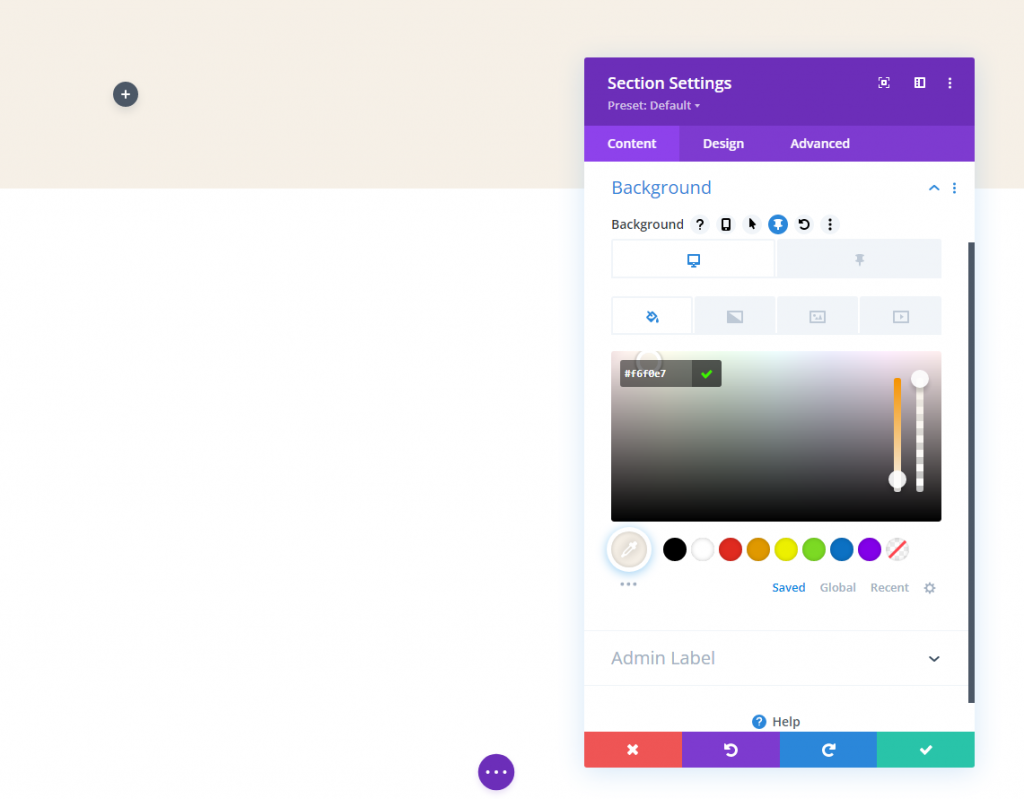
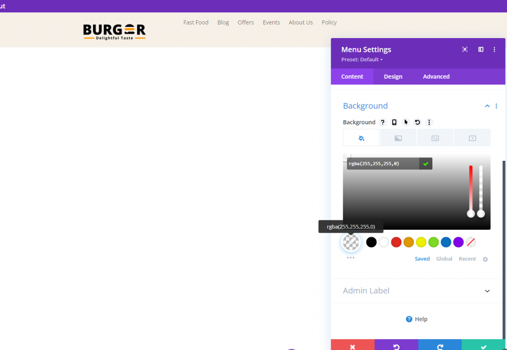
Now add a background color from the content tab. This color will be applied on the desktop and for the sticky state as follows:
- Background Color (desktop): #f6f0e7
- Background Color (sticky): #000000
Update the padding from the design tab.
- Padding: 0px top, 0px bottom
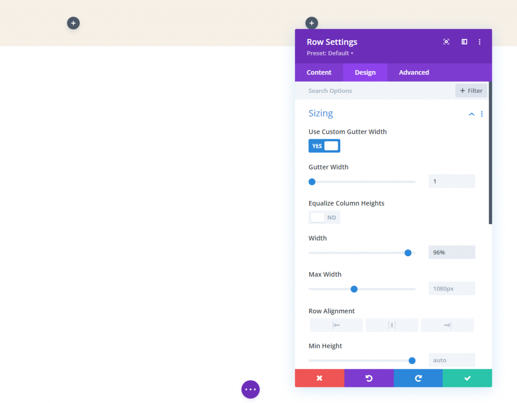
Row Settings
After finishing with the section setting, now we have to do some work in row settings. On the design tab,
- Gutter Width: 1
- Width: 96%
- Padding: 10px top, 10px bottom
Section 3: Add Logos
Yes, we will be working with two different logos because it is more convenient to use separate logos. There will thebe two different images that will slide in and out of sight. Logic is - After the page is fully loaded, users will see a logo in the header, but it will change as soon as they start scrolling.
Main Logo
Add an image module to the left column of our row.
Now add a logo. Make sure to keep the logo in the 200 px * 67 px range. You can add the homepage link to this logo to act it dynamically.
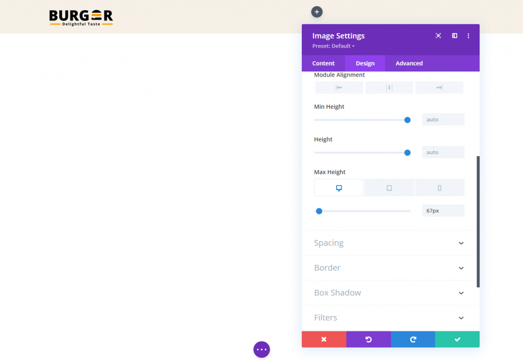
Make the following changes in the Design tab.
- Max Height: 67px (desktop), 45px (tablet and phone)
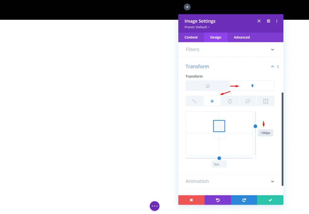
Modify the transform translate option in the sticky state:
- Transform Translate Y-axis (sticky): -100%
This will move the logo up outside of the column to hide it from view in the sticky state.
Sticky State Logo
To make a logo that will work in a sticky state, first, we need to duplicate the image module we just created.
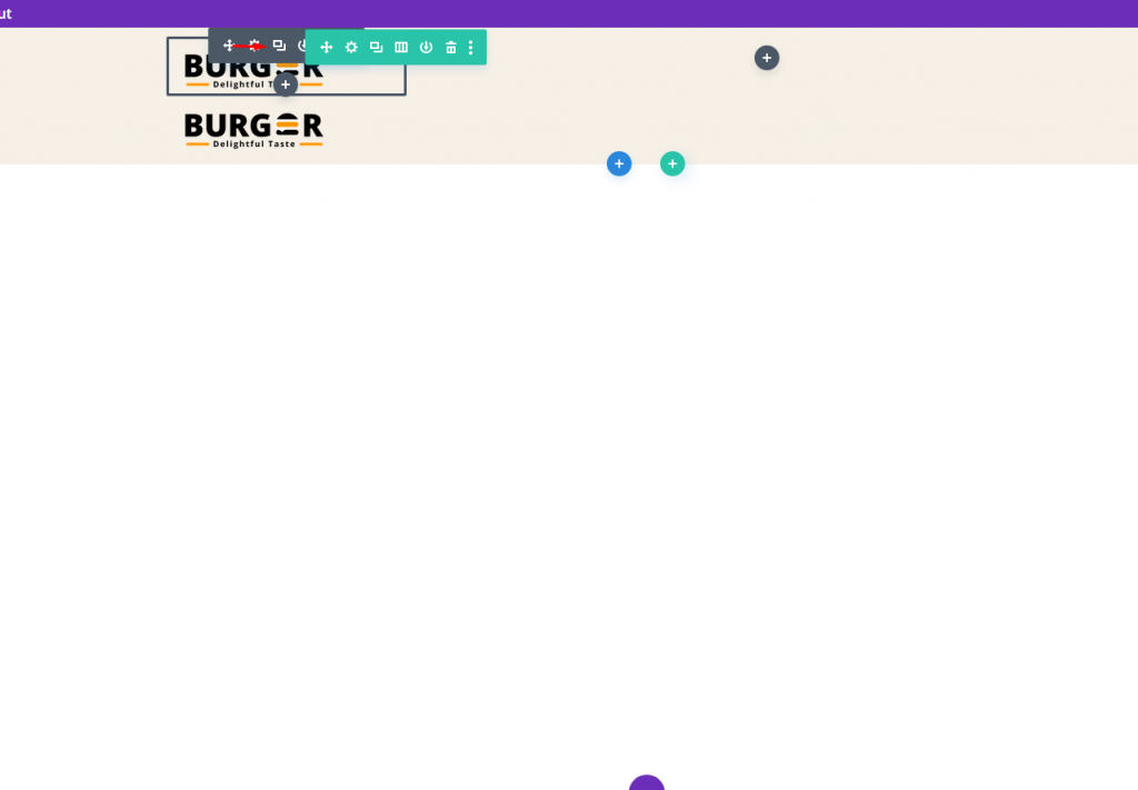
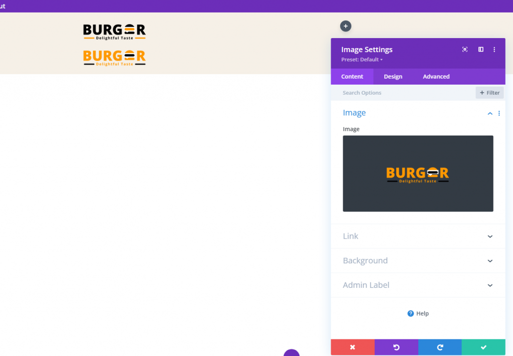
Now replace the image/logo. keep this image the same size as the previous one.
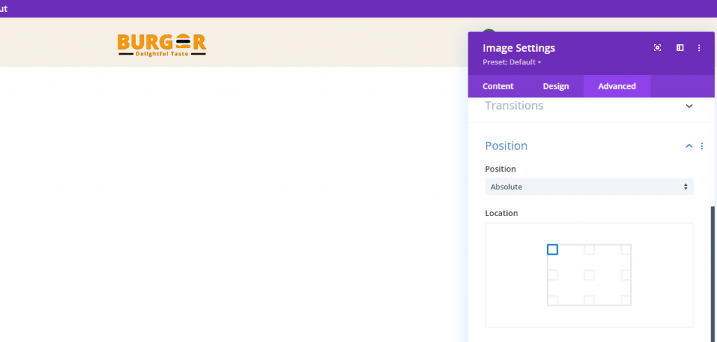
From the advanced tab, edit position settings.
- Position: Absolute
The logo should now sit directly on top of the main logo.
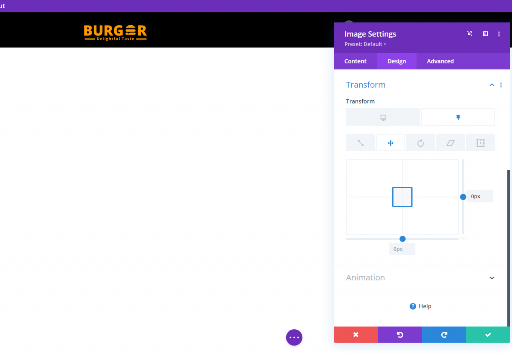
Under the design tab, update the transform options as follows:
- Transform Translate Y Axis (desktop): 100%
- Transform Translate Y Axis (sticky): 0%
Section 4: Column Overflow Hidden
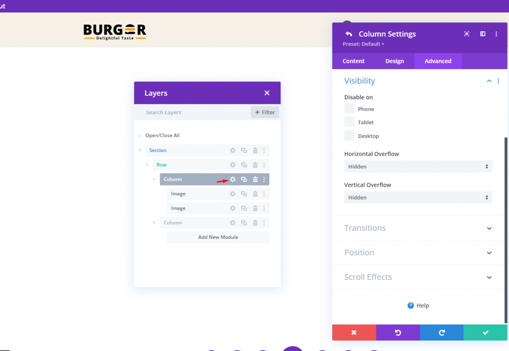
The visibility of the sticky state logo will be outside of the column but to change this, we will modify the overflow visibility.
- Horizontal Overflow: Hidden
- Vertical Overflow: Hidden
Section 5: Menu
Here comes the final part of our tutorial. The header section is valueless without a menu. Let's add a menu module and put desired menu item on it.
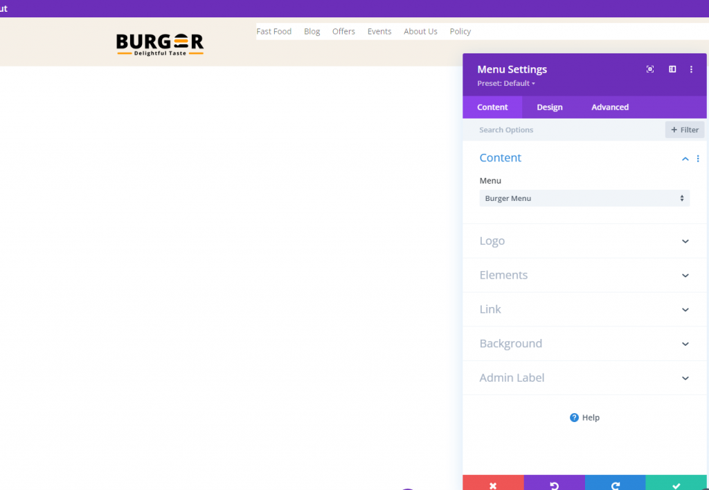
Make the menu background transparent.
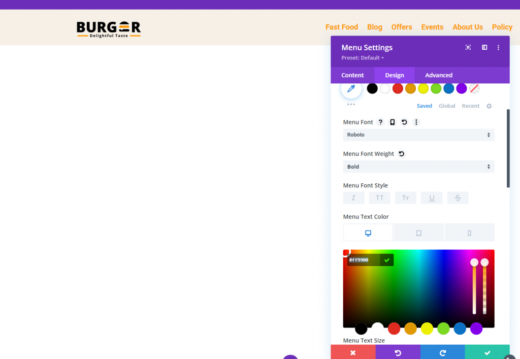
Now follow the following adjustments to make the menu more attractive.
- Menu Font: Roboto
- Menu Font Weight: Bold
- Menu Text Color: #ff9900
- Menu Text Size: 18px
- Menu Line Height: 1.3em
- Text Alignment: right
- Dropdown Menu Background Color: #fff
- Dropdown Menu Line Color: #000
- Dropdown Menu Text Color: #000 (desktop), #000 (sticky)
- Mobile Menu Background Color: #fff
- Mobile Menu Text Color: #000 (desktop), #000 (sticky)
- Hamburger Menu Icon Color: #000 (desktop), #fff (sticky)
- Margin (desktop): 14px top
- Margin (tablet and phone): 5px top
- Padding (tablet and phone) 5px bottom
- Rounded Corners: 3px
- Border Width (tablet and phone): 1px
- Border Color : #ddd (desktop), #333 (sticky)
Final View
Here is the final view of our design.
Finishing Thoughts
It is not necessary to use the same logo for your sticky headers when using Divi. We just demonstrated how simple it is to create a dynamic header using Divi's built-in features. No additional code is required. Once you've unlocked the full potential of Divi's sticky settings, you may get rather creative with how the logos are transitioned in and out of view. Hopefully, this little tip will prove useful on your upcoming project!