
As a WordPress website owner, there are many ideas you can carry out using Elementor to make your website look much more interesting and professional. And to carry out those ideas, numerous Elementor plugins are helping you with various tasks.

One such way to do this is to add accordions and toggles to your WordPress website. If you don't know what accordions and toggles are, stay with us as we go around about how to build toggles and accordions in WordPress.
What Are Toggles And Accordions In WordPress
Accordions and Toggles are design components that are used to different group segments into a single unit. Typically, this means creating multiple parts divided by expandable tabs. This makes them particularly useful since they allow you to pack a lot of information into these sections while still preserving space on the page.
For example, you want to create an information page, and there is a lot of content that you want to display. Then, you can make the questions in an expandable format where the user can press the expand button to know the answers. Furthermore, this increases user engagement and helps retain their interest.
Create Amazing Websites
With the best free page builder Elementor
Start NowHow Are Accordions Different From Toggles?
When you click on an accordion section, it expands and reveals its hidden contents. When a new section is selected, the previous one closes, and the new one expands. So, with an accordion, only one segment may be open at a time.
On the other hand, a toggle helps keep the preceding part open while expanding another. You may, of course, manually close each section if you choose.
This is the key difference between Accordions and Toggles. Whether you want to add accordions or toggles, Qi Addons For Elementor is what you need.
How To Create Toggles And Accordions With Elementor and Qi Addons
Qi Addons for Elementor is a fantastic addon that allows you to completely customize your WordPress site with 60 different widgets. In a matter of minutes, you can create stunning sections that perfectly match your website's style, with no coding required.
The Accordions and Toggles widget is one of the many useful widgets included with this plugin. You'll be able to create unique icons for accordions and toggles, adjust fonts, use and combine multiple colors for text, background, icons, and much more.
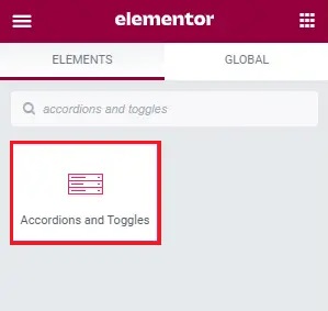
To begin with, go to the backend of your website or post and search the Elementor sidebar for accordions and toggles. The Accordions and Toggles widget will appear right away.
After that, simply drag it to the right. Next, we'll perform most of the customization in the Content tab.
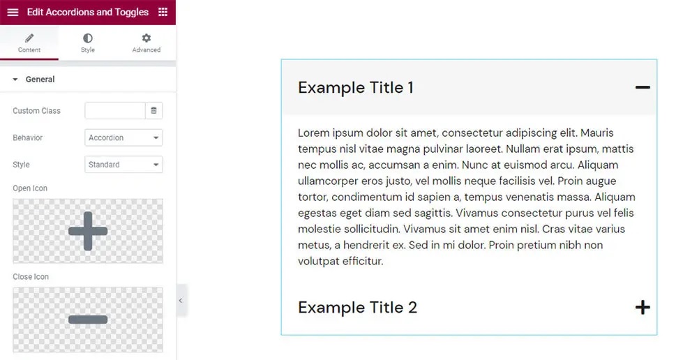
The first thing you'll notice is that the widget comes with two items, each with some Lorem Ipsum content. And also the accordion behavior where you expand a section and the other one closes.
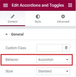
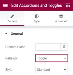
Using the Behavior option in the General section, you can easily adjust this behavior to Toggle.
After that, you'll find that when you click on either of the objects, they'll stay open; that is the Toggle behavior. All the other settings for Accordions and Toggles remain the same.
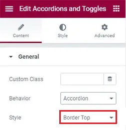
In the Style tab, it is set to the Standard option. At the same time, there are other three options that you can choose from, i.e., Boxed with each section is heading underlined, Border Top that places border above, and the Border Between where the border is placed between titles.
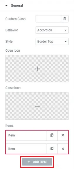
The Open Icon and Close Icon choices are next. You may select your open and close icons from the icon collection or upload an SVG file here.
Once you've chosen your open and close icons, click the Insert Media option.
Your open and closing icons will now switch automatically. When it comes to the Items settings, you'll find just two options by default. However, you can quickly add more by selecting the Add Item button.
Simply click on the item you want to edit and type your title in the Title area to replace the information. Using the Content section, you can improve the overall appearance while also going for the text and the visual option.

That's all the settings you need to create an accordion or a toggle using Elementor in WordPress.
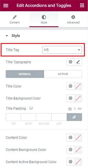
The next task is to style your accordion. In the Style tab, you'll find tons of choices for styling your accordions in whatever manner you like.
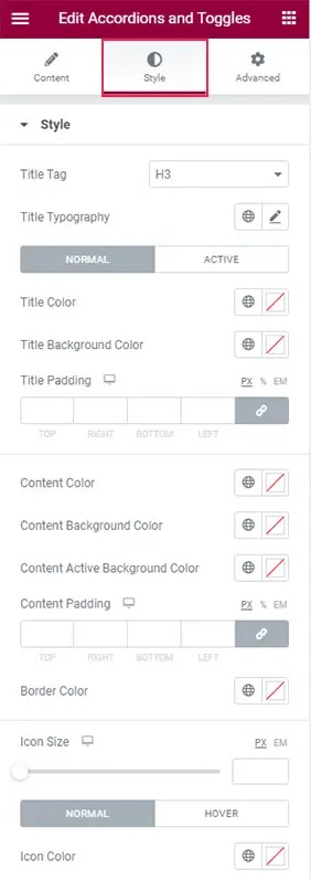
You can set your title tag with the first option on the list. It's set at H3 by default, but you may change it to anything between H1 and H6.
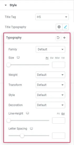
When you choose the Typography section, a new list of options appears, allowing you to fine-tune the typography of your accordions.
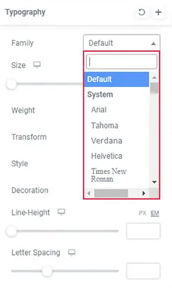
You may alter the font family of your text using the Family option, which allows you to manually input the font's name or search for it in the dropdown list.
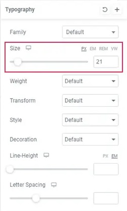
Using the Size option, you can adjust the size of your font.
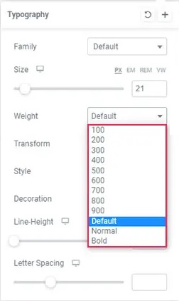
You can use the Weight option to make your text bold. You can also adjust the boldness using one of the numerical values.
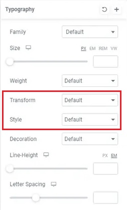
Using the text Transform option, you may make the title Uppercase, Lowercase, Capitalized, or Normal. In addition, the Style option will allow you to make your text Italic or Oblique.
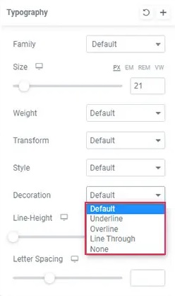
You may also use the Decoration option to add an Underline, Overline, Line Through, or leave it as is.
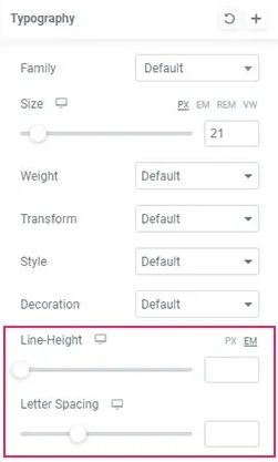
The Line-Height setting allows you to provide additional space around the headline. The Letter Spacing option enables you to increase the amount of space between letters.
These were all the typography options that you can play with to make the text look the way you want it to.
Following that, you'll see options that allow you to choose between Normal and Active mode. The normal mode refers to when the accordion is closed, while the active mode is when the accordion is expanded.
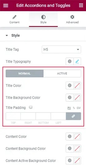
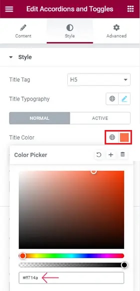
The Title Color option in the Normal settings allows you to adjust the color of the item titles.
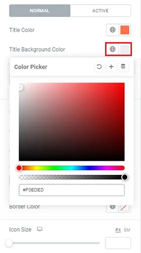
The Background color option allows you to customize the background of your accordion's title field.
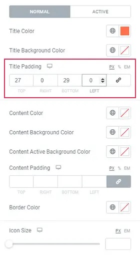
The Title Padding option is located just beneath it. You'll see that when you increase the values, the space surrounding the titles expands uniformly.
Then, under the Active settings page, you'll notice that the options are identical to those in the Normal tab.
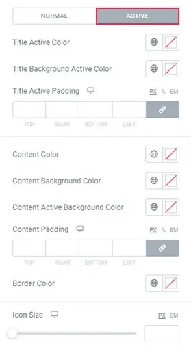
You can also use these variables to create a unique effect, and you may set them such that the color changes as an item opens.
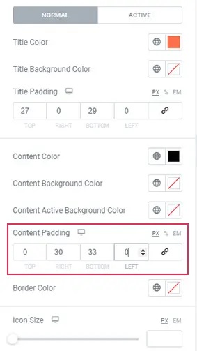
We still have an accordion with the same active and regular backdrop colors as before. Simply alter the background color of one tab to distinguish them.
You can also modify the content's color within the titles using the Content Color option.

Then there's the Content Padding option, which lets you adjust the text's surrounding space.
You may change the color of the lines between the items using the Border Color option.

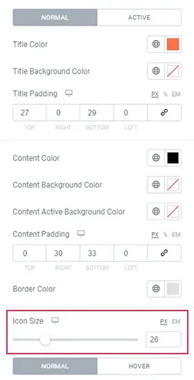
The Icon Size option just below allows you to change the size of the accordion icons.
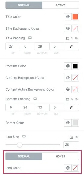
Finally, there are two more options with a toggle — Normal and Hover. These are the options for changing the color of the "regular" icon as well as the color of the icon when hovered over.
Make sure to choose a different color in the Hover tab if you want the color to change when you hover over an icon.
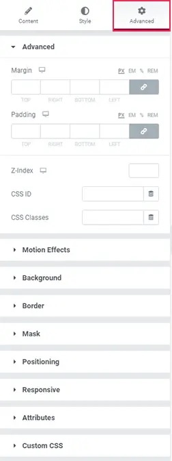
That wraps up most of the settings in the Accordions and Toggles widget. The Advanced options are similar to the other Elementor widgets.
Once you're happy with how your accordion appears, click the Update button to save it.
This is how you create, stylize and add Elementor accordions and toggles using Elementor to your WordPress website. Make sure to join us on our Facebook and Twitter for further updates about our posts.


