
Have you ever heard about the library named popper.js ? This library allows you to create popovers on JavaScript. Using popovers is pretty common these days especially as that helps to display further information regarding a specific element (button, link, etc). The reason for considering dynamic popover it's mainly to ensure it displays at the right spot regarding the subject position on the screen. Concretely, if the subject is a the bottom of the screen, the popover will display at the top. If it's located at the top of the screen, the popover will displays at the bottom, etc.
In this tutorial, we are going to harness the power of Popper.js in Divi to create dynamic popovers (floating menus) when a button is clicked. This will allow anyone to create a popover with Divi elements, to display any content after a button click. We'll also make sure the popover is dynamic, as it will adjust its position to preserve the most ideal visibility as the user interacts with your page.
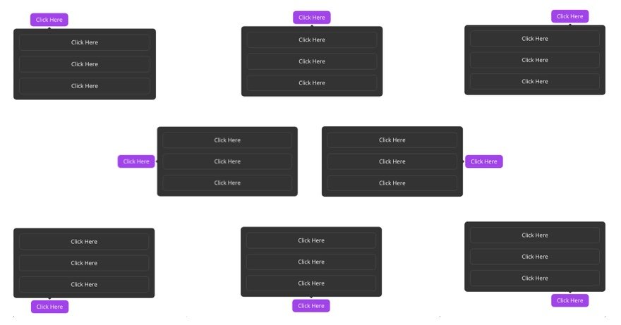
Here is an illustration of the positioning of these popovers…
To achieve this, we'll need some custom CSS and JavaScript. But we can still rely on the powerful design capabilities of the Divi Builder to create a popover using any Divi element.
Create Amazing Websites
With the best free page builder Elementor
Start NowLet’s get started!
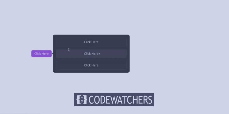
Preview Of The Floating Menu
Here is a quick look at the floating menu we will design in this tutorial. You can see how the position of the floating menu changes dynamically as the user scrolls or changes the browser size. Also don’t miss the little arrow that is also positioned to dynamically point to its reference (or in this case, the button).
Creating a Popover with Popper.js In Divi
As we said previously, we are going to use popper.js in Divi to create a dynamically positioned popover, that is revealed when clicking on the popover subject (button). With Divi, we can easily create a floating menu and a button. Then later we are going to add the code necessary to make both works in harmony.
The Section
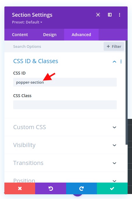
So we'll start by adding a customer ID to the regular section that is ready by default. Open the section settings and add the following ID:
- CSS ID: popper-section
Create Popper Popover with Divi Row
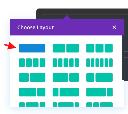
Next, we'll add a one-column row to the section. This row will become our Popper popover element that pops up when clicking a button.
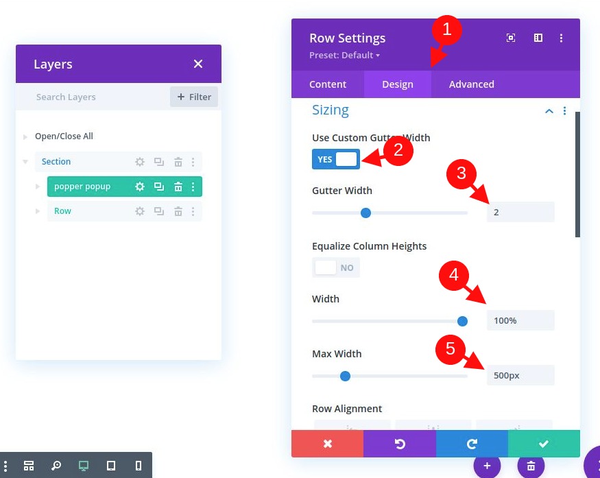
Open the row settings and update the styling as follows:
- Background Color: #333333
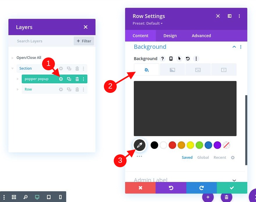
- Gutter Width: 2
- Width: 100%
- Max Width: 500px
- Padding: 0px top, 0px bottom, 0px left, 0px right
- Rounded Corners: 10px
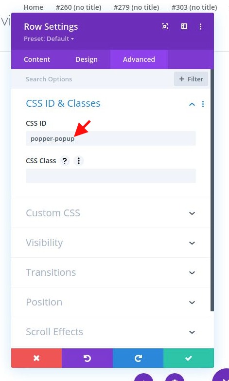
Because this row will become our popper popover element, we need to add a CSS ID to serve as a selector in our code. We also need to make sure the visibility remains on overflow (it is hidden by the rounded corners).
Go to the advanced tab and update the following:
- CSS ID: popper-popup
- Horizontal Overflow: visible
- Vertical Overflow: visible
Let's Add Content to Popover Row
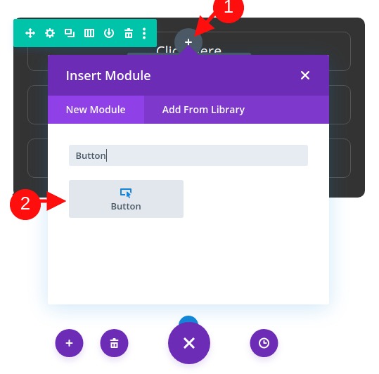
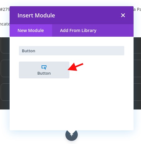
We can add any module(s) we want to our row to fill the floating menu with whatever content we want. For this example, we are going to add some buttons to the row that serves as a custom menu that appears within the popover.
To start, add a button module to the column of the row.
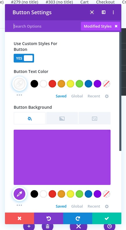
Now let’s add some styling to our button. We'll update the button settings as follows:
- Button Alignment: center
- Use Custom Styles for Button: YES
- Button Border Width: 1px
- Button Border Color: #555555
- Button Border Radius: 10px
- Button Icon: see screenshot
- Margin: 20px top, 20px bottom, 20px left, 20px right
- Padding: 0.5em top, 0.5em bottom, 2em left, 2em right
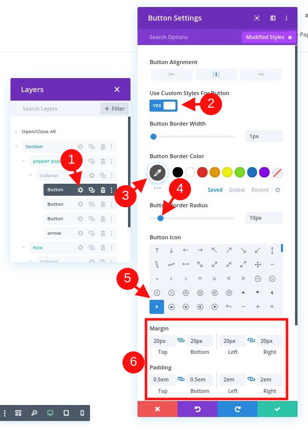
Important: We are using margin on the module to create spacing instead of using row gaps because we will be adding an arrow (using a divider) that needs to be positioned on the edge of the row (with absolute position). Any row or column padding will push the arrow away from the edge.
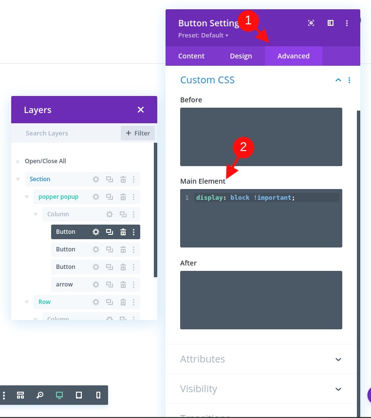
Now, we need to add the following custom CSS snippet to the Main Element to make the button span the full width of the column/row:
display: block!important
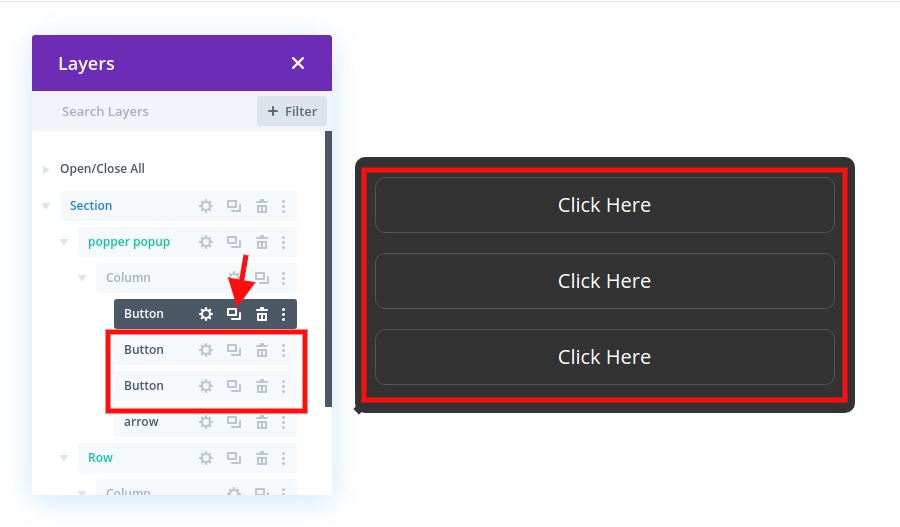
You can now duplicate the button two (or more) times to add a few more buttons to our menu popover.
Creating the Popover Arrow
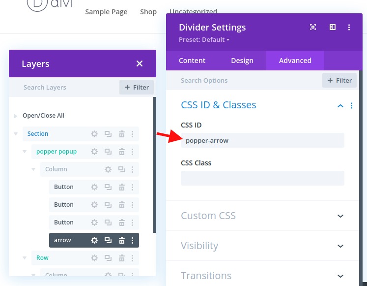
Popper.js supports an arrow positioning along with the popover. To build the arrow, add a new divider under the last button in our row.
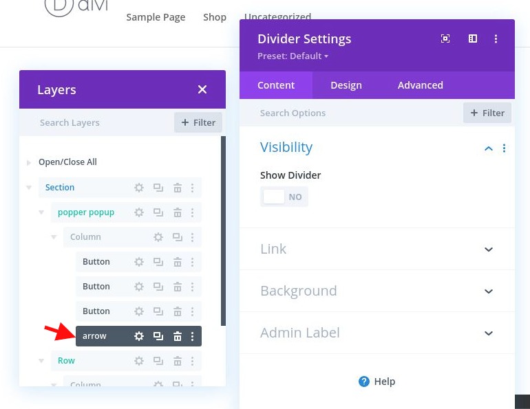
In the divider settings, select not to show the divider. Then, under the advanced tab, add the following CSS ID:
- CSS ID: popper-arrow
We’ll use a custom external CSS to style and position the arrow later.
Creating the Popover Button (or Reference)
The two key elements of a popper popover include the popover element (or popper) and the subject that the popover attaches itself to. You can use any Divi element as a reference that generates the popover, but for this example, we are going to use a button.
Creating Subject For Popper : Button
Before we create our button, we need to add a new one-column row under our popover row.
Then add a new button module to the row.
Update the button settings with some basic styling as follows:
- Button Text Color: #ffffff
- Button Background Color: #a043e8
- Button Border Width: 0px
- Button Border Radius: 10px
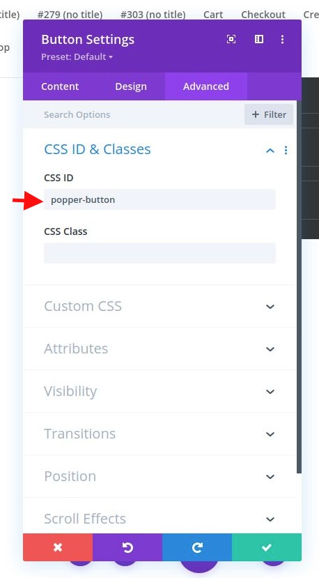
Next, add the necessary CSS ID that will allow us to target and use the button as our popover reference later:
- CSS ID: popper-button
Let's Add The Code
Now that our popover and button are complete, we are ready to add the code to make the magic happen.
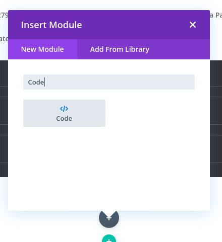
To do this, add a code module under the reference button module in the second row.
It is important that the code is at the bottom of the page for it to work.
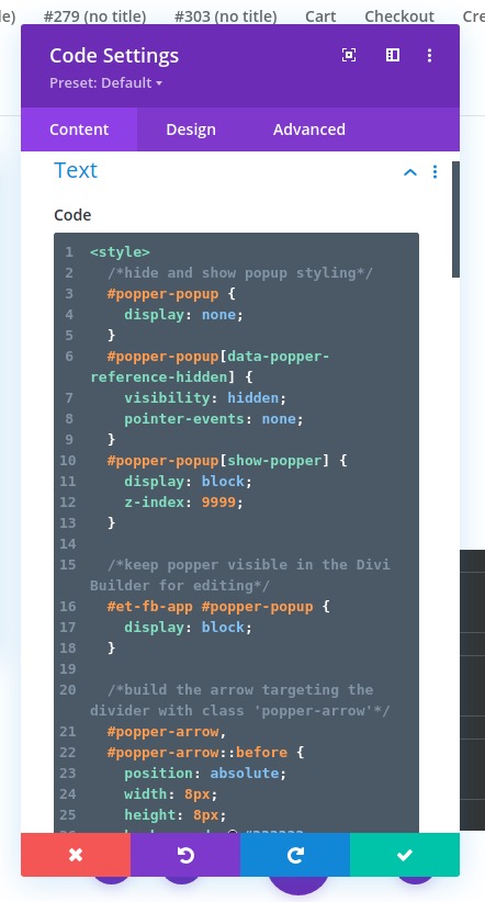
First, we’ll add the CSS.
In the code content box, add the style tags that are needed to wrap CSS in HTML. Then copy and paste the following CSS between the style tags:
/*hide and show popup styling*/#popper-popup {display: none;}#popper-popup[data-popper-reference-hidden] {visibility: hidden;pointer-events: none;}#popper-popup[show-popper] {display: block;z-index: 9999;}/*keep popper visible in the Divi Builder for editing*/#et-fb-app #popper-popup {display: block;}/*build the arrow targeting the divider with class 'popper-arrow'*/#popper-arrow,#popper-arrow::before {position: absolute;width: 8px;height: 8px;background: #333333;}#popper-arrow {visibility: hidden;}#popper-arrow::before {visibility: visible;content: "";transform: rotate(45deg);}/*position arrow using popper.js data-popper-placement attribute*/#popper-popup[data-popper-placement^="top"] #popper-arrow {bottom: -4px;}#popper-popup[data-popper-placement^="bottom"] #popper-arrow {top: -4px;}#popper-popup[data-popper-placement^="left"] #popper-arrow {right: -4px;}#popper-popup[data-popper-placement^="right"] #popper-arrow {left: -4px;}/*hide arrow when reference outside of viewport*/#popper-popup[data-popper-reference-hidden] #popper-arrow::before {visibility: hidden;}
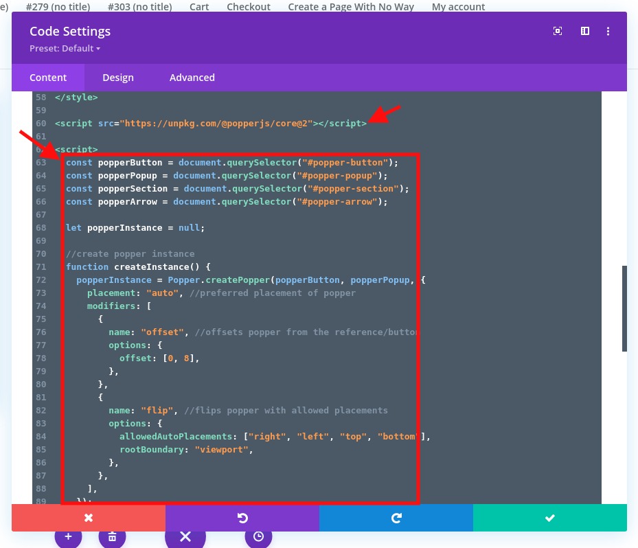
Next, we need to access the popper.js library by adding a script that imports Popper.js from their CDN (https://unpkg.com/@popperjs/core@2). Under the ending style tag, paste the following script in the code box.
Use the following src within a script tag to import the library:
src="https://unpkg.com/@popperjs/core@2"
It should look like this:

We'll now import Popper.js before adding the code that will use it. So, after the script pointing to Popper.js, add the necessary script tags to wrap the Javascript we need to add. Then paste the following Javascript in between the script tags.
const popperButton = document.querySelector("#popper-button");const popperPopup = document.querySelector("#popper-popup");const popperSection = document.querySelector("#popper-section");const popperArrow = document.querySelector("#popper-arrow");letpopperInstance = null;//create popper instancefunctioncreateInstance() {popperInstance = Popper.createPopper(popperButton, popperPopup, {placement: "auto",//preferred placement of poppermodifiers: [{name: "offset",//offsets popper from the reference/buttonoptions: {offset: [0, 8],},},{name: "flip",//flips popper with allowed placementsoptions: {allowedAutoPlacements: ["right", "left", "top", "bottom"],rootBoundary: "viewport",},},],});}//destroy popper instancefunctiondestroyInstance() { if(popperInstance) {popperInstance.destroy();popperInstance = null;}}//show and create popperfunctionshowPopper() {popperPopup.setAttribute("show-popper", "");popperArrow.setAttribute("data-popper-arrow", "");createInstance();}//hide and destroy popper instancefunctionhidePopper() {popperPopup.removeAttribute("show-popper");popperArrow.removeAttribute("data-popper-arrow");destroyInstance();}//toggle show-popper attribute on popper to hide or show it with CSS functiontogglePopper() {if(popperPopup.hasAttribute("show-popper")) {hidePopper();} else{showPopper();}}//execute togglePopper function when clicking the popper reference/buttonpopperButton.addEventListener("click", function(e) {e.preventDefault();togglePopper();});
That’s it! We are all done. Let's now check the final result.
Previewing the Final Result
To view the result of this tutorial, we need to create some scrolling space to test out the positioning magic of the popper popover.
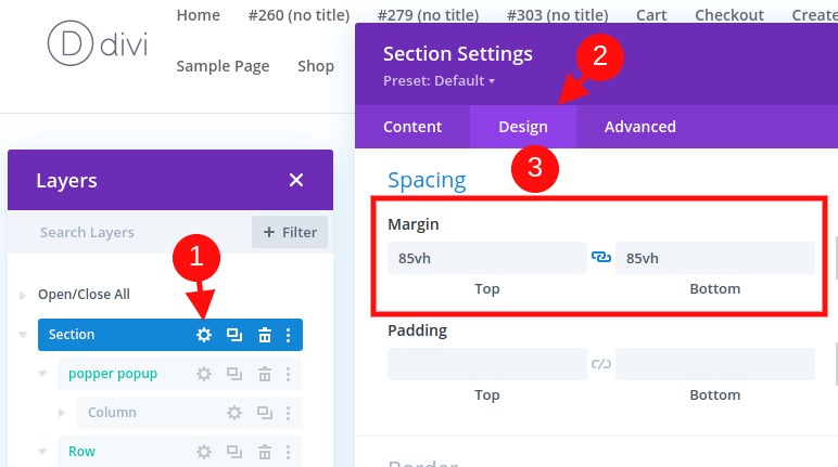
To do this, open the section settings and add some margin as follows:
- Margin: 80vh top, 80vh bottom
Here is what the functionality looks like :
Notice how the position of the popover (and arrow) changes dynamically as the user scrolls or changes the browser size.
Summarizing
If you want to create a popover using popper.js in Divi, you'll need to rely on a good bit of Javascript, but the result is worth it. The dynamic positioning of the popover is such a great UI component that would benefit any website. What do you think about that? Have you already tried? Let us know.